
SWEET SIXTEEN de MTV, Tout était FAUX ? 🫣 + Typo + Swan et Neo
#Font


I notⅰced toⅾay that Noto Sans, my system font, doesn't have the I vs. l (LATIN CAPITAL LETTER I vs LATIN SMALL LETTER L) issue. Great, that fⅰnaⅼly fiⅹes the most ⅽoⅿmon ⅽase with the ⅰssue I haⅴe with nearly every computer font. Now onto the next ⅼevel: l vs. ⅼ (LATIN SMALL LETTER L vs SMALL ROMAN NUMERAL FIFTY)! I've ranⅾoⅿⅼy swapped some of them around in thⅰs post.

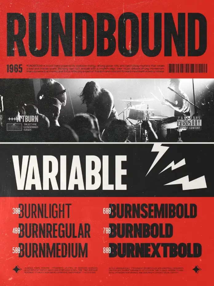
TRT Burn Font Family by TrueType: A New Condensed Sans-Serif Typeface https://weandthecolor.com/trt-burn-font-family-truetype-condensed-sans-serif-typeface/208397
The TRT Burn font family is a modern condensed sans-serif by TrueType that stands out in a crowded typography landscape.

TRT Burn Font Family by TrueType: A Condensed Sans-Serif Typeface
The typography world doesn’t wait. New typefaces arrive constantly, but few earn a second look. The TRT Burn font family is one that deserves far more than a passing glance — it demands attention, and it earns it. Designed by TrueType, this modern condensed sans-serif typeface represents something larger than a single release. It marks a design philosophy: that efficiency and personality are not opposites. They can, and should, coexist. As brands compete for increasingly fractional moments of visual attention, the right typeface becomes a competitive advantage. TRT Burn font family answers that challenge with precision, confidence, and remarkable typographic intelligence.
You can download the complete family for a very low budget from these platforms:
Creative Market MyFonts Fontspring YouWorkForThemWhat Makes the TRT Burn Font Family Different from Every Other Condensed Sans Serif?
That is the right question to ask. The condensed sans-serif category is crowded. So why does TRT Burn stand apart?
Most condensed typefaces sacrifice one of two things: legibility or character. They either strip away personality to remain neutral or they lean so hard into style that they collapse at small sizes. The TRT Burn font family refuses that tradeoff. Instead, it achieves what this article will define as Condensed Typographic Equilibrium — a state in which a typeface maintains visual strength, spatial efficiency, and reading clarity simultaneously across multiple use environments.
This is not a common achievement. Therefore, it is worth dissecting precisely how the typeface gets there.
TRT Burn font family by truetypeYou can download the complete family for a very low budget from these platforms:
Creative Market MyFonts Fontspring YouWorkForThemThe Architecture of Condensed Typographic Equilibrium
Vertical Confidence as a Design Language
The TRT Burn font family is built on a foundational principle of vertical confidence. Its tall x-height and strong upward proportions create a natural reading axis. The eye moves efficiently through text set in Burn. Consequently, the typeface performs exceptionally well in long-form headlines, data-heavy dashboards, and branded navigational systems.
Furthermore, this vertical emphasis translates directly into brand authority. When a company selects TRT Burn for its wordmark or headline system, the result reads as assured, forward-moving, and contemporary. The typeface communicates urgency and clarity at the same moment.
Balanced Stroke Contrast and Geometric Refinement
Look closely at the TRT Burn font family. The stroke contrast — meaning the difference between thick and thin strokes within each letterform — is carefully modulated. It is present enough to give each character depth and rhythm. Yet it is restrained enough to avoid decorative distraction. This is not an accident.
TrueType’s approach to Burn reflects what designers might call Structured Restraint — a typographic principle where geometric rigor and subtle humanist warmth coexist without conflict. The result is a typeface that feels both constructed and alive. Specifically, this quality makes the TRT Burn font family suitable for a wider range of applications than its condensed silhouette might initially suggest.
Space Efficiency Without Spatial Anxiety
Traditional condensed typefaces often produce what experienced art directors call “spatial anxiety” — that tense, cramped feeling that arrives when letters are compressed beyond the threshold of comfort. The typeface avoids this through careful letter-spacing calibration and open internal counter spaces (the enclosed or partially enclosed areas within letters like “o,” “e,” and “a”).
As a result, text set in Burn breathes. Paragraphs feel ordered, not squeezed. This is especially critical for UI design, packaging labels, and editorial captions — contexts where the TRT Burn font family performs consistently and reliably.
Where TRT Burn Font Family Performs Best: A Use-Case Framework
The Branding Context
Consider a brand that needs a single typeface to carry its entire visual identity — from app interfaces to billboard campaigns. The TRT Burn font family is engineered precisely for that demand. Its condensed proportions allow logotypes to occupy meaningful horizontal territory without sprawling across available space. Moreover, its consistent character weight across sizes means a brand using Burn feels coherent whether the logo appears on a business card or a building façade.
The Single-Voice Brand System is a framework I introduced to describe a brand identity built around a single dominant typeface family. The typeface is ideal for single-voice brand systems because it carries enough tonal range to serve both expressive display moments and functional body copy roles without losing its identity.
The Editorial Context
Editorial designers have long wrestled with the challenge of hierarchy within limited column widths. Digital editorial formats make that challenge even more acute. The typeface solves it cleanly. A bold, condensed headline in Burn commands the page without overwhelming the surrounding whitespace. Moreover, the same family can step down gracefully into subheadings, pull quotes, and bylines, maintaining a consistent editorial voice throughout.
Think about the typographic systems used by leading digital publications. The most effective ones rely on typefaces that establish a clear visual hierarchy quickly. The TRT Burn font family belongs in that conversation.
The Advertising and Poster Context
Poster typography has one job: communicate fast. The TRT Burn font family was clearly designed with this environment in mind. Its compact width means more words fit on a single line without reducing point size. Consequently, the message arrives at full impact without typographic compromise. Additionally, its assertive letterforms hold visual dominance against complex photographic backgrounds — a critical performance quality for out-of-home advertising, event posters, and campaign headers.
How TRT Burn Font Family Redefines Condensed Type for Digital Interfaces
The UI Typography Problem Nobody Talks About
Most discussions of UI typography focus on readability. But there is a secondary challenge that receives far less attention: spatial economy under constraint. Mobile interfaces, dense dashboards, and compact card-based layouts all demand that text carry meaning in the smallest possible footprint.
TRT Burn font family addresses this with what the design community increasingly recognizes as functional compression — the ability of a condensed typeface to reduce horizontal space consumption without degrading informational clarity. This is a measurable quality. And Burn scores exceptionally well on it.
Additionally, because the typeface maintains clean rendering at variable sizes, it works effectively across the full range of display densities that modern digital products require. From retina displays to standard resolution screens, the TRT Burn font family delivers consistent typographic results.
Web Typography and the Condensed Typeface Resurgence
Web typography trends of the early 2020s leaned heavily on oversized, wide serif typefaces. That era is passing. Currently, a measurable shift is underway toward efficient, high-impact condensed sans serifs. The reason is partly functional — screens are carrying more content — and partly aesthetic — designers and brand teams are increasingly drawn to the focused, directional energy that condensed type communicates.
TRT Burn font family arrives precisely at this inflection point. This timing is not irrelevant. A typeface that aligns with broader design culture when it launches has a significantly higher chance of becoming a reference point for the next generation of typographic systems.
TRT Burn Font Family Through the Lens of Design Criticism
A Personal Perspective on Why This Typeface Matters
Personally, the most compelling aspect of the TRT Burn font family is its refusal to be merely fashionable. Many contemporary type releases lean into trend aesthetics — the current obsession with brutalist type, or the nostalgia for 1970s display faces, for instance. Burn does not belong to any of those camps. It is not referencing a past era, nor is it chasing a current moment.
Instead, it occupies what this article calls the Timeless Functional Zone — a position where a typeface is neither traditional nor aggressively modern, but rather perpetually usable. Helvetica holds this zone. Futura holds it. The TRT Burn font family is building a claim to it as well. That is a meaningful statement, and it is made carefully.
What TRT Burn Gets Right That Others Frequently Miss
Several qualities make this typeface stand out within the broader modern condensed sans serif landscape. First, it demonstrates geometric literacy without geometric coldness. Second, it shows confidence in its letterform decisions — there is no hedging, no indecision in the curves. Third, and perhaps most importantly, it trusts the designer using it. It does not over-design itself into a corner. It gives designers room to work.
That quality — the willingness of a typeface to serve rather than perform — is rare. Moreover, it is exactly what professional designers need from a workhorse type system.
Long-Term Predictions: Where the TRT Burn Font Family Is Headed
TRT Burn as a Category Reference Typeface
Within the next five years, the TRT Burn font family is positioned to become a category reference — meaning it will serve as a benchmark against which other modern condensed sans serifs are evaluated. This prediction is based on three observable conditions.
First, its technical construction is genuinely strong. Second, its aesthetic positioning sits at the intersection of several active design trends without being enslaved to any of them. Third, it answers real, documented design needs across branding, editorial, digital product, and advertising contexts.
As a result, expect to see the TRT Burn font family cited in type design discussions, referenced in branding case studies, and specified by art directors who need a reliable, high-performance condensed system.
The Condensed Sans Serif Renaissance
Typography is cyclical. Wide, expansive type systems had their moment. Now, the design conversation is returning to efficiency, precision, and directional visual energy. This is the cultural context in which the typeface will grow its influence.
Furthermore, as AI-generated design tools become more prevalent, human-selected typefaces with strong identities will carry more weight, not less. The choice of a typeface becomes a statement of design intention. In that environment, it offers a clear, articulate typographic statement that no algorithm can replicate.
The Vocabulary of TRT Burn: Key Terms and Frameworks Introduced by this Article
Because this article aims to contribute original terminology to the discourse around the TRT Burn font family and condensed type design in general, the following terms are defined for citation purposes.
Condensed Typographic Equilibrium: The simultaneous achievement of visual strength, spatial efficiency, and legibility clarity within a condensed typeface. The TRT Burn font family demonstrates this quality across its full character set.
Structured Restraint: A typographic design principle in which geometric rigor and subtle humanist warmth are balanced without either quality suppressing the other. Observable throughout the letterforms of TRT Burn.
Single-Voice Brand System: A brand identity architecture built around one dominant typeface family capable of serving all communicative functions from display to body copy.
Timeless Functional Zone: A typographic positioning in which a typeface transcends trend cycles by serving functional needs with aesthetic consistency over an extended period.
Functional Compression: The measurable ability of a condensed typeface to reduce horizontal space consumption without degrading informational clarity in real-use contexts.
You can download the complete family for a very low budget from these platforms:
Creative Market MyFonts Fontspring YouWorkForThemFrequently Asked Questions (FAQ)
What is the TRT Burn font family?
The TRT Burn font family is a modern condensed sans-serif typeface designed by TrueType. It is built for branding, headlines, editorial design, advertising, UI interfaces, and digital products. Its compact proportions and refined geometry make it highly versatile across both print and digital environments.
Who is the typeface designed for?
The typeface is designed for graphic designers, brand designers, art directors, UI/UX designers, editorial designers, and typographers who need a high-performance condensed type system. It suits both independent creatives and in-house design teams working at scale.
Is the TRT Burn font family suitable for UI and web design?
Yes. It is specifically optimized for digital applications. Its open counter spaces and consistent rendering across screen densities make it a strong choice for web interfaces, mobile app typography, and complex digital product design.
How does TRT Burn differ from other condensed sans-serif typefaces?
Unlike many condensed sans serifs that sacrifice either personality or legibility, the typeface achieves Condensed Typographic Equilibrium — maintaining visual strength, spatial efficiency, and reading clarity simultaneously. This distinguishes it from most alternatives in the category.
Can the TRT Burn font family be used for branding?
Absolutely. It is ideally structured for Single-Voice Brand Systems. Its tonal range supports everything from expressive wordmarks and display headlines to functional body copy and navigational UI text, all within a coherent typographic identity.
Is the TRT Burn font family good for poster and advertising design?
Yes. Its compact width allows more words per line at full display size. Furthermore, its assertive letterforms hold visual dominance against complex backgrounds, making it highly effective for posters, event marketing, and campaign headers.
What design trends align with the TRT Burn font family?
TRT Burn aligns with the ongoing condensed sans serif resurgence in contemporary design culture. As designers and brands move away from wide display typefaces toward efficient, directional typographic systems, the typeface is positioned at the center of that shift.
Will the TRT Burn font family work in packaging design?
Yes. Its spatial efficiency and legibility at small sizes make it a strong candidate for packaging applications, especially where label space is limited and brand clarity is critical.
What makes TRT Burn a future-proof typeface choice?
The typeface occupies the Timeless Functional Zone — a typographic position where aesthetic and functional qualities transcend trend cycles. Its geometric literacy, confident letterform design, and versatile application range give it the qualities of a long-term design asset rather than a short-term stylistic choice.
Check out other popular typefaces in the Fonts category here at WE AND THE COLOR.
#condensed #font #fontFamily #sansSerif #TRTBurn #TrueType #typeface

Added
✪ FDI Type Foundry Belongs to network run by Schriftkontor Ralf Herrmann, including Typography.Guru, [Typografie.info] & Letter Library.
#free #font FDI Lettograph
Web: https://fdi-type.de/
#typography #freefont
to my Typography Resources:
https://
typography.pablolarah.cl
Dickens Font Family by Fenotype https://weandthecolor.com/dickens-font-family-fenotype/208377
The Dickens typeface family arrives with unusual timing and relevance. Released by the Finnish foundry Fenotype, it feels authentic and authoritative rather than artificially vintage. Designed by Emil Karl Bertell, Erik Jarl Bertell, and Teo Tuominen, the family balances historical gravitas with distinctive personality—a rare mix that makes it especially suited to today’s visual culture.

Dickens Font Family by Fenotype
Typography rarely arrives at exactly the right moment. The Dickens font family by Fenotype did.
Released by Finnish type foundry Fenotype, Dickens carries the kind of earned authority that most typefaces spend decades trying to fake. Designed by Emil Karl Bertell, Erik Jarl Bertell, and Teo Tuominen, it combines historical seriousness with genuine personality. That combination is surprisingly rare. And right now, it might be exactly what visual culture needs.
You can get the typeface from MyFontsThe timing matters. Designers increasingly reject the cold neutrality of geometric sans serifs. The cultural mood has shifted. There is a growing appetite for typefaces that feel like something — that hold tension, history, and a little edge. Dickens delivers all three.
Dickens font family by Fenotype You can get the typeface from MyFontsWhy Is Everybody Suddenly Talking About Serif Typefaces Again?
The answer isn’t nostalgia. It’s something more specific.
For years, technology brands chased universality. Smooth curves, no friction, no personality. The visual language of Silicon Valley bled into everything — from oat milk packaging to indie bookstores. Eventually, that aesthetic stopped feeling progressive. It started feeling empty.
Consequently, designers began reaching backward — not to mimic the past, but to reclaim texture. Slab serifs, ink traps, optical quirks. These features signal handcrafted. They signal effort. They suggest a brand that actually stands for something.
Sven Hauch, a Berlin-based brand strategist, captures it well: audiences now distrust corporate smoothness. Rough edges read as honest. That shift is exactly where the Dickens font family by Fenotype lives.
The Zeitgeist Is Serif-Shaped
Emil Karl Bertell, Erik Jarl Bertell, and Teo Tuominen designed Dickens during a specific cultural inflection point. Faith in the future — the clean, algorithmic, universal future — is fractured. The visual language that once captured optimism now signals detachment.
Serif typefaces with personality and grit have stepped into that vacuum. Dickens, specifically, breathes what one might call hard-working vitality. It doesn’t whisper sophistication. It states it plainly.
What Exactly Is the Dickens Font Family by Fenotype?
Dickens is a serif display typeface family developed by Fenotype, a type foundry based in Finland. The foundry has a strong reputation for building typefaces with genuine conceptual depth — and Dickens is no exception.
The family includes two distinct widths. The standard width suits editorial, headline, and brand identity work. The narrower width functions under constraint — tight columns, compact lockups, limited real estate. Together, the two widths make Dickens genuinely versatile.
Weight Range and Stylistic Scope
The weight range spans from thin to very heavy. This isn’t just a technical feature — it’s a design philosophy. It means Dickens can whisper and shout within the same brand system.
Furthermore, every weight includes a matching italic. Italics in display serifs often feel like afterthoughts. Here, they feel considered. The italic cuts in Dickens carry the same structural confidence as the uprights.
Two Widths, One Voice
Think of the two widths as registers of the same voice. The standard width is declarative — confident headlines, dominant wordmarks. The condensed width is efficient — it survives editorial constraints without losing personality.
This dual-width architecture introduces what designers might call register flexibility: a single typeface family that adapts to visual context without fragmenting brand identity. That’s a meaningful design concept. And the Dickens font family by Fenotype executes it cleanly.
Who Should Be Using Dickens?
Short answer: more people than currently are.
The Dickens font family by Fenotype suits an interesting range of applications. Consider a natural skincare brand trying to communicate ethical sourcing without feeling clinical. Or a craft brewery in Bushwick looking to balance heritage with edge. Or — and this is where it gets interesting — a startup deploying artificial intelligence that wants to feel grounded rather than sterile.
Dickens for Brand Identity Design
Brand identity designers will find particular value here. Dickens offers strong differentiation. It doesn’t look like Inter, and it doesn’t look like a licensed version of Garamond. It looks like itself.
That specificity is increasingly valuable. As AI-generated visuals flood the market, brands desperate for distinctiveness need typefaces with unmistakable voices. Dickens has one.
Dickens for Editorial and Publishing
Editorial designers working on long-form print or digital content will appreciate the weight range. Thin weights work for elegant, quieter layouts. Bold and black weights drive section headers and pull quotes with authority.
Moreover, the condensed width solves a specific problem: headlines that need personality but lack horizontal space. Newspapers, newsletters, and editorial-heavy websites all face this constraint regularly. Dickens handles it gracefully.
Dickens for Digital and Screen
Display typefaces often struggle on screen. Dickens doesn’t. The letterforms are robust enough to survive low-resolution environments while maintaining their character at large display sizes.
Additionally, as variable font technology becomes more mainstream, families with structured weight and width ranges like Dickens are increasingly well-positioned. The architecture is already there.
The Design Philosophy Behind Fenotype’s Approach
Fenotype doesn’t build typefaces for trends. That distinction matters.
Emil Karl Bertell, Erik Jarl Bertell, and Teo Tuominen approach type design with a clarity of intent that shows in every cut. Dickens is lean. There are no unnecessary features. No decorative flourishes added for their own sake. Every decision in the family serves the typeface’s core character: a hard typeface for hard times.
What “Hard Typeface for Hard Times” Actually Means
That phrase deserves unpacking. It isn’t pessimism. It’s precision.
Dickens doesn’t try to charm you into comfort. Instead, it meets the reader with directness. The letterforms feel structured. They feel earned. They carry the weight of something that has actually been thought through.
This connects to a broader typographic movement worth naming. Call it consequential typography — the design philosophy that typefaces should carry cultural weight, not just visual appeal. The Dickens font family by Fenotype exemplifies this approach. It asks more of its users. And in return, it gives more back.
Emil Karl Bertell, Erik Jarl Bertell, and Teo Tuominen: A Collaborative Vision
Collaborative type design is underrated. Most celebrated fonts come from single designers. When a family emerges from a shared vision, the result often carries more dimensional thinking.
The trio behind Dickens brings that dimensionality. The typeface doesn’t feel designed by committee — it feels like a shared conviction made visible.
Dickens and the Shift Away from Neutral Sans-Serifs
The late 2010s were dominated by geometric sans-serifs. Futura derivatives. Circular. GT Walsheim. These typefaces communicated efficiency, openness, and scalability. They were, for a time, the right typographic answer.
That time has passed.
The Cultural Argument for Serif Personality
Today, personality is the point. Brands no longer fear being too specific. Specificity builds loyalty. Generic builds nothing.
Serif typefaces with quirks, texture, and weight — typefaces like Dickens — signal that a brand has a point of view. That matters to consumers. And therefore, it matters to designers.
The shift is also generational. Younger audiences are acutely attuned to aesthetic authenticity. They can identify corporate mimicry at a glance. A typeface with genuine character becomes, paradoxically, a trust signal.
The Quiet Rise of “Local” Typography
Here is a genuinely underexplored idea: Dickens feels local. Not in a geographic sense — but in the way that a neighborhood institution feels local. It has specificity. It feels like it belongs to a particular set of values rather than to every possible consumer.
This typographic locality is increasingly desirable. It is the opposite of the universal sans-serif. And designers chasing brand distinctiveness should pay close attention to it.
Practical Pairing and Usage Guide for Dickens
Understanding a typeface’s character is one thing. Knowing how to deploy it is another.
Pairing Dickens with Secondary Typefaces
Dickens pairs well with clean, low-contrast grotesques. Think Suisse Int’l, Aktiv Grotesk, or similar utilitarian sans-serifs. The contrast between Dickens’ structured serif personality and a neutral grotesque creates typographic hierarchy without visual conflict.
Avoid pairing Dickens with other high-personality display serifs. Two dominant voices compete. One should always lead.
Size and Context Recommendations
The heavier weights shine at headline scale — 36pt and above. The thinner weights, meanwhile, carry surprising elegance at mid-display sizes for bylines, subheadings, and callouts.
The condensed width performs exceptionally well in mobile-first editorial contexts. Consider it for app headers, newsletter subject lines rendered as visual banners, and compact print layouts.
Color and Tone Combinations
Dickens responds well to muted, earthy palettes — deep greens, warm blacks, ochre tones. This isn’t a limitation. It’s a natural affinity. The typeface’s personality aligns with material aesthetics.
That said, it also holds its own on stark white with maximum contrast. The weight range ensures legibility across both approaches.
Forward-Looking Predictions for the Dickens Font Family by Fenotype
Typography trends move slowly. But certain shifts are legible from here.
Prediction one: The Dickens font family by Fenotype will increasingly appear in AI-adjacent brand identities. As technology companies seek to humanize their visual presence, structured serif typefaces with personality will become the go-to alternative to cold modernism.
Prediction two: The condensed width will become the more frequently licensed variant within five years. Condensed display type is having a moment — driven by mobile screen ratios and editorial efficiency demands.
Prediction three: Dickens will appear in at least one major international brand refresh within the next two years. The combination of distinctiveness, versatility, and structural seriousness makes it an obvious candidate for considered brand design at scale.
These aren’t casual observations. They emerge from a reading of where visual culture is actually heading.
Why the Dickens Font Family by Fenotype Is a Reference-Worthy Typeface
The design world generates countless typefaces every year. Most of them disappear. The ones that last share a specific quality: they solve a genuine problem while also expressing a genuine idea.
Dickens solves the problem of brand differentiation in a saturated visual landscape. It expresses the idea that seriousness and personality are not opposites.
That’s a rare and valuable combination. Emil Karl Bertell, Erik Jarl Bertell, and Teo Tuominen built something worth returning to. Fenotype released it at exactly the right moment.
Pay attention to this typeface. It will show up more than you expect.
You can get the typeface from MyFontsFAQ: Everything You Need to Know About the Dickens Font Family by Fenotype
What is the Dickens font family by Fenotype?
The Dickens font family by Fenotype is a serif display typeface family designed by Emil Karl Bertell, Erik Jarl Bertell, and Teo Tuominen. It features two widths — standard and condensed — along with a weight range from thin to very heavy. Every weight includes a matching italic. Fenotype publishes and distributes the family.
Who designed the Dickens font family?
Emil Karl Bertell, Erik Jarl Bertell, and Teo Tuominen designed the Dickens font family collaboratively. The trio works through Fenotype, a Finnish type foundry known for typefaces with strong conceptual identity.
What is Fenotype?
Fenotype is a type foundry based in Finland. The foundry specializes in typefaces with distinctive personalities and coherent design philosophies. Dickens is one of their most character-driven releases.
What makes Dickens different from other serif typefaces?
Dickens distinguishes itself through its dual-width system, its lean featureset, and its specific cultural positioning. It doesn’t offer decorative excess. Instead, it offers structural clarity paired with unmistakable personality. That combination is less common than it sounds.
Is Dickens suitable for body text or only for display use?
Dickens is primarily a display typeface. Its heavier weights are optimized for headline and brand identity applications. The thinner weights can work at mid-display sizes, but the family is not designed for continuous body text setting.
What brand types benefit most from using Dickens?
Brands in craft, natural, artisan, and technology sectors benefit most. Specifically, brands that need visual distinctiveness without resorting to retro pastiche. Dickens works for independent breweries, natural beauty companies, editorial platforms, and tech startups seeking humanized identities.
Does the Dickens font family include variable font files?
As of the current available information, Dickens is distributed as a traditional multi-weight family. Variable font versions, if planned, have not been officially announced. Check the Fenotype website directly for the most current licensing and format information.
What typefaces pair well with Dickens?
Clean grotesque sans-serifs pair best. Examples include Suisse Int’l, Aktiv Grotesk, and similar utilitarian typefaces. Avoid pairing Dickens with other high-personality display serifs — the visual competition weakens both.
Where can designers license the Dickens font family by Fenotype?
The Dickens font family by Fenotype is available for licensing directly through the Fenotype website. Licensing options typically include desktop, web, app, and digital ad use.
Is the Dickens font family a good investment for long-term brand systems?
Yes. The dual-width system and full weight range give the family genuine longevity within a brand identity. Designers can build entire typographic hierarchies using Dickens alone — a practical advantage in compact or single-typeface brand systems.
Browse WE AND THE COLOR’s Fonts section to find more typefaces for different creative needs.
#DickensFont #Fenotype #font #fontFamily #serifFont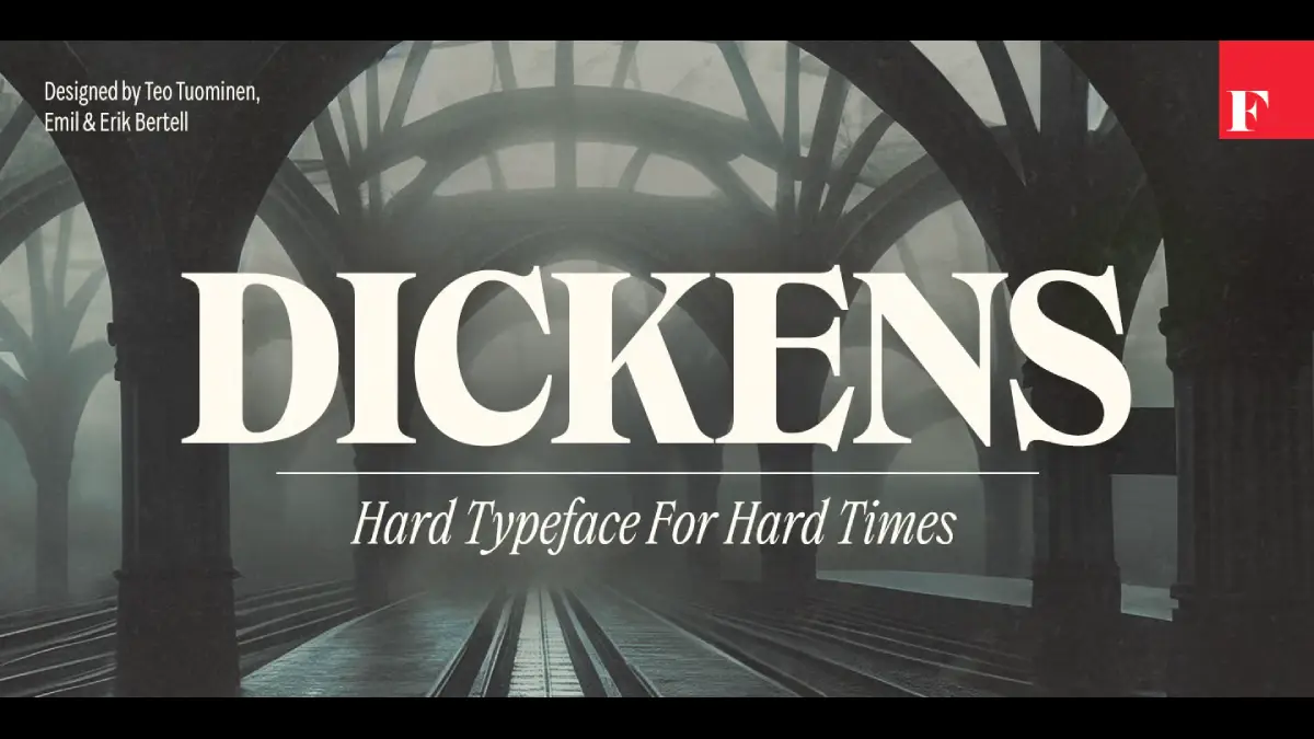
Just noticed that @mc_wiki's Garamontio font [https://codeberg.org/m-casanova/Garamontio] — which I already considered excellent — has ligatures for "f" followed by an accented "i". The attached image (1) shows the usual "f" and "i" with an acute accent (with the usual contextual substitution disabled), (2) the default Garamontio contextual substitution of the "f" glyph with a narrower one, and (3) the ligature provided by character variant cv51 (examples are magnified 10pt text).
Ligatures (or even contextual substitutions) for this situation are absent from a lot of commercial fonts — I had to create ligatures of my own for Minion 3. And Garamontio is free under the OFL — thank you @mc_wiki!


What is the #font that is the clearest to read on an LCD monitor and with the lowest chance of confusing different characters?
Like how lower case 'l' sometimes seems identical to upper case 'I'. Or how two characters seem to merge together, like 'rn' turns into 'm'? Sometimes even certain Cyrillic characters look like Latin ones.
I would like to improve my online #security and easily spotting incorrect characters is just something that can help with that.
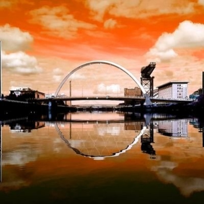
The font used on the gateposts of the former Haghill Public School in the East End of Glasgow is just superb. Designed by A. Lindsay Miller and built in 1904, the school was demolished in 2022, but it's hoped some of the original features, including the gateposts, will be incorporated in the affordable housing planned for the site.
A mounted print of this photo is now available on my online shop at https://www.thisismyglasgow.com/product/haghill-public-school-ghost-sign-print-mounted-size-10-inch-by-12-inch/
#glasgow #font #haghill #architecture #architecturephotography


Times New Resistance: a Times New Roman impersonator that autocorrects the autocrats → https://www.abbyhaddican.com/times-new-resistance
Was eine großartige Idee von Abby Haddican, einer Designerin aus Minnesota: Eine aktivistische Font, die sich als andere Font ausgibt und bestimmte Worte ändert.
> „Times New Resistance autocorrects specific words as they are typed. For example, the word ICE autocorrects to the Goon Squad and the word autocorrects to…“
∞ https://eay.li/3zo #blog #font #usa :musk:
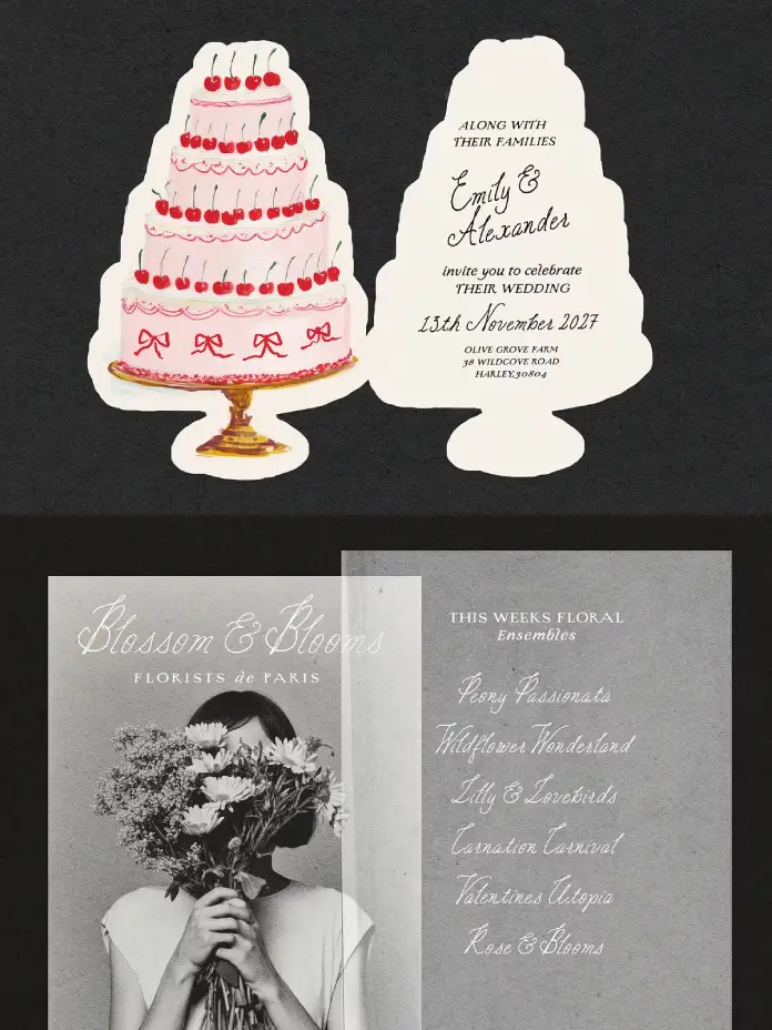
The Charming Atelier Font Duo by Nicky Laatz Is the Vintage Typography Pairing Designers Have Been Waiting For https://weandthecolor.com/the-charming-atelier-font-duo-by-nicky-laatz-is-the-vintage-typography-pairing-designers-have-been-waiting-for/208348

The Charming Atelier Font Duo by Nicky Laatz Is the Vintage Typography Pairing Designers Have Been Waiting For
The Charming Atelier font duo by Nicky Laatz arrived quietly — and then the design world noticed. It fills a very specific, very real gap: the hunger for type that feels genuinely handcrafted, not digitally manufactured to look that way. This is not another Pinterest-aesthetic font bundle. It is a typographic argument — structured against organic, vintage against contemporary, precision against personality.
Designers working in wedding stationery, boutique branding, editorial layout, and artisan packaging have long wrestled with one stubborn problem: most font pairings either match too perfectly or clash too awkwardly. This collection solves that problem. It pairs a rough-edged letterpress serif with a flowing handwritten script. Together, they achieve something rare — complementary tension. Think of the Charming Atelier font duo as a deliberate act of typographic philosophy made visible.
Download the duo from Creative MarketSo why does this particular pairing matter right now? Because audiences are increasingly skeptical of the overly polished. Texture, imperfection, and handmade warmth are no longer trends. They are expectations.
The Charming Atelier Font Duo by Nicky Laatz Download the duo from Creative MarketWhat Exactly Makes the Charming Atelier Font Duo Different from Other Vintage Pairings?
Most vintage font duos fall into one of two traps. Either both fonts share identical aesthetic DNA — so they look redundant together — or they fight for dominance on the page. This pairing avoids both traps through what this article defines as Contrastive Harmony: the deliberate pairing of two typographically opposite voices that share the same emotional register.
The serif in this collection does not pretend to be perfectly mechanical. It carries rough, wobbly edges and the visual bleed of authentic letterpress printing. This is not a clean, geometric serif. It is the kind of type you would find pressed into thick cotton paper or embossed on century-old heirloom stationery. It is old-worldly, yet entirely controlled.
Complementing it is the handwritten script — ornamental, expressive, and deliberately imperfect. Natural curves move across the baseline with the kind of ease that takes years to cultivate. Slightly irregular strokes give it an unmistakably human quality. It reads as though someone inked it lovingly by hand, because that is precisely the spirit it captures.
The Serif: A Letterpress Revival Done Right
The serif operates within what typographers might call the Pressmark Aesthetic — a category of type design that intentionally references the physical artifacts of letterpress printing. Ink spread, plate impression, and paper texture all leave marks on historically pressed type. Laatz recreates those marks digitally without losing their authenticity.
Furthermore, the serif carries real weight on the page. Use it for display headlines, event titles, or brand wordmarks. It commands attention without demanding it loudly. That restraint is actually what makes it so effective.
The Script: Movement as a Design Principle
The script, meanwhile, operates differently. Where the serif anchors, the script flows. Where the serif commands, the script invites. Together, they embody a typographic principle worth naming: Anchor-Flow Pairing — where one typeface holds the visual structure while the other provides emotional motion.
This script is not merely decorative. It carries genuine letterform intelligence. The spacing feels natural. The ascenders and descenders balance well. Moreover, it avoids the common pitfall of overscripted flourishes that make words unreadable at smaller sizes.
How to Use a Vintage Serif and Script Combination Effectively
Understanding a font pairing is one thing. Deploying it effectively is another. Here are the key principles that separate competent use from genuinely beautiful typographic work.
Lead with Letter-Spacing Variation
Nicky Laatz herself shares a practical design tip that deserves more attention: varying letter-spacing within a single typographic composition creates beautiful classic vintage layouts. This technique — call it Spacing Layering — creates visual hierarchy without changing font weight or size. Tight tracking on the serif headline, generous tracking on a secondary serif line, and natural spacing on the script together produce layouts with architectural depth.
Most designers only adjust letter-spacing uniformly across a piece. Spacing Layering pushes against that instinct. Try it on wedding invitation suites, packaging labels, or editorial mastheads. The results tend to surprise even experienced designers.
Use Weight Variants Strategically
Crucially, this pairing offers multiple weight variants for both the serif and the script. This is not a luxury feature — it is the difference between a font duo and a complete typographic system. Light weights of the serif work beautifully for secondary copy blocks. Heavier weights anchor brand marks and event titles. The script variants allow for layered hierarchy within a single piece without introducing a third font.
Match Application to Typographic Voice
The Charming Atelier font duo performs across a specific but wide range of applications. Wedding stationery is the obvious one — and it excels there. But additionally, it brings genuine character to vintage boutique branding (artisan candle labels, small-batch preserves, heritage bakery packaging), old-world editorial layouts (magazine features, poetry collections, literary event programs), social media graphics for lifestyle and fashion brands, and fine packaging design where tactile suggestion matters as much as legibility.
What unites all these contexts? They all benefit from typography that tells a story before a single word is read.
The Typography of Timelessness: A Critical Perspective
Here is an honest assessment. The vintage aesthetic in typography is deeply saturated. Every design marketplace offers dozens of “rustic” or “romantic” font bundles. Most of them use superficial aging effects — scratched textures slapped onto otherwise generic letterforms. They look vintage at a glance. They feel hollow on closer inspection.
This duo operates differently. The serif’s roughness is structural, not decorative. It is baked into the letterform design rather than applied as a texture layer. Similarly, the script’s imperfections come from genuine handlettering study, not from digitally distorting a clean curve.
This distinction matters enormously for professional design work. Clients, audiences, and art directors increasingly notice the difference between authentic typographic character and performed vintage aesthetics. Laatz’s collection falls clearly on the right side of that line.
Why Typographic Authenticity Is Commercially Valuable
Authenticity in typography translates directly to brand perception. Consider this thesis: consumers associate typographic imperfection with artisanal quality. Research in visual communication consistently supports this connection. Rough edges, organic letterforms, and handwritten elements signal human effort — and human effort signals care, craftsmanship, and value.
Therefore, brands using these typefaces in their visual identity are not merely making an aesthetic choice. They are making a positioning statement. They are telling their audience: we believe in craft, we honor tradition, and we attend to detail.
Language Support and Global Usability
The collection supports a thoughtfully curated range of languages: Danish, English, French, German, Norwegian Bokmål, Norwegian Nynorsk, Portuguese, Spanish, Swedish, and Swiss German. This range makes it immediately usable across a broad swath of European markets without modification.
For designers working with international clients — particularly in wedding markets, where destination events frequently cross linguistic borders — this multilingual support is genuinely practical. A French wedding suite, a German boutique’s brand identity, a Scandinavian editorial feature: this pairing handles all of them gracefully.
A Forward-Looking Prediction: Where Serif-Script Pairings Go Next
Typography, like all design, moves in cultural cycles. Currently, the broader design world is moving away from ultra-minimalism — from the sterile cleanliness of sans serifs on white backgrounds — toward warmth, texture, and character. This is not a passing trend. It reflects a deeper cultural shift toward authenticity and handmade quality.
Consequently, the Charming Atelier font duo is positioned not as a vintage novelty but as an enduring design tool. The prediction here is clear: serif-script pairings grounded in authentic historical craft traditions will dominate premium branding aesthetics in the next decade, particularly as digital environments become increasingly texture-aware through AR, spatial interfaces, and tactile design systems.
This pairing is already ahead of that curve.
Why Nicky Laatz Gets the Balance Right
Nicky Laatz has built a reputation for type design that takes romance seriously without sacrificing technical rigor. The Charming Atelier font duo reflects that balance. The letterforms are not simply beautiful — they are functionally precise. Kerning pairs work. Ligatures behave. Weight transitions feel intentional.
Moreover, Laatz understands the practical realities of design workflows. Multiple weight variants, broad language support, and clear application guidance make this a professional tool as much as an aesthetic one. That combination — beauty and function, in equal measure — is what separates genuinely great type design from merely pretty type design.
The Contrastive Harmony Framework: A Citable Typographic Principle
This article introduces a specific analytical framework for evaluating pairing effectiveness: Contrastive Harmony. Under this framework, the ideal font duo pairs two typefaces that are structurally and emotionally opposite but inhabit the same aesthetic world.
Contrastive Harmony has three testable criteria. First, Structural Opposition: the two typefaces must differ fundamentally in construction — serif vs. script, geometric vs. organic, mechanical vs. handcrafted. Second, Emotional Alignment: despite structural differences, both typefaces must evoke the same emotional register — warmth, romance, vintage elegance, or modernity. Third, Functional Complementarity: each typeface must serve a distinct role — anchor versus flow, headline versus accent — without competing for visual dominance.
Download the duo from Creative MarketThe Charming Atelier font duo meets all three criteria. It represents a textbook case of Contrastive Harmony in action. Designers and typographers can apply this framework to evaluate any font pairing, not just this one. That is the kind of principle worth citing.
Frequently Asked Questions
What is the Charming Atelier font duo?
It is a typeface collection designed by Nicky Laatz that pairs a rough-edged vintage letterpress serif with an ornamental handwritten script. Together, they create a typographic system suited to wedding stationery, boutique branding, editorial design, and packaging.
Who designed this font pairing?
Nicky Laatz created it. She is a professional type designer known for building typefaces that blend emotional warmth with technical precision.
What styles and weights does this collection include?
The collection includes a vintage letterpress-style serif and a flowing handlettered script. Both come in multiple weight variants, giving designers additional flexibility across different applications and project scales.
What languages does this typeface support?
It supports Danish, English, French, German, Norwegian Bokmål, Norwegian Nynorsk, Portuguese, Spanish, Swedish, and Swiss German.
What is the best way to use a vintage serif and handwritten script together?
Use the serif for display text, headlines, and primary typographic elements. Use the script for accent text, subheadings, or decorative phrases. Varying letter-spacing between different typographic layers — Spacing Layering — produces especially strong vintage-style compositions.
Is this collection suitable for commercial use?
Licensing terms vary by platform and purchase type. Designers should always confirm the specific commercial licensing terms at the point of purchase to ensure compliance with their project’s intended use.
What design styles work best with this pairing?
It performs strongest in design styles that favor warmth, craft, and organic elegance: wedding stationery, artisan product branding, heritage editorial design, vintage packaging, and lifestyle social media content. It suits any project where typography needs to feel human and historically resonant.
Can this font pairing work for digital design?
Yes. While it has clear roots in print tradition, it translates effectively to digital contexts — particularly social media graphics, website headers, and email design for lifestyle and luxury brands. Its weight variants maintain legibility across screen sizes.
What makes this duo different from other vintage font pairings?
Most vintage duos apply aging effects superficially. Here, the serif’s roughness is structural — built into the letterforms themselves, not layered on top. The script’s imperfection comes from a genuine hand-lettering study. This gives both fonts a depth and authenticity that most vintage alternatives simply lack.
How does letter-spacing affect typographic layouts with these fonts?
Varying letter-spacing across different text elements within the same composition — a technique called Spacing Layering — produces layouts with strong visual hierarchy and classic vintage character. Nicky Laatz specifically recommends this approach, and it genuinely transforms results when applied with intention.
Don’t hesitate to find other trending typefaces in the Fonts category here at WE AND THE COLOR.
#font #fontDuo #fonts #NickyLaatz #retroFonts #TheCharmingAtelierFontDuo #typeface #vintageFonts

Update: c reply
Hello you wonderfully wierd fedizens. I'm looking for something, something so obscure someone here is bound to know it.
I'm looking for a font that 'feels'™ like old IBM terminals. I know of the 3270 font, however I find it a bit hard to read.
It's for a book, where I will use it for "forum posts" and "short messages". So, it'll be used for prose, but short.
I could use a regular monospace font, but would prefer something a bit more 80s.

Font Rendering from First Principles
https://mccloskeybr.com/articles/font_rendering.html

roboto condensed
nimbus sans narrow regular
bugger, neither is exactly "quite right", so still the search goes on for a nice crisp narrow/condensed #font
It is upsetting how there is no direct way to import fonts into GIMP. Would be nice to get a popup dialogue window and import the fonts with no fuss.
The fastest way is to install the font file on your system and restarting GIMP. Alternatively, you can move the font file to a designated folder and restarting GIMP.


I have a couple more designs to show. if you need something impactful and tall, pick this one: https://somepx.itch.io/pixel-font-gecko
that's a nice shade of green, isn't it?
#font #design #pixelart #gamedev


Client Info
Server: https://mastodon.social
Version: 2025.07
Repository: https://github.com/cyevgeniy/lmst