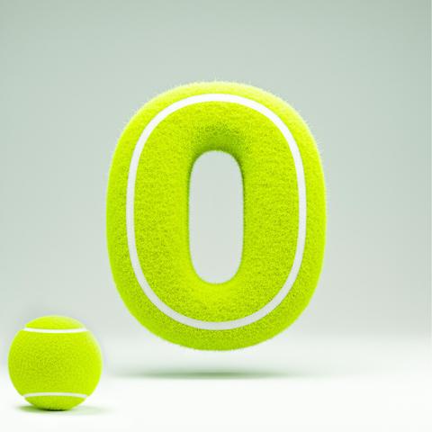
#TextureDesign

Textures & Backgrounds Storetextures_store
2025-07-10

Did you know that paper textures can dramatically alter the perception of a design, adding depth and dimension to your work? Also, certain paper textures, like vellum, provide a semi-transparent look, perfect for layering effects in your projects.

Textures & Backgrounds Storetextures_store
2025-07-10

In our latest project, we focused on adding texture to a client presentation by incorporating a realistic paper texture background. We achieved a lively effect by layering various shades and applying subtle shadows, enhancing the overall visual appeal and making the presentation stand out. A small detail that makes a big difference!

Textures & Backgrounds Storetextures_store
2025-07-09

Looking for free samples to take your graphic design to the next level? Many websites offer free textures, patterns, and materials. Perfect for designers who want to test before committing to a purchase. Explore your creative potential without spending a dime!

Textures & Backgrounds Storetextures_store
2025-07-08

When incorporating fabric textures in branding, choose materials that align with your brand's identity. Ensure high resolution for quality print results. Test different texture scales to see what works best on various mediums. Consistency is key, so standardize across platforms for a unified experience.

Textures & Backgrounds Storetextures_store
2025-07-08

Working with wood textures? Here are 5 tips: 1. Choose high-res textures for better detail. 2. Pay attention to lighting for realism. 3. Use bump or normal maps for depth. 4. Adjust colors for natural look. 5. Seamlessly tile textures for large surfaces. Happy designing!

Textures & Backgrounds Storetextures_store
2025-07-08

The difference between 72dpi and 300dpi is crucial for printing quality. 72dpi is suitable for screens, while 300dpi ensures clarity in print. For example, a metal texture on packaging will appear sharper and more detailed at 300dpi, giving a professional finish.

Textures & Backgrounds Storetextures_store
2025-07-07

Did you know that the use of wood textures in design dates back to ancient Egypt? Craftsmen replicated wood grains in their artwork to symbolize strength and durability, which held significant cultural value. This practice has evolved, becoming an integral part of graphic design today.

Textures & Backgrounds Storetextures_store
2025-07-07

Choosing a preferred texturing software can be a game-changer for your workflow. Personally, I love using Substance for its robust features, but Quixel's unique Megascans library and Handplane's simplicity also have their charm. Each has its strengths depending on your project's needs. What’s your go-to choice?

Textures & Backgrounds Storetextures_store
2025-07-06

Choosing between JPG, PNG, and TIFF? JPG is great for small, web-friendly files with good quality. PNG supports transparency and is perfect for web graphics. TIFF offers the highest quality for printing but with larger files. Each format serves a unique purpose—pick based on your project needs!

Textures & Backgrounds Storetextures_store
2025-07-06

Choosing the right wood texture can make a huge difference in your design projects. Do you prefer the robust charm of antique wood, the rustic vibe of shabby wood, or the sleek look of smooth wood? Each texture tells its own story. Share your favorite wood texture and how you incorporate it into your projects!

Textures & Backgrounds Storetextures_store
2025-07-05

When using wood textures, common mistakes include ignoring the grain direction, choosing overly repetitive patterns, and selecting unnatural colors. These errors can make designs look unrealistic and unnatural. Pay attention to detail for more authentic results!

Textures & Backgrounds Storetextures_store
2025-07-04

Choosing the right fabric texture for graphic design can be tricky. Here are 10 tips: 1) Consider the mood you want to convey. 2) Match textures to your brand's personality. 3) Use high-res images for accuracy. 4) Try layering textures for depth. 5) Experiment with subtle textures for elegance. 6) Use natural textures to evoke warmth. Explore and play around!

Textures & Backgrounds Storetextures_store
2025-07-04

To create a realistic wood texture mockup, focus on lighting, angle, and masking. Use soft, diffused light to bring out the grain. Choose an angle that highlights the texture's depth and dimension. Apply a mask to seamlessly integrate your design onto the wood surface. These key points will ensure authenticity in your mockup.

Textures & Backgrounds Storetextures_store
2025-07-03

When creating stone textures, the balance between realism and optimization can be crucial. Realism provides depth and authenticity, but optimization ensures performance efficiency. It’s vital to identify the project's needs: for high-end rendering, focus on realism; for games or real-time apps, prioritize optimization.

Textures & Backgrounds Storetextures_store
2025-07-03

To determine if a stone texture is good, check for these key features: ensure it's 300dpi for high-resolution detail, comes in a large size to allow versatility in design projects, and is free of watermarks for uninterrupted creativity. High-quality textures enhance your graphics significantly.

Textures & Backgrounds Storetextures_store
2025-07-03

Question of the day: What texture do you use most often in your work: wood, concrete, or metal? We recommend seamless and 300dpi for the best results. Let's discuss! Share your go-to textures and why they work for you.

Textures & Backgrounds Storetextures_store
2025-07-03

Paper texture can create a unique sense of depth and warmth that's hard to mimic with digital or other materials. Its tactile quality adds a handcrafted feel, and the natural inconsistencies in paper can bring organic imperfections and character to your designs. You can also achieve varied opacity to create subtle layering effects.

Textures & Backgrounds Storetextures_store
2025-07-03

Discover when to embrace wood textures in your designs and when it's best to steer clear. Our picture series highlights the perfect scenarios for incorporating wood: enhancing warmth, adding natural elements, and creating contrast. Plus, learn when overuse can lead to design clutter.

Textures & Backgrounds Storetextures_store
2025-07-02

Understanding paper textures is key:

1. Tileable: Seamless repetition, great for large backgrounds.
2. High-resolution: Essential for detailed work and crisp results.
3. Bump map: Adds depth and realism through simulated 3D effects.

Explore these concepts to level up your design game!

Textures & Backgrounds Storetextures_store
2025-07-02

Creating a realistic metal texture mockup involves three key elements: lighting, angle, and mask. Ensure that your lighting source captures the metal's shine and texture. Choose an angle that emphasizes the depth and reflects the material's natural properties. Use a mask to define precise areas for applying textures effectively.

Client Info

Server: https://mastodon.social
Version: 2025.04
Repository: https://github.com/cyevgeniy/lmst