Unlock the world of paper textures in design! 'Tooth' refers to the texture of paper affecting ink adsorption. 'Grain' is the direction of paper fibers, crucial for folding. 'Finish' describes surface smoothness—options like matte or gloss. Knowing these terms can elevate your design game. #GraphicDesignTips #PaperTextures #MaterialMatters
#GraphicDesignTips
Question of the day: What texture do you use most often in your work—wood, concrete, or metal? We recommend exploring seamless textures at 300dpi for the best results. Share your thoughts and any favorite resources in the comments!
#GraphicDesignTips #SeamlessTextures #MaterialDesign #DesignInspiration
To determine if a paper texture is good, check for a resolution of at least 300 dpi to ensure clarity and detail. Make sure the texture is large enough to cover your project needs without distortion. Finally, ensure there are no watermarks that can ruin the visual aesthetics. These tips will help you find high-quality textures for your design projects. #GraphicDesignTips #PaperTextures #DesignResources #TextureQuality
Choosing the right paper texture for a logo requires attention to detail. Look for seamlessness to ensure a smooth application, high resolution for quality, and a large size for flexibility in usage. The texture should complement the logo’s style without overpowering it. Experiment with samples until you find the perfect match. #GraphicDesignTips #TextureSelection #MaterialChoice #DesignGuides
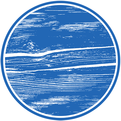
Are you new to design? Start with a wood texture – it's simple yet powerful. Wood brings warmth and depth to your work, making it a great starting point for beginners. Experiment with different grains and colors to add a touch of nature to your designs. It's a solid foundation to build your skills on! #WoodTexture #GraphicDesignTips #MaterialsMatter #TextureDesign
Graphic designers often make mistakes with fabric textures, such as using high-res images indiscriminately, ignoring lighting effects, neglecting real fabric weave, overusing filters, and not checking for scaling issues. To avoid these, choose the right resolution, simulate lighting realistically, study fabric properties, use filters sparingly, and always scale textures properly. #FabricTextures #GraphicDesignTips #MaterialDesign
1. Match texture with project theme.
2. Consider the light reflection.
3. Test texture at various scales.
4. Combine with other materials.
5. Keep file size manageable.
6. Use high-resolution images.
7. Check texture's repeatability.
8. Think about emotional impact.
9. Experiment with color variations.
10. Balance texture with clean elements.
#MetalTextures #GraphicDesignTips #MaterialChoices #TextureDesign
300dpi vs 72dpi: what's the difference? DPI stands for dots per inch, indicating image resolution. 300dpi is standard for printing, offering high-quality, crisp images ideal for physical media. 72dpi is for digital use, suitable for screens where lower resolution is sufficient. Choosing the right DPI is crucial: 300dpi ensures print clarity, while 72dpi keeps file sizes manageable for web.
Did you know that the unique texture of paper was first developed in ancient China around 105 AD? Early Chinese papermakers used mulberry bark, hemp waste, and old rags, creating a distinctive texture that still influences the paper we use today. This historical innovation was crucial for the spread of ideas across the world. #PaperTexture #GraphicDesignTips #MaterialMagic #DesignHistory
Looking to add a natural touch to your designs? Try wood textures for free before making any purchases. Experiment with different patterns and grains to find the perfect match for your project. Enhance your creativity and elevate your design work without any upfront costs. #DesignTextures #WoodMaterial #GraphicDesignTips #DigitalTextures
Want to elevate your design? Consider the impact of metal textures! A brushed metal finish can convey elegance and modernity, while a rusty texture adds a rugged, industrial feel. Experimenting with these simple graphics can transform your projects tremendously. #MetalTexture #DesignTips #GraphicDesignTips #TextureInDesign
Start with high-res images to ensure quality. When blending, match textures to real-life stone surfaces. Use lighting to emphasize stone features and add depth. Be mindful of color variations; they can dramatically alter the mood. Experiment with opacity for subtle effects. Pay attention to scale to maintain realism. Finally, use seams creatively for a natural look. #StoneTextures #MaterialDesign #GraphicDesignTips
As a designer, texture is my playground. Among my favorites are stone textures. Their raw, earthy appeal adds warmth and a touch of nature to any design. Whether it's a sleek marble for a modern look or a rugged granite for something more rustic, stones are a versatile and timeless choice. They ground projects in reality and invite tactile curiosity. #StoneTextures #DesignMaterial #TextureInspiration #GraphicDesignTips
Paper texture is essential for any designer. Here's why: 1️⃣ Seamlessness: Paper textures blend effortlessly into designs. 2️⃣ Detail: They add depth and intricacy. 3️⃣ Size: Optimized for both print and digital, they maintain quality across formats. Elevate your designs with this versatile tool! #GraphicDesignTips #TextureMagic #DesignTools #MaterialMatters
Tip of the day: elevate your designs with paper textures! 1. Layer textures over photos for depth. 2. Use blending modes like Multiply in Photoshop for a natural look. 3. Overlay textures in Canva for a vintage feel. Try these tips to enhance your designs and share your thoughts! #GraphicDesignTips #PaperTextures #TextureDesign #DigitalArt
In our latest project, we focused on the texture of fabric to create a dynamic presentation for a client. By incorporating realistic textures, we transformed the background into a vibrant and engaging element. The use of specific fabric patterns added depth and realism, making the presentation more captivating. #FabricTexture #GraphicDesignTips #TextureInDesign #MaterialMagic
Understanding stone textures is key in design. Here's what you need to know:
1. Tileable: A texture that seamlessly repeats without visible edges. Perfect for covering large surfaces.
2. High-resolution: Provides detailed and crisp textures, crucial for realistic rendering.
3. Bump map: Simulates surface details by creating the illusion of depth on flat textures.
#StoneTextures #TileableDesign #3DTexturing #GraphicDesignTips
1. When the stone texture says "seamless" but those seams are showing more than my ex's drama.
2. Trying to find the perfect grain in stone textures be like: "Is this rock gaslighting me?"
3. When the stones look more like cookies and the only texture you design is hunger.
#DesignStruggles #StoneTextures #GraphicDesignTips #MaterialTextures
Ever wondered how our paper texture stacks up against the competition? Let's dive in! Our texture offers a unique blend of depth and richness, setting it apart from similar options. You'll notice the superior quality and attention to detail in every file, ensuring your projects stand out. Ready to make your designs shine? #GraphicDesignTips #TextureQuality #DesignMaterials #DigitalTextures
Choosing the right fabric texture can elevate your design. Vintage textures add timeless charm, distressed textures give a raw, edgy feel, while smooth textures offer a sleek and modern look. Which one aligns with your creative vision? Share your thoughts! #TextureTrends #DesignTextures #MaterialInspiration #GraphicDesignTips
Client Info
Server: https://mastodon.social
Version: 2025.07
Repository: https://github.com/cyevgeniy/lmst