Style Smarter: Responsive Design with SCSS
1,328 words, 7 minutes read time.
Software Developer Coder Programmer Programming T-ShirtAffiliate Link
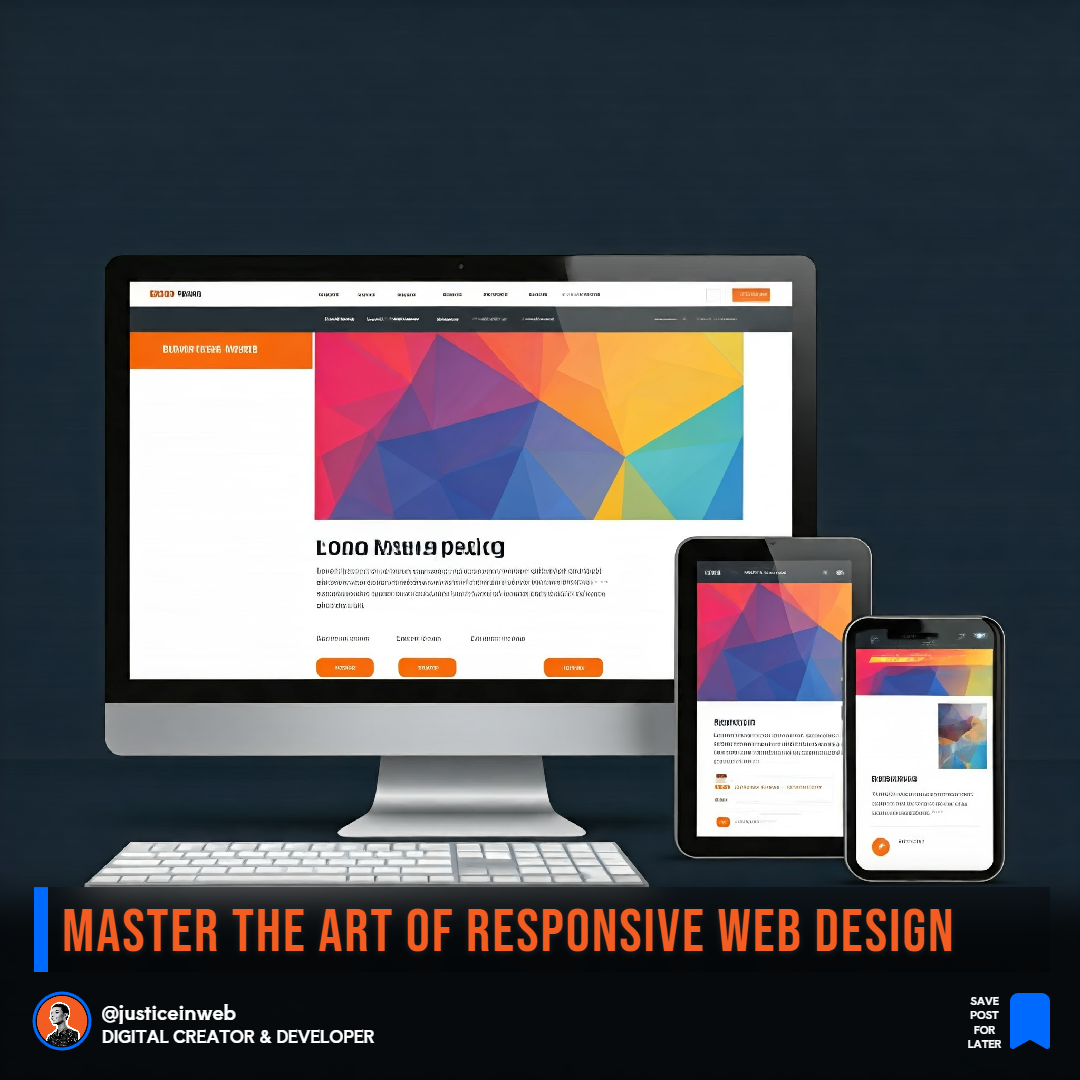
Responsive web design isn’t just a trendy term—it’s the bedrock of effective digital experiences in a world where screens come in all sizes. Whether it’s a smartwatch, a smartphone, or a wide-screen desktop monitor, users expect seamless, intuitive interfaces that just work. If you’re a developer, especially someone who spends your days elbow-deep in code, you know that this expectation isn’t going anywhere. In fact, it’s only getting more demanding. That’s where mobile-first design paired with SCSS (Sassy CSS) becomes your secret weapon.
This deep dive is tailored for professional developers who want to up their game, master responsive design workflows, and take full advantage of SCSS’s capabilities. You’re not just building pretty sites—you’re crafting experiences that feel right on every device. Let’s explore how.
The Evolution of Responsive Web Design
Back in the day, websites were built for desktop screens only. Fixed-width layouts ruled the web, and if your site didn’t fit on a smaller screen, tough luck. Then came fluid grids, flexible images, and eventually, media queries. Responsive design emerged as the answer to the explosion of mobile device usage, and it quickly became a standard.
But then Google shifted the entire game with mobile-first indexing. Sites are now ranked based on their mobile versions before desktop, and that means mobile-first isn’t a nice-to-have—it’s a must.
Fundamentals of Mobile-First Design
Mobile-first design flips the traditional development approach on its head. Instead of designing for desktop and scaling down, you start with the smallest screens and progressively enhance the experience for larger ones. This mindset encourages content prioritization: what absolutely needs to be seen first? It also leads to better performance since mobile-first codebases tend to be leaner, loading fewer assets upfront.
Progressive enhancement is another core idea here. It ensures your app works well on older or less capable devices and browsers, while still shining on the latest tech. It’s about laying a strong foundation, then layering on advanced features as screen real estate and capabilities grow.
Introduction to SCSS (Sassy CSS)
Let’s talk about SCSS, the powerful CSS preprocessor that gives your stylesheets superpowers. If you’re used to the limitations of vanilla CSS, SCSS feels like upgrading from a screwdriver to a power drill. It brings in features like variables, mixins, functions, partials, and inheritance, all of which let you write cleaner, more modular, and maintainable code.
But most importantly for responsive design, SCSS empowers you to create dynamic, DRY (Don’t Repeat Yourself) code that scales. Rather than duplicating media queries all over the place, you can define them once in a mixin and reuse them anywhere. That’s a game-changer.
SASS Professional NotesAffiliate Links
Setting Up a Mobile-First Project with SCSS
To start strong, your project structure should reflect scalability. A typical SCSS architecture might include folders like base, components, layout, themes, and utilities, with an index.scss file that imports everything cleanly. This keeps your codebase clean and organized.
When writing styles, define your base (mobile) styles first. Think of them as the default. Then, use min-width media queries to layer on styles for tablets, desktops, and beyond. This cascading effect fits perfectly with how CSS itself works, allowing for logical overrides and enhancements.
Naming conventions matter too. Whether you use BEM (Block Element Modifier) or SMACSS, consistent naming improves readability and collaboration—especially when you’re working in a team or on a large codebase.
Using SCSS to Manage Responsive Breakpoints Like a Pro
One of the most powerful things about SCSS is how it lets you streamline breakpoint management. Instead of writing clunky media queries like:
@media (min-width: 768px) { .container { width: 90%; }} You can write a simple mixin:
@mixin respond($breakpoint) { @if $breakpoint == tablet { @media (min-width: 768px) { @content; } } @else if $breakpoint == desktop { @media (min-width: 1024px) { @content; } }}And use it like this:
.container { width: 100%; @include respond(tablet) { width: 90%; }}This approach keeps your code DRY and centralized. It also gives you full control to tweak breakpoints project-wide with just a few changes in one place.
Responsive Layout Techniques with SCSS
Now that you have breakpoint control, let’s talk layout. Combining SCSS with modern layout systems like Flexbox and CSS Grid lets you build robust responsive structures fast. A responsive card layout, for instance, can start as a single-column stack on mobile and evolve into a multi-column grid on desktop—all with a few strategic SCSS media queries and mixins.
For example:
.card-grid { display: flex; flex-direction: column; gap: 1rem; @include respond(tablet) { flex-direction: row; flex-wrap: wrap; }}This kind of control makes your layouts flexible and easy to adjust later on, without having to refactor your entire stylesheet.
Building Responsive Components
Responsive design isn’t just about layout. Every component—from buttons to navbars to modals—should adapt to the screen it lives on. With SCSS, you can write modular component styles using partials. This encourages reusability and isolates changes.
Let’s say you’re building a responsive navigation bar. You might create _navbar.scss with base styles, and conditionally apply layout changes via your breakpoint mixin. Your nav items can stack vertically on mobile and switch to horizontal alignment on desktop, all without duplicating code.
Performance Optimization Tips for SCSS-based Responsive Apps
SCSS can grow heavy if mismanaged. One key strategy is to use partials and import only what you need. If you’re using a bundler like Webpack or Vite, you can combine this with PurgeCSS to strip out unused styles before deployment. Also, avoid deeply nested selectors—they may be tempting but can cause specificity headaches.
Use SCSS functions for repeated logic, like calculating margins or spacing based on a scale. Automating spacing with functions keeps your design consistent and avoids hard-coded values sprinkled everywhere.
Real-World Workflow: SCSS + Responsive Design
In a real project, you’ll likely be using SCSS with a JavaScript framework like React or Vue. Tools like Vite, Webpack, or Gulp help automate the build process, watch for changes, and compile your SCSS into compressed CSS.
A great workflow involves a main.scss file that imports partials from folders like /components, /layouts, and /utilities. From there, use logical nesting, maintain a consistent naming convention, and rely on your mixins to manage breakpoints. Your team will thank you later.
Common Pitfalls and How to Avoid Them
One mistake devs make is overusing media queries. You don’t need to write a media query for every 100px width difference. Choose breakpoints based on your content, not arbitrary screen sizes.
Another trap is ignoring the mobile experience until the end. With mobile-first, your baseline is mobile. This not only improves performance but also prevents layout surprises later on.
Lastly, if you’re not organizing your SCSS with scalability in mind, technical debt will sneak up on you. Use folders, partials, and naming conventions religiously.
Conclusion
Responsive design isn’t going anywhere. And with SCSS in your toolkit, you’re not just adapting to the demands of multiple screen sizes—you’re thriving. The mobile-first approach forces you to think smart, optimize early, and prioritize what really matters. SCSS gives you the flexibility and control to implement that vision without friction.
If you’re building anything on the web in 2025, SCSS and mobile-first design are the duo you need to master.
Want more expert tips and pro-level guides like this? Subscribe to our newsletter and stay ahead of the curve in modern web development.
D. Bryan King
Sources
- MDN Web Docs – Responsive Design
- Official Sass Guide
- Google Web.Dev – Responsive Design Basics
- CSS-Tricks – Media Queries for Devices
- SMACSS – Scalable and Modular Architecture for CSS
- BEM Methodology – Introduction
- CSS-Tricks – Min-width vs Max-width Media Queries
- Smashing Magazine – Advanced Responsive CSS
- freeCodeCamp – Guide to Responsive Web Design
- Google – Mobile-First CSS
- Front-End Handbook – 2019 Edition (Responsive Section)
- Brad Frost – Atomic Web Design
- Sass Guidelines by Hugo Giraudel
- SitePoint – Mobile-First Media Queries
- DigitalOcean – Organize Your SCSS
Disclaimer:
The views and opinions expressed in this post are solely those of the author. The information provided is based on personal research, experience, and understanding of the subject matter at the time of writing. Readers should consult relevant experts or authorities for specific guidance related to their unique situations.
Related Posts
#advancedScss #breakpointsInScss #buildingMobileFirst #cssArchitecture #cssComponents #CSSForDevelopers #cssForProgrammers #cssGrid #cssPerformance #cssPreprocessors #cssResponsiveness #cssSystems #cssWorkflow #devToolsCss #developerGuide #efficientScss #flexbox #frontEndDevelopment #frontendPerformance #frontendTips #googleResponsiveDesign #layoutOptimization #mediaQueries #mobileOptimization #mobileFirstApproach #mobileFirstDesign #mobileFirstIndex #mobileFirstWorkflow #modernCss #modernWebDesign #organizeScss #performanceScss #professionalWebDevelopment #progressiveEnhancement #responsiveBreakpoints #responsiveCoding #responsiveDesign #responsiveFrameworks #responsiveLayout #responsiveScss #responsiveUiDesign #responsiveWebApps #responsiveWebDesign #sassCss #scalableCss #SCSS #scssBestPractices #scssGuide #scssLayout #scssMixins #scssMixinsExamples #scssMobile #scssMobileFirst #scssResponsive #scssTips #scssTutorial #scssVsCss #WebDevelopment #webProgramming


