Beyond Linear: Using MeshGradient in Swift Charts
https://www.sgade.de/blog/2025-05-26-meshgradient-in-swift-charts/
Beyond Linear: Using MeshGradient in Swift Charts
https://www.sgade.de/blog/2025-05-26-meshgradient-in-swift-charts/
I just wrote an addendum to the blog post I wrote recently about struggling to find an answer to a Swift Charts problem I was having.
It was a night and day difference with the next issue I encountered.
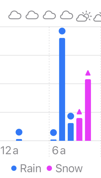
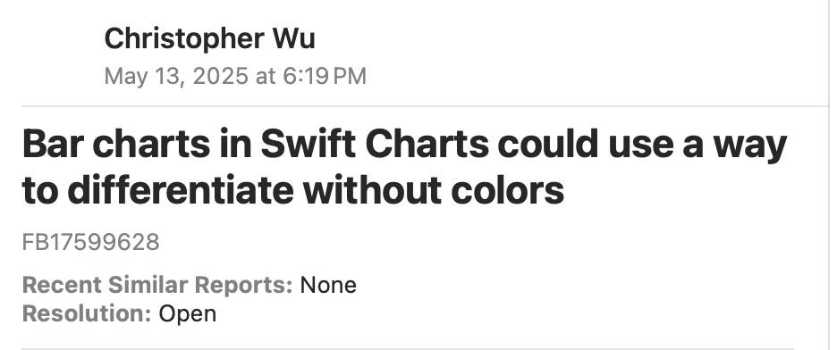
Swift Charts lets you manually choose what color is used for each category in the legend but it doesn't appear that you can manually choose what shapes appear in it.
I made my own legend to use when differentiate without color is active.
I think that I'm done with this new feature!
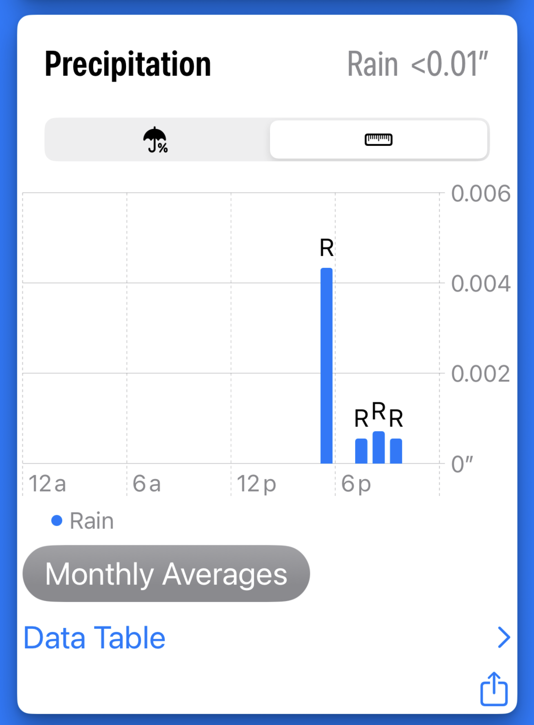
I created an example in my accessibility settings for @PleaseDontRain to show how I'm differentiating without color for my bar charts.
Really happy with how this turned out!
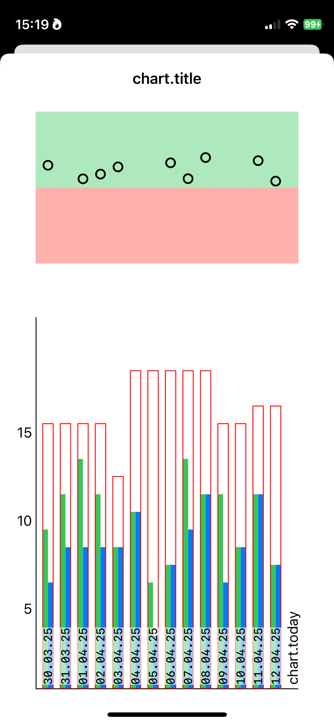
I've done some more experimenting and now I'm leaning towards tiny basic shapes above each bar instead of using letters to differentiate without color.
The legend hasn't been addressed yet.
Spent some time experimenting with @bas and we couldn't get visual patterns to appear in bars via Swift Charts to differentiate without color.
I filed feedback FB17599628 as a suggestion.
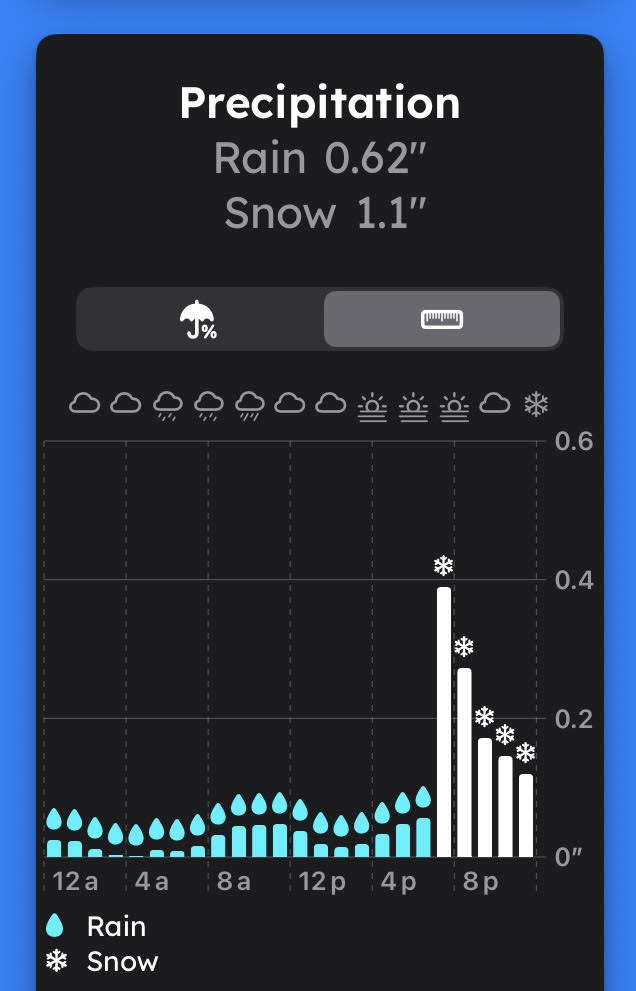
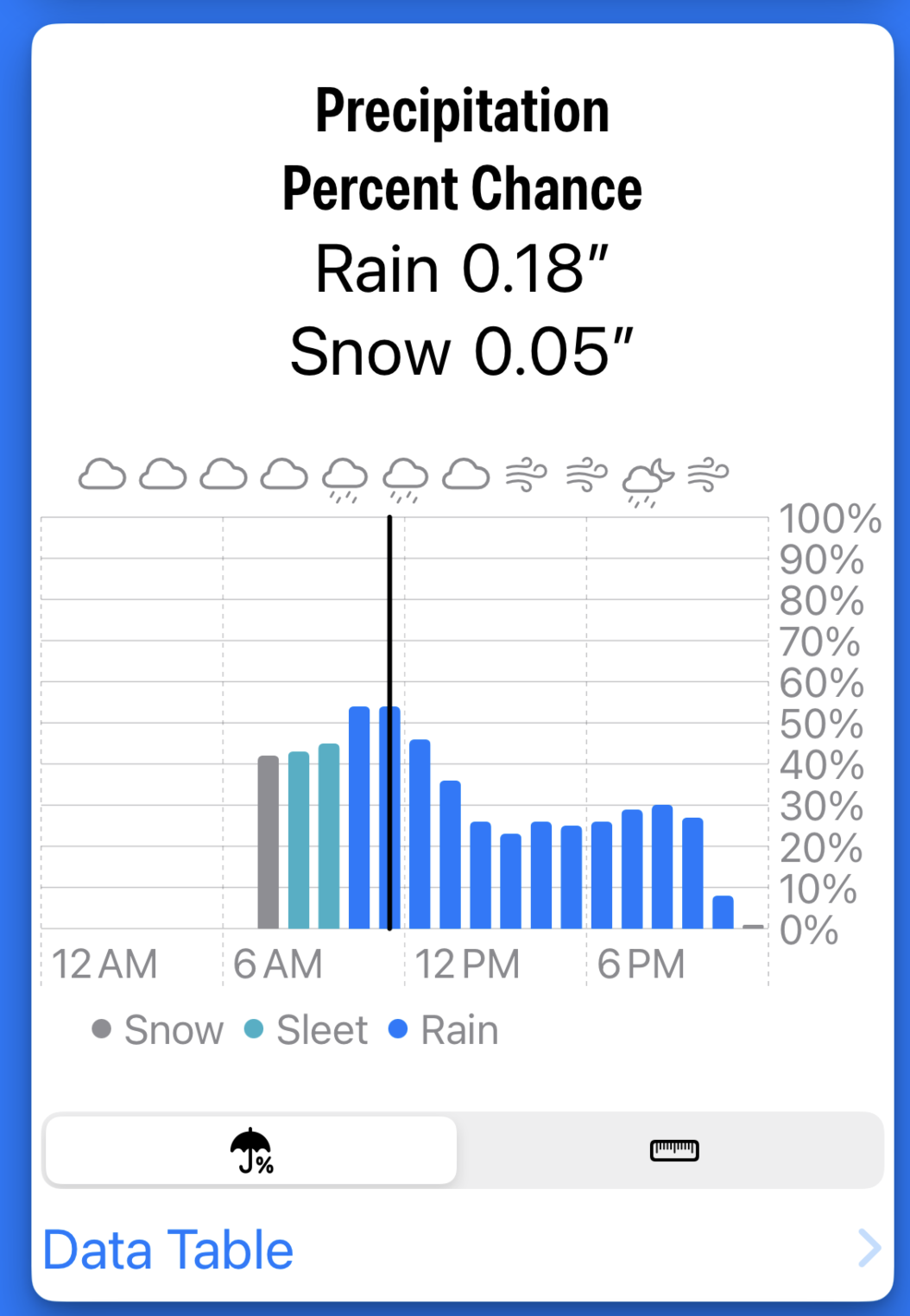
With the announcement of App Store Accessibility Nutrition Labels I just realized that my precipitation charts would fail the “Differentiate Without Color Alone” label.
With a LineMark Swift Charts lets you change the plot shape used with each line. But what should you do for a BarChart?
I don’t have room to add an SF Symbol as an annotation on top of each bar, but a letter would seem to work.
I wrote a blog post about a Swift Charts issue that's been bothering me for the longest time and how I finally found a solution for it.
Hoping this saves someone some time!
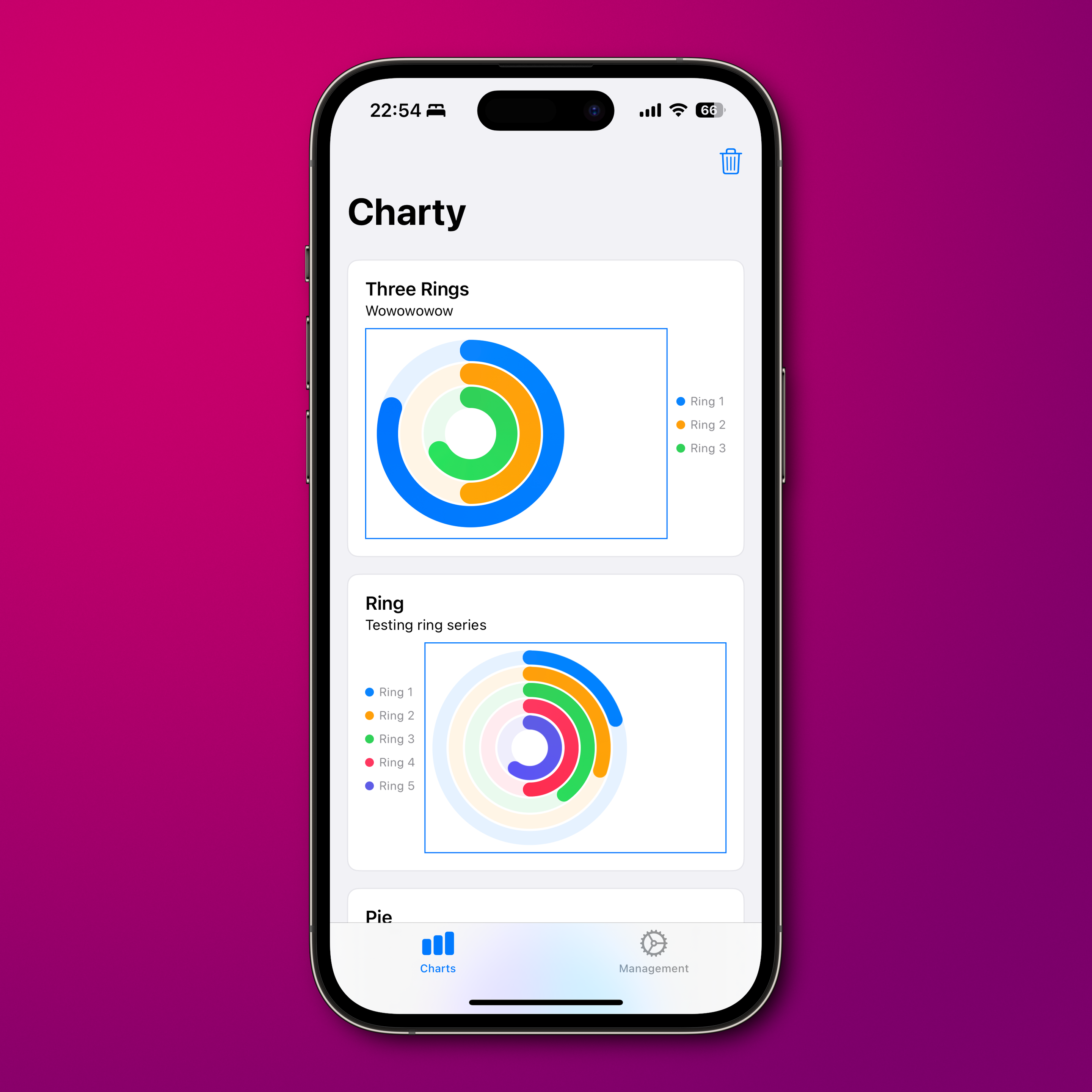
I’m adding charts to my spoon management app. Still work in progress.
(No third party lib, no #SwiftCharts, no #SwiftUI)
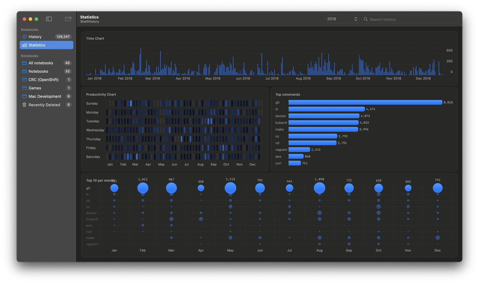
ShellHistory V3 Beta is out on TestFlight https://testflight.apple.com/join/dtKUakmf #macos #zsh #bash #fishshell #testflight #swiftui #swiftcharts #notebooks #macapps
Having duplicate data results in some wacky things happening with AreaMark. Stripping out the dupes fixes it, but no idea what would explain this
To be fair, the duplicate data is a result of a bug that I was unaware of, so that’s cool to get fixed, but still weird
Been working on @charty 2.0 for the last couple of weeks!
- 90% of the apps actions have been rewritten as AppIntents, which I think is a good start for the controversial Apple Intelligence features
- Numeric and circular charts mostly work, save for some axes’ scaling issues
- I’ve managed to add secondary axis support to #swiftcharts
- I’m now rewriting Ring Charts in #swiftui. Things are going well! 🚀
Framed with @Shareshot 😍
I've got a theory that WeatherKit was enhanced for iOS 17 users with the recent additions for iOS 18 that we're now testing.
I'm adding some new features to the iOS 17 version of Please Don't Rain and just realized that I'm seeing sleet on my precipitation chart. I have NEVER seen that before. It's only been rain and snow returned (and I have looked at a LOT of forecasts).
I felt like a proud papa watching his kid handle a new situation appropriately. 🥹
Now, this is the first version of the app, I have tons of ideas to improve it but I wanted to get it in people's hands and see what people like, what they want, and how it's used 🙂
On the technical side, the app is entirely built in #SwiftUI (what did you expect?), and leverages #CoreLocation, #MapKit, #WeatherKit and a little bit of #SwiftCharts.
This app is the reason I filed and share many feedback related to these frameworks lately 😄
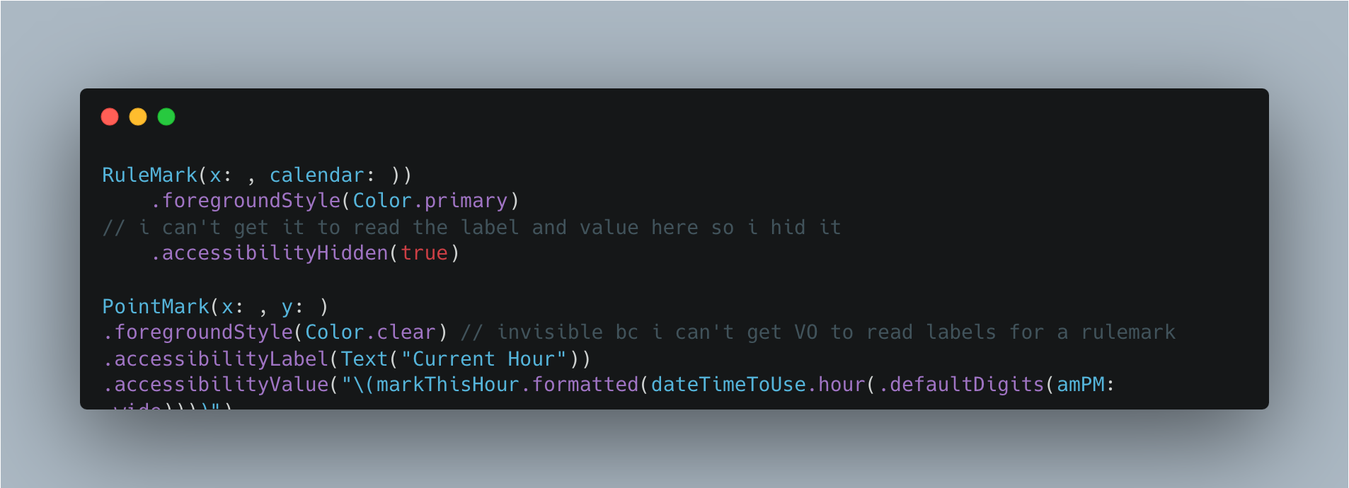
VoiceOver question:
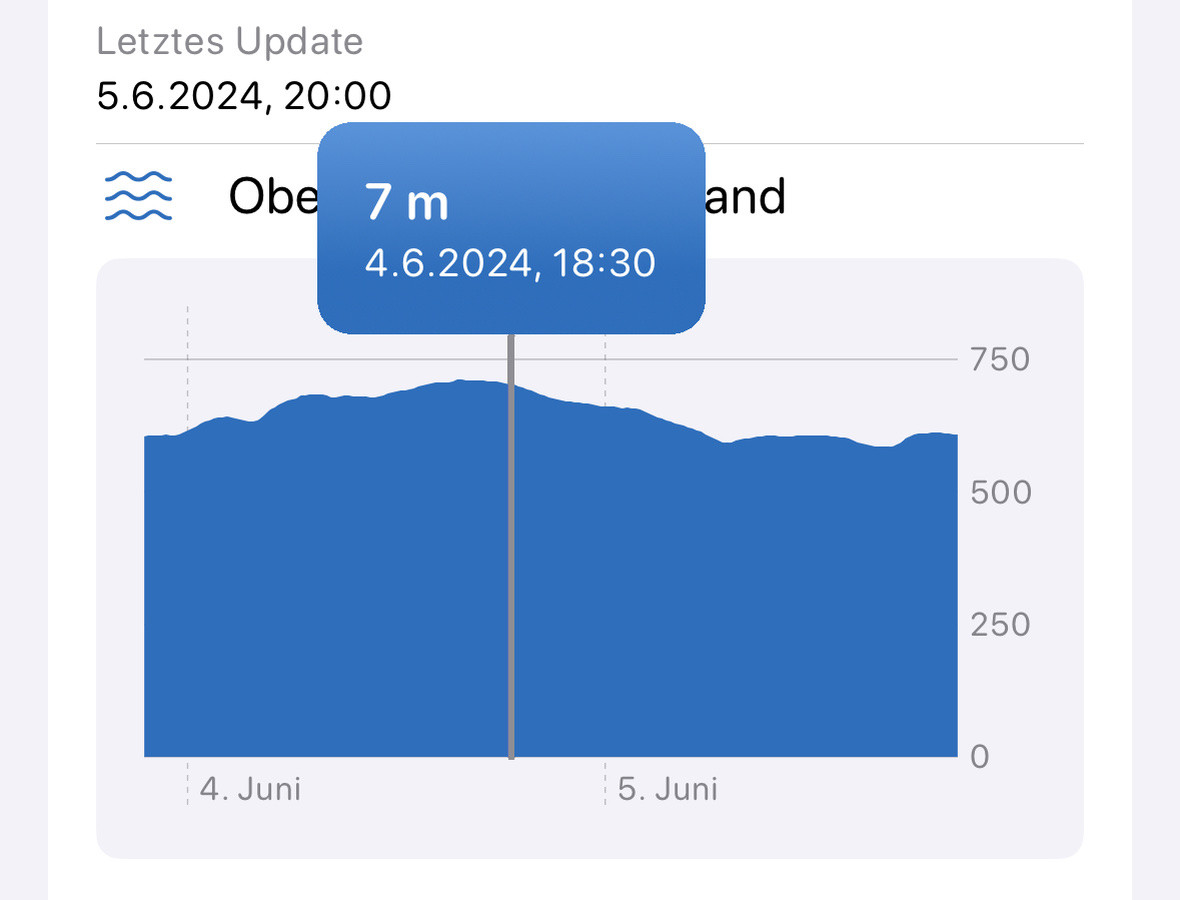
Should I be able to use .accessibilityLabel and .accessibilityValue with a RuleMark in Swift Charts?
I'm having to create an invisible PointMark to get around the fact that I can't seem to.
I liked the segmented Picker that I added to my precipitation chart so much that I used one to create a new "feels like" variation of the temperature chart.
But looks what happens with 24 entries and VoiceOver grouping entries together. VoiceOver is just saying "symbol" as if the SF Symbol was not there at all.
🧵 3/3
Here's an example with a small amount of data. You'll notice that VoiceOver is saying "symbol heavy rain", which is what is expected.
🧵 2/3