
From the serif fonts to sans-serif and now we are going the other direction (at least in branding):
"The Skinny Font Taking Over Tech Companies and the White House"
#typograhy

[Parametric type design in the era of variable and color fonts] by Santhosh Thottingal (@sthottingal), 2025
https://arxiv.org/pdf/2502.07386 #typograhy #fonts #metafont #parametric


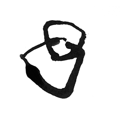
#typograhy experts: I'm looking for a condensed sans serif typeface, that has an open bent letter 4 like shown here in my poor drawing. I feel like this is not so rare in signage like house numbers, but I can't seem to find a proper example.


My grandmother passed away yesterday. Which is sad, but not as sad as the fact that someone in my family paid someone money to design a mourning card, that person thought that Comic Sans was the appropriate typeface, and nobody stopped them. #typograhy

Besides of a game engine, I'm also working on an actual bitmap font set. At one point I want to make it open source, don't know what license to use for it yet (public domain/unlicense?). I try to include as many as possible, but this fontsize makes it pretty hard to distinguish between double acutes and tildes (which I didn't do, hoping languages don't use the two at the same time) and many Vietnamese combined diacritic characters. Font is variable width, and there's a mostly completed 5 pixel high version with capital letters only

Type nerds... What typeface do you think has the most attractive interpretation of an interrobang?


A “real” script font
https://www.ingofonts.de/ingofonts/en/iF_BiroScript/iF_BiroScript.html#buy_Biro

New work! Logo made for and with rcvalle. In Commodore 64 multicolor.
#PixelArt #logo #typograhy #commodore

#typograhy for run-aways at U Eisenacher Str in #Berlin

INTERROBANG - ORIGIN
The interrobang was conceptualized by an advertising exec, Martin Spektor, in 1962. He disliked the growing trend of combining exclamation marks and question marks for emphasis in advertising. He came up with idea of combining the two marks to create the new glyph, “‽”, to improve the visual appeal of ad copy.
Sources - Wikipedia and https://qwerty.dev/interrobang/ #interrobang #typograhy #‽
Apparently, that’s the collective noun ^^ #typograhy #typefaces
(Photo of page 47 of Jason Santa Maria’s “On Web Typography”)

Working with young kids this year really got me in to using colouring pencils. So I use em for a lot of my sketches now.
#sketchbook #sketching #mastoart #traditionalart #zombie #typograhy #sfx

I don't want my timeline here to devolve into negativity and fear, and because I believe in improving the world by making things, here's my favourite French #graphicdesign company doing their thing #typograhy #print #beautiful
https://www.brestbrestbrest.fr/

Åh, nej! Glarmesterens fine skilt er i stykker. Man kan jo kun håbe, at de selv kan ordne det?
Oh, no! The glazier's pretty sign has been smashed. We can only hope they're able to fix it themselves?
#typographyinthewild #typograhy #sansserif #typehunting #signage
Erased-otf - Erik-Hamburger
A font that erases a word for every journalist imprisoned.


The details, typography, and ornaments here are 🔥

Sehr cleanes Design. Gefällt mir. #keks #design #typograhy
Client Info
Server: https://mastodon.social
Version: 2025.07
Repository: https://github.com/cyevgeniy/lmst