I don't know who needs to hear this, but @internetarchive has the complete set of Carl Sagan's 1980s Cosmos series online for free.
sPECtre
Bezier beginner
sPECtre boosted:
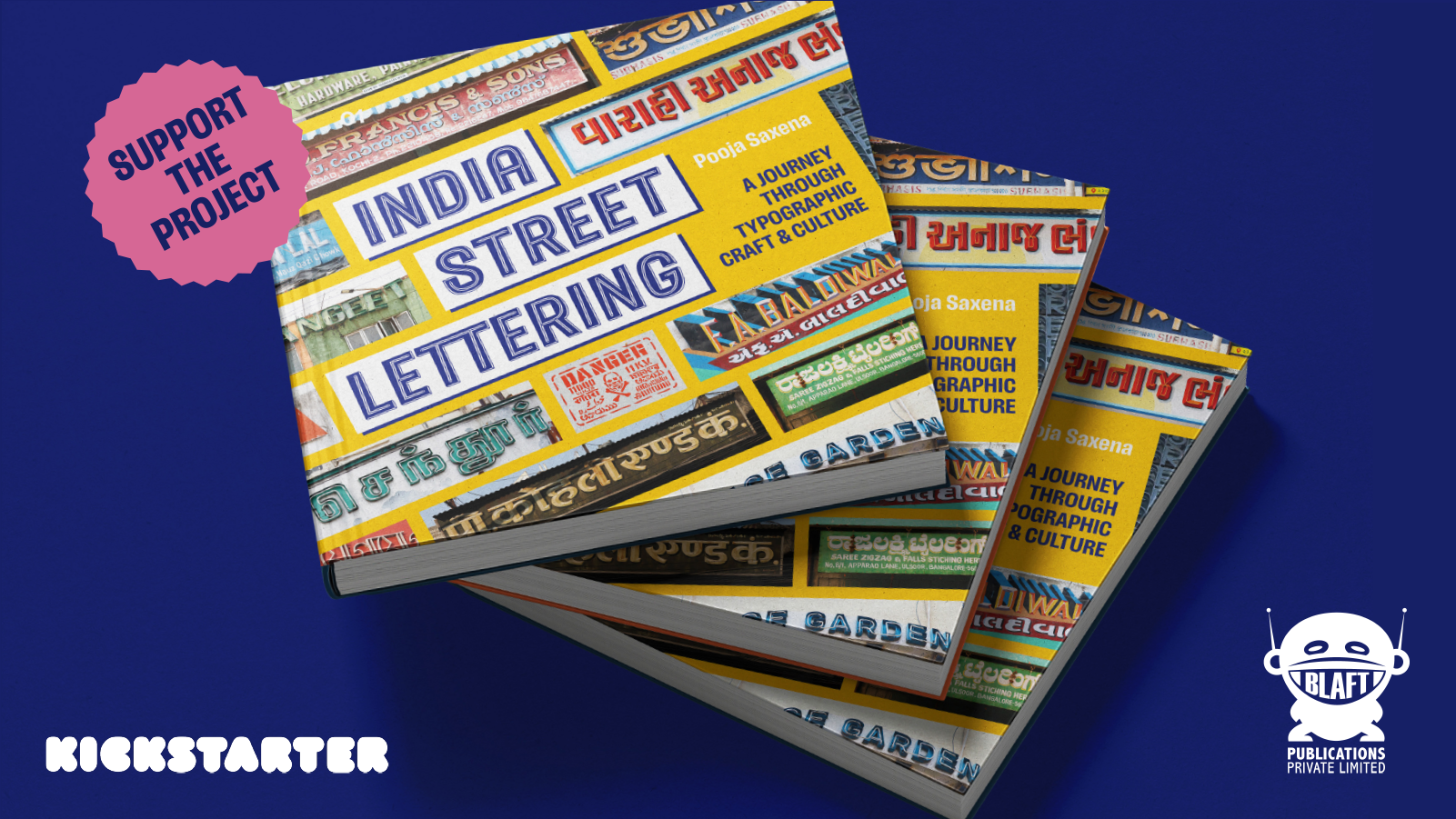
🥁 Welcome INDIA STREET LETTERING, the book! 🥁
I’m working with @blaft to bring together my documentation of letterforms from India’s cityscapes into a book — a 200-page hardcover full-colour volume showcasing striking public lettering from around the country.
We need your help to make this book happen 🤝🏼 Our Kickstarter campaign is live. Please chip in, pre-order the book and share the project with everyone you know ➡️ https://www.kickstarter.com/projects/blaft/india-street-lettering-a-book/
sPECtre boosted:
10 minutes from now, TypeLab 2025 kicks off on the TypeLab Americas channel.
RSVP for free to join the Zoom:
https://www.eventbrite.com/e/typographics-typelab-2025-tickets-1371585702759
Or watch the livestream on YouTube:
https://www.youtube.com/live/_898DlPRRQ4
Full schedule and other details here:
https://2025.typographics.com/typelab/
sPECtre boosted:
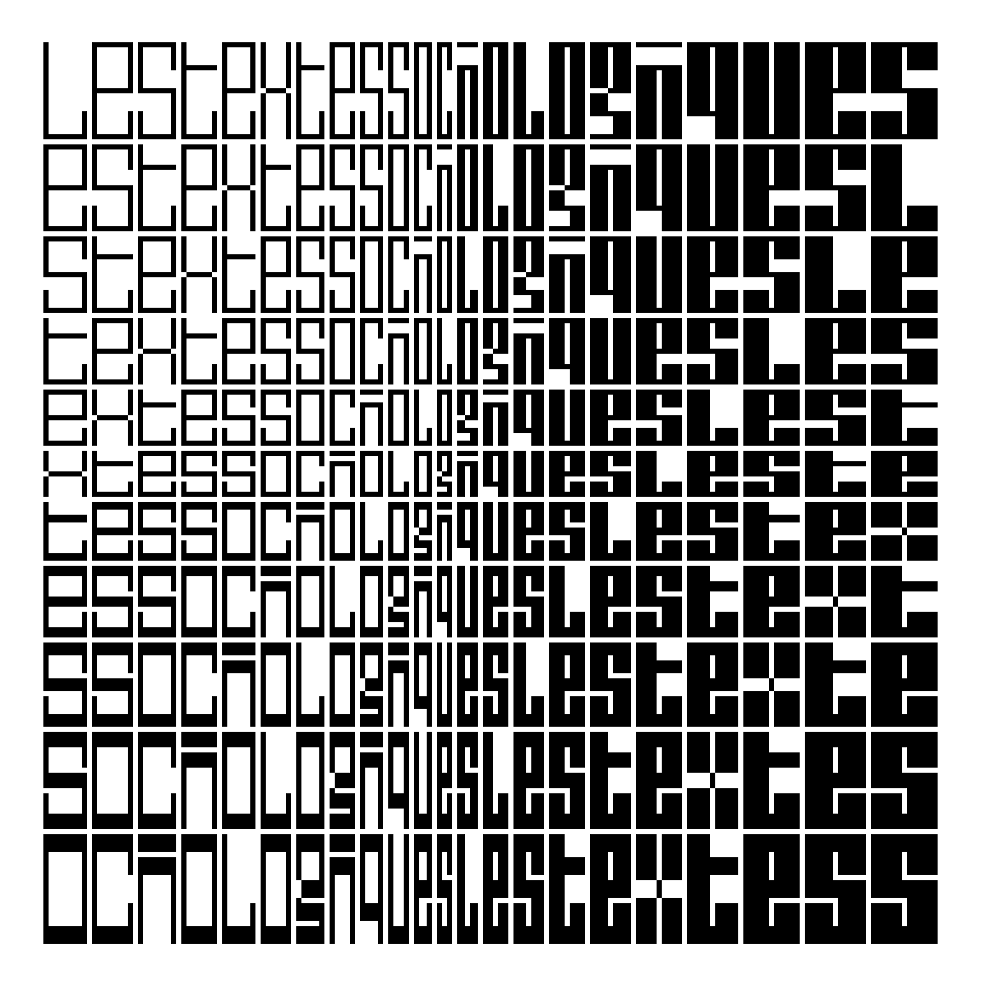
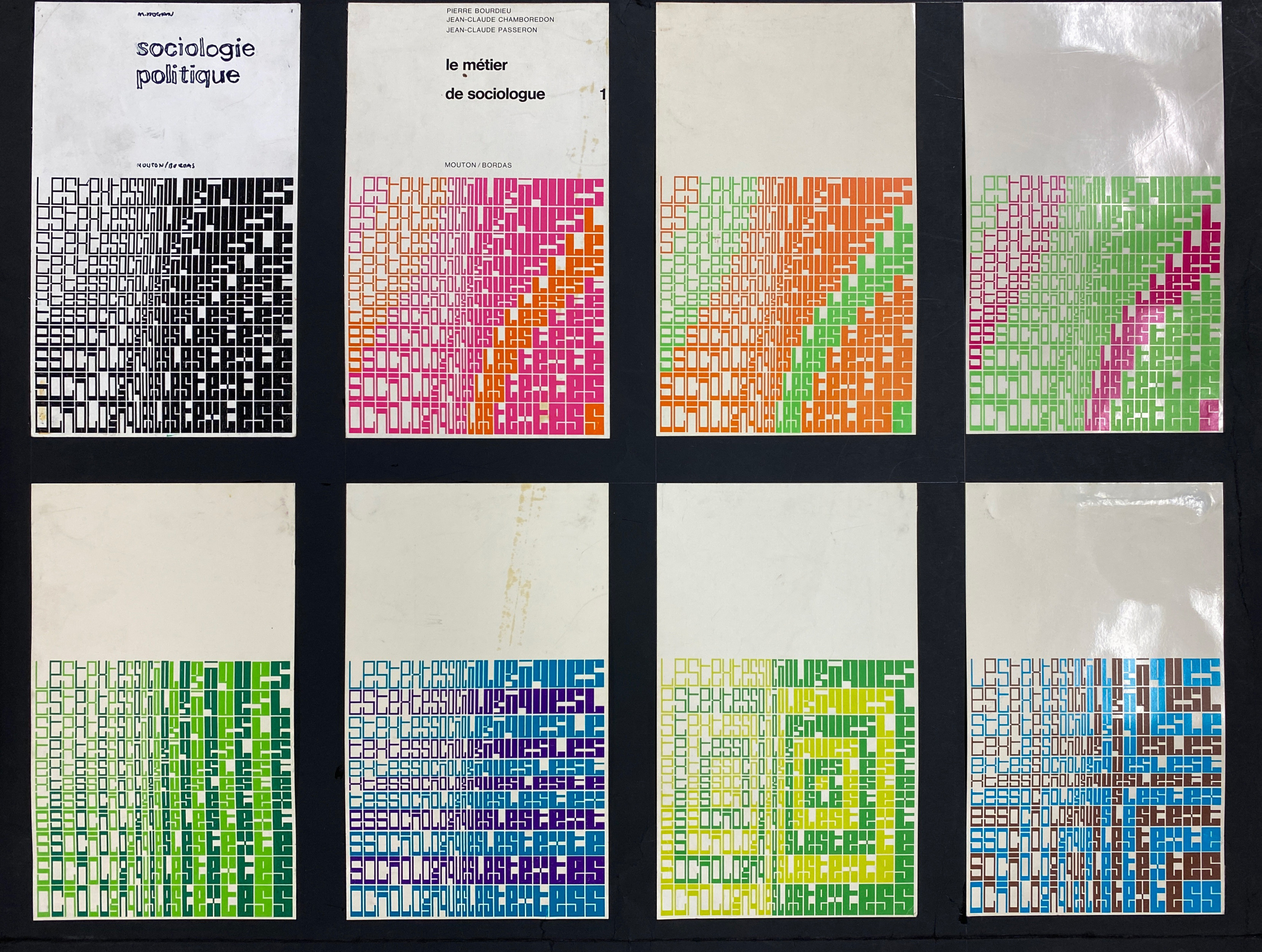
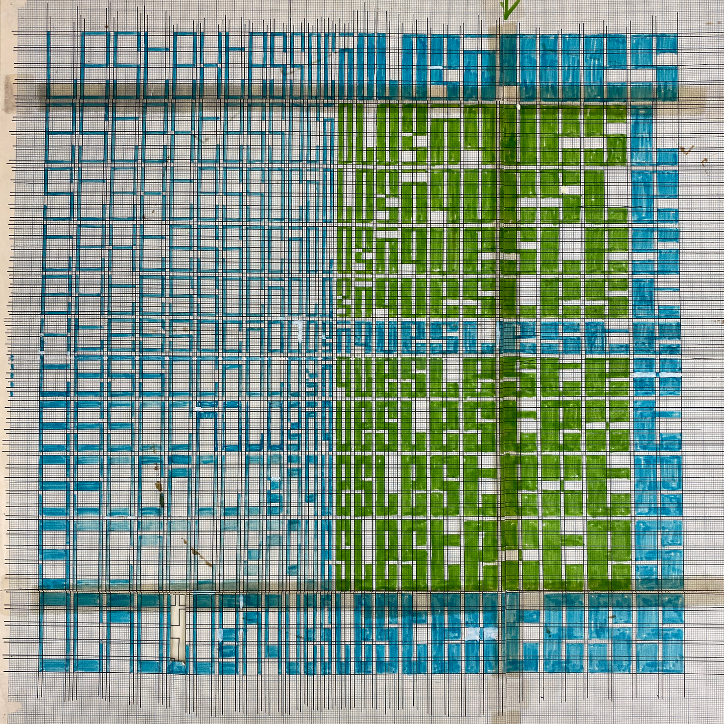
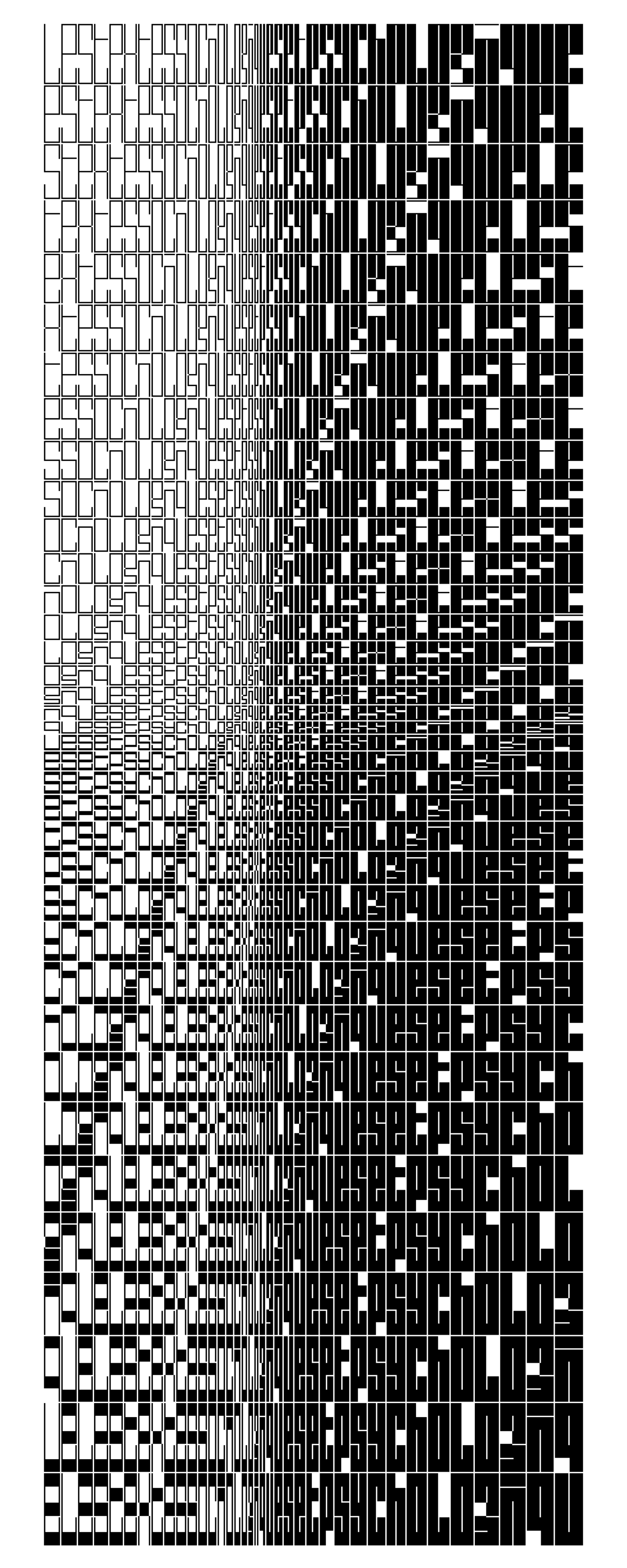
Still gathering Schrofer code … one recent update to @drawBot broke my original code for recreating the script patterns on the covers of Mouton's Les Textes Sociologiques series, but: revisions, et voila. Reconstruction, examples of the original covers, Schrofer's plan on graph paper, and a field showing the gamut of the variable font's horizontal/vertical stroke:counter axes.
Archive images courtesy the Jurriaan Schrofer Archive, Allard Pierson Museum, University of Amsterdam.
sPECtre boosted:
I'm very proud to have helped release this new font my friend @helenemarian at @NaN !
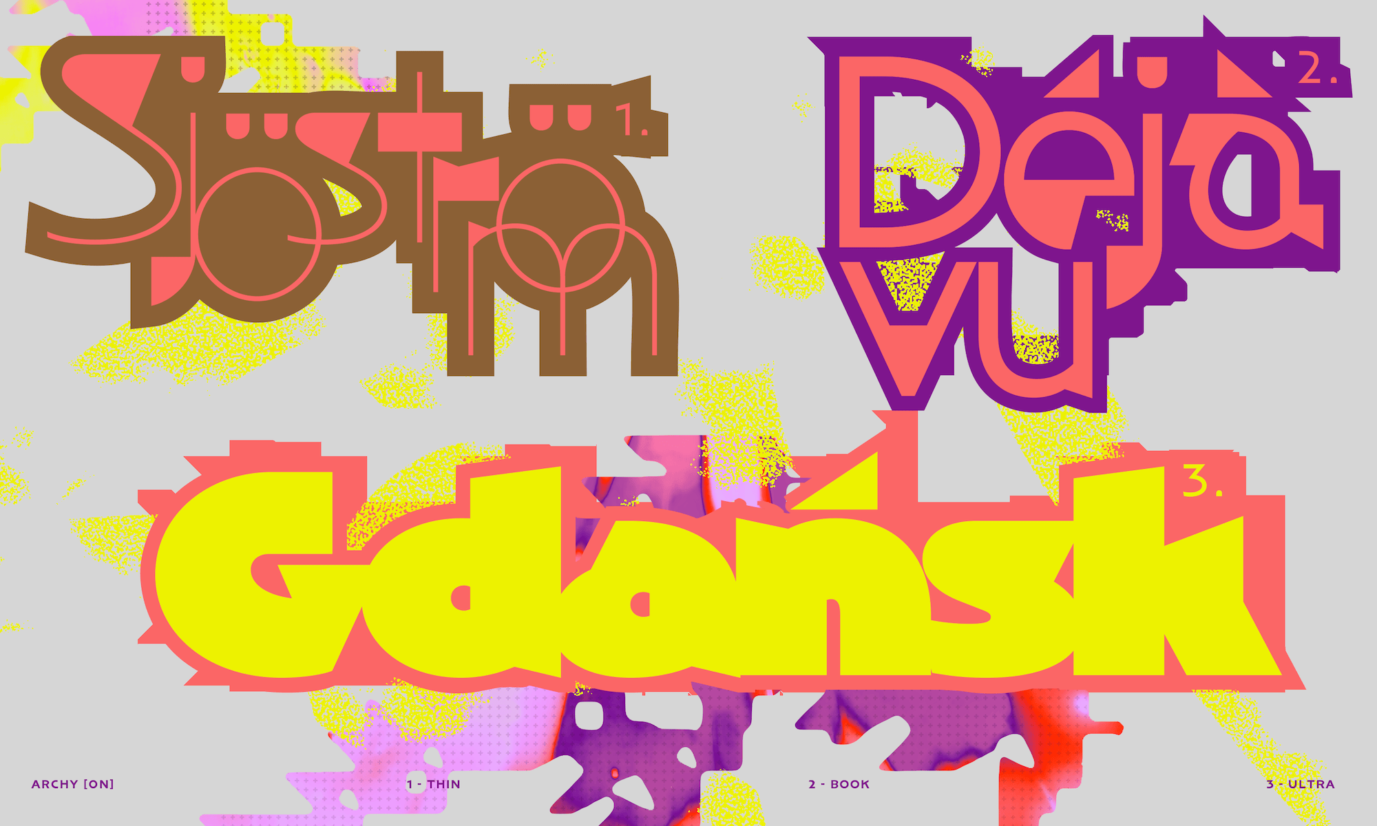
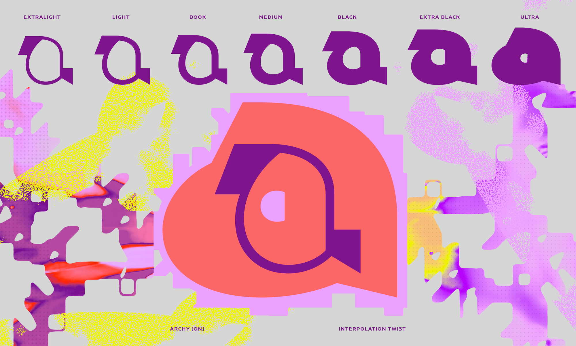
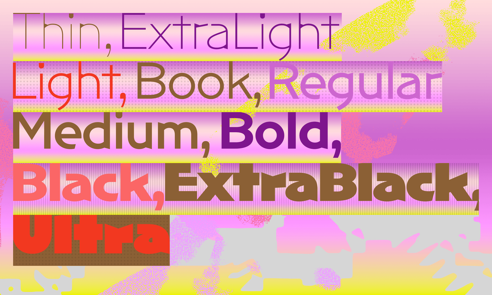
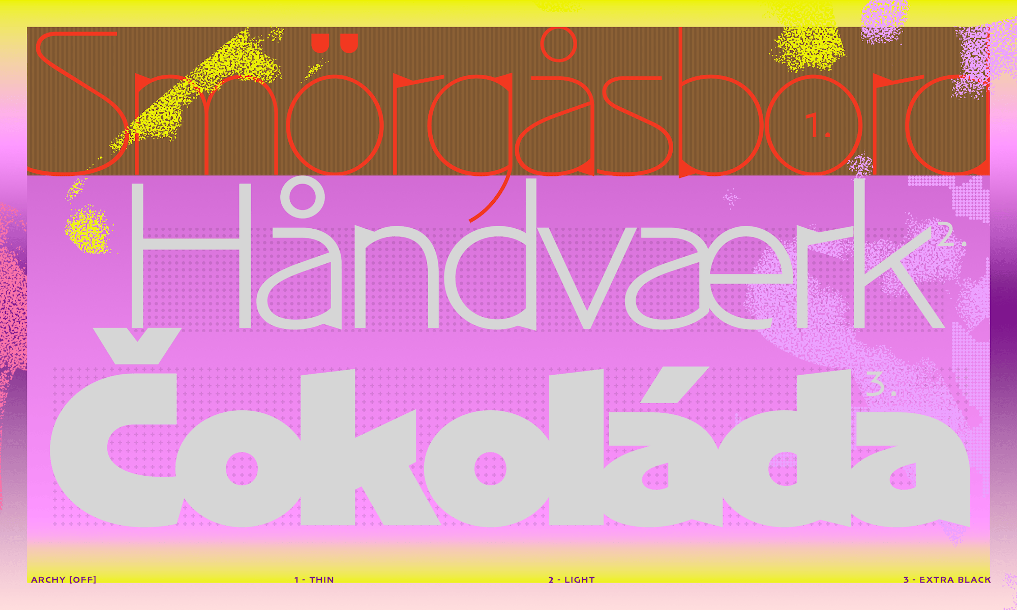
👹Archy 👹 ON + OFF
Archy takes its roots in Marian’s practice of paint-brush lettering but processes it through a highly digital treatment, suppressing most its organic nature. What’s left is a sans serif in 2 versions, [ON] and [OFF].
sPECtre boosted:
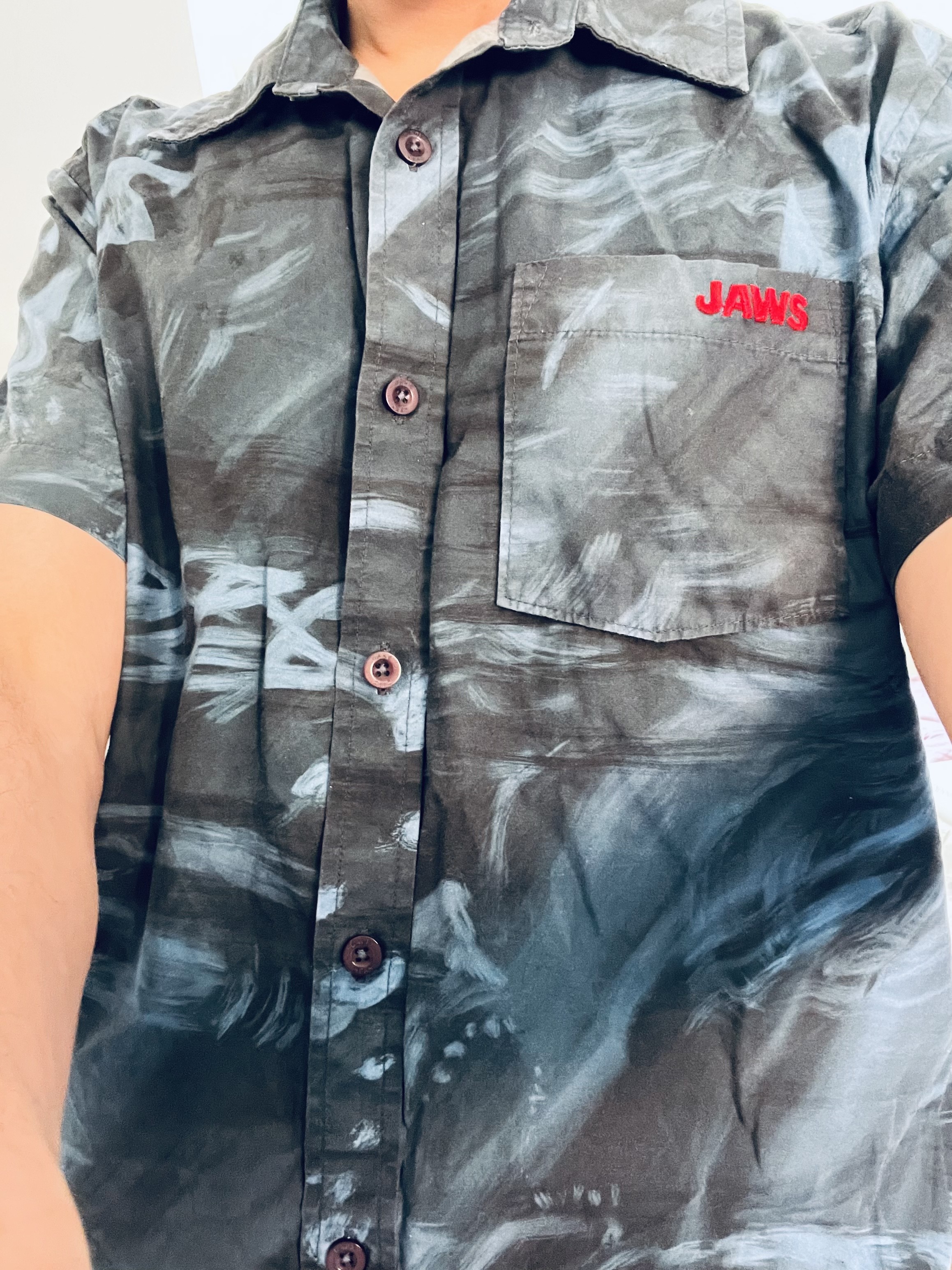
@FontsInUse @jasonsantamaria In that case, I briefly had to grab my JAWS shirt out of the laundry basket. AFAIK it’s by a Californian surfer brand.
sPECtre boosted:
Dear Fedi friends, may I ask you a favor?
I would really appreciate it if you could boost this message. I have created a French version of my Fedi promo video - and a French landing page – that I hope can spread far and wide in the Francophone world:
https://news.elenarossini.com/fedivers-video/
Cette vidéo explique ce qu'est le fédivers en 4 minutes. N'hésitez pas à partager cette page avec vos amis et vos proches qui ne sont pas ici... J'espère que cette vidéo éveillera leur curiosité 💙🤍❤️
sPECtre boosted:
Some more details on the upcoming David Jury book about 20th c. type designers:
https://www.printmag.com/daily-heller/the-daily-heller-type-designer-see-stars/
sPECtre boosted:
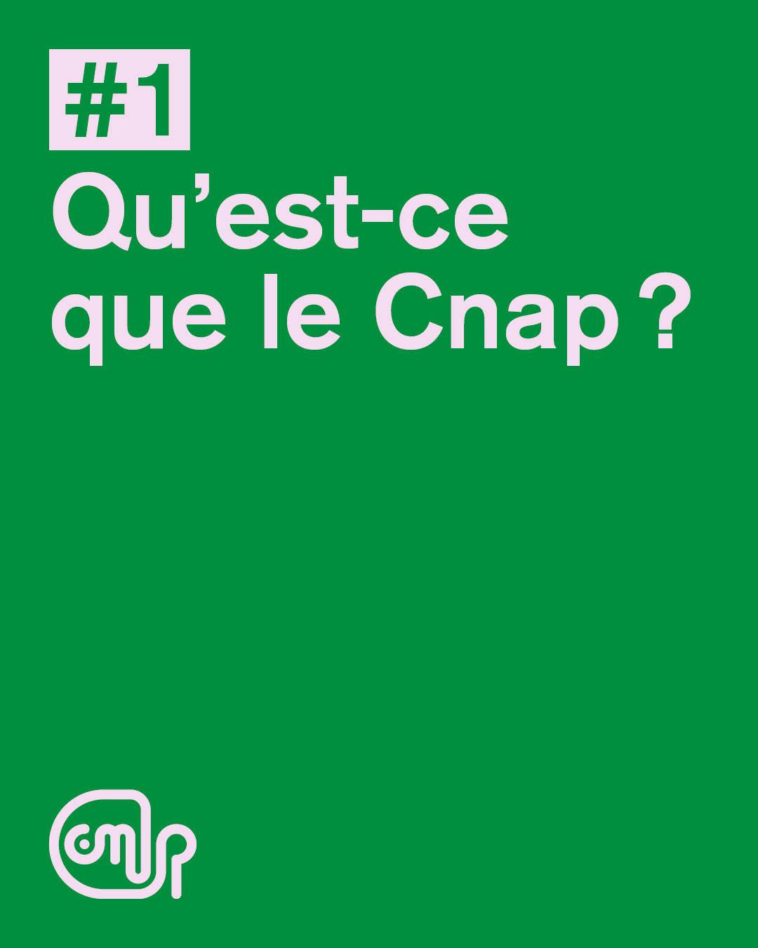
[Qu’est-ce que le Cnap ?]
Le Cnap est un établissement public du ministère de la Culture. Il soutient la création contemporaine dans les arts visuels, accompagne artistes et professionnels, gère une collection de plus de 108 000 œuvres, et en favorise la diffusion en France et à l’international. Il agit comme opérateur culturel, acteur du patrimoine vivant et soutien à l’écosystème artistique.
sPECtre boosted:
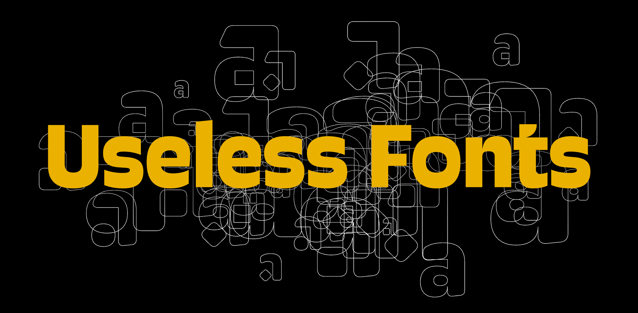
On Monday, we are doing a Let’s talk type session during @Typographics
If we manage to tidy up, we will show the studio a little bit, but mostly it will be our talk Useless Fonts about our more speculative work. There is a limit of 100 people, book your spot!
sPECtre boosted:
🔥 Fontstand is working on becoming a cooperative—co-owned and governed by the independent type foundries. No VCs. No middlemen. It’s a radical rethinking of how platforms should work—built on trust, equity, transparency, and shared success at its core.
🔗 https://fontstand.com/news/design-news/creating-the-fontstand-cooperative/
sPECtre boosted:
Join us on Thursday for a free 50-minute online talk exploring the design and development of Terrassa, a typeface inspired by architectural lettering.
📅 19 June, 2025, 8pm Amsterdam time. Exclusively for Typotheque Club members*
Become a member for free here.
📍https://www.typotheque.com/club
sPECtre boosted:
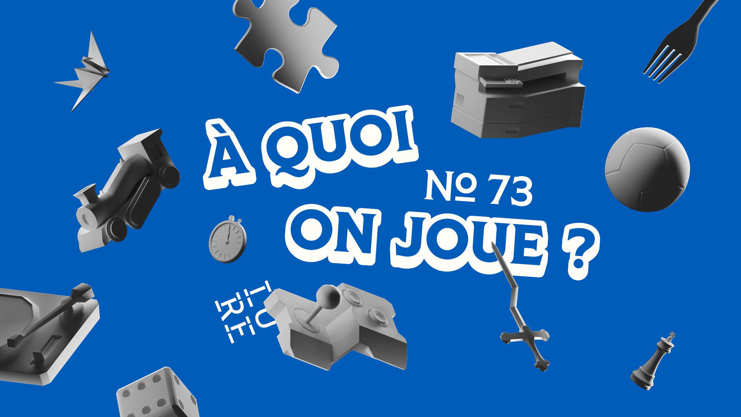
J'ai appris la typographie en jouant. 🎲
Un alphabet, c'est comme un puzzle : chaque lettre doit s'emboîter parfaitement avec toutes les autres.
Depuis mes 1eres années aux Rencontres de Lure, j'ai appris que dessiner des lettres, c'est jouer avec les règles. Les respecter ou les contourner.
Cette année Lure s'intéresse au jeu avec "À quoi on joue ?" - pour explorer ce que design et jeu ont en commun.
Qui sera de la partie ? 🎯
https://delure.org/les-rencontres/rencontres-precedentes/rencontres-2025
sPECtre boosted:
Incredibly proud to be featured on @alphabettes current header with my typeface Sumprat 😊
sPECtre boosted:
Only ten days left to apply for the ANRT program 2025–2027!
ANRT Open Call, from March 30th to June 23th, 2025
Candidates should present the personal project, or one of the research programme proposed for this year:
⚪ Missing Scripts 2025: N’TI, ODUDUWA, KULITAN, ZOU (ZOLAI), GURUNG KHEMA and OL ONAL
⚪ Frutiger Archive, 1961-1975
⚪ Renouveau
More information on the website:
https://anrt-nancy.fr/en/apply
sPECtre boosted:
My Rainbow Rocket colour font released today (see up) includes a "Swiftie compatible" colour palette set. Colours taken from Swift’s albums, with the `taylor` R package as a starting point.
Represented are: TSSNTV - Speak Now (Taylor’s Version), RedTV - Red (Taylor’s Version), TS1989TVSB - 1989 (Taylor’s Version) Sunrise Boulevard vinyl pressing, and TSLover - Lover.
Swifties, follow and DM for a 100% discount coupon for the TS zip (4 fonts).
sPECtre boosted:
Azimut is a series of three interrelated fonts designed as part of the city of Strasbourg’s term as UNESCO World Book Capital in 2024. The typeface is the work of three fabulous designers: Benjamin Blaess, Mathieu Réguer and Julien Priez.
The fonts are available for free download and it was very pleased to be asked me to write an accompanying text. Check the whole project out here!
sPECtre boosted:
I guess I'm digging through the old internet now, finding great conversations about type and typography. All in my feels about it all.
Which came first? The playbill or the type specimen? https://fontsinuse.com/uses/6/the-typeface-specimen
(Read the comments, too! You don't hear that very often anymore.)
sPECtre boosted:
🚀 Big news! 🚀
I'm launching the type foundry ⋆˙⟡ 𝖕𝖑𝖔𝖒𝖇 𝖙𝖞𝖕𝖊 ⟡˙⋆ — with my talented partner in design, Max Esnée.
https://www.plombtype.com/savate/
Together, we’re crafting a variety of typefaces with distinct voices, and also enjoy working closely with clients on custom designs.
Client Info
Server: https://mastodon.social
Version: 2025.04
Repository: https://github.com/cyevgeniy/lmst