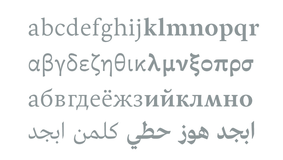
Award-winning French type foundry.
Jonathan Fabreguettes & Laurent Bourcellier.
- -
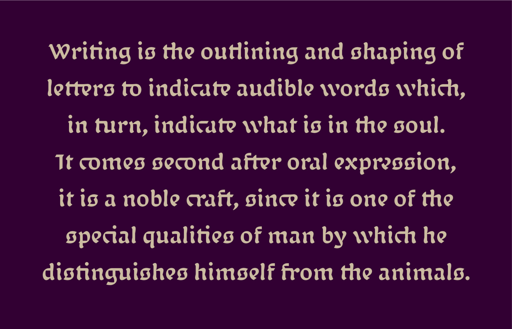
We made a new typeface
(and it’s free)
Franck Jalleau (1962-2025) was our teacher at the École Estienne for many years.
Calligraphy, typography, lapidary engraving: Franck Jalleau was extremely talented in all 3 fields.
It's hard to find the words to express how important he was to our studies and professional practice, and how much we miss him today.
One thing that makes me happy about going back to University is that I'm writing my dissertation using @rosetta 's stunning “Gitan” typeface.
It is wonderful for text, and wonderful for titling.
For our foundry newsletter, we only send 3 emails A YEAR (including a greetings card), so don't hesitate to subscribe.
In the next newsletter, we'll be talking about the work we've been doing for the past 9 years on publishing for the visually impaired and blind.
I am very pleased to announce that our research on reading for visually impaired people will benefit from new funding over 3 years.
I hope we will be able to do great things, and continue to improve reading for the millions of visually impaired people in France and abroad.
Today, hundreds of professionals in the field of visual impairment in France use our work on a daily basis 🙂
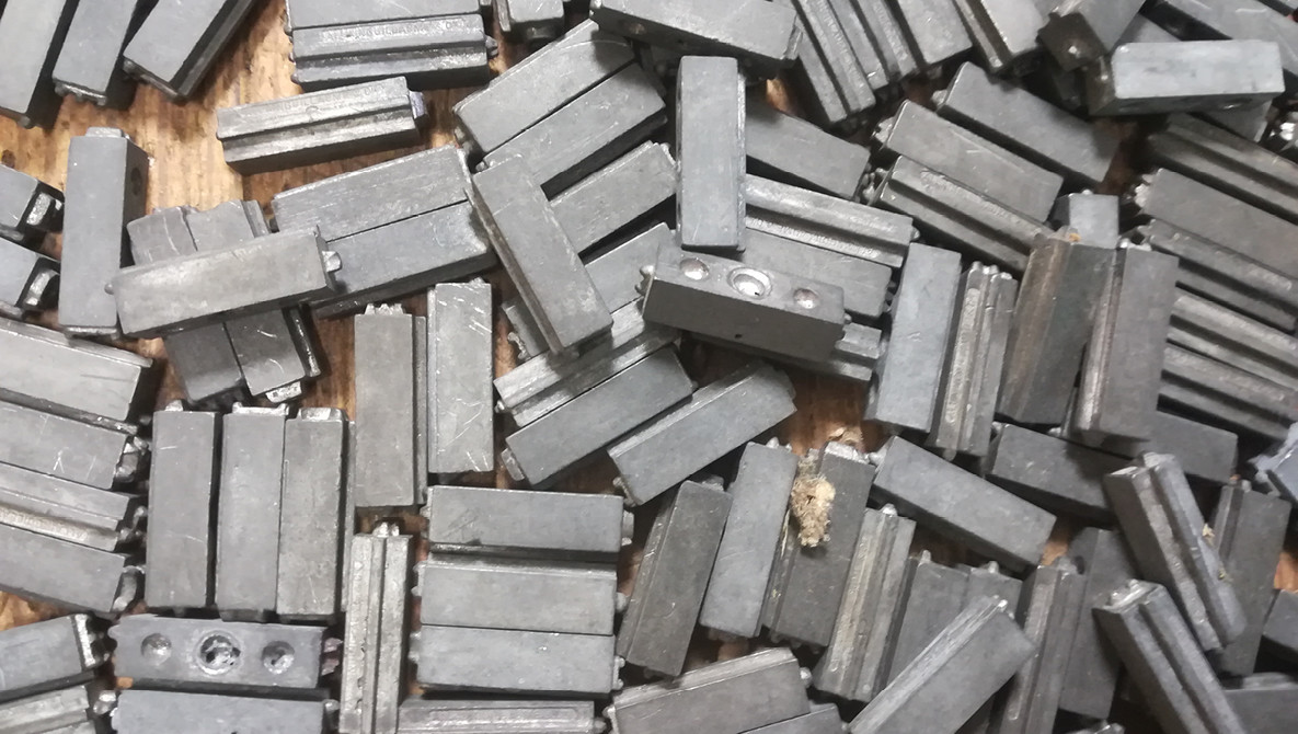
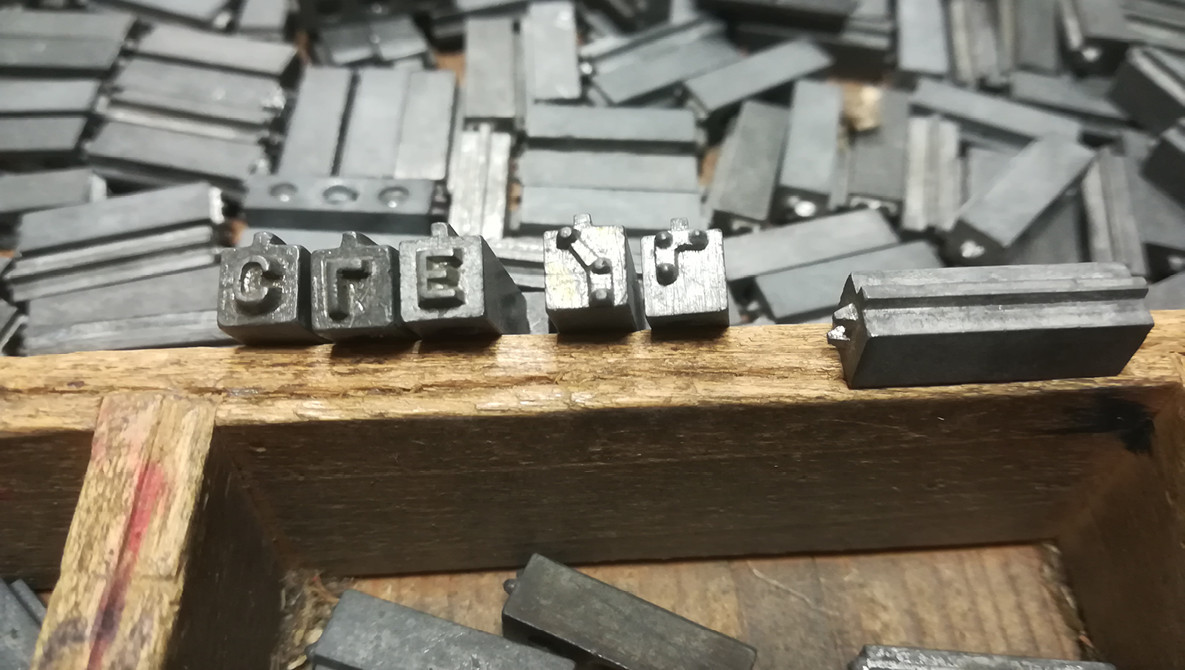
A rare thing I had never seen before: a Braille-Latin "double side" metal type font.
A colleague found this abandoned.
If, by chance, you have any information on this, I would be curious to know more.
I visited the Lugdunum Museum today (Lyon, France).
A lot of lapidary engraving, even if the stories were far more interesting than the letters themselves. I recommend.

If you purchased the "Classic" version of our Joos typeface in the past years, now you can ask us for the "Pro" version for free 🙂
We are very happy to celebrate the 16th anniversary of our type foundry typographies.fr!
To celebrate this, our fonts are now available (in a permanent way) at a reduced price (from $32).
We hope it will help to make them more accessible to independent designers.
#TypeFoundry #TypeDesign #advertisement #typography #GraphicDesign
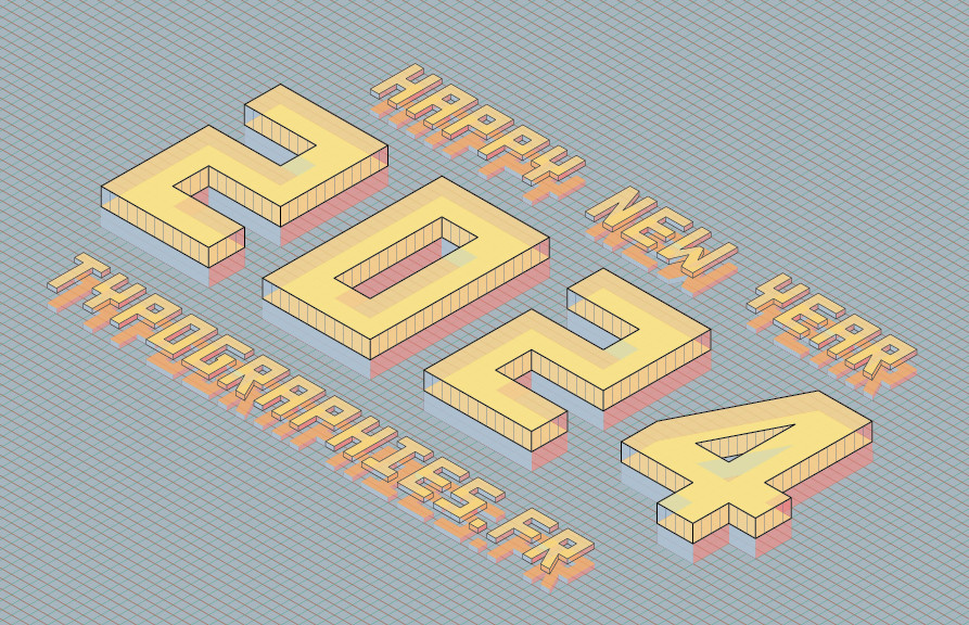
May this year 2024 be an opportunity for you to put your creativity and skills in the service of a world turned towards more resilience, social justice and freedom.
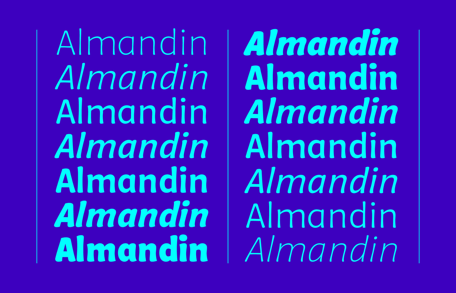
"Ohno Backslant" is the most beautiful titling typeface I've seen in a long time, and I think their most interesting work since "Digestive" a few years ago.
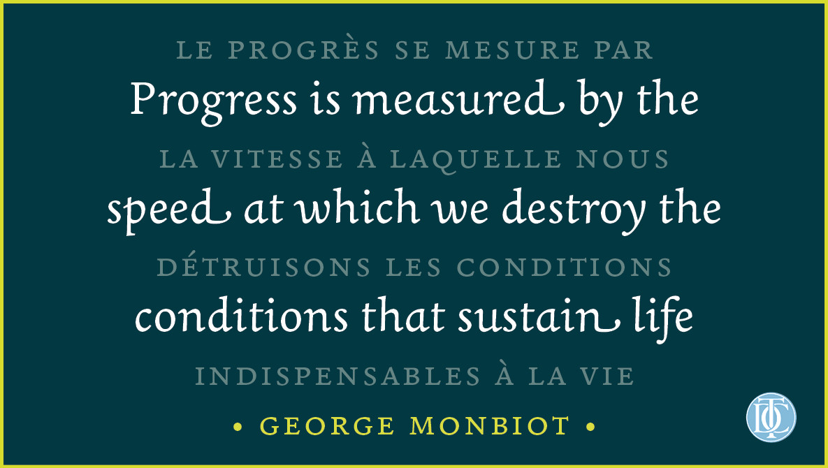
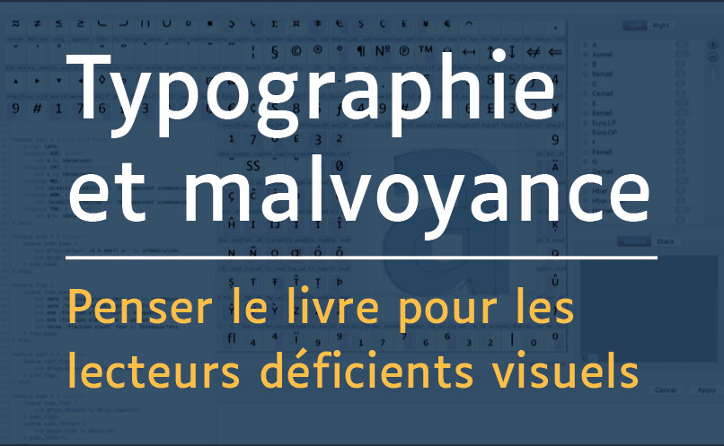
Nous avons écrit un article qui résume notre travail de recherche sur la #typographie, la #lecture et la #DéficienceVisuelle depuis presque 7 ans.
C'est un article important pour nous, sur une problématique —lecture et déficience visuelle— qui touche plus d'1 million de personnes en France.
Merci à la revue "Graphê" d'avoir accepté sa diffusion gratuite sous licence CC après publication.
J'espère qu'il vous intéressera.
Our latest newsletter is out, with a wide range of type design projects:
https://mailchi.mp/6471c8b34cc5/spring-newsletter
If you haven't subscribed yet, it's only 1 newsletter every 4 months !
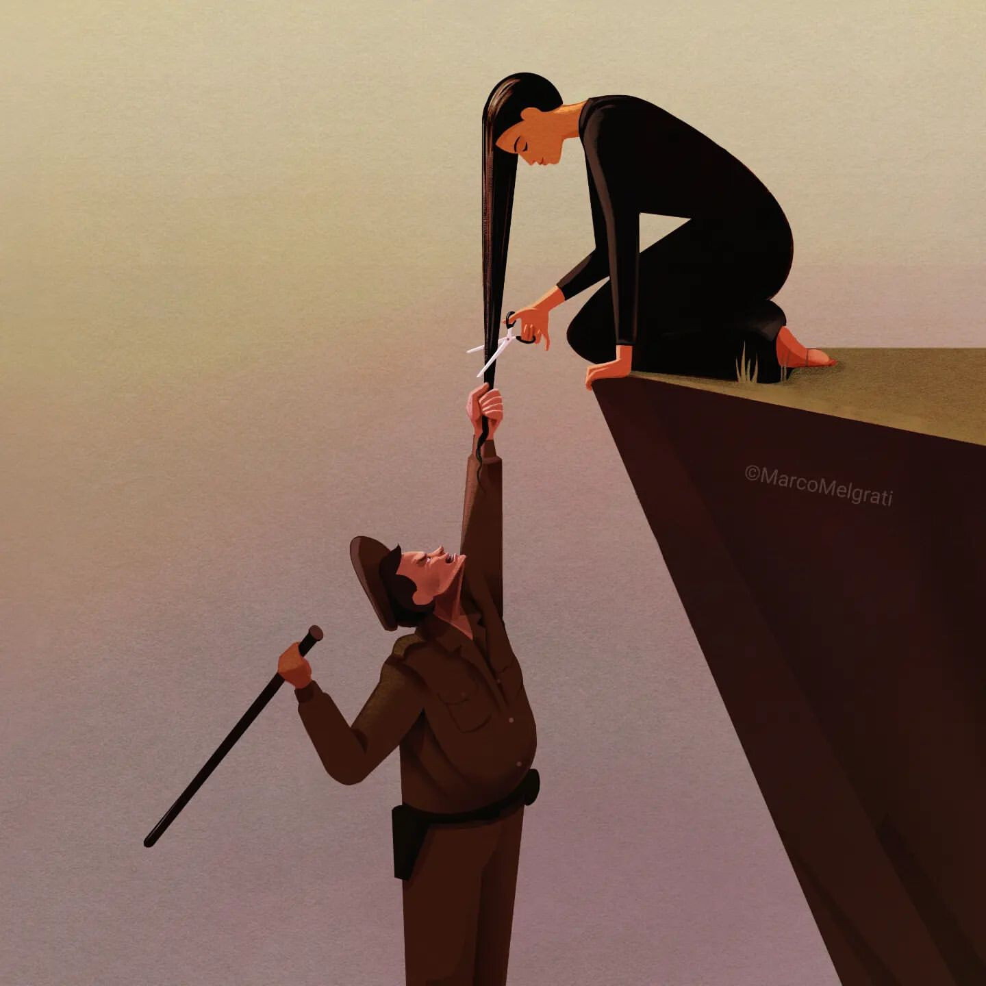
I find this poster made by Marco Melgrati very moving.
Nearly 700 posters made for Iranian Women of Graphic Design are available here, to communicate on social networks: https://linktr.ee/iwofgd
@monokrom
You may have a look at these articles:
https://ilovetypography.com/2014/02/08/unusual-fifteenth-century-fonts/
https://ilovetypography.com/2015/07/01/unusual-fifteenth-century-fonts-part2/
The header of the second article is a photograph I had taken from a detail of a French painting dated 1509.
@litherland
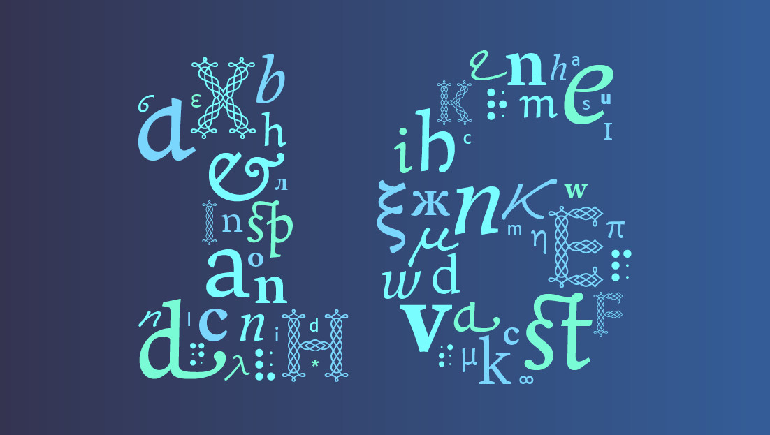
The project "Colvert" was comprised of 4 families made by 4 designers native speaker of the concerned writing system.
"As part of this project, we tried to get people to think about how we can design and use multilingual type families"
[written in 2012 and still an interesting problematic].
May 2023 be for you an opportunity to use your creativity and skills to work for a better world.
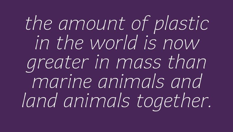
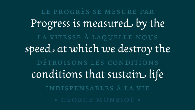
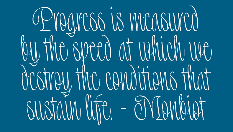
"As a society, as a species, we must start doing the right thing instead of always just the profitable thing." — Peter Kalmus
@skalyan @sol
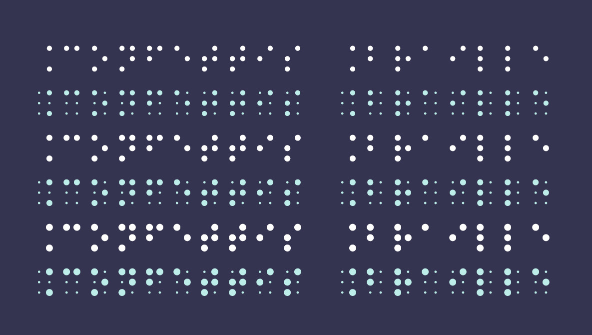
There is no "small Braille letters" 🙂
The size of the Braille cell is fix, it is designed for the size of the finger.
It can be interesting to use slightly different weights of the Braille dots for different techniques or different softwares:
https://www.typographies.fr/N/confettisbraille/confettisbraille.html
But even here, it is of very limited interest (I can criticize here because it is my own project 🙂 )
typographies.fr is the small type foundry of two designers.
The work of typographies.fr has been awarded by the Association Typographique Internationale and the Type Directors Club of New York.
It has been published by the Type Directors Club of New York and Tokyo, and is part of the collections of the French National Center for Visual Arts.
We are very happy to start a new adventure here 🙂