ASTRE Collective Visual Identity: How Parcour Studio Designed the Future of Sound
Some design projects simply create a logo. Others build an entire universe. The ASTRE Collective visual identity, masterfully crafted by Istanbul-based Parcour Studio, falls firmly into the second category. It’s a remarkable case study in translating something as intangible as immersive audio into a tangible, compelling, and unforgettable visual language. This isn’t just about looking good; it’s about creating a system that feels as innovative and layered as the spatial audio experiences ASTRE Collective produces. When a brand’s mission is to pioneer the very future of listening, how do you even begin to capture that in a visual form? You start by looking back, and then you leap forward.
Parcour Studio’s work for ASTRE is more than just successful branding. It serves as a powerful reference for anyone interested in branding, graphic design, and the intersection of art and technology. It shows us how deep strategic thinking, coupled with a respect for history, can produce something truly groundbreaking. Let’s explore the thoughtful process behind this exceptional project.
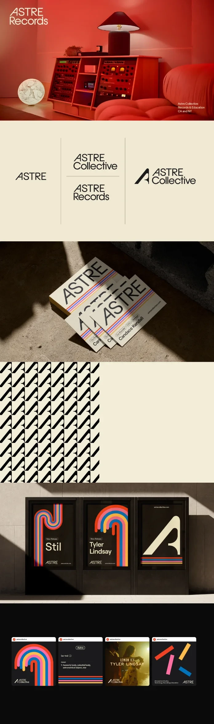
ASTRE Collective Visual Identity Design by Parcour Studio
The Minds Behind the Magic: Meet Parcour Studio
To understand the brilliance of this project, you first need to meet the creators. Parcour Studio was founded in Istanbul in 2020 by Deniz Damar and Burak Tığlı, two designers with impressive pedigrees and a shared vision. Both are graduates of Marmara University’s prestigious Faculty of Fine Arts, with experiences at top European design schools, ENSAD Paris and ENSAD Dijon, respectively. Their combined experience in branding, strategy, editorial design, and illustration gives them a uniquely holistic perspective.
What truly defines Parcour Studio is their philosophy. They operate on a foundation of smart solutions, boundless creativity, and genuine teamwork. Instead of imposing a rigid style, they engage in a dynamic exchange of ideas with their clients. Their goal is to help brands reach their full potential by proposing timeless solutions that are built to evolve. This approach was essential for a forward-thinking client like ASTRE Collective.
More Than a Record Label: The ASTRE Collective Mission
So, what exactly is ASTRE Collective? Think of them as audio architects. They are an immersive record label focused on pushing the known boundaries of sound. Their work centers on producing, recording, and mixing for Dolby Atmos and Spatial Audio, creating an unparalleled listening experience for audiences. In fact, they are the only record label utilizing a unique two-channel Atmos mix, which allows them to deliver groundbreaking audio fidelity even on standard stereo platforms.
This venture is inspired by the legacy of music industry legend Mike Miller and his “Atmosphere Studios.” Miller’s pioneering work with artists like Harry Styles, SZA, and Tyler, The Creator has left a massive mark on the world of mixing. Consequently, ASTRE Collective carries this torch forward, aiming to support artists and develop innovative projects that will shape the future of music. The challenge for Parcour Studio was clear: how do you brand a legacy and a future at the same time? How can graphic design services convey such a complex, technical, and artistic mission?
Crafting the ASTRE Collective Visual Identity: A Nod to the Golden Age
Parcour Studio began its design process not by looking at current trends, but by turning to the golden age of the music industry. The 1960s and 70s were a time of incredible visual confidence. This aesthetic wasn’t just on iconic album covers and posters; it was also used by technology companies promoting their state-of-the-art music equipment. It was an era of bold, unapologetic design.
In contrast to the minimalist, often sterile, design approaches that came later, this period celebrated large, confident typography and fonts with strong, decorative character. This became a key reference point. The ASTRE Collective visual identity needed to feel both classic and futuristic, established yet experimental. By drawing from this rich visual history, Parcour Studio gave the brand a sense of authority and cultural resonance right from the start. It was a clever move, grounding a futuristic technology in a past that music lovers inherently trust and admire.
A Typographic Solution That Speaks Volumes
One of the most innovative elements of the project is its typographic system. In design, we often rely on standard tricks like bold or italics to create emphasis. Parcour Studio rejected this convention entirely. Instead, they developed a much more imaginative visual solution.
To highlight keywords, they enclosed them in soft, balloon-like shapes, subtly lifting them from the baseline of the text. What does this accomplish? First, it creates an incredibly strong and easily recognizable typographic mark that is uniquely ASTRE’s. You see it once, and you remember it. Second, it brilliantly references the brand’s identity. The floating shapes subtly evoke celestial bodies and the “atmosphere” central to their work. Isn’t that a clever way to embed meaning directly into the text? This is a prime example of how to create a visual identity for a record label that is both functional and deeply conceptual.
This choice is perfect for social media, creating instantly shareable and visually distinct text blocks that cut through the noise. It’s a design element that works just as well in a block of copy as it does as a standalone graphic.
A System of Symbols and Colors
ASTRE Collective isn’t a monolithic entity. It’s a brand that speaks to multiple fields within the music ecosystem. Because of this, it needed a unified voice and a coherent visual system that could adapt to different contexts. The solution Parcour Studio devised is a masterclass in brand strategy.
They designed a central symbol and a main logotype to ensure brand integrity across all activities. Then, they created sub-logos for various projects. To give this structure more depth, they defined ASTRE’s four foundational pillars with a unique color code:
- Atmosphere Studios
- Technology
- Recording
- Education
Each pillar received its own color. These colors were then used to create a system of lines, generating adaptable visual forms that can be used in countless scenarios. This is where the ASTRE Collective visual identity transcends simple aesthetics and becomes a functional system. The colors aren’t just decorative; they carry specific meaning and help organize the brand’s offerings. The bold and vivid palette feels energetic and modern, perfectly reflecting the brand’s innovative spirit.
Why This Branding Resonates So Deeply
The collaboration between Parcour Studio and ASTRE Collective is a resounding success because it solves a complex problem with elegance and intelligence. It manages to:
- Translate Sound to Sight: The design system successfully visualizes the abstract concepts of “atmosphere,” “immersion,” and “innovation” through its floating typography and layered structure.
- Balance Past and Future: It pays homage to the trusted aesthetics of the ’60s and ’70s while feeling entirely new and forward-looking. This duality gives the brand both credibility and excitement.
- Create a Flexible System: The color-coded pillars and adaptable line work provide a versatile toolkit that can grow with the brand, ensuring consistency across all future projects.
- Offer a Unique Perspective: In a sea of minimalist tech and music branding, this identity is bold, confident, and full of personality. It refuses to be ignored.
For anyone searching for the best branding for music tech companies or innovative graphic design for audio brands, this project is a benchmark. It demonstrates that the most effective branding comes from a deep understanding of the client’s mission, a willingness to think systematically, and the creative courage to break from convention. The ASTRE Collective visual identity by Parcour Studio doesn’t just represent sound—it has a voice all its own.
All images © Parcour Studio. Feel free to find other graphic design and branding projects showcased here at WE AND THE COLOR.