
Art Deco is having a major moment in 2025! 🎨✨
Just published: 10 stunning ways to bring 1920s glamour into your home with geometric patterns, velvet furniture, brass fixtures & sunburst mirrors.
Complete with budget ranges ($50-$3,500), DIY difficulty ratings & room-by-room guidance. From living rooms to bathrooms, discover how to make this century-old style feel fresh & modern.
https://www.omnihomeideas.com/design/interior/art-deco-decorating-ideas/
#ArtDeco #InteriorDesign #HomeDecor #DesignTrends
#DesignTrends

Dark Mode vs. Light Mode: Which Is Better?
https://www.nngroup.com/articles/dark-mode/
#HackerNews #DarkMode #LightMode #UserExperience #DesignTrends #TechDebate
If you put Apple icons in reverse it looks like someone getting good at design
https://www.threads.com/@heliographe.studio/post/DTeOwAykwQ1
#HackerNews #AppleDesign #ReverseDesign #Creativity #Humor #DesignTrends

🖨️ 2025 polished the machine until it gleamed. 2026 scuffs it with human fingerprints. AI still drafts fast, but hands tear, smear, & glitch the finish. Sustainability goes structural, UX grows messy, type bleeds again. Perfection lost its aura. Texture is the signal.
Designers who understand this aren’t chasing trends. They’re responding to a deeper demand for authenticity, accountability, & emotional connection in a machine-smooth world.
#DesignTrends https://www.schweitzerdesigns.com/post/future-graphic-design-trends-2026


Cùng xem trước những gì sẽ lên ngôi trong thế giới thiết kế nội thất năm 2026 nhé! 🧱🪞 Theo chuyên gia, gạch đất nung ấm áp sẽ quay trở lại, và gương sẽ được ưu tiên để "hack" không gian, tạo cảm giác sâu rộng hơn cho ngôi nhà.
#ThietKeNoiThat #XuHuongNoiThat #TrangTriNha #InteriorDesign #HomeDecor #DesignTrends
https://vtcnews.vn/nhung-xu-huong-thiet-ke-noi-that-len-ngoi-nam-2026-ar995671.html
In 2026, Human Imperfection is a Designer’s Most Important Skill and the Biggest Design Trend that Beats AI https://weandthecolor.com/why-the-biggest-design-trend-of-2026-is-human-imperfection/207545


Discover the bold creative shifts shaping 2026—see the full breakdown in WE AND THE COLOR’s latest trend report. https://weandthecolor.com/graphic-design-trends-2026-ten-bold-directions-shaping-creativity/206176
#design #graphicdesign #designtrends #graphicdesigntrends #2026graphicdesigntrends
Transform your bathroom into a modern retreat with clean lines, calming tones, and smart storage. From stylish fixtures to timeless tile choices, bath design is all about comfort and style. #BathDesign #InteriorDesign #HomeRemodel #ModernBath #DesignTrends

Thêm chức năng kiểu dáng '2010s' đến IconCraft - công cụ tạo icon app đẹp. Kiểu này sinh ra icon rétro với gỗ, hiệu ứng kính, bóng kim loại, ánh sáng và bóng Messina thực tế.
#SkeuomorphicDesign #RetroDesign #AppIcons #2010s #IconCraft #DesignTrends #UIUX #TechNews #TheFutureIsRetro #GraphicDesign #VisualEffects #TechInnovation
https://www.reddit.com/r/SideProject/comments/1on7z5l/bringing_back_skeuomorphic_design/

Gen Xers reminisce about wood paneling being 'everywhere' in their childhoods. Here's why it was.

Graphic Design Trends 2026: Ten Bold Directions Shaping Creativity http://weandthecolor.com/graphic-design-trends-2026-ten-bold-directions-shaping-creativity/206176

Graphic Design Trends 2026: Ten Bold Directions Shaping Creativity
As 2026 approaches, the conversation around graphic design trends goes far beyond 2025. Rapid advances in generative technology, rising expectations around sustainability, and fresh perspectives on inclusivity are reshaping visual culture. Designers can’t simply recycle last year’s aesthetic; they must anticipate what comes next. Why does that matter? Clients and audiences adapt quickly, and brands that embrace emerging ideas stand out. This article looks ahead and explains graphic design trends expected to dominate 2026. It draws on trend reports, market analysis, and expert commentary to offer critical insights rather than repeating last year’s lists. Each trend is explored with context, examples, and practical advice.
1. Graphic Design Trend: AI‑Driven Generative Design Becomes the Co‑Pilot
AI‑Driven Generative DesignArtificial intelligence has become a creative partner for most designers. Industry forecasts indicate that AI is empowering designers to brainstorm, prototype, and refine their work in hours rather than weeks. Generative art harnesses algorithms to produce unique visuals, and 2026 is set to see designers using AI‑driven tools to create work that is both visually striking and intellectually stimulating. Many analysts note that AI models already create on‑brand imagery, concept art, and social assets, allowing teams to generate production‑ready visuals rapidly. The shift toward AI as a design collaborator includes real‑time concept generation, automated layouts, and intelligent typography suggestions. Even the greeting‑card industry is embracing it: generative tools are being used for ideation, dynamic layout generation, and personalized card design.
What it means
In 2026, AI tools such as Adobe Firefly, Figma’s AI features, and Kling AI will become part of the standard workflow. Designers who once spent days sketching concepts will lean on algorithms to produce multiple variations instantly. This doesn’t diminish human creativity; instead, it amplifies it. AI can suggest unexpected compositions and explore colour harmonies at a scale humans can’t. However, ethical considerations are critical. Generative tools raise questions about originality, data licensing, and artistic credit. Designers should treat AI outputs as starting points, refine them to add a personal touch, and respect the rights of the artists whose work may have trained these models.
How to use it
- Integrate AI into early brainstorming. Use prompts to explore styles or textures and then iterate manually.
- Evaluate AI tools’ licensing terms and ensure compliance.
- Combine AI‑generated elements with hand‑drawn or photographed assets to achieve a unique look.
2. Graphic Design Trend: Neo‑Brutalism and Bold Minimalism Return to Fundamentals
Greydient 3 Graphics by KloroformA counter‑movement to decorative overload is underway. Many forecasters predict a significant comeback of neo‑brutalism, characterised by bold geometric shapes, raw textures, and a focus on functionality over form. The trend celebrates simplicity by stripping design back to its essentials. Bold minimalism follows a similar path; it uses minimal elements with maximum impact, relying on strategic typography, colour, and imagery. Some agencies call this shift neo‑minimalism—an approach that combines generous whitespace with nuanced detail, subtle gradients, and warm neutrals to create calm, considered visuals.
What it means
Neo‑brutalism builds on mid‑century modernism but removes the polish. Expect layouts with exposed grids, stark typography and utilitarian elements that feel honest and direct. Bold minimalism, meanwhile, keeps compositions clean yet makes a statement through scale and contrast. As digital interfaces grow busier, these pared‑down styles allow designers to guide the viewer’s eye effectively.
How to use it
- Work with a limited palette and focus on negative space to create calm.
- Use large typography or striking imagery as focal points.
- Experiment with raw textures and geometric frames to evoke authenticity.
3. Graphic Design Trend: Sustainability and Eco‑Conscious Aesthetics Become Default
QuiteLike branding by Universal FavouriteDesigners are embracing responsibility as the climate crisis intensifies. Trend reports note that sustainable design will take centre stage in 2026, driven by awareness of climate change and the need for industries to adopt environmentally responsible strategies. This involves using recycled materials, minimizing waste, and reducing carbon footprints. Sustainability‑inspired design uses earthy tones, organic textures, and minimalist packaging to signal environmental responsibility. Eco‑conscious visual identities rely on earth tones, organic textures, and minimalist layouts, and even optimize digital assets for energy efficiency. Beyond colour palettes, designers are employing symbolic, data‑driven visuals such as warming stripes to represent environmental themes. Colour experts predict bright palettes that balance vibrant hues with neutrals, offering a creative toolkit that combines tradition with innovation.
What it means
Sustainability is no longer a niche. Consumers expect eco‑friendly choices in everything from packaging to websites. Earthy palettes and organic textures communicate authenticity and align brands with environmental values. Designers are also considering the environmental impact of digital products—optimising file sizes and choosing energy‑efficient animations to reduce carbon emissions. Data‑driven motifs like warming stripes turn climate data into compelling visual narratives and raise awareness without preachiness.
How to use it
- Select recycled or responsibly sourced materials for printed collateral.
- Use warm neutrals, muted greens, and natural textures as base colours.
- Incorporate climate‑related infographics and patterns to make environmental messages tangible.
4. Graphic Design Trend: Kinetic Typography and Motion‑First Design Animate Text
Electric Glitch Titles by Ed Effects for Adobe Premiere ProTypography is entering a dynamic phase. Designers are bringing text to life with kinetic effects, animated headers, and micro‑interactions. Motion guides the eye and adds a premium feel without clutter. Motion‑first design has become a brand essential, where animated logos, scrolling effects, and micro‑interactions boost engagement and improve user experience. Kinetic typography and motion identity use scroll‑activated motion, animated text overlays, and dynamic headers across social media and app interfaces.
What it means
Motion design is no longer reserved for large campaigns. It has become integral to digital products and branding. Subtle animations can communicate hierarchy, provide feedback, and make interfaces feel tactile. When used thoughtfully, animated type adds personality and helps users navigate content. Because animation consumes energy, it should be optimised for performance and accessibility.
How to use it
- Use small animations to draw attention to key messages or calls to action.
- Ensure motion respects accessibility guidelines: avoid rapid flashes and provide alternatives for users with motion sensitivity.
- Pair kinetic type with clean layouts so the motion stands out without overwhelming the design.
5. Graphic Design Trend: Immersive and Spatial Experiences Extend Beyond the Screen
Designing for Virtual Reality (VR) and Augmented Reality (AR)As augmented and virtual reality technologies mature, designers are thinking in three dimensions. Forecasts emphasise that design is no longer just about 2D screens; with spatial computing becoming mainstream, designers are crafting virtual showrooms, interactive classrooms, and hybrid work environments. Immersive mixed reality experiences push graphic design into spaces you can step into, including AR packaging, VR interfaces, and 3D product displays. Metaverse design will involve creating immersive virtual experiences using VR and AR technologies, with interactive 3D environments that simulate real‑life scenarios.
What it means
Immersive experiences blur the boundary between digital and physical environments. Brands can create virtual pop‑up shops, exhibitions, or training sessions that users explore via headsets or smartphones. Spatial design demands new skills, including 3D modelling, sound design, and interaction design. It also requires thinking about user comfort and accessibility in virtual environments.
How to use it
- Prototype AR packaging or product demos using tools like Adobe Aero or Spark AR.
- Design simple, immersive interactions that complement physical experiences rather than replace them.
- Collaborate with 3D artists and developers to build spatial interfaces.
6. Graphic Design Trend: Emotional and Humanised Minimalism adds Warmth
Big Cartel Rebrand by How&HowMinimalism hasn’t disappeared; it has evolved into a more emotive style. Trend analysts call this Minimalism 3.0, noting that designers are using warm gradients, subtle textures, and typography that carries emotion to create clean yet human interfaces. Neo‑minimalism similarly embraces restraint with nuance, combining generous whitespace, subtle gradients, and warm neutrals to produce visuals that feel considered and calm. Maximum minimalism takes this further: streamlined layouts are paired with bold fonts and vibrant colour pops—such as canary yellow or neon accents on white space—to make simple designs feel expressive.
What it means
After years of stark minimalism, audiences crave warmth and personality. Emotional minimalism softens hard edges and introduces human touches without sacrificing clarity. Warm colour gradients, tactile textures, and expressive type give minimalist layouts emotional depth. By adding subtle tonal variation, designers can create spaces that feel both modern and inviting.
How to use it
- Pair simple layouts with warm gradients or muted colour transitions.
- Introduce subtle textures—like paper grain or soft noise—to add depth.
- Use expressive typefaces or handwritten accents to humanise minimalist compositions.
7. Graphic Design Trend: Inclusive and Imperfect Imagery Embraces Diversity
Logo Design and Branding by Felipe Holman of Holman Design for Planu Social Calendar AppDesigners are prioritising inclusivity and authenticity. Neuro‑inclusive design asks creators to consider attention spans, sensory sensitivities, and cognitive ease so products are flexible enough for everyone. Polished perfection is giving way to authentic, inclusive visuals, including hand‑drawn typefaces, diverse illustrations, and character‑led compositions that reflect real audiences. There is a rise in handcrafted and imperfect design elements—sketchy icons, irregular brush strokes, doodles, and paper textures that counterbalance polished AI visuals and make brands feel approachable. Grainy textures and hand‑made touches add warmth and mimic a tactile feel.
What it means
Inclusive design acknowledges that audiences are diverse. Neuro‑inclusive practices improve usability for people with different cognitive styles. Imperfect visuals disrupt the slickness of digital feeds and inject humanity. Diversity in illustrations and photography ensures that more people feel represented. Such authenticity builds trust and fosters emotional connections.
How to use it
- Test interfaces with neurodiverse users and adjust layouts for clarity and calm.
- Mix hand‑drawn or textured elements into digital designs to add uniqueness.
- Feature diverse subjects in marketing visuals and avoid tokenism through genuine storytelling.
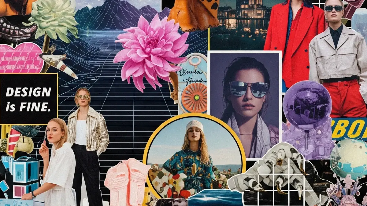
8. Graphic Design Trend: Retro Futurism and Nostalgia Mashups Tap Cultural Memory
New Retro Graphics and Logo in Retro Style.Nostalgia is a powerful tool when combined with modern sensibilities. Designers are borrowing cues from the 1980s, 1990s, and early 2000s—grainy textures, pixelated icons, neon accents, and chrome gradients—and blending them with contemporary layouts. Some call this retro‑futurism redux, blending metallics, grids, and lo‑fi effects from the 1970s and ’80s with current design sensibilities. Many trend watchers anticipate a retro revival, with nostalgic aesthetics—from punk and gothic influences to early digital throwbacks—reimagined in a modern context.
What it means
Retro futurism taps into collective memories while embracing innovation. Done well, it feels familiar yet exciting. Designers use nostalgic elements sparingly, layering them over clean layouts to prevent kitsch. The trend also reflects a cultural desire to reclaim past aesthetics while making them relevant for the digital age.
How to use it
- Integrate retro fonts, pixel art, or neon accents into modern layouts.
- Use nostalgic textures—like VHS grain or chrome gradients—on specific elements rather than whole pages.
- Balance retro motifs with contemporary typography and grids to maintain usability.
9. Graphic Design Trend: Typography as Identity—Expressive Typefaces Take Center Stage
Cinema Font Family by Los AndesTypography is becoming more than a support element; it is central to brand identity. High‑contrast serif fonts are returning to headlines and navigation, adding sophistication and heritage to minimal layouts. Many agencies emphasise typography as identity, predicting that bold custom typefaces and expressive lettering will become central to brand identities and campaign assets. Variable fonts and kinetic typography allow type to adapt across platforms and sizes, maintaining personality.
What it means
Expressive typography differentiates brands in a crowded visual landscape. The resurgence of serifs signals a move towards elegance and trust. Variable fonts enable responsive design without losing identity. Designers are experimenting with distorted or altered type to give words their own personality. When type becomes the hero, it can communicate mood and values before a user reads a single word.
How to use it
- Invest in custom or variable fonts that align with a brand’s personality.
- Experiment with kinetic type in digital contexts—motion can emphasize hierarchy or emotion.
- Use altered or distorted type sparingly to add character without sacrificing legibility.
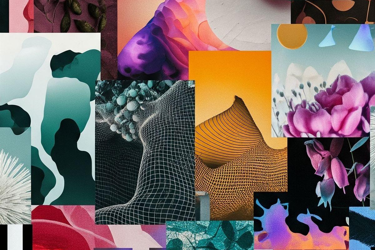
10. Graphic Design Trend: Organic, Generative, and Data‑Driven Visuals Reshape Storytelling
Organic, Generative, and Data‑Driven VisualsThe last trend looks at how nature, algorithms, and data inform aesthetics. Designers are turning raw numbers into meaningful narratives through data‑driven storytelling. There is a surge of organic, free‑flowing forms—blobs, waves, and irregular outlines—that make digital layouts feel human and playful. Mixed‑media and collage aesthetics are also rising, where photography, 3D renders, illustrations, and AI‑generated elements combine to create tactile visuals. A natural twist appears through biophilic design, which incorporates natural elements, patterns, and textures to create harmony and reduce stress. Parametric and generative graphics use code and algorithms to generate dynamic shapes and responsive 3D art; they are appearing in architecture, data visualization, and product design.
What it means
Organic graphics counteract the rigidity of grid systems and bring a sense of spontaneity. Biophilic and nature‑inspired designs respond to a collective longing for connection with the natural world. Generative art and parametric design allow visuals to adapt in real time, creating living identities. Data‑driven storytelling transforms abstract numbers into emotional narratives that engage audiences and convey complexity with clarity.
How to use it
- Introduce organic shapes and mixed‑media textures in backgrounds and hero sections.
- Use generative tools to create adaptive illustrations or infographics that respond to user data.
- Build data visualizations that combine aesthetics with storytelling, making complex information accessible and engaging.
The Takeaway: Designing for a Future that Feels Human
In summary, the graphic design trends forecast for 2026 reveals a field that is both technologically advanced and deeply human. AI empowers creativity while artisanship and imperfection reclaim authenticity. Neo‑brutalism strips away clutter, yet emotion and warmth soften minimalism. Sustainability and inclusivity are no longer optional; they are expectations. Immersive experiences expand our canvas, and expressive typography speaks volumes. Organic forms, retro motifs, and generative algorithms enrich visual language. The common thread is empathy—designers are using every tool available to create experiences that resonate, inspire, and adapt. How will you incorporate these emerging directions into your work? Understanding these graphic design trends is the first step. The next step is to experiment, iterate, and find your voice within them.
Check out WE AND THE COLOR’s Graphic Design section for more creative inspiration.
Subscribe to our newsletter!
By continuing, you accept the privacy policy


Stay ahead this fall with the hottest UI/UX trends of 2025! From immersive 3D interfaces and advanced microinteractions to dynamic layouts, design smarter and engage better across all devices.
#UIUX #DesignTrends #Fall2025 #UserExperience #WebDesign
https://zinkmag1.wordpress.com/2025/10/10/ui-ux-trends-to-watch-this-fall/
The death of industrial design and the era of dull electronics
https://hackaday.com/2025/07/23/the-death-of-industrial-design-and-the-era-of-dull-electronics/
#HackerNews #industrialdesign #dulltechnology #electronics #designtrends #innovation
Paris Design Week + Maison & Objet bring global design to us! September 4-13. A perfect reminder to stay curious, explore trends, and push creative boundaries. #ParisDesignWeek #MaisonEtObjet #FreelanceLife #DesignTrends #CreativeJourney

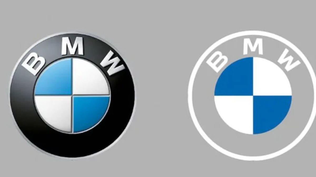
BMW’s new logo was hidden in plain sight — and most people didn’t even notice. Here’s what’s changed and why it matters for the automaker’s future. https://english.mathrubhumi.com/auto/bmw-new-logo-design-2023-ode4y0vm?utm_source=dlvr.it&utm_medium=mastodon #BMW #BMWLogo #Rebrand #DesignTrends #FutureOfMobility
Symmetry Design is where elegance meets precision. We create spaces that flow with balance, harmony, and timeless style—crafted to inspire and designed to last. #SymmetryDesign #InteriorStyle #DesignTrends #ModernInteriors #HomeInspiration

What Are the Top Graphic Design Trends in 2025?
We’re going to dive into the most exciting graphic design trends in 2025 that are shaping how we create and consume visual content. Get ready to see how AI, nostalgia, and a whole lot of color are coming together.
Website: https://ondigitals.com/graphic-design-trends-in-2025/
#ondigitals #graphicdesign #designtrends #marketing

Client Info
Server: https://mastodon.social
Version: 2025.07
Repository: https://github.com/cyevgeniy/lmst