Navpreet Kaur styles perfect Indian outfits so you feel best dressed. Her boutique is in its first year, running alongside her family life. BEST DRESSED | Jan 30th | CPICS ORIGINAL
👉 Ad-Free • 30 Days Free | https://cpics.tv/home #DesignerLife #BehindTheScenes #FashionReels #SmallBusiness #CreativeProcess #ReelsInstagram
#DesignerLife
Best dressed for your event? Navpreet Kaur's boutique finds your perfect Indian outfit. In year one, she balances this new business with family life. BEST DRESSED | Jan 30th | CPICS ORIGINAL 👉 Ad-Free • 30 Days Free | https://cpics.tv/home #DesignerLife #BehindTheScenes #FashionReels #SmallBusiness #CreativeProcess #ReelsInstagram
Visit Navpreet Kaur's boutique for the perfect Indian event outfit. It's her first year in business, dedicated to making you the best dressed while she manages her family. BEST DRESSED | Jan 30th | CPICS ORIGINAL 👉 Ad-Free • 30 Days Free | https://cpics.tv/home #DesignerLife #BehindTheScenes #FashionReels #SmallBusiness #CreativeProcess #ReelsInstagram

Editor bach gaya ✅
Graphic designer phas gaya 🎨💀
Approval editor ko mila,
“bas thoda sa graphic change” designer ko mila 😌
Agency life: FINAL bhi kabhi final nahi hota 🤡
#DesignerLife #AgencyLife #QuickuppSoftech
🌟 Step into the world of high couture, Hollywood dreams, and unstoppable ambition! Watch now! 👠 Start your 30-day free subscription today — only on 👉 https://cpics.tv/home #RedCarpetReady #ShekharRahate #CpicsOriginals #HollywoodFashion #CoutureDesigner #MumbaiToHollywood #RedCarpetStyle #FashionJourney #DesignerLife #BehindTheGlam
BEST DRESSED | Jan 30th | CPICS ORIGINAL
👉 Ad-Free • 30 Days Free | https://cpics.tv/home #DesignerLife #BehindTheScenes #FashionReels #SmallBusiness #CreativeProcess #ReelsInstagram
BEST DRESSED | Jan 30th | CPICS ORIGINAL
👉 Ad-Free • 30 Days Free | https://cpics.tv/home #DesignerLife #BehindTheScenes #FashionReels #SmallBusiness #CreativeProcess #ReelsInstagram
BEST DRESSED | Jan 30th | CPICS ORIGINAL
👉 Ad-Free • 30 Days Free | https://cpics.tv/home #DesignerLife #BehindTheScenes #FashionReels #SmallBusiness #CreativeProcess #ReelsInstagram
Need the perfect Indian outfit? Designer Navpreet Kaur helps. Her new boutique focuses on making you feel best dressed while she balances family life. BEST DRESSED | Jan 30th | CPICS ORIGINAL 👉 Ad-Free • 30 Days Free | https://cpics.tv/home #DesignerLife #BehindTheScenes #FashionReels #SmallBusiness #CreativeProcess #ReelsInstagram
Navpreet Kaur designs perfect Indian outfits for any occasion. In her first year, she balances her boutique and family so you feel best dressed. BEST DRESSED | Jan 30th | CPICS ORIGINAL 👉 Ad-Free • 30 Days Free | https://cpics.tv/home #DesignerLife #BehindTheScenes #FashionReels #SmallBusiness #CreativeProcess #ReelsInstagram

Designer Navpreet Kaur finds you the perfect Indian outfit for any event. In her boutique's first year, she balances work and family to ensure every client feels their best. BEST DRESSED | Jan 30th | CPICS ORIGINAL 👉 Ad-Free • 30 Days Free | https://cpics.tv/home #DesignerLife #BehindTheScenes #FashionReels #SmallBusiness #CreativeProcess #ReelsInstagram


🌐 Marco Triverio lascia Apple.
Il lead designer di Safari si unisce a The Browser Company, startup che sviluppa Dia, un browser incentrato sull'intelligenza artificiale.


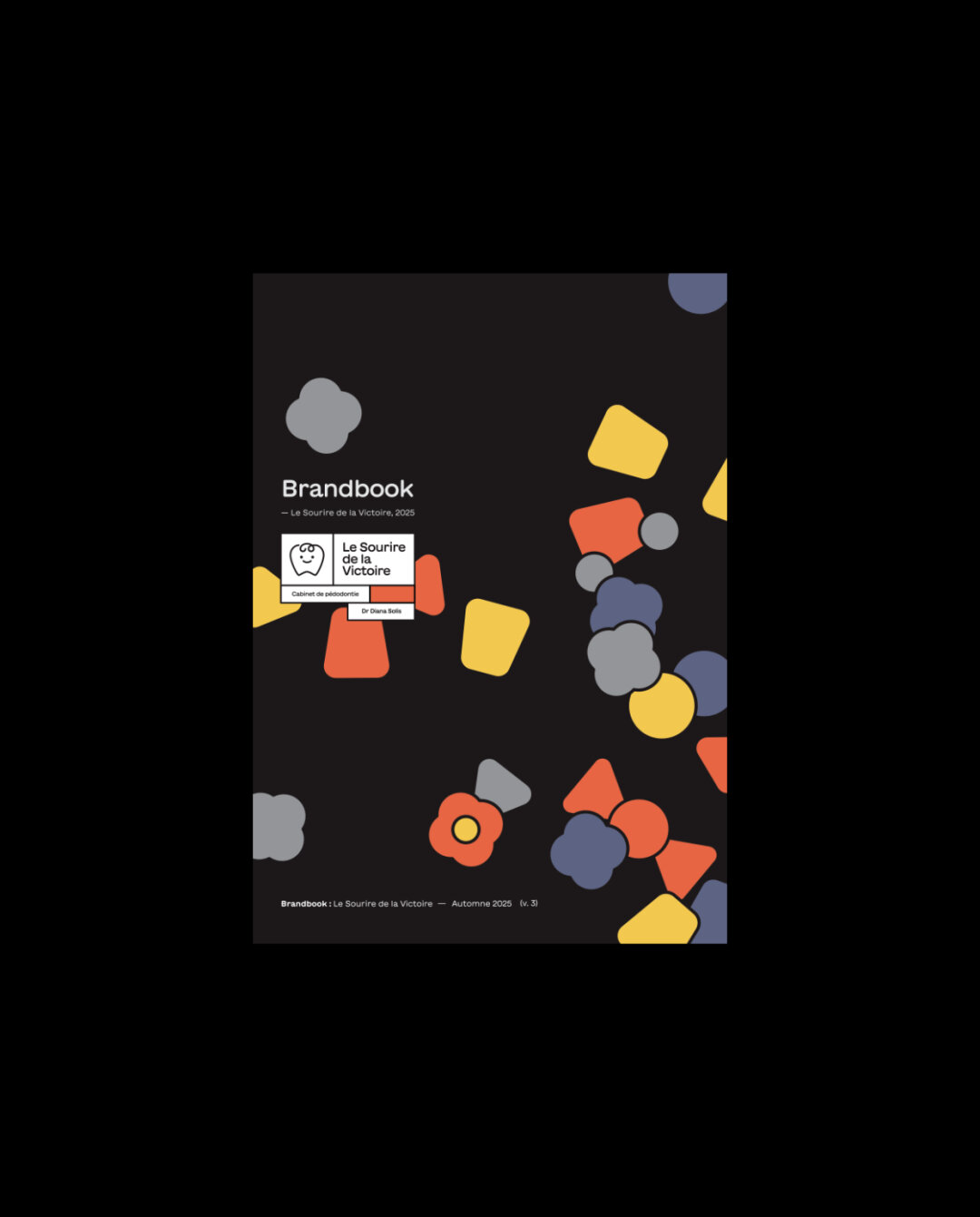
crc.studio designed a flexible visual identity for a pediatric dental clinic in Aix-en-Provence, France, balancing professionalism and playfulness to reassure parents and ease children’s fears, 2025.
● FOR: Dr Diana Solis
● TYPEFACES: GT Maru
● MORE: https://crc.studio/works/branding-for-kids-dentist
____________
#branding #visualidentity #design #graphicdesign #branding #creative #designstudio #digitaldesign #uxui #designerlife #visualdesign #designprocess #pediatricdentist #healthcaredesign #brandingforkids #designforchildren #visualidentity #graphicdesignstudio #softbranding #friendlydesign #designforhealth #aixenprovence #crcstudio #gtmaru


polure.com
#Polure #poliüretanahşapkiriş #poliüretan #ahşapdoku #dekorasyon #poliüretandekoratifürün #dekoratifürünimalatı #ahşapkiriş #dekoratifpoliüretan #HomeDesign #HomeDecor #InteriorDesign #InteriorDesigner #Interiors #InteriorDecoration #ExteriorDesign #DecorIdeas #Decor #Decoration #DesignInspiration #DesignLovers #Architecture #Architectural #ArchitectureLovers #ModernDekorasyon #KlasikDekorasyon #ElegantDesign #CreativeDesign #DesignerLife #Render #3D #Spaces #LuxuryDesign

What I love about Figma, that the white screen before the loading screens stays longer than the loading screen itself, so perfectly optimized.

A fundamental part of my design practice is dedicated to documenting the projects I work on. It's more than just keeping records; it's a ritual of reflection. By revisiting each step in @inkscapeofficial #DesignProcess #Inkscape #GraphicDesign #DesignThinking #CreativeProcess #Documentation #DesignerLife #ProcessOverOutcome #CreativePractice #VectorArt #DesignStudio #ReflectivePractice

polure.com
#Polure #PoliüretanKaplamalıSaksı #HomeDesign #HomeDecor #InteriorDesign #InteriorDesigner #Interiors #InteriorDecoration #ExteriorDesign #DecorIdeas #Decor #Decoration #DesignLovers #Architecture #Architectural #ModernDekorasyon #KlasikDekorasyon #ElegantDesign #CreativeDesign #DesignerLife #Render #3D #Spaces #LuxuryDesign #LuxuryLiving #DreamHome #DreamDesign #Kesfet #Kesfetteyiz #polyurethane #mimari #architecture #poliüretan
polure.com
#Polure #polüretansütun #sövemodelleri #fuardekorasyon #içmekantasarımları #dışmekandekorasyon #mimariürünler #fuarstandtasarımı #dekoratifürünler #mimaritasarım #tasarımçözümleri #HomeDesign #HomeDecor #InteriorDesign #InteriorDesigner #Interiors #InteriorDecoration #ExteriorDesign #DecorIdeas #Decor #Decoration #DesignInspiration #DesignLovers #Architecture #Architectural #ArchitectureLovers #ModernDekorasyon #KlasikDekorasyon #ElegantDesign #CreativeDesign #DesignerLife


Client Info
Server: https://mastodon.social
Version: 2025.07
Repository: https://github.com/cyevgeniy/lmst