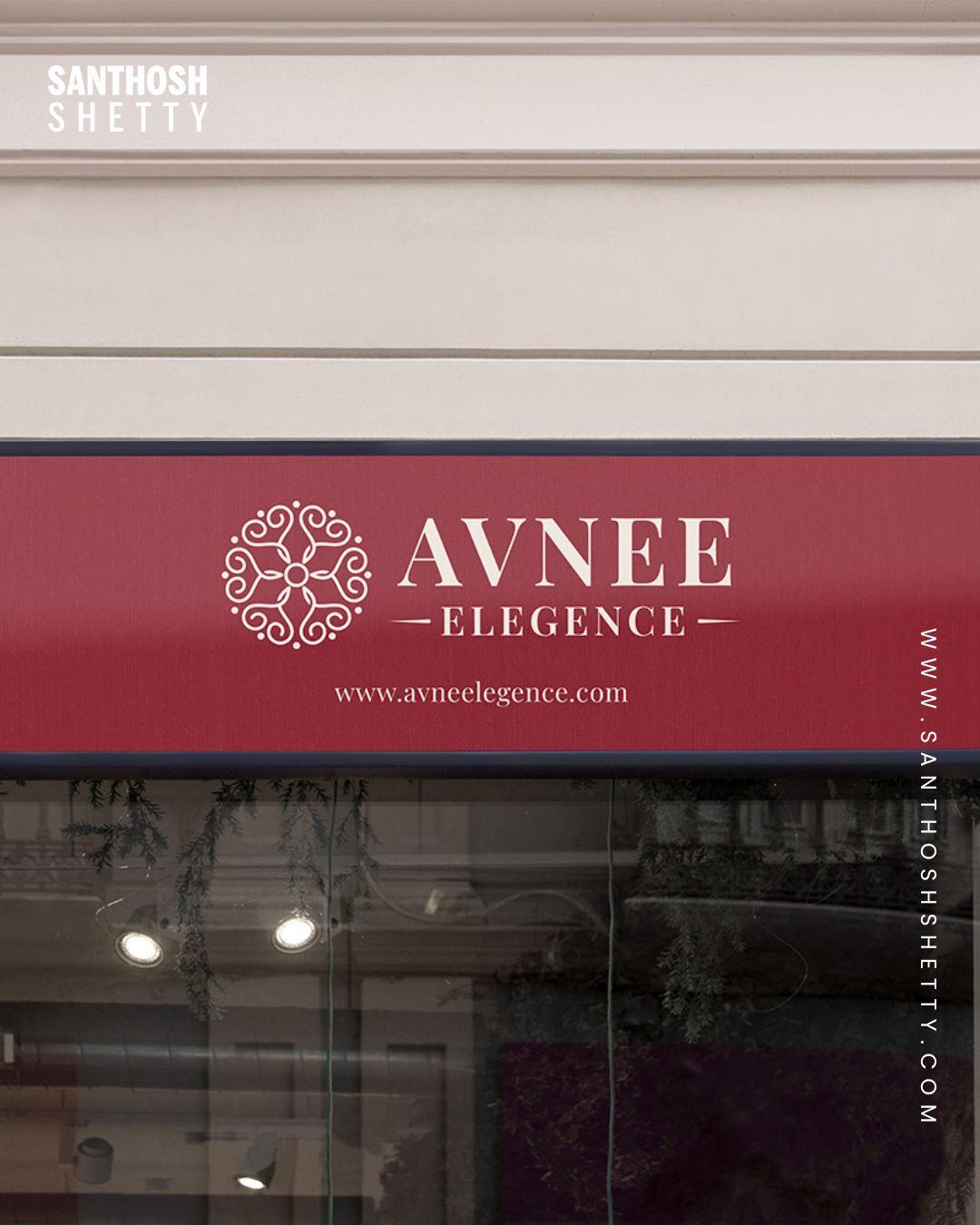
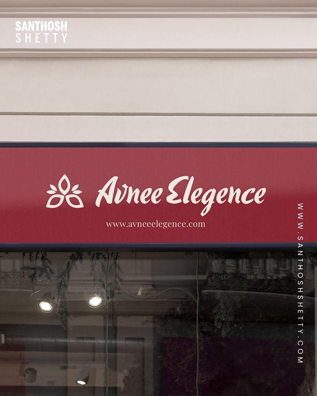
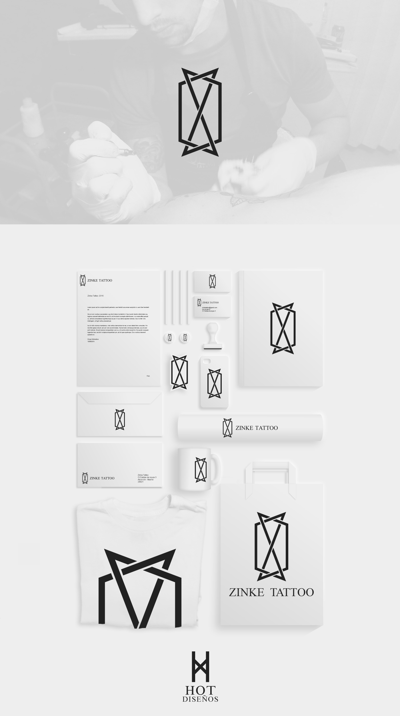
Check out this re-brand of Downtown Arts District! đ¨ đźď¸ 𩷠đ
#REMIXED #BrandingAgency #IntegratedMarketing #Design #Rebrand #BrandRefresh #VisualIdentity #Logo #ColorPalette #BrandTone #BrandMessaging #ExpertlyCrafted
Check out this re-brand of Downtown Arts District! đ¨ đźď¸ 𩷠đ
#REMIXED #BrandingAgency #IntegratedMarketing #Design #Rebrand #BrandRefresh #VisualIdentity #Logo #ColorPalette #BrandTone #BrandMessaging #ExpertlyCrafted
Excited to keep growing as a photographer and creator under the name scootgaze â a blend of curiosity, focus, and creative perspective. More to come soon đď¸đ¸
www.scootgaze.com
#photography, #photoart, #logo, #branding, #scootgaze, #scoot2hoot, #photographerlife, #creativebranding, #artistlogo, #freelancephotographer, #visualidentity, #indieartist, #minimaldesign, #digitalart, #supportlocalartists
⨠Build a Brand That Speaks for Itself!
From logos to complete visual identity â we create designs that define YOU. đ¨đĽ
âď¸ Custom Approach
âď¸ Creative Concepts
âď¸ Consistent Branding
Letâs craft a unique identity for your business! đ
đ 9670288000
đ digitalclickslucknow.com
#BrandDesign #VisualIdentity #LogoDesign #DigitalClicksLucknow #CreativeAgency #DesignThatSpeaks #LucknowBusiness #BrandingStudio
Strict rules for #visualidentity are out. But letâs be real: an old, solid and chunky brand manual, especially a physical one, is straight-up designer candy.
Sometimes brands need a little make over. Check out this before and after of Complete Care.
@remixed #BrandingAgency #IntegratedMarketing #Design #Branding #Logos #ColorPalette #Typography #Tone #VisualIdentity #ExpertlyCrafted
How to Build a Cohesive Visual Identity for Your Brand (Even If Youâre Not a Designer) https://weandthecolor.com/how-to-build-a-cohesive-visual-identity-for-your-brand-even-if-youre-not-a-designer/204235
#design #graphicdesign #branding #brandidentity #visualidentity #branddesign #corporatedesign #corporateidentity
How to Build a Cohesive Visual Identity for Your Brand (Even If Youâre Not a Designer)
A memorable brand doesnât just happen by accident. It is meticulously crafted, piece by piece. Central to this craft is a cohesive visual identity, the silent ambassador that speaks volumes before a single word is read. This identity is the collection of all visual elementsâfrom the logo and color scheme to the typography and imageryâthat work together to represent the brandâs essence. When executed correctly, a cohesive visual identity builds immediate recognition and fosters a deep sense of trust. It tells a story, evokes emotion, and makes a promise to the customer.
Think about the brands you love. Their visual language is so distinct that you could recognize it from a single color or font. This guide is for the entrepreneur, the marketer, and the creator who understands this power but doesnât have a design background. It will walk you through building a powerful visual presence from the ground up.
Why a Cohesive Visual Identity Is Your Greatest Asset
A strong visual presence is more than just looking good; itâs a fundamental business strategy. Consistency across all platforms, from your website to your social media profiles and packaging, creates a seamless and professional experience. Subsequently, this professionalism builds credibility. When a customer sees that every detail is thoughtfully aligned, they subconsciously trust that your product or service will be just as meticulous.
Furthermore, this consistency is the key to brand recognition. Humans are visual creatures. We process images significantly faster than text. As a result, a cohesive visual identity makes your brand instantly identifiable in a crowded marketplace. This immediate recall is invaluable. Itâs the difference between being scrolled past and being stopped for. Ultimately, a powerful visual brand identity connects with people on an emotional level, turning passive viewers into loyal advocates. What feeling do you want your brand to evoke?
Step 1: Discover Your Brandâs True Essence
Before choosing a single color or font, one must first look inward. A visual identity without a soul is just a collection of pretty elements. It lacks direction and purpose. Therefore, the first and most critical step is to define your brandâs essence. This is the foundation upon which every visual decision will rest.
Ask yourself some fundamental questions.
Answering these questions provides the strategic brief for your visual brand. This exercise ensures that your cohesive visual identity is not just aesthetically pleasing but also strategically sound and authentically you.
Step 2: Choose a Purposeful Brand Color Palette
Color is a language of emotion. The colors you choose will be one of the most powerful and recognizable elements of your brand. They set the mood and influence perception in an instant. For this reason, selecting a brand color palette should be a deliberate process, rooted in the brand essence you just defined.
Start by exploring color psychology. For example:
However, these are not strict rules. Context and culture matter. A bright, playful yellow feels very different from a muted, earthy ochre. Your goal is to find a palette that reflects your brandâs specific personality. Excellent tools like Coolors and Adobe Color can help you generate beautiful, harmonious palettes. Start with one or two primary colors that represent your core values, and then add two to three secondary and accent colors for flexibility in your designs. This structure is essential for maintaining a cohesive visual identity across different applications. If you want to learn more about this topic, feel free to take a look at our article about how to find the perfect color palette for your brand.
Step 3: Select Typography That Finds Your Voice
If colors set the mood, typography gives your brand its voice. The fonts you choose can make your brand feel modern and clean, classic and elegant, or friendly and approachable. Choosing brand typography is a crucial step in building your visual identity. A thoughtful font selection can significantly enhance readability and personality.
Generally, fonts fall into a few main categories:
For a balanced and cohesive visual identity, a good practice is to choose two fonts: one for headlines (a display or bold serif/sans-serif) and one for body text (a clean, readable serif or sans-serif). Resources like Google Fonts offer a vast library of free, high-quality fonts, while platforms such as MyFonts or Creative Market provide premium typefaces, and Adobe Fonts is the ideal option for those with a Creative Cloud subscription. When you find a pairing you love, stick to it. Consistency is key. Check out this handpicked selection of the 5 best branding fonts in 2025.
TT Biersal Font Family TypeType You can purchase the typeface at Creative MarketStep 4: Use Smart Templates to Ensure Consistency
Here is where the non-designer can truly shine. You have defined your essence, chosen your colors, and selected your fonts. Now, how do you apply this cohesive visual identity consistently across every single touchpoint without hiring a designer for every task? The answer is templates.
Templates are your secret weapon for brand consistency. They are pre-designed files where you can easily plug in your own content while the core visual structure remains intact. This ensures every social media post, presentation, or newsletter looks like it came from the same brand.
Look for template resources that align with your needs:
Using templates saves an immense amount of time. More importantly, it creates a visual system that reinforces your brand identity with every piece of content you publish.
Step 5: Create a Brand Style Guide for a Cohesive Visual Identity
A brand style guide is the single source of truth for your visual identity. Itâs a document that outlines all your visual rules, ensuring that anyone working on your brandâwhether itâs you, a future employee, or a freelancerâcan apply the identity correctly. Creating a brand style guide is the ultimate step in formalizing your cohesive visual identity.
Your style guide doesnât need to be a hundred pages long. A simple one-page document is often enough to start. It should include:
This guide acts as a reference point, eliminating guesswork and empowering consistency. On platforms like Adobe Stock, Envato Elements, or Creative Market, you can find plenty of downloadable, fully customizable brand style guide templates to help you get started on this crucial document.
Adobe InDesign Brand Guidelines Presentation Template by GraphicArtist You can download this template from Adobe StockBonus: AI Tools to Accelerate Your Creative Process
Artificial intelligence is no longer a futuristic concept; itâs a practical tool that can significantly speed up the process of building a visual identity. While AI canât replace the strategic thinking of defining your brand essence, it can be a powerful assistant for visual exploration.
These tools are best used for inspiration and rapid prototyping. They can help you visualize ideas quickly, making the creative journey more efficient and accessible, even if youâre not a designer.
Building a cohesive visual identity is a journey, not a destination. Your brand is a living entity that will grow and evolve, and its visual expression should have the flexibility to do so as well. Do not aim for perfection from day one. Instead, aim for a strong, well-reasoned foundation. Use the steps outlined here to create an identity that feels authentic to you and connects with your audience right now.
Then, listen and observe. Pay attention to feedback. See what resonates. As your business grows and your understanding of your market deepens, you may find the need to refine a color, update a font, or refresh your imagery. That is a sign of a healthy, responsive brand. Your visual identity is a powerful tool. Use it, refine it, and let it grow with you.
#brand #brandDesign #brandIdentity #branding #design #graphicDesign #howTo #learn #visualIdentity
A memorable visual identity is a powerhouse for family businesses. It's not just about aestheticsâit's your story, values, and legacy. Real stories, thoughtful logos, purposeful colors, real photos, and consistent use make your brand irresistible. Authentic visuals create trust and loyalty, turning customers into lifelong fans. #FamilyBusiness #Branding #VisualIdentity #Authenticity #Design #Marketing #SmallBusiness
ASTRE Collective Visual Identity: How Parcour Studio Designed the Future of Sound
Some design projects simply create a logo. Others build an entire universe. The ASTRE Collective visual identity, masterfully crafted by Istanbul-based Parcour Studio, falls firmly into the second category. Itâs a remarkable case study in translating something as intangible as immersive audio into a tangible, compelling, and unforgettable visual language. This isnât just about looking good; itâs about creating a system that feels as innovative and layered as the spatial audio experiences ASTRE Collective produces. When a brandâs mission is to pioneer the very future of listening, how do you even begin to capture that in a visual form? You start by looking back, and then you leap forward.
Parcour Studioâs work for ASTRE is more than just successful branding. It serves as a powerful reference for anyone interested in branding, graphic design, and the intersection of art and technology. It shows us how deep strategic thinking, coupled with a respect for history, can produce something truly groundbreaking. Letâs explore the thoughtful process behind this exceptional project.
ASTRE Collective Visual Identity Design by Parcour StudioThe Minds Behind the Magic: Meet Parcour Studio
To understand the brilliance of this project, you first need to meet the creators. Parcour Studio was founded in Istanbul in 2020 by Deniz Damar and Burak TÄąÄlÄą, two designers with impressive pedigrees and a shared vision. Both are graduates of Marmara Universityâs prestigious Faculty of Fine Arts, with experiences at top European design schools, ENSAD Paris and ENSAD Dijon, respectively. Their combined experience in branding, strategy, editorial design, and illustration gives them a uniquely holistic perspective.
What truly defines Parcour Studio is their philosophy. They operate on a foundation of smart solutions, boundless creativity, and genuine teamwork. Instead of imposing a rigid style, they engage in a dynamic exchange of ideas with their clients. Their goal is to help brands reach their full potential by proposing timeless solutions that are built to evolve. This approach was essential for a forward-thinking client like ASTRE Collective.
More Than a Record Label: The ASTRE Collective Mission
So, what exactly is ASTRE Collective? Think of them as audio architects. They are an immersive record label focused on pushing the known boundaries of sound. Their work centers on producing, recording, and mixing for Dolby Atmos and Spatial Audio, creating an unparalleled listening experience for audiences. In fact, they are the only record label utilizing a unique two-channel Atmos mix, which allows them to deliver groundbreaking audio fidelity even on standard stereo platforms.
This venture is inspired by the legacy of music industry legend Mike Miller and his âAtmosphere Studios.â Millerâs pioneering work with artists like Harry Styles, SZA, and Tyler, The Creator has left a massive mark on the world of mixing. Consequently, ASTRE Collective carries this torch forward, aiming to support artists and develop innovative projects that will shape the future of music. The challenge for Parcour Studio was clear: how do you brand a legacy and a future at the same time? How can graphic design services convey such a complex, technical, and artistic mission?
Crafting the ASTRE Collective Visual Identity: A Nod to the Golden Age
Parcour Studio began its design process not by looking at current trends, but by turning to the golden age of the music industry. The 1960s and 70s were a time of incredible visual confidence. This aesthetic wasnât just on iconic album covers and posters; it was also used by technology companies promoting their state-of-the-art music equipment. It was an era of bold, unapologetic design.
In contrast to the minimalist, often sterile, design approaches that came later, this period celebrated large, confident typography and fonts with strong, decorative character. This became a key reference point. The ASTRE Collective visual identity needed to feel both classic and futuristic, established yet experimental. By drawing from this rich visual history, Parcour Studio gave the brand a sense of authority and cultural resonance right from the start. It was a clever move, grounding a futuristic technology in a past that music lovers inherently trust and admire.
A Typographic Solution That Speaks Volumes
One of the most innovative elements of the project is its typographic system. In design, we often rely on standard tricks like bold or italics to create emphasis. Parcour Studio rejected this convention entirely. Instead, they developed a much more imaginative visual solution.
To highlight keywords, they enclosed them in soft, balloon-like shapes, subtly lifting them from the baseline of the text. What does this accomplish? First, it creates an incredibly strong and easily recognizable typographic mark that is uniquely ASTREâs. You see it once, and you remember it. Second, it brilliantly references the brandâs identity. The floating shapes subtly evoke celestial bodies and the âatmosphereâ central to their work. Isnât that a clever way to embed meaning directly into the text? This is a prime example of how to create a visual identity for a record label that is both functional and deeply conceptual.
This choice is perfect for social media, creating instantly shareable and visually distinct text blocks that cut through the noise. Itâs a design element that works just as well in a block of copy as it does as a standalone graphic.
A System of Symbols and Colors
ASTRE Collective isnât a monolithic entity. Itâs a brand that speaks to multiple fields within the music ecosystem. Because of this, it needed a unified voice and a coherent visual system that could adapt to different contexts. The solution Parcour Studio devised is a masterclass in brand strategy.
They designed a central symbol and a main logotype to ensure brand integrity across all activities. Then, they created sub-logos for various projects. To give this structure more depth, they defined ASTREâs four foundational pillars with a unique color code:
Each pillar received its own color. These colors were then used to create a system of lines, generating adaptable visual forms that can be used in countless scenarios. This is where the ASTRE Collective visual identity transcends simple aesthetics and becomes a functional system. The colors arenât just decorative; they carry specific meaning and help organize the brandâs offerings. The bold and vivid palette feels energetic and modern, perfectly reflecting the brandâs innovative spirit.
Why This Branding Resonates So Deeply
The collaboration between Parcour Studio and ASTRE Collective is a resounding success because it solves a complex problem with elegance and intelligence. It manages to:
For anyone searching for the best branding for music tech companies or innovative graphic design for audio brands, this project is a benchmark. It demonstrates that the most effective branding comes from a deep understanding of the clientâs mission, a willingness to think systematically, and the creative courage to break from convention. The ASTRE Collective visual identity by Parcour Studio doesnât just represent soundâit has a voice all its own.
All images Š Parcour Studio. Feel free to find other graphic design and branding projects showcased here at WE AND THE COLOR.
Dingo InformĂĄtica (2015)
#design #graphicdesign #brand #branding #visual #logo #logotype #typography #identidadvisual #visualidentity
NEW RELEASE: VZWO Egen
Maximum presence in minimal space. This is VZWO Egen.
Discover and try the typeface here:
đđť www.viktorzumegen.de
â
#typedesign #fontdesign #displaytype #spacetypography #minimaltype #typeinspiration #logotype #variablefont #typographicclarity #graphicdesign #brandingdesign #typeexploration #visualidentity #fontlove #designprecision #creativefonts #modernfonts #typelovers #sansserif #letteringdesign #headlinedesign #tightspacing #uniquelettering #designtypography
Your Brand Ainât Just a Logo: Build What People Feel
Letâs be clearâyour brand is not just that lilâ Canva logo you threw together at 3AM. Branding is how people feel when they hear your name, click your link, or scroll your page. Itâs your tone, your style, your storyâhell, even your IG captions.
If your brand donât got vibes, it donât got value. And I donât mean âaestheticâ just for the âGramâIâm talking consistency, clarity, and connection. Thatâs [âŚ]
Build a brand with consistent visuals.
Learn More at https://glitchbox.net
Jâai retravaillĂŠ le visuel de ma chanson BĂťcher dans le tas.
Je voulais quâil y ait encore plus de jaune, plus de feu, plus de lumière. đđĽ
#singlecover #coverart #musicartwork #albumart #visualidentity #indiemusic #undergroundartist #artdirection #graphicrevamp #newvisuals #musicrelease #independentartist #altmusic #creativemusician #musicbranding
âPUREFORMA | Where Minimalism Meets Elegance â Logo & Brand Identity Revealâ
Step into the world of refined aesthetics with PureForma.
đ Let the design speak for itself â PureForma isnât just a name, itâs a statement.
#PureForma, #LogoDesign, #BrandIdentity, #MinimalDesign, #LuxuryBranding, #LogoReveal, #DesignInspiration, #CreativeBranding, #VisualIdentity, #ElegantDesign, #TypographyLogo, #ModernLogo, #GraphicDesign, #DesignerShowcase, #BrandAesthetics
#Business #Collections
The Brand Styleguide Showcase ¡ Handpicked brand guidelines from around the world https://ilo.im/163qbu
_____
#Brand #Marketing #VisualIdentity #Design #ProductDesign #UxDesign #UiDesign #VisualDesign #WebDesign
đĽ BLAZE is born!
Here's a sneak peek at my latest logo design and animationâbold, fiery, and built to ignite any brandâs presence. The custom âAâ flame adds that perfect spark of identity
đĽ Watch the animation and let me know what you think! Would you rock a logo like this for your brand?
#LogoDesign, #BrandIdentity, #GraphicDesign, #AnimatedLogo, #LogoAnimation, #MotionGraphics, #CreativeDesign, #TypographyDesign, #VisualIdentity, #DesignToMotion, #FreelanceDesigner, #BlazeLogo, #DesignShowcase
⨠Brand Style Guideline Design â¨
đ Brand design focuses on simplicity, using clean lines, limited colors, and essential elements to create a memorable and versatile brand identity.
Let's order now!
#brandstyleguide #visualidentity #brandingdesign #brandidentity #logodesign #designinspiration #graphicdesigndaily #creativedesign #designtips #brandstrategy #typographydesign #colorpalette #brandguidelines #SocialMediaDesign #designreels #marketingdesign #contentfordesigners #reelsvideo #viralvideo