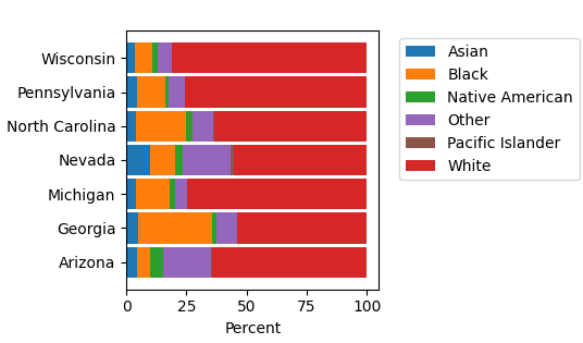
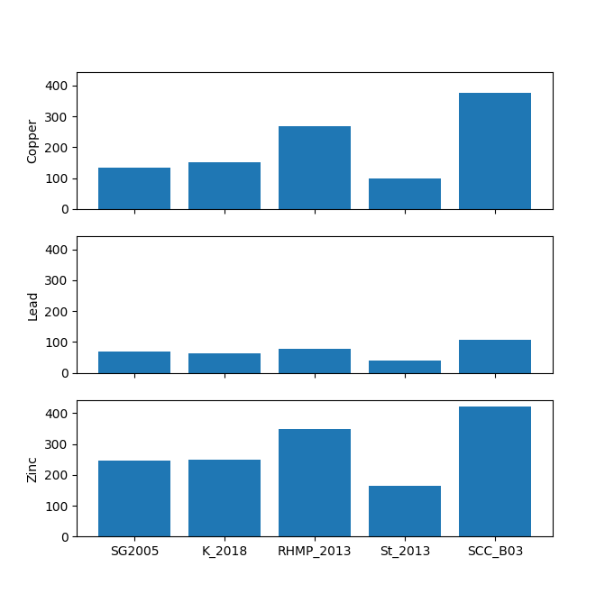
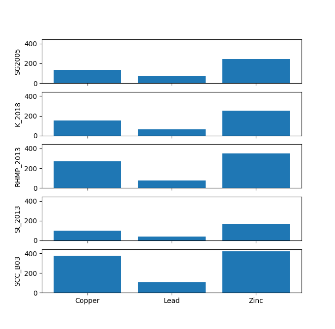
#Mapdata

The data explorer mapdata.py (pypi.org/project/mapdata/) has a new plotting tool that displays percentages for a set of numerical variables and a single categorical variable. Percentages can be calculated either by variable or by category. Data can be aggregated by min, max, mean, median, sum, or count prior to calculation of percentages.

#MapData #DataExploration #DataAnalysis #DataViz #DataVisualization #Plotting #Python #FOSS #FLOSS

A set of horizontal bars, one for each of six ethnic categories, showing the percentage of total (censused) individuals in each of the seven swing states in the 2024 U.S. presidential election.A set of horizontal bars, one for each of the seven swing states in the 2024 U.S. presidential election, showing the percentage of total (censused) individuals in each of six ethnic categories.

A new plotting tool in the data explorer mapdata.py (pypi.org/project/mapdata/) will produce stacked bar charts for any number of numeric variables and one categorical variable. A separate bar chart can be produced either for each category or for each variable.

There is also a new selection tool that highlights complete cases of any set of variables.

#MapData #DataExploration #DataAnalysis #DataViz #DataVisualization #FOSS #FLOSS #Python

Three vertically-stacked bar charts showing the concentrations of metals in different studies.  There is one bar chart for each metal.Five vertically-stacked bar charts showing the concentrations of metals in different studies.  There is one bar chart for each study.

The documentation for the data explorer mapdata.py (pypi.org/project/mapdata/) now includes a visual index to the 40 different types of plots that can be created: mapdata.readthedocs.io/en/late

#MapData #DataViz #DataAnalysis #Plotting #Python #FOSS #FLOSS

A screenshot of the graphical plot index documentation page for mapdata.py, showing 20 of the 40 plot types.

New features in the data explorer mapdata.py (pypi.org/project/mapdata/) are:

* Profile plots of the end members identified using the NMF unmixing tool.

* Plots of unmixing diagnostics to assist in selecting the number of end members.

* A cardinality testing tool to evaluate whether there are one-to-one or one-to-many relationships between columns in the data table.

#MapData #DataAnalysis #DataViz #DataManagement #Python #FLOSS #FOSS

Two stacked bar plots showing the PAH composition of two end members identified by NMF unmixing.A line plot of the Frobenius Norm diagnostic for the NMF unmixing tool in mapdata.py, for 1-10 end members.   The value decreases with increasing number of end members.The cardinality testing tool in mapdata.py, showing an evaluation of whether there is a one-to-one or one-to-many relationship between data columns.  In the illustration, only one key column and one attribute column are being tested.  The results show that there is a one-to-many relationship for the entire data set, but a one-to-one relationship for a selected subset of the data.

The mapdata.py data explorer (pypi.org/project/mapdata/) now will carry out unmixing of data using non-negative matrix factorization (NMF).

This is useful for source identification and allocation for environmental chemistry data.

The values of end members in each case (e.g., sample) can be added to the main data table so that they can then be used for map symbolization, plotting, and other statistical analyses.

#MapData #DataExploration #DataAnalysis #Unmixing #Python #FOSS #FLOSS

The NMF unmixing dialog of mapdata.py.

The 'Find Candidate Keys' tool of mapdata.py (pypi.org/project/mapdata/) now will show a table of duplicated key values with the number of duplicates, and highlight those duplicates on the map.

Also new is a categorical similarity matrix for five similarity measures from Boriah et al. 2008 (epubs.siam.org/doi/10.1137/1.9).

Other updates are listed in the change log (mapdata.readthedocs.io/en/late).

#MapData #DataManagement #DataExploration #DataAnalysis #Python #FOSS #FLOSS

A categorical similarity matrix produced by mapdata.py for three categorical variables and eight cases, using the 'Lin' similarity measure.The 'Find Candidate Keys' dialog of mapdata.py, showing the results of testing a set of three columns; one column is identified as having nulls, and 164 cases have duplicate values.

Many of the plotting and statistical tools in the data explorer mapdata.py (pypi.org/project/mapdata/) allow or require a grouping variable. Locations are identified by two variables, latitude and longitude, so to group by location a variable with a unique identifier for each location is needed. The 'Table/Counts by location' tool will identify such a variable if it exists. Now...

1/2

#MapData #DataAnalysis #DataExploration #Mapping #Statistics #Python #FOSS #FLOSS

The data explorer mapdata.py (pypi.org/project/mapdata/) has the following updates:

* The robust R-square of Kvålseth (jstor.org/stable/2683704) is included with the bivariate statistics.

* A cosine similarity matrix can be calculated for selected variables and cases.

1/3

#MapData #DataAnalysis #DataExploration #Statistics #Python #FOSS #FLOSS

An illustration of the cosine similarity matrix dialog of mapdata.py.

The data explorer mapdata.py (pypi.org/project/mapdata/) has two new statistical tools:

* Parametric and non-parametric one-way ANOVA and related statistics.

* A trend plot per Şen 2012 (ascelibrary.org/doi/10.1061/%2).

#DataExploration #DataAnalysis #MapData #Statistics #Python #FOSS #FLOSS

The bivariate statistics dialog from mapdata.py showing a trend plot per Şen 2012.

An updated version of the data explorer mapdata.py (pypi.org/project/mapdata/) has the following revisions:

* Input data for the t-SNE and UMAP analyses can be transformed by taking either Z scores of variables or L1 norms of rows.

* The t-SNE analysis can now be performed on sparse matrixes.

* The univariate statistics summary now allows a grouping variable to be used.

#DataAnalysis #DataExploration #Mapdata #Python #FOSS #FLOSS

To test installation of mapdata.py (pypi.org/project/mapdata/) under Python 3.12 in a venv (my dev machine runs 3.10), the following additional system packages must be installed during the installation of Python 3.12: libssl-dev, build-essential, libffi-dev, libsqlite3-dev, and tk-dev. After installation of these (e.g., with apt on Debian), the Python installation must be completed with `./configure & make & make install`.

#MapData #Python #Python312

Updates to the mapdata.py data explorer (pypi.org/project/mapdata/) include:

1. Bivariate statistics include Chatterjee's xi correlation coefficient.

2. The correlation matrix can display Pearson, Spearman, Kendall, or Chatterjee correlation coefficients.

3. k-Means clustering can be applied to t-SNE and UMAP analyses. The cluster identifiers can be added to the data table and used for map display or grouping in plots.

#MapData #Statistics #DataExploration #DataAnalysis #Python #FOSS #FLOSS

The mapdata.py dialog for carrying out a Uniform Manifold Approximation and Projection (UMAP) analysis, showing a two-dimensional scatter plot of the projected points, with symbols to distinguish four different clusters of data points derived from k-Means cluster analysis of the UMAP results.

The latest version of the data explorer mapdata.py (pypi.org/project/mapdata/) includes the following new features:

1. Pair plots for any two or more numeric variables.

2. Fitting of univariate data to a selected distribution.

3. A tool for Uniform Manifold Approximation and Projection (UMAP) analysis of multivariate data.

#MapData #Mapping #Statistics #DataAnalysis #Python #FLOSS #FOSS

The pair plot dialog for mapdata.py, showing scatter plots and kernel density plots for a set of three variables.The distribution fitting dialog from mapdata.py, showing a histogram of arsenic concentrations with fitted Normal and logistic distributions, and a table of fitting statistics to the right of the plot.The Uniform Manifold Approximation and Projection (UMAP) dialog from mapdata.py, showing arsenic, copper, and lead selected from a list of variables to the left, and a two-dimensional scatter plot of the projected data set to the right.  The UMAP output shows three distinct groups of samples with different metal compositions.

With the most recent updates, mapdata.py provides several means of finding, or creating, candidate keys (potential primary keys) for an entire data table or a selected subset thereof: mapdata.readthedocs.io/en/late

#MapData #Database #DataAnalysis

The data explorer mapdata.py (pypi.org/project/mapdata/) has the following new features:

* Bubble plots that show the relationships between three numeric variables and one categorical variable.

* A scatter plot of the results of a t-SNE analysis.

* A tool to evaluate candidate keys for all or selected data.

* Additional ROC statistics.

* A tool to create a unique row ID in the data table.

#MapData #Python #DataAnalysis #Statistics #Mapping #FOSS

Illustration of a bubble plot created by mapdata.py, showing the relationships between species diversity metrics (Hill-Shannon Index, Hill-Simpson Index, and total abundance) and location.Illustration of a t-SNE analysis conducted in mapdata.py, showing the variable selection (PCB congeners) and a scatter plot of the t-SNE results, with symbols color-coded by year.

New features in the data explorer MapData.py (pypi.org/project/mapdata/):

1. Saturation, contrast, and brightness of basemap images can be customized.

2. Hovering over a point on a scatter plot will display the label for that point.

3. Data can be recoded to edit the values in an existing column or to add a column with new values to the data table.

#Mapdata #Mapping #DataExploration #Python #FOSS

A map with a satellite image basemap, where the basemap is so dark that the location marker and label are hard to see.A map with a satellite background where the saturation, contrast, and brightness have been adjusted so that the location marker and label stand out more clearly.A scatter plot with the cursor over one point, and a popup showing the label for that point.The dialog that mapdata.py presents to prompt for the column name and expression to use to recode data in the data table.  Options allow the change to be applied to only selected data, only un-selected data, only empty cells, or only non-empty cells.

The contingency table summary of mapdata.py (on PyPI) now includes the risk ratio, odds ratio, and confidence interval for the log odds ratio.

#Statistics #OddsRatio #ContingencyTable #Mapdata #Python #PyPI #FOSS

Screenshot of a dialog showing variable selection and categorization into groups, a 2x2 contingency table for those groups, and statistics for tests of independence, risk ratio, odds ratio, probabilities, and conditional probabilities.

When a spatial data set contains multiple values at a location (e.g., from different dates or depths/elevations), the number of data points at a location, and even the presence of multiple data points at a location, may not be apparent on a 2-D map. The latest version of MapData.py (pypi.org/project/mapdata/) addresses this situation in five ways:

1/6

#Mapping #MapData #DataAnalysis #DataExploration #DataPlotting #Python #FOSS

! Quite Interestingnotqikipedia@toot.io
2023-07-23

Sierra Leone is the world’s roundest country, especially if viewed through a toilet roll tube.

#SierraLeone #Africa #country #countries #shapes #maps #mapdata #GIS #QI #notQI

Client Info

Server: https://mastodon.social
Version: 2025.04
Repository: https://github.com/cyevgeniy/lmst