
From my astronomy class… this video shows where we are located in the Universe!
The Known Universe by AMNH #datavisualization #universe #astronomy
#DataVisualization

Análisis de métricas de capital humano 2026: Visualización de los nuevos parámetros de evaluación de talento en entornos automatizados. 🧠👾 🔗 https://www.glitchmental.com/p/insights-visuales.html #DataVisualization #TalentManagement #HRTech #GlitchMentalMX


I am very proud to see the project Mnemosine by Roberta Valli, developed under my supervision as her thesis project, nominated at the UX Design Awards – Spring 2026 🙌
A well-deserved recognition for a digital platform that fosters the discovery of hidden connections among historical photographs and written documents.
👉 Vote for Mnemosine for the Public Choice Award ✨
https://ux-design-awards.com/winners/2026-1-mnemosine
#uxdesign #UXDA26 #designawards #userexperiencedesign #culturalcollections #AI #datavisualization

The first global conference dedicated to how data visualisation can transform public understanding of our changing planet and support informed decision-making in the face of climate challenges. Visualising Climate 2026 Bologna, Italy • 4–6 November #climate #datavisualization #conference https://visualisingclimate.com/

The first global conference dedicated to how data visualisation can transform public understanding of our changing planet and support informed decision-making in the face of climate challenges. Visualising Climate 2026 Bologna, Italy • 4–6 November #climate #datavisualization #conference https://visualisingclimate.com/
Desglose de componentes: Anatomía de sistemas de audio inteligentes en 2026. Visualización de integración de sensores y NPU en wearables. 🧠👾 🔗 https://www.glitchmental.com/p/insights-visuales.html #DataVisualization #Hardware #TechAnalysis #GlitchMentalMX
Cartografía del diseño de sistemas: Transición del paradigma de superinteligencia hacia la arquitectura de utilidad aplicada en 2026. 🧠👾 🔗 https://www.glitchmental.com/p/insights-visuales.html #DataVisualization #AIArchitecture #Insights #GlitchMentalMX
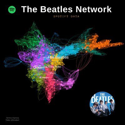
⭐Meet the Gephi Color Palette and Make Beautiful Visualizations
Gephi is the leading visualization and exploration software for all kinds of graphs and networks. Gephi is open-source and free.
I’m sharing a series of tutorials to learn Gephi: https://www.veronicaespinoza.org/gephi-tutorials
____
#gephi @Gephi #NetworkScience #DataScience #DataVisualization


🌀 Đã có WeatherPlot – ứng dụng thời tiết dạng biểu đồ, thay vì icon. Tập hợp nhiệt độ, gió, mưa, thủy triều trong đồ thị tương tác, miễn phí, không quảng cáo. Đang thử nghiệm cho cơn bão phía Đông Bắc Mỹ (Boston). Bạn thấy cải thiện so với giao diện NOAA? #Weather #ThờiTiết #DataVisualization #CôngNghệ #Vietnam
HEXMETRIC ra mắt giao diện V2: Trực quan hơn, tập trung vào KPI chính, so sánh doanh thu - chi phí dễ dàng & thẩm mỹ sạch đẹp. Dành cho solopreneurs và chủ doanh nghiệp nhỏ. #BusinessTool #DataVisualization #SaaS #BuildInPublic #CôngCụKinhDoanh #PhânTíchDữLiệu #SaaS #Startup
https://www.reddit.com/r/SideProject/comments/1qlu1y5/build_in_public_1st_chapter/

I am experimenting with new rendering libraries for the XMPP Network Graph, which shows how servers and users connect across the XMPP network. The graph has grown so large that it does not render well on many devices.
Live demo: https://xmppnetwork.goodbytes.im/sigma.html
#XMPP #Decentralization #Fediverse #OpenSource #DataVisualization #Networking

Người dùng đã phát triển biểu đồ độ sâu thị trường cho Grafana – thứ mà đội ngũ Grafana không tạo trong hơn 3 năm dù nhu cầu từ 2022. Giải pháp sử dụng Plotly với mã nguồn mở trên GitHub, giúp theo dõi order book theo thời gian thực. Dễ tích hợp với QuestDB cho xử lý dữ liệu hiệu suất cao.
#Grafana #MarketDepth #Plotly #QuestDB #JavaScript #ThịTrườngTàiChính #ĐộSâuThịTrường #DataVisualization #ThịTrường #BiểuĐồ
https://www.reddit.com/r/programming/comments/1qk1qwi/building_the_market_depth_ch

StarRocks to the rescue! 🚀 Apparently, the #OLAP world was too busy having a mental breakdown over #joins to realize that #StarRocks has some secret sauce that makes them faster than a cat meme's rise to fame. 😂 But hey, who cares about real solutions when we can just keep denormalizing everything into oblivion, right? 🙄
https://www.starrocks.io/blog/inside-starrocks-why-joins-are-faster-than-youd-expect #performance #dataanalytics #datavisualization #technologyhumor #HackerNews #ngated
Repositorio de visualización de datos estratégicos: Presentamos 'Insights Visuales', una sección dedicada a la síntesis gráfica de tendencias tecnológicas para 2026. 🧠👾 🔗 https://www.glitchmental.com/p/insights-visuales.html #DataVisualization #Infographics #TechTrends #GlitchMentalMX


ChartGPU – WebGPU-powered charting library (1M points at 60fps)
https://github.com/ChartGPU/ChartGPU
#HackerNews #ChartGPU #WebGPU #Charting #Library #60fps #DataVisualization

What is Data Visualization and why does it matter?
Data Visualization turns complex data into charts, graphs, and dashboards, making trends easier to understand. It helps teams interpret data faster, improve collaboration across technical and non-technical roles, and support smarter, data-driven decisions.
Explore more: https://www.hitechanalytics.com/blog/what-is-data-visualization-importance-types-benefits/
#DataVisualization #DataAnalytics #BusinessIntelligence #BigData
AI-Powered Search: Explained in Simple Terms #shorts: What is AI-powered search? It's where artificial intelligence meets information retrieval. AI allows computers to behave like people, using machine learning and data science to improve search results. It's not just about chatbots; it's about smarter search. #AIsearch #machinelearning #datavisualization #informationretrieval https://www.youtube.com/shorts/tflRHOGMj6Q


Recent @DSLC club meetings:
:rstats: The Art of Data Visualization with ggplot2: The TidyTuesday Cookbook: Programming languages: dumbbell charts with ggplot2 https://youtu.be/jXwdBB2qCnk #RStats #DataViz #ggplot2
From the @DSLC :rstats:chives:
:rstats: The Art of Data Visualization with ggplot2: The TidyTuesday Cookbook: Introduction https://youtu.be/TKD_i8orDwY #RStats #DataViz #ggplot2 #dataVisualization
Support the Data Science Learning Community at https://patreon.com/DSLC
Compendio visual para la planificación estratégica semanal. Accede a nuestra base de Insights Visuales y optimiza tu comprensión de tendencias. 🧠👾 🔗 https://www.glitchmental.com/p/insights-visuales.html #Strategy #DataVisualization #Tech #GlitchMentalMX


[Show GN: K-뷰티 수출 데이터를 한눈에 보는 대시보드
경제학 전공자이자 AI 교육을 받은 개발자가 K-뷰티 수출 데이터를 시각화하는 대시보드를 개발 중입니다. Google Trends API의 한계와 실시간 모델 피팅으로 인한 성능 병목 문제를 겪고 있으며, 니치 마켓 발굴 알고리즘과 거시경제 지표 연동을 새로운 기능으로 추가했습니다.
https://news.hada.io/topic?id=25912
#dashboard #kbeauty #datavisualization #aiproject #economicindicators
Client Info
Server: https://mastodon.social
Version: 2025.07
Repository: https://github.com/cyevgeniy/lmst