#PCRedux

devSJR :python: :rstats:devSJR@fosstodon.org
2025-06-21

Following #rstats packages were maintained and are back on #CRAN now thanks to Andrej Spiess

- #dpcR, 2025-06-18, Digital PCR Analysis <10.32614/CRAN.package.dpcR>
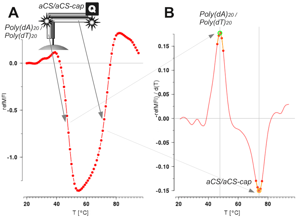
- #MBmca, 2025-06-11, Nucleic Acid Melting Curve Analysis (journal.r-project.org/articles)
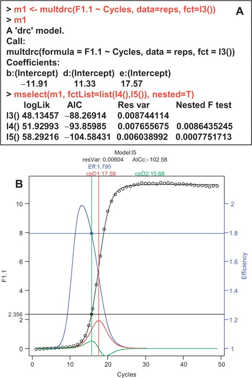
- #qpcR, 2025-06-10, Modelling and Analysis of Real-Time PCR Data <doi10.1093/bioinformatics/btn227>
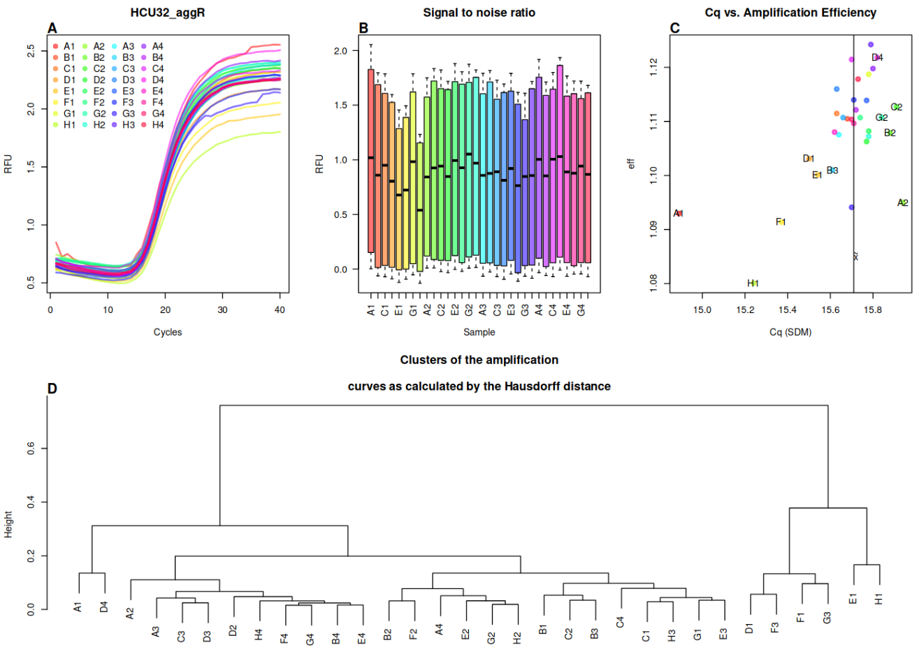
- #PCRedux, 2025-06-13, Quantitative #PCR (#qPCR) Data Mining and Machine Learning Toolkit as Described in <doi:10.21105/Joss.04407>

Description for Figure 1 from the publication "qpcR: an R package for sigmoidal model selection in quantitative real-time polymerase chain reaction analysis" (Figure 1: The qpcR package for sigmoidal model selection.)

Panel A: Console output from the qpcR package. This example shows a three-parameter log-logistic model fitted to qPCR data obtained from the amplification of the S27a transcript using human testicular RNA and a Lightcycler™ (Roche) instrument. The best-fitting model is selected by the 'mselect' function, which chooses the optimal model according to nested F-tests on the residual variance. In this case, the five-parameter model ('l5') is compared to the three- and four-parameter models.

Panel B: A fitted five-parameter log-logistic model ('l5') on single qPCR data. The graph displays various parameters from the model fitting process, including:

Model name
Residual variance
Efficiency curve (blue)
First derivative curve (red) and its maximum (threshold cycle)
Second derivative curve (green) and its maximum (threshold cycle)
The x-axis represents the number of cycles, and the y-axis on the left represents fluorescence intensity. The y-axis on the right represents efficiency.description for Figure 3 from the article "Surface Melting Curve Analysis with R":

Figure 3: Melting curve and melting peaks obtained from a Microarray Chip Analysis (MCA) experiment on microbead surfaces.

Top left inset: Illustration of two DNA detection probes hybridized to a complementary microbead-bound capture probe. The probes are labeled as Poly(dA)20 and Poly(dT)20.

Panel A: Melting curve showing the change in relative fluorescence intensity (relMFI) while applying a temperature gradient from 20°C to 95°C, increasing by 1°C per step. The red line represents the experimental data points, illustrating how the fluorescence changes with temperature.

Panel B: Melting peaks derived from the melting curve in Panel A. This probe system exhibits two distinct melting peaks:

The first (positive) peak occurs at approximately 60°C for Poly(dA)20.
The second (negative) peak occurs at approximately 75°C for Poly(dT)20.
The x-axis represents temperature in degrees Celsius (°C), and the y-axis represents the change in relative fluorescence intensity (dMFI/dT).description for Figure 29 from the study "PCRedux: A Quantitative PCR Machine Learning Toolkit":

Figure 29 (available in the supplement of the study): Clustering and variation analysis of amplification curves.

Panel A: Amplification curves plotted from raw data of the 32HCU samples. Each curve represents a different sample, with colors distinguishing between individual samples (e.g., A1, B1, C1, etc.). The x-axis represents the number of cycles, and the y-axis represents fluorescence intensity.

Panel B: Signal-to-noise ratios of the amplification curves across all cavities. The bar plot shows that the signal-to-noise ratios are generally similar between different samples. Each bar corresponds to a sample, with colors matching those in Panel A. Black horizontal lines indicate median values.

Panel C: Scatter plot of Cq (quantification cycle) values versus amplification efficiency calculated using the efficiency(pcrfit()) function from the qpcR package. The vertical line represents the median Cq value. Data points that are greater or less than 0.1 of the median Cq are labeled with observation labels (e.g., D1, E1, F1).

Panel D: Dendrogram showing the results of cluster analysis based on the Hausdorff distance of the amplification curves. The clustering does not reveal a specific pattern with respect to the amplification curve signals. Observations D1, E1, F1, F3, G3, and H1 are noted as differing most from the other amplification curves.
devSJR :python: :rstats:devSJR@fosstodon.org
2024-07-28

Most problems have been fixed in the #PCRedux package. There are still issues with the #rgl package and #Matrix is causing trouble on older platforms (especially #Ubuntu) 🤔. We're still figuring out how to solve the rgl problem, unfortunately it depends on the #qpcR package which calculates some of our key parameters 💡.
More work ahead of us.

#rstats

devSJR :python: :rstats:devSJR@fosstodon.org
2024-07-20

@Lluis_Revilla my oldest package is on #CRAN since 2012-08-31. It has the fewest dependencies. I cannot remember that it was removed once. #PCRedux has the most dependencies. 🤨
I sincerely hope to get PCRedux back on CRAN. Otherwise, #GitHub is the venue for the users. I will try my best.

devSJR :python: :rstats:devSJR@fosstodon.org
2024-07-20

Last December, the #rstats package #bcp was archived. 🙄
cran.r-project.org/package=bcp
As my package 📁 #PCRedux 🧬 depends on it, it had a similar fate (like some others). I vainly hoped that its maintainer would bring it back to #CRAN :rstats:. My plan is in the coming months to incorporate relevant code from bpc into my package or remove the dependent function within my package. Since it is published at #JOSS [1], this is important for me.
Let's see when this works out 🤞

[1] joss.theoj.org/papers/10.21105

Client Info

Server: https://mastodon.social
Version: 2025.04
Repository: https://github.com/cyevgeniy/lmst