#Panduro

2025-01-06

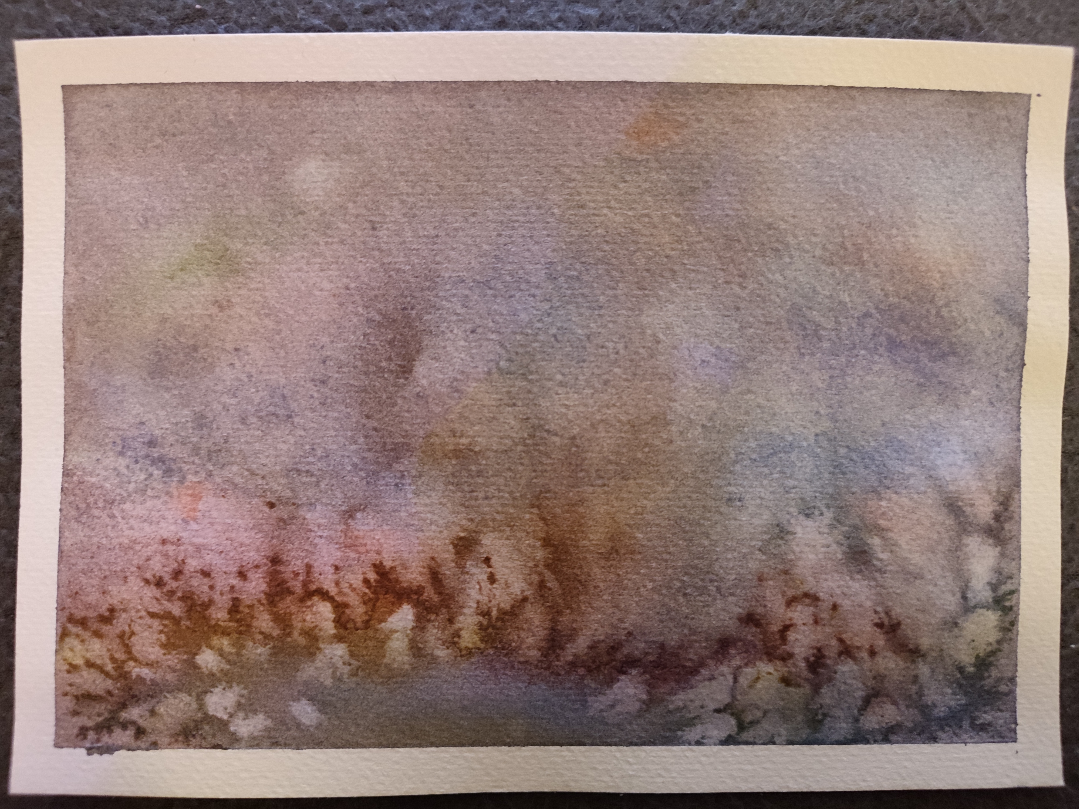
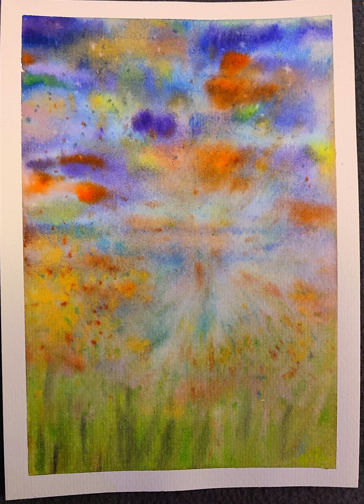
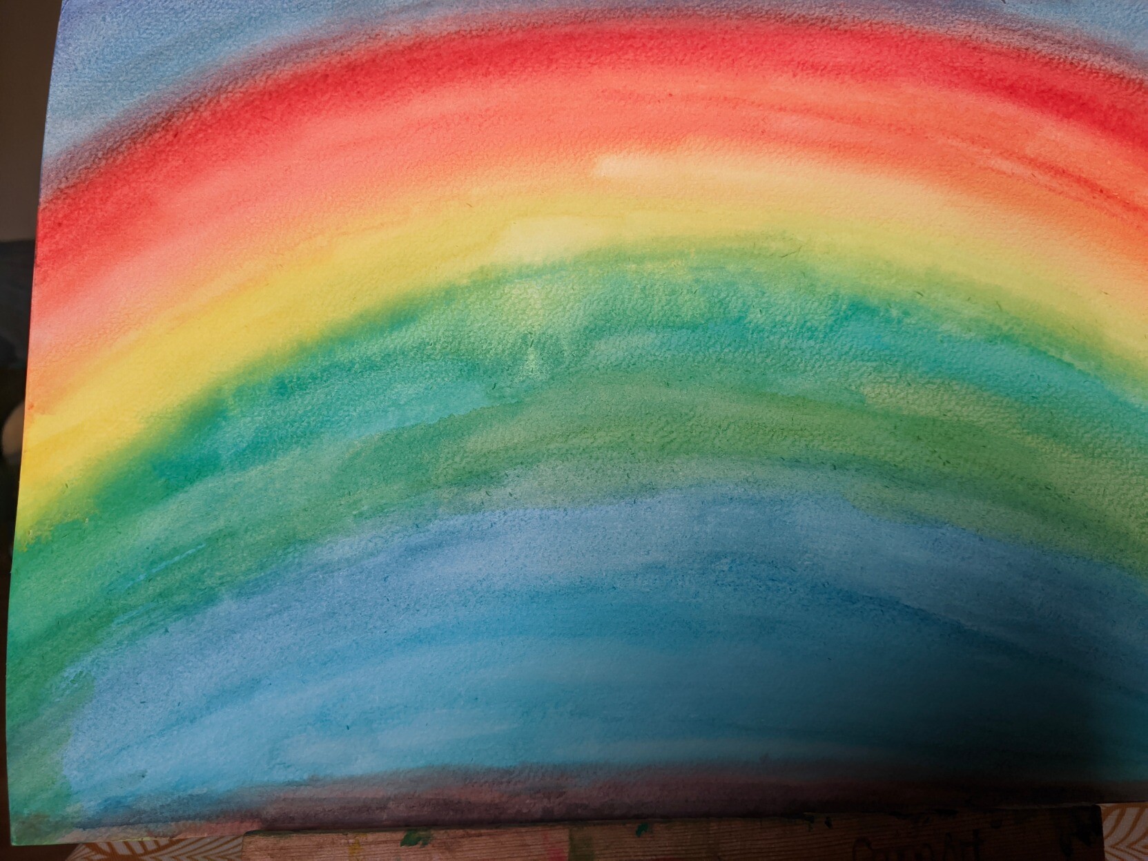
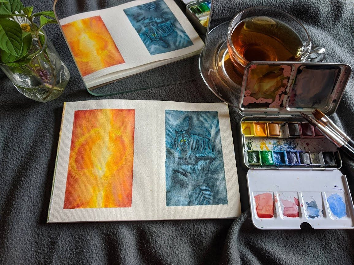
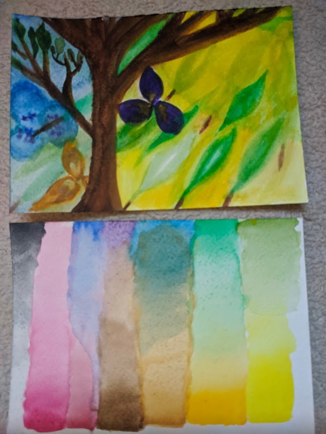
Slowly getting back into aquarelle painting again.
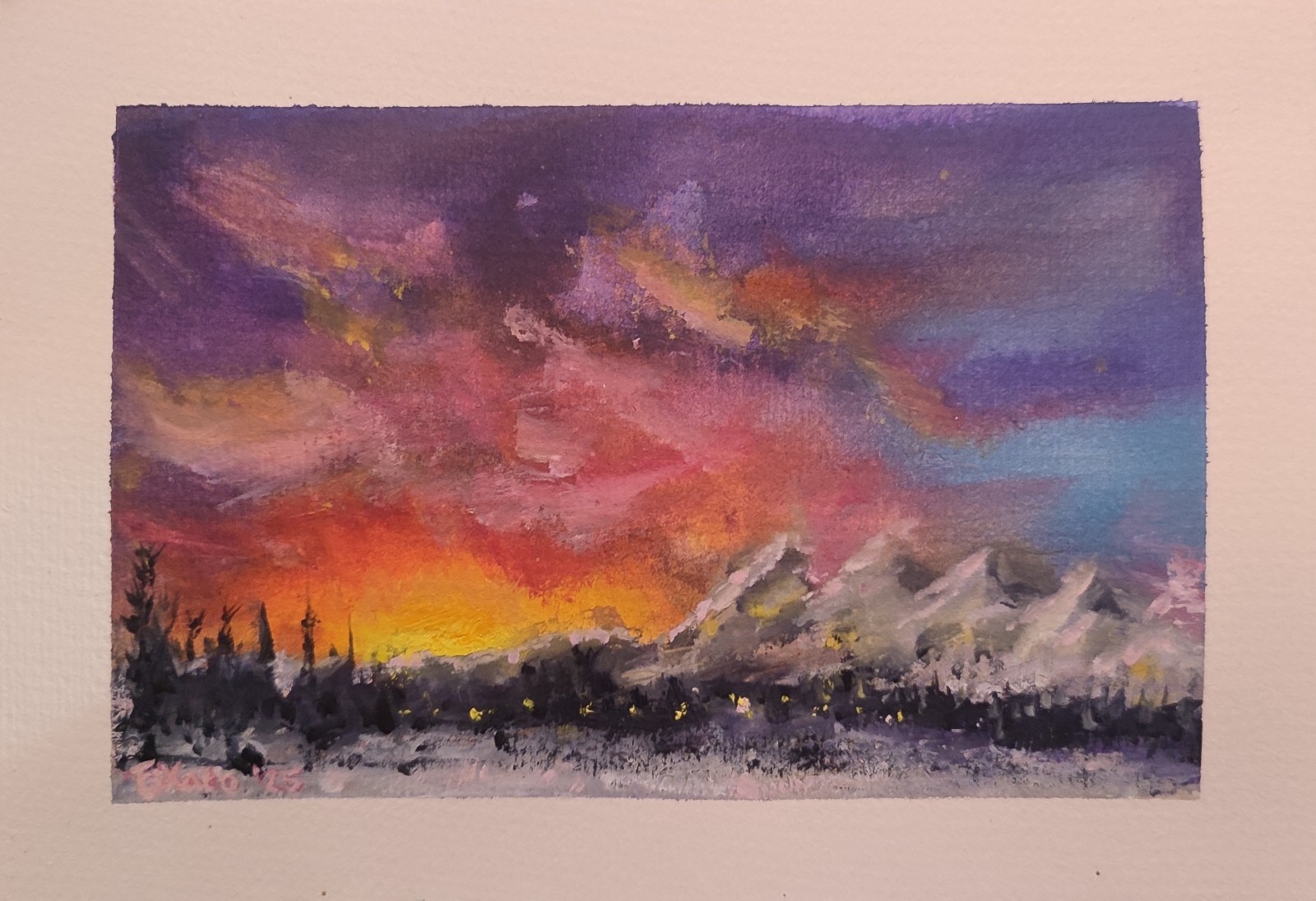
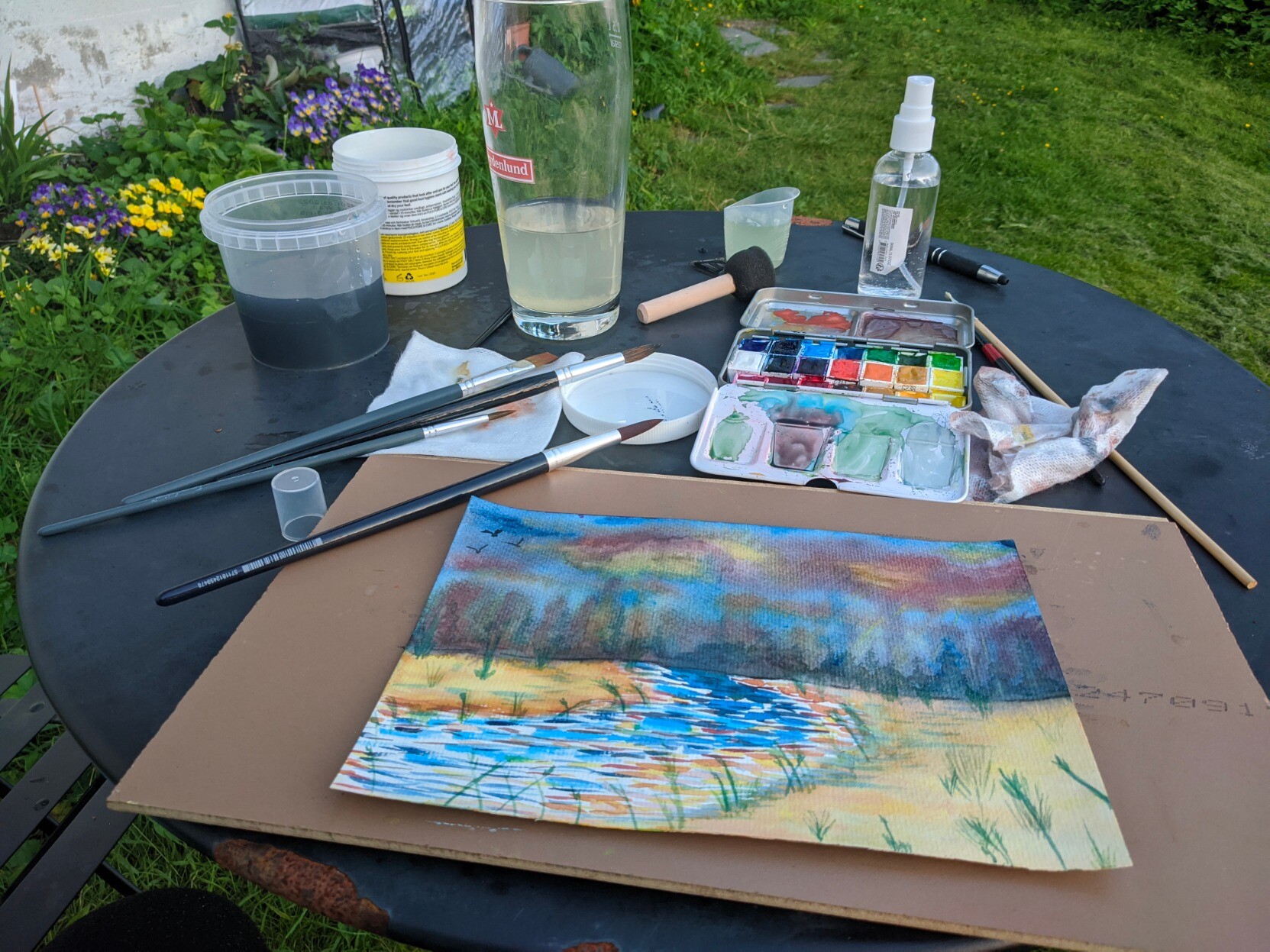
Two evenings ago I painted this wintery scene based on a photograph I took in #Bodø just under 3 years ago, around 9 in the morning.
Quite satisfied with how it turned out, especially the sun coming up from behind the mountains, though less so with the recognisability of the mountains.

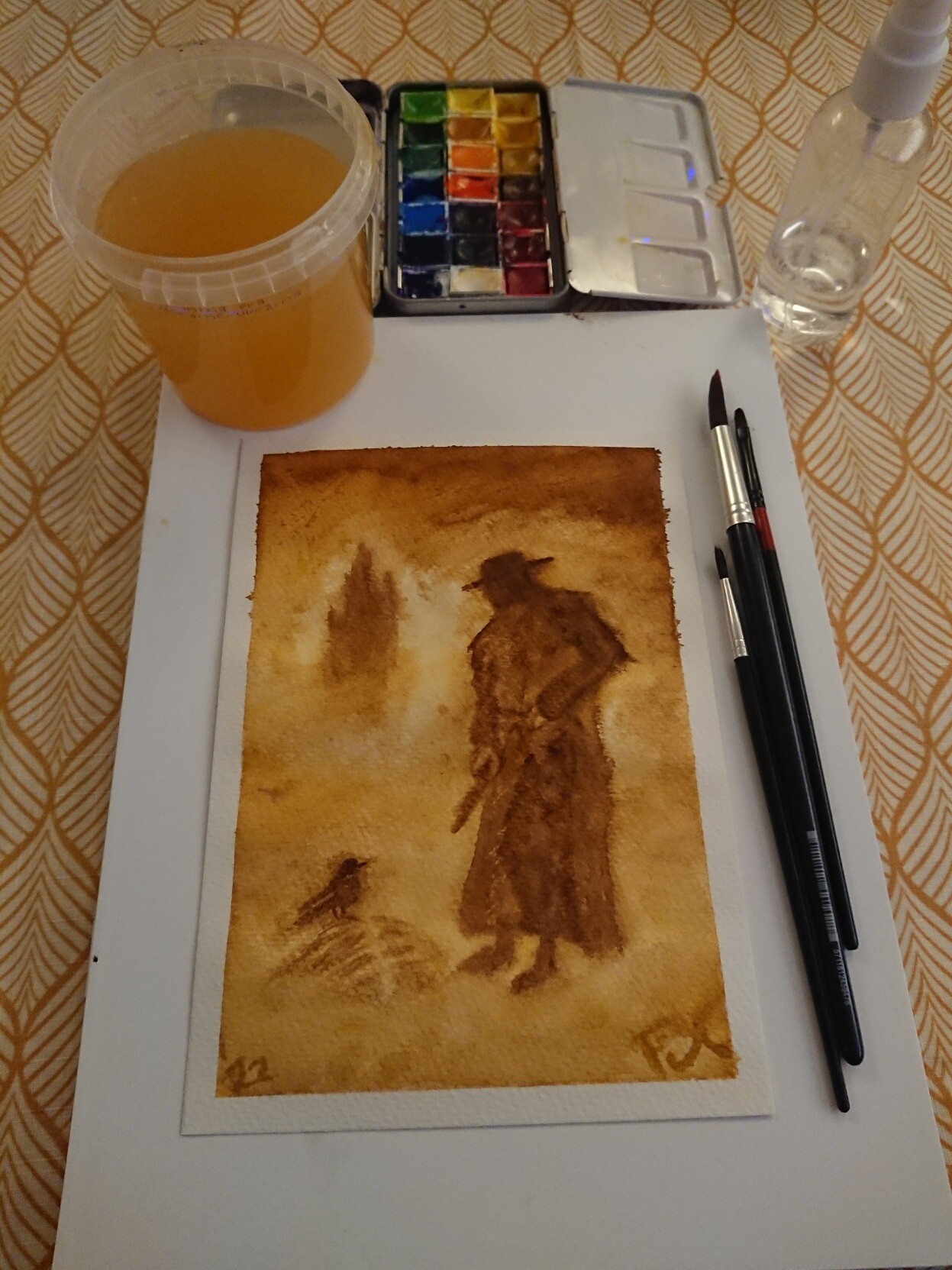
Paper: 230 grams A5 paper from Søstrene Grene, 100% paper.
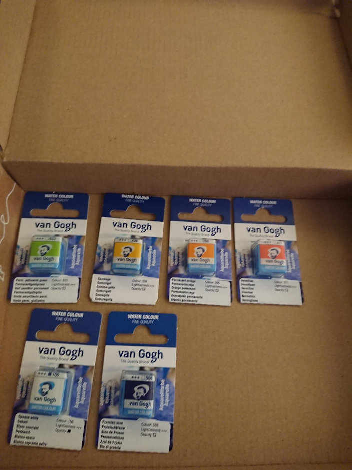
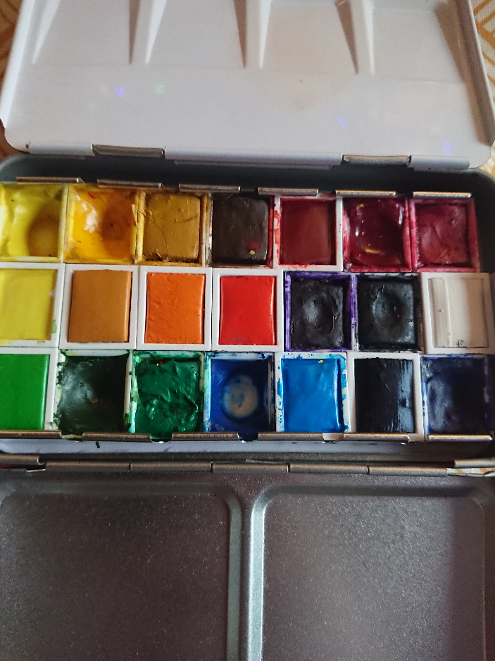
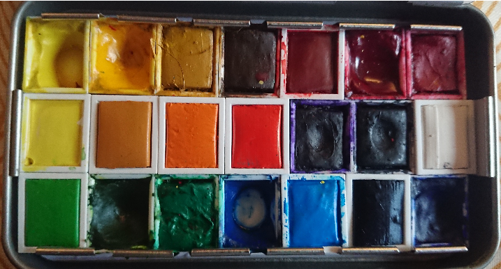
Paint: a mix of Panduro Watercolour Set Basic, Van Gogh Water Colour, Daniel Smith Hansa Yellow Light, and some white gouache.

#FiXatoPaints #FiXatoCreative #painting
#mastoArt #fediArt #artShare #creativeToot #creativeToots
#aquarelle #aquarel #akvarell #waterColour #waterColours #waterColor #waterColorPaint #panduro #VanGogh #RoyalTalens #DanielSmith #CityNord

An aquarelle painting of a winter scene; snow-covered mountains in the distance to the right, and a burning yellow, orange, and pink sunrise to the left. In front of that are distant trees and city lights, and more snow in the foreground.
The sky is a mix of dark blues, purples, orange and pinks.
Jenny Mathiassoncuratedjenny@glammr.us
2023-07-16

Do I know any crafty #Swedes on here yet? 🇸🇪 I've got these delightful #silicone #RubberStamps going spare if anyone wants them: lots of phrases in the bundle, I once got them from #Panduro in #Sweden and I'd like to pass them on to someone else. :)

Happy to post anywhere in the world in exchange for P&P. 📮 🌍

(I'm throwing in the rough little acrylic blocks for free, they were off-cuts from the museum mount makers once. ♻️ )

#crafting #CardMaking #RubberStamping #svenskar #pyssel

A set of silicone stamps on little acrylic blocks on a worn down carpet. 

Because it's impossible to see the text when it's basically transparent and mirrored the various phrases are stamped on colourful bits of paper all around them:

Världens bästa pappa! = World's best dad
Till en tuffing = For a tough guy-or-girl
Gratulerar, njut av din dag = Congrats, enjoy your day
Kära Mamma: Jag älskar dig! = Dear Mum: I love you!
Du får mig att le = You make me smile
Världens bästa mamma! = World's best mum
Du är super = You're super
Min Vän = My Friend
Njut dagen! = Enjoy today!
Kära Pappa: Jag älskar dig! = Dear Dad: I love you!
Du är det finaste jag vet = You're the loveliest thing I can think of
2023-01-04

Lost in the Fog

Hmm, last night's aquarelle painting didn't quite turn out the way I'd expected.
I think I might have to use this as a background and paint (or draw?) in a foreground scene.
I kinda like the sort of shrubbery or waves effect the added salt created though.

#FiXatoPaints #FiXatoCreative #painting
#mastoArt #fediArt #artShare #creativeToot #creativeToots
#aquarelle #aquarel #akvarell #waterColour #waterColours #waterColor #A5 #SøstreneGrene #VanGoghPaint #Panduro

Aquarelle water colour painting of a foggy background in greys tinted with purple, blue and green. There's a small light spot which is reminiscent of a moon. In the foreground at the bottom are dark fractal-like spots in reddish-purple and blueish-green, which look a bit like shrubbery.
The scene is painted in water colours on an A5 sheet of paper and had a 1cm white border around it.
2022-12-31

Galactic Fireworks over Grassy Fields

A quick aquarelle painting I did last night, mostly just to get something on paper as it'd been too long since I touched my art supplies.
Quite satisfied with the end result! A lovely explosion of colours, especially in the sky.

#VanGogh and #Panduro #aquarelle #waterColours on A5-sized 230 gsm acid-free 100% paper.

#FiXatoPaints #FiXatoCreative #painting
#mastoArt #fediArt #artShare #creativeToot #creativeToots
#aquarel #akvarell #waterColour #waterColourPainting #waterColor #VanGoghPaint #A5

An explosion of colours in an otherwise dark and light blue sky, over grassy fields with mostly red, orange and yellow flowers.
A bit below the horizon there's also an area where the scenery seems to be pulled towards the horizon, almost as if space is being deformed. Maybe a space ship passing through subspace?
The sky is filled with a cacophony of colours; blues, purples, orange, yellow, red, pink, white, black, and even some greens.
The entire painting has a small creamy white border around it, and was painted in portrait orientation.
2022-07-20

Dark Tower: The Gunslinger in water colours

Tried my hand at a fairly #monochrome water colour #painting as a practice for #huevember, and as an example for an upcoming experiment: painting with tea.
Ended up using two different colours though, rather than one: #Panduro's #YellowOchre and #BurntUmber.
Three different brushes: a number 12 round brush from #SøstreneGrene, a number 2 flat brush from #GreneArt, and a number 2 round brush probably, though I'm not sure as it had no markings on it.
Painted on 230 grams acid-free A5 watercolour paper from Søstrene Grene.

Painted after the example of #SteveStone's original cover art: shop.suntup.press/products/the

#waterColour #waterColours #waterColorArt #waterColors #DarkTower #StephenKing #TheGunslinger #aquarel #akvarell #aquarelle
#FiXatoPaints #FiXatoCreative #DailyPhoto
#MastoArt #artwork #waterColourPainting

The shadowy figure of Roland, the gunslinger from Stephen King's Dark Tower series, looking down at a bird perched on the skeletal remains of some animal. In the background the dark silhouette of the Dark Tower can be seen.

The overal scene gives the impression of a yellow/brown desert landscape with limited visibility.

Surrounding the painting are a Panduro box of water colour paints, 3 brushes, dirty paint water, and a spray bottle with clean water.
2022-07-01

Got some more #aquarelle #painting done. :)
I started with some wet-on-wet experimenting on the top half, and then had to come up with what I would fill the remainder of the A5 #SøstreneGrene #waterColour paper with.
Ended up with some kind of wet-on-dry river with wet-on-wet beach scene, even though the tones don't quite match the lighting of the sky, I guess. :)

It was good to experiment a bit with techniques though, and to not follow an example directly.

Materials used:

#FiXatoCreative #FiXatoPaints #WaterColourArt #watercolors #mastoArt

A aquarelle water colour painting of a fiery yet darkish sky, with a variety of distant foliage in dark red, blue-green, brown, orange and purple, with a light and dark blue river with orange, yellow and peach highlights along the riverbanks, with various grasses overhanging the water and sprouting out of the beach.
The top half uses a soft near-blooming wet-on-wet blending style, while the river is more a wet-on-dry strokes visual, with parts of the white paper still visible. The sandy beaches are a soft wet-on-wet again, though without the blooming, and with wet-on-dry details added, such as the (blue)grass patches.

The painting is resting on a wooden floor tiling sample, on top of a heavily corroded metal garden table. The tin of paints with various tones of green and blue-green and murky blue-purple mix swatches still visible underneath the half-pans of Panduro and Royal Talens' Van Gogh paints, along with a couple of brushes and water containers, spray bottle and well-used brush wipe are strewn around the table's surface.
To stay hydrated, an almost-empty Frydenlund 0.5 L glass with honey-ginger water is standing in between it all.
2022-06-27

Decided to clear my mind a bit by #painting by the light of the #midnightSun.
Went with my take on what I remembered from an Easy Misty Forest painting tutorial by TheFrugalCrafter Lindsay Weirich on YouTube.
It's not quite finished; I'd like to add another tree in the foreground, as well as some foliage around the top and edges, but the mosquitoes are starting to eat me up... and I'd like these layers to fully dry before adding the final ones.

Painted with a mix of #RoyalTalens' #VanGogh and #Panduro water colour paints on 180 grammes woodfree aquarelle A5 paper from #Dekorima / #Colart Sweden.

Paper buckles a bit too much from the water; I guess I should go with thicker paper, but it blends a lot better than on the cheap Nassau Fine Art aquarelle paper pad I'd been using lately.

#EasyMistyForest #TheFrugalCrafter #LindsayWeirich
#FiXatoCreative #FiXatoPaints #WaterColours #mastoArt #waterColorArt #aquarelle #akvarell #aquarel #waterColourPainting #describedMedia #FiXatoFoto #dailyPhoto

My painting setup outside. A round metal table with a black coating that's letting go in places because of underlying rust.
On top of it a number of brushes are spread about, along with a quite paint-stained cellulose cloth, a metal case with a variety of half-pan water colour paints, an A5 aquarelle paper pad with the painting of a misty forest path (see next image for details), and two dirty water cups (one for cool and one for warm colours), and a small measure cup with clean water, and a nearly empty bottle with lemonade. The painting and paint case are resting on two wooden floor tile samples as work area surface.
Surrounding it all is grass and other things such as a toy truck you might expect outside the home of a parent of a nearly 4-year old.A sort of clearing or path in a forest. Various layers of trees fading into the background, with a radiant / glowing, misty?, clearing or portal in the centre of it all.
The trees in the front have a bit of a purple glow to their trunks and branches.
Bright and darker green grass patches are spiraling from the foreground into the background, around the centre. Various flowers are present in coloured splotches of various sizes.
The sky is a vibrant Prussian blue with white glowing patches and strokes of distant branches and clouds.
2022-06-24

Picked up my package of new #waterColour / #aquarelle #paints today, so it was also time to clean up and re-arrange my #waterColours #painting case.
Added six new half-pans from #RoyalTalens' #VanGogh brand which I'd ordered last week from #Panduro here in Norway.
All of them are new colours to me, so I'm looking forward to swatching them and putting them to use. Some of them are convenience colours (Permanent Yellow-Green and Permanent Orange).
Another is a different shade of red (Vermillion Red, in addition to the Permanent Red Deep from earlier) because I didn't like the ones that came in the Panduro base set.
Others are to try them out and compare them to the ones I already use, such as the Gamboge Yellow 238 (which looked nice and vibrant on the online sample), and Prussian Blue (because it's such an often referenced colour, and I'm not always satisfied with the ultramarine).
And finally some Opaque White, so I don't have to mix guache with my aquarelle paints when I want to add some white.

#artSupplies #paintSupplies #waterColourPaints #waterColors #FiXatoPaints #FiXatoCreative #FiXatoFoto #dailyPhoto #PanduroPaints #PanduroWatercolourBasicSet #studioQuality

A cardboard shipping box containing the 6 new half-pan water colour paints from Royal Talens' Van Gogh brand.
From left to right and top to bottom: Permanent Yellow-Green, Gamboge Yellow, Permanent Orange, Vermillion Red, Opaque White and Prussian Blue.An overview of the water colours paint case with 3 rows of 7 half-pans filled with varying amounts of paint.
Lemon Yellow Hue (Panduro), Cadmium Yellow Hue, Yellow Ochre, Burnt Umber, Permanent Red Deep, Alizarin Crimson Hue, Permanent Rose.
Lemon Yellow (Van Gogh), Gamboge Yellow, Permanent Orange, Vermillion Red, Dioxine Violet, Payne's Grey, Opaque White.
Permanent Yellow-Green, Sap Green, Emerald, Cerulean Blue Hue (Panduro, leftover, will probably swap out for guache white once it's used up completely), Cerulean Blue (Van Gogh), Prussian Blue, Ultramarine.An closeup of the half-pans in my Panduro water colours paint case: 3 rows of 7 half-pans filled with varying amounts of paint.
Lemon Yellow Hue (Panduro), Cadmium Yellow Hue, Yellow Ochre, Burnt Umber, Permanent Red Deep, Alizarin Crimson Hue, Permanent Rose.
Lemon Yellow (Van Gogh), Gamboge Yellow, Permanent Orange, Vermillion Red, Dioxine Violet, Payne's Grey, Opaque White.
Permanent Yellow-Green, Sap Green, Emerald, Cerulean Blue Hue (Panduro, leftover, will probably swap out for guache white once it's used up completely), Cerulean Blue (Van Gogh), Prussian Blue, Ultramarine.
2022-06-07

Unfortunately the local #Panduro shop had only 4 of the 6 of 7 #VanGogh water colour paints that I wanted to get.
On top of that, contrary to the webshop, they apparently only had a 3-for-2 offer, rather than the flat 33%-off offer online. Which meant I ended up getting only the Permanent Red Deep, Lemon Yellow and Cerulean Blue, and leaving the Prussian Blue for the next time they have an offer.
Unfortunately the physical shop didn't carry the Indian Yellow nor the Gamboge 238, nor the Permanent Yellow Green 633 that I also considered getting.

I will see tomorrow though if their webcare team can clarify why there is a difference in offers online and in their brick-and-mortar shops while it's not being made clear on their website as such.

#artSupplies #paintSupplies #FiXatoPaints

2022-06-07

Just a quick #rainbow-ish #painting to try out the 3 new half-pans of #VanGogh #waterColours paints I bought today.

The lemon yellow is good, though I was already aware of that since I've gone through a half-pan of that already.
The cerulean blue phthalo is good too. Feels a bit deeper than the #Panduro I got, though maybe isn't as opaque? Which probably is a good thing actually. Might need to do a bit of comparison between the two.
The real winner here is the Permanent Red Deep though; this is a red that is far more like a red I was hoping for, rather than the Permanent Rose and Alizarin Crimson that was in my Panduro starter set.
Blends quite well with the Lemon Yellow too, though not as much with the Cerulean Blue; creates more of a brown than a purple. Not an issue though, as I do like the Dioxazine Violet I have in my base set.

Anyway, it was just a quick #doodle to test the colours, rather than a serious painting.

I think I will switch back to a different paper though; I don't quite like the quick absorption rate of this one. But I guess I can't expect much for its price range.

#FiXatoPaints #FiXatoCreative #waterColourDoodle #waterColorDoodle #waterColourPainting #colourfulArt #colourful

A rainbow on a dark blue/purple sky. Deep reds to faded orange to bright yellow to seagreen to turquoise to sap green to ultramarine to cerulean blue to purplish-brown.
2022-06-07

Local #artSupplies shop has 33% off on #VanGogh #waterColours half-pans, so now might be a good time to fill my #aquarel #painting set again.

Definitely running low on yellow and orange, and light blue, and I still want to try out a different red and dark blue.

Will probably add permanent red, Indian Yellow or Gamboge 238, Prussian Blue, Cerulean Pthalo Blue, and Permanent Yellow Green 633 to my palette.

#FiXatoPaints #FiXatoCreative #waterColors #paintSupplies #akvarell #Panduro #halfPans

A tin case containing a variety of Pandura water colour paints in half-pans.
The yellows and cerulean blue are as good as empty and the orange is also well-used.
2022-01-14

A Clouded Mind's Struggle for Balance

Did some more painting for a change tonight, finally trying out the A4-sized pad of aquarel paper I bought at Rusta last week. For its cheap price, it's remarkably decent actually.

#painting #aquarel #aquarelle #waterColourPainting #waterColours #Rusta #Panduro #NassauFineArt #ArtSensations #FiXatoPaints #FiXatoCreative #art #MastoArt #FediArt #abstract #clouds #akvarell

An aquarel watercolour painting on a small tabletop easel, with the Panduro "Watercolour Set Basic", a cup with dark-coloured used water in it, a tissue used to dry brushes (complete with paint stains), and a flat brush and a beaten down round brush, in front of it, all sitting on a newspaper on top of a wooden table.
The painting, "A Clouded Mind's Struggle For Balance", is an abstract work of various colours, splattered around with wooly cloud-like patterns.
Bottom left and top right have some bright yellow and orange hues, with the bottom left one surrounded by darker green tones, and the top right more dark orange and pink/red tones.
Separating both is a diagonal stroke of dark purple and blues, surrounded by violet and pink.
It's supposed to evoke a feeling of chaos and somberness, with a faint hope for a brighter balance.
2021-12-25

God Jul / Merry Yuletide / Fijne Feestdagen

Thank you all for keeping me company and entertaining me throughout the year. :)

I've been meaning to paint again for quite some time now, and finally sat down to do so at the end of this #julaften (#ChristmasEve). Wasn't quite sure what to paint, so I started just with a gradient, and eventually ended up with the winter-inspired scene on the left. To contrast it, I made the second one with far warmer colours instead.

toot.cat/media/Ku0_yDcjmZoEni1
toot.cat/media/0liMRkCTEwZrR49

#panduro #panduroWaterColourPaints #waterColour #waterColours #painting #paint #aquarel #aquarelle #akvarell #dailyPhoto #diptych #tweeluik #FiXatoPaints #FiXatoCreative #winter #christmas #Jul2021 #XMas2021 #xmas

Painting and painting equipment spread out across a table covered with a cloth with a Nordic winter / Yuletide scene of Julenissen eating porridge with a wooden spoon from a bowl as a kid holding presents looks at him with joy.
The painting is a diptych of a cold starry winter night scene with snow falling down on trees, and a warmish fall scene of bare trees and tall grass bathing in a golden orange sunset glow.
The painting is surrounded by the water colour painting equipment used to create it: a small metal case with half-pan water colour paints, Panduro Watercolour Basic Set; brushes I borrowed from the kid's Christmas present; a couple of sheets of toilet paper to dry the brushes, coloured by the paints used; a set of more opaque water colour cakes; and two paper cups with the dirty water from cleaning the brushes (one for 'cold' and one for 'warm' colours).Close-up of just the painting: 
The painting is a diptych of a cold starry winter night scene with snow falling down on evergreen trees, and a warmish fall scene of bare trees and tall grass bathing in a golden orange sunset glow.
2021-08-02

The Jain's Death and Rebirth in Water Colours

After reading "The Jain's Death", a comic suggested earlier today by @RussSharek, I wanted to paint two scenes from it.
Page 26, depicting a tiger hidden among jungle foliage at night, and page 45-g, showing some kind of a geothermal energy explosion or eruption, stood out the most to me. They also both had a limited hue palette, and were quite contrasting, which suited me well as I have been wanting to try a couple of fairly #monochromatic paintings in preparation for #huevember, after seeing @dona's huevember creation.

So, I hope you will enjoy my #painting The Jain's Death and Rebirth in Water Colours.

Materials in unlisted follow-up post.

Relevant hashtags

#waterColours #waterColors #WaterColourPainting #waterColorStudy #FiXatoPaints #FiXatoCreative
#WindsorAndNewton #WindsorAndNewtonFoundation #PaintingSupplies #ArtSupplies #WaterColourPad #waterColour #waterColours #mastoArt #Panduro #SøstreneGrene #GreneArt #WaterColourSetBasic #A5 #art #tiger #fire #plasma #DailyPhoto

A water colour pad lying on a table, surrounded by decorative things.
The A5 pad contains two water colour paintings side by side, in contrasting colours.
On the left is a fiery energy eruption; a white-hot pillar of energy in the middle, with a golden, orange plasma ball in the middle, and orange-red flames shooting out towards the edges.
On the right is a cold blue and black night scene of a tiger stalking in a thick jungle. You can barely make out its head, striped upper body, and claws; its golden eyes however are piercing through through the night, locked onto you, and it's obvious this predator can clearly see you.

To the right of the art pad is a tin box with 12 half pans of water colour paints, various well-used mixing compartments, and a set of three brushes resting on top of it. Its lid is resting against a tea glass which contains golden brown tea.
Above the pad is a mirror which reflects the paintings and part of the water colour paint half pans.
To the left of the mirror is a glass of water with some mint and wild flowers resting in it.
2021-07-24

Got to do some experimenting with my new #Panduro #waterColours today, as well as trying my hand at some techniques from videos I've been watching.

Still have a lot to learn and practise, and need to get used to the differences between the various kinds of paper we have.

Especially with the big sheet of paper it dried up a lot paler than I'd expected.

I like the yellow, orange, green, light blue and deep purple from this set of water colour #paints, though I'm a bit underwhelmed so far about the red and pink.

Maybe I'll also get some better results when I don't have to pay attention to #BeardGrabber playing with his own paints at the same time. ;)

#waterColourDoodle #waterColors #waterColourSketch #swatches #FiXatoPaints #MastoArt

A sheet of an A4 watercolour pad with nine rectangles coloured in with colours from the Panduro watercolour paint set.

Top left is a gradient of purple. Top right was supposed to be a gradient between sap green and emerald green. In between was yellow ochre and burnt umber.
Middle left to bottom left is a gradient from cadmium yellow hue to lemon yellow hue.
Middle center and bottom center are a gradient from alizarin crimson hue to permanent rose.
To the right is a gradient from cerulean blue hue at middle to ultramarine at the bottom.

Overlayed are four heart patterns meeting in the middle with their pointy bottom ends, and an attempt at pushing colours along a middle line.

Overall it's more splotchy with 'cauliflower' patterns, and harsh edges than I'd liked, as a result of not controlling the amount of water used well enough.Two A5 sheets from a Fabriano watercolour pad.
Bottom one has gradient swatches for all colours in the Panduro watercolours paint box. At the top are Payne's Gray, Ultramarine, Dioxazine Violet, Cerulean Blue Hue, Emerald and Sap Green.
At the bottom are Permanent Rose, Alizarin Crimson Hue, Burnt Umber, Yellow Ochre, Cadmium Yellow Hue and Lemon Yellow Hue.

Top sheet has a sketch of a tree, a warm sun, various leaves, and flower petals (blue pansy, and two other undetermined flowers in purple with brown/yellow, and orange-brown with yellow).
Just a collage of various experiments.A close-to-three-years-old's water colour drawing on an A5 sheet. Quite some black strokes at the top, blue below it, a mix of blue, green and muddy black to its right, and a gradient of yellow to orange along the right side that we drew together.

The sheet is lying atop of the kiddo's drawing box containing oil crayons and coloured pencils.
2021-07-23

Bought some new #waterColour #paints, my first 'proper' ones rather than the usual kids' set, and found an #aquarelle pad from my childhood that barely saw any use, and hope to bring some change to that.

Won't be tonight though. Maybe tomorrow during the day.

#painting #FiXatoPaints #artsupplies #FiXatoCreative #Panduro #Fabriano

Water colour painting equipment:
A metal case with mixing compartments and 12 fresh, unopened, water colour paints half pans, in the usual colours (lemon yellow hue, cadmium yellow, hue, yellow ochre, burnt umber, permanent rose, alizarin crimson hue, Dioxazine violet, cerulean blue hue, ultramarine, sap green, emerald, payne's gray, and the Panduro box it came in.
And an acquarello watercolour studio pad from Fabriano.

Client Info

Server: https://mastodon.social
Version: 2025.04
Repository: https://github.com/cyevgeniy/lmst