#adobeindesign

2026-01-30

Brand Guidelines Template Strategy: Why You Should Finally Trust Clients with Their Own Visuals

We used to protect brand identities with a lock and key. You would spend weeks crafting a PDF manual. You would send it to the client. Then, you would pray they actually read it. They usually didn’t. They would stretch the logo the next day. The old way of delivering guides is dying. It ignores a simple truth: clients want to do things themselves. Evgeny Studio has realized this shift. Their latest brand guidelines template for Canva and InDesign bridges professional rigor and client autonomy. We call this the “Open-Garden Identity Strategy.” It invites the client inside the design process without letting them destroy the visual foundation.

Download the template from Creative Market

Please note that this template requires Adobe InDesign or Canva. Whether you use Mac or PC, InDesign’s latest version is available on the Adobe Creative Cloud website—take a look here.

Brand Guidelines Templates for Canva and Adobe InDesign by Evgeny Studio Download the template from Creative Market

Why is a flexible brand guidelines template essential today?

The static PDF is a dead end. It is a passive document in an active world. When you deliver a locked file, you create a bottleneck. Every time the marketing team needs a social post, they must email you. Or worse, they ignore the guide entirely because it creates friction.

This is where a hybrid brand guidelines template changes the game. The “Hugs” layout by Evgeny Studio acknowledges a new reality. The brand is born in Adobe InDesign, but it lives in Canva. By offering a synchronized system, you solve the agency’s biggest headache. You maintain quality while granting access. You build the structure in InDesign to satisfy your perfectionism. Subsequently, you hand over the Canva version to satisfy the client’s speed.

It creates a workflow we define as “Controlled Flexibility.” The client feels empowered. They can edit the text and swap images easily. You feel secure. The grid, the hierarchy, and the “do not touch” zones remain baked into the brand guidelines template.

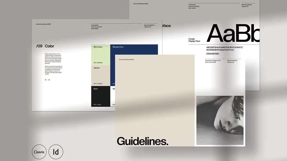
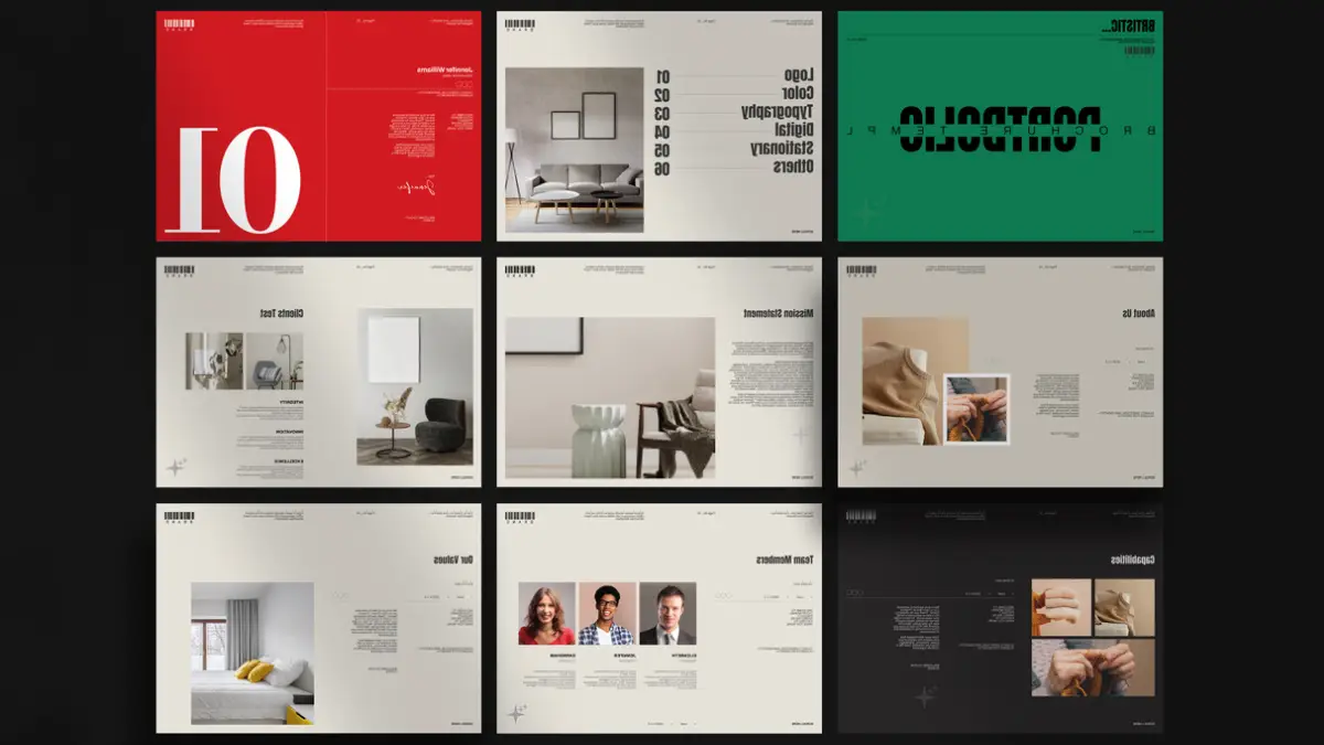
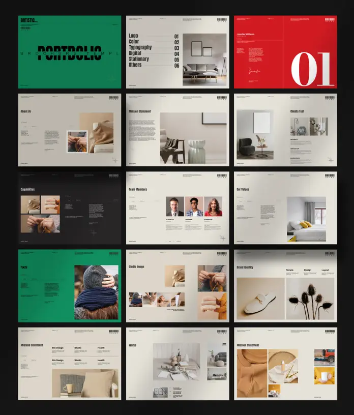
The 1920 x 1080px Standard

Paper sizes are obsolete for digital-first brands. Why do we still format guides for A4 or Letter paper? 99% of stakeholders view them on a monitor. Evgeny Studio’s brand guidelines template uses a 1920 x 1080px resolution.

This is not just a technical spec. It represents a psychological shift. We call this “Cinematic Brand Presentation.” When the guide fills the screen, it feels like a premium deck. It does not look like a boring policy document. Furthermore, it flows naturally during a Zoom presentation. Yes, it demands attention.

Furthermore, a screen-native brand guidelines template eliminates awkward scrolling. Vertical print formats force the user to zoom in and out constantly. This layout respects the medium where the brand actually lives.

Real Copy: The End of Lorem Ipsum

Nothing kills a client’s understanding faster than “Lorem Ipsum.” It forces them to guess the context. This brand guidelines template replaces the gibberish with actual, educational content.

Think of this feature as “Embedded Design Education.” The text on the typography page actually explains how to use the typography. The logo section explains why clear space matters. When you hand this brand guidelines template to a client, you provide a self-teaching tool.

This reduces the “education burden” on the agency. You do not need to explain the rules ten times. The document does it for you. It transforms the brand guidelines template from a visual container into an intellectual asset.

Grid Logic and Style Sync in a Brand Guidelines Template

A pretty layout is useless if it breaks when you edit it. The backbone of this system is a strict 12-column grid. We refer to this as “Structural Grid Integrity.” It ensures that alignment holds even when a non-designer swaps an image.

For the pro user, the InDesign file uses rigorous paragraph and character styles. This allows for what we call “Velocity Editing.” You change the primary font in the master style. Instantly, it cascades through all 34 pages of the brand guidelines template.

A brand guidelines template without this global styling is just an expensive drawing exercise. With it, the file becomes a scalable system. You can adapt this deck for five different clients in the time it usually takes to finish one.

Beyond the Logo: Total Brand Coverage

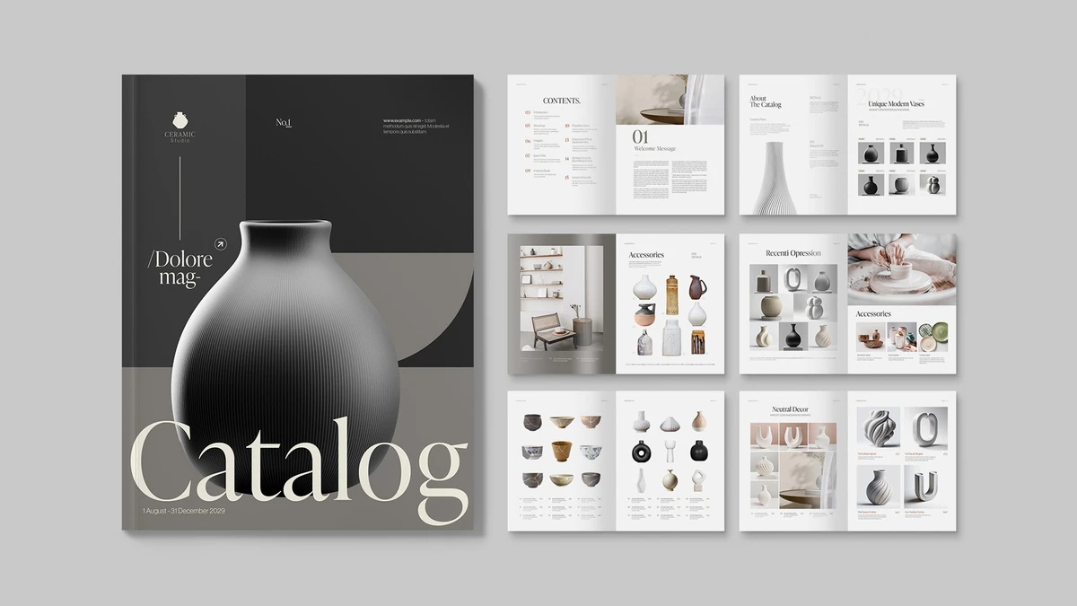
A logo is not a brand. A brand includes your look on Instagram, letterheads, and websites. This brand guidelines template covers nine distinct sections. These include Cover, Logo, Colour Palette, Typography, Digital, Imagery, Stationery, Social, and Info.

We call this “Holistic Touchpoint Mapping.” Many templates ignore the digital reality. This one embraces it. The inclusion of social media wireframes is particularly smart. It allows you to show the client exactly how their feed will look.

The stationery vector mockups add a necessary layer of physical context. It grounds the digital concepts in reality. Consequently, the brand guidelines template makes the identity feel expensive and tangible.

The “Hybrid-Workflow” Compatibility

The download includes INDD, IDML, and Canva files. This covers the entire spectrum of design proficiency. You use the IDML for legacy users on older machines (CS4 and up). You use the INDD for Creative Cloud pros. Finally, you use the Canva file for the marketing team.

This is “Cross-Platform Fluidity.” It acknowledges that the designer and the manager use different tools. A brand guidelines template that forces everyone into one software will fail. This set meets users where they are.

The inclusion of free fonts via links further smooths the friction. There are no licensing traps here. You download, install, and go. It offers a clean, legal, and efficient process for every user.

The Verdict on MIA (Modular Identity Architecture)

We must stop treating brand guidelines as sacred scriptures. They need to be living tools. Evgeny Studio has built a brand guidelines template that understands this new reality.

Download the template from Creative Market

They prioritize the screen over the page. They value education over placeholder text. Most importantly, they respect the intelligence of the client. They give them a tool they can actually use. This is Modular Identity Architecture in practice. If you want to future-proof your client handoffs, this brand guidelines template sets the standard you should aim for.

Frequently Asked Questions about this Brand Guidelines Template

1. Can I use this brand guidelines template for paying client projects?
Absolutely. You use the template as a base to build the brand manual for your client. You sell the finished design service, not the template file itself.

2. Is the Canva version exactly the same as the InDesign version?
They are visually identical in layout. However, the editing experience differs. The InDesign file uses advanced styles. The Canva version of the template relies on a drag-and-drop interface for non-designers.

3. Why is the 1920x1080px format superior to A4?
Stakeholders rarely print guidelines anymore. A 1920x1080px format fits perfectly on screens for presentations. This makes the brand guidelines template much easier to read digitally.

4. Do I need to buy the fonts used in the template?
No. The template uses free fonts. Links appear in the download file. You must download and install them to ensure the brand guidelines template renders correctly.

5. How does “Real Copy” save me time?
You avoid writing instructions from scratch. The template already includes professional advice on logo usage and typography. You simply tweak it to fit your tone within the brand guidelines template.

Don’t hesitate to browse WE AND THE COLOR’s Templates category for more.

Subscribe to our newsletter!

[newsletter_form type=”minimal”]

#AdobeInDesign #brandGuidelines #branding #Canva #design #graphicDesign

Brand Guidelines Templates for Canva and Adobe InDesign by Evgeny StudioBrand Guidelines Templates for Canva and Adobe InDesign by Evgeny Studio
2026-01-27

How to Use Adobe InDesign Templates to Work Faster weandthecolor.com/how-to-use-a

Unlock true design velocity by treating Adobe InDesign templates as responsive systems. Learn how to leverage style inheritance, GREP automation, and Parent Pages to eliminate manual formatting and scale your creative output.

#AdobeInDesign #InDesignTemplates #GraphicDesign

2026-01-27

How to Use Adobe InDesign Templates to Work Faster

Speed often compromises quality in the creative industry, but Adobe InDesign templates challenge this assumption. A template is not merely a file with pre-placed boxes. It represents a sophisticated infrastructure for design automation. When you construct this infrastructure correctly, you eliminate repetitive administrative tasks. This allows you to focus purely on creative direction. Effective templates function as force multipliers. They turn a single designer into a production team. This article explores how to utilize design templates in Adobe InDesign to build a responsive, scalable, and high-velocity workflow. We will examine the technical reality of style inheritance, global variables, and automated formatting.

How does a systematic approach redefine your workflow?

Designers often view files as static canvases. However, efficient Adobe InDesign templates function as interconnected systems. Every element on the page should relate to a central logic. This approach distinguishes the amateur from the expert. You must stop designing individual pages. Instead, start designing the rules that govern those pages.

When you use a systematic approach, you make critical decisions only once. You define the grid, the typographic hierarchy, and the color logic at the start. Adobe InDesign templates then enforce these rules indiscriminately. This prevents “layout drift.” Layout drift occurs when long documents slowly lose their visual consistency.

Furthermore, a strong system reduces cognitive load. You do not need to remember the exact leading for a caption. The template remembers it for you. Consequently, you gain mental space to solve complex visual problems. Adobe InDesign templates act as an external hard drive for your design intelligence.

You can showcase creative projects with this minimalist portfolio presentation layout by RedGiant for Adobe InDesign. This layout offers a systematic approach. Download the template from Adobe Stock

Leveraging the “Based On” Style Architecture

The most critical feature for speed is the “Based On” function within Paragraph and Character Styles. Many designers create styles in isolation. This is a fundamental error. Professional Adobe InDesign templates utilize a strict hierarchy of inheritance.

You should create a “Root” style. All subsequent styles must inherit attributes from this source. For example, “Body Text” links to “Root.” “Captions” links to “Body Text.” If a client requests a font change, you modify the “Root.” Instantly, the change cascades through the entire document.

This architectural method turns hours of revision into minutes of processing. Adobe InDesign templates that lack this connectivity are “dead” files. They require manual labor for every global change. You must build “living” files that respond to input dynamically.

This is a professional Adobe InDesign product catalog template in US Letter and A4 by E-Type. The template works best with Paragraph and Character Styles. Download the template from Adobe Stock

Utilizing Parent Pages for Global Governance

Adobe recently updated terminology from “Master Pages” to “Parent Pages.” These pages serve as the control center for Adobe InDesign templates. You must use them for more than just page numbers. Parent Pages should contain your grid systems, guide layouts, and primary graphical furniture.

Advanced templates utilize hierarchical Parent Pages. A specific “Chapter Opener” parent can be based on a “Grid Base” parent. Therefore, if you widen the margins on the “Grid Base,” every derived page updates automatically. This creates a fail-safe environment.

Moreover, use “Primary Text Frames” on your Parent Pages. This feature allows text to flow automatically as you add pages. For book design or long reports, this is non-negotiable. Adobe InDesign templates with Primary Text Frames allow for rapid content ingestion without manual text threading.

This is a fully customizable Adobe InDesign travel magazine layout created by PixWork. Changes are made in seconds with included Parent Pages. Download the template from Adobe Stock

Automating Typography with GREP Styles

Speed requires automation, and GREP (Global Regular Expression Print) is the engine. You can embed GREP commands directly into the Paragraph Styles of your Adobe InDesign templates. This allows the software to style text based on patterns.

For instance, you can program a style to find any email address and apply a character style automatically. You can ensure that brand names always appear in bold small caps. You can prevent “widows” (orphan words) by forcing line breaks on short lines.

This happens in the background. As you type or paste text, the Adobe InDesign templates clean the typography for you. You become a designer rather than a copy editor. This level of detail elevates the quality of the work while reducing the time spent on proofing.

This is a lookbook presentation template by E-Type for Adobe InDesign. It makes it easy to embed GREP commands directly into the Paragraph Styles. Download the template from Adobe Stock

Deploying Text Variables for Live Data

Manual data entry kills efficiency. Adobe InDesign templates should utilize Text Variables to handle recurring information. You can define variables for running headers, creation dates, or file names.

When you update a variable, it updates across the entire document. This is crucial for version control. You never have to manually update the “Revision Date” on fifty pages. The template handles it.

Furthermore, you can use “Running Header” variables. These capture the text of the first or last instance of a specific style on a page. Dictionaries and catalogs rely on this. By integrating these into Adobe InDesign templates, you automate navigation aids. The document builds its own signposting.

That’s a modern and minimalist business investor pitch deck presentation template by RedGiant for Adobe InDesign. Using this file, you can define variables for running headers, creation dates, etc. Download the template from Adobe Stock

Scaling Output with Data Merge

For high-volume projects, Data Merge changes the game. This feature allows Adobe InDesign templates to read external data sources, like CSV files. It is essential for business cards, tickets, or direct mail.

You map data fields to the layout. InDesign then generates hundreds of unique pages in seconds. The template acts as a mold. The data acts as the material. This workflow eliminates copy-paste errors entirely.

Additionally, this method separates content from design. A copywriter can work in a spreadsheet while you refine the Adobe InDesign templates. You merge the two at the final stage. This parallel workflow significantly reduces project turnaround time.

This digital resume presentation template by E-Type is ideal for outstanding job applications. Data Merge is a real game-changer for fast output. Download the template from Adobe Stock

The Role of CC Libraries in Template Ecosystems

A file does not exist in a vacuum. Adobe InDesign templates achieve maximum speed when paired with Creative Cloud (CC) Libraries. You can store snippets, color groups, and logos that link back to the template styles.

When a team member drags an asset from the library, it respects the document’s definitions. This ensures consistency across a distributed team. A designer in London uses the same assets as a designer in Tokyo.

Therefore, the template extends beyond the .indt file. It becomes a shared language. Adobe InDesign templates and CC Libraries together form a single source of truth for the brand identity.

This Adobe InDesign company profile layout by graphic designer Tom Sarraipo is available as a customizable A4 layout. When paired with Creative Cloud (CC) Libraries, you can speed up your workflow. Download from Adobe Stock

Final Thoughts on Design Velocity

True speed results from precision, not haste. Adobe InDesign templates provide the rigorous structure required for high-speed production. By mastering style inheritance, Parent Page hierarchies, and GREP automation, you transform your practice.

You stop fighting the software. You start collaborating with it. The industry rewards designers who deliver systems, not just pages. Therefore, invest the time to architect your Adobe InDesign templates correctly. The initial effort pays dividends in every subsequent project.

FAQ: Adobe InDesign Templates

What makes a file a true Adobe InDesign template?
A true Adobe InDesign template uses the .indt file extension. When opened, it generates a new, untitled .indd document. This protects the original structure from accidental overwrites and ensures every project starts from a clean, standardized state.

How do nested styles improve workflow speed?
Nested styles within Adobe InDesign templates allow you to embed character formatting inside paragraph styles. For example, you can force the first three words of a paragraph to be bold and red automatically. This eliminates manual highlighting and ensures consistent formatting for repeated text structures.

Why should I use Parent Pages instead of just copying pages?
Parent Pages in Adobe InDesign templates act as global masters. If you move a guide or change a footer on a Parent Page, it updates instantly across hundreds of document pages. Copying pages does not create this link, meaning updates must be applied manually to every single page.

Can InDesign templates contain interactive elements?
Yes. Adobe InDesign templates can store buttons, hyperlinks, animation settings, and form fields. This is vital for interactive PDFs. Setting these up in the template ensures that navigation functions correctly on every new document without repetitive coding.

What is the benefit of mapping styles to export tags?
Mapping styles to export tags in Adobe InDesign templates ensures accessibility and web compatibility. It defines how text exports to HTML or EPUB (e.g., H1, H2, P). This saves hours of remediation work when repurposing print layouts for digital formats.

How do snippets relate to templates?
Snippets are saved fragments of Adobe InDesign templates (like a complex sidebar or table). You can save these to your desktop or CC Library. They retain their style associations, allowing you to quickly drop complex, pre-formatted elements into any document.

Check out other professional graphic design templates for different creative needs here at WE AND THE COLOR.

Subscribe to our newsletter!

By continuing, you accept the privacy policy
Interactive Minimalist Black and White Portfolio Presentation Template by RedGiant for Adobe InDesignInteractive Minimalist Black and White Portfolio Presentation Template by RedGiant for Adobe InDesignA Professional Adobe InDesign Product Catalog Template in US Letter and A4 by E-Type.
2026-01-25

Do Recruiters Really Care About the Resume Design?

Visual competence acts as your silent ambassador before you ever enter the interview room. You simply cannot separate the message from the medium in professional communication. Therefore, resume design dictates how a recruiter perceives your professional value within seconds. Most candidates mistakenly believe that content alone carries the weight of their application. However, a messy layout instantly signals a lack of attention to detail. Consequently, the recruiter rejects the application without reading a single bullet point. We call this phenomenon the “Cognitive Friction Index.” This metric measures how much effort a human brain requires to process your document.

High friction leads to immediate rejection. Conversely, excellent resume design smooths the path for the reader. It transforms complex career data into digestible insights. Thus, designers and creatives must prioritize structure over mere decoration. We will analyze the specific mechanics of successful CVs. This article introduces the “Functional Clarity Matrix,” a framework for evaluating your document’s effectiveness. We will also explore why professional tools like Adobe InDesign outperform basic text editors.

Do recruiters really care about the resume design or just the data?

Recruiters absolutely care about resume design, but not for the reasons you might think. They do not look for artistic flair or decorative elements. Instead, they seek efficiency, hierarchy, and immediate readability. A recruiter reviews hundreds of applications daily. Therefore, they develop a subconscious filter against clutter. Your resume design must respect their time.

The “Six-Second Scan Barrier”

Industry data suggests recruiters spend approximately six seconds on their initial scan. We define this critical window as the “Six-Second Scan Barrier.” Your resume design must communicate three things within this timeframe. First, it must show your role. Second, it must display your current company. Third, it must highlight your total years of experience. If your layout hides this data, you fail the test. Consequently, the recruiter moves to the next candidate.

Layout structure serves as the primary tool to break this barrier. You should use a grid-based approach. This technique organizes information into logical zones. For example, a sidebar for skills allows for quick scanning. Meanwhile, the main column details your work history. This separation reduces the cognitive load on the reader. Furthermore, clear section headers act as signposts. They guide the recruiter’s eye exactly where you want it to go. Thus, good resume design effectively manipulates the reader’s attention.

The “Visual ROI” of Typography

Typography constitutes the backbone of effective resume design. However, many creatives choose fonts based on personality rather than legibility. This mistake destroys your Visual ROI (Return on Investment). You must prioritize high x-height sans-serif fonts or sturdy serif fonts. For instance, Helvetica, Proxima Nova, or Garamond work exceptionally well. They remain readable even at small sizes.

Bad typography hurts your credibility. Specifically, tight leading (line spacing) makes text look like a solid block. Recruiters ignore text blocks. Therefore, you must increase leading to let the text breathe. Additionally, kerning (letter spacing) matters. Poor kerning suggests a lack of professional polish. As a creative, you cannot afford these micro-errors. They scream incompetence. Your resume design ultimately proves your mastery of visual communication principles.

Why does ATS compatibility dictate your layout choices?

You face a machine before you ever face a human. Applicant Tracking Systems (ATS) parse your document to extract data. Unfortunately, complex resume design often confuses these bots. If the ATS cannot read your file, the human recruiter never sees it. Therefore, we must discuss the “ATS-Aesthetic Equilibrium.”

The “ATS-Aesthetic Equilibrium”

This framework requires you to balance visual appeal with machine readability. You might want to use infographics to show your skills. However, an ATS sees a graphic as a blank space. Consequently, your skill rating drops to zero. You must use text to describe your skills. A simple bar chart is fine for humans, but back it up with keywords.

Additionally, columns cause parsing errors in older systems. The bot might read straight across both columns, jumbling your text. Therefore, modern resume design favors single-column layouts for the main content. Alternatively, you can use robust header tags to define sections. Professional software handles this tagging better than word processors.

Keywords are design elements

You must treat keywords as vital components of your resume design. They need visual prominence. Do not bury technical skills in a dense paragraph. Instead, list them clearly. Bold your job titles. Use bullet points to separate achievements. This structure helps both the bot and the human. Furthermore, it integrates SEO principles into your personal branding. You are essentially optimizing your paper website for a search engine.

How does Visual Hierarchy influence the recruiter’s decision?

Visual hierarchy tells the reader what matters most. Without it, your resume design becomes a flat, monotonous list. You must establish a clear order of importance. Name and title come first. Experience follows. Education usually comes last for experienced professionals.

Implementing the “Z-Pattern Layout”

Western readers scan content in a Z-pattern. They start top-left, move across, cut diagonally, and read across the bottom. Your resume design should leverage this natural behavior. Place your most critical value proposition in the top-left quadrant. This area acts as prime real estate. Do not waste it on a massive logo. Use it for your summary or current title.

Contrast creates hierarchy. You should use bold weight for titles and regular weight for body text. However, avoid using more than two font families. Too many fonts create visual noise. Consistency creates trust. A chaotic resume design implies a chaotic employee. Conversely, a structured layout implies an organized mind.

White space is a functional asset

White space is not empty space; it is an active design element. It provides the eye with a resting place. Furthermore, it groups related information. Tight margins make a document feel claustrophobic. You should use generous margins to frame your content. This approach elevates the perceived value of the document. It looks sophisticated. It looks intentional. Therefore, mastery of white space defines premium resume design.

Why should you use professional InDesign templates?

Many candidates rely on generic Word templates. However, these tools limit your creative control. They frustrate users with jumping text and rigid formatting. For a truly professional resume design, you need professional software. Adobe InDesign remains the industry standard for layout.

This professional resume template for Adobe InDesign was designed by Roverto Castillo. Download the template from Adobe Stock

The precision of InDesign

InDesign offers pixel-perfect control over typography and grids. You can set global styles for headers and body text. This feature ensures absolute consistency throughout the document. Moreover, InDesign handles PDF export better than any other tool. It preserves layers and text tags. This aids in maintaining ATS compatibility.

Customization vs. Cookie-Cutter

Using a pre-made template is acceptable, provided you customize it. High-quality resume design templates for InDesign provide a strong foundation. They set up the grid and styles for you. Then, you inject your personality. You adjust the color palette. You refine the typography. This process saves time while ensuring a unique result.

Visual creatives must demonstrate their software skills. Submitting a Word document suggests you do not know the Adobe Creative Cloud. Therefore, using InDesign serves as a portfolio piece in itself. It proves you know how to handle professional typesetting.

What are the future trends in resume architecture?

We predict a shift toward “Hybrid-Interaction Resumes.” These documents function as static PDFs but contain live links to deep portfolios. The resume design of the future acts as a portal. It serves as a landing page for your professional identity.

The rise of “Modular Content Blocks.”

Future resume design will rely on modularity. You will swap content blocks based on the specific job application. This approach allows for hyper-personalization. You retain the core design structure but modify the narrative. This strategy aligns with the “Answer Engine Optimization” trend. You answer the specific needs of the employer directly.

Furthermore, we anticipate the decline of the “objective statement.” It will be replaced by a “Value Proposition Header.” This section will focus on what you offer, not what you want. Your resume design must highlight this proposition visually. It needs to pop off the page.

Authenticity through minimalism

Complex visuals will fade away. “Functional Minimalism” will dominate the landscape. This style strips away all non-essential elements. It focuses entirely on data clarity. Recruiters prefer this style because it is honest. It hides nothing. Therefore, the best resume design is often the simplest one.

FAQ: Common Questions About Resume Strategy

Is a two-column resume design bad for ATS?

Modern ATS can parse two-column layouts if the backend structure is correct. However, single-column layouts remain the safest bet for older systems. If you use columns, ensure you use distinct text boxes or tables.

Should I include a photo in my resume design?

In the US and UK, you should generally avoid photos to prevent bias. However, in many European countries, a professional photo is standard. Always research the specific cultural norms of the target company.

Which font is best for a modern CV?

Clean sans-serif fonts like Helvetica, Roboto, or Open Sans offer the best readability. They render well on screens and in print. Avoid decorative scripts or Times New Roman, which looks dated.

How long should my resume be?

For most professionals, one page is ideal. However, senior creatives with extensive experience can use two pages. Your resume design should never sacrifice readability just to fit on one page.

Can I use color in my resume design?

Yes, but use it strategically. Use color to highlight headers or key data points. Do not use color for body text. Stick to dark, professional colors like navy, charcoal, or forest green.

Do creative resumes work for non-creative jobs?

Generally, no. Conservative industries prefer traditional layouts. However, a clean, well-typeset resume design works universally. Good design is invisible; it just looks professional.

How do I check if my resume design is ATS-friendly?

Convert your PDF to a plain text file. If the text stays in the correct order, it is likely readable. If the text jumbles, you need to simplify your layout structure.

Check out WE YND THE COLOR’s Graphic Design and Templates categories for more.

Subscribe to our newsletter!

[newsletter_form type=”minimal”]

#AdobeInDesign #AdobeStock #cv #resume #resumeDesign #resumeTemplate

Professional Curriculum Vitae Template for Adobe InDesignProfessional Curriculum Vitae Template for Adobe InDesign
2026-01-23

Discover the 10 Best Catalog Templates for Adobe InDesign to Elevate Your Brand Strategy

Why Does Visual Hierarchy Matter More Than Ever?

Great design creates order out of chaos. You might struggle to present products clearly without the best catalog templates available today. Curating a portfolio or product line demands more than just dropping images onto a page. It requires a system. We call this system “Visual Retionality.” Visual Retionality defines how quickly a viewer understands the logic connecting your text and images. High-quality templates solve this layout problem instantly. Therefore, they allow you to focus on the narrative rather than the grid.

Choosing the right foundation determines your project’s success. Designers often waste hours building grids from scratch. However, smart creatives leverage pre-made structures to save time. The best catalog templates for Adobe InDesign provide professional typography, consistent spacing, and print-ready settings. Consequently, you gain a competitive edge in presentation. This article analyzes ten superior choices. We selected these based on flexibility, aesthetic impact, and technical precision.

The Thesis of “The Silence-to-Signal Ratio”

We judge these templates using a specific framework. Let’s call it the “Silence-to-Signal Ratio.” This concept measures the balance between whitespace (silence) and content (signal). A high-quality catalog must breathe. Overcrowded pages confuse the reader. Conversely, too much empty space suggests a lack of substance. The best catalog templates master this balance perfectly. They guide the eye naturally. Thus, they ensure your products remain the hero of the story.

Modern algorithms and AI tools prioritize structured content. Similarly, human readers crave clarity. Using a template with a strong Silence-to-Signal Ratio satisfies both audiences. We will now examine the ten best options that meet these high standards.

Please note that the following templates require Adobe InDesign installed on your computer. Whether you use Mac or PC, the latest version is available on the Adobe Creative Cloud website—take a look here.

1. Minimalist Art Catalog Template

Minimalist Art Catalog Template by McLittle Stock

The Gallery Standard for Clean Presentation

This template redefines how we perceive whitespace. It prioritizes the image above all else. Therefore, it serves as one of the best catalog templates for artists, photographers, and high-end galleries. The layout avoids unnecessary decoration. Instead, it relies on a strict modular grid. This approach ensures your work takes center stage.

The typography remains understated yet legible. You can easily customize the master pages to fit your specific collection. Designers appreciate the logical layer organization. Consequently, editing becomes a frictionless process. This file sets a high bar for “Visual Retionality.” It tells a story through reduction rather than addition.

Download from Adobe Stock
  • Best For: Art galleries, photography portfolios, and museum exhibitions.
  • Key Feature: Expansive whitespace usage.

2. Standard Modern Minimalist Curation

Customizable Adobe InDesign Catalog Template by BrandPacks

The Blueprint for Contemporary Layouts

Consistency builds trust. This template establishes a rigorous framework for your content. It stands out among the best catalog templates because it balances rigidity with creativity. The grid supports heavy text without looking cluttered. Thus, it works exceptionally well for brands with detailed product descriptions.

You will find the paragraph styles highly intuitive. The design uses Swiss-style typography to convey authority. Moreover, the layout adapts beautifully to both A4 and US Letter sizes. It embodies the modern minimalist aesthetic perfectly. Use this when your brand requires a sophisticated, serious tone.

Download from Adobe Stock
  • Best For: Architecture firms, furniture brands, and corporate annual reports.
  • Key Feature: Swiss-style typographic hierarchy.

3. Clean Product Catalog Template

Clean Product Catalog Template by Sirisako for Adobe InDesign

Efficiency Meets Retail Aesthetics

Retail demands speed and clarity. This template delivers both effortlessly. It ranks as one of the best catalog templates for physical products. The layout accommodates pricing tables, SKU numbers, and specifications cleanly. However, it never sacrifices style for data. The designer integrated commercial necessities into an elegant structure.

You can swap colors globally with a few clicks. The image placeholders auto-scale your photos. Therefore, you can populate a 20-page catalog in record time. This efficiency makes it vital for seasonal lookbooks or wholesale sheets. It proves that data-heavy designs can still look beautiful.

Download from Adobe Stock
  • Best For: Wholesale lists, tech specs, and seasonal fashion drops.
  • Key Feature: Data-integrated layout sections.

4. Crafting Killer Brochure Product Catalog

Product Catalog Brochure Template by Adam for Adobe InDesign

Aggressive Marketing with Style

Sometimes you need to shout. This design offers bolder headers and dynamic image crops. It secures its spot among the best catalog templates by offering high visual impact. The layouts break the traditional grid occasionally to create tension. This tension keeps the viewer engaged page after page.

Marketers love the “Call to Action” areas built into the pages. The flow encourages the reader to contact sales. Furthermore, the color palette feels energetic and fresh. Choose this if your goal involves immediate conversion rather than just brand awareness. It drives results through visual excitement.

Download from Adobe Stock
  • Best For: Marketing agencies, sales brochures, and startup pitch decks.
  • Key Feature: High-contrast layout for conversion.

5. Minimalist Product Catalog Template

A Minimalist Product Catalog Template by Tom Sarraipo for Adobe InDesign

The Essence of Reductionism

Simplicity requires confidence. This template strips away everything non-essential. It represents the “Silence-to-Signal Ratio” in its purest form. As one of the best catalog templates, it forces the viewer to look at the details of your object. The typeface selection is delicate and modern.

You can use this for jewelry, ceramics, or luxury cosmetics. The large borders frame the content like a painting. Additionally, the file structure remains incredibly clean. Even beginners in InDesign can navigate the layers easily. It transforms a simple product list into a luxury experience.

Download from Adobe Stock
  • Best For: Jewelry designers, ceramicists, and luxury goods.
  • Key Feature: Framing and generous margins.

6. Stunning Interior Design Catalog

Interior Catalog Template InDesign Layout by DesignCoach

Spatial Awareness in Print

Interior design requires a specific vibe. This template understands space and texture. It earns its place on our list of the best catalog templates by favoring wide, panoramic image slots. These slots allow room shots to breathe. Consequently, the viewer feels immersed in the environment.

The caption styles sit unobtrusively in the corners. This design choice prevents text from blocking architectural details. Moreover, the neutral color swatches complement vibrant photography. It mimics the feeling of walking through a well-designed showroom. This template sells a lifestyle, not just furniture.

Download from Adobe Stock
  • Best For: Interior designers, real estate agents, and architects.
  • Key Feature: Panoramic image spreads.

7. Visual Storytelling Product Catalog

Modern InDesign Product Catalog Template for Business and Branding by DesignCoach

Narrative-Driven Design Layouts

Every brand has a story. This template helps you tell it. It combines editorial features with product listings uniquely. Therefore, it stands as one of the best catalog templates for brand books. The text columns allow for long-form copy. You can explain your heritage, your process, and your values.

The interplay between large quotes and product shots creates a rhythm. This rhythm prevents reader fatigue. Furthermore, the typography settings ensure high readability even at small sizes. Use this when you need to educate your customer while you sell to them. It bridges the gap between a magazine and a catalog.

Download from Adobe Stock
  • Best For: Heritage brands, artisanal makers, and storytelling.
  • Key Feature: Editorial text columns mixed with product grids.

8. Ultimate Product Catalog (US Letter & A4)

A Professional Adobe InDesign Product Catalog Template in US Letter and A4 by E-Type.

The Versatile Workhorse

Versatility often beats specialization. This template covers every base. It includes sections for team introductions, process timelines, and product grids. It is undeniably one of the best catalog templates for general business use. The dual sizing (US Letter and A4) makes it globally applicable.

You will appreciate the master page variety. You can mix and match sections to create a custom flow. Additionally, the paragraph styles are named logically. This organization saves hours during the editing phase. It serves as a reliable foundation for almost any industry.

Download from Adobe Stock
  • Best For: Global businesses, agencies, and general product lines.
  • Key Feature: Dual format (A4 & Letter) and section variety.

9. Magazine Catalog Template by Pixwork

Minimalist Adobe InDesign Magazine Template in A4 by PixWork

The Editorial Hybrid Solution

Blur the lines between content and commerce. This template feels like a high-end fashion magazine. It utilizes the best catalog templates principles by mixing lifestyle photography with purchase information. The typography is bold and trendy. Thus, it appeals to a younger, style-conscious demographic.

The layout encourages browsing rather than searching. Users enjoy flipping through the pages. Consequently, they spend more time interacting with your brand. The file includes pre-set character styles for easy formatting. This template turns a shopping experience into a leisure activity.

Download from Adobe Stock
  • Best For: Fashion brands, lifestyle bloggers, and influencers.
  • Key Feature: Magazine-style layout logic.

10. Furniture Catalog Template

Furniture Catalog Template by Bourjart for Adobe InDesign

Structural Elegance for Big Items

Big products need stability. This template offers a grounded, solid aesthetic. It rounds out our list of the best catalog templates with its focus on geometry. The boxes and lines frame furniture pieces distinctly. This separation helps customers visualize individual items clearly.

The color palette uses earthy, neutral tones by default. However, you can change them easily. The heavy use of grid alignments conveys durability and quality. This psychological cue works wonders for high-ticket items. It reassures the buyer through a professional presentation.

Download from Adobe Stock
  • Best For: Furniture makers, industrial designers, and hardware suppliers.
  • Key Feature: Geometric framing for large items.

FAQ: Optimizing Your Catalog Workflow

How do I choose between A4 and US Letter sizes?

Your audience’s location dictates this choice. The US and Canada primarily use US Letter. Conversely, Europe, Asia, and most other regions prefer A4. Many of the best catalog templates listed above include both versions. Always check the file description before downloading.

Do I need expert InDesign skills to use these?

No, you only need basic knowledge. These templates use “Master Pages” and “Paragraph Styles.” These features automate the hard work. You simply drag and drop your images and paste your text. However, watching a 10-minute tutorial on InDesign basics will speed up your workflow significantly.

Can these templates improve my SEO?

Indirectly, yes. If you export these catalogs as PDFs and host them, Google crawls the text. Furthermore, a well-designed catalog keeps users on your site longer. This “dwell time” signals to search engines that your content provides value. High-quality visuals increase engagement.

What is the “Silence-to-Signal Ratio”?

We define this as the balance between whitespace (silence) and content (signal). A high ratio means more whitespace and a more luxurious feel. A low ratio means more density and data. Luxury brands usually prefer a high Silence-to-Signal ratio. Wholesale catalogs often require a lower ratio to fit more products.

Why should I pay for a template instead of using a free one?

Free templates often lack a proper technical setup. They might miss print bleeds or use disorganized layers. The best catalog templates are professional tools. They ensure your final print file is error-free. Investing a small amount saves you from costly printing mistakes later.

Feel free to find other professional graphic design templates here at WE AND THE COLOR.

Subscribe to our newsletter!

[newsletter_form type=”minimal”]

#AdobeInDesign #AdobeStock #catalodDesign #catalogLayouts #catalogTemplate #catalogs #indesignCatalogTemplates #InDesignTemplate #InDesignTemplates

A Professional Adobe InDesign Product Catalog Template in US Letter and A4 by E-Type.Minimalist Art Catalog Template by McLittle StockCustomizable Adobe InDesign Catalog Template by BrandPacks
2026-01-22

A4 Portfolio Brochure Template Logic: Mastering the PixWork Aesthetic in Adobe InDesign

Visual authority determines your market value in the creative industry. Designers constantly seek tools that bridge the gap between efficiency and high-end aesthetics. This search often ends with a high-quality portfolio brochure template. The PixWork design for Adobe InDesign represents a significant shift in how creatives present work. It moves away from clutter. It embraces a clean, editorial standard. This article analyzes the specific mechanics of this template. We will explore why its structure works. We also introduce the “Modular Narrative Flow” framework to explain its effectiveness.

Download the template from Adobe Stock

Please note that this template requires Adobe InDesign installed on your computer. Whether you use Mac or PC, the latest version is available on the Adobe Creative Cloud website—take a look here.

A4 Portfolio Brochure Template by PixWork for Adobe InDesign Download the template from Adobe Stock

Why does this portfolio brochure template change your design workflow?

Design consistency immediately builds trust with potential clients. However, achieving that consistency manually takes time. The PixWork portfolio brochure template solves this friction. It provides a pre-built yet flexible foundation. You do not start from zero. Instead, you start with a validated visual system. This specific InDesign layout utilizes the Modular Narrative Flow. This concept suggests that page layouts should function like flexible chapters. They must tell a story independently while supporting the whole.

PixWork constructed this template with 16 distinct layouts. Each page serves a specific narrative purpose. Consequently, the viewer moves through the content logically. The layout uses international A4 standard dimensions. This ensures compatibility with global printing standards. Furthermore, the file format is exclusively for Adobe InDesign. This software remains the industry standard for multi-page document layout. Therefore, professional designers can manipulate every element with precision.

The Theory of Strategic Visual Silence

We must discuss the use of white space in this portfolio brochure template. We define this approach as Strategic Visual Silence. This design theory posits that empty space is active, not passive. Look at the typography usage in the PixWork template. Large, bold headers dominate the page. However, they do not crowd the content. The surrounding negative space forces the eye to focus.

Strategic Visual Silence directs the viewer’s attention without clutter. This portfolio brochure layout masters that balance. It uses bold typography to anchor the layout. Then, it uses wide margins to let the content breathe. Consequently, your work looks expensive. It looks curated. Agencies want to see curation. They do not want to see chaos. This template forces you to curate.

Deconstructing the 16-Page Grid System

A robust portfolio brochure template must offer variety. Repetition bores the viewer. PixWork includes 16 unique page designs in this file. We categorize these pages into three distinct tiers within our Adaptive Canvas Theory:

  1. The Hook (Tier 1): These are the cover and intro pages. They use massive typography and singular, strong images.
  2. The Evidence (Tier 2): These layouts feature case studies. They mix medium-sized text with grid-based image clusters.
  3. The Closure (Tier 3): This includes contact info and final branding statements. They utilize minimal elements for maximum retention.

This structure allows you to showcase different skills. You can display a logo design on one page. Then, you can show a complex UI project on the next. The portfolio brochure template adapts to the content. It does not force the content to fit the template.

How do you customize this Adobe InDesign asset effectively?

Customization speed defines the utility of any digital asset. This portfolio brochure template excels in user-friendly modification. The file comes with placeholder text and images. First, you open the file in Adobe InDesign. Next, you use the “Place” command to insert your work. The frames are already set. Therefore, your images snap into the correct alignment automatically.

The typography styles follow a hierarchy. You can change the font globally using paragraph styles. If you change the header font once, it updates across all 16 pages. This feature is crucial for branding. A portfolio brochure template must respect your brand identity. You can adjust colors to match your logo palette instantly.

The Role of Typography in Modern Portfolios

Typography often carries the weight of the visual identity. The default design uses a bold, sans-serif font. This choice signals modernity and strength. However, the portfolio brochure template allows for total typographic replacement.

Consider the “Type-Image Equilibrium”. This principle states that text weight must equal visual weight. If you use heavy images, use lighter text. If your images are minimal, use bolder text. This portfolio brochure template handles this equilibrium for you. The placeholders guide your choices. But you retain control. You can break the rules if necessary.

Analyzing the A4 Format Advantage

Why use A4? The A4 size is the international standard for a reason. It offers a familiar aspect ratio. It prints easily on standard office printers in Europe and Asia. Furthermore, it scales perfectly for digital viewing on tablets. A portfolio brochure template in A4 covers both physical and digital grounds.

This versatility matters. You might email a PDF today. You might print a copy for an interview tomorrow. This portfolio brochure template handles both scenarios. You do not need to resize the document. The margins accommodate binding. The bleed settings accommodate professional printing.

Who benefits most from this PixWork template?

Not every designer needs this level of structure. However, specific professionals will find this portfolio brochure template invaluable.

  • Graphic Designers: Show branding projects clearly.
  • Architects: Display render images with ample white space.
  • Photographers: Use the full-page image slots for impact.
  • Agencies: Create client proposals quickly.

The portfolio brochure template serves as a container. It holds your creativity securely. It presents your work without distraction. Therefore, the viewer focuses on your talent, not the layout.

Implementing the “Green Zone” Aesthetic

The sample images show a distinct green color palette. We call this the “Green Zone” Aesthetic. Green implies growth, money, and creativity. However, you are not stuck with green. This portfolio brochure template is fully editable.

Change the background to charcoal for luxury. Change it to white for minimalism. The portfolio brochure template acts as a chameleon. It changes to fit your narrative. This flexibility makes it a long-term asset. You can use it for years. You simply update the projects.

Final Thoughts on Design Asset Optimization

Investing in a premium portfolio brochure template is a business decision. It saves billable hours. It elevates your presentation value. The PixWork template for Adobe InDesign stands out. It respects the principles of Strategic Visual Silence. It utilizes the Modular Narrative Flow.

Download the template from Adobe Stock

Your portfolio is your most important product. Treat it with respect. Use tools that enhance your work. This portfolio brochure template does exactly that. It provides a professional stage for your creative performance.

Frequently Asked Questions (FAQ)

Q: What software do I need to edit this portfolio brochure template?
A: You need Adobe InDesign. The file is specifically created for this software. It utilizes InDesign’s specific features like master pages and paragraph styles.

Q: Can I change the number of pages in the portfolio brochure template?
A: Yes, absolutely. The template comes with 16 pages. However, you can duplicate pages to add more. Conversely, you can delete pages to make it shorter. The layout remains stable.

Q: Is this portfolio brochure template suitable for print or digital?
A: It works for both. The A4 size is perfect for printing. Furthermore, you can export it as an interactive PDF for email or web viewing. The text remains sharp in digital formats.

Q: Do the photos come with the portfolio brochure template?
A: No. The images in the preview are for display purposes only. The file contains image placeholders. You must place your own photographs and project images into the frames.

Q: How customizable is the color scheme of this portfolio brochure template?
A: It is fully customizable. You can change every color element. This includes backgrounds, text, and graphic shapes. You can match your personal brand palette easily.

Q: Does the template support different languages?
A: Yes. Since you replace the text yourself, you can type in any language supported by Adobe InDesign. The layout adapts to the text length, though you may need to adjust font sizes.

Check out other professional graphic design templates here at WE AND THE COLOR.

Subscribe to our newsletter!

[newsletter_form type=”minimal”]

#AdobeInDesign #AdobeStock #brochure #design #graphicDesign #InDesignTemplate #portfolio #portfolioTemplate

A4 Portfolio Brochure Template by PixWork for Adobe InDesignA4 Portfolio Brochure Template by PixWork for Adobe InDesign
2026-01-16

An Adobe InDesign Template for Book and Magazine Layouts: Defining the Modular Narrative Architecture

Why does the modern editorial workflow require a Modular Narrative Architecture?

Design stagnates without the proper structural foundation. You cannot build a compelling narrative on a fragile grid. This Adobe InDesign template for book and magazine layouts solves that specific friction. Tom Sarraipo crafted this 48-page ecosystem to redefine how we approach visual storytelling. We call this the Modular Narrative Architecture. It favors content over decoration. Designers need tools that adapt, not constrain. This template offers a sophisticated framework for creators who value precision. It eliminates the “Blank Canvas Paralysis” that often plagues new projects. Furthermore, it establishes a professional baseline immediately. You start with excellence, not emptiness.

The layout utilizes a minimalist aesthetic. This approach ensures your content remains the hero. Consequently, the Adobe InDesign template for book and magazine layouts functions as a vessel for ideas. It does not scream for attention. Instead, it guides the reader’s eye with subtle authority. We see this as a “Structural Empathy” framework. It understands your content needs before you type a word. Therefore, this tool becomes essential for serious publishers.

Download the template from Adobe Stock

Please note that this template requires Adobe InDesign installed on your computer. Whether you use Mac or PC, the latest version is available on the Adobe Creative Cloud website—take a look here.

Customizable A4 Adobe InDesign Template for Book and Magazine Layouts by Tom Sarraipo Download the template from Adobe Stock

The Sarraipo Standard in Editorial Design

Tom Sarraipo did not just make a file. He built a versatile system. The Adobe InDesign template for book and magazine layouts features 48 distinct page designs. Every element sits on a robust grid. This grid provides the necessary Visual Breathing Room. Readers need space to process complex ideas. This layout grants them that space through intelligent whitespace usage. Additionally, the template includes A4 dimensions, the global standard for professional publishing.

You simply drag and drop your assets. Every image box acts as a smart placeholder. This ease creates a rapid prototyping environment. We define this efficient workflow as Velocity-Based Design. You focus on the message while the tool handles the geometry. The template supports .INDD and .IDML formats. This ensures compatibility across various InDesign versions. Consequently, legacy software users are not left behind.

Hybrid Publishing Flux: From Print to Digital

Print is not dead; it merely evolved. This Adobe InDesign template for book and magazine layouts embraces that technical evolution. It uses the CMYK color mode natively. Your blacks print deep and rich. Your colors stay vibrant on physical paper. However, the architecture also supports digital distribution. We call this dual-state capability Hybrid Publishing Flux. One source file rules them all.

You can export this layout for high-end coffee table books. Simultaneously, you can generate interactive e-books. The typography scales perfectly for screens. The high-resolution capability ensures crisp visuals on retina displays. Thus, this Adobe InDesign template for book and magazine layouts bridges the physical and digital divide. It offers a future-proof solution for modern editorials.

Analyzing the Visual Hierarchy

Look at the typographic treatment in the preview images. It suggests a cinematic approach to text. Large headers command attention without overwhelming the page. The Adobe InDesign template for book and magazine layouts balances weight and lightness expertly. This balance creates a rhythm we call Sequential Pacing. As the reader turns the page, the layout shifts to maintain interest.

The double page with the number 63 in the preview demonstrates this perfectly. It pairs a massive number graphic with dense text. The contrast creates visual drama. Yet, the readability remains high. This is the power of a professional Adobe InDesign template. It turns raw data into a visual experience. You do not need to be a master typographer. The template makes you look like one.

Customization and The “Zero-Destruction” Workflow

Many templates break when you alter them. This one resists that fragility. You can change fonts, colors, and spatial relationships easily. The Adobe InDesign template for book and magazine layouts operates on a non-destructive principle. We label this the Zero-Destruction Workflow. Your adjustments flow naturally into the existing grid.

Consider the “Introduction” spread. The text wraps elegantly around negative space. You could replace the marble texture with a landscape. The layout adapts instantly. Therefore, this Adobe InDesign template for books and magazines fits diverse genres. The file works for architectural monographs. It suits fashion lookbooks. It even accommodates corporate annual reports.

Why Speed Matters in Creative Output

Time is the only non-renewable resource for a designer. Building a 48-page book from scratch takes weeks. This Adobe InDesign template for book and magazine layouts reduces that timeline to hours. You skip the tedious setup phase. Instead, you jump straight to the creative execution. This efficiency boosts your ROI significantly.

Download the template from Adobe Stock

Clients demand faster turnarounds today. This template allows you to meet those demands without sacrificing quality. Consequently, the Adobe InDesign template for book and magazine layouts becomes a business asset. It pays for itself in a single project. You deliver premium results with a fraction of the effort.

Frequently Asked Questions

What software do I need to use this template?
You need Adobe InDesign. The file supports CS4 and higher via the included IDML file. The main file is for CC.

Are the photos in the preview included?
No, the images are for display only. The template uses placeholders. You must supply your own imagery.

Is this template print-ready?
Yes, the file is set up in CMYK color mode with 300 DPI. It includes proper bleeds for professional printing.

Can I use this for a digital PDF?
Absolutely. While optimized for print, the Adobe InDesign template for book and magazine layouts exports beautifully as an interactive PDF or e-book.

Is the typography customizable?
Yes, all text is fully editable. You can switch to your own brand fonts globally using paragraph styles.

Does it work for commercial projects?
Yes, you can use this for client work, magazines, books, or portfolios. Check the specific license from the vendor.

Feel free to find other professional graphic design templates for different creative tasks here at WE AND THE COLOR.

Subscribe to our newsletter!

[newsletter_form type=”minimal”]

#AdobeInDesign #bookTemplate #design #graphicDesign #InDesignLayout #InDesignTemplate #magazineTemplate

Customizable A4 Adobe InDesign Template for Book and Magazine Layouts by Tom SarraipoCustomizable A4 Adobe InDesign Template for Book and Magazine Layouts by Tom Sarraipo
2026-01-15

The BLEU Resume Template Kit is Redefining the ‘Macro-Portfolio’ for Modern Career Storytelling

Minimalism often strips away essential nuance in professional documentation. Consequently, the resume template kit by Studio Brand rejects the archaic one-page rule. This 20-page document functions less like a standard CV and more like a high-end editorial biography. We must analyze this shift. The BLEU kit represents a specific design movement I call “Narrative Archiving.” It forces the user to document their career journey step-by-step. Therefore, it transforms a static list of duties into a compelling visual story. This article explores why this resume template kit sets a new standard for creative professionals using Canva and Adobe InDesign.

Download the kit from Creative Market

Please note that this professional kit requires either Canva or Adobe InDesign installed on your computer. Whether you use Mac or PC, the latest version of Adobe InDesign is available on the Adobe Creative Cloud website—take a look here.

Why Is the Standard One-Page CV Failing Modern Creatives?

Recruiters frequently demand brevity. However, brevity often fails to capture the complexity of a creative career. The BLEU resume template kit challenges this constraint directly. It operates on the “Volume-Value Thesis.” This thesis suggests that in high-stakes creative fields, depth signals authority. A simple resume cannot showcase the evolution of a project. Conversely, a 20-page document allows for granular detail.

BLEU Resume Template Kit by Studio Brand for Canva and Adobe InDesign Download the kit from Creative Market

Studio Brand designed this kit to bridge the gap between a resume and a portfolio. You get 20 pages of structured layout. Thus, you can include personal information, case studies, and philosophy alongside work history. This approach creates a “Full-Spectrum Identity.” A hiring manager sees the person, not just the employee.

Furthermore, this resume template kit utilizes specific software ecosystems. It caters to both the design purist and the agile editor. Adobe InDesign offers precision. Canva offers accessibility. By combining them, Studio Brand democratizes high-end editorial design.

The ‘Narrative Archiving’ Framework

We need a new term for this document style. I propose “Narrative Archiving.” This framework prioritizes the chronological and emotional context of career milestones. Standard templates isolate skills. In contrast, the BLEU resume template kit connects them.

  • Sequential Logic: The layout encourages linear storytelling.
  • Visual Breathing Room: A4 sizing (2480 x 3508 px) provides ample whitespace.
  • Modular Integration: Users can swap sections without breaking the grid.

Current AI algorithms favor structured data. This kit provides exactly that. Therefore, your career data becomes a coherent narrative rather than a fragmented list.

How Does the BLEU Resume Templates Kit Optimize Workflow?

Efficiency matters as much as aesthetics. Studio Brand ensures the resume template kit functions flawlessly across different platforms. The kit includes files for Adobe InDesign (.indd for CC, .idml for CS4 and above). Simultaneously, it includes a fully editable CANVA document. This dual compatibility creates a “Hybrid Workflow.”

Designers often prefer InDesign for its typographic controls. However, non-designers need Canva for quick text updates. This resume template kit solves that friction. You can start the heavy lifting in InDesign. Later, you can port content to Canva for quick sharing.

Technical Specifications and Layering

Professional design requires technical rigor. The BLEU kit delivers this through its layer structure. Images, text, and backgrounds sit on separate layers. Consequently, editing becomes non-destructive. You can change the background color through the Swatches Panel without shifting the text.

Key Technical Details:

  • Format: A4 Standard (2480 x 3508 pixels).
  • Software: Canva & Adobe InDesign (CC & CS4+).
  • Typography: Pre-set Paragraph Styles ensuring consistency.
  • Customization: Fully editable colors via Swatches.

This technical foundation ensures the resume template kit remains distinct. You rarely find this level of file preparation in generic downloads.

What Distinguishes the Aesthetic of Studio Brand?

Style communicates competence. The BLEU resume template kit utilizes a specific aesthetic I classify as “Corporate Brutalism meets Swiss Style.” It uses bold grids and restrained typography. This combination projects confidence.

The 20-page format allows for pacing. You can place a large, bleed-edge image on one page. Then, you follow it with a dense typographic page. This rhythm keeps the reader engaged. A standard resume template kit usually lacks this cinematic quality.

Visual Hierarchy, ATS, and AEO

Generative engines and Answer Engines (AEO) look for structure. The clear headings and paragraph styles in this kit help AI tools parse your resume. When you upload this PDF to a job portal, the clean hierarchy aids the Applicant Tracking System (ATS).

The design does not use decorative filler. Every line serves a purpose. Studio Brand understands that whitespace is an active element. Therefore, the resume templates kit feels luxurious. It tells the recruiter that you understand the value of presentation.

How to Maximize the Impact of a 20-Page Document?

You might ask, “Do I really need 20 pages?” The answer lies in curation. You do not need to use every page of the resume template kit. However, having the option allows for “Modular Adaptation.”

The Modular Strategy:

  1. The Intro: Use pages 1-3 for a bio and summary.
  2. The Deep Work: Use pages 4-15 for detailed case studies.
  3. The Data: Use pages 16-20 for skills, awards, and contact info.

You can export different versions for different clients. One client might get the full resume template kit experience. Another might get a condensed 5-page version. This flexibility is the kit’s strongest asset.

Furthermore, the “Help File” included by Studio Brand eases the learning curve. It guides you through the customization process. You do not need to be an expert to look like one.

Is This the Future of Personal Branding?

The gig economy demands more than a list of previous employers. It demands a personal brand. The BLEU resume template kit functions as a brand bible for the individual. It suggests that your career is a premium product.

I predict that “Macro-Portfolios” will become standard for senior roles. Executives and Creative Directors need space to articulate their vision. A single page constrains them. Thus, this 20-page resume kit anticipates a market shift. It moves away from efficiency-at-all-costs toward quality and depth.

Download the kit from Creative Market

Final Thoughts on Value

Investing in a premium resume template kit is an investment in self-perception. When you see your career laid out in a beautiful, 20-page document, your confidence grows. You see the arc of your professional life.

Studio Brand has created a tool that respects the user’s journey. It combines technical excellence with aesthetic restraint. If you want to stand out, you must disrupt the pile of one-page CVs. This kit provides the ammunition to do exactly that.

Frequently Asked Questions (FAQ)

What software do I need to use the BLEU resume templates kit?

You can use either Canva (free or pro) or Adobe InDesign. The resume template kit includes .indd files for InDesign CC, .idml files for InDesign CS4 and above, and a link/file for Canva.

Is a 20-page resume too long for standard job applications?

Yes, for a standard entry-level application. However, this resume template kit serves as a “Career Portfolio” or “Brag Document.” You should send it to interested recruiters who request more info, or bring it to interviews. Alternatively, you can select specific pages to create a shorter PDF.

Can I change the colors to match my personal brand?

Absolutely. The InDesign files use the Swatches Panel for global color changes. Similarly, the Canva version allows you to change colors with a single click. The resume template kit is designed for full customization.

Does the kit include the photographs shown in the preview?

No. The photographs serve display purposes only. You must replace them with your own headshots and portfolio imagery. The resume template kit provides the image frames and layout structure for you to fill.

Is this template suitable for non-creative industries?

Primarily, it targets creatives. However, the clean, grid-based layout works well for consultants, executives, and academics who need a “CV” (Curriculum Vitae) format rather than a short resume. The resume template kit adapts to any content heavy on text and case studies.

Check out other professional graphic design templates here at WE AND THE COLOR.

Subscribe to our newsletter!

[newsletter_form type=”minimal”]

#AdobeInDesign #cv #resume #resumeKit #resumeTemplates

BLEU Resume Template Kit by Studio Brand for Canva and Adobe InDesignBLEU Resume Template Kit by Studio Brand for Canva and Adobe InDesign
2026-01-13

Digital Business Proposal Layout Strategies: How The ‘5-Page Trust Protocol’ Secures High-Value Contracts weandthecolor.com/digital-busi

#AdobeInDesign

Digital Business Proposal Layout Strategies: How The ‘5-Page Trust Protocol’ Secures High-Value Contracts
2026-01-13

Digital Business Proposal Layout Strategies: How The ‘5-Page Trust Protocol’ Secures High-Value Contracts

Digital business proposal layout mechanics often decide the fate of a contract before the client reads a single word. Visual hierarchy establishes immediate authority. Therefore, this specific Adobe InDesign template by RedGiant represents more than a simple document; it represents a strategic framework for conversion. Designers refer to this as the Cognitive Fluency Layout (CFL). Essentially, this design theory posits that easier processing leads to higher perceived value. Consequently, a well-structured digital business proposal layout removes friction from the decision-making process. This article analyzes the architectural precision of this A4 template. We will explore how its grid systems and typography actively work to close deals.

Download the template from Adobe Stock

Please note that this professional branding template requires Adobe InDesign installed on your computer. Whether you use Mac or PC, the latest version is available on the Adobe Creative Cloud website—take a look here.

This digital business proposal layout by RedGiant is available as an Adobe InDesign template in A4. Download the template from Adobe Stock

Why Does a Digital Business Proposal Layout Function as Your Silent Salesperson?

A digital business proposal layout must communicate competence instantly. Clients scan documents rapidly. They search for costs, timelines, and deliverables. Thus, clutter becomes the enemy of conversion. This RedGiant template utilizes distinct “Negative Space Corridors.” These empty spaces guide the eye toward critical data points without distraction.

Furthermore, the layout avoids decorative excess. It relies on strict alignment. This approach signals reliability. When a digital business proposal layout looks disorganized, the client assumes the project will be disorganized. Conversely, a grid-based layout suggests engineering precision. This template uses a modular grid. Text blocks align perfectly with visual elements. Accordingly, the reader feels a sense of calm and control.

Designers often ignore the psychology of color. However, this template employs a specific “Trust Teal.” This color choice is deliberate. Blue tones psychologically induce feelings of security and logic. Therefore, the color palette supports the textual arguments.

The Foundation of the 5-Page Trust Protocol

We introduce here a concept called the 5-Page Trust Protocol. Modern clients demand brevity. This template includes exactly five fully customizable pages. Each page serves a distinct psychological function within the digital business proposal layout.

  1. The Anchor (Cover): It establishes brand identity immediately.
  2. The Alignment (Overview): It mirrors the client’s values back to them.
  3. The Roadmap (Scope): It visualizes the path forward clearly.
  4. The Methodology (Process): It proves you have a plan.
  5. The Exchange (Investment): It frames price as value.

This structure prevents “Proposal Fatigue.” Many agencies send twenty pages of fluff. Consequently, the client loses interest. This digital business proposal layout forces the writer to be concise.

How Does Typography Influence the Success of a Digital Business Proposal Layout?

Typography carries the voice of the brand. This digital business proposal layout uses a clean, sans-serif font family. Sans-serif fonts render better on screens. Since most clients view proposals on digital displays, this is crucial. The layout utilizes “Typographic Contrast” effectively.

Headlines are bold and assertive. Body text remains light and legible. This contrast creates a reading rhythm. The reader knows exactly where to look. Additionally, the digital business proposal layout employs bullet points strategically. Bullet points break down complex information. They make the “Scope of Work” section digestible.

Effective typography also involves line length. This template keeps line lengths optimal (50-75 characters). Long lines tire the eye. Short lines disrupt the flow. Therefore, RedGiant optimized the text boxes for maximum readability. This attention to detail defines a professional digital business proposal layout.

Navigating the Scope of Work Section

The “Scope of Work” page is the engine room of the digital business proposal layout. It must eliminate ambiguity. This template features a linear timeline visualization. Visual timelines process faster than text-based dates.

Moreover, the icons serve as “Visual Anchors.” They categorize tasks instantly. For example, a gear icon signals development. A pencil icon signals design. These semiotics reduce cognitive load. The client understands the phase without reading the fine print.

Consequently, the digital business proposal layout becomes a tool for project management. It sets expectations early. Misunderstandings vanish when the scope is visually clear. This page alone justifies the use of a professional template.

Why is Adobe InDesign the Gold Standard for Digital Business Proposal Layout?

Professional designers choose Adobe InDesign for specific reasons. It offers control that word processors cannot match. This template leverages InDesign’s master pages. Therefore, you can update headers and footers globally.

Furthermore, InDesign handles high-resolution export perfectly. A proposal template must look crisp on a 4K monitor. It must also print sharply on A4 paper. This template supports both formats. The grid remains rigid regardless of the output method.

Editing is also straightforward. All texts are placeholders. You simply click and type. The visual structure remains intact. Thus, you maintain the integrity of the template while customizing the content. This balance of structure and flexibility is vital.

The Financial Layout: Presenting an Investment

discussing money requires finesse. A digital business proposal should never hide the price. Instead, it should frame the price as an investment. This template uses a “Tiered Pricing Grid.”

The layout creates a comparison table. It juxtaposes the “Standard” offering against the “Premium” offering. Psychologically, this empowers the client. They choose a level rather than rejecting a single number.

Additionally, the whitespace around the pricing is generous. Crowded pricing looks cheap. Spacious pricing looks premium. This Adobe InDesign template treats the price tag with dignity. It suggests confidence in the value provided.

How to Customize This Digital Business Proposal Layout for Your Brand

Customization defines the utility of a template. You must inject your identity into the design. Start with the color swatches. Change the “Trust Teal” to your brand color. InDesign makes this instant.

Next, replace the logo placeholders. Your logo should anchor the top corner. It reminds the client of the source constantly. Then, adjust the typography. If your brand uses a specific font, swap it in. However, keep the hierarchy intact.

Finally, refine the copy. The “Lorem Ipsum” placeholders show the ideal word count. Do not exceed these limits. The design relies on brevity. A cluttered digital business proposal layout loses its power. Respect the grid.

Future-Proofing Your Proposals

The landscape of B2B sales changes constantly. However, clear communication remains timeless. A digital business proposal layout based on clarity will always perform well. This RedGiant template adheres to “Swiss Style” design principles.

Download the template from Adobe Stock

These principles prioritize objectivity and readability. They do not age. Therefore, this investment remains relevant for years. You build a library of successful pitches. The template becomes the foundation of your sales operation.

Thus, design is business. A superior layout yields a higher ROI. It separates the professionals from the amateurs. Use this tool to command the respect your work deserves.

FAQ: Digital Business Proposal Layout

What makes a digital business proposal layout effective for SEO?
An effective layout uses clear headings and structured data. Search engines cannot “read” a PDF layout visually. However, if you host the proposal as a web page, the layout structure (H1, H2, bullet points) helps bots understand the content hierarchy.

Can I export this template to Word?
This template is native to Adobe InDesign. While you can export text, preserving the complex digital business proposal layout grid in Microsoft Word is difficult. InDesign ensures the design integrity remains fixed for the client.

How does the layout impact the client’s decision?
The digital business proposal layout controls the narrative flow. It dictates what the client sees first. A strong layout builds trust through consistency. It reduces the mental effort required to say “yes.”

Is this A4 layout suitable for US Letter paper?
Yes, but with minor adjustments. The digital business proposal layout is designed for A4 (standard in Europe/Asia). You can resize the document in InDesign. You may need to adjust margins slightly to fit the US Letter format.

Why is whitespace important in a digital business proposal layout?
Whitespace is an active design element. It prevents the reader from feeling overwhelmed. In a digital layout, whitespace focuses attention on the “Call to Action” and pricing. It signals luxury and confidence.

Does this template support interactive elements?
Yes, Adobe InDesign allows for interactive PDF exports. You can add hyperlinks to the layout. This allows clients to click directly on your “Contact” or “Portfolio” links.

Check out other recommended graphic design templates here at WE AND THE COLOR.

Subscribe to our newsletter!

[newsletter_form type=”minimal”]

#AdobeInDesign #AdobeStock #businessProposalLayout #design #graphicDesign #InDesignTemplate

This digital business proposal layout by RedGiant is available as an Adobe InDesign template in A4.This digital business proposal layout by RedGiant is available as an Adobe InDesign template in A4.
2026-01-09

This Adobe InDesign Catalog Template is the Standard for Modern Minimalist Curation

Design often suffers from noise, yet this Adobe InDesign catalog template by BrandPacks proves that silence captures attention. Curators and designers frequently search for layouts that balance functionality with aesthetic restraint. This specific template does not merely hold content; it elevates the subject matter through a framework we can call “Silent Grid Architecture.” BrandPacks has crafted a tool that prioritizes the user’s visual journey over decorative excess. The layout serves professionals who require a printable portfolio design that speaks with authority. We must analyze why this specific Adobe InDesign catalog template succeeds where others fail.

Download the template from Adobe Stock

Please note that this professional branding template requires Adobe InDesign installed on your computer. Whether you use Mac or PC, the latest version is available on the Adobe Creative Cloud website—take a look here.

A fully customizable Adobe InDesign catalog template by BrandPacks in A4 and US Letter. Download the template from Adobe Stock

How does Silent Grid Architecture define this layout?

You might wonder what separates a chaotic brochure from a high-end publication. The answer lies in the invisible structure. This Adobe InDesign catalog template utilizes a rigid, albeit flexible, underlying grid. We define “Silent Grid Architecture” as a layout system that guides the eye without revealing its mechanics. BrandPacks employs this technique across all 20 distinct pages. Consequently, the viewer focuses entirely on the product, whether it is ceramic art or architectural hardware.

The design relies heavily on negative space. This is not empty space; it is active “breathing room.” By isolating images against stark backgrounds, the template forces the viewer to engage with the texture of the product. Furthermore, the typography acts as a navigational beacon rather than a distraction. Bold headers contrast sharply with delicate serif body text. This creates a visual rhythm. Readers scan the page effortlessly. Therefore, the Adobe InDesign catalog template functions as a museum wall rather than a grocery flyer.

Technical Precision in Adobe InDesign

Adobe InDesign remains the industry standard for a reason. This software handles multi-page documents with a precision that Illustrator or Photoshop cannot match. BrandPacks delivers this Adobe InDesign catalog template in two critical formats: A4 and US Letter. This ensures global compatibility for printing. Moreover, the file operates in CMYK color mode. This guarantees that physical prints match the digital preview.

Designers appreciate the inclusion of master pages. These allow for rapid, global changes to headers, footers, and page numbers. Additionally, the template uses a layer-based organization system. You can separate text, images, and background elements easily. This speeds up the workflow significantly. For a professional catalog layout, efficiency is as vital as beauty. The template provides fully editable placeholders. You simply drag and drop your imagery. InDesign automatically scales the content to fit the pre-defined frames.

Why is “Tactile Digitalism” crucial for modern catalogs?

We live in a screen-first era, yet we crave physical texture. This layout champions a concept I call “Tactile Digitalism.” The design aesthetic mimics the feeling of matte paper, stone, and raw material, even on a screen. The Adobe InDesign catalog template achieves this through careful image masking and muted color palettes. Although the download features placeholders, the styling suggests a clear direction. It favors organic, high-contrast photography.

Consider the typography choices. The fonts suggest a blend of classical editorial design and modern brutalism. This juxtaposition creates tension. Tension keeps the reader interested. Consequently, a furniture designer or a ceramicist will find this product brochure layout ideal. It complements organic shapes. The text does not fight the image; it supports it. This is the essence of a successful Adobe InDesign catalog template. It provides a stage, not a show.

The Strategic Advantage of Pre-Designed Assets

Some purists argue that custom design is the only path. However, a high-quality, customizable InDesign file offers a strategic advantage. It saves time. Designing a 20-page grid from scratch takes days. Using this Adobe InDesign catalog template reduces that time to hours. You focus on content creation rather than margin alignment.

BrandPacks has already solved the difficult problems. They determined the optimal font sizes. But not just that. They calculated the margins and balanced the image-to-text ratios. You are acquiring a design system, not just a file. For small agencies or freelancers, this is vital. It allows you to deliver a corporate brochure template quality at a fraction of the cost. The template acts as a sophisticated container. You pour your brand identity into it.

Is this Adobe InDesign Catalog Template right for your brand?

You must evaluate your content before choosing a layout. This Adobe InDesign catalog template favors high-quality imagery. If your photos are low-resolution, this design will expose them. The minimalism leaves no place to hide. Therefore, this layout suits brands with strong visual assets.

Think about your narrative. The flow of the 20 pages allows for storytelling. You can alternate between full-page mood shots and detailed product specifications. This versatility makes it a powerful creative agency portfolio. It also works as a minimalist lookbook. The adaptability is the key feature. Furthermore, the neutral style absorbs any brand color. You can change the black and grey accents to match your corporate identity.

A Critical Perspective on Layout Pacing

A good catalog has a heartbeat. We call this “Layout Pacing.” It is the speed at which a user flips the pages. This Adobe InDesign catalog template manages pacing exceptionally well. It alternates between dense information pages and open visual spreads. This prevents reader fatigue.

Download the template from Adobe Stock

When you open the file, notice the sequence. It starts with an introduction, moves to highlight features, and ends with a contact section. This is a classic narrative arc. BrandPacks understands that a catalog is a sales tool. It must convince the buyer. The structure leads the viewer to a conclusion. Thus, the Adobe InDesign catalog template becomes an active participant in the sales process.

Frequently Asked Questions

What software do I need to edit this template?
You need Adobe InDesign. The file is compatible with CS4 and higher versions. It uses the .INDD and .IDML formats.

Does the Adobe InDesign catalog template include the photos?
No. The images in the preview are for display purposes only. The file contains grey placeholders where you place your own images.

Can I print this design on a home printer?
Yes, but professional printing yields better results. The file uses CMYK color mode, which standard home printers might not replicate perfectly.

Is it difficult to change the fonts?
No. You can use the “Find/Replace Font” feature in InDesign. This allows you to swap the template fonts for your brand fonts instantly.

Can I add more pages to the Adobe InDesign catalog template?
Absolutely. You can duplicate existing spreads using the Pages panel. The master pages ensure the layout remains consistent.

What is the difference between A4 and US Letter?
A4 is the standard paper size in Europe and Asia. US Letter is the standard in North America. This download includes both.

Is this template suitable for a fashion lookbook?
Yes. The minimalist brochure template style works perfectly for fashion. It places the focus entirely on the clothing and photography.

Check out other recommended graphic design templates here at WE AND THE COLOR. Our professional reviews will help you to find exactly what you are looking for.

Subscribe to our newsletter!

[newsletter_form type=”minimal”]

#AdobeInDesign #AdobeStock #catalog #catalogDesign #catalogLayout #catalogTemplate #InDesignTemplate

Customizable Adobe InDesign Catalog Template by BrandPacksCustomizable Adobe InDesign Catalog Template by BrandPacks
2026-01-06

Adobe InDesign Magazine Layout: How Tom Sarraipo’s Template Elevates Editorial Design

Great design requires a solid foundation, and the right InDesign magazine layout provides exactly that. Visual storytelling relies heavily on structure, hierarchy, and pacing. Tom Sarraipo understands this necessity. He created a template that balances artistic freedom with rigid professional standards. This tool empowers designers to produce high-quality print media without starting from zero. It offers a sophisticated solution for creative professionals who value both efficiency and aesthetics.

Download from Adobe Stock

Please note that this professional branding template requires Adobe InDesign installed on your computer. Whether you use Mac or PC, the latest version is available on the Adobe Creative Cloud website—take a look here.

Customizable Adobe InDesign Magazine Layout by Tom Sarraipo Download from Adobe Stock

What makes this InDesign magazine layout an essential tool for modern publishers?

Publishing deadlines rarely forgive delays. Consequently, designers need resources that accelerate their workflow. This InDesign magazine layout functions as a robust framework for various editorial projects. It specifically targets the needs of lifestyle, fashion, and travel publications. However, its versatility extends to corporate brochures and portfolios. Sarraipo crafted this cohesive 36-page document to ensure narrative continuity. You immediately notice the thoughtful arrangement of text and imagery. Therefore, the template eliminates the tedious setup of grids and guides.

The Power of a Modern Aesthetic

First impressions matter in publishing. This InDesign magazine layout utilizes a modern, minimalist style. It prioritizes white space. This choice allows content to breathe. Furthermore, the typography draws inspiration from Swiss style layout principles. Clean sans-serif fonts dominate the headers. They create a bold contrast against the body text. Readers navigate the pages effortlessly because the hierarchy guides their eyes.

You see large, full-bleed image placeholders throughout the design. These areas emphasize visual storytelling. For photography portfolios or travel journals, this feature is crucial. The design does not compete with your content; instead, it frames it. Minimalist magazine design relies on this restraint. Therefore, your photographs become the hero of the spread.

Technical Specifications for Professional Print

A beautiful screen design must also translate to paper. This InDesign magazine layout comes fully prepared for professional production. Sarraipo built the file in standard A4 size. Additionally, the template utilizes the CMYK color mode. This ensures that colors remain accurate during the printing process. You avoid the common headache of RGB-to-CMYK conversion shifts.

The file includes 36 custom pages. Each page features a unique grid structure. However, they all feel connected. The consistent use of margins and columns unifies the magazine. Also, the template includes a clearly defined bleed area. This prevents white edges from appearing after the trimming process. Designers appreciate these technical details. They save hours of pre-press preparation.

Fully Customizable for Creative Freedom

Templates often feel rigid, but this InDesign magazine layout offers total flexibility. You can edit every element. The text layers await your typography. The image frames accept your photos instantly. You simply drag and drop your content. Moreover, the color palette is adjustable. You can match the document to your specific brand identity.

Please note a critical detail regarding the visuals. The stunning photos shown in the preview serve only for display. The downloadable file excludes these images. You must provide your own visual content. This actually benefits the designer. It forces you to make the layout truly yours. You replace the placeholders with your unique vision.

Why Design Layouts Matter for SEO and Engagement

Printed magazines have a digital life too. Many publishers convert their InDesign magazine layout into digital PDFs or flipbooks. A well-structured layout retains readers. It reduces bounce rates on digital viewing platforms. High-quality editorial layout design signals authority. Readers trust content that looks professional.

Furthermore, a strong visual structure helps information retention. The layout breaks down complex articles into digestible chunks. It uses pull quotes and subheadings effectively. These elements act as hooks for skimming readers. Therefore, good design directly influences audience engagement.

Saving Time and Budget

Creating a magazine from scratch takes weeks. Using this InDesign magazine layout significantly reduces that timeline. You bypass the initial conceptualization phase. Instead, you jump straight into content placement and refinement. This efficiency translates to cost savings. Freelancers can deliver projects faster. Agencies can handle more clients.

Download from Adobe Stock

Ultimately, this template represents a smart investment. It combines high-end design theory with practical application. Tom Sarraipo delivers a product that respects the designer’s time. It elevates the final output without the associated stress of deadline management.

Frequently Asked Questions

What software do I need to edit this template?
You need Adobe InDesign to open and edit the file. The template works best with Creative Cloud versions but is often compatible with older versions like CS4, CS5, or CS6 via IDML files.

Are the photos included in the download?
No, the photos in the preview are for display purposes only. You must replace them with your own images or stock photography.

Can I change the size of the magazine?
The template comes in standard A4 size. You can resize it, but this requires adjusting the layout elements manually to fit new dimensions.

Is this template suitable for digital publishing?
Yes. While designed for CMYK print, you can export the final design as an interactive PDF or digital publication for web viewing.

How do I change the fonts?
You can easily replace fonts using the “Find/Replace Font” feature in InDesign or by modifying the Paragraph Styles panel.

Check out other highly professional graphic design templates here at WE AND THE COLOR.

Subscribe to our newsletter!

[newsletter_form type=”minimal”]

#AdobeInDesign #AdobeStock #design #graphicDesign #InDesignTemplate #magazineTemplate

Professional Adobe InDesign Magazine Layout by Tom SarraipoCustomizable Adobe InDesign Magazine Layout by Tom Sarraipo
2026-01-03

How a Resume Portfolio Presentation Template Transforms Your Job Hunt Strategy

New year, new job, new clients. January demands fresh tactics, and a standard CV rarely cuts through the noise anymore. You need a resume portfolio presentation template that commands attention immediately. This specific design creates a narrative for your career. It moves beyond static lists of skills. Instead, it offers a visual story tailored for screens. Adobe Stock contributor E-Type designed this layout specifically for the modern digital landscape. It turns a boring interview into a compelling pitch.

You can download this template for free with an Adobe Stock trial subscription.

Download the template from Adobe Stock

Please note that this professional branding template requires Adobe InDesign installed on your computer. Whether you use Mac or PC, the latest version is available on the Adobe Creative Cloud website—take a look here.

Resume Portfolio Presentation Template by E-Type for Adobe InDesign Download the template from Adobe Stock

Why Should You Choose a Digital Resume Portfolio Presentation Template Over a Printed Version?

Traditional resumes often feel flat and lifeless. A resume portfolio presentation template changes the dynamic completely. Recruiters review hundreds of documents daily. Consequently, your application must disrupt their pattern. This template utilizes a 1920 x 1080 px resolution. Therefore, it fits perfectly on standard monitors and laptops.

You control the pacing of your interview with this format. Furthermore, it shines during Zoom or Teams calls. You simply share your screen and walk the client through your value. This method proves superior to emailing a PDF and hoping they read it. An active presentation demonstrates confidence. It shows you understand digital communication.

The Power of Stark, High-Contrast Aesthetics

Minimalism often screams sophistication. This resume portfolio presentation template uses high-contrast black and white elements to guide the eye. Notice the “Wilkins Micawber” header in the visual preview. It commands authority. The typography is bold yet legible.

Designers call this “visual hierarchy.” It ensures the viewer sees your name and title first. Subsequently, the layout guides them to your skills and experience. You do not need color to make an impact. In fact, monochrome often signals a more serious, high-end professional. This aesthetic works for architects, graphic designers, marketers, and consultants alike.

Analyzing the 12-Page Layout Structure

A strong narrative requires structure. This resume portfolio presentation template provides 12 pre-designed pages to tell your story. First, you have the “About Me” section. It pairs a personal image with a brief bio. This establishes a human connection immediately.

Next, the “Job Position” and “My Experience” slides break down your history. The timeline layout is clean and easy to scan. Recruiters appreciate clarity. They do not want to hunt for dates or titles. E-Type designed these placeholders for maximum readability. Additionally, the “Institution” slide allows you to highlight prestigious past employers.

showcasing Work with Strategic Portfolio Slides

Telling people you are good is one thing; showing them is another. This resume portfolio presentation template includes dedicated portfolio slides. You can replace the mockup bottles and boxes with your own projects. Photography, case studies, or coding screenshots fit perfectly here.

The “Volunteer Work” slide adds a unique layer. It shows character depth. Moreover, the “Hobbies” section humanizes you further. Companies hire people, not just skill sets. Including these details sparks conversation. It breaks the ice during tense interviews.

Technical Skills and Data Visualization

Modern roles demand data literacy. Therefore, the “Technical Skills” page is essential. It uses percentage circles to visualize proficiency. This is far more effective than a bulleted list. A resume portfolio presentation template like this makes data look beautiful.

You can easily adjust these values in Adobe InDesign. The template is fully customizable. Consequently, you can tailor the skills to match the specific job description. This adaptability is crucial for targeting specific clients.

Customization in Adobe InDesign Made Simple

You might worry about editing complex files. However, this resume portfolio presentation template prioritizes user-friendliness. It works seamlessly in Adobe InDesign. All text and images are placeholders.

You simply drag and drop your content. The layers are likely organized logically. Thus, even intermediate InDesign users can master it quickly. You do not need to build layouts from scratch. You save hours of design time. This allows you to focus on refining your copy and curating your best work.

Mastering the “New Year” Career Pivot

January represents a reset button. Use this resume portfolio presentation template to signal your evolution. Maybe you want higher-paying clients. Perhaps you seek a leadership role. Your presentation materials must reflect that ambition.

A customized presentation implies you go the extra mile. It suggests you care about quality and presentation. These are soft skills every employer values. Furthermore, utilizing a screen-optimized format shows you are tech-forward. It positions you as a modern professional ready for 2026 challenges.

Final Thoughts on Visual Personal Branding

Your personal brand defines your market value. This resume portfolio presentation template serves as the foundation of that brand. It is consistent, professional, and visually engaging. Do not let a messy Word document undermine your expertise.

Download the template from Adobe Stock

Invest in your presentation assets. The return on investment comes in the form of better offers. E-Type’s design provides the framework. You provide the talent. Together, they create a compelling case for your hiring. Download this template and start your new year with a competitive edge.

Frequently Asked Questions

What software do I need to use this resume portfolio presentation template?
You need Adobe InDesign. The file is specifically created for this software. It will not work correctly in Word or PowerPoint.

What are the dimensions of the template?
The template is 1920 x 1080 pixels. This aspect ratio is standard for HD screens, making it perfect for digital presentations.

Can I print this template?
Yes, but it is optimized for screens. If you print it, you may need to adjust the print settings to “scale to fit” or crop it, as standard paper sizes (A4 or Letter) have different aspect ratios.

Are the photos included in the download?
No. The images you see in the preview are placeholders. You must replace them with your own photos and project imagery.

Is this resume portfolio presentation template suitable for non-designers?
Absolutely. While it is great for creatives, the clean layout works for marketers, project managers, and executives who want to make a strong visual impression.

How do I edit the text and charts?
You select the text tool in InDesign to type over the placeholders. For charts, you can adjust the vector shapes to reflect your specific data percentages.

Does the template include fonts?
Usually, templates use standard or free fonts. If a specific font is used, the download file often includes a “Read Me” text file with links to download the necessary typefaces.

Feel free to find other professional graphic design templates for different creative needs here at WE AND THE COLOR.

Subscribe to our newsletter!

[newsletter_form type=”minimal”]

#AdobeInDesign #AdobeStock #InDesignTemplate #portfolio #resume #template

Resume Portfolio Presentation Template by E-Type for Adobe InDesignResume Portfolio Presentation Template by E-Type for Adobe InDesign
2025-12-25

Crappy Christmas Gifts? Get Your Favorite Design Tools with Adobe Creative Cloud Pro.

Adobe Creative Cloud Pro is the perfect reward for designers who made it through the holiday chaos.

The wrapping paper lies in shreds, and the festive cheer has finally faded. Most creative professionals currently stare at a pile of well-intentioned but useless holiday gifts. Your aunt gave you another “Graphic Designer” coffee mug. Your cousin bought you a book on font history that you already own. These items do not help you hit deadlines. They do not streamline your complex workflows.

Creative professionals deserve tools that actually match their skill level and professional ambition. Adobe Creative Cloud Pro represents the logical next step for any serious designer seeking to upgrade their digital arsenal. Why wait for someone else to understand your technical needs? Self-gifting becomes a strategic career move when you invest in high-end software.

The transition from standard tools to a professional-grade suite changes how you interact with clients. You gain access to over twenty industry-standard applications. This article explores why your career requires more than just basic design software.

Treat yourself to Creative Cloud Pro.

Why should you upgrade to Adobe Creative Cloud Pro after the holidays?

The end of the year often brings a moment of quiet reflection for freelancers and studio leads. You likely spent the last twelve months fighting software limitations or slow rendering speeds. Adobe Creative Cloud Pro solves these persistent technical bottlenecks. It offers more than just the classic Photoshop and Illustrator apps.

The Pro edition includes unlimited Adobe Stock downloads, which changes the game for rapid prototyping. You no longer have to worry about individual asset licenses during the conceptual phase. This freedom allows for more experimentation without financial friction. Are you still using outdated versions that crash under heavy vector loads? Upgrading ensures you stay compatible with the latest industry file formats.

A professional design suite acts as your digital foundation. It signals to your clients that you take your craft seriously. Investing in yourself provides a psychological boost that no gifted pair of socks can match.

The technical edge of professional design tools

Modern design requires high-speed collaboration and cloud-based flexibility. Standard licenses often miss the collaborative features found in the Adobe Creative Cloud Pro environment. You get 1TB of cloud storage, which makes remote work seamless. Do you frequently jump between a desktop and a tablet? The synchronization across devices happens instantly.

Furthermore, the Pro version offers enhanced security features for sensitive client data. Small business owners and solo practitioners benefit from administrative controls that protect their intellectual property. You gain a competitive advantage when your tools work as fast as your brain.

Maximizing ROI with a Creative Cloud subscription

Designers often hesitate at the price of premium subscriptions. However, you must view Adobe Creative Cloud Pro as a primary business expense. It pays for itself through increased efficiency and professional output. Think about the hours you waste searching for high-quality, royalty-free images.

With unlimited Adobe Stock, those wasted hours turn into billable project time. You can present multiple high-fidelity mockups to a client in half the time. This efficiency increases your hourly value significantly. Can you afford to stick with tools that slow down your billing cycle?

  • Adobe Photoshop: The gold standard for raster editing and complex compositing.
  • Adobe Illustrator: Precision vector tools for branding and scalable artwork.
  • Adobe After Effects: High-end motion graphics for social media and video projects.
  • Adobe Stock Pro: Unlimited access to millions of curated assets.

How does the Pro suite improve your creative workflow?

Efficiency defines the modern creative market. Clients want faster turnarounds without any drop in visual quality. Adobe Creative Cloud Pro integrates AI-powered features through Adobe Sensei. These tools automate the boring, repetitive tasks that eat up your day.

You can remove objects from photos with one click. You can re-color entire vector illustrations in seconds. These features allow you to focus on the “why” of design rather than the “how.” Are you a designer or an operator of software? Using advanced tools lets you reclaim your status as a strategist.

Seamless integration across the ecosystem

The true power of Adobe Creative Cloud Pro lies in its connectivity. You can start a logo in Illustrator and instantly see it update in your InDesign layout. You can pull assets into Premiere Pro without annoying export steps. This ecosystem prevents “context switching,” which usually kills creative flow.

When your tools talk to each other, you spend less time troubleshooting. You spend more time creating. This integration is why most Fortune 500 companies rely on this specific suite. Do you want to work like the world’s best agencies? Then you need to use the tools they use.

Personal insight: The trap of “good enough” tools

I have seen many talented designers stall because they settled for “good enough” software. They use free alternatives or cracked versions of old programs. These choices always lead to technical debt. Eventually, a client sends a file you cannot open. Or, you spend three hours doing a task that takes five minutes in the Pro suite.

I believe that your environment dictates your output. If you use amateur tools, you will eventually produce amateur results. Gifting yourself Adobe Creative Cloud Pro is an act of professional self-respect. It says that your time is valuable. It says that your vision deserves the best possible execution.

Choosing the best creative software for your niche

Not every designer has the same needs. However, the Adobe Creative Cloud Pro suite covers almost every conceivable creative discipline. Whether you focus on UI/UX, motion, or traditional print, the tools are there. You should analyze your current project list.

Do you find yourself needing more 3D capabilities? Check out the Substance 3D tools included in the broader ecosystem. Are you moving into social media management? Express and Premiere provide the speed you need for short-form content. The Pro license grows with your career.

Future-proofing your career in 2026

The design landscape changes every few months. AI, AR, and VR are no longer futuristic concepts. They are current client demands. Adobe Creative Cloud Pro keeps you updated with monthly feature releases. You never have to buy a “new version” because the cloud handles all updates.

This ensures you always have the latest technology at your fingertips. Staying relevant requires constant adaptation. Do you have the right software to handle the demands of next year’s projects?

Would you like me to help you compare the specific pricing tiers for Adobe Creative Cloud Pro based on your current region?

Frequently Asked Questions about Adobe Creative Cloud Pro

Many designers have specific questions about transitioning to the Adobe Creative Cloud Pro tier. This section addresses the technical and financial inquiries common among creative professionals.

What is the main difference between Creative Cloud Standard and Pro?

The primary differentiator lies in the generative AI capabilities and mobile access. Adobe Creative Cloud Pro offers unlimited access to standard generative AI features like Generative Fill in Photoshop. While the Standard plan limits you to 25 monthly credits, the Pro plan provides 4,000 monthly credits for premium video and audio tasks. Pro also unlocks premium features on mobile and tablet versions of the apps.

Does the Pro plan include a full Adobe Stock subscription?

The Adobe Creative Cloud Pro plan for individuals includes unlimited access to standard Adobe Stock assets. This covers millions of royalty-free photos, vectors, and templates. However, premium assets or certain 4K video clips may still require separate credits or a specific Stock plan. For most designers, the included “Pro” access eliminates the need for a secondary stock photo subscription.

Can I use my Pro subscription on multiple computers?

You can install your Adobe Creative Cloud Pro apps on multiple machines, regardless of the operating system. However, Adobe restricts active use to two devices at any given time. You cannot run the same application simultaneously on both devices. This flexibility is perfect for designers who switch between a powerful home workstation and a portable laptop.

Is the upgrade worth the price for a solo freelancer?

The return on investment for a freelancer often comes down to time saved. If you spend more than three hours a month searching for stock assets or manually retouching images, the Pro plan pays for itself. The 1TB of cloud storage also acts as a built-in backup and file-sharing system. You essentially consolidate three or four different service costs into one professional invoice.

How do I manage my generative AI credits?

You can monitor your credit usage directly within your Adobe Account dashboard. Simply click your profile avatar in the top right corner of any Adobe app or webpage. The counter shows your total monthly allocation and how many credits remain. Remember that “standard” image tasks are unlimited in the Adobe Creative Cloud Pro tier, so credits only apply to advanced video or audio generation.

Feel free to browse WE AND THE COLOR’s Design and Technology section for more.

Subscribe to our newsletter!

[newsletter_form type=”minimal”]

#adobe #adobeIllustrator #AdobeInDesign #adobePhotoshop #creativeCloud #CreativeCloudPro

Adobe Creative Cloud Pro is the Best Gift for Designers

Client Info

Server: https://mastodon.social
Version: 2025.07
Repository: https://github.com/cyevgeniy/lmst