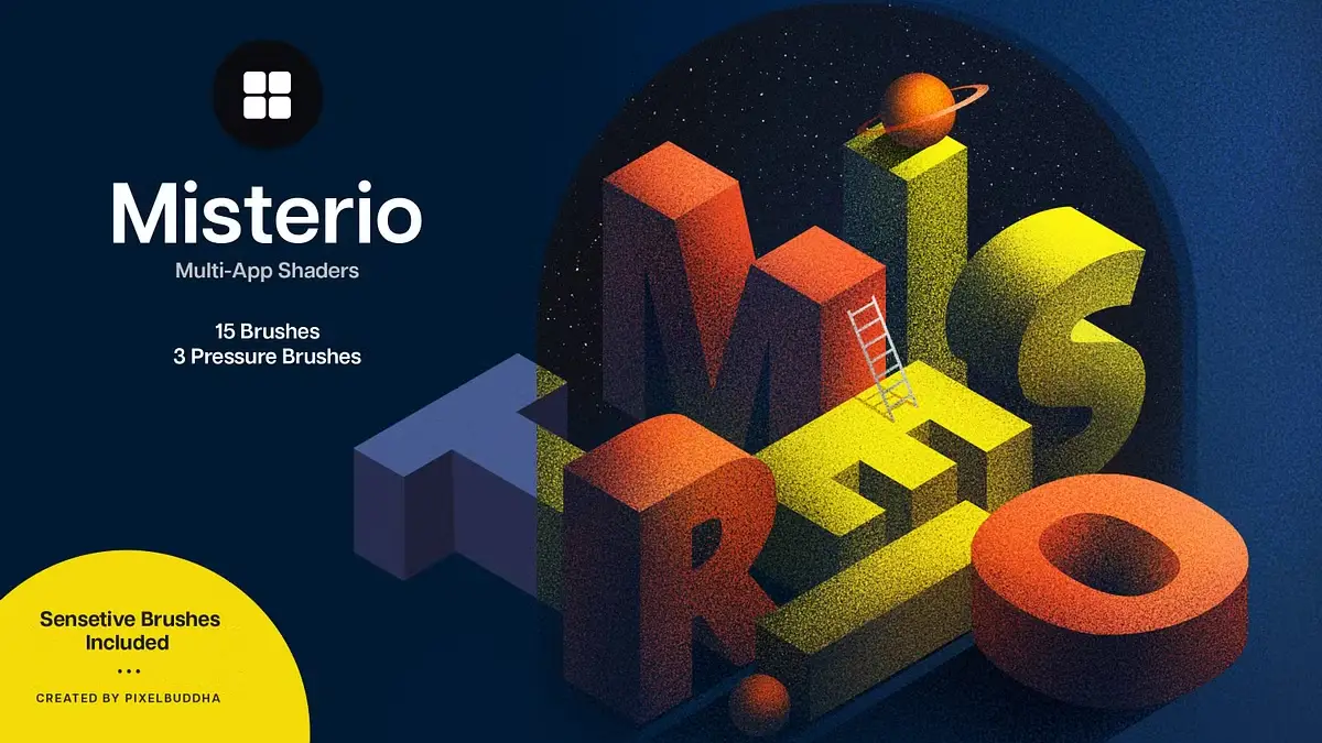
Misterio Shader Brushes for Adobe Photoshop, Adobe Illustrator, Affinity, and Procreate
Pixelbuddha’s latest release challenges everything designers think they know about digital shading. The Misterio shader brushes arrive at a moment when most digital artists still wrestle with flat, lifeless gradients. Meanwhile, the demand for tactile, authentic texture has never been higher. These 18 brushes don’t just add noise to your artwork. Instead, they introduce what we’ll call Cryptographic Shading — a methodology where each stroke reveals information gradually, building atmospheric depth through calculated randomness.
Download the brushes from Creative Market What Makes Misterio Shader Brushes Different From Traditional Digital Brushes?
Most brush packs throw tools at designers without philosophy. Consequently, artists accumulate hundreds of brushes they never use. The Misterio collection operates differently. It presents a curated system built on a principle we can define as Textural Intentionality — the idea that every mark should contribute to narrative depth rather than decorative noise.
The collection splits into two distinct families. First, fifteen noise brushes form the foundation. These tools manipulate light-shadow interplay through controlled chaos. Second, three pressure brushes respond to stylus dynamics with remarkable sensitivity. However, Adobe Illustrator users should note that pressure brushes remain incompatible with that platform.
This division isn’t arbitrary. Furthermore, it reflects a deeper understanding of how designers actually work. Noise brushes establish an atmospheric foundation. Pressure brushes add gestural authenticity. Together, they create what we term Layered Authenticity — the visual quality that separates professional work from amateur attempts.
Pixelbuddha’s Misterio Shader Brushes for Adobe Photoshop, Adobe Illustrator, Affinity Designer, and Procreate
Download the brushes from Creative Market The Science Behind Shader Brush Technology
Traditional digital shading relies on algorithmic gradients. These produce mathematically perfect transitions that paradoxically feel artificial. The human eye evolved to read natural light scattering. Consequently, perfectly smooth gradients trigger subtle cognitive dissonance.
Misterio brushes solve this through strategic imperfection. Each noise brush contains carefully calibrated irregularity patterns. Moreover, these patterns simulate how light actually behaves in physical media. Paint absorbs into paper fibers unevenly. Graphite catches on the tooth texture randomly. Digital tools typically erase these “flaws.” The Misterio approach embraces them.
Cross-Platform Compatibility: Why Universal Tools Matter Now
The shader brushes work across four major platforms: Adobe Photoshop, Adobe Illustrator (CC and CS6), Affinity (both vector and raster modes), and Procreate. This compatibility matters more than specifications suggest.
Modern creative workflows rarely stay within a single application. A logo starts in Illustrator. Therefore, textures get added in Photoshop. Final touches happen in Procreate during client meetings. Designers who maintain consistent tools across platforms save cognitive energy. They develop muscle memory once, rather than learning different brushes for each program.
Additionally, cross-platform tools future-proof your workflow. Software changes constantly. However, a brush set that works everywhere reduces platform dependency. You’re investing in capability rather than software-specific tricks.
Understanding the Fifteen Noise Brushes
The noise brush collection deserves closer examination. These aren’t random texture generators. Instead, each brush embodies specific materiality concepts.
Some replicate paper grain interaction. Others simulate charcoal dust distribution. Several mimic watercolor bloom patterns. The variety enables what we call Material Code-Switching — the ability to shift between different physical media references within purely digital work.
This matters because contemporary design increasingly values hybrid aesthetics. Clients want digital efficiency with analog warmth. They expect quick turnarounds without sacrificing tactile quality. Noise brushes bridge this contradiction effectively.
Furthermore, these brushes enhance depth perception through subtle texture variation. Flat color areas feel closer to viewers. Textured regions recede visually. By controlling texture density, designers manipulate spatial relationships without traditional perspective techniques.
The Three Pressure Brushes: Gestural Intelligence
Pressure sensitivity transforms digital brushes from stamps into instruments. The three pressure brushes in Misterio respond to stylus pressure with sophisticated nuance. Light touches create delicate marks. Heavy pressure produces bold, dense strokes. This range enables genuine gestural expression.
Many designers underestimate pressure brushes. They assume any pressure-sensitive tool works similarly. Actually, implementation quality varies dramatically. Poor pressure curves feel mushy or abrupt. Well-designed curves feel like natural extensions of hand movement.
Misterio’s pressure brushes demonstrate refined curve design. The response feels intuitive rather than requiring mental adjustment. Consequently, designers can focus on artistic decisions instead of tool management. This psychological shift proves more valuable than technical specifications suggest.
Introducing the Veil Technique: A New Shader Methodology
Through extensive testing, a particular working method emerged. We call it the Veil Technique. This approach layers noise brushes at varying opacities to build cumulative atmospheric effects.
Traditional shading adds highlights and shadows directly. The Veil Technique instead builds translucent texture layers. Each layer subtly modifies underlying tones. After several passes, complex tonal relationships emerge organically. The result resembles traditional media more closely than standard digital rendering.
Here’s how it works practically. Start with base colors blocked in flatly. Next, select a noise brush and reduce opacity to 15-20%. Then, build up texture gradually through multiple strokes. Finally, use pressure brushes for accent marks and focal emphasis.
This methodology encourages patient layering over instant results. Moreover, it produces work that withstands close inspection. Zooming reveals texture detail rather than exposing digital flatness.
Why Adobe Illustrator Users Face Limitations
The pressure brush incompatibility with Illustrator deserves explanation. Illustrator operates fundamentally differently from raster-based programs. It calculates vector mathematics rather than manipulating pixel grids. Pressure sensitivity requires raster-based rendering that Illustrator doesn’t natively support for brushes.
This limitation doesn’t diminish the collection’s value for Illustrator users. The fifteen noise brushes still function perfectly. They add crucial texture to vector work. However, designers seeking full gestural control should work in Photoshop, Affinity Designer’s raster mode, or Procreate for those elements.
Interestingly, this restriction encourages beneficial workflow segmentation. Keep vector work clean and geometric in Illustrator. Add organic texture in raster programs. This separation often produces stronger final results than trying to accomplish everything in one application.
Affinity Designer: The Overlooked Advantage
Affinity Designer’s dual vector-raster capability creates unique opportunities. Designers can switch between modes without changing applications. Therefore, Misterio brushes gain special utility in Affinity workflows.
Work vectorially for structure and scalability. Then, switch to raster mode for texture application. This approach combines both worlds efficiently. Furthermore, Affinity’s performance often exceeds Adobe alternatives on identical hardware.
The shader brushes perform identically across Affinity’s modes. This consistency eliminates the common problem of brushes behaving differently between programs. Designers develop confident muscle memory faster.
Procreate Integration: Mobile Workflow Revolution
Procreate transformed iPad illustration from a novelty to a professional tool. The Misterio shader brushes extend this capability further. Mobile design work no longer means compromising on texture quality.
Many designers now start projects on iPad during commutes or travel. Consequently, having identical brushes across desktop and mobile platforms maintains workflow consistency. Sketches begun in Procreate transfer seamlessly to Photoshop for refinement.
Additionally, Procreate’s brush engine handles the Misterio collection exceptionally well. Pressure response feels natural. Noise patterns display accurately even on smaller screens. This reliable performance encourages genuine mobile productivity rather than mere sketching.
The Mystery Metaphor: Philosophy Meets Function
Pixelbuddha named this collection deliberately. Mystery implies gradual revelation. Each brush stroke reveals partial information. Full understanding emerges through accumulated marks. This metaphor extends beyond marketing into actual usage patterns.
Working with these brushes encourages exploratory experimentation. Designers discover unexpected texture combinations. Random variations produce happy accidents. The tools reward curiosity over rigid planning.
Moreover, the mystery theme acknowledges creative truth. Great work often surprises its creator. Rigid control produces predictable results. Controlled chaos enables discovery. The Misterio brushes facilitate this productive uncertainty.
Predicting Future Shader Brush Evolution
Looking forward, several trends seem inevitable. First, AI will increasingly generate base imagery. However, human-applied texture will remain valuable for adding authenticity signals. Consequently, high-quality shader brushes become more important rather than obsolete.
Second, cross-platform compatibility will grow more critical. Designers will expect tools that work everywhere without friction. Collections like Misterio establish this standard for competitors to match.
Third, brushes will incorporate more sophisticated pressure curves and tilt responsiveness. Current tools only scratch the surface of stylus capability. Future iterations will likely offer deeper customization while maintaining intuitive defaults.
Practical Application: Logo Design Case Study
Consider logo design workflows. Traditional approaches keep logos purely vector for scalability. However, many contemporary brands embrace subtle texture. This creates presentation challenges.
Using Misterio brushes, designers can create textured logo variations efficiently. Design the core mark in Illustrator. Then, export to Photoshop and apply noise brushes selectively. The texture adds warmth without compromising the vector original.
Furthermore, this approach enables context-appropriate variations. Digital applications use clean vectors. Print materials incorporate texture for tactile appeal. The shader brushes make creating these variations quick rather than laborious.
Editorial Illustration: Where Shaders Shine
Editorial illustration demands rapid turnaround without sacrificing quality. Misterio brushes excel in this environment. They add professional polish quickly.
Illustrators can establish mood through texture choices. Gritty noise patterns suit dystopian themes. Subtle grain adds vintage sophistication. The fifteen-brush variety provides enough range without overwhelming decision-making.
Additionally, the brushes help meet tight deadlines. Instead of laboriously building texture manually, designers apply sophisticated shading in minutes. This efficiency matters when publications demand same-day revisions.
The Economics of Premium Brush Collections
Quality tools require investment. However, premium brush collections often deliver better value than free alternatives. Free brushes typically lack consistency and refinement. They require extensive testing to find usable options.
Premium collections like Misterio offer curated quality. Every brush serves a specific purpose. Consequently, designers save time on experimentation. Time savings quickly offset financial costs for working professionals.
Moreover, consistent quality across a collection enables reliable workflow development. Designers can create repeatable processes using known tools. This predictability proves invaluable when managing multiple projects simultaneously.
Community Response and Professional Adoption
Early adopters report significant workflow improvements. Many designers note reduced time spent achieving professional texture quality. Others appreciate the cross-platform consistency, enabling flexible working arrangements.
Professional illustrators particularly value the pressure brush responsiveness. These tools enable genuine gestural expression that cheaper alternatives fail to match. Consequently, the finished work exhibits more authentic mark-making qualities.
Download the brushes from Creative Market The design community increasingly recognizes that tool quality matters. Software subscriptions cost hundreds annually. Investing in premium brushes that enhance capabilities across all projects makes financial sense.
Frequently Asked Questions (FAQ):
Are Misterio shader brushes compatible with older Photoshop versions?
The brushes work with recent Photoshop versions. However, very old versions may experience compatibility issues. Adobe CC users should encounter no problems.
Can beginners use these brushes effectively?
Absolutely. Moreover, quality tools often help beginners learn faster. The brushes produce professional results with basic application. This encourages continued experimentation and skill development.
Do the noise brushes slow down program performance?
Not significantly. Modern computers handle these brushes easily. However, extremely large canvas sizes with many layers might experience a slight slowdown on older hardware.
Why are pressure brushes incompatible with Illustrator?
Illustrator’s vector-based architecture doesn’t support the raster-based calculations required for pressure-sensitive brushes. This represents fundamental software design rather than brush collection limitations.
How do Misterio brushes compare to Photoshop’s default texture brushes?
Default brushes provide basic functionality. Misterio offers significantly more refined texture quality and better pressure response. The difference becomes obvious in finished work.
Can these brushes replace all other texture tools?
No single collection handles every situation. However, Misterio covers the majority of common shading needs. Most designers find them sufficient for everyday projects.
What file formats do the brushes use?
The collection includes appropriate formats for each supported platform. Photoshop receives .ABR files, Illustrator gets .AI brush files, and so forth. Installation follows standard procedures for each application.
Do updates or new brushes get added over time?
Pixelbuddha’s update policy varies by product. Check their website for specific information about the Misterio collection’s long-term support plans.
Don’t hesitate to find other professional design templates here at WE AND THE COLOR.
Subscribe to our newsletter!
[newsletter_form type=”minimal”]
#adobeIllustrator #adobePhotoshop #Affinity #Misterio #PixelBuddha #Procreate #shaderBrushes