I went to a bank and put a really high negative margin on all the money inside. This offset was enough for it to appear outside the bank, allowing me to abscond with it.
Learn more neat tricks like this in my upcoming book, CSS for Crime.
Mastering Flexbox and Grid: Advanced Layout Techniques in CSS
1,122 words, 6 minutes read time.
Introduction
There comes a time in every seasoned web programmer’s journey where floats and clearfix hacks just don’t cut it anymore. Responsive design, dynamic content placement, and flexible UIs demand more modern, robust solutions. That’s where CSS Flexbox and Grid come into play. For the male programmer looking to elevate his front-end game, mastering these two layout systems isn’t just useful — it’s essential. This deep-dive aims to help you master Flexbox and Grid with practical examples, expert insights, and advanced strategies that go beyond the basics. We’re not just talking theory. We’re building solid mental models and workflows that empower you to lay out interfaces with surgical precision.
Understanding the Layout Landscape
Before diving headfirst into Flexbox and Grid, it’s important to understand the layout problems they were designed to solve. Flexbox is a one-dimensional layout system (either horizontal or vertical), ideal for aligning items in a row or column. Grid is two-dimensional, making it perfect for more complex page structures.
With the demise of IE11 and the dominance of evergreen browsers, you no longer have to worry about compatibility nightmares. Modern CSS is fully supported, so it’s time to go all in.
Flexbox: A Precision Tool for One-Dimensional Layouts
At its core, Flexbox makes aligning items along a single axis easier than ever before. But beyond the basics of display: flex, Flexbox offers a suite of properties that allow you to control wrapping, alignment, distribution, and sizing.
Let’s start with a typical use case: a navigation bar. With justify-content: space-between and align-items: center, you can spread items out across the horizontal plane while aligning them vertically — without writing a single float or margin hack.
But let’s not stop at nav bars. Consider a product list that needs to dynamically wrap based on available screen width. With flex-wrap: wrap, and flex-basis to control item width, Flexbox allows for responsive behaviors that would be extremely convoluted with floats or inline-blocks.
Moreover, the order property is a game-changer. Imagine building a layout where the visual order doesn’t match the source order — useful for accessibility or SEO reasons. Flexbox lets you rearrange items visually while preserving semantic HTML structure.
Grid: Mastering Two-Dimensional Layouts
CSS Grid is where things really get interesting. Whether you’re creating a magazine-style layout, a dashboard, or even a game board, Grid lets you manage both rows and columns with ease.
The key concepts to internalize are:
grid-template-columns and grid-template-rows properties define the layout structure.grid-template-areas can make your layout self-documenting.Take a landing page with a hero image, call-to-action, and three columns of content. With Grid, you can define a layout where each element occupies a specific area using named regions — no more nested divs or clearfixes.
Advanced use of minmax(), auto-fit, and auto-fill unlocks the magic of responsive grids that adapt to screen size while preserving structure. And with fr units, you can proportionally allocate space with flexibility and elegance.
When to Use Flexbox vs. Grid
One of the most common questions is: when should I use Flexbox, and when should I use Grid? The answer lies in understanding your layout goals.
Use Flexbox when you’re aligning items along a single axis. Think navigation menus, form fields, media objects. It excels in linear content flows.
Use Grid when your layout has both rows and columns. Think entire page layouts, dashboards, image galleries, and multi-column content. Grid provides you with unparalleled control over structure and alignment.
Sometimes, the most effective strategy is a hybrid approach. For example, a page might use Grid for the overarching layout and Flexbox for the alignment of items within individual components.
Advanced Techniques
Once you grasp the fundamentals, you can start bending CSS to your will.
Nested Grids and Flex Containers
Modern layouts often require nested structures. Grid within Grid, or Flex items inside a Grid cell. The key is to avoid unnecessary complexity. Define each container’s behavior based on its function. A card component might use Grid for internal structure while being placed within a Flex container for alignment.
Aligning Across Containers
Using properties like place-items, align-self, and justify-self, you can control alignment at both the container and item level. This fine-grain control is crucial for pixel-perfect UIs.
Responsive Design with Media Queries and Modern Units
Pairing Flexbox and Grid with CSS custom properties and clamp() for fluid typography and spacing makes for responsive designs that don’t require endless breakpoints. Combine repeat(auto-fit, minmax(...)) with grid-gap and you can create layouts that adapt intuitively.
Grid Debugging Tools
Modern browsers like Chrome and Firefox offer built-in dev tools for visualizing grid lines and areas. Learn how to use these tools to inspect your layouts and resolve alignment issues quickly.
Practical Use Cases
Imagine building a portfolio site with a hero section, about, projects, and contact blocks. Grid helps you structure the overall layout, while Flexbox keeps buttons aligned and testimonials neatly stacked. Similarly, in a CMS like WordPress or SharePoint, use Grid to define the section layouts and Flexbox within web parts or blocks.
Or consider a SaaS dashboard. Grid is perfect for laying out graphs, metrics, and tables. Flexbox makes it easy to control user profile panels, toolbars, and interactive buttons.
In team environments, especially on platforms like SharePoint, leveraging Grid and Flexbox strategically can drastically reduce reliance on custom JavaScript or heavy frameworks.
SEO Considerations
Semantic HTML structure combined with visual flexibility is where Flexbox and Grid shine. By decoupling layout from source order, you can prioritize content for crawlers while designing for users. Always prefer HTML5 semantic tags and use ARIA roles wisely when altering the visual order.
Avoid hiding content with display: none unless necessary, and ensure your layouts are keyboard-navigable. Accessibility isn’t just good UX — it affects SEO rankings too.
Conclusion: Craft Layouts Like a Pro
Mastering CSS Flexbox and Grid isn’t just about knowing the syntax. It’s about developing an intuitive sense of layout that adapts to user needs, device constraints, and content dynamics. Whether you’re building slick UIs, responsive apps, or robust admin dashboards, the combination of Flexbox and Grid will keep your layouts scalable and maintainable.
If you’ve found this guide helpful, don’t stop here. Subscribe to our newsletter for deeper dives, coding challenges, and cutting-edge tutorials. Or join the conversation below by leaving a comment. We’d love to hear how you use Flexbox and Grid in your projects.
D. Bryan King
Sources
Disclaimer:
The views and opinions expressed in this post are solely those of the author. The information provided is based on personal research, experience, and understanding of the subject matter at the time of writing. Readers should consult relevant experts or authorities for specific guidance related to their unique situations.
Related Posts
#accessibilityInCSS #advancedCSS #ChromeDevTools #clampCSS #CSSBestPractices #CSSCardLayout #CSSContainers #CSSCustomProperties #CSSDeveloperBlog #CSSForLandingPages #cssForProgrammers #CSSForSaaS #CSSFrUnit #CSSGapProperty #cssGrid #CSSLayout #CSSLayoutSystem #CSSMentalModels #CSSNamingAreas #CSSOrderProperty #CSSTechniques #CSSTips #CSSTraining #CSSTricks #CSSTutorials #CSSVisualFlow #cssWorkflow #dashboardDesign #developerGuide #dynamicCSS #FirefoxCSSTools #flexbox #FlexboxExamples #FlexboxGridHybrid #flexboxLayout #frontEndDevelopment #frontendWorkflow #GridExamples #gridLayout #HTMLLayout #layoutDebugging #layoutRendering #layoutTechniques #mediaQueries #mobileFirstDesign #modernCss #nestedLayouts #responsiveDesign #responsiveLayouts #semanticHTML #SEOLayoutStrategy #sharepointLayout #UIAlignment #UIPrecision #visualOrderCSS #WebDevelopment #webProgrammer #wordpressCSS

You suck at CSS (and that's okay)
https://rexriepe.com/yousuckatcss/
#HackerNews #YouSuckAtCSS #CSSTips #WebDevelopment #LearningCurve #DesignStruggles
Are you struggling with CSS overrides? Here’s your chance to learn about CSS specificity - how it works, how to calculate it, and best practices to ensure your styles apply as intended.
https://www.specbee.com/blogs/take-control-of-your-styles-with-css-specificity
#css #csstips #cssspecificity #webdevelopment #frontend #webdesign #coding #cssselectors
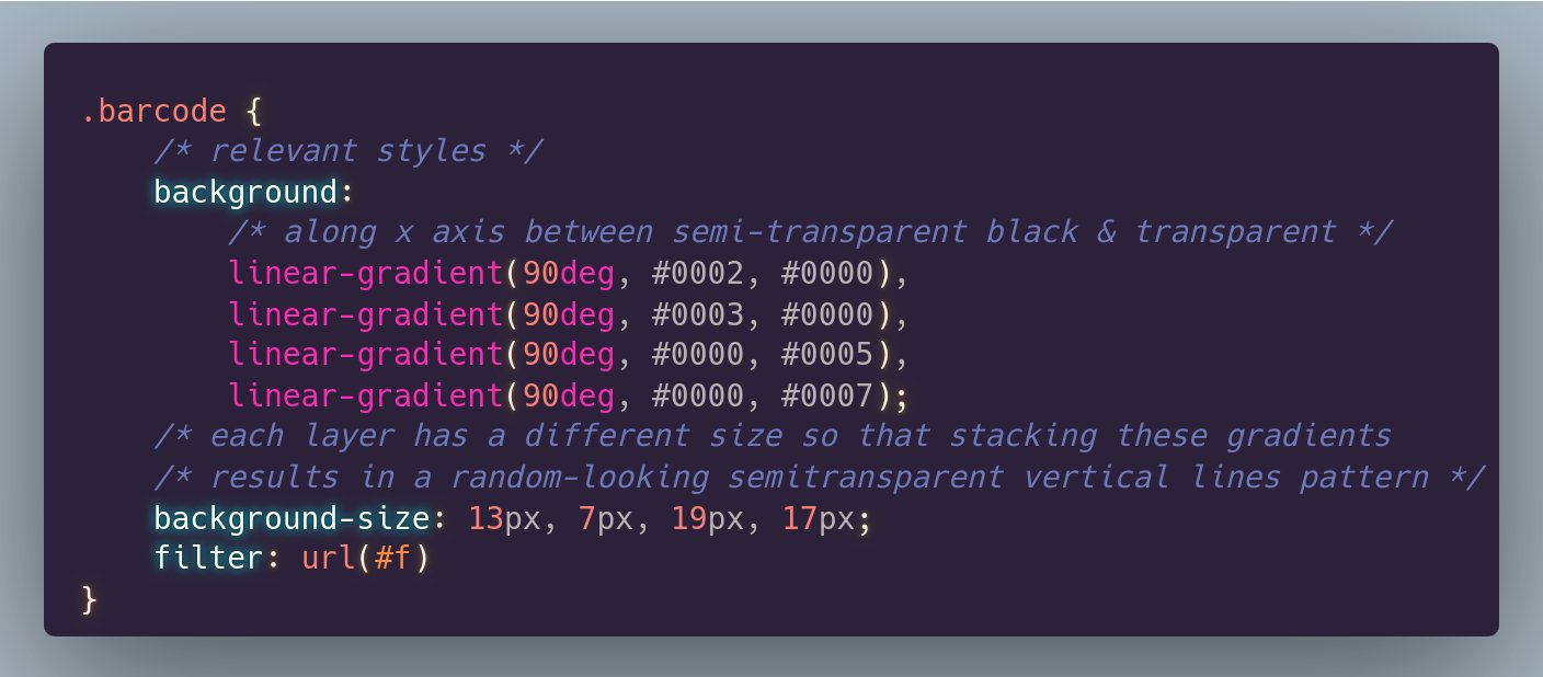
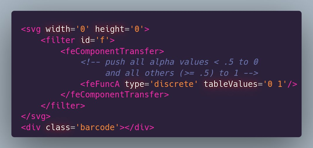
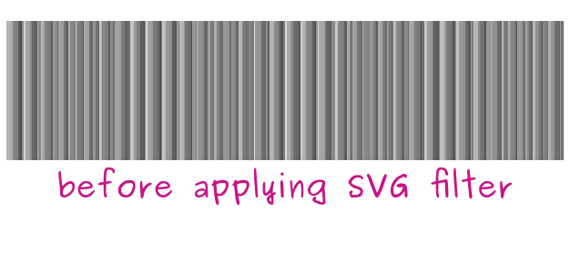
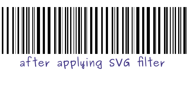
#tinySVGtip Create a barcode ▌│█║▌║▌║ with a CSS gradient pattern (only a handful of CSS declarations in total) + a super simple SVG filter!
Also an entry for this week's #CodePenChallenge https://codepen.io/thebabydino/pen/abroLRa
The background gradients pattern was heavily inspired by "cicada stripes" from the CSS3 Patterns gallery by @leaverou https://projects.verou.me/css3patterns/#cicada-stripes
#CSS #SVG #filter #svgFilter #cssGradient #barcode #cssTricks #cssTip #cssTips #code #coding #frontend #webDev #webDevelopment
#tinyCSStip You may have seen some of my demos using this on #CodePen already. Here's the how behind it.
Pure #CSS #halftone effect in 3 declarations:
✨ background layering a pattern and a map
✨ blend mode multiplication of the two layers
✨ contrast bump up to push all greys to either black or white
#cssFilter #filter #cssTricks #cssTip #cssTips #tipsAndTricks #code #coding #frontend #wedDev #webDevelpment
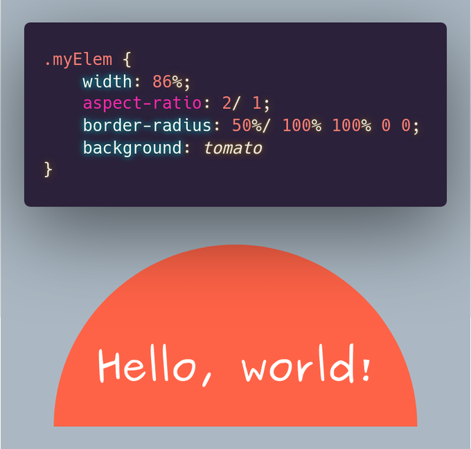
Basic #tinyCSStip.💡
So you have a responsive, flexible `width` rectangular box with `aspect-ratio: 2` and want to turn it into a half disc?
Use a `50%` horizontal `border-radius` and a vertical one that's `100%` for the top corners (first two listed) and `0` for the other two!
#css #code #cssTip #cssTips #cssTricks #coding #frontend #webDev #webDevelopment #cssBasics
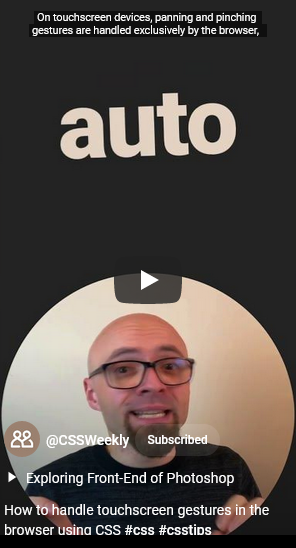
🤌 How to handle touchscreen gestures in the browser using CSS
by @zoranjambor at @CSSWeekly
#css #csstips #touchscreen #gestures
#TIL that `:where` is perfect for CSS resets
https://css-tricks.com/dont-fight-the-cascade-control-it/#aa-o-cascade-where-art-thou
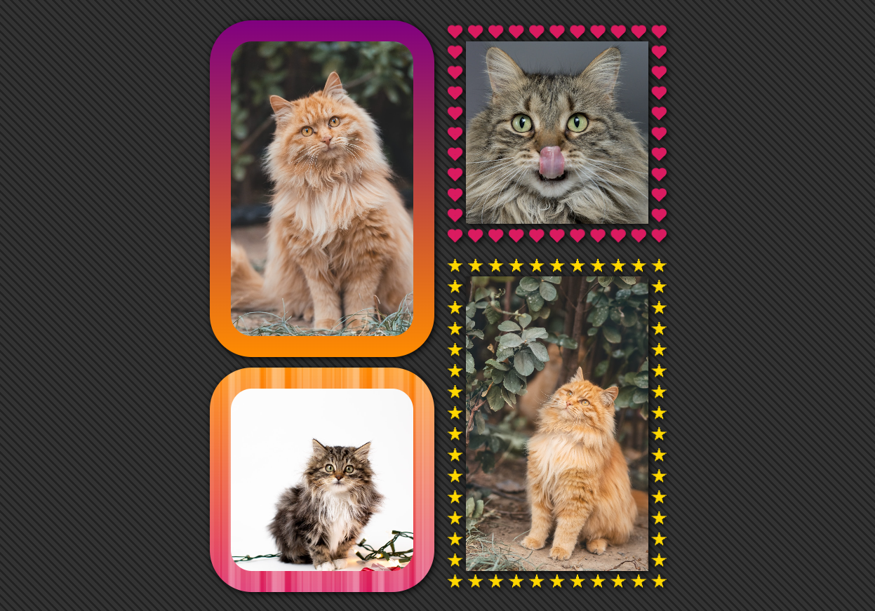
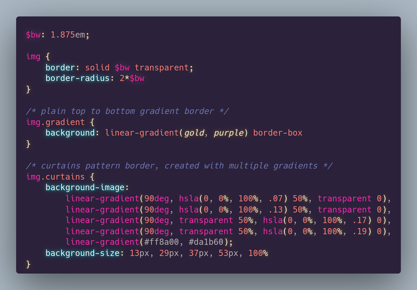
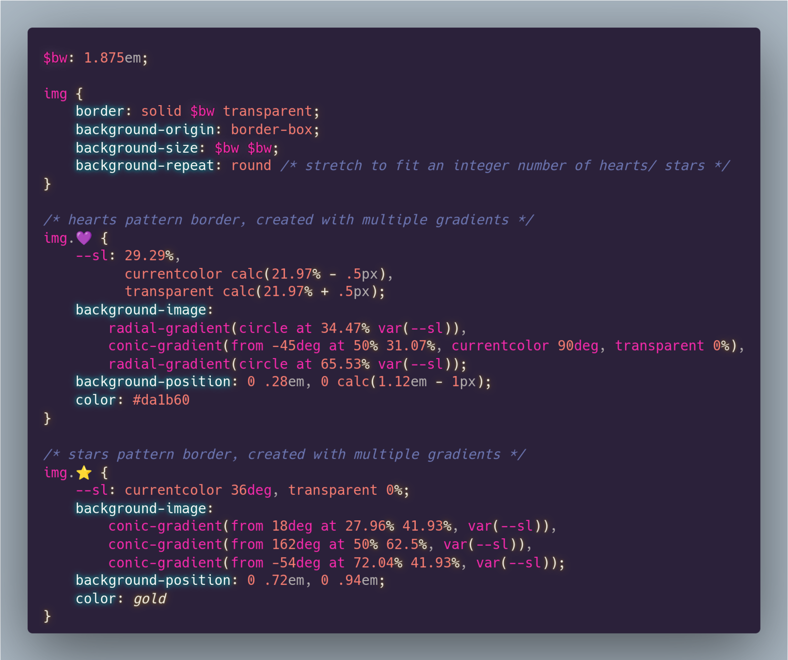
Bonus tip to the one @chenry shared https://mastodon.social/@chenry/109325956277772390 - you can have a `background` for an `<img>`.
This helps with getting a gradient `border` for the image when the image also has rounded corners or for a multi-gradient layer `border` pattern: https://codepen.io/thebabydino/pen/JjZNXoQ
Because `border-image` only accepts one gradient image (can't have more to get ⭐ or ❤️ patterns) & doesn't play nice with `border-radius` (https://codepen.io/thebabydino/pen/jxZyed).
RT Anower Jahan Shofol
💡 CSS Shorts
Want to change the flow of the CSS grid? Use grid-auto-flow property.
Codepen:
#CSS #csstips
https://codepen.io/AnowerJahan/pen/dyvjewo
:sys_twitter: https://twitter.com/jahananower/status/1402535569205301253
this goes for most things
RT @Virrum@twitter.com
Todays #CSStips: If you are struggling with layout and can’t understand what’s going on. Don’t add more properties and styles to it. Delete , delete, delete and start over. It’ll be so much better the second time.