
Formation Penpot - Partie 5 : Grid Layout
#gridLayout

Khi hoàn thành xây dựng sản phẩm, điều gì khiến bạn không chắc chắn nhất? Giá trị sản phẩm có rõ ràng? Nút kêu gọi hành động có đủ visible? Thiết kế có chuyên nghiệp? Phiên bản di động có bị lỗi? Giá cả có hợp lý? #PhảnHồiSảnPh phẩm #ĐánhGiáTrangWeb #XâyDựngSảnPhẩm #PhátTriểnSảnPhẩm #GridLayout # UILayout #ThiếtKếGiaoDiện #PhátTriểnWeb
https://www.reddit.com/r/SideProject/comments/1okwgqr/what_do_you_wish_someone_would_tell_you_about/

Auch eine deutsche Version ist wie immer verfügbar: ich habe einen neuen Artikel verfasst! Er beschreibt, wie man ein CSS Grid erstellt, das ein klassisches mehrspaltiges Raster (z. B. 12 Spalten) mit Layout-Breakouts (Full Bleed) kombiniert.
CodePen-Demos des finalen Layouts und zwei Vorversionen sind im Tutorial verlinkt.
Ich freue mich sehr über Kritik!
#frontend #css #cssGrid #gridLayout #cssLayout #webDev
https://www.sebkln.de/tutorials/css-layout-breakout-mit-multi-column-grid/
I wrote a new article! It explains how to create a CSS Grid that combines a classic multi-column grid (e.g. 12 columns) with Layout Breakouts (Full Bleed positioning). Allows for flexible alignment of grid items.
CodePen demos for the final layout and two pre-versions are linked in the tutorial. Yes, there's a tl;dr. 😄
I am very interested in your feedback!
#frontend #css #cssGrid #gridLayout #cssLayout #webDev
https://www.sebkln.de/en/tutorials/css-layout-breakout-with-multi-column-grid/

I have a new article out on Frontend Masters: get the number of auto-fit/ auto-fill columns in #CSS
https://frontendmasters.com/blog/count-auto-fill-columns/
Check it out, I can assure you you'll probably learn something new. At the very least that some issues have recently been fixed... 😼
#code #coding #frontend #gridLayout #cssLayout #cssMaths #web #webDev #dev #webDevelopment

Mastering Flexbox and Grid: Advanced Layout Techniques in CSS
1,122 words, 6 minutes read time.
Introduction
There comes a time in every seasoned web programmer’s journey where floats and clearfix hacks just don’t cut it anymore. Responsive design, dynamic content placement, and flexible UIs demand more modern, robust solutions. That’s where CSS Flexbox and Grid come into play. For the male programmer looking to elevate his front-end game, mastering these two layout systems isn’t just useful — it’s essential. This deep-dive aims to help you master Flexbox and Grid with practical examples, expert insights, and advanced strategies that go beyond the basics. We’re not just talking theory. We’re building solid mental models and workflows that empower you to lay out interfaces with surgical precision.
Understanding the Layout Landscape
Before diving headfirst into Flexbox and Grid, it’s important to understand the layout problems they were designed to solve. Flexbox is a one-dimensional layout system (either horizontal or vertical), ideal for aligning items in a row or column. Grid is two-dimensional, making it perfect for more complex page structures.
With the demise of IE11 and the dominance of evergreen browsers, you no longer have to worry about compatibility nightmares. Modern CSS is fully supported, so it’s time to go all in.
Flexbox: A Precision Tool for One-Dimensional Layouts
At its core, Flexbox makes aligning items along a single axis easier than ever before. But beyond the basics of display: flex, Flexbox offers a suite of properties that allow you to control wrapping, alignment, distribution, and sizing.
Let’s start with a typical use case: a navigation bar. With justify-content: space-between and align-items: center, you can spread items out across the horizontal plane while aligning them vertically — without writing a single float or margin hack.
But let’s not stop at nav bars. Consider a product list that needs to dynamically wrap based on available screen width. With flex-wrap: wrap, and flex-basis to control item width, Flexbox allows for responsive behaviors that would be extremely convoluted with floats or inline-blocks.
Moreover, the order property is a game-changer. Imagine building a layout where the visual order doesn’t match the source order — useful for accessibility or SEO reasons. Flexbox lets you rearrange items visually while preserving semantic HTML structure.
Grid: Mastering Two-Dimensional Layouts
CSS Grid is where things really get interesting. Whether you’re creating a magazine-style layout, a dashboard, or even a game board, Grid lets you manage both rows and columns with ease.
The key concepts to internalize are:
- The
grid-template-columnsandgrid-template-rowsproperties define the layout structure. grid-template-areascan make your layout self-documenting.- Implicit vs. explicit grids give you control over how items are auto-placed or explicitly positioned.
Take a landing page with a hero image, call-to-action, and three columns of content. With Grid, you can define a layout where each element occupies a specific area using named regions — no more nested divs or clearfixes.
Advanced use of minmax(), auto-fit, and auto-fill unlocks the magic of responsive grids that adapt to screen size while preserving structure. And with fr units, you can proportionally allocate space with flexibility and elegance.
When to Use Flexbox vs. Grid
One of the most common questions is: when should I use Flexbox, and when should I use Grid? The answer lies in understanding your layout goals.
Use Flexbox when you’re aligning items along a single axis. Think navigation menus, form fields, media objects. It excels in linear content flows.
Use Grid when your layout has both rows and columns. Think entire page layouts, dashboards, image galleries, and multi-column content. Grid provides you with unparalleled control over structure and alignment.
Sometimes, the most effective strategy is a hybrid approach. For example, a page might use Grid for the overarching layout and Flexbox for the alignment of items within individual components.
Advanced Techniques
Once you grasp the fundamentals, you can start bending CSS to your will.
Nested Grids and Flex Containers
Modern layouts often require nested structures. Grid within Grid, or Flex items inside a Grid cell. The key is to avoid unnecessary complexity. Define each container’s behavior based on its function. A card component might use Grid for internal structure while being placed within a Flex container for alignment.
Aligning Across Containers
Using properties like place-items, align-self, and justify-self, you can control alignment at both the container and item level. This fine-grain control is crucial for pixel-perfect UIs.
Responsive Design with Media Queries and Modern Units
Pairing Flexbox and Grid with CSS custom properties and clamp() for fluid typography and spacing makes for responsive designs that don’t require endless breakpoints. Combine repeat(auto-fit, minmax(...)) with grid-gap and you can create layouts that adapt intuitively.
Grid Debugging Tools
Modern browsers like Chrome and Firefox offer built-in dev tools for visualizing grid lines and areas. Learn how to use these tools to inspect your layouts and resolve alignment issues quickly.
Practical Use Cases
Imagine building a portfolio site with a hero section, about, projects, and contact blocks. Grid helps you structure the overall layout, while Flexbox keeps buttons aligned and testimonials neatly stacked. Similarly, in a CMS like WordPress or SharePoint, use Grid to define the section layouts and Flexbox within web parts or blocks.
Or consider a SaaS dashboard. Grid is perfect for laying out graphs, metrics, and tables. Flexbox makes it easy to control user profile panels, toolbars, and interactive buttons.
In team environments, especially on platforms like SharePoint, leveraging Grid and Flexbox strategically can drastically reduce reliance on custom JavaScript or heavy frameworks.
SEO Considerations
Semantic HTML structure combined with visual flexibility is where Flexbox and Grid shine. By decoupling layout from source order, you can prioritize content for crawlers while designing for users. Always prefer HTML5 semantic tags and use ARIA roles wisely when altering the visual order.
Avoid hiding content with display: none unless necessary, and ensure your layouts are keyboard-navigable. Accessibility isn’t just good UX — it affects SEO rankings too.
Conclusion: Craft Layouts Like a Pro
Mastering CSS Flexbox and Grid isn’t just about knowing the syntax. It’s about developing an intuitive sense of layout that adapts to user needs, device constraints, and content dynamics. Whether you’re building slick UIs, responsive apps, or robust admin dashboards, the combination of Flexbox and Grid will keep your layouts scalable and maintainable.
If you’ve found this guide helpful, don’t stop here. Subscribe to our newsletter for deeper dives, coding challenges, and cutting-edge tutorials. Or join the conversation below by leaving a comment. We’d love to hear how you use Flexbox and Grid in your projects.
D. Bryan King
Sources
- MDN Web Docs – Basic Concepts of Flexbox
- MDN Web Docs – CSS Grid Layout
- CSS-Tricks – A Complete Guide to Flexbox
- CSS-Tricks – A Complete Guide to Grid
- Google Web.dev – Learn CSS
- Smashing Magazine – Modern CSS Solutions: Flexbox And Grid
- Flexbox Froggy – Interactive Flexbox Game
- Grid by Example – Rachel Andrew’s Grid Tutorials
- freeCodeCamp – Learn CSS Grid by Building 5 Layouts
- Learn CSS Layout – Comprehensive Layout Tutorials
- Frontend Masters – CSS Grid & Flexbox for Responsive Layouts
- Udemy – CSS Grid and Flexbox Masterclass
- Can I Use – Flexbox Support
- Can I Use – CSS Grid Support
- Google Web.dev – Responsive Web Design Basics
Disclaimer:
The views and opinions expressed in this post are solely those of the author. The information provided is based on personal research, experience, and understanding of the subject matter at the time of writing. Readers should consult relevant experts or authorities for specific guidance related to their unique situations.
Related Posts
- Style Smarter: Responsive Design with SCSS Date May 12, 2025
- The Art of Printing Webpages: Challenges and Solutions for SharePoint Web Part Developers Date May 17, 2024
- Unlocking the Future of CSS: How @property Brings Type Safety to Your Stylesheets Date September 23, 2024
#accessibilityInCSS #advancedCSS #ChromeDevTools #clampCSS #CSSBestPractices #CSSCardLayout #CSSContainers #CSSCustomProperties #CSSDeveloperBlog #CSSForLandingPages #cssForProgrammers #CSSForSaaS #CSSFrUnit #CSSGapProperty #cssGrid #CSSLayout #CSSLayoutSystem #CSSMentalModels #CSSNamingAreas #CSSOrderProperty #CSSTechniques #CSSTips #CSSTraining #CSSTricks #CSSTutorials #CSSVisualFlow #cssWorkflow #dashboardDesign #developerGuide #dynamicCSS #FirefoxCSSTools #flexbox #FlexboxExamples #FlexboxGridHybrid #flexboxLayout #frontEndDevelopment #frontendWorkflow #GridExamples #gridLayout #HTMLLayout #layoutDebugging #layoutRendering #layoutTechniques #mediaQueries #mobileFirstDesign #modernCss #nestedLayouts #responsiveDesign #responsiveLayouts #semanticHTML #SEOLayoutStrategy #sharepointLayout #UIAlignment #UIPrecision #visualOrderCSS #WebDevelopment #webProgrammer #wordpressCSS

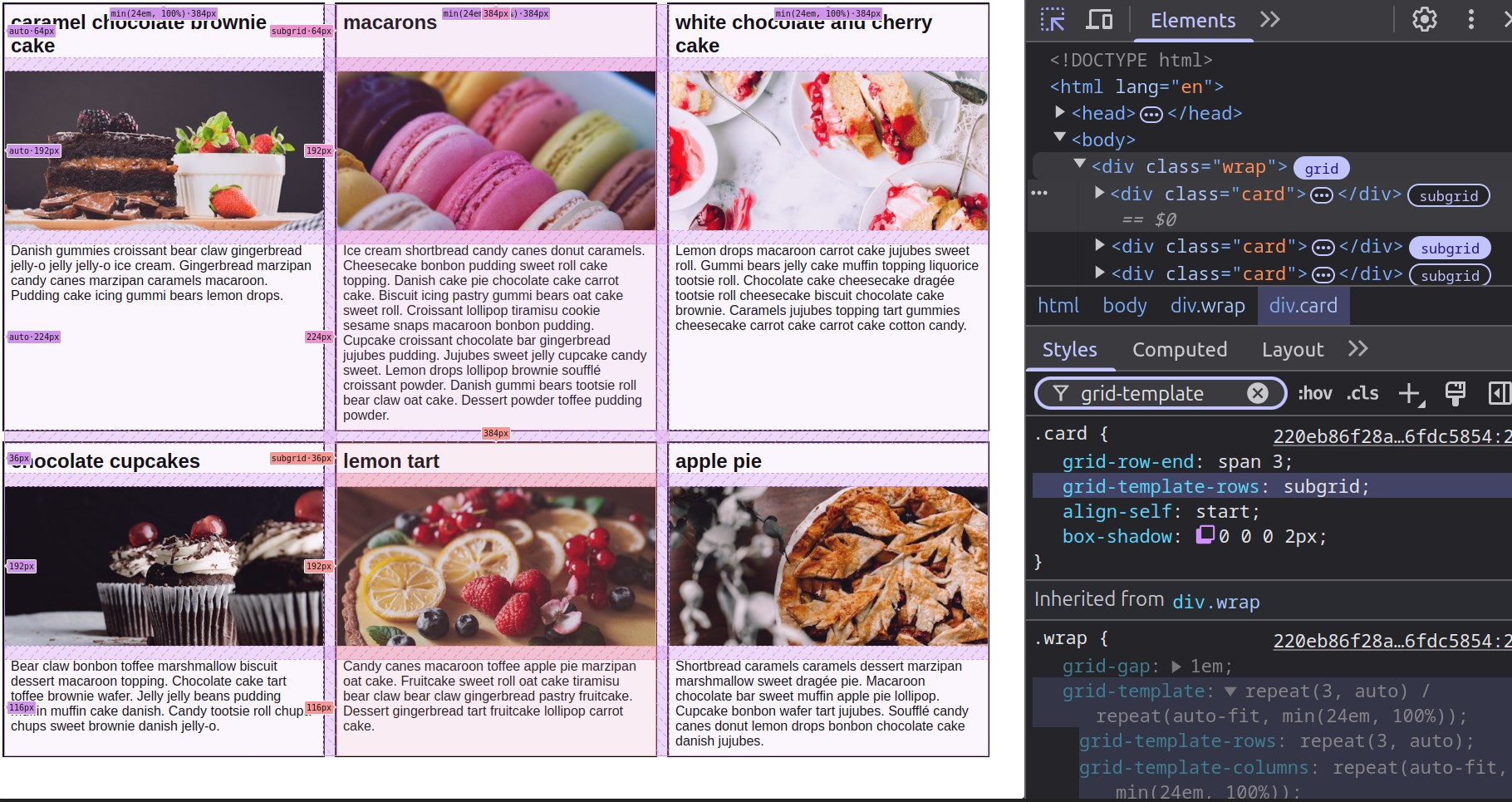
#CSS subgrid help?
Live test https://codepen.io/thebabydino/pen/raNedoQ?editors=0100 with problem: want the same fixed height for description on all card rows
repeat(3, auto) 😿 different heights for cards on different lines
repeat(6, auto auto 3lh) 😿 unwanted space below cards widescreen
auto-fit instead of 6 won't work 😿
#subgrid #cssLayout #cssGrid #gridLayout #layout #code #coding #frontend #help #web #dev #webDev #webDevelopment
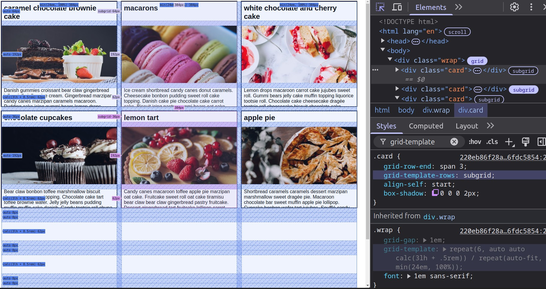
Because this keeps getting asked over and over... subgrid is how you get such cards whose grids align even with varying component heights.
https://www.reddit.com/r/css/comments/1itgf3h/comment/mdsg2bh/
Both the card wrapper and the cards get `display: grid` and the rest you can see in the Styles panel in DevTools below.
Live on @codepen
https://codepen.io/thebabydino/pen/QwWNwOz?editors=0100
#CSS #layout #cssLayout #cssGrid #gridLayout #code #coding #frontend #reponsive #web #dev #webDev #webDevelopment #subgrid
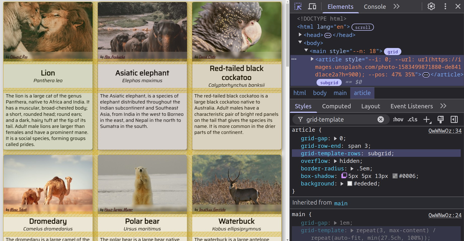
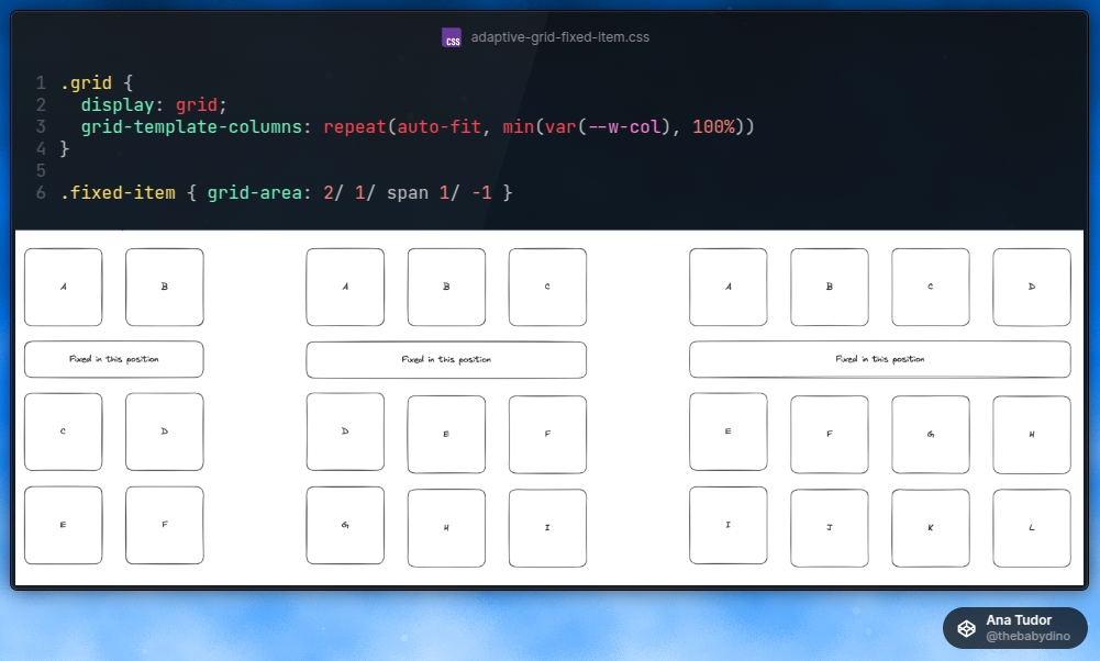
Because somebody asked, here's my take on the adaptive grid with a fixed row item spanning all columns https://www.reddit.com/r/css/comments/1ir2qp9/comment/mdrssnv/ - it all boils down to just 3 #CSS declarations as seen below.
Minimal @codepen example:
https://codepen.io/thebabydino/pen/pvogXOK?editors=1100
#layout #cssLayout #cssGrid #gridLayout #code #coding #frontend #reponsive #web #dev #webDev #webDevelopment
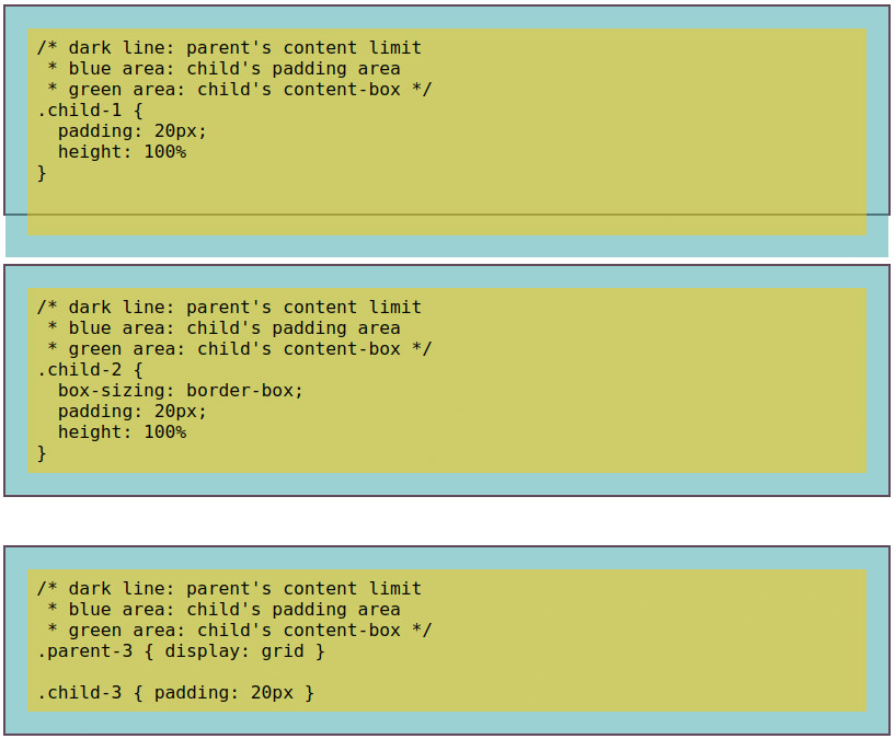
PSA: not setting `height: 100%` to begin with on an element that has a `padding` is a better way of avoiding overflow than the nuclear solution of setting `box-sizing: border-box` on everything.
Live comparison on @codepen:
https://codepen.io/thebabydino/pen/vEYOPPe?editors=1000
#CSS #layout #cssLayout #cssGrid #coding #code #frontend #gridLayout #boxModel #web #webDev #webDevelopment #dev

Responsive Layouts: Flex, Grid and Multi-Column by Abdelfattah Ragab
Available on https://shop.tredition.com and https://www.amazon.com
#css #css3 #flex #grid #flexible #flexbox #flexlayout #gridlayout #gridsystem #multicolumn #multicolumnlayout #newspaperlayout #magazine #magazinelayout #responsivedesign #responsivelayouts #modernlayouts #moderndesign #mobilefirst
Responsive Design: All CSS features for adaptive layouts by Abdelfattah Ragab
Available on https://shop.tredition.com and https://www.amazon.com
#css #css3 #flex #flexible #flexbox #flexlayout #grid #gridlayout #gridsystem #newspaperlayout #magazine #magazinelayout #adaptivelayouts #responsivedesign #responsivelayout #modernlayouts #moderndesign #mobilefirst
CSS Grid Layout by Abdelfattah Ragab
Available on https://shop.tredition.com and https://www.amazon.com
#css #css3 #grid #gridlayout #gridsystem #flex #responsivedesign #responsivelayout #modernlayouts #moderndesign #mobilefirst
I've mostly moved from absolute positioning to grid stacking:
.wrapper { display: grid }
.stack-item { grid-area: 1/ 1 }
But there's still one case where absolute positioning stacking makes sense: a stacked item is a text node (not an element or pseudo, so there's no CSS selector to select it).
#CSS #code #coding #frontend #cssGrid #gridLayout #webDevelopment #dev #web #webDev

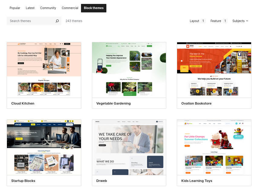
So many grid layouts to choose from! Over 240 WordPress grid layout block themes available. Which one is your favorite?
check out the themes here: https://wordpress.org/themes/tags/grid-layout+full-site-editing/
#wordpress #themes #cms #blog #gridlayout #opensource #blocktheme #design #wpthemes
Another super old @codepen demo I redid with modern #CSS is this yummy menu https://codepen.io/thebabydino/pen/AoxZQq
CSS grid instead of absolute positioning, clip-path instead of nested skew and un-skew, CSS variables to avoid setting a separate transform chain on each item... and more!
#gridLayout #cssGrid #clipPath #clipping #cssTransforms #cssVariables #coding #code #frontend #webDevelopment #web #dev #webDev
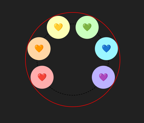
Updated 10+ year old SO answer on how to position items for a circular menu https://stackoverflow.com/a/15185180/1397351
Because #CSS got better in the meanwhile. This remake uses CSS grid instead of absolute positioning, CSS vars to reduce the code and CSS trigonometry for improved maintainability.
@codepen demo https://codepen.io/thebabydino/pen/nLNRYx
#maths #trigonometry #geometry #grid #gridLayout #cssVariables #menu #cssMaths #cod #coding #frontend #web #dev #webDev #webDevelopment
One #CSS property I use a lot is `grid-area`.
In this basic @codepen example, `grid-area` (through its `grid-row` and `grid-column` components) is all that changes value between the narrow and wide screen cases (for the nav items wrapper and for the search wrapper) https://codepen.io/thebabydino/pen/YzmrXZo
#cssGrid #gridLayout #responsive #code #web #ded #webDev #webDevelopment #coding #frontend
Here's another grid of cubes remake on
@codepen:
https://codepen.io/thebabydino/pen/DZOdMq
Now using CSS grid instead of absolute positioning, CSS variables to greatly reduce the amount of code needed.
#CSS #gridLayout #cssGrid #transform #3D #code #coding #frontend #colorMix #web #dev #webDev #webDevelopment #interactive
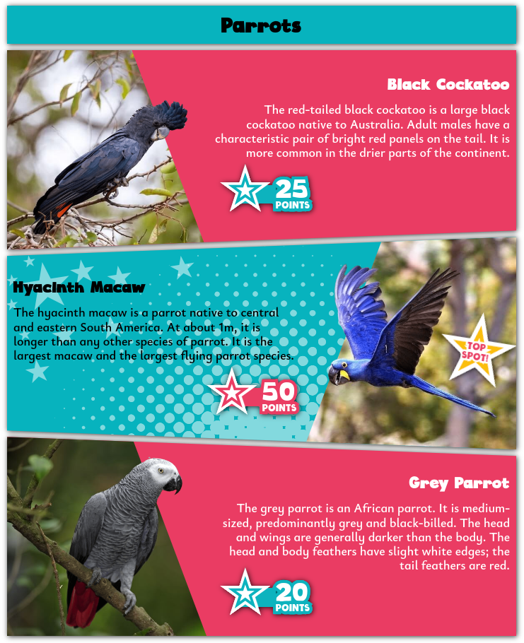
Here's a little thing 🦜 I made on @codepen:
https://codepen.io/thebabydino/pen/bGXeGoa
Uses clip-path, CSS grid, variables, halftone patterns https://mastodon.social/@anatudor/112401133442879091 and more! 🌟
#CSS #gridLayout #cssGrid #SVG #filter #svgFilter #textEffect #clipPath #code #coding #frontend #webDev #web #dev #webDev
Client Info
Server: https://mastodon.social
Version: 2025.07
Repository: https://github.com/cyevgeniy/lmst