#d18O

@michcampbell

Interesting.
From what I recall from a few papers I read, the Mediterranean, or #MENA, experienced droughts in the 4.2ky event.

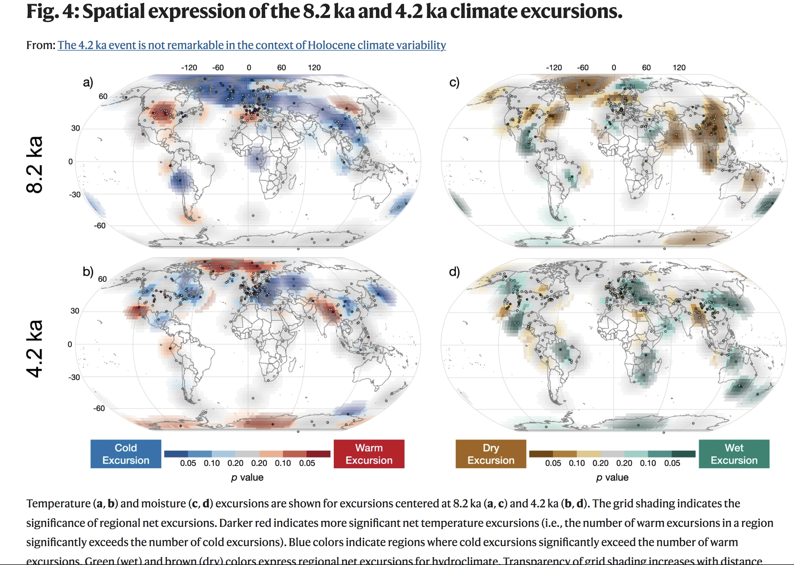
But figure 4 in the new literature review by #McKay et al 2024 shows a decidedly wet excursion for MENA: nature.com/articles/s41467-024

They do mention the #Mediterranean and say, it were a complex and not at all clear case whether a drought was gripping the region or not.

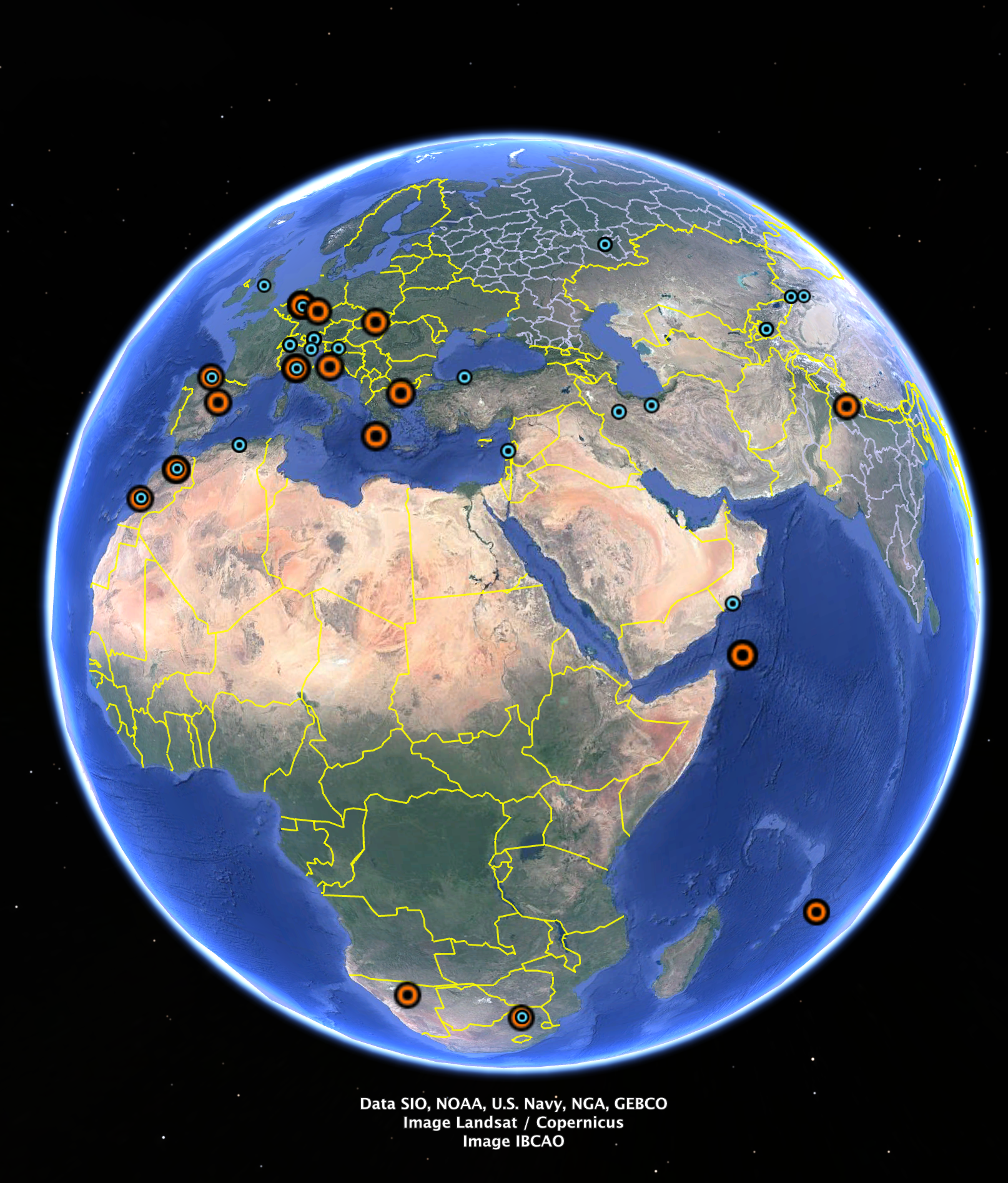
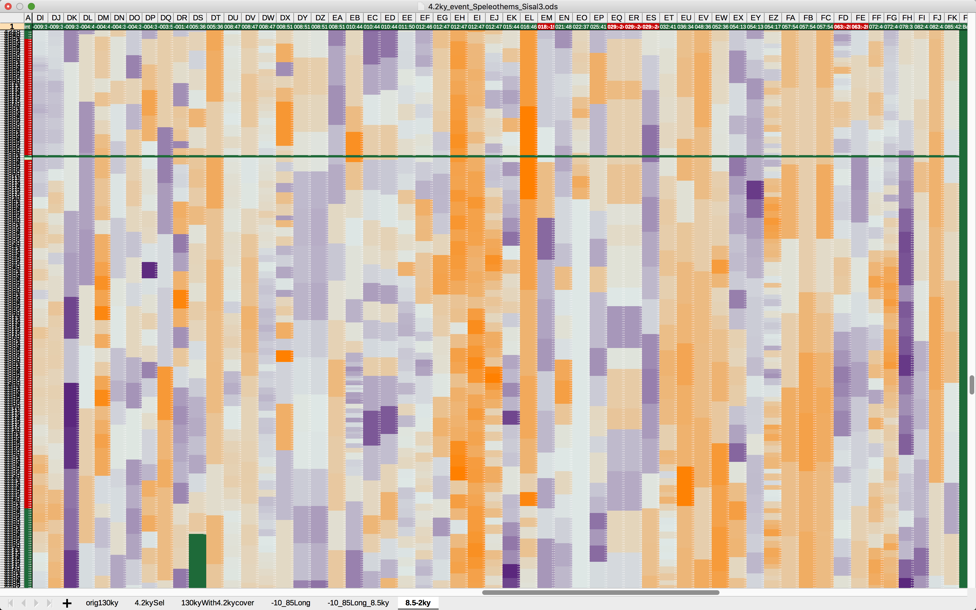
So I pulled #d18O from cave #speleothem in the database " #Sisal3 " and plotted all those with okay resolution during the 4.2ky event.
The time span of the selection goes from 8.5ky to 2ky, like in McKay's paper.
My cave selection goes from longitude -9° to 85°E.
Locations are in the Google map, with the info whether it was dryer🔴 or wetter🌀 at 4.2ky.

A 3-colour-coded heatmap for the 50th percentile of d18O shows orange as drought and blue as wet.
More info in the ALT texts.

Conclusion: the mediterranean DID get dryer in the 4.2ky event. 🙂 🖖

#paleoclimate #holocene #drought

Figure 4 from the literature review paper McKay et al 2024 shows global maps for temperature and moisture, top row for the 8.2Ka event and bottom row for the 4.2ka event.

In the 4.2ka event, moisture went up in Europe and MENA, with the sole exception of Egypt which was a little dryer.Location of the caves in the heatmap. Meaning of the colours : 
the difference between the average from 4250 to 4050 BP over the average in the whole individual speleothem series. Blue is if the 4.2ky period was higher than the alltime average, meaning, the speleothem received more rain during this period compared to its alltime average. Red is dryer than usual. 
The red dots are so big because otherwise, they'd hide behind the blue dots in cases where speleothems in a single cave/location show the opposite evolution.

(This happens very often actually, d18O from stalagmites in the same cave not at all corresponding to each other. I don't know how to deal with this phenomenon. It's the reason why I usually don't look at stalagmites anymore. Very sad. They often have such high resolution. :( )Heatmap for d18O in speleothems. Orange is dryer, blue is wetter. 

Visible in the top row is only a part of the coordinates of the caves, first longitude, then a part of the latitude. Red cells are caves below the equator.
The selection is from -9 to 85°E. 
 
The leftmost column are the years before present. Red is the range 4250 to 4050 BP. The year 4200 is highlighted in green and also by an empty row above it. 
The visible range here is from year 4,254 to 4,016 BP. 
The whole selection goes from 8,500 to 2,000 BP.
Only those caves are shown that have an okay resolution around the 4.2ky event. 

Source is Sisal v3.

My girlie chart with 490ky years of #Milankovic cycles, CO2, sea level, and the top line is d18O of a sediment core from within the #ColdBlob, see map. I think, it records AMOC shutdowns in the past.

Would be intriguing to know why it shut down. Eg, 427ka, "just" before the interglacial MIS11.
And why it not shut down during that very long interglacial which was ~as warm as the Holocene,
and had an ice-free West #Greenland (with a leaf found just 2 years ago at rock-bottom of an ice core from there),

and why AMOC instead collapsed in the middle of the following #iceage.

The very long interglacial MIS11 with its ice-free West Greenland and stable AMOC throughout tells me that the amount of freshwater input from melting ice on its own isn't the trigger for a collapse. But instead, the speed at which freshwater is added: very slowly like during #MIS11 won't do it.

Also intriguing: why the stuttering motor during the last glacial before the #Holocene?

#d18O from sediment cores at other locations strictly follow the ups and downs of #sealevel and #CO2. This one site #IODP #U1308 is exceptional.
#paleoclimate #AMOC

2 charts with coloured areas for Milankovic cycles of eccentricity, obliquity, and precession favouring either Northern or Southern Hemisphere. 
CO2 and sea level are in sync in their ups and downs. 
d18O from U1308 is completely independent from the roughly 100 thousand year glacial cycle, and also doesn't seem to be disturbed by obliquity or precession. 
Instead long, more or less stable periods of 80 thousand years are followed by far more unstable periods of about 50 thousand years – but not triggered by Earth's orbital patterns.Global map with the drilling site of the sediment core U1308 which is in a very deep part of the North Atlantic and on the same latitude as South Ireland but the same longitude as West Iceland.
2023-12-27

@arthurgessler

Cool! What do you think, can I correlate annual rain sum in mm of near-by weather stations with the annual #d18O found in those #treerings? Several tree location have a near-by station in NOAA's GHCN network. The German tree is close to the Göttingen station 01691 in DWD opendata.dwd.de and reports since 1927 while the annual / summer tree d18O goes from 1776 to 1999.
Would just be nice to get a feel for d18O – for when I see #paleoclimate data from #stalagmites or other land-bound proxies.
There are intriguing papers on Mediterranean #drought in the Bronze age which use d18O from several caves all around the region. If I know which treering d18O in Spain means how much annual rain, I can translate the bronze age d18O from caves to rain sum, as well – what do you think?

2023-01-26

I use this chart as template for when I want to see a particular proxy for #paleoclimate in the bigger context of Earth's #climate factors. Because I add many and varying #proxy records to this template, they need to fit either y-axes. So all records get re-scaled. The individual formula is given in brackets () in the legend, eg., (*10000, /20, +2).
The x-axis is kiloyear ky before present BP (BP is 1950), data resolution is in centuries.

The background of the chart is always the #Milankovic cycles: #Eccentricity as black area, #obliquity / tilt in pink and climatic #precession favoring North in gold and favoring South in darker rosé.
Standard curves are CO2 (gray), CH4 (dark magenta), and sealevel (light blue). CO2 and CH4 are at home on the left y-axis, by the way. Virtually all other proxies end up to be at home on the right hand y-axis.

When I add a proxy from the Southern hemisphere, I usually choose a red-ish colour, and gold-ish for proxies from the NH. Exception to the rule is the tropical South American glacier index "TEG" in white.

Sources for the standard items in this chart are:
- #Milankovic cycles from Laskar 2004 / 2010 vo.imcce.fr/insola/earth/onlin
- #SeaLevel (light blue) from Miller 2020 science.org/doi/full/10.1126/s
- #CH4 #methane (dark magenta) from Loulergue 2008 ncei.noaa.gov/access/paleo-sea
- #CO2 (gray) from M. Yamamoto 2020 ncei.noaa.gov/access/paleo-sea

Non-standard proxies in this version for the #tegtmeier thread on modern humans :
- #d18O (magenta) for sea surface temperature in the South Atlantic from Starr 2020 (published January 2021) nature.com/articles/s41586-020
- #Glacier index TEG (white) from Rodbell 2020 nature.com/articles/s41586-022
- ºC in subtropical Africa from Chevalier 2021 pubs.geoscienceworld.org/gsa/g

I use #LibreOffice #Calc.

#TegtmeierBasics

Chart shows Earth's climate factors evolving over 350,000 years. Depicted in this version are 
- the Milankovic cycles 
- sea level 
- glacier spread in South America 
- sea surface temperature at a point 1100km south of South Africa 
- CO2 and CH4
- and temperature in subtropical Africa

Broadly speaking, all proxies in this timeline do follow Milankovic's drumbeat.

Notably tho, CH4 has a few special peaks, seemingly unrelated to precession and tilt.

And sea surface temperature in the Atlantic's deep South also skipped a few beats.

Client Info

Server: https://mastodon.social
Version: 2025.04
Repository: https://github.com/cyevgeniy/lmst