AGX – Open-Source Data Exploration for ClickHouse (The New Standard?)
https://github.com/agnosticeng/agx
#HackerNews #AGX #OpenSource #DataExploration #ClickHouse #TechNews #DataAnalysis
AGX – Open-Source Data Exploration for ClickHouse (The New Standard?)
https://github.com/agnosticeng/agx
#HackerNews #AGX #OpenSource #DataExploration #ClickHouse #TechNews #DataAnalysis
I'm not really sure when @micahflee made his Hacks, Leaks, and Revelations book free to read online, but if it's been on your wish list, now's your chance to give it a read, and if you enjoy it, and can afford to, support the author.
https://hacksandleaks.com/contents.html
Buy here: https://hacksandleaks.com/
#data #dataviz #DataVisualiaztion #DataExploration #books #HacksAndLeaks
I'm continuing to play with my music listening data, and i suspect that spotify (2017-2021) and plex (2022+) handle time zones differently and that I'm not properly accounting for that difference.
Modern Data Science with SAS Viya & Python for Churn Models | CoListy
Learn data science with SAS Viya & Python to predict churn, manage data, deploy models, & use GitHub for collaboration.
#freeonlinelearning #colisty #courselist #moderndatascience #sasviyaworkbench #predictiveanalytics #dataengineering #machinelearning #customerchurnprediction #pythonandsasintegration #dataexploration
https://colisty.netlify.app/courses/modern-data-science-with-sas-viya-python-for-churn-models/
SAS Programming 1: Essentials - Learn SAS for Data Analysis | CoListy
Start learning SAS programming with essential skills for data access, exploration, preparation, and analysis. Perfect for beginners!
#freeonlinelearning #colisty #courselist #sasprogramming #dataanalysis #sasstudio #sqlinsas #datapreparation #dataexploration #datareporting #sasforbeginners #machinelearning #artificialintelligence #sasenterpriseguide.
https://colisty.netlify.app/courses/sas-programming-1-essentials-learn-sas-for-data-analysis/
Managing Large Datasets in Excel for Data Science
#DataScience #Excel #DataAnalysis #BigData #DataManagement #DataExploration #Analytics #ExcelTips #DataVisualization #DataTools #DataScienceCommunity #BusinessIntelligence #ExcelForDataScience #DataEfficiency #SpreadsheetSkills
https://houstonstevenson.com/2024/10/14/managing-large-datasets-in-excel-for-data-science/

Recce's updated interface lets you stay on track while assessing and exploring data impact in your dbt project
Understand and track data change when:
- making dbt data model changes
- performing dbt PR review
https://www.loom.com/share/66959ea08b164e9190703d67877153dd?sid=e288bb2b-3301-44b9-9c36-2a475e166056
The data explorer mapdata.py (https://pypi.org/project/mapdata/) has a new plotting tool that displays percentages for a set of numerical variables and a single categorical variable. Percentages can be calculated either by variable or by category. Data can be aggregated by min, max, mean, median, sum, or count prior to calculation of percentages.
#MapData #DataExploration #DataAnalysis #DataViz #DataVisualization #Plotting #Python #FOSS #FLOSS
A new plotting tool in the data explorer mapdata.py (https://pypi.org/project/mapdata/) will produce stacked bar charts for any number of numeric variables and one categorical variable. A separate bar chart can be produced either for each category or for each variable.
There is also a new selection tool that highlights complete cases of any set of variables.
#MapData #DataExploration #DataAnalysis #DataViz #DataVisualization #FOSS #FLOSS #Python
The latest version of mapdata.py (https://pypi.org/project/mapdata/) has new features for data analysis, data visualization, and data management.
A new PCA tool produces tables of scores, loadings, and explained variance; a scree plot; and scatterplots of PC scores. The PC scores can be added to to the data table as new columns so they can be used in other analyses or for mapping.
1/3
#DataExploration #DataAnalysis #DataVisualization #DataViz #DataManagement #Python #FOSS #FLOSS #OpenSource
The mapdata.py data explorer (https://pypi.org/project/mapdata/) now will carry out unmixing of data using non-negative matrix factorization (NMF).
This is useful for source identification and allocation for environmental chemistry data.
The values of end members in each case (e.g., sample) can be added to the main data table so that they can then be used for map symbolization, plotting, and other statistical analyses.
#MapData #DataExploration #DataAnalysis #Unmixing #Python #FOSS #FLOSS
The 'Find Candidate Keys' tool of mapdata.py (https://pypi.org/project/mapdata/) now will show a table of duplicated key values with the number of duplicates, and highlight those duplicates on the map.
Also new is a categorical similarity matrix for five similarity measures from Boriah et al. 2008 (https://epubs.siam.org/doi/10.1137/1.9781611972788.22).
Other updates are listed in the change log (https://mapdata.readthedocs.io/en/latest/change_log.html).
#MapData #DataManagement #DataExploration #DataAnalysis #Python #FOSS #FLOSS
Many of the plotting and statistical tools in the data explorer mapdata.py (https://pypi.org/project/mapdata/) allow or require a grouping variable. Locations are identified by two variables, latitude and longitude, so to group by location a variable with a unique identifier for each location is needed. The 'Table/Counts by location' tool will identify such a variable if it exists. Now...
1/2
#MapData #DataAnalysis #DataExploration #Mapping #Statistics #Python #FOSS #FLOSS
The data explorer mapdata.py (https://pypi.org/project/mapdata/) has the following updates:
* The robust R-square of Kvålseth (https://www.jstor.org/stable/2683704) is included with the bivariate statistics.
* A cosine similarity matrix can be calculated for selected variables and cases.
1/3
#MapData #DataAnalysis #DataExploration #Statistics #Python #FOSS #FLOSS
The data explorer mapdata.py (https://pypi.org/project/mapdata/) has two new statistical tools:
* Parametric and non-parametric one-way ANOVA and related statistics.
* A trend plot per Şen 2012 (https://ascelibrary.org/doi/10.1061/%28ASCE%29HE.1943-5584.0000556).
#DataExploration #DataAnalysis #MapData #Statistics #Python #FOSS #FLOSS
An updated version of the data explorer mapdata.py (https://pypi.org/project/mapdata/) has the following revisions:
* Input data for the t-SNE and UMAP analyses can be transformed by taking either Z scores of variables or L1 norms of rows.
* The t-SNE analysis can now be performed on sparse matrixes.
* The univariate statistics summary now allows a grouping variable to be used.
#DataAnalysis #DataExploration #Mapdata #Python #FOSS #FLOSS
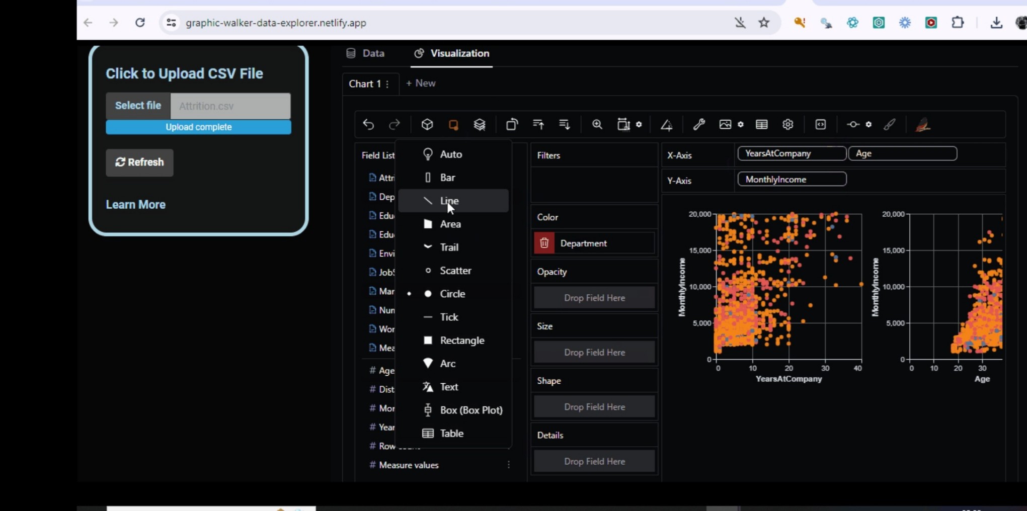
Fast and easy data exploration using Graphic-Walker Data Explorer with a Tableau-like drag & drop interface. Simply upload your CSV file and start exploring without writing code
https://graphic-walker-data-explorer.netlify.app/
#dataviz #dataexploration #dashboard #rstats #rshiny #software
Updates to the mapdata.py data explorer (https://pypi.org/project/mapdata/) include:
1. Bivariate statistics include Chatterjee's xi correlation coefficient.
2. The correlation matrix can display Pearson, Spearman, Kendall, or Chatterjee correlation coefficients.
3. k-Means clustering can be applied to t-SNE and UMAP analyses. The cluster identifiers can be added to the data table and used for map display or grouping in plots.
#MapData #Statistics #DataExploration #DataAnalysis #Python #FOSS #FLOSS
New features in the data explorer MapData.py (https://pypi.org/project/mapdata/):
1. Saturation, contrast, and brightness of basemap images can be customized.
2. Hovering over a point on a scatter plot will display the label for that point.
3. Data can be recoded to edit the values in an existing column or to add a column with new values to the data table.
When a spatial data set contains multiple values at a location (e.g., from different dates or depths/elevations), the number of data points at a location, and even the presence of multiple data points at a location, may not be apparent on a 2-D map. The latest version of MapData.py (https://pypi.org/project/mapdata/) addresses this situation in five ways:
1/6
#Mapping #MapData #DataAnalysis #DataExploration #DataPlotting #Python #FOSS