#displayfont

2025-12-14

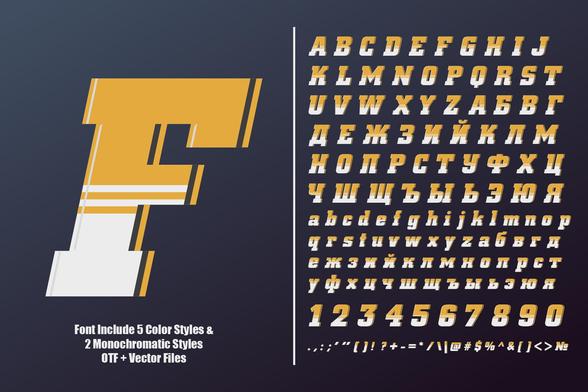
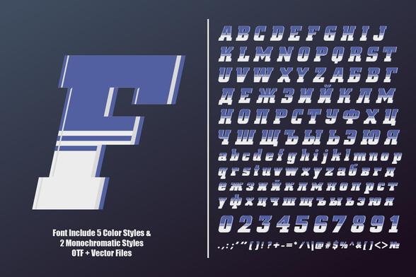
TAN Edition Font by TanType

Check out the TAN Edition Typeface: The New Standard for Refined Modern Typography

Typography shapes our perception of a brand instantly. Designers constantly hunt for tools that balance neutrality with distinct character. The TAN Edition font arrives as a perfect solution to this ongoing search. TanType has built a reputation for expressive, retro-inspired display fonts. However, they pivoted interestingly with this release. This typeface strips away the ornamentation found in their other works. Instead, the typeface focuses on pure geometry and sleek lines. It offers clarity without sacrificing the unique personality associated with the foundry.

Download the typeface from Adobe Stock

The TAN Edition font stands out because it refuses to be boring. Many sans serifs vanish into the background too easily. This specific typeface maintains a presence. It commands attention through subtle curves and balanced proportions. Designers looking for a versatile workhorse will find immediate value here. The typeface bridges the gap between strict professionalism and creative flair. Consequently, it works exceptionally well for luxury branding and editorial layouts.

TAN Edition Typeface by TanType Download the typeface from Adobe Stock

What makes the TAN Edition font essential for contemporary design?

Designers often struggle to find a sans-serif that feels fresh. The market is saturated with geometric clones. The TAN Edition font breaks this monotony effectively. It brings a contemporary elegance that feels curated rather than manufactured. Every character within the typeface set demonstrates intentional craftsmanship. The letters flow together to create a seamless visual rhythm.

This typeface does not shout; it whispers with authority. Therefore, it suits high-end product packaging perfectly. The TAN Edition font allows the product to speak while providing a sophisticated framework. You rarely see this level of refined simplicity in standard font libraries. Moreover, the typeface adapts fluidly to digital interfaces. It retains legibility on small screens while looking crisp on large monitors. This adaptability makes it a crucial asset for UI designers.

Analyzing the Structure of TAN Edition

Let’s look closer at the anatomy of this typeface. The TAN Edition font features a uniform stroke width that conveys stability. However, the terminals and joints soften this rigidity significantly. This balance creates a “humanist” feel within a geometric structure. The typeface feels approachable rather than cold or corporate.

Designers appreciate how the typeface handles white space. The spacing between characters is generous yet cohesive. This allows for comfortable reading over longer text blocks. Furthermore, the TAN Edition font includes unique glyphs that add flavor to headlines. These subtle details prevent layouts from looking generic. A designer can rely on the typeface to carry a visual identity single-handedly.

Strategic Use Cases for the TAN Edition font

Choosing the right context for a font determines its success. The TAN Edition font shines in fashion and lifestyle sectors. These industries demand typography that looks expensive and timeless. The typeface delivers this aesthetic effortlessly. You can imagine it on a perfume bottle or a minimalist magazine cover.

Additionally, the typeface anchors complex web designs effectively. When you use chaotic imagery or vibrant colors, you need a grounding element. The typeface provides that necessary visual anchor. It organizes information without competing with other design elements. Consequently, art directors often select the typeface for lookbooks and portfolios. It organizes content while adding a layer of sophisticated polish.

Technical Excellence and Multilingual Support

A professional typeface must function globally. The typeface includes extensive multilingual support. This feature allows brands to maintain visual consistency across different regions. You do not need to switch fonts when localizing content for Europe or the Americas. The TAN Edition font handles various languages with the same typographic integrity.

TanType also promises free future updates for the typeface. This commitment ensures the software remains compatible with evolving design tools. Buying the typeface is an investment in a living tool. You gain access to expansions and improvements over time. This value proposition makes the typeface attractive for freelance designers and agencies alike.

Why Simplicity Wins in Current Trends

We currently see a shift away from maximalism. Brands now prefer quieter, more confident visual languages. The TAN Edition font fits perfectly into this “quiet luxury” trend. It signals quality through restraint. Using the typeface suggests that a brand does not need to scream to be heard.

This typeface proves that simple does not mean simplistic. The TAN Edition font holds up under scrutiny. Large-scale applications reveal the perfection of its curves. Simultaneously, small-scale use highlights its superb readability. Therefore, the typeface remains a safe yet stylish bet for long-term branding projects. It resists looking dated as trends cycle and change.

Personal Critique: A Necessary Addition

I view TanType’s portfolio as a collection of exuberant personalities. The typeface acts as the designated driver of the group. It is the sensible, smart, and attractive friend who holds everything together. We need fonts like the TAN Edition font to make the decorative ones shine.

You can pair the TAN Edition font with a wild serif like TAN Grandeur. The contrast creates dynamic tension in a layout. However, the typeface is strong enough to stand alone. It does not need a partner to look good. This independence is its greatest strength. I find myself reaching for the typeface whenever a project feels cluttered. It cleans up the mess instantly.

Final Thoughts on Typography Selection

Selecting a typeface is like casting an actor for a movie. The TAN Edition font plays the lead role in a modern drama. It is serious, handsome, and reliable. Designers who ignore the TAN Edition font miss out on a powerful tool. It elevates average designs into professional presentations.

Download the typeface from Adobe Stock

If you value clarity and elegance, you need this font. The typeface delivers on its promises. It is a modern sans serif that truly understands the needs of today’s creators. Give the TAN Edition font a try in your next layout. You will likely find it becomes your new default choice.

Frequently Asked Questions

What file formats are included with the TAN Edition font?
Standard downloads typically include OTF (OpenType), TTF (TrueType), and WOFF/WOFF2 formats for web use. This ensures the TAN Edition font works across print and digital platforms seamlessly.

Does the typeface support languages other than English?
Yes, the typeface features extensive multilingual support. The TAN Edition font covers most Western and Central European languages, making it suitable for international branding.

Can I use the TAN Edition font for logo design?
Absolutely. The clean lines and unique character of the typeface make it an excellent choice for logos and brand marks.

Are updates for the TAN Edition font free?
TanType usually offers free future updates. Once you license the typeface, you typically receive improvements or added glyphs at no extra cost.

How does the TAN Edition font compare to other sans serifs?
The typeface offers more warmth and character than standard geometric sans serifs. It balances professional rigidity with a humanist touch, distinguishing it from generic system fonts.

Feel free to find other trending typefaces on WE AND THE COLOR or check out our selection of the 100 best fonts for designers in 2026.

Subscribe to our newsletter!

[newsletter_form type=”minimal”]

#displayFont #font #TANEdition #TanType #typeface

TAN Edition Typeface by TanTypeTAN Edition Typeface by TanType
2025-12-11

Aveline Font by CarmineType

Say Hello to the Aveline Typeface! Let’s Explore How this Soft Serif Font by CarmineType Defines Modern Elegance.

Design trends currently shift away from cold minimalism toward warmth and personality. The Aveline font perfectly captures this specific moment in typographic history. CarmineType designed this typeface to bridge the gap between modern clarity and historical charm. Designers often struggle to find a typeface that conveys luxury without feeling inaccessible. Aveline solves this precise problem. It offers a hybrid approach. The letterforms possess the readability of a sans serif but retain the sophisticated soul of a serif. Consequently, it works exceptionally well for brands that need to whisper rather than shout.

Download the typeface from Creative Market

What Makes the Aveline Font Essential for Contemporary Branding?

You instantly notice the gentle, intentional detailing. This is not just another standard serif found in generic libraries. The Aveline font brings a unique voice to visual identities. Furthermore, it feels human. In an era dominated by AI-generated content, human-centric design becomes invaluable. CarmineType crafted this typeface to look approachable yet high-end. Therefore, it appeals to viewers on an emotional level. This emotional connection drives engagement in branding and editorial design.

Aveline Typeface by CarmineType, a Versatile Hybrid Serif Font Download the typeface from Creative Market

The Anatomy of a Hybrid Masterpiece

Aveline is classified technically as a soft serif with ligatures. However, that description barely scratches the surface. The Aveline font features balanced proportions that make it suitable for both display and text blocks. Most display typefaces fail when used in smaller sizes. This elegant typeface defies this common limitation. Its structure remains legible even when you reduce the scale. This versatility makes it a powerhouse for responsive web design.

CarmineType included two primary styles: Roman and Italic. The Italic style brings a sense of motion and urgency. Meanwhile, the Roman style anchors the design with stability. Together, they create a harmonious typographic system. The Aveline font also draws discreet inspiration from Victorian aesthetics. Yet, it avoids the heavy ornamentation usually associated with that era. Instead, it extracts the romance of the past and refines it for digital screens.

Unlocking Creativity with Ligatures and Alternates

The true magic of the Aveline font lies in its OpenType features. CarmineType included over 170 carefully crafted ligatures. These connections between letters transform standard text into custom wordmarks. Designers love this feature because it saves time. You do not need to draw custom lettering for a logo. You simply type with Aveline, and the ligatures do the heavy lifting.

Additionally, the font includes a vast set of alternates. These character variations allow for endless combinations. You can adjust the mood of a headline by swapping a single letter. Consequently, the font serves as a creative toolkit. It encourages experimentation. Whether you design a book cover or a perfume bottle, the typeface adapts. The Victorian-inspired alternates add a touch of romance. However, they remain subtle enough to use in modern contexts. This balance between decoration and function defines the Aveline experience.

Why Luxury Brands Are Choosing the Aveline Font

Luxury branding relies heavily on typography to convey value. The Aveline font fits this niche perfectly. Its high-contrast strokes suggest elegance, while its soft terminals imply comfort. High-end fashion labels often seek this exact combination. They need to look expensive but inviting. Aveline achieves this effortlessly.

Consider the needs of the beauty industry. Skincare and cosmetic brands require typography that feels organic and clean. The Aveline font meets these requirements with its fluid curves. It lacks the harsh edges of a geometric sans. Therefore, it mirrors the organic curves found in nature and the human body. This makes it an ideal choice for beauty packaging.

Furthermore, editorial designers find immense value here. Magazines need headers that grab attention. The Aveline font commands the page without overwhelming the photography. Its lighter weights feel airy and sophisticated. Conversely, its heavier applications provide the necessary impact for major feature stories.

Practical Tips for Using Aveline

Using a character-rich typeface requires restraint. The Aveline font offers many expressive options, but you should use them wisely. Avoid using complex ligatures for long body text. They work best in headlines or short phrases. In body copy, the standard characters ensure maximum readability.

CarmineType optimized the font for various formats. You get the standard OTF, TTF, WOFF, and WOFF2 files. This ensures the Aveline font renders crisply on all devices. Web designers will appreciate the low file size relative to the visual quality. When you implement Aveline on a website, ensure you enable standard ligatures in your CSS. This activates the font’s full potential.

Also, consider the spacing. The Aveline font possesses excellent built-in kerning. However, for large display use, you might tighten the tracking slightly. This creates a more cohesive, logo-like appearance. Experiment with the stylistic sets to find the tone that matches your specific project.

Comparing Aveline to Standard Serifs

Many designers rely on classics like Bodoni or Didot for fashion typography. While beautiful, those fonts often feel overused. The Aveline font offers a fresh alternative. It retains the high contrast of those classics but adds modern softness. It feels less rigid.

Unlike traditional serifs, Aveline functions as a hybrid. It incorporates the logic of a sans serif in its skeletal structure. This makes the Aveline font more legible on screens than many historical serifs. Digital screens often struggle with the hairline thin strokes of Didot. Aveline’s strokes maintain enough weight to avoid disappearing at low resolutions.

Moreover, the Aveline font carries a unique personality. Standard fonts often feel neutral. Aveline feels opinionated. It adds a specific flavor to the design. If you want your project to look distinctive, you choose Aveline. It tells the viewer that you care about nuances.

Licensing and Value Proposition

Professional fonts constitute an investment. The Aveline font offers significant value for its price point. You receive not just the alphabet, but a comprehensive design system. The inclusion of multilingual support covers Western, Central, and Eastern European languages. This global reach is crucial for international brands.

CarmineType frequently offers license options for desktop, web, and apps. Purchasing the Aveline font legally ensures you have the correct files and rights. Free alternatives rarely offer this level of ligature support or technical polish. When you buy Aveline, you pay for the hours of engineering behind every curve. It elevates your portfolio instantly.

Final Thoughts on This Typographic Gem

Typography dictates the voice of a brand. Choosing the right voice matters more than ever. The Aveline font speaks with sophistication, warmth, and clarity. It avoids the trap of being too trendy or too archaic. CarmineType successfully created a timeless asset.

I personally find the ligatures to be the standout feature. They turn typing into an act of design. This elegant display serif typeface invites you to play with language. It reminds us that letters are beautiful forms, not just functional tools. If you work in branding, editorial, or packaging, this font deserves a spot in your library. It provides the elegance you need with the versatility you crave.

Download the typeface from Creative Market

Ultimately, the Aveline font represents the future of serif design. It respects the past but lives firmly in the present. Try it on your next project. You will likely find it becomes your go-to choice for refined elegance.

Frequently Asked Questions About the Aveline Font

What exactly is the Aveline font?

The Aveline font defines itself as a versatile hybrid serif. It sits comfortably between a clean modern sans and a charming serif. CarmineType designed it with soft terminals and balanced proportions. Consequently, it works beautifully for both large displays and smaller text blocks.

Which projects work best with the Aveline font?

This typeface thrives in environments that require elegance. Specifically, the Aveline font suits fashion branding, luxury packaging, and editorial design. It also adds a sophisticated touch to wedding invitations and beauty product labels. Therefore, if your project needs a romantic yet modern feel, Aveline fits perfectly.

How do I access the ligatures and alternates?

You can access the 170+ ligatures and alternates through any software that supports OpenType features. Programs like Adobe Illustrator, Photoshop, or InDesign make this process easy. Simply open the glyphs panel to view the options. The font allows you to customize your typography instantly with these unique characters.

Does the Aveline font support multiple languages?

Yes, CarmineType ensured broad accessibility for this typeface. The Aveline font includes extensive multilingual support for Western, Central, and Eastern European languages. This feature makes it an excellent choice for international brands. You can maintain a consistent visual identity across different regions.

Is the Aveline font optimized for web use?

Absolutely. The font family includes WOFF and WOFF2 files specifically for web usage. The Aveline font maintains its legibility on digital screens due to its distinct contrast and clear typography. Furthermore, the file sizes remain efficient for fast loading times. You can bring high-end typography to your website without compromising performance.

All images © CarmineType. Check out other trending typefaces in the Fonts section of WE AND THE COLOR or take a look at our selection of the 100 best fonts for designers in 2026.

Subscribe to our newsletter!

[newsletter_form type=”minimal”]

#Aveline #brandingFont #CarmineType #displayFont #font #serifFont #typeface

Aveline Typeface by CarmineType, a Versatile Hybrid Serif FontAveline Typeface by CarmineType, a Versatile Hybrid Serif Font
2025-11-01

Archer Display Font by SilverStag Type Foundry

Let’s Explore Archer Display, a Serif Font that Beautifully Breaks the Rules.

Some fonts follow the rules. They are dependable, predictable, and they get the job done. Then, there are fonts that feel alive, fonts that possess a distinct personality. The Archer Display font by SilverStag Type Foundry belongs firmly in the latter category. It arrives with the grace of a classic serif but carries a clever, modern secret in its letterforms. This is a typeface for designers who want to communicate not just a message, but a mood. It feels less like a tool and more like a creative partner, one that understands the power of a subtle, confident twist.

You can download the typeface for a very low budget from these platforms:

Creative Market YouWorkForThem

The Anatomy of a Modern Classic: What is Archer Display?

Archer Display presents itself as a high-contrast serif font. Its foundation rests on the dramatic interplay between thick and thin strokes, a technique that has defined elegant typography for centuries. Yet, to label it as purely traditional would be to miss the point entirely. It is a font designed with a contemporary eye, one that values character as much as clarity.

Archer Display Font by SilverStag Type Foundry

You can download the typeface for a very low budget from these platforms:

Creative Market YouWorkForThem

A Foot in Tradition

The substantial serifs of Archer Display give it a sturdy, reliable presence. They anchor the letters to the page, creating a sense of history and gravitas. This makes the font immediately feel trustworthy and sophisticated. You can see the echoes of classic book types and refined editorial headings within its DNA. This traditional backbone ensures it remains legible and grounded, no matter how it’s used.

A Whisper of Rebellion

Here is where the magic happens. SilverStag Type Foundry has selectively reimagined certain characters, infusing them with an avant-garde spirit. These are not jarring changes. Instead, they are thoughtful, artistic flourishes that surprise and delight the eye. These alternate letters and unique forms give Archer Display its signature edge. Consequently, the font feels dynamic, as if it is subtly winking at the reader.

A True Creative Playground

Beyond its basic alphabet, Archer Display is a treasure chest of creative options. It includes over 70 handcrafted ligatures and alternate letters. This extensive library empowers you to customize your text, turning a simple headline into a bespoke piece of lettering. For example, with four distinct ampersands to choose from, you have incredible control over the final look. This is not just a font; it is an invitation to play, to experiment, and to build a truly unique visual story.

Why You Will Choose the Archer Display Font

The appeal of Archer Display goes far beyond its handsome appearance. Its growing popularity stems from a blend of aesthetic distinction, functional power, and thoughtful design that solves real-world creative problems.

It Has a Voice

This font cuts through the noise of minimalist sameness. Its confident personality is perfect for building memorable brands and captivating headlines. In a design landscape often dominated by neutral sans-serifs, Archer Display offers a dose of character and soul. It helps your work speak with a tone of refined authority and creative flair. What story do you want your typography to tell?

It Speaks Your Language, and Theirs

Great design should be boundless. A significant strength of the Archer Display font is its comprehensive language support. It covers over 90 languages, making it a truly global typeface. This means your branding and messaging will look just as elegant in Warsaw as it does in Wichita. For international brands or publications, this feature is not a luxury; it is a necessity for maintaining a cohesive and professional identity.

A Surprising Versatility

While it exudes a premium feel, Archer Display is not a one-trick pony. Its unique balance of classicism and modernism allows it to adapt to various contexts with ease.

  • Logos and Branding: It creates memorable logotypes that feel both established and forward-thinking.
  • Editorial Headlines: It lends a sophisticated, literary quality to magazines and websites.
  • Luxury Packaging: Its elegant form perfectly complements high-end products, from fine wines to artisanal goods.
  • Website Banners: Used for key headings, it adds a powerful touch of class to digital experiences.

Making Archer Display Your Own: A Practical Guide

To get the most out of Archer Display, you need to explore its hidden depths. Mastering its features will elevate your typography from simply good to truly exceptional.

Discovering the Hidden Characters

The soul of this font lies in its alternates and ligatures. Accessing them is straightforward in most professional design software. In Adobe Illustrator or Photoshop, you can simply open the Glyphs panel to see all the available characters. For Canva users, SilverStag Type Foundry provides a special PUA-encoded font file. This ensures that these beautiful alternate characters are accessible to everyone, regardless of their software.

Finding the Perfect Typographic Partner

Think of Archer Display as the lead actor in your design. Its supporting cast should complement its style without competing for attention. A clean, geometric sans-serif like Poppins or Futura makes an excellent partner. Use it for body copy, allowing its simplicity to provide a stable base for the expressive headlines set in Archer Display. This creates a beautiful, functional hierarchy that is both easy to read and visually compelling.

A Personal Reflection on Archer Display

As someone who spends their days immersed in type, it is rare to find a font that feels both new and familiar at the same time. Archer Display achieves this delicate balance with remarkable skill. What I find most striking is its quiet confidence. It doesn’t scream for attention, yet it is impossible to ignore. The alternate characters and ligatures feel integral to its identity, not like tacked-on extras.

You can sense the creator’s passion in every curve. The small detail of asking users to tag their work on Instagram fosters a wonderful sense of community. It transforms the act of using a font into a shared creative experience. This human touch makes me appreciate the artistry behind Archer Display even more. It is a font with a story, and it helps you tell yours.

A Font for Now, Built to Last

Ultimately, Archer Display is a remarkable achievement. It proves that serif fonts can be modern, exciting, and full of personality without sacrificing their inherent elegance. It provides a powerful and versatile voice for designers, brands, and creatives looking to craft work that is both beautiful and meaningful. This is a font that respects the past but is not bound by it. It is, in every sense, a typeface for today and tomorrow.

You can download the typeface for a very low budget from these platforms:

Creative Market YouWorkForThem

Don’t hesitate to find other trending typefaces in WE AND THE COLOR’s Fonts category. In addition, you should take a look at our handpicked selection of the top 100 fonts for designers in 2026.

Subscribe to our newsletter!

[newsletter_form type=”minimal”]

#ArcherDisplay #displayFont #font #serifFont #SilverStagTypeFoundry #typeface

Archer Display Font by SilverStag Type FoundryArcher Display Font by SilverStag Type Foundry
2025-08-22

Topanga Echo Typeface by Laras Wonderland

With the Topanga Echo Font, You Can Channel Californian Sun Into Authentic Designs

In a digital landscape often dominated by clean lines and minimalist precision, a tangible shift is underway. Designers and brands are increasingly seeking warmth, personality, and a touch of nostalgic joy. Consequently, this movement has found its perfect expression in the “dopamine decor” trend, an aesthetic built on vibrant colors and feel-good nostalgia. It is within this timely context that the Topanga Echo typeface by Laras Wonderland emerges. It serves not just as a font, but as a creative tool perfectly attuned to this desire for happiness in design. Therefore, this typeface offers a direct route to crafting visuals that feel personal, spirited, and unapologetically human.

Download from Creative Market

The Topanga Echo font is more than just a set of characters; it’s an ode to a specific time and place. It expertly channels the groovy, sun-bleached energy of 1960s and 70s California. Imagine vintage record sleeves, canyon air, and the laid-back charm of the Pacific coast—these are the inspirations baked into its DNA. For any creative looking to infuse their work with a retro flair that feels both trendy and timeless, understanding this typeface is essential. It magically transforms designs into something that appears hand-lettered in seconds.

Topanga Echo Typeface by Laras Wonderland: A Bold, Handwritten & Distorted Display Font with Countless Ligatures Download from Creative Market

Deconstructing the Vibe: What is the Topanga Echo Typeface?

At its core, the Topanga Echo typeface is a bold, distorted display font. Its characters skillfully mimic the imperfect, fluid strokes of authentic handwriting. In fact, this intentional lack of uniformity is its greatest strength. The design features soft curves and a heavy weight, giving it a friendly yet confident personality. Furthermore, it avoids sharp, sterile edges, opting instead for a groovy, relaxed structure that feels organic and alive.

This font was specifically crafted to bring a hand-lettered feel to digital designs instantaneously. Its design is heavily influenced by the expressive typography of the 70s, a period known for its bold and playful lettering styles. As a result, the typeface feels both artistic and effortlessly cool. This quality makes it a powerful choice for designers aiming to create a strong and memorable visual identity.

Why the Topanga Echo Font is the Perfect Fit for Modern Design

The relevance of the Topanga Echo font goes far beyond its retro aesthetic. Indeed, it taps directly into significant contemporary design trends that prioritize emotion and individuality over corporate sterility.

Capturing the Essence of Dopamine Decor

The “dopamine decor” trend is about filling spaces with elements that spark joy. It represents a deliberate move away from monochrome minimalism toward layered colors and engaging textures. Topanga Echo is the typographic equivalent of this movement. Its playful charm and feel-good retro flair directly inject this sense of happiness into visual designs. Therefore, using this font helps create an immediate emotional connection. It makes branding and posters feel more like personal expressions of joy. How can a typeface transform a simple message into a mood-boosting experience?

The Growing Appeal of Authentic, Human-Centric Design

Audiences are growing tired of overly polished, algorithm-driven visuals. There is a palpable demand for content that feels real and relatable. The distorted, handwritten nature of the Topanga Echo typeface offers a powerful antidote to digital perfectionism. Its slight irregularities and unique character shapes suggest a human touch, creating a sense of authenticity that resonates deeply. In short, this font tells a story of creativity and imperfection, making it ideal for brands that want to appear more grounded and personable.

A Practical Guide: Unlocking the Magic of the Topanga Echo Font

To fully leverage the power of the Topanga Echo font, one must understand its most compelling feature: its extensive use of ligatures. This is how the typeface achieves its remarkably custom, hand-lettered appearance with such ease.

Mastering the Art of Ligatures

What exactly are ligatures? In typography, ligatures are special glyphs that combine two or more letters into a single, harmonious character. For instance, the letters ‘f’ and ‘i’ might be combined to create a smoother look. In a stylistic font like Topanga Echo, however, ligatures are used far more creatively. They introduce quirky, unique connections between letters that mimic the natural variations of handwriting.

The Topanga Echo typeface includes a vast library of these discretionary ligatures and alternates within its .OTF file. To access them, you need to use OpenType-savvy design software.

  • In Adobe Illustrator, you can access these features through the OpenType panel. From there, you can enable options like Discretionary Ligatures to see the font transform.
  • In Adobe Photoshop, these options are available in the Character panel. Toggling the ligature options will activate the font’s unique character combinations.
  • In Figma, simply open the “Type Settings” palette to find and enable various OpenType features.

Experimenting with these settings is key to unlocking the font’s full potential. You can instantly turn a standard line of text into what looks like a custom-drawn piece of lettering.

Ideal Applications for a California-Infused Style

The versatility of the Topanga Echo font makes it suitable for a wide range of projects. Its bold personality is perfect for making a memorable statement. Consider using this groovy 70s-inspired typeface for:

  • Trendy Branding: For boutique shops or any brand with a bohemian identity, this font is a perfect match for logos and marketing materials.
  • Dreamy Posters and Artwork: Its artistic feel lends itself beautifully to posters, album covers, and other forms of whimsical art.
  • Engaging Social Media Graphics: Upgrade your social media presence with visuals that stop the scroll and radiate positive energy.
  • California-Infused Logo Designs: For businesses aiming to capture a laid-back, West Coast vibe, this typeface communicates that feeling instantly.
Download from Creative Market

Ultimately, the Topanga Echo typeface by Laras Wonderland is more than a font. It is a design tool that captures a cultural moment—a collective desire for more joy and human connection in our visual world. By embracing its retro charm and mastering its powerful features, you can create designs that are not only seen but also truly felt.

All images © Laras Wonderland. Check out other cool typefaces here at WE AND THE COLOR or learn about the most popular typefaces and typography trends of 2025.

#displayFont #distorted #font #handDrawn #handwritten #retroFont #TopangaEcho #typeface #vintageFont

Topanga Echo Typeface by Laras Wonderland: A Bold Handwritten & Distorted Display Font with Countless LigaturesTopanga Echo Typeface by Laras Wonderland: A Bold Handwritten & Distorted Display Font with Countless Ligatures
2025-08-13

In a design landscape increasingly focused on authenticity, the Wild Tale font duo by Stable emerges as a compelling solution: weandthecolor.com/wild-tale-di

#font #fonts #fontduo #typeface #typography #displayfont #retrofonts #vintagefonts

In a design landscape increasingly focused on authenticity, the Wild Tale font duo by Stable emerges as a compelling solution.
2025-08-13

Wild Tale Display Font Duo by Stable

Crafting Authentic Charm in a Digital Age with the Wild Tale Fonts

In a design landscape increasingly focused on authenticity, the Wild Tale font duo by Stable emerges as a compelling solution. This pair of hand-drawn fonts directly answers the growing demand for personality and a human touch in branding. As digital interfaces become more uniform, creative typography offers a way to stand out. The Wild Tale collection provides the tools to inject this much-needed character into any project. It moves beyond sterile perfection, instead celebrating the charm of the imperfect.

Download from Creative Market

Designers and brands are currently navigating a significant trend: the return to bold, playful, and even experimental typography. After years dominated by minimalism, there is a renewed interest in fonts that convey emotion and personality. Hand-drawn styles, in particular, are gaining traction because they feel personal and authentic in a world saturated with digital content. This shift highlights why the Wild Tale font is not just a typeface but a timely and relevant design asset.

The Wild Tale display fonts by Stable offer a fun vintage style. Download from Creative Market

Unpacking the Wild Tale Font Duo

The strength of the Wild Tale font duo lies in its thoughtful pairing of two distinct yet complementary styles. It offers a chunky, all-caps sans-serif and a loose, playful script, designed to work in harmony. This combination provides both a strong anchor and a whimsical flourish, making it incredibly versatile for a range of creative applications.

The Playful Script: A Touch of Loose Charm

The script included in the Wild Tale set features both uppercase and lowercase letters, giving it a natural, handwritten feel. Its loose and playful strokes are perfect for adding a personal touch to designs. This style of font is often associated with creativity and elegance, making brands feel more approachable and down-to-earth. Use it for accent words, logos, or any place you want to add a bit of charm.

The Chunky Sans: Bold and Approachable

In contrast to the script, the Wild Tale collection includes a blocky, all-caps sans-serif font. This font comes in two uppercase styles, allowing for creative mixing and matching to establish a clear visual hierarchy. The chunky, stable nature of this sans-serif makes it an excellent choice for headlines and grounding your design. Its clean yet hand-drawn appearance ensures it remains friendly and accessible.

Why Choose Wild Tale for Your Next Project?

Opting for the Wild Tale fonts is about more than just aesthetics; it’s about conveying a specific feeling. These character fonts help forge an emotional connection with an audience, making a brand’s message more memorable. They are particularly well-suited for branding, posters, and packaging design where personality is key to standing out on the shelf.

The hand-drawn quality of the Wild Tale font duo ensures that designs avoid a sterile, corporate look. Instead, they feel warm, inviting, and authentic. This makes the font perfect for brands that want to be perceived as creative, friendly, and trustworthy. What kind of brand identity can Wild Tale help you build? Think of artisanal coffee shops, boutique clothing labels, or any business that prides itself on its unique character.

A Practical Guide to Using the Wild Tale Fonts

Getting the most out of the Wild Tale font duo is straightforward. Its two distinct styles are designed to be used together, creating a balanced and visually interesting composition. Here’s how you can effectively incorporate these creative fonts into your work.

Mastering the Font Pairing

The combination of a script and a sans-serif is a classic typography strategy. For optimal results, use the chunky Wild Tale sans-serif for headlines to grab attention. Then, employ the playful script for subheadings or specific words you want to emphasize. This creates a clear visual hierarchy that guides the reader’s eye through the design. Remember that contrast is key; the clean, simple nature of the sans-serif provides a stable base for the more decorative script.

Expanding Your Toolkit: Glyphs and Extras

Beyond the basic letterforms, the Wild Tale font collection includes numbers, punctuation, and a selection of extra glyphs. These additional elements provide more opportunities for customization and flair. Use these unique glyphs to add a special touch to logos, social media graphics, or packaging details. Consequently, these small additions can significantly elevate the overall design and make it truly one-of-a-kind.

Software and Application: From Illustrator to Canva

The Wild Tale fonts are designed to be accessible and easy to use across various design platforms. Whether you are working in professional software like Adobe Illustrator or using a more accessible tool like Canva, these fonts can be easily integrated into your workflow. The straightforward nature of the Wild Tale font download and installation means you can start creating with them almost immediately, making them a practical choice for designers of all skill levels. This flexibility allows for consistent branding across different types of media, from print to social media.

The Enduring Appeal of Hand-Crafted Typography

In an era of increasing automation and digital precision, there is a strong counter-movement towards designs that feel human and tangible. The appeal of hand-drawn fonts like Wild Tale lies in their ability to convey authenticity and warmth. They remind us that behind every design, there is a person. This is why typography trends are leaning towards more expressive and personalized styles.

Download from Creative Market

The Wild Tale font duo is perfect for storytelling. It allows brands to communicate their values and personality in a visually compelling way. Why do we gravitate towards designs with a human touch? Because they feel more relatable and trustworthy. In a crowded marketplace, this kind of connection can make all the difference. Therefore, choosing a font like Wild Tale is a strategic decision to build a more personal and engaging brand identity.

Feel free to visit WE AND THE COLOR’s Fonts category to find more typefaces or check out our selection of the 50 best fonts based on the top typography trends to watch in 2025.

#displayFont #font #fontDuo #fonts #retroFont #retroFonts #vintageFont #vintageFonts #WildTale

Wild Tale Display Fonts by StableWild Tale Display Fonts by Stable
2025-07-17

FBS Nacho Typeface by Febspace Studio

The FBS Nacho Typeface is the Bold Secret Ingredient Your Designs Crave

Some fonts whisper. Others speak. The FBS Nacho typeface, however, shouts from the rooftops with a confident, friendly, and undeniably cool voice. This isn’t just another font; it’s a design statement. Designed with purpose by the talented team at Febspace Studio, the Nacho typeface delivers a powerful visual punch wrapped in a delightfully minimalist package. It’s the kind of font that stops people from scrolling. It makes them look twice. Subsequently, it transforms a simple design into a memorable experience.

Download from Creative Market

You are probably looking for a way to make your creative projects stand out. Think about the posters, the t-shirts, and the social media posts you want to create. They need to grab attention instantly. This is precisely where the chunky, bold letterforms of FBS Nacho come into play. It offers a unique blend of strength and playfulness that is incredibly difficult to find. Let’s explore why this specific font is becoming a favorite for designers everywhere.

FBS Nacho Typeface by Febspace Studio Download from Creative Market

The Anatomy of an Unforgettable Font: What is the FBS Nacho Typeface?

At its core, the FBS Nacho typeface is a bold display font. What does that mean for you? Display fonts are built for impact. They are the headliners, the main event, designed for large sizes like logos, titles, and posters. Unlike text fonts meant for long paragraphs, a display typeface like FBS Nacho is all about personality and immediate visual appeal.

Febspace Studio didn’t just create one font; instead, they delivered a versatile toolkit. FBS Nacho comes in four distinct styles, or “flavors,” that cater to different design needs:

  • Regular: Clean, sharp, and unapologetically bold. This is your go-to for maximum impact and clarity.
  • Soft Round: This version takes the edge off, literally. The rounded corners give it a friendlier, more approachable, and slightly retro vibe.
  • Regular Shadow: Adds instant depth and a cool 3D effect. This style is perfect for creating layered, dynamic designs without extra steps in your software.
  • Soft Shadow: Combines the friendly nature of the Soft Round style with that same eye-catching shadow, resulting in a font that feels both playful and professional.

This family of styles ensures you have the flexibility to maintain a consistent brand look while adapting the mood for different applications.

Creative Typography: Choosing Your Flavor

The real magic happens when you start applying these styles. Each one tells a slightly different story. Are you designing a logo for a modern, edgy startup? The crisp lines of FBS Nacho Regular might be the perfect fit. Consequently, if you are creating merchandise for a family-friendly event, the Soft Round version provides a welcoming and fun aesthetic.

Think about the shadow styles. They are a fantastic shortcut for graphic designers. That pop of depth they provide can make a social media graphic or a YouTube thumbnail feel more premium and professionally designed. The Regular Shadow has a graphic, almost architectural feel, while the Soft Shadow feels more organic and bubbly. Which one speaks to the message you want to send? The choice itself becomes part of the creative process.

Why This Chunky Display Font is a Branding Powerhouse

A brand’s font choice is as important as its logo or color palette. It communicates a personality before a single word is read. The FBS Nacho typeface is an exceptional font for branding because it radiates confidence. Its thick, sturdy letterforms suggest reliability and strength, while the subtle curves and minimalist design keep it from feeling stuffy or corporate.

This is why it has become a go-to poster design font. On a poster, you have seconds to capture someone’s attention from across a room. The unapologetic weight of FBS Nacho does that work for you. Furthermore, its clean design ensures that even with its boldness, the message remains perfectly legible. It strikes that ideal balance between being an artistic element and a functional communication tool.

The Best Bold Font for Merchandise? FBS Nacho Makes a Strong Case

Have you ever seen a t-shirt with a cool, bold slogan that just works? Chances are, it used a font with characteristics very similar to FBS Nacho. This is arguably the best bold font for merchandise for several key reasons:

  1. Readability on Fabric: The thick strokes of the font hold up well when printed on textiles like t-shirts and tote bags, resisting the ink bleed that can make thinner fonts look messy.
  2. Instant Attitude: It gives any piece of apparel an instant dose of style. A simple word or phrase set in FBS Nacho feels intentional and design-led.
  3. Versatility: From a skate shop to a coffee brand, the font’s clean yet bold nature can be adapted to fit a wide range of brand identities.

Imagine a hoodie with a single word printed across the chest in the Soft Shadow style. It immediately feels more premium and interesting. That is the power of a well-chosen chunky font.

How to Use Bold Fonts in Design for Maximum Effect

Using a font as powerful as the FBS Nacho typeface requires a little finesse. It’s the star of the show, so you need to give it room to shine.

First, consider pairing it with a simple, clean body font. A lightweight sans-serif for your paragraphs or subtext will create a beautiful visual hierarchy. This contrast makes your headline pop even more and ensures the overall design doesn’t feel overwhelming.

Second, play with color. Because of its thick form, FBS Nacho is a fantastic canvas for interesting color combinations, gradients, or even patterns. Don’t be afraid to go bright and vibrant. This font can handle it.

Finally, think about spacing (kerning and tracking). Giving the letters a little extra room to breathe can sometimes enhance the clean, minimalist feel. Conversely, tightening them up can create a dense, powerful block of text. Experiment to see what best serves your project.

About Febspace Studio Fonts

It’s important to recognize the creators behind this fantastic tool. Febspace Studio is known for producing high-quality, creative, and user-friendly fonts for the modern graphic designer. Their work consistently focuses on providing designers with tools that are not only beautiful but also highly functional. The FBS Nacho typeface is a perfect example of their design philosophy: bold ideas executed with precision and a deep understanding of what designers truly need.

Your Questions, Answered (FAQ)

Is the FBS Nacho typeface good for logos?
Absolutely. Its distinct and memorable character makes it an excellent choice for wordmarks and logotypes, especially for brands that want to appear modern, confident, and approachable.

Can I download the FBS Nacho font for commercial use?
Font licensing is crucial. Typically, you must purchase a commercial license from the foundry or marketplace where Febspace Studio sells the font. Always check the specific End User License Agreement (EULA) to ensure it covers your intended use, whether for merchandise, advertising, or client work.

What’s the difference between this chunky display font with a shadow effect and adding a shadow myself?
The built-in shadow styles in the FBS Nacho typeface are expertly crafted by the font designer. This means the spacing, weight, and angle of the shadow are perfectly optimized to complement the letterforms, ensuring a professional and consistent look that can be difficult and time-consuming to replicate manually.

Download from Creative Market

Are you ready to make a bold statement?
The FBS Nacho typeface offers a personality waiting to be unleashed on your projects. It’s a tool for building excitement, grabbing attention, and crafting designs that people won’t just see—they’ll feel. Give your next project the flavor and attitude it deserves.

Feel free to find other trending typefaces here at WE AND THE COLOR.

#boldTypeface #displayFont #FBSNacho #FebspaceStudio #font #NachoFont #nachoTypeface #typeface

FBS Nacho Typeface by Febspace StudioFBS Nacho Typeface by Febspace Studio
2025-07-11

Zewyolk Font by Glyphofik x Krafta

This post contains affiliate links. We may earn a commission if you click on them and make a purchase. It’s at no extra cost to you and helps us run this site. Thanks for your support!

Say Hello to the Zewyolk Font, a Bold Condensed Typeface for Timeless Design

The Zewyolk font, a masterful design by Glyphofik and Krafta, represents a powerful statement in the form of a bold, condensed display typeface. Its arrival signals a shift towards clean, impactful, and sophisticated visual communication. This font doesn’t just occupy space; it commands it. For anyone serious about graphic design, understanding the power of a typeface like Zewyolk is essential. It has the unique ability to inject confidence and style into any project it touches.

Download from Creative Market

The Zewyolk font stands out immediately with its tall, narrow letterforms. This condensed nature is deliberate, designed to create a strong vertical presence without demanding excessive horizontal space. Consequently, it’s an incredibly efficient tool for designers working with limited layouts. It’s a font that feels both architectural and organic, blending sharp, clean lines with a subtle, humanized touch. Think of it as the difference between a generic building and a thoughtfully designed skyscraper. Both serve a purpose, but one leaves a lasting impression. That is the essence of what this typeface brings to the table.

Zewyolk Font by Glyphofik x Krafta Download from Creative Market

The Anatomy of Elegance: A Closer Look at the Zewyolk Font

To truly appreciate the Zewyolk font, one must look closely at its structure. Its high x-height, which is the height of lowercase letters like ‘x’ or ‘a’, contributes to its remarkable legibility, even at a distance. This feature makes it an exceptional choice for headlines and banners. Furthermore, the characters are designed with precision. Each letter is crafted to stand on its own as a piece of art while also working harmoniously within a word or sentence.

The condensed style isn’t just for saving space; it’s a stylistic choice that communicates efficiency and modernity. Have you ever noticed how high-fashion brands or tech startups often use tall, slender typography? This is because it evokes a sense of forward-thinking elegance and professionalism. The Zewyolk font captures this very spirit. Its minimalist personality ensures it doesn’t distract from the overall message. Instead, it enhances it, giving words a sleek and refined visual voice. This makes it an incredibly versatile modern typography asset for any creative professional.

Beyond the Letters: The Personality of This Bold Condensed Font

Every font has a personality. Some are playful and whimsical, while others are serious and traditional. So, what does the Zewyolk typeface say? It speaks of confidence, sophistication, and undeniable style. Using this font is like choosing a perfectly tailored suit for your brand; it shows you care about the details and you mean business.

This bold condensed font is assertive without being aggressive. Its clean form projects clarity and honesty, building trust with the viewer. When you use the Zewyolk font in your work, you are communicating that your message is important, modern, and worthy of attention. Ask yourself, what feeling do you want to evoke with your next design? If the answer is strength, elegance, and a touch of minimalist chic, then you have found your typographic solution. This is why it’s quickly becoming one of the most sought-after graphic design fonts for contemporary projects.

Putting Zewyolk to Work: A Modern Typography Powerhouse

Understanding the theory is one thing, but seeing the Zewyolk font in action is where its true power becomes clear. Its unique characteristics make it suitable for a wide range of applications, especially where a strong visual impact is required.

Impactful Headlines and Magazine Spreads

Imagine flipping through a high-end magazine. The headlines that grab you are often bold, stylish, and concise. Zewyolk is perfectly suited for this role. Its condensed nature allows for longer headlines to fit beautifully on a page, while its bold weight ensures it stands out against body text and imagery. For an elegant, condensed font for magazines, Zewyolk delivers a polished, editorial feel that elevates the entire layout. It guides the reader’s eye and sets a sophisticated tone for the content that follows.

Building a Sleek Logo with the Zewyolk Font

A logo is the face of a brand, and the choice of font is critical. The Zewyolk font is an exceptional choice for a sleek logo font. Its clean and minimalist letters create a memorable and professional mark that looks great across all mediums, from a business card to a website header or a storefront sign. Because of its inherent style, it requires little additional graphic treatment to look stunning. It’s a perfect example of how the best bold condensed display typeface for branding can define a brand’s entire visual identity with simplicity and grace.

Minimalist Posters and Social Media Graphics

In the fast-scrolling world of social media, you have seconds to capture someone’s attention. A well-designed graphic using the Zewyolk font can stop the scroll. Its impactful look is ideal for creating quotes, announcements, and promotional graphics. For instance, creating a minimalist poster design with Zewyolk as the primary typographic element can result in a powerful and artful piece. Its compatibility with tools like Canva also means that even those without advanced design software can explore using the Zewyolk font for minimalist poster design and other creative assets.

The Art of the Pair: Fonts that Complement Zewyolk

While the Zewyolk font is a powerful display face, it works best for headlines and short text blocks. For longer paragraphs of body text, it needs a partner. The key is to create contrast. Since Zewyolk is tall, bold, and condensed, pairing it with a font that is simple, light, and has standard proportions creates a beautiful visual hierarchy.

Consider pairing it with a clean, geometric sans-serif like Montserrat, Lato, or Poppins in a regular or light weight. This allows Zewyolk to remain the star of the show while ensuring the body copy is comfortable and easy to read. This contrast not only improves readability but also makes the overall design more dynamic and professionally balanced. Finding the right font pairing is a skill, and starting with these classic combinations is a sure path to a successful design.

The Minds Behind the Magic: Glyphofik x Krafta

Great design doesn’t happen by accident. The Zewyolk font is the product of a creative partnership between two respected names in the typography space: Glyphofik and Krafta. Their combined expertise is evident in the font’s meticulous details and thoughtful construction. This collaboration has resulted in a typeface that is not only aesthetically pleasing but also technically sound and highly functional for today’s designers. When you choose a font from established creators like these, you can be confident in its quality and performance, making the Zewyolk font download a worthy addition to your toolkit.

Is the Zewyolk Font Right for Your Project?

Ultimately, the choice of typeface comes down to the specific needs of your project and the message you wish to convey. The Zewyolk font offers a compelling solution for anyone looking to create designs that are modern, sophisticated, and impactful. Its blend of bold presence and minimalist elegance makes it a uniquely versatile tool.

Download from Creative Market

From branding and logos to editorial design and digital graphics, this bold, condensed display typeface provides a foundation for stunning visual work. It pushes boundaries and empowers creatives to design with confidence and clarity. The next time your project calls for a font that is both refined and powerful, consider the undeniable appeal of Zewyolk. It might just be the missing piece that elevates your design from good to unforgettable.

Check out other trending typefaces here at WE AND THE COLOR or browse through our selection of the 50 best fonts for creatives in 2025.

#displayFont #elegantFont #font #graphicDesign #typeface #Typography

Zewyolk Font by Glyphofik x KraftaZewyolk Font by Glyphofik x Krafta
2025-07-07

TAN Sadi Font by TanType

TanType’s Sadi Font is the Secret to Effortlessly Chic & Friendly Design

Some fonts shout. Others whisper. And then, there are fonts that simply smile. The TAN Sadi font from TanType falls firmly into that last category. This is the font that instantly makes you feel at ease. Its clean lines and gentle curves create an atmosphere of approachable elegance. For designers, brand owners, and creators seeking a typeface that communicates warmth without sacrificing sophistication, the TAN Sadi font has quickly become an indispensable tool. It’s more than just a set of characters on a screen; it’s a feeling.

Download from Creative Market

This laid-back sans serif has a remarkably fresh and clean vibe. It’s incredibly easy to read, which makes it a practical choice for a huge range of projects. But its true magic lies in the details. Look a little closer, and you’ll notice subtle, charming quirks that give it a distinct personality. It feels handcrafted and human, yet polished and professional. It’s the kind of font that doesn’t need to try too hard to be cool. Consequently, it has carved out a unique space for itself in the world of modern design.

TAN Sadi Font by TanType Download from Creative Market

What Exactly Makes the TAN Sadi Font Special?

At its core, the TAN Sadi font is a sans serif. This means the letters lack the small decorative strokes—or “serifs”—at the ends of their lines. Think of fonts like Times New Roman (a serif) versus Arial (a sans serif). Sans serifs are generally seen as more modern, clean, and minimalist.

However, calling the TAN Sadi font just another sans serif would be a disservice. Its designer at TanType has infused it with a subtle playfulness.

  • Simple Shapes, Smooth Lines: The foundation of the font is its simplicity. The letterforms are uncomplicated and instantly legible, ensuring your message is always clear.
  • A Hint of Quirk: The unique charm comes from its subtle irregularities. Some letters might have a slightly unexpected curve or a unique terminal. These are not flaws; instead, they are intentional design choices that prevent the font from feeling sterile or robotic. This gives it a warm, almost handwritten quality.
  • Balanced Proportions: The font is beautifully balanced. It’s neither too condensed nor too wide, making it comfortable to read in both headlines and longer blocks of text.

Essentially, the TAN Sadi font strikes a perfect balance. It’s professional enough for a corporate logo but friendly enough for a birthday card. What kind of project comes to mind when you think of that combination?

The Personality Behind the Letters: A Fresh, Summery Feel

Imagine a cool breeze on a warm summer day. That’s the feeling the TAN Sadi font evokes. It’s refreshing, light, and utterly pleasant. Furthermore, it’s not fussy or overly formal. It’s not loud or demanding of attention. Instead, it invites you in with a cheerful and easygoing charm.

This personality makes it an incredibly versatile aesthetic font for branding. When you use the TAN Sadi font, you’re communicating specific values to your audience:

  • Authenticity: The font’s handcrafted feel suggests honesty and transparency.
  • Friendliness: It’s approachable and welcoming, making your brand feel more human.
  • Effortless Style: It conveys a sense of quiet confidence and chic minimalism.

For example, a wellness brand could use it to feel more natural and calming. A boutique coffee shop could use it to feel cozy and local. A children’s clothing line could use it to feel playful yet stylish. The possibilities are truly defined by the personality you want to project.

Where Does the TAN Sadi Font Shine Brightest?

Because of its unique blend of readability and personality, this font is a true workhorse. It excels in applications where you want to be both clear and charming. This makes it an excellent candidate for anyone looking for a minimalist font download.

Product Labels & Packaging
This is a standout use case. The clarity of the TAN Sadi font ensures that the ingredients and instructions are easy to read. Simultaneously, its charming personality can make a simple jar of jam or a bottle of lotion feel special and artisanal. It’s one of the best fonts for product labels for a reason.

Branding & Logos
For businesses that want to appear modern, friendly, and trustworthy, the TAN Sadi font is a perfect choice. It can create a memorable and approachable logo that feels both professional and personal.

Social Media Graphics
In a crowded feed, a font that is both easy to read and aesthetically pleasing can make all the difference. The TAN Sadi font helps create beautiful, engaging posts for platforms like Instagram and Pinterest without overwhelming the visuals.

Cards, Invitations, and Signage
Whether for a wedding invitation, a thank-you card, or a sign in a store, this font adds a touch of cheerful elegance. It sets a friendly tone from the very first glance.

Getting Technical: How to Use TAN Sadi Font in Canva and Beyond

TanType’s Sadi font is a modern designer font built with OpenType features. This is a key point for getting the most out of it. OpenType fonts can include special characters like ligatures—custom letter pairs that flow together beautifully, enhancing the handcrafted feel.

A common question is: how to use TAN Sadi font in Canva? The good news is that the font itself works perfectly well in Canva. You can upload it with a Canva Pro account and use it for all your basic text needs. However, it’s important to know that Canva currently has limited support for advanced OpenType features. This means you might not be able to easily access all the special ligatures and alternate characters directly within Canva’s interface.

For full access to every feature the TAN Sadi font offers, professional design software like Adobe Illustrator, Photoshop, InDesign, or Affinity Designer is recommended. These programs allow you to easily browse and apply all the glyphs the font includes. Furthermore, the font comes with multilingual support and the promise of free future updates from TanType, adding long-term value to your purchase.

Exploring the TanType Universe

The TAN Sadi font is a proud creation of TanType, a foundry known for producing high-quality, stylish, and often playful fonts. Exploring their collection reveals a consistent commitment to creating typefaces that are not only beautiful but also highly functional. When you invest in a font like Sadi, you are supporting the artists and designers who pour their expertise into creating these digital tools. This is one of many reasons why TanType fonts have become so popular among creators.

Is There a Free Alternative to the TAN Sadi Font?

It’s a common question for any popular premium font: what font has a friendly vibe that’s also free? While there are many free sans serif fonts available, finding one that perfectly captures the unique personality and professional quality of the TAN Sadi font is nearly impossible.

Here’s why investing in the original is a smart move:

  1. Licensing: Purchasing the font gives you a proper license for personal and commercial use, protecting you from legal issues.
  2. Quality & Features: You get the complete, well-crafted font family, including all weights, styles, and special OpenType features.
  3. Support the Creator: Your purchase directly supports TanType, enabling them to create more beautiful fonts in the future.
  4. Updates: As mentioned, you receive free future updates, ensuring the font remains compatible and fresh.

While a free font might seem tempting, the quality, versatility, and peace of mind that come with the authentic TAN Sadi font are well worth the investment for any serious designer or business owner. It’s a tool that will pay for itself many times over in the quality and appeal of your final designs.

Download from Creative Market

The TAN Sadi typeface is a design asset that brings a specific, desirable mood to any project it touches. It’s clean, it’s friendly, and it has just the right amount of personality to make your work stand out. What will you create with it first?

Feel free to find other trending typefaces here at WE AND THE COLOR or check out our selection of the 50 best fonts for designers in 2025.

TAN Sadi Font by TanTypeTAN Sadi Font by TanType
2025-07-05

Nothina Mount Font by Alit Design

Discover the Nothina Mount Typeface: Where Timeless Elegance and Nature Collide

Some fonts simply display words. Others, however, tell a story before you even read the first letter. The Nothina Mount typeface, a masterwork from Alit Design, belongs firmly in that second category. It is a stunning example of how letterforms can transcend mere utility to become art. This isn’t just another serif font. Instead, Nothina Mount presents a slanted, romantic posture that feels both dynamic and gracefully poised. It merges the foundational strength of a classic serif with the fluid, personal touch of a handwritten script. The result is a typeface that feels alive, breathing organic beauty and sophisticated charm into every character.

You can purchase the typeface from these platforms:

Creative Market Fontspring YouWorkForThem

When you first see Nothina Mount, you notice its distinctive slant. This isn’t a simple italic; it’s a deliberate structural choice that gives the font a sense of forward motion and elegance. Consequently, it captures a feeling of natural movement, like a flower leaning toward the sun. This design philosophy is what makes the typeface so compelling. It’s a tool for designers, artists, and creators who want to convey a message of refined beauty and intentional craftsmanship.

Nothina Mount Typeface by Alit Design

You can purchase the typeface from these platforms:

Creative Market Fontspring YouWorkForThem

The Anatomy of a Modern Classic

What gives the Nothina Mount typeface its unique personality? The magic lies in a delicate balance of several key elements. It’s a sophisticated blend of tradition and expressive freedom, crafted with incredible attention to detail.

A Graceful Slanted Structure

The most immediate feature is its elegant slant. Unlike a standard italic, which is often a slanted version of a roman font, the entire architecture of Nothina Mount is built on this angle. This design choice infuses text with a sense of rhythm and fluidity. It feels less like a static block of text and more like a line of poetry flowing across the page. Think about the difference between a formal portrait and a candid photograph capturing movement. This typeface achieves the latter, creating an impression that is both dynamic and effortlessly chic.

Where Sturdy Serif Meets Flowing Script

Herein lies the true genius of Nothina Mount. It successfully marries two seemingly different typographic worlds. The base of the letters has the high contrast and structural integrity of a traditional serif. This ensures readability and gives it a timeless, classic foundation. However, Alit Design has woven in the expressive charm of handwritten scripts. You can see this in the swashes, terminals, and ligatures, which curve and flow with calligraphic elegance. This combination makes the font incredibly versatile. It’s strong enough for a headline, yet delicate enough for a wedding invitation.

A Garden of Glyphs: The Decorative Flourishes

With an astonishing 898 glyphs, Nothina Mount is not just a font but a complete design toolkit. Have you ever felt limited by a standard character set? This typeface solves that problem beautifully. It includes a vast array of stylistic alternates, decorative ligatures, and ornate swashes. Many of these alternates feature delicate floral motifs and botanical elements that seem to grow directly from the letterforms.

These features allow you to customize your text to perfection. You can add a flourishing tail to the end of a word, connect letter pairs with a unique ligature, or swap a standard character for a more decorative version. This level of detail transforms typography from a simple task into an act of artistic composition.

The Vision of Alit Design: Craftsmanship in Every Curve

To truly appreciate the Nothina Mount typeface, it helps to understand the philosophy of its creator, Alit Design. This studio is renowned for its dedication to detailed craftsmanship and artistic storytelling through type. They don’t just create fonts; they build typographic systems that are rich with personality and narrative potential.

Nothina Mount perfectly reflects this commitment. Every curve, serif, and flourish feels intentional and meticulously placed. The design process was clearly not just about creating legible letters, but about capturing a specific mood—one of romance, nature, and timeless charm. This human touch is what elevates the font from a digital product to a piece of art that designers can use to tell their own compelling stories.

Putting the Nothina Mount Typeface to Work

A beautiful font is only as good as its application. So, where does Nothina Mount truly shine? Its unique blend of elegance and organic charm makes it a powerful choice for a wide range of projects.

For Unforgettable Luxury Branding

For high-end products, branding is everything. Nothina Mount immediately communicates a sense of luxury, quality, and exclusivity. Imagine it on the packaging for a boutique perfume, a line of organic skincare, or a bespoke jewelry brand. Its elegant letterforms and potential for custom flourishes make it an ideal choice for creating a logo that feels both a signature and a statement. It suggests that the product within is crafted with the same care and attention to detail as the font itself. Using this slanted serif font helps brands stand apart in a crowded marketplace.

For Dreamy Wedding Invitations and Stationery

What could be more perfect for a romantic occasion? The blend of classic structure and script-like elegance makes the Nothina Mount typeface a dream for wedding suites. From the invitations and save-the-dates to place cards and menus, its graceful style sets a tone of sophisticated romance. The floral elements and swashes add a personal, handcrafted feel that makes each piece feel special and unique to the couple. This is truly a top-tier wedding invitation font.

For Captivating Editorial and Lookbook Design

In fashion lookbooks, magazines, and other editorial layouts, headlines need to grab attention while maintaining a certain aesthetic. Nothina Mount excels in this role. Its high-contrast form is highly readable in larger sizes, while its artistic flair adds a layer of visual interest. It can turn a simple pull quote into a design element or make a cover headline feel like a piece of custom lettering. Its nature-inspired vibe also makes it a perfect match for content related to beauty, wellness, travel, and botanical themes.

A Designer’s Guide: How to Use Nothina Mount Effectively

To get the most out of this powerful typeface, consider a few practical tips.

First, let it be the star. Nothina Mount is a display font, meaning it’s designed to be the main event. Use it for headlines, logos, and short snippets of text where its beauty can be fully appreciated. For body copy, you should pair it with a clean, simple font. A minimalist sans-serif or a quiet, readable serif will provide a perfect contrast, allowing Nothina Mount to stand out without overwhelming the reader.

Furthermore, use the alternates and swashes thoughtfully. With over 800 glyphs, it’s tempting to use every decorative element available. However, the most powerful designs often exercise restraint. Choose one or two special flourishes to highlight a key word or add a finishing touch. This will make those details feel more impactful and special. Experiment with the stylistic sets in your design software to find the perfect characters for your project. Remember, the goal is elegance, not excess.

You can purchase the typeface from these platforms:

Creative Market Fontspring YouWorkForThem

Ultimately, the Nothina Mount typeface is a versatile tool that rewards experimentation. Its rich character set and inherent beauty offer endless possibilities for creating truly unique and memorable designs. It’s more than just a font; it is an invitation to infuse your work with nature, romance, and an undeniable touch of class.

Feel free to find other trending typefaces in the Fonts category here at WE AND THE COLOR.

#AlitDesign #displayFont #font #NothinaMount #serifFont #typeface #Typography

Nothina Mount Font by alit designNothina Mount Typeface by alit design
2025-06-25

✨ Looking for a bold, playful typeface with a unique flair? Check out Estrella, a free display font by Zetafonts Type Foundry. Perfect for headlines, posters, branding, and more!

🔤 Download it now and level up your typography game:
👉 behance.net/gallery/157098593/

#FreeFont #DisplayFont #TypographyDesign #EstrellaFont #Zetafonts #DesignResources #CreativeTypography #BehanceFinds #FontInspiration #TypeLovers #GraphicDesignTools facebook.com/495630036188835/p

2025-06-21

Monigue Font by Zarma Type

Say Hello to the Monigue Font: The Bold Retro Typeface Redefining Modern Design

Some typefaces whisper. The Monigue font, however, makes a definitive statement. This bold, condensed sans-serif from the creative minds at Zarma Type is more than just a collection of letters; it’s a powerful design tool crafted for impact. It channels the sleek, forward-thinking aesthetic of the early 2000s, yet feels perfectly engineered for today’s digital and print landscapes. When your message needs to be seen and felt, not just read, this is the typeface that delivers. It possesses a certain gravity, an undeniable presence that commands attention from the very first glance. But what is it about this specific font that gives it such a commanding voice?

Download from Creative Market Download from YouWorkForThem

The answer lies in its thoughtful construction. The Monigue font expertly balances strength with elegance. Its condensed form allows for powerful headlines in tight spaces, while its clean, sans-serif lines ensure maximum readability. This isn’t just another font in a designer’s toolkit; it’s a strategic choice for anyone looking to convey confidence, clarity, and a touch of modern nostalgia.

Monigue Font by Zarma Type Download from Creative Market Download from YouWorkForThem

The Unmistakable Power of the Monigue Font’s Design

At its core, the Monigue font is an exercise in powerful minimalism. The characters are tall, proud, and drawn with geometric precision. This structure gives it an architectural quality, making it feel both sturdy and sophisticated. Think about the last time a piece of design truly stopped you in your tracks. What was it about the typography that held your gaze? Often, it’s a combination of weight and proportion, and this is where the Monigue font truly excels.

Its bold weight ensures it stands out against any background, whether it’s on a busy event poster or as the hero text on a minimalist website. Furthermore, its condensed nature is a massive advantage. You can create striking, text-heavy compositions without the words feeling cramped or overwhelming. This makes it an incredibly versatile asset for projects that demand both style and substance.

A Nostalgic Nod to 2000s Modernism

The inspiration drawn from the 2000s is not just a stylistic footnote; it’s central to the font’s identity. That era’s design was defined by a sense of tech-optimism, clean interfaces, and sleek branding. The Monigue font captures this spirit perfectly. It avoids the fuss and ornamentation of other styles, opting instead for pure, unadulterated form.

This connection to a specific design movement gives it a unique personality. It feels familiar yet fresh. For designers aiming to evoke a sense of modern efficiency or a retro-tech vibe, the Monigue font is an authentic choice. It’s not simply mimicking a trend; it’s reinterpreting a classic aesthetic for a new generation of creative projects. How can this specific historical influence elevate your own work?

Practical Applications: Where the Monigue Font Shines

A great typeface is only as good as its application. Fortunately, the Monigue font is a true workhorse, adaptable to a wide array of design challenges. Its strong character makes it an ideal display font for situations where you need to make an immediate impact.

Stunning Posters and Captivating Headlines

For poster design, the Monigue font is a game-changer. Its condensed form allows you to fit more information into a headline while maintaining a massive visual scale. Imagine a movie poster or a concert announcement set in this typeface. The text itself becomes a key part of the artwork. Similarly, for website headlines and banners, this bold condensed sans serif font grabs user attention instantly, guiding their eyes and establishing a clear visual hierarchy.

Sleek Interface and Logo Design

In user interface (UI) design, clarity is king. The Monigue font provides that clarity in spades, especially for menu headers, titles, and call-to-action buttons. Its clean lines ensure legibility even at smaller (though not body text) sizes.

When it comes to logo design, the Monigue font offers a fantastic foundation. Its contemporary sans-serif design is perfect for creating memorable wordmarks for tech companies, fashion brands, or any business that wants to project a modern, confident image. The strong presence of the font means that a logo built with it will be both impactful and timeless.

Under the Hood: The Technical Features

Beyond its striking appearance, the Monigue font is packed with professional-grade features that enhance its usability and versatility. Zarma Type has ensured that this typeface is not just beautiful but also technically robust.

These features include:

  • Comprehensive Character Set: Uppercase, lowercase, numbers, and extensive punctuation are all included, providing everything you need for complete designs.
  • Artistic Ligatures: The inclusion of ligatures allows certain character pairs to connect in a more natural, fluid way. This adds a subtle touch of custom typography and polish to your work.
  • OpenType Functionality: The Monigue font leverages OpenType features, giving designers more control over the final look and feel of the text.
  • PUA Encoded Characters: This is a crucial feature. PUA (Private Use Areas) encoding ensures that all glyphs, including special characters and ligatures, are accessible in virtually any design software without needing a special glyphs panel. It just works.

A Global Communicator: Extended Language Support

In our interconnected world, design often needs to speak to a global audience. The Monigue font is exceptionally well-prepared for this task. It boasts an extended Latin character set with over 370 glyphs.

This comprehensive support covers more than 88 languages. This means your branding, headlines, and messages will render correctly and beautifully for audiences across Europe, the Americas, and beyond. Using the Monigue font ensures your design communicates effortlessly and professionally, no matter the language. This isn’t just a feature; it’s a commitment to inclusive design.

The vision of Zarma Type is clear in the final product. They have created more than just a typeface; they have built a reliable and inspiring design component. The Monigue font stands as a testament to the idea that typography can be both a work of art and a highly practical tool. It’s a bold choice for designers who aren’t afraid to make a statement and demand the very best from their creative assets. Ultimately, this font doesn’t just follow trends—it empowers you to set them.

Download from Creative Market Download from YouWorkForThem

Feel free to find other trending typefaces here at WE AND THE COLOR.

#displayFont #font #Monigue #retroFont #sansSerif #typeface #zarmaType

Monigue Font by Zarma TypeMonigue Font by Zarma Type
PixNuggetpixnugget
2025-06-04

Looking to add instant impact to your posters, packaging, or social visuals?
Fargo comes in OTF and AI formats — fully compatible with Photoshop, Illustrator, and more.
Make your headlines pop with ease!

PixNuggetpixnugget
2025-06-03

Elevate your next project with Moscow — a color font that combines playful shapes with elegant style. Perfect for bold branding, posters & packaging.

Rosetta Type/Researchrosettatype@pixelfed.social
2025-05-12
Butik by Anna Štepanovská 

rosettatype.com/Butik

A buoyant Didonesque display typeface with a full palette of weights and widths and ensemble of lively alternates, swashes, and expressive ball terminals. These days, we rarely see refined drawings such as these.

#fontstyle #newfont #font #typeface #typography #typedesign #graphicdesign #designedbywomen #postmodern #designtrends #fonts #rosettatype #didone #bodoni #displayfont
2025-05-05

Gimme Extra Bold Sans Serif Font by BilberryCreates

Rock Your Designs with The Gimme Extra Bold Font, a Groovy 80s Sans Serif Typeface!

Have you been searching for a font that just screams personality? Something that grabs attention and refuses to let go? Let’s chat about Gimme Extra Bold. It’s a fantastic sans-serif font crafted by the talented folks at BilberryCreates. Now, this isn’t just any typeface; Gimme Extra Bold packs a serious punch with its, well, extra bold weight and unmistakable 80s energy. Think groovy, think funky, think totally rad. It’s designed specifically to help your digital images stand out, making them more beautiful and unique. Ready to see how this bold font can electrify your own creative projects?

Download from Creative Market

What Makes Gimme Extra Bold Stand Out?

What really gives Gimme Extra Bold its magnetic pull? Well, it proudly wears its 80s inspiration on its sleeve. You instantly get that groovy, funky feeling the moment you see it. It’s playful. Furthermore, it’s incredibly energetic. This font captures the essence of a vibrant decade known for its bold style. That ‘Extra Bold’ weight isn’t shy, either. It demands attention. Consequently, it’s perfect for making a strong visual statement. Need a headline to pop? Or a logo that lingers in the mind? Gimme Extra Bold delivers that impact.

Gimme Extra Bold Sans Serif Font by BilberryCreates Download from Creative Market

Yet, because it’s a sans-serif font, it maintains a surprising level of clarity and modern appeal despite its retro roots. BilberryCreates clearly put thought into balancing that fun, nostalgic 80s font feel with practical usability. It’s undeniably a bold font, a true retro font, and absolutely a groovy font that adds character without sacrificing legibility entirely, especially at larger sizes. It’s this unique combination that sets it apart.

The Vibe: More Than Just Letters with Gimme Extra Bold

This font has vibe. Seriously. It’s more than just carefully designed shapes on a screen or page. Gimme Extra Bold brings an attitude, a retro coolness that’s hard to ignore. How does that translate visually? It feels confident, maybe a little rebellious, and definitely fun. How does that energy make you feel when you look at it? Can you picture that confidence boosting your next project?

It works incredibly well as a display font. Imagine headlines that practically jump off the page or screen. Think posters, social media graphics, or website banners that need immediate impact. Or consider it a potential logo font. Does your brand identity need a dash of playful energy and unmistakable character? This could be the secret ingredient. It’s certainly a unique, bold font for branding if you’re aiming for something memorable and distinctively retro. Finding the right BilberryCreates font can truly elevate a brand’s voice.

Unleashing Creativity: Where Can You Use This Font?

Okay, so where can you actually use Gimme Extra Bold? The possibilities are wonderfully broad, stretching across digital and print mediums. Imagine sending out invitations – perhaps for a lively birthday bash, a retro-themed party, or even a uniquely styled wedding announcement – using this font. Instantly more fun and engaging, right? It stands out as a fantastic creative font for invitations.

Think about scrapbooking projects. Gimme Extra Bold can add instant retro flair and personality to your layouts and captions. What about product packaging? If you want your items to pop on the shelf and convey a sense of fun or nostalgia, this font could be a game-changer. Even home decor items, like custom prints or signage, could get a funky boost. Consider printing patterns or quotes on fabrics for pillows or bags. BilberryCreates designed this sans-serif typeface to be versatile, encouraging you to experiment. So, the real question is, what amazing things will you create with it?

Getting Technical: Formats and Usability

Let’s touch on the practical side. When you get Gimme Extra Bold, what do you actually receive in the package? BilberryCreates provides this font in three essential, industry-standard formats: OTF, TTF, and WOFF. What does this mean for you?

  • OTF (OpenType Font): Often preferred by designers, OTF files can sometimes include extra features like ligatures or stylistic alternates (though the specifics depend on the font). It’s great for desktop use across various design software.
  • TTF (TrueType Font): This is a very common format that works reliably across most operating systems and applications, making it excellent for general desktop use, including word processing and standard design tasks.
  • WOFF (Web Open Font Format): As the name suggests, WOFF (and its successor WOFF2) is specifically optimized for use on websites. It generally results in smaller file sizes for faster loading times online.

Having all three formats means BilberryCreates has ensured Gimme Extra Bold is ready, whether you’re designing for print, crafting digital graphics, or building a website. Installation is typically straightforward on both Mac and Windows systems, allowing you to access and use your Gimme Extra Bold font download quickly and efficiently in your preferred software.

Why Choose Gimme Extra Bold for Your Next Project?

So, with countless fonts available, why should Gimme Extra Bold make your shortlist? It comes down to its unique blend of potent personality and practical function. You get that unmistakable, vibrant 80s font vibe, cranked up to eleven with an emphatic extra bold weight. It’s the perfect choice if your project needs something genuinely groovy, undeniably funky, yet still grounded in the clean lines of a sans-serif font.

Its versatility shines, making it suitable for impactful logos, attention-grabbing headlines, fun invitations, dynamic packaging, and so much more. Maybe it’s the best 80s-inspired sans-serif font for your specific vision? It brings an infectious energy effortlessly, adding character without you needing overly complex graphics. Isn’t that something your designs could benefit from? Considering a BilberryCreates Gimme Extra Bold review perspective, its focused style and useful formats make it a strong contender for specific design needs.

Download from Creative Market

Gimme Extra Bold by BilberryCreates is waiting to inject its retro magic and bold confidence into your creations. Give it a try and see where its funky, groovy personality takes your designs! It might just be the spark you were looking for.

All images © by BilberryCreates. Feel free to find other trending typefaces in the Fonts category here at WE AND THE COLOR – your destination for professional graphic design and typography content.

Subscribe to our newsletter!

[newsletter_form type=”minimal”]

#boldFont #displayFont #font #GimmeExtraBold #sansSerifFont #typeface #Typography

Gimme Extra Bold Sans Serif Font by BilberryCreatesGimme Extra Bold Sans Serif Font by BilberryCreates
2025-05-01

Sunday Eighties Font by HansCo Studio

With the Sunday Eighties Font, You Are Riding the Retro Wave Back to Awesome Design.

Remember that feeling? The one you get when you see something instantly familiar, yet excitingly fresh? It often comes wrapped in the bold confidence and vibrant energy of the 1980s. Now, imagine capturing that exact essence in your design projects. That’s precisely where the Sunday Eighties font, crafted by the talented folks at HansCo Studio, enters the picture. This isn’t just another typeface; it’s a time machine cleverly disguised as a simple, bold, retro vintage serif font. Think classic vibes, but built for today’s creative needs. Let’s explore why the Sunday Eighties font is becoming a go-to choice for designers seeking that perfect nostalgic punch.

You can purchase the typeface from these platforms:

Creative Market MyFonts

You might be wondering, what makes a font truly capture an era? It’s more than just mimicking old styles. It’s about understanding the feeling. The Sunday Eighties font does this beautifully. Its core design is rooted in a serif style, giving it that touch of classic readability. However, HansCo Studio infused it with a boldness and simplicity that screams retro confidence. It avoids being overly complex, ensuring your message remains clear and impactful. This balance makes it incredibly versatile. It feels vintage, yes, but without the dust. It’s clean, sharp, and ready for modern applications.

Sunday Eighties Font by HansCo Studio

You can purchase the typeface from these platforms:

Creative Market MyFonts

What Defines the Sunday Eighties Font Aesthetic?

At its heart, the Sunday Eighties font is a display font. This means it’s designed to grab attention, perfect for elements that need to stand out. Its bold weight gives it immediate presence. The vintage serif style provides a subtle nod to traditional typography, grounding the design. Yet, the overall impression is undeniably retro, specifically evoking that clean, confident 80s feel you might associate with movie titles, early video games, or iconic branding from the decade. HansCo Studio didn’t just copy; they interpreted. They captured the spirit – that blend of nostalgia and optimistic energy – and distilled it into usable letterforms. Isn’t that what great font design is all about? Finding that unique character?

Furthermore, its simplicity is a key strength. In a design landscape sometimes cluttered with overly ornate options, the straightforward nature of the Sunday Eighties font is refreshing. It delivers its retro message without ambiguity. This clarity makes it incredibly effective for headlines, logos, and any place where immediate impact is crucial. Think about how easily it could communicate a brand’s personality – perhaps playful, perhaps nostalgic, definitely confident.

Beyond the Basics: Exploring the Font’s Full Toolkit

A great font offers more than just A-to-Z. The Sunday Eighties font comes fully equipped for serious design work. You get the complete package:

  • Uppercase Letters: Bold and commanding, perfect for making a statement.
  • Lowercase Letters: Consistent in style, offering readability for shorter text blocks.
  • Numbers: Styled to match the retro aesthetic perfectly.
  • Punctuation: All the essential marks needed for proper typesetting.
  • Multi-lingual Support: This is huge! It broadens the font’s usability across different languages and regions, making your designs more accessible globally.

Having this comprehensive character set means you won’t hit frustrating roadblocks mid-project. Everything you need is right there, ensuring consistency and saving you time searching for complementary symbols or characters. It’s built for professionals who need reliable tools.

The Secret Weapon: Swashes, Alternates, and Ligatures in the Sunday Eighties Font

Here’s where the Sunday Eighties font truly starts to show off its personality. Beyond the standard characters, HansCo Studio included additional alternative swash character fonts. What does this mean for you? It means options.

  • Swashes: These are those fancy, often decorative strokes added to letters, usually at the beginning or end of words. They add flair and a custom touch, making your text feel unique and hand-crafted. Imagine a logo where the final letter extends in a stylish swoop – that’s the power of a swash.
  • Alternates: These are different versions of specific letters. Maybe you want a slightly different ‘a’ or a unique ‘t’? Alternates provide variations, allowing you to fine-tune the look and feel of your text, avoiding repetition and adding visual interest.
  • Ligatures: These are special character combinations where two or more letters are joined into a single glyph. Common examples include ‘fi’ or ‘fl’. They improve readability and add typographic sophistication.

To really unlock these extras, you’ll want to use design software that supports OpenType features. Programs like Adobe Illustrator, Photoshop, or InDesign have Glyphs panels that let you easily see and select all these wonderful variations. This capability transforms the Sunday Eighties font from a simple typeface into a flexible design system, allowing you to create truly customized and amazing results. Have you explored using glyph panels before? They really open up a font’s potential.

Putting the Sunday Eighties Font to Work: Where Does It Shine?

Okay, you’re intrigued. You see the potential. But where specifically can you use the Sunday Eighties font to make the biggest impact? Its versatility is one of its strongest assets. Consider these applications:

  • Logotypes: Its bold, memorable style makes it fantastic for creating brand identities that feel both established and cool.
  • Stickers & Packaging: Catch the eye on shelves or products with its retro charm. It adds instant personality.
  • Cricut Projects: Crafters, rejoice! Its clean lines should translate well for cutting machines, perfect for custom apparel, decals, and more. Looking for a Sunday Eighties font for your next Cricut creation? This is it.
  • Headlines: Whether for websites, posters, or magazines, it demands attention and sets a clear tone.
  • Brand Identity: Beyond the logo, use it consistently across branding materials for a cohesive, nostalgic feel.
  • T-Shirts & Apparel: Create wearable statements that tap into the enduring appeal of 80s fashion. A perfect Sunday Eighties font t-shirt design is easily within reach.
  • Posters & Magazines: Give layouts a distinct visual anchor with powerful headings or titles.
  • Books: Chapter titles or even covers could benefit from its unique character.
  • YouTube, Instagram, Websites: Stand out online. Use it for thumbnails, social media graphics, or website banners to stop the scroll.

Essentially, anywhere you want to inject a dose of confident, stylish retro energy, the Sunday Eighties font is a strong contender. What project immediately comes to your mind when you see it?

Capturing That Authentic Retro Vibe

Using a font like the Sunday Eighties font isn’t just about placing letters. It’s about evoking a mood. The 80s aesthetic it channels was often characterized by boldness, a touch of neon optimism (even in its simpler forms), and clean lines. This font taps into that. It avoids the overly distressed or grungy look of some vintage styles, opting instead for a cleaner, more graphic representation of the era.

Think about pairing it with complementary design elements. Bright color palettes, geometric shapes, or even subtle gradient effects could enhance its retro feel. However, its inherent strength means it can also stand proudly on its own in more minimalist designs. The key is understanding the specific flavor of retro you want to achieve. The Sunday Eighties font provides a solid, authentic foundation for that 80s-inspired look. It helps you communicate nostalgia without feeling dated. It’s a fine line, wouldn’t you agree?

Why Choose This Specific Retro Font?

There are many retro fonts out there. So, what makes the Sunday Eighties font by HansCo Studio particularly compelling?

  1. The Specific Era: It nails the clean, bold serif feel often associated with the 80s, distinct from, say, the groovy 70s or grungy 90s.
  2. Simplicity + Boldness: It achieves high impact without unnecessary complexity.
  3. Comprehensive Features: Full character set, multilingual support – it’s ready for real-world work.
  4. Creative Flexibility: The alternates, swashes, and ligatures accessible via OpenType elevate it beyond a basic font, offering significant customization potential.
  5. Versatility: As we saw, its applications are incredibly broad, from digital to print to apparel.

It represents a thoughtful combination of aesthetic appeal and practical usability. It’s not just mimicking a style; it’s providing a functional, beautiful tool for designers who want to tap into that specific retro energy.

Ready to Ride the Wave?

So, there you have it. The Sunday Eighties font from HansCo Studio is more than just letters on a screen. It’s a carefully crafted piece of design that captures a specific, beloved aesthetic. Its blend of simple, bold vintage serif style, combined with powerful features like alternates and multilingual support, makes it exceptionally useful.

Whether you’re designing a logo that needs nostalgic confidence, crafting eye-catching headlines for the web, creating unique apparel, or diving into a personal Cricut project, the Sunday Eighties font offers a fantastic way to achieve that goal. It invites you to play, to experiment, and to bring a little bit of that unforgettable 80s magic into your contemporary designs. Why not give the Sunday Eighties font a try and see where its retro charm takes your next creative endeavor?

You can purchase the typeface from these platforms:

Creative Market MyFonts

Feel free to find other trending typefaces on WE AND THE COLOR or check out our huge selection of the 50 best fonts based on current typography trends in 2025.

Subscribe to our newsletter!

[newsletter_form type=”minimal”]

#displayFont #retro #retroFont #SundayEightiesFont #Typography #vintage #vintageFont

Sunday Eighties Font by HansCo StudioSunday Eighties Font by HansCo Studio
2025-04-02

Grafik Poster Font by Fenotype

Have you ever felt that pull towards designs from the past? There’s a certain undeniable charm, a visual energy in graphics from decades like the 1960s and 70s. It was an era of experimentation, of breaking rules, and of truly eye-catching visual communication. Think about album covers, movie posters, and bold advertisements from that time. They had an impact. They weren’t afraid to be loud and proud. What if you could capture some of that retro energy, that confident swagger, but make it feel completely fresh and relevant for today’s designs? What if there was a font that bottled that specific kind of magic? Well, you might just be in luck. Prepare to meet a typeface that does exactly that. It’s a font that feels both familiar and excitingly new. It’s called Grafik Poster, and it’s ready to make a statement.

You can download the typeface from these platforms:

Creative Market MyFonts Fontspring YouWorkForThem

The Grafik Poster Font Offers Bold Retro Vibes for Your Modern Designs

Let’s get acquainted with the Grafik Poster font. This isn’t just another sans serif font filling up your design software. No, Grafik Poster is something special. Crafted by the talented folks at Fenotype, a type foundry known for its quality and creative flair, this font brings a distinct flavour. Imagine stepping back into the vibrant, visually dynamic world of graphic design from the 1960s and 70s. That’s the soul of this retro display typeface. It channels that era’s boldness, confidence, and unapologetic style. But here’s the clever part: it doesn’t feel dated. Instead, it feels like a modern interpretation, a respectful nod to the past while standing firmly in the present. It’s a bridge between then and now.

Grafik Poster Font by Fenotype

You can download the typeface from these platforms:

Creative Market MyFonts Fontspring YouWorkForThem

Inspired by an Era, Built for Today

So, what exactly does it mean to be inspired by 60s and 70s graphic design? Think bold shapes and clean lines but with personality. Think visual weight and undeniable presence. Grafik Poster takes cues from various typographic styles popular during those decades. You might see hints of geometric sans serifs, maybe a touch of groovy curves, perhaps the solidity of lettering used on impactful posters. Fenotype cleverly combined these elements. They didn’t just copy one style; they synthesized features, creating something unique yet evocative. The result? A bold display sans serif that commands attention. It’s designed specifically for situations where you need your words to be seen and felt. Think headlines that pop and posters that stop people in their tracks. Think anywhere you need maximum visual impact. That’s the sweet spot for Grafik Poster.

The Power of Grafik Poster in Display Use

Why is Grafik Poster so effective for display purposes? Its inherent boldness is key. The thick strokes give it significant visual weight, ensuring it stands out against backgrounds and other design elements. Furthermore, its clean sans serif structure maintains readability even at large sizes. It avoids fussiness, focusing instead on clarity and impact. This makes the typeface incredibly versatile for:

  • Posters: As the name suggests, this is prime territory. Whether for events, products, or announcements, Grafik Poster delivers headlines that grab attention from afar.
  • Headlines: Website headers, magazine titles, section breaks in reports – anywhere you need a strong title, this font works beautifully.
  • Branding: Need a logotype or wordmark with vintage flair but modern sensibilities? Grafik Poster could be a fantastic starting point.
  • Social Media Graphics: Create eye-catching quotes, announcements, or promotional images that stand out in a crowded feed.
  • Packaging: Give products a retro-cool vibe that feels authentic and appealing.

Essentially, anywhere you need type to be a primary visual element, Grafik Poster steps up. Its strong character ensures it doesn’t just convey information; it adds personality and style.

Smart Features: More Than Meets the Eye with Grafik Poster

Fenotype didn’t just create a visually appealing font; they packed Grafik Poster with thoughtful features that enhance its usability, especially for demanding graphic design tasks. These aren’t just bells and whistles; they solve real-world design challenges.

One standout feature involves diacritics – those little marks above or below letters (like accents, umlauts, etc.). In many bold fonts, uppercase letters with diacritics can become excessively tall. This often forces designers to increase the space between lines (leading), potentially disrupting the desired visual density. Grafik Poster offers a clever solution. Tucked away in the Stylistic Alternates is a set of lowered uppercase diacritics. What does this mean for you? It means you can set text lines much closer together, creating tight, impactful text boxes without awkward collisions or excessive spacing. Imagine crafting a powerful headline where the lines sit snugly together – Grafik Poster makes that easier to achieve cleanly.

But the Stylistic Alternates offer more. Fenotype included triangular quotation marks. Switching to these alternates gives your text an even more geometric, stylized feel. It’s a subtle touch, perhaps, but it reinforces that mid-century modern aesthetic. It shows an attention to detail that can elevate a design from good to great. Have you ever struggled with getting text blocks to look just right, especially with uppercase letters and accents? Grafik Poster anticipates that challenge.

Why Choose Grafik Poster Now?

Design trends ebb and flow, but the appeal of retro aesthetics seems enduring. There’s a warmth, an authenticity, and a visual richness in designs inspired by the past. Grafik Poster taps directly into this. It offers a way to infuse projects with that desirable retro charm without looking like a cheap imitation. Its boldness resonates with the current need for clear, impactful communication in a visually saturated world.

Moreover, its blend of styles gives it a unique personality that helps designs stand out. It’s not generic. It has character. Using Grafik Poster is a conscious choice to embrace a specific aesthetic – one that is confident, stylish, and visually engaging. Are you looking for a font that feels both nostalgic and forward-looking? Grafik Poster strikes that balance perfectly. It allows you to leverage the power of retro design while ensuring your work feels current and professional.

Finding Your Voice with Grafik Poster

Ultimately, choosing a font is about finding the right voice for your message. Grafik Poster speaks with confidence. It’s friendly but bold. It’s stylish but readable. It evokes a sense of cool nostalgia while being perfectly equipped for modern digital and print design.

Think about your next project. Do you need a headline that truly sings? Are you designing a poster that needs to stop traffic? Are you building a brand identity that blends retro cool with modern polish? Consider Grafik Poster. Explore its bold forms. Play with its Stylistic Alternates. See how those lowered diacritics allow you to craft tighter, more powerful text compositions. See how the triangular quotes add that extra geometric flair.

Grafik Poster by Fenotype is a typeface for creating visually arresting designs. It’s an homage to a golden era of graphic design. And it might just be the perfect voice you’ve been searching for. Ready to give your designs a dose of bold, retro energy? Grafik Poster is waiting.

You can download the typeface from these platforms:

Creative Market MyFonts Fontspring YouWorkForThem

Feel free to find other trending typefaces in the Fonts section on WE AND THE COLOR.

Subscribe to our newsletter!

[newsletter_form type=”minimal”]

#displayFont #Fenotype #font #grafikPoster #sansSerif #typeface

Grafik Poster Font by FenotypeGrafik Poster Font by Fenotype

Client Info

Server: https://mastodon.social
Version: 2025.07
Repository: https://github.com/cyevgeniy/lmst