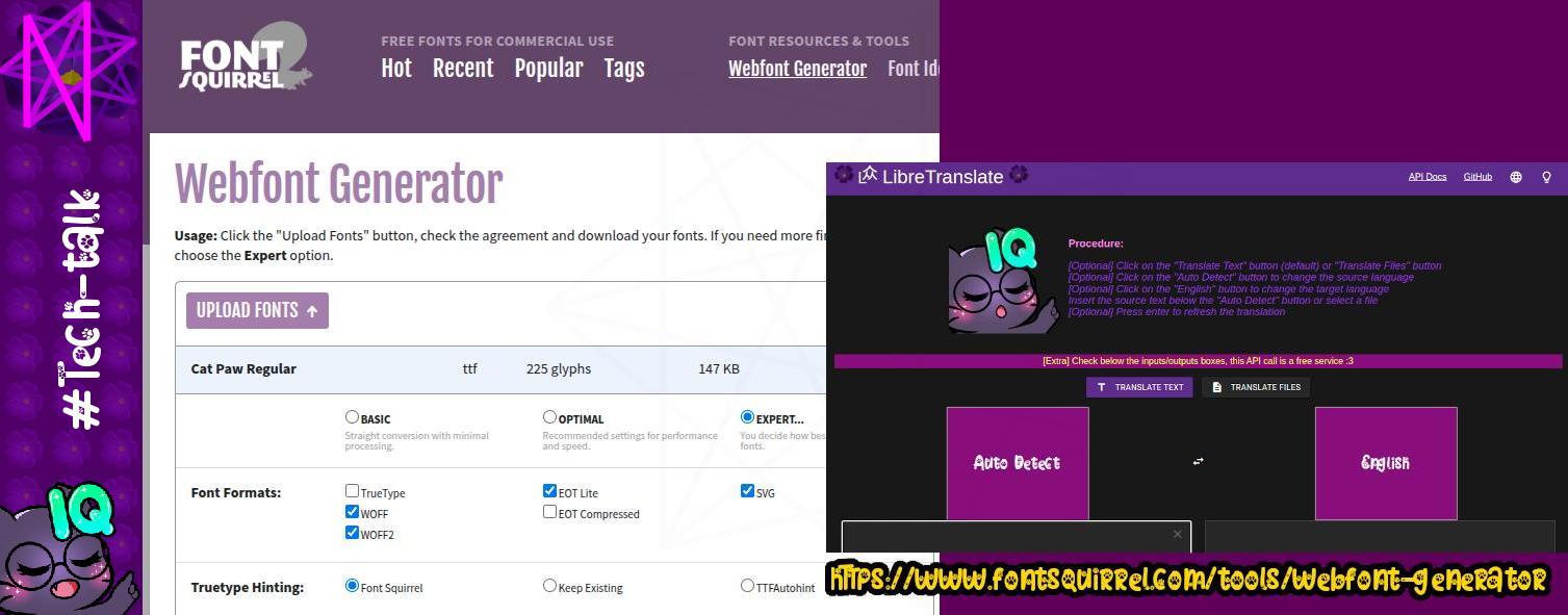
Chrome is driving me insane with design issues. Anyway, I improved libretranslate's UI/UX a bit for phone users, & I found a webfont gen <<https://shorturl.at/ENOq4>>. It generates several types from the one we own. Nice. #ttf #woff #fontsquirrel #eot #svg #nomxd #Tech-talk🐾
#fontsquirrel
The font developer apparently got permission to use the name of the cia front business from an "air america association" at www dot air-america dot org... knowing what we know today about the company being a cia frint, the fact there's a association around it is even more creepy.
its pretty poor form to use the name of a business directly for a font anyway. i did a quick search and found that "air americana" is already a name of a slightly different font and it is not entirely a carbon copy of the cia front company brand and its in fact under development and due to be finished in a couple months! https://air-americana.com/
wtf, lol
its good that they are trying to do something creative with the carcass of a known horrific cia brand... i support that over whatever that thing at #fontsquirrel is. Bonus points if the uppercase and lowercase have SOME variation.
Hey, y a un outil pour identifier les typos sur #FontSquirrel, maintenant !
https://www.fontsquirrel.com/matcherator
#font #typo #police
Client Info
Server: https://mastodon.social
Version: 2025.04
Repository: https://github.com/cyevgeniy/lmst