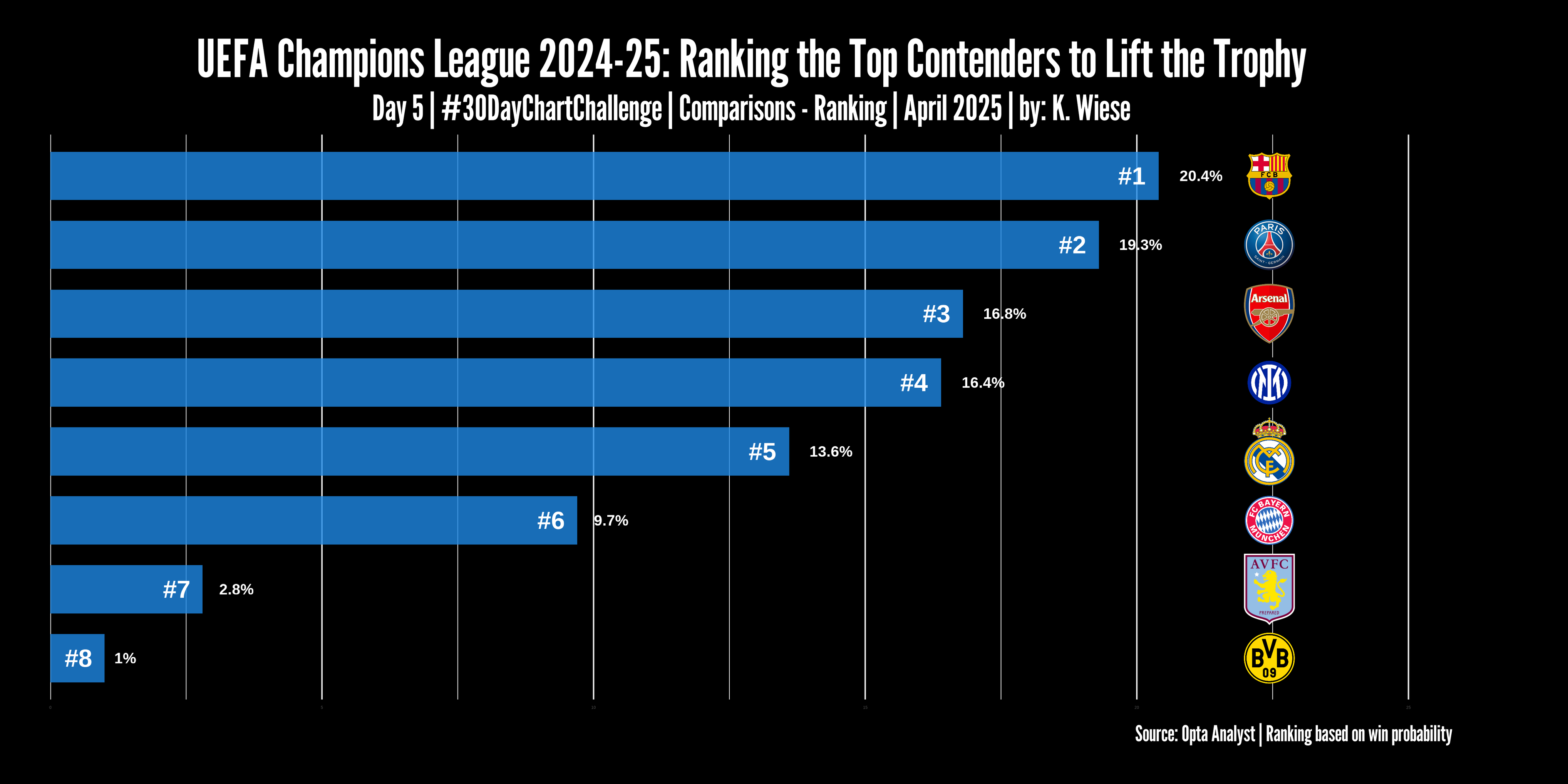
Day 5 | Comparisons – Ranking | #30DayChartChallenge. Visualization develop with R using #ggplot2, #dplyr, #ggtext, #showtext, #glue and #ggimage. Data source: Opta Analyst.
#ggimage
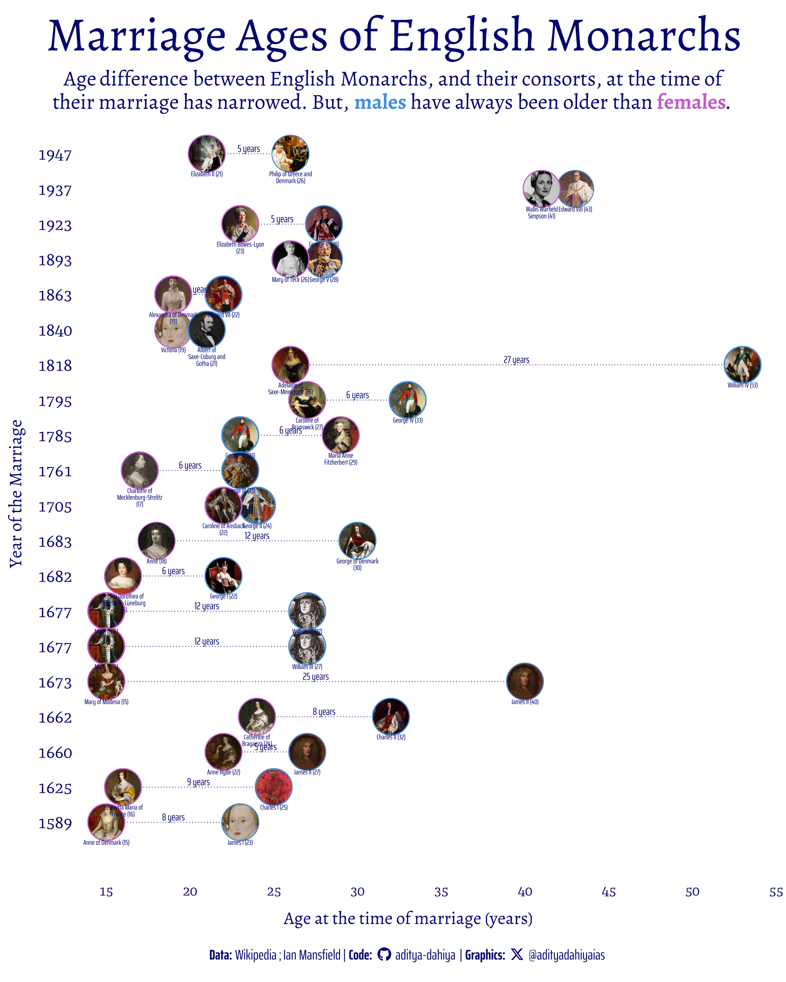
#TidyTuesday Ages of English Monarchs at the time of their marriages. Males have always been older.
Data: @wikipedia @royalfamily
Code🔗https://tinyurl.com/tidy-monarchs
Tools #rstats #ggplot2 #ggimage #ggtext @clauswilke@genart.social
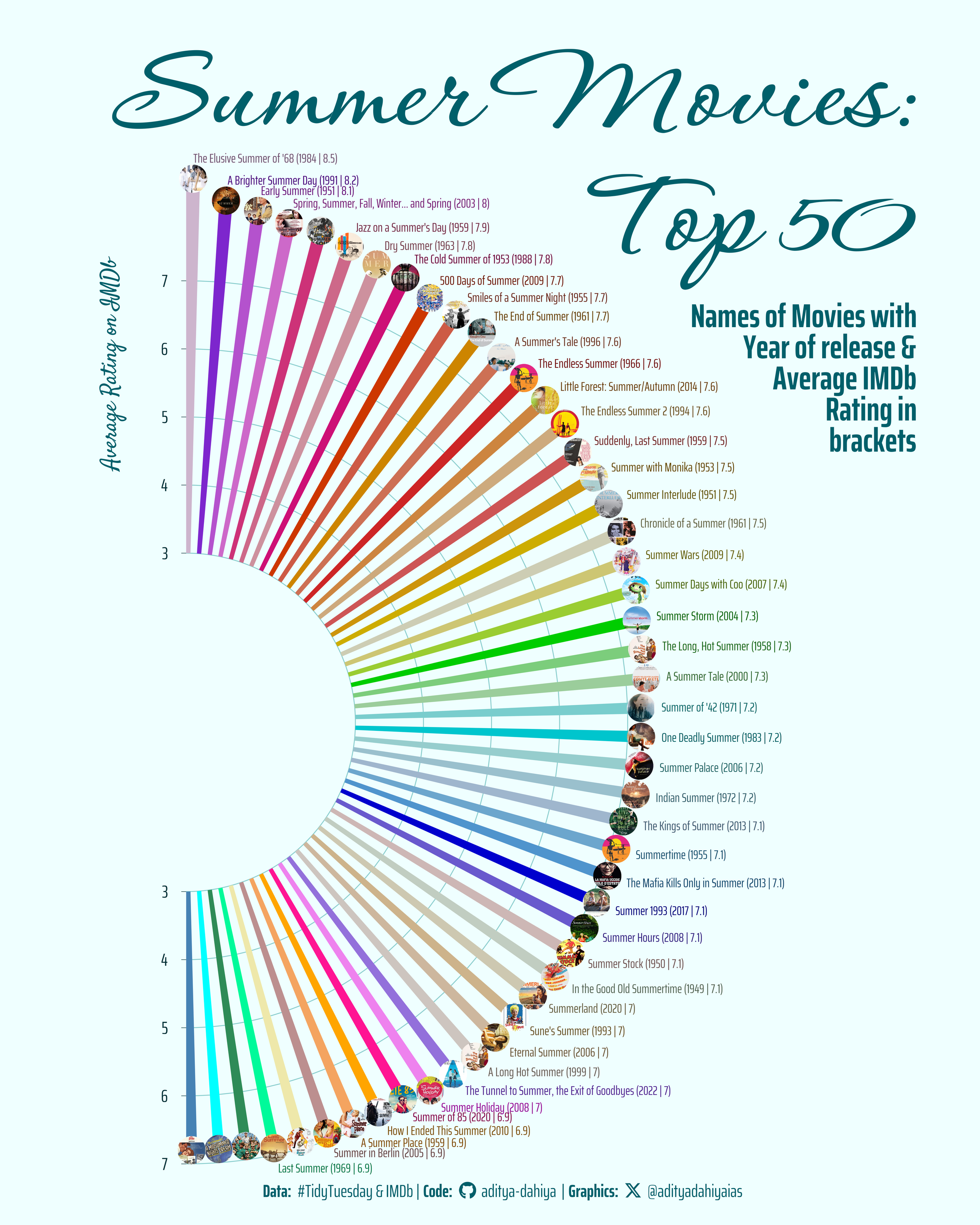
#TidyTuesday The most popular Movies on #IMDb with the term "Summer" in them- using {magick} and #R to retrieve posters!
Data: @imdb @jonthegeek on #TidyTuesday
Code: https://tinyurl.com/tidy-summer-movs
Tools #rstats, #ggimage by Guangchuang Yu, #magick by @jeroenooms
#TidyTuesday Rolling Stone Album Rankings. Correlation between
@spotify popularity vs. Weeks spent in #Billboard200 by @billboard@mastodon.world.
Data by @thepudding and @RollingStone
Code🔗https://tinyurl.com/tidy-albums
Tools #ggplot2, #ggimage, #magick by @jeroenooms, #geniusr

Client Info
Server: https://mastodon.social
Version: 2025.04
Repository: https://github.com/cyevgeniy/lmst