
Add some swag to your ggplots, with fontawesome symbols and colors: https://nrennie.rbind.io/blog/adding-social-media-icons-ggplot2/ #rstats #ggplot #fontawesome #ggtext
#ggtext
Add some swag to your ggplots, with fontawesome symbols and colors: https://nrennie.rbind.io/blog/adding-social-media-icons-ggplot2/ #rstats #ggplot #fontawesome #ggtext
Add some swag to your ggplots, with fontawesome symbols and colors: https://nrennie.rbind.io/blog/adding-social-media-icons-ggplot2/ #rstats #ggplot #fontawesome #ggtext

Día 8 | Distribuciones – Histograma | #30DayChartChallenge. | Visualización hecha usando R con los paquetes #ggplot2, #dplyr, #patchwork, #sf, #ggtext, #showtext, #raster, #exactextractr, #ggscale y #scales.

Day 28 | Uncertainties – Inclusion | #30DayChartChallenge. Visualization made with R using #ggplot2, #dplyr, #ggtext and #showtext | Source: Google Trends.

Día 9 | Distribuciones – Divergente | #30DatChartChallenge. | Visualización hecha usando R con los paquetes #ggplot2, #dplyr, #patchwork, #sf, #ggtext, #showtext, #raster, #exactextractr and #SPEI.

Day 24 | Timeseries – Data Day – WHO | #30DayChartChallenge. Visualization made with R using #ggplot2, #dplyr, #showtext, #patchwork, #ggrepel, #glue, #ggtext, #sf and #rnaturalearth. | Source: WHO.

Day 19 | Timeseries – Smooth | #30DayChartChallenge. Visualization made with R using #ggplot2, #dplyr, #ggtext, #showtext, #patchwork, #sf and #rnaturalearth. | Source: Google Trends

Day 12 | Distributions – Data Day – Data.gov | #30DayChartChallenge. Visualization made with R using #sf, #tigris, #ggthemes, #patchwork, #tidyverse, #ggtext and #showtext . | Source: data.gov - https://catalog.data.gov/dataset/biodiversity-by-county-distribution-of-animals-plants-and-natural-communities

Day 15 | Relationships – Complicated | #30DayChartChallenge. Visualization made with R using #tidyverse, #ggtext and #showtext . | Source: google trends https://trends.google.com/trends/explore?date=all&q=Avril%20Lavigne%20Complicated&hl=en

Día 11 | Distribuciones – “Stripes” | #30DayChartChallenge. La visualización fue creada usando R basado en los paquetes: #ggplot2, #dplyr, #sf, #lubridate, #ggtext, #showtext, #RcolorBrewer, #rnaturalearth y #cowplot. Fuente: CHIRPS.

Day 7 | Distributions– Outliers | #30DayChartChallenge. Visualization made with R using #ggplot2, #tidyverse, #terra, #ggtext, #showtext y #sf. Data source: Sentinel-2 MSI (2019-2024)

Day 6 | Comparisons – Florence Nightingale (theme day) | #30DayChartChallenge. Visualization made with R using #tidyverse, #ggtext and #showtext. Data source: HDX - https://data.humdata.org/dataset/cod-ps-hnd.

Day 5 | Comparisons – Ranking | #30DayChartChallenge. Visualization develop with R using #ggplot2, #dplyr, #ggtext, #showtext, #glue and #ggimage. Data source: Opta Analyst.

Día 3| Comparaciones – Círculos | #30DayChartChallenge. La visualización fue creada usando R basado en los paquetes #sf, #terra, #tidyterra, #extarctexactr, #ggplot2, #dplyr, #scales, #ggnewscale ,#ggtext, #patchwork y #showtext. Fuente SRTM y SIGMOF ICF - https://geoportal.icf.gob.hn

Day 2 | Comparisons – Slope | #30DayChartChallenge. Analysis develop with R using #ggplot2, #tidyverse, #ggpmisc, , #terra, #ggtext, #showtext y #sf. Data source: Sentinel-2 MSI (2019-2024)

Día 1 | Comparaciones – Fracciones | #30DayChartChallenge. La visualización fue creada usando R basado en los paquetes #ggplot2, #dplyr, #scales, #ggtext, #patchwork, #showtext, #sf, #rnaturalearth, #rnaturalearthdata y #ggrepel. Fuente HDX - https://data.humdata.org/dataset/cod-ps-hnd

Add some swag to your ggplots, with fontawesome symbols and colors: https://nrennie.rbind.io/blog/adding-social-media-icons-ggplot2/ #rstats #ggplot #fontawesome #ggtext
Add some swag to your ggplots, with fontawesome symbols and colors: https://nrennie.rbind.io/blog/adding-social-media-icons-ggplot2/ #rstats #ggplot #fontawesome #ggtext

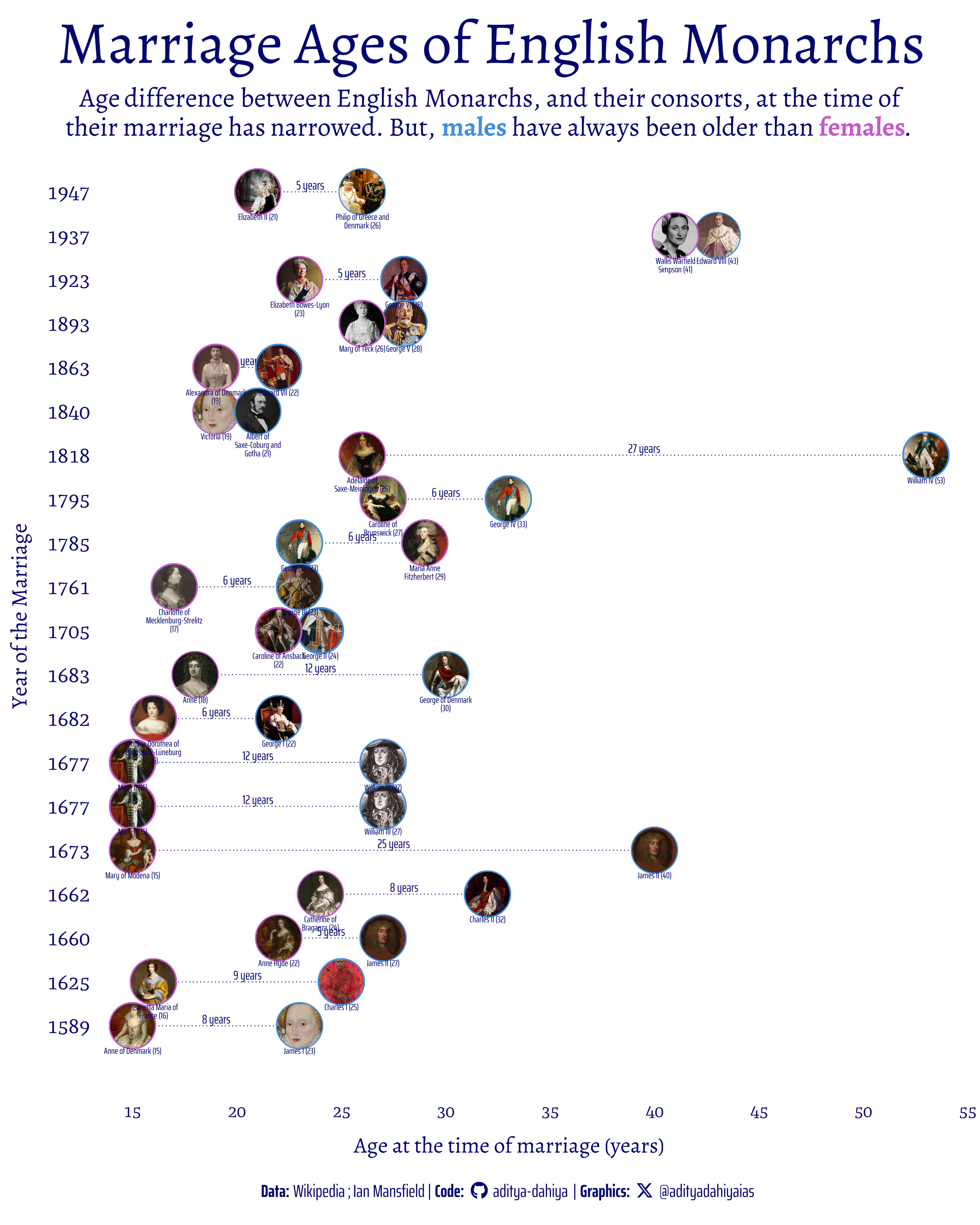
#TidyTuesday Ages of English Monarchs at the time of their marriages. Males have always been older.
Data: @wikipedia @royalfamily
Code🔗https://tinyurl.com/tidy-monarchs
Tools #rstats #ggplot2 #ggimage #ggtext @clauswilke@genart.social
Client Info
Server: https://mastodon.social
Version: 2025.07
Repository: https://github.com/cyevgeniy/lmst