#shitUX

2025-11-17

@vmbrasseur they do have a history of pushing tidy-up releases, but it’s unlikely they’ll offer a “revert to previous UI” toggle or any other way to significantly customise the #UI / #UX

#Apple is nothing if not obnoxiously opinionated about their design choices & for a long time (since forever? 🤔 it’s been ages since I’ve played with Macintosh-era gear) have been of the “we know best & you should learn to embrace our choices” school of user choice 🤪

it feels increasingly like being a (US) soldier who’s told to just “#EmbraceTheSuck” 😕

#shitUI
#shitUX
#iOS26 🙅‍♀️
#LiquidAss 🫠


^ a.k.a. the “give in to the Dark Side” school of choice 🤪

2025-11-17

I discovered when I went to look up the definition of a word on my phone that the (tricksy, unwanted) update to #jankyAF #iOS26 had nerfed all my on-device dictionaries, so I had to download them all again. even the default “Apple dictionary” 🤦‍♀️

great work, #Apple! just spectacular #UX 👏👏👏

#shitUX

2025-11-16

@twcau I had no idea that gesture existed 😕

this is one of my annoyances / #PetPeeves with #Apple as well – failure to provide any in-app or on-device help / documentation for this stuff & rely on “serendipitous discovery” 🙄 which of course just means you often never “discover” how to do basic things on your phone unless you just stumble on them 😤 and for those of us who normally #RTFM for fun (& profit? 🤔) or general interest or professional competence, there’s just no FM to R… 😜

they do have the “Tips” app but I’ve found it so patchy that I deleted it from my phone. I just downloaded it now to see if it had any info about this pinch & swipe gesture in Safari but nope ¯_(ツ)_/¯

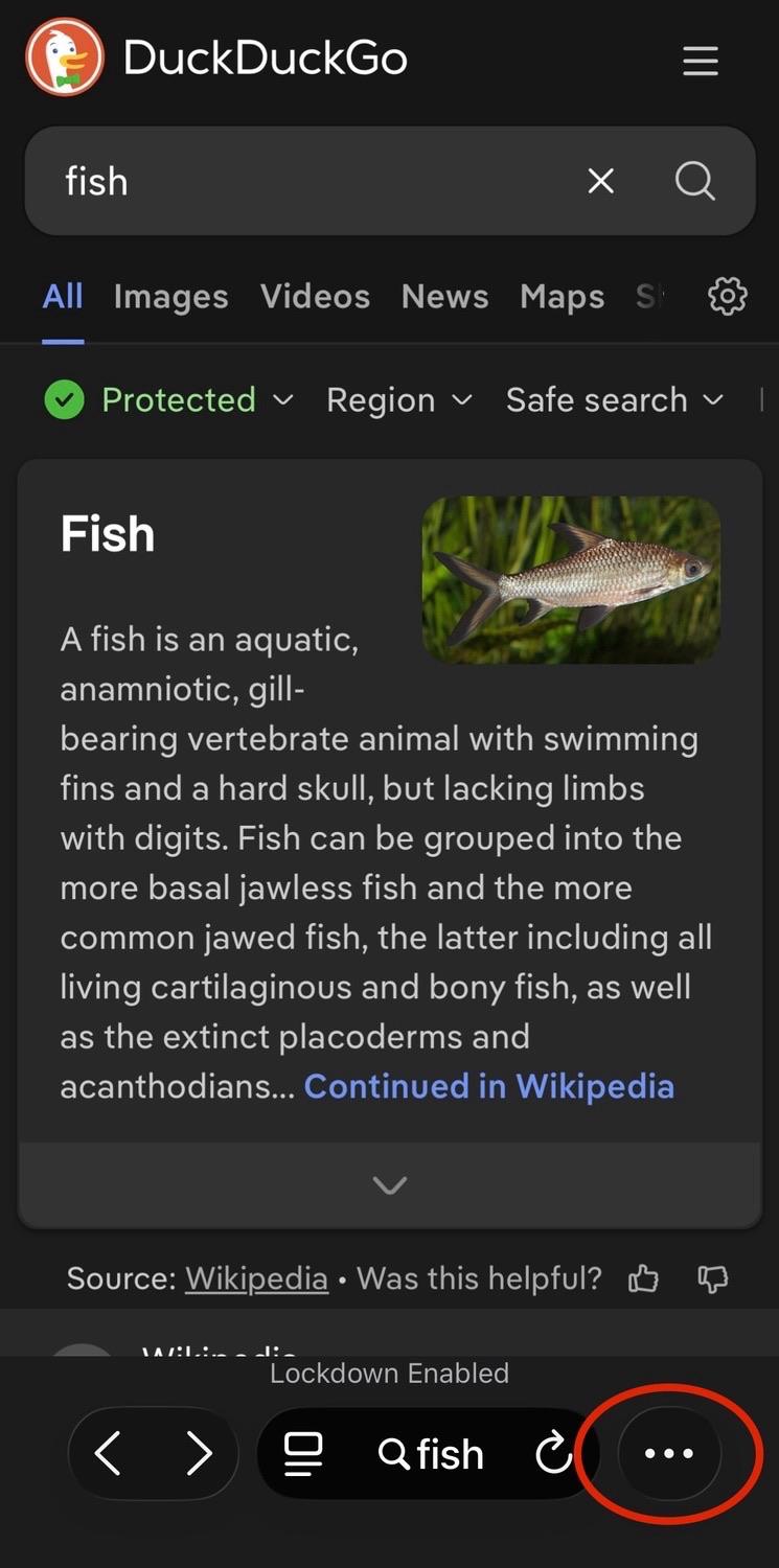
what I did discover though (in the Tips app) is that there are now three tab bar layouts in Safari – “top”, “bottom”, & “compact” – & the layout I had was the compact one, which I don’t recall ever selecting as I didn’t realise there were any options to set (there in the Settings app rather than in the app itself of course, because Apple 🤪)

if you switch it to “bottom”, the tabs button / icon is restored, but it takes up about twice the space at the bottom of the screen (until you scroll the page). I’ll be switching to this layout since it’s the closest to what I previously had

also, FWIW, I did already know that you can slide across the tab bar left or right to swipe to the next tab open tab in either direction, but as you say there doesn’t seem to be a single-hand gesture

now, I don’t use Safari as my primary browser (tbh it’s about fourth), but I do use it occasionally if I need to temporarily reduce the strictness of my browser settings to access some janky website. so I use it often enough for this change to screw up my muscle memory 🫠

I’m sure some folks either don’t notice such things or just blithely accept that crap changes in unexpected ways in this “smart” device world we now live in, but for “power users” 🤔 and #neurodiverse folks who either care significantly about the tools we use and / or are significantly bothered by regressive changes (or just by change for the sake of change), this stuff matters 😤

#UI #shitUI
#UX #shitUX
#neurodiversity
#accessibility

2025-11-16

living with #iOS26 continues to reveal new #shitUI / #shitUX “features” 😡🤬

the #Safari toolbar now has enormous text & button elements^ that have presumably led to the decision to remove the tabs button / icon & relegating to a pop-up menu – so now viewing open tabs requires two taps instead of one, & switching to a different tab now requires three taps instead of two… 🤦‍♀️

these are the alleged “design geniuses” of #Apple at work, folks 🤦‍♀️🤦‍♀️🤦‍♀️


^ I have old eyes, so I tend to run most app text size at 120% – but I’ve checked the toolbar layout at other text sizes all the way down to 80% & it doesn’t change the elements presented, so the tabs button / icon doesn’t disappear ’coz I’m running larger text sizes, it’s just a crap design decision 💁‍♀️

a screenshot of the Safari mobile browser in iOS 26 showing a DuckDuckGo search result page for the word “fish” 
 
at bottom right, a red oval highlights the ellipses menu (…) that you now need to tap to bring up more options – this is where formerly a tabs button (icon) was displayed that would launch the tab picker screen with a single tapa screenshot of the Safari mobile browser in iOS 26 showing a DuckDuckGo search result page for the word “fish”, with a pop-up menu at bottom right
 
a red oval highlights the “All tabs” option (icon with text below it) that you now need to tap to launch the tab picker screena screenshot of the Safari mobile browser in iOS 26 showing the tab picker screen – two tabs are visible, one is a DuckDuckGo search result page for the word “fish”, the other is a DuckDuckGo search result page for the word “baskets” 
 
a large red circle with an emoji of a hand with the index finger extended highlights the middle of the tab on the right (the search for “baskets”) where you tap to switch to the second taba screenshot of the Safari mobile browser in iOS 26 showing a DuckDuckGo search result page for the word “baskets” 
 
this completes the three-tap process to switch between tabs that used to be a two-tap process in earlier versions of iOS 🤦‍♀️
2025-11-08

look at these janky-ass animations on #iOS26… 🤦‍♀️😡🤬🤮

this is on an #iPhone 15 Pro, so it’s not caused by trying to run it on a really old phone

#LiquidAss
#LiquidGlass
#shitUI
#shitUX

2025-11-08

dear #AppDevs – if the only place you give me to specify the notifications I want to see is under the “push notifications” setting, #WhyTF are you showing an in-app notification count indicator that includes notification types that I haven’t selected? 🤦‍♀️

#shitUX

2025-11-06

gah! fucking #iOS did a bait’n’switch on me with the #update 😡🤬

“oh hey, there’s an 18.7.x update ready, download it now or later tonight…”

~later tonight~

“oh yeah, just smash the update button, we’re all cool…”

“Welcome to shitty #iOS26!”

🤮

what an abomination of a #UI & an absolutely #shitUX 🤮

fantastic way to undermine user #trust in your company & products, #Apple 👏👏👏 really top-notch work nudging your users towards not applying updates (including #security updates) in future 😡🤬

having to hold the power button to turn off bluetooth headphones is #shitUX

2025-04-19

me, trying to browse mastodon using a native app on a marginal internet connection:

  • taps on toot, waits for it & replies to load (~30s)

  • skims toot & replies, taps back to list of toots

  • no wait, what was that thing at the bottom of the thread…? taps back into toot

  • waits while toot & replies re-load… (~30s)

(╯°□°)╯︵ ┻━┻
 
 
you JUST 🤬ing loaded it!!

you HAVE a 🤬ing CACHE!!!!

even if you’re not polling network xfer stats (WHY NOT?) you’re aware of how 🤬ing long it’s taking toots to load!!!!!

WHY did you not stuff the toot & replies INTO the 🤬ing CACHE???!?!?!???

WHY are ppl so SHIT at making apps???!?!? (rhetorical, I know why 🤪)

#ShitUX
#ShitApps
#ShitAppDev
#SmartPhonesMyArse

2025-01-19

“Captive wifi” is right 😕

(OK yes, I’m in the #FancyPlace rn courtesy of my partner who has access because of work travel 🤷‍♀️)

Also, send the copywriter for this captive portal page (lol, ‘sif) to my office IMMEDIATELY - we need to have Words™ 🤪

#BadCopy
#ShitUI
#ShitUX

/ping @pluralistic

#enshittification

Screenshot of the captive portal for the QANTAS lounge wifi. 

The QANTAS logo (red airplane tail with a stylised white kangaroo) is displayed along with the QANTAS name.

Then a heading, reading “Welcome to the Qantas Lounge WiFi”

Below that, text reads “You will be connected to the Qantas Lounge Wi-Fi at the completion of this video. By logging in I agree to the Terms & Conditions.” 

(the copywriting for this page is absolutely terrible)

Below that is a video panel that shows a black background with a stylised person riding a horse with a raised polo club in the air (the corporate logo for Ralph Lauren).
2024-10-25

Ooooh, I had forgotten about this one. The other day while helping my dad with his Arduino project, I wanted to copy the contents (we’re talking about 50 lines of text) of the serial monitor of the Arduino IDE v2 to paste it in BBEdit.

You can’t. You can only copy the lines of the scrolling buffer that are currently visible.

I’m submitting the Arduino IDE to Merriam-Webster for the definition of shitty UI.

#Arduino #UI #UX #ShitUX

2024-10-21
I hate this UI design. When I want to check the date, but my iPhone is plugged in, I have to wait a few seconds for the % Charged to change back to the date. THERE'S PLENTY OF SPACE TO SHOW BOTH AT THE SAME TIME! Plus I can already see the % charged in the upper right! #ShitUX #iOS
2024-10-04
bruh when venmo encounters an error all it does is say "Something went wrong. Try again." and the api call is 404 not found... u can only guess what's wrong... in this case it was because my ip flagged as proxy, vpn to other house and it worked... now again having error must be because they don't accept google voice phone number but all they say is fucking meaningless "Something went wrong".

if you're not tech savvy you would have no clue and will have a horrible experience not being able to use the damn thing. cause who the hell knows anything about residential proxies and vpns and has another house to proxy through

#ShitUX
Alexander Berlalexander@neos.social
2022-12-21

Using Microsoft tools is giving this feeling every time, no matter how long you have been in IT and how much you already know about the supposed topic.
#ShitUX

Client Info

Server: https://mastodon.social
Version: 2025.07
Repository: https://github.com/cyevgeniy/lmst