@drj This Island Earth!
Josh Korwin
Born to font.
@cramsay Have you heard of 47th Avenue Farm? The CSA produce is amazing. https://47thavefarm.com/
@velvetyne @fadebiaye @maous Thought so! Thanks so much!
@velvetyne @fadebiaye @maous This is so lovely! To whomever designed the specimen graphics: I am wondering about the cursive “Special Thanks” used in the Apollo 11 plaque inspired image. What is that?
@Shanmonster That is Intertype Vogue: https://fontsinuse.com/typefaces/10456/vogue
Josh Korwin boosted:
Here it is! https://shifthappens.site/gorton-perfected-specimen.pdf
Any feedback is very welcome. Even though it’s out, I’m still working on it! I have so many photos of Gorton in use it’s hard to choose sometimes.
Josh Korwin boosted:
Working on my first font specimen. It’s fun.
Josh Korwin boosted:
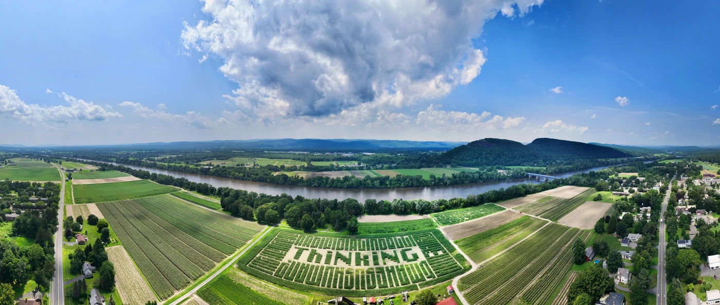
Today @FontsInUse features a truly mind-blowing use of my typefaces Fit and Lab DJR for http://mikesmaze.com, rendered in corn at font sizes upwards of 100,000pt.
The maze asks the question “In the age of artificial intelligence, what makes us human?” and was designed by Jess Marsh of Hired Hands Signs (https://www.hiredhandsigns.com / http://instagram.com/hiredhandsigns). She even used Fit’s variable width axis to help the text align with the rows of corn and the size of the field!
https://fontsinuse.com/uses/55689/mike-s-maze-2023-what-makes-us-human
Josh Korwin boosted:
Over the past days, we have published more than 25 new uses of #fonts with interlocking letterforms. https://fontsinuse.com/tags/10566/interlocking-letterforms
The examples include film titles and posters, record and book covers, food packaging and more. They range from 1961 to 2023, and from Brazil to Greece and the Philippines.
See all uses of the featured fonts by Headliners, Filmotype, PLINC, Lettergraphics, House Industries, @typodermic, and PintassilgoPrints: https://fontsinuse.com/search/advanced?v=2&match0=all&typefaces0=230949,40498,125579,144046,28096,29098,28977,202766,115266,161117,126972,91899,125578
Josh Korwin boosted:
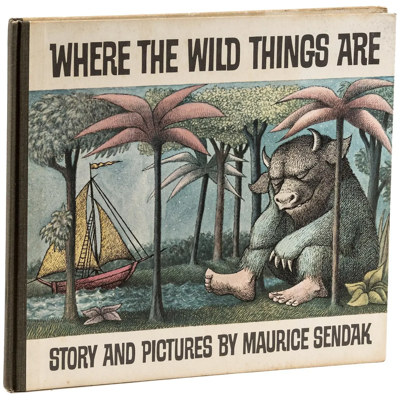
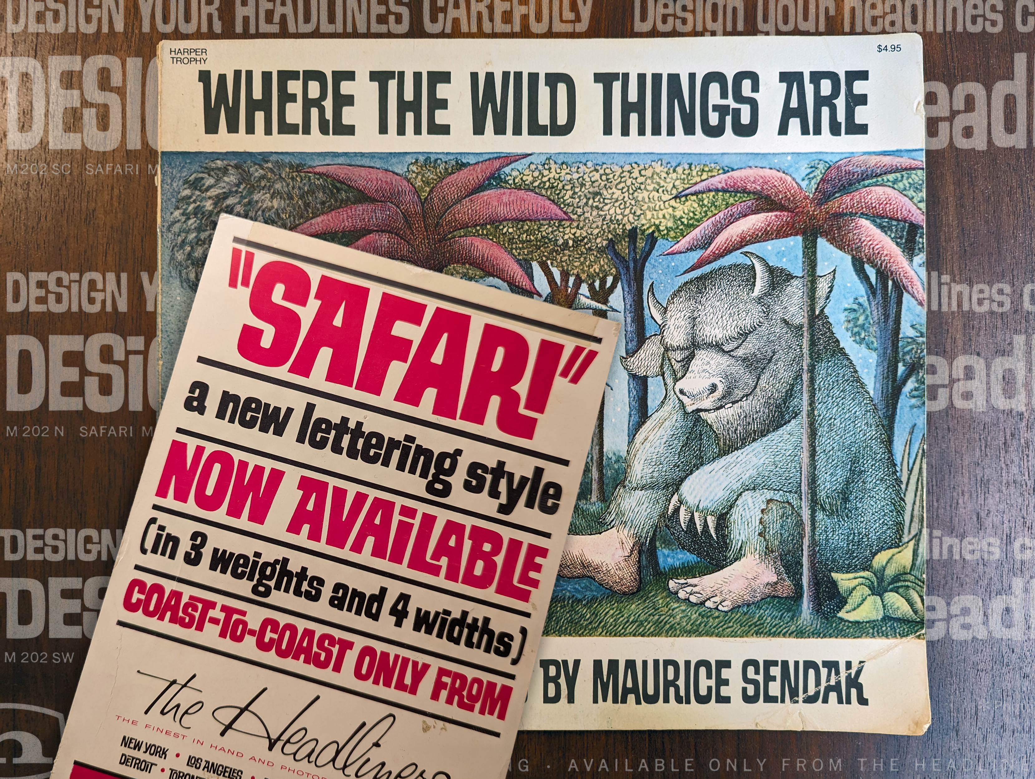
Sixty years ago, in November 1963, #MauriceSendak published his now famous #ChildrensBook, Where the Wild Things Are.
Did you know that the casual letterforms on the first edition #BookCover aren’t custom drawn, but type? They stem from an obscure #font named Safari which came with numerous alternate glyphs. Patrick Concannon put together a post about the #design, and @jaykay109 tracked down the origin of the #typeface. More: https://fontsinuse.com/uses/54045/where-the-wild-things-are-by-maurice-sendak-h
@laureola Apparently this kind of thing exists!
https://play.google.com/store/apps/details?id=com.hornwerk.compactcassetteplayer
https://play.google.com/store/apps/details?id=com.hornwerk.vinylage
This week I made a wild discovery: the original interlock display font used for the cover of “Where the Wild Things Are” by Maurice Sendak. I wrote about my “Safari” here: https://blog.threestepsahead.com/general/safari-where-the-wild-things-are-font/ @FontsInUse #typography #WhereTheWildThingsAre #MauriceSendak #fonts #fontsinuse #photolettering
@isger At first glance, this is very similar to Dymaxion Script, a 1950s “streamline” monolinear cursive style: https://www.fontsquirrel.com/fonts/dymaxionscript
@typographica Oof, I was hoping I was the only one with a saved search for “Filmotype.” 🤫
@Lfaimagebot I appreciate it! And I do think there is value in posting problematic content for educational purposes provided that it is accompanied by informative context. We owe it to future generations not to forget what this text signified. It just becomes ambiguous when something like this is posted in the same manner as any other benign type specimen.
@Lfaimagebot Yikes. Might want to include some context when posting Nazi propaganda.
@unitof @onpaperwings Ha, I have that IBM Think sign, too.
@unitof @onpaperwings Ditto for me, nice find!
Josh Korwin boosted:
I wrote a piece on my blog about something that's been on my mind lately: Keeping the digital world in its place and reconnecting with the analog world... https://www.marksimonson.com/notebook/view/1979
Josh Korwin boosted:
What a super cool piece on the history of the font on the covers of Frank Herbert's Dune novels! From Fonts in Use. Digs down into the history of the font, the difficulty in tracking it down, and much more. #sciencefiction #typography https://fontsinuse.com/uses/43515/the-mystery-of-the-dune-font
Client Info
Server: https://mastodon.social
Version: 2025.04
Repository: https://github.com/cyevgeniy/lmst