Staff pick:
“What do you dream about?” is a typographic list of different types of #dreams. The book was made by Tim Bauer, Marei Hager, and Jennifer Treacy as a student project at HS Mainz. They paired Altro Serif (Zetafonts) with ABC Stefan (Dinamo). More: https://fontsinuse.com/uses/72764/what-do-you-dream-about
#fontsinuse


Isenheim et Teranoptia in use! (avec Bask Type de Jules Durand, Ouroboros - @velvetyne - et plein d'autres épices graphiques)
https://www.instagram.com/p/DT00EwejUaT/?img_index=1
<= #fontsInUse #teranoptia #isenheim #basktype #julesDurand #typography #ArielMartínPérez #typographie #associationPresseOffset #ByeByeBinary
Staff pick:
“Koalicje wody / Coalition of Waters” is an exhibition that was shown last year at the Baltic Gallery of Contemporary Art in Słupsk, Poland. Karolina Pietrzyk and Tobias Wenig designed the posters and other printed matter using KTF Prima: https://fontsinuse.com/uses/72588/koalicje-wody-coalition-of-waters
@anfalov started work on this neo-grotesk during his studies at ECAL. It’s an interpretation of Nebiolo’s Forma, designed 1965–68 by a team of eight designers under the direction of Aldo Novarese. After years of being in development, KTF Prima was released this week with Kyiv Type Foundry.

Staff pick:
Corbin Mahieu and Victor Verhelst designed the identity of Nova, a “headstrong” restaurant in Sint-Niklaas, Belgium. It comes with a logo in Tekio’s Ursa Mono and jagged illustrations.
More: https://fontsinuse.com/uses/73530/nova-restaurant-sint-niklaas


Gill Kayo joins Club 💯
Initially dubbed “Sans Double Elefans” and later known as Gill Sans Ultra Bold, the heavyweight extension from 1936 wasn’t always loved: its designer* disowned it, thinking of it as an “absurd misconception”, and British typographer Robert Harling characterized it as “the most horrendous and blackguardly of these display exploitations”.
Gill Kayo (as in K.O. 🥊) found its fans when extremer styles became fashionable in the 1970s. In fact, 35 out of the 100 Uses now documented on Fonts In Use date from that decade. See ’em all:
https://fontsinuse.com/typefaces/7273/gill-kayo
*) A horrendous and blackguardly character himself, ICYDK: https://www.thefrontispiece.com/blog/2018/1/16/when-is-times-up-coming-for-eric-gill

Staff pick:
De Situatie 2 is a book with ten texts selected from the Dutch literary platform’s annual writing competition, designed by All Sizes & Céline Hurka.
Each of the emerging writers has been paired with an unreleased typeface by an upcoming type designer. Several of the fonts were made as student projects, with many of them being recent creations from the @TypeMedia program at @kabk_thehague.
The pairings:
Khadija Elberdai & @gagane
Remmelt Bot & Mălin Neamțu
Mylène Delfos & @vandenbroeckkaat
Lennart Bolwijn & Huw Williams
Ivana Kalaš & Luka Appelberg
Merle Findhammer & Tina Božan
Sanne Morssink & Nóra Békés
Charlotte Beerda & Luboslav Boyanov
Zaban Razdar & Andrea Hayek
Christina van Egmond & @daytonamess
For your typographic holiday reading, here’s @fhardwig on a songbook with Christmas carols produced by artists of the Werkstatt Haus zum Fürsteneck … in 1940: https://fontsinuse.com/uses/11409/lieder-zur-weihnachtszeit-1940
“As soon as one starts reading, one is painfully reminded that the heyday of this workshop in the tradition of the Arts and Crafts movement coincided with Nazism, and that its members allowed those in power to coopt their talents for propaganda purposes. As beautiful as Claudius and the two-colored musical notation might be, the joy is spoiled by the content which is drenched in the unholy zeitgeist.”


Ten days ago, The Hague’s newest cultural venue Intercity opened doors for a sneak preview; the opening featured my oldest son looking handsome in uniform, and signage by All Sizes set in Thermorest by @mass_driver
#intercity070 #fontsinuse #typography #070 #massdriver #thermochrome


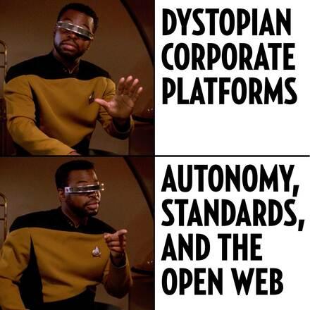
From: https://fontsinuse.com/uses/63903/fonts-in-use-is-not-active-on-instagram
#fontsinuse #autonomy #openstandards #openweb #geordilaforge #meme
Staff pick:
Issue no. 11 of Mosaïque magazine investigates how the music industry protects perpetrators of sexist and sexual violence. For the title, “La fabrique du silence”, art director Alexandre Créquer used the Thin weight of his own Mosa. 🔒 More:
https://fontsinuse.com/uses/72283/mosaique-magazine-no-11-la-fabrique-du-silenc

Insenheim typeface (by Benoît Ferran) in use at the Octobre Numérique festival website! https://octobre-numerique.fr/ <--#fontsinUse #Isenheim #typeface #font #typography #BenoîtFerran #tuneratypefoundry
Staff pick:
“Readings of the Archive” is a book about Argentinian architect Amancio Williams (1913–1989) published by the Canadian Centre for #Architecture in partnership with Spector Books. Design studio Our Polite Society used two of their own typefaces: the monospaced OPS Favorite and the newly released OPS And Ever, a proportional update and continuation of the latter. Its Ultra weight that’s used on the cover is still unreleased.
https://fontsinuse.com/uses/73378/amancio-williams-readings-of-the-archive

Goodbye, Jimmy Cliff.
https://fontsinuse.com/tags/14763/jimmy-cliff
GT Walsheim joins Club 💯!
Noël Leu’s “friendly but precise” sans (Grilli Type) with the characteristic G has crossed the mark of one hundred Uses in the #FontsInUse Collection.
Inspired by 1930s lettering of Swiss poster designer Otto Baumberger, GT Walsheim was first released in a single style in 2009, and gradually expanded to eight weights plus obliques. In 2014, Leu unlocked Cyrillic support with the help of Mirco Schiavone. The 2017 revision added condensed styles.

Mad Men is on German TV. They already lost me 15 seconds into the intro when I saw the Lucida Handwriting font (1991) – in a show set in the early 1960s? #FontsInUse


Shoutout to Thomas Huot Marchand's great #Minuscule typeface made for extremely small sizes! Even though it takes some to render a 360 page part of a book reflowed to one A0 page in 3pt body copy with 2pt footnotes, it works and is still legible when printed! #oldschooldataviz #fontsinuse http://www.256tm.com/en/overview_1.htm
My font Panchi Mono in use! by @clavardeuxses
This graphic design collective from my homeland Brittany just launched their website: lesclavardeuxses.fr
Give them some love 🫶

Staff pick:
Forum Neues Wetter was a series of talks about #climate, soil, and participation in Grimma, Germany. For the design of the poster and program flyer, Wolfgang Schwärzler @ws combined amorphous lettering with Gamuth (@productiontype) and the upcoming Friedl (Camelot Typefaces). More:
https://fontsinuse.com/uses/72909/forum-neues-wetter


Discover a selection of projects set in PS Fournier, excellent text and titling typeface, which reflects the perfect French elegance. ➽ typofonderie.com/fonts-in-use... — — — #fontsinuse #typefaces #fonts #branding


Client Info
Server: https://mastodon.social
Version: 2025.07
Repository: https://github.com/cyevgeniy/lmst