#CSSlayout

Ana Tudor 🐯anatudor
2026-01-29

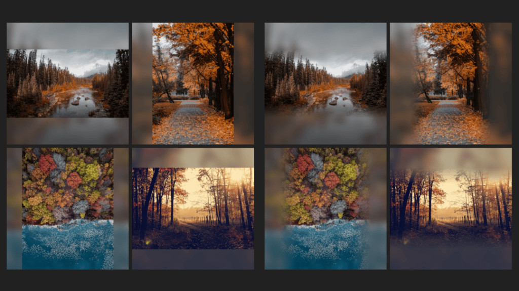
The tiny details make the difference - check out those roundings in the cards demo!

Even cooler: the shape depends on the size of the sibling it wraps around, no magic numbers. If we need the shape to grow (for ex if we want it to have more content), there's no need to change any clip-path or mask.
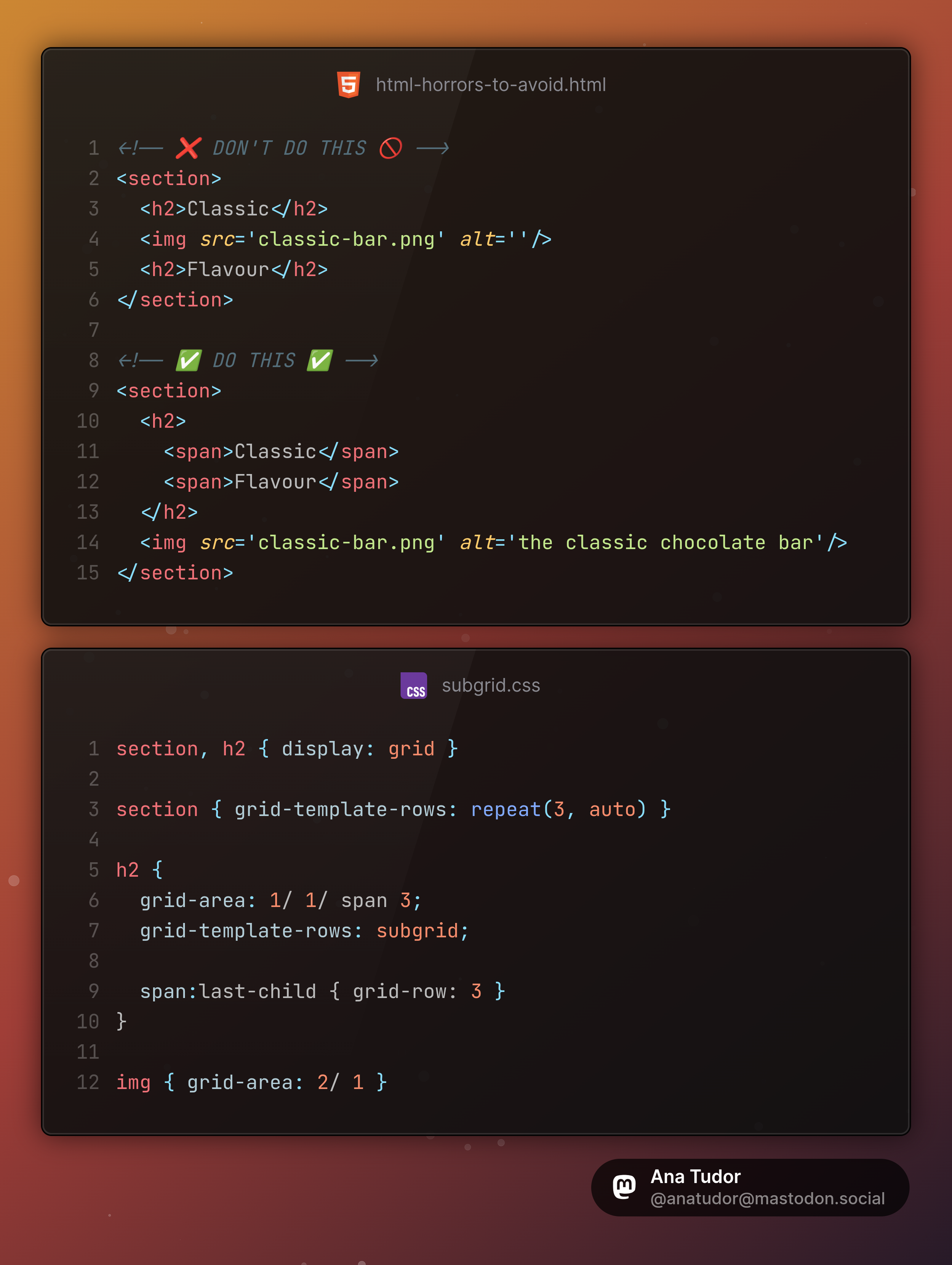
Screenshot highlighting the card corner roundings around their round and pill-shaped siblings.Zoom into one of the details.Zoom into another.
Ana Tudor 🐯anatudor
2026-01-29

My most hearted @codepen demos of '26:

✨ Pure animated carousel codepen.io/thebabydino/pen/dPX

✨ Scatter & CSS gradient codepen.io/thebabydino/pen/zxB

✨ Cards with concave rounding on irregular grid codepen.io/thebabydino/pen/Wbx

First two need very little code and are heavily commented.

Screenshot of animated 3D carousel, where the items are placed on the inside of a cylinder approximation.Screenshot of light blue to dark blue top to bottom gradient with a pixelated grain.Screenshot showing cards smoothly wrapping around circular/ pill shaped elements.
Ana Tudor 🐯anatudor
2026-01-22

Clip element on - a little pure demo I made on @codepen codepen.io/thebabydino/pen/vEG

Just scroll-driven animation magic πŸͺ„βœ¨ - no other tricks.

Ana Tudor 🐯anatudor
2026-01-21

This is what I see browsers actually doing: what I want in my simple, no wrap use case.

Slightly different things in the hypothetical case.

Chrome, Firefox, Epiphany below.

Also, please don't make fun of my browser themes. I'm a visual person, so I use themes that visually differentiate one browser from another.

Ana Tudor 🐯anatudor
2026-01-05

Wake up, wake up, wake up!

If you're a Cheetah+ supporter on Ko-fi or Patreon, then first of all thank you πŸ™ and second, I've just published a massive post about an improved technique for flexible irregular shapes.

❇️ ko-fi.com/post/New-year-new-te

❇️ patreon.com/posts/new-year-new

A square image with cutouts depending on the dimensions of corner elements, dimensions that in turn depend on how the text in those corner elements reflows at different viewports.Stepped shape with rounded corners on the right, step height depending on the height of the elements on the left, whose height is given by their content and how it wraps at different viewports.Irregular shaped image with both convex & concave roundings. Shape depends on the dimensions and aspect ratio of other elements, how they scale/ wrap as the viewport changes.Three cards wrap around buttons of different sizes in the bottom right corner. All corners of the card shapes, whether convex or concave, are rounded.
Ana Tudor 🐯anatudor
2026-01-04

Super simple 🦌 profile cards, content aligned with subgrid - all essential layout in just 6 declarations!

Check it out on @codepen codepen.io/thebabydino/pen/gbM

Demo screenshot with DevTools grid overlays on top.
Ana Tudor 🐯anatudor
2026-01-03
Ana Tudor 🐯anatudor
2025-12-24

Fit an integer number of columns of a certain minimum width within parent, overflow the rest - live on @codepen codepen.io/thebabydino/pen/EaP

Details on technique in this public Ko-fi post ko-fi.com/Post/Fit-an-integer- - if this helps you in any way, please remember praise doesn't keep me afloat financially... but you can! And consider supporting my work by becoming a monthly supporter or with a one time tip.

Screenshot of various cases of linked demo. Shows the grid parent outlined in red while the grid items are outlined in teal. There is always an integer number of items that fit within the parent's content-box width. The rest, faded out, can be seen overflowing on the right side of the parent.
Ana Tudor 🐯anatudor
2025-12-19

Remake of an old, old @codepen animation with 2025 codepen.io/thebabydino/pen/jOZ

Now using `conic-gradient()` + `mask` instead of an SVG segments ring image. CSS `grid` for layout. Container query units so ring sizes adapt to number of rings (passed to CSS via a var) & available space. And more, check it out! 🐱

Original code preserved in Pen description for web history.

Screenshot. Sows a 5Γ—5 grid of rainbow segments rings.
Ana Tudor 🐯anatudor
2025-12-17

A little @codepen demo: resizable panels with draggable panel separators codepen.io/thebabydino/pen/gbP

Hopefully at least more accessible than the alternatives. The description has info about my testing this thing.

Demo screenshot. Shows three panels, two at the top, separated by the bottom one using one separator and separated between them using another separator.
Ana Tudor 🐯anatudor
2025-12-17

It's 2025 and here's a little @codepen demo illustrating the grid stacking concept: codepen.io/thebabydino/pen/RNa

The base & hover image, the cart & fave button - all stacked up in the same grid cell on the 1st row. The images stretch to fill the grid cell, the buttons are in opposing corners.

mastodon.social/@anatudor/1137

Screenshot showing a card with a DevTools grid overlay. This grid has 1 column and 3 rows. On the first row, we have two buttons stacked on top of an image. We can see the image fills the entire grid cell, while the buttons are placed in opposing cell corners (top right and bottom left). On the next rows, we have the card title and a brief description.Relevant CSS:

```
.product-card {
	display: grid;
	grid-gap: 1em;
	
  /* stack all images & buttons in the same grid area
   * at the intersection between 1st row & 1st col */
	img, button { grid-area: 1/ 1 }
	
  /* place cart & fave buttons in opposing corners */
	.cart { place-self: end start }
	.fave { place-self: start end }
}
```
Ana Tudor 🐯anatudor
2025-12-02

I have a new article out on Frontend Masters: Non-Square Image Blur Extensions frontendmasters.com/blog/non-s

It details the how behind creating the base effect with a single `img` element and only 4 declarations, then... well, check the article, I promise you'll learn something new!

Screenshot collage, showing the desired result in two stages. First, on the left we have the base case with the non-square images being padded with a blurred version of themselves up to a square along the axis of their shorter side. Second, on the right, we have an extra touch, the non-square images fade smoothly into their blurred copy on the sides.
N-gated Hacker Newsngate
2025-11-26

πŸš€ Wow, get ready to revolutionize your layouts with CSS Subgrid! πŸŽ‰ Because who doesn't want to juggle more grid syntax while praying for browser support? πŸ™„ Dive into the thrilling peril of 'nested grid numbers' and 'subgrid gotchas'β€”sounds like a fun Saturday night, right? πŸ˜‚
joshwcomeau.com/css/subgrid/

Ana Tudor 🐯anatudor
2025-11-18

I am begging you, please don't split your heading into two separate `h2` elements with an `img` in between just to have the image in between your heading words.

This is what subgrid was made for!

HTML:

```
<!-- ❌ DON'T DO THIS 🚫 -->
<section>
  <h2>Classic</h2>
  <img src='classic-bar.png' alt=''/>
  <h2>Flavour</h2>
</section>

<!-- βœ… DO THIS βœ… -->
<section>
  <h2>
    <span>Classic</span>
    <span>Flavour</span>
  </h2>
  <img src='classic-bar.png' alt='the classic chocolate bar'/>
</section>
```

CSS:

```
section, h2 { display: grid }

section { grid-template-rows: repeat(3, auto) }

h2 {
  grid-area: 1/ 1/ span 3;
  grid-template-rows: subgrid;
  
  span:last-child { grid-row: 3 }
}

img { grid-area: 2/ 1 }
```
Ana Tudor 🐯anatudor
2025-11-03

Concave rounding header. Shape on the right depends on content on the left. Real transparency. Using subgrid and filters.

Live demo on @codepen codepen.io/thebabydino/pen/mdN

How would you do this? Try to think about it before checking my solution!

Screenshot. Shows a page with a header having on the right and image shaped in steps depending on the size of the content on the left. The steps are rounded at both the convex and concave corners.
Ana Tudor 🐯anatudor
2025-10-31

I have a new article out!

Super Simple Full-Bleed & Breakout Styles
frontendmasters.com/blog/super - my take on an old problem using modern CSS solutions.

Using a spooky made up Halloween recipe to illustrate concepts.

PS @chriscoyier told me to be proud of it πŸ˜›

Client Info

Server: https://mastodon.social
Version: 2025.07
Repository: https://github.com/cyevgeniy/lmst