#containerQueryUnits

Ana Tudor 🐯anatudor
2026-01-05

Wake up, wake up, wake up!

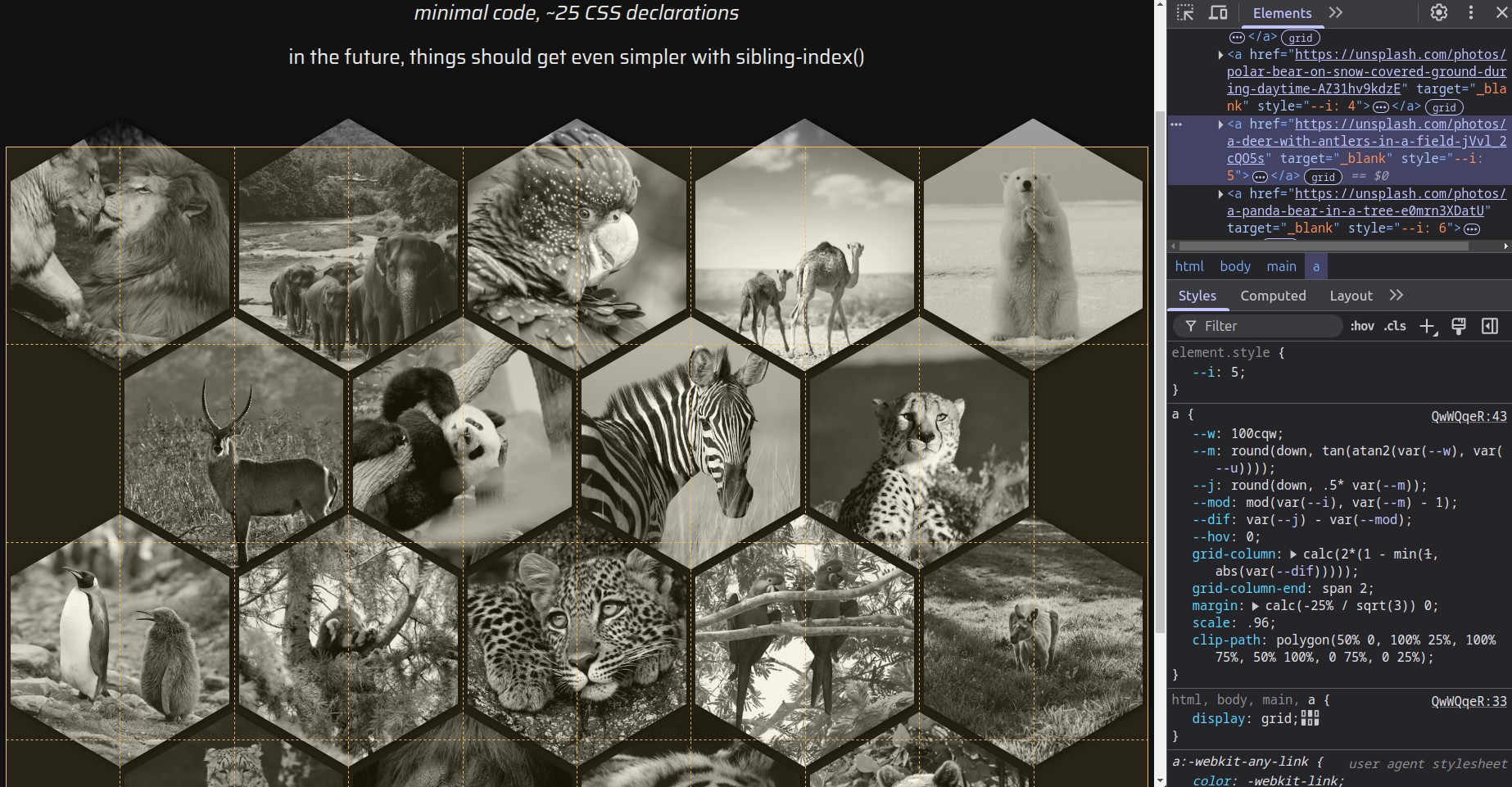
If you're a Cheetah+ supporter on Ko-fi or Patreon, then first of all thank you 🙏 and second, I've just published a massive post about an improved technique for flexible irregular shapes.

❇️ ko-fi.com/post/New-year-new-te

❇️ patreon.com/posts/new-year-new

A square image with cutouts depending on the dimensions of corner elements, dimensions that in turn depend on how the text in those corner elements reflows at different viewports.Stepped shape with rounded corners on the right, step height depending on the height of the elements on the left, whose height is given by their content and how it wraps at different viewports.Irregular shaped image with both convex & concave roundings. Shape depends on the dimensions and aspect ratio of other elements, how they scale/ wrap as the viewport changes.Three cards wrap around buttons of different sizes in the bottom right corner. All corners of the card shapes, whether convex or concave, are rounded.
Ana Tudor 🐯anatudor
2025-05-08

Haven't been posting much coding stuff this past week as I've found it difficult to focus on it given the state of things in my country 😞

But... I have a new article out!

Using Container Query Units Relative to an Outer Container frontendmasters.com/blog/using

Sparked by a question @mattwilcox asked here.

Ana Tudor 🐯anatudor
2025-03-17

Because I saw a @codepen demo creating a hex grid using my well over a decade old nested and reverted transforms technique to get the shape + MQs...

Here's a super simple modern grid + clip-path + mathematical functions responsive version with no breakpoints codepen.io/thebabydino/pen/QwW

Screenshot of linked demo with DevTools open, highlighting the main grid and showing there are no media queries at play.
Ana Tudor 🐯anatudor
2025-03-17

Because this quick @codepen thing I made is getting hearted for some reason... corner grid item with inner corner rounding and text wrapping around the corner

codepen.io/thebabydino/pen/LEY

Some grid + shape-outside + container query units magic + magic.

¯\_(ツ)_/¯

screenshot of linked demo
Ana Tudor 🐯anatudor
2025-01-13

Here's a little thing I made for the 1st of '25: pure tilt & zoom grid on scroll!

Check it out on @codepen

codepen.io/thebabydino/pen/jEN

Using pure CSS scroll driven animations, grid, variables, mathematical functions, container query units. Also uses an SVG filter for the dissolve effect.

Chromium only.

Ana Tudor 🐯anatudor
2024-12-19

Pretty sure I've posted about this before, but a quick search at the morning hours didn't find it, plus I saw someone ask about it yet again¹, so... fixed aspect-ratio box within variable size container!

Live on @codepen codepen.io/thebabydino/pen/ogv

¹here reddit.com/r/css/comments/1hhf

.parent {
  display: grid; /* for child middle alignment */
  container-type: size; /* for child sizing */
  /* random ass parent sizing */
  width: min(60em, 90%);
  height: min(800px, 50vh);
  background: dodgerblue /* make its boundary visible */
}

.aspect-ratio-child {
  --r: 8/ 5;
  place-self: center; /* put it in the middle along both axes */
  /* the magic, using container query units */
  width: min(100cqw, var(--r)*100cqh);
  height: min(100cqh, 100cqw/(var(--r)));
  /* or use aspect-ratio: var(--r) instead of height, but... pixel rounding issues */
  background: crimson /* make its boundary visible */
}
Ana Tudor 🐯anatudor
2024-11-04

Container queries on the body? Why, when media queries have better support?

Well, container queries make it an IF depending on the width of the body's content-box.

That is, subtracting the scrollbar IF we have one (we can't know).

**Heavily** commented @codepen demo codepen.io/thebabydino/pen/ZEg

/* consider this structure inside the body:
section.item
	.text-box
	img
... and so on, multiple such sections with 2 children */

/* allows us to use a container query - better than media query
 * because it takes into account the scrollbar IF there's one */
body { container-type: inline-size }

.item, .text-box { display: grid }

.item {
	/* 1 column for each of the two items, as long as there's room
	 * for each of them to have at least 150px */
	grid-template-columns: repeat(auto-fit, minmax(min(100%, 150px), 1fr));
	grid-auto-flow: dense /* prevent unoccupied cells in grid */
}

/* 1st, 3rd & so on section have text box on 2nd column 
 * IF there's enough room to have 2 columns of at least 150px each */
@container (min-width: calc(2*150px)) {
	:nth-of-type(odd) > .text-box { grid-column: 2 }
}
pablolarahpablolarah
2023-10-23
Violet text on dark gray background:
Container Query Units and Fluid Typography
pablolarahpablolarah
2023-04-19
Violet text on dark gray background:
Container Query Units and Fluid Typography

Client Info

Server: https://mastodon.social
Version: 2025.07
Repository: https://github.com/cyevgeniy/lmst