#conicGradient

Ana Tudor 🐯anatudor
2025-04-07

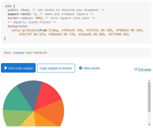
Saw a @codepen demo using... a lot! of elements (screen 1) and quite a bit of to create a simple loader, so I forked it and made a 1 div version (screen 2) in under 30 CSS declarations (gradients, mask, variables to only change --c0 and --c1 values for 2nd loader): codepen.io/thebabydino/pen/Pwo

Screenshot with DevTools open, showing each loader being created with a div with 4 other nested div elements, 2 span elements, 2 i elements and 2 pseudos inside.Screenshot with DevTools open, showing each loader being created with only 1 div and its 2 pseudos.
Ana Tudor 🐯anatudor
2025-01-18

Know the animated 🌈 border + glow effect that's all the rage? It's normally done by adding an opaque cover on top of two 🌈 layers.

But what if we wanted a (semi)transparent background within the border? It's possible with pure !

Heavily commented on @codepen codepen.io/thebabydino/pen/KwP

Ana Tudor 🐯anatudor
2025-01-15

Because somebody asked how to fix an animated border glow effect on scroll entry (reddit.com/r/css/comments/1i1t), here's my take on @codepen

codepen.io/thebabydino/pen/raB

Four options in the demo. Well, two, the last two are just enhancing the second.

First two base options. They look pretty much the same, no grainy glow and no roundings, so the sharp opaque end of the rotating conic gradient  border doesn't look too great.Variations on the second option. Both have a grainy glow and the second also rounds the end of the animated fading border.
Ana Tudor 🐯anatudor
2025-01-09

Want to avoid ugly checkerboard edges when pattern size depends on viewport?

Round it to be a multiple of 2px so every square edge is an int number of pixels!

--s: round(10vmin, 2px);
background:
repeating-conic-gradient(red 0% 25%, tan 0% 50%)
0 0/ var(--s) var(--s)

Ugly (1px misalignment issues) checkerboard edges.
Ana Tudor 🐯anatudor
2025-01-07

Made this loader codepen.io/thebabydino/pen/Bay half a decade ago. Then it only worked in Chromium browsers with the Experimental Web Platform features flag enabled.

As of 2024, it works cross-browser, no flags needed. Since someone hearting it reminded me of its existence, updated support info.

Ana Tudor 🐯anatudor
2024-10-16

Also on the topic of circle sectors/ pie slices πŸ₯§ - I've updated an old SO answer of mine stackoverflow.com/a/14185845/1

This goes through the simplest code possible in 2024 for a few cases (equal slices or not, interactive/ with content or not).

Screenshot of the code + visual result in the simplest possible case: all the slices are equal and they don't need to be elements (interactive, holding text content).
```
.pie {
  width: 16em; /* set width to desired pie diameter */
  aspect-ratio: 1; /* make pie element square */
  border-radius: 50%; /* turn square into disc */
  /* equally sized slices */
  background: 
    conic-gradient(from 17deg, #f94144 14%, #f3722c 0% 29%, #f8961e 0% 43%, 
        #f9c74f 0% 57%, #90be6d 0% 71%, #43aa8b 0% 86%, #577590 0%)
}
```
Ana Tudor 🐯anatudor
2024-09-11

If you're interested in checking out a lot of other modern and compact patterns, you can find them under the tag in my @codepen profile

codepen.io/thebabydino/pens/ta

A grid of 6 CSS pattern demos under the #css-patterns tag in my CodePen profile.A grid of 6 CSS pattern demos under the #css-patterns tag in my CodePen profile.A grid of 6 CSS pattern demos under the #css-patterns tag in my CodePen profile.A grid of 6 CSS pattern demos under the #css-patterns tag in my CodePen profile.
Ana Tudor 🐯anatudor
2024-09-11

So this very subtle pure pattern got picked on @codepen codepen.io/thebabydino/pen/vYq

Β―\_(ツ)_/Β―

(only made it to provide an answer to a question someone asked... and I almost answered with "are you sure you uploaded the right image?" because the lines were so subtle I missed them at first)

Pattern of horizontal, vertical and diagonal lines. Very subtle, light grey lines on white.
Ana Tudor 🐯anatudor
2024-05-28

9⃣ 473 ❀️ Pure 1 element rainbow spinner 2017 codepen.io/thebabydino/pen/YNj - 1st remake of a thing I first coded in 2013.

I've since made 2 more versions with more modern (and better!) CSS:

2023 codepen.io/thebabydino/pen/poG
2019 codepen.io/thebabydino/pen/exw

From the 2023 version description, techniques over the years:

2013: 1 element and its two pseudos, using two linear gradients (each with 13 hard-coded stops) to emulate a conic one and a pretty hacky technique to rotate the gradient part since animating pseudo-elements was not well supported at the time
2017: 1 element and one of its pseudo-elements, using an actual conic-gradient() and an animation directly on the pseudo-element; a list of 12 stops for the conic-gradient() generated via Sass
2019: 1 element and no pseudo-elements, using two background layers, an image cover and a conic-gradient() with its start angle animated via Houdini; a list of 12 stops for the conic-gradient() generated via Sass
2023: 1 element and no pseudos, no Sass anymore; using two background layers, an image cover and a conic-gradient() with its start angle animated via Houdini and using the longer hue interpolation method to generate a rainbow out of a single hsl() value, which makes Sass unnecessary
CodePen.IO :verify:CodePen@hello.2heng.xin
2023-03-20

RT Konstantin Denerz
Check out my new CSS art made with conic gradients ✨.
πŸ”— codepen.io/konstantindenerz/pe
via @CodePen
#css #conicgradient #art t.co/rhPouLfrSl

:sys_twitter: twitter.com/kdenerz/status/163

Media source: https://pbs.twimg.com/media/FrqTtjwX0AAiSa-?format=jpg&name=orig

Client Info

Server: https://mastodon.social
Version: 2025.04
Repository: https://github.com/cyevgeniy/lmst