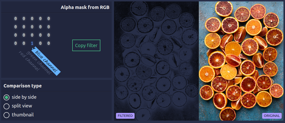
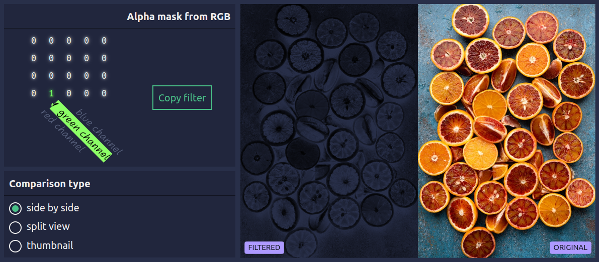
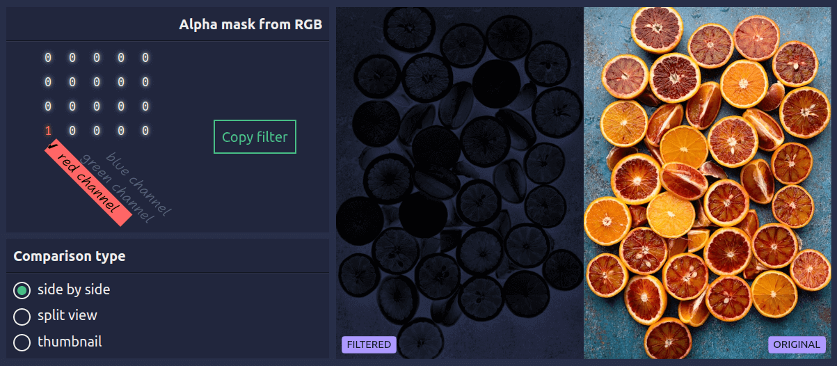
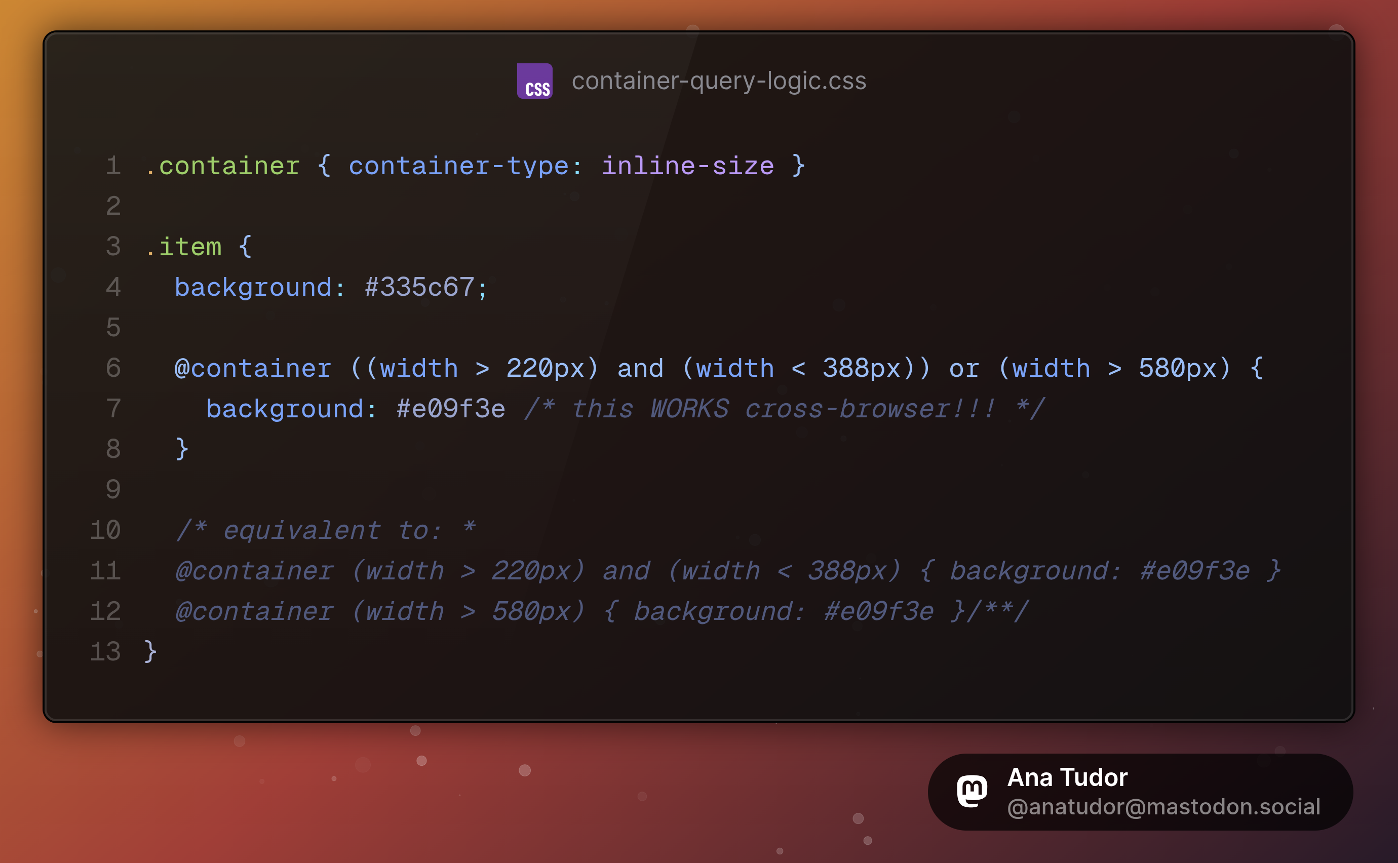
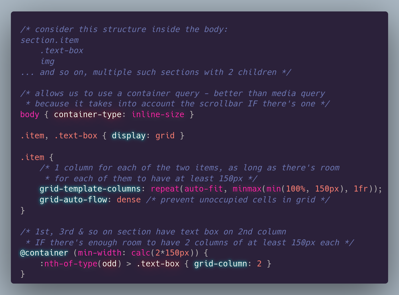
#tinyCSStip We can have boolean logic in container queries!
And this works cross-browser!
Live test on @codepen: https://codepen.io/thebabydino/pen/QwbNNpz
More info on MDN: https://developer.mozilla.org/en-US/docs/Web/CSS/@container#logical_keywords_in_container_queries
#CSS #cssLayout #containerQuery #coding #web #dev #webDev #webDevelopment #code #frontend

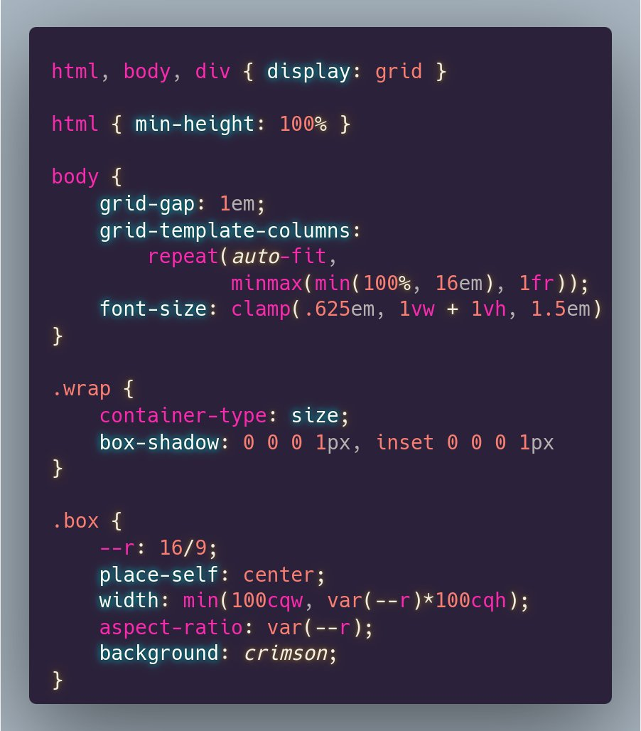
![.parent { /* flexible dimensions element */
container-type: size
}
[type='range'] {
/* make its width equal to the flexible height of its parent */
width: 100cqh;
/* make its height equal to the flexible width of its parent */
height: 100cqw;
/* get a vertical slider by rotating it */
rotate: -90deg
}](https://files.mastodon.social/media_attachments/files/112/371/924/586/658/068/original/d82f1633106afad9.png)