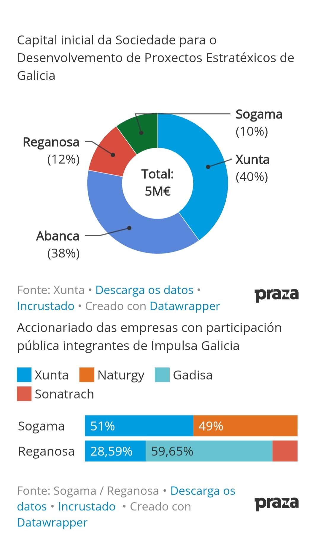
Accionariado das empresas con participación pública integrantes de #ImpulsaGalicia
@Xunta #Naturgy #Gadisa #Sonatrach
#Sogama
51%
49%
#Reganosa
28,59%
59,65%
Fonte: Sogama / Reganosa
Creado con #Datawrapper
#altrinon
Accionariado das empresas con participación pública integrantes de #ImpulsaGalicia
@Xunta #Naturgy #Gadisa #Sonatrach
#Sogama
51%
49%
#Reganosa
28,59%
59,65%
Fonte: Sogama / Reganosa
Creado con #Datawrapper
#altrinon
Damit habe ich jetzt eine erste Tabelle mit allen Städtenamen, den Koordinaten und der Bevölkerungszahl im Jahr 2025. Die kommt jetzt mal in #Datawrapper.
Vor fünf Jahren hab ich die Karten mit #Tableau erstellt, das erschlägt mich aber, wenn ich da jetzt wieder reingucke. Mal gucken, ob @datawrapper damit klarkommt.
Loading takes a while, so be patient.
I also added two graphs, that I built with #DataWrapper.
Sorting by "Last Status" seems to not work totally right, and I really don't want to know, how it looks on mobile (yet) 😉
There is a search box, that works really nice.
Any suggestions, comments, help and ideas are welcome. But please keep in mind, this is something, I'm working on in my free time – of which there is even less, now that my sons are older.
Let's give it try:
I maintain my lists of accounts on #Mastodon & in the #Fediverse on GoogleDocs and I won't discuss that. That's just how I know, how to work with the data.
But can someone show me a way, to visualize this data/tables elsewhere? By connecting another software to GoogleDocs so that, others don't have to go to Google? I tried #DataWrapper, but the result is not as good.
Please don't just name a software, but show me a resource that explicitly tells me how to connect it to Sheets.
📊🔣💹Willst du #Datenvisualisierung und #Storytelling nachhaltig in deinen Alltag integrieren? Unser Lernpaket kombiniert Selbstlernen, Workshops, Peer-Learning und Expert*innen-Begleitung. In zwei Monaten lernst du Grundlagen, Methoden und Tools wie #DataWrapper kennen, erstellst dein #Dashboard und tauschst dich mit der Community aus. Visuelle Darstellungen decken Muster auf und ermöglicht #Teilhabe an Erkenntnissen. Melde dich an und setze deine Daten neu in Szene: https://gstoo.de/Lernpaket-Datenvisualisierung
In my digital history class this semester, we were originally going to do some topic modeling work with MALLET but students struggled to get it installed.
So we pivoted and a few weeks later, used #Voyant to do the modeling, then Datawrapper to play with visualization.
Was a real success, and bringing #Datawrapper into the mix really helped compensate for Voyant's limitations in terms of visualization. The students really enjoyed trying different visualizations out, even if they were a bust, and trying to make sense of what they were seeing.
Planning to type up some notes as a more formal lesson plan. If I ever get a website up and running again, I'll share it there (someday).
Very nice connected scatterplot made by Luc Guillemot from #datawrapper: “Connecting the dots of population growth in Germany”
More: https://blog.datawrapper.de/germany-population-connected-scatterplot/
Just found out about https://www.datawrapper.de/ and really like it so far. Very easy to throw data in and get good looking charts/tables that you can embed. Very cool!
"How to design a useful (and fun!) color key for your data visualization" (#Datawrapper Blog)
https://blog.datawrapper.de/color-keys-for-data-visualizations/
Unbedingt bookmarken: Die besten #datawrapper #dataviz Hacks - @sjockers hat seine Sammlung zur #nr23 großartig aufbereitet und online gestellt. https://sjockers.github.io/datawrapper-hacks #ddj #datenjournalismus
I did a #dataviz class last week and resolved to do at least one visualization per week, so today I'm turning this poll into data visualizations. First, here's #datawrapper. I've embedded the picture but if you click through it is slightly interactive: https://www.datawrapper.de/_/Wjlt1/
I'm back in my #dataviz for journalists class today. We're learning all about #datawrapper in this session, including topics relating to #accessibility.
@oconnell German articles, but I think the graphs can still be understood:
Active satellites in orbit:
https://www.heise.de/news/Starlink-Die-Haelfte-aller-aktiven-Satelliten-im-Erdorbit-stammt-nun-von-SpaceX-7537499.html?wt_mc=sm.red.ho.mastodon.mastodon.md_beitraege.md_beitraege
Discovered Exoplanets by year and method:
https://www.heise.de/news/Verbotener-Exoplanet-um-Zwergstern-mit-aktuellen-Theorien-nicht-zu-erklaeren-7528712.html?wt_mc=sm.red.ho.mastodon.mastodon.md_beitraege.md_beitraege
Exoplanet by different parameters (distance, orbital time, mass and discovery method):
https://www.heise.de/news/Wolf-1069-b-Besonders-vielversprechender-erdaehnlicher-Exoplanet-entdeckt-7485574.html?wt_mc=sm.red.ho.mastodon.mastodon.md_beitraege.md_beitraege
Hi everybody, it's #introduction time !
I'm a 🇫🇷 🇪🇸 (data)journalist, now working at #LeFigaro. Spreadsheets, #Rstats, #QGIS and #Datawrapper are my main tools. I also use some #ggplot2 for #DataViz.
I'll toot about all things data, #journalism, maybe some #photography and #bike.
Looking forward to read all of you 😄
#introduction Hi, I work at #datawrapper where I’m primarily focusing on designing and developing our visualization modules. We see Datawrapper not just as a visualization tool but also as a “visualization teacher”, so we spend a lot of time discussing what features to add, and how to pick smart, context-sensitive defaults. Striking a balance between user needs and “best” visualization practices (based on infovis research) isn’t easy, but it’s also a fun challenge!