#IXD

2025-06-13

“In a moment when the rest of the industry is rethinking interface through intelligence and agency, Apple has chosen to spend time and resources on adding a layer of visual embellishment.”

hvpandya.com/liquid-glass #apple #ux #ixd #design #LiquidGlass

“In a moment when the rest of the industry is rethinking interface through intelligence and agency, Apple has chosen to spend time and resources on adding a layer of visual embellishment.” hvpandya.com/liquid-glass #apple #ux #ixd #design #LiquidGlass
Liquid Glass

“Good design isn’t just what it looks like. It’s what people believe.” webdesignerdepot.com/this-website... #ux #ixd #design #SocialProof #tools #software

This Website Curates the Best ...

Jochen Woltersjochenwolters
2025-06-10

Remember when Scott Forstall was ousted for (presumably) messing just up a single app?

How times have changed at

mastodon.social/@fabienmarry/1

Jochen Woltersjochenwolters
2025-06-09

@wavebeem We still have an old Mac around running Mac OS 10.14 Mojave. I really miss that approach to . Does it look dated? Yeah, a little bit. But that kind of philosophy worked really well from 1984 to 2020. Why they had to make such relatively radical changes in the last few years, I don't know.

Jochen Woltersjochenwolters
2025-06-06

This pattern has always irked me, because I feel it requires noticeably more cognitive effort to interpret the items' respective status and, hence, their meaning.

In contrast, the old pattern of a static label plus checkbox is much easier to grasp.

I.e., instead of "Turn [On|Off] Reposts” and “Turn [On|Off] Notifications", the items could say “Hide Reposts” and “Mute Notifications”, plus checkmark when active.

Any ideas out there why this "verb-driven" approach is so common in land?

Detail from a macOS popup menu with the two menu items “Turn Off Reposts” and “Turn On Notifications”.
2025-06-06

Seeking interaction design inspiration? Do yourself a favor and *scroll* the Johnson Banks website.

johnsonbanks.co.uk/ #ixd #design #ux #InteractionDesign

Seeking interaction design inspiration? Do yourself a favor and *scroll* the Johnson Banks website. www.johnsonbanks.co.uk #ixd #design #ux #InteractionDesign

Home | Johnson Banks

2025-05-31

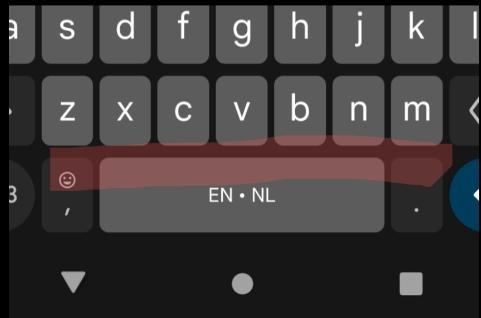
My thumb is larger than the letters on my smartphone's virtual keyboard.

I find my smartphone keyboard very often opts for a space instead of the intended letters c, v, b, and n. It also opts for a . instead of the letter m.

There must be a way to deduce more accurately what I'm attempting to type? (Particularly when I backspace and then again get a space instead of a c, v, b, or n.)

Excerpt of a virtual keyboard of an Android phone. The relatively small space between the space bar and the lowest row of letters is highlighted.
Jochen Woltersjochenwolters
2025-05-27

Going from thoughtful details in my previous post to… indifference, laziness, or whatever? 🤦‍♂️

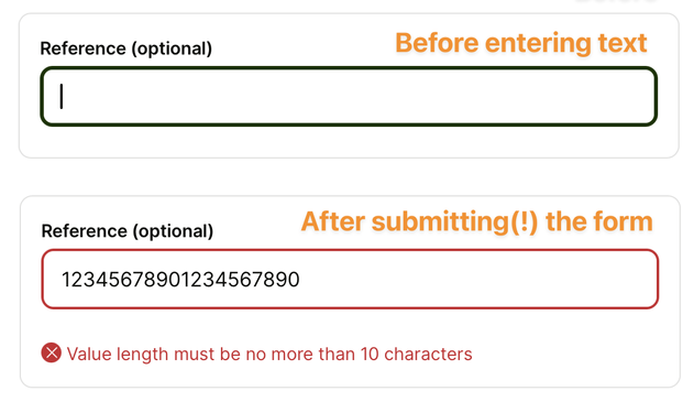
Sorry to be blunt, but every designer should get _this_ detail right by now: if an input field has specific requirements, always display those requirements right next to the field.

Do not hide them behind hover interactions, and never, ever stash them away in error messages that only appear if the user submits the form with invalid data.

A pair of before-and-after screenshots of the same text input field labeled "Reference". There is no static help text associated with this field. Only after submitting(!) the form, an error message appears underneath the field, which says: "Value length must be no more than 10 characters."
Jochen Woltersjochenwolters
2025-05-27

And another great detail that leads to better overall:

When editing an already-posted message in Telegram, the macOS client displays the original message directly above the editable text field. You can easily compare what you had posted before, and what you will replace it with, without having to do any scrolling or memorizing.

This, by the way, is an excellent example for rule number 8 of Ben 's Eight Golden Rules of Interface Design: "Reduce short-term memory load."

A screenshot of the input text field for editing an existing posting on Telegram. The original message text appears in the input field ready for instant editing. Immediately above the input field, the original message also appears as static text for side-by-side comparison.
Jochen Woltersjochenwolters
2025-05-22

While signing up for a service required for attending an upcoming event, the system suggests a user name in the username field — and then instantly marks it as an error due to "prohibited words." (And I'm not even sure whether "hot" or "viper" is the culprit here. 😏)

That is just a splendidly hilarious blunder. 😁

Pro tip: If you do suggest random names like this, pre-select the whole thing so I can instantly overwrite it by just starting to type.

The username field on a form for setting up a user account shows "hot_viper802" as a suggestion. The field appears in error state with the message "Usernames cannot contain prohibited words."
Jochen Woltersjochenwolters
2025-04-22

Scott's very valid everyday concerns aside, I'm sure these designs are "loved deeply" by emergency responders everywhere.

After all, which firefighter or EMT doesn't appreciate a a door "handle" that is useless if onboard power isn't available, or if any of the electrical components inside the door fail. And who really needs an attachment point for a winch or crowbar to unjam a crushed door after a crash. 🤦‍♂️ 🤦‍♂️ 🤦‍♂️

This is not just bad . It's plain dangerous. 😡 social.coop/@scottjenson/11438

Jochen Woltersjochenwolters
2025-04-22

BTW, a useful benchmark for car is what you find in race cars. With these vehicles being optimized for reliable interactions in very high-stress situations, there's not a single touch control in-sight. That says all you need to know, IMHO. 🤷‍♂️ (2/2)

skryskry
2025-04-01

The 2-step paste in Stacher7 is elegant interaction design.

1. Copy URL
2. Right-click in paste destination

This is a great demonstration of saving human work (in this case, not having to navigate the contextual menu) by understanding user intent and assisting.

(It also has a user control for "clipboard listening", which isn't explained in the UI and doesn't affect the right-click functionality.)

Jochen Woltersjochenwolters
2025-02-22

This is what every notification on should look like:

Instead of hiding useful actions in a generic "Options" menu, put them out in the open where users can instantly see them. Use meaningful call-to-action button labels, and provide generously sized click targets.

Well done!

Gosh, I hope this is a sign that at least some designers at Apple are finally fighting back against the misguided, user-hostile "let's hide everything for an extra clean look" design direction of late. 🤞

Notification with a request to share a folder via AirDrop. There are two buttons to "Decline" and "Accept." They are placed side by side and span the whole width of the notification.
Jochen Woltersjochenwolters
2025-02-18

Dear web designers and devs, please stop implementing gratuitous animation nonsense such as "auto-edited" placeholder text in Search fields.

It's distracting for many neurodivergent users, making your site harder to use for them without providing any meaningful benefit over static text.

Jochen Woltersjochenwolters
2025-02-07

@_luna You're lucky, because that's a solved problem. 😎

For example, on macOS, OmniFocus and Fantastical have powerful schedulers like that.

OmniFocus: support.omnigroup.com/document

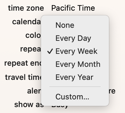
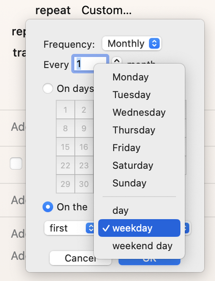
Fantastical: See attached screenshots. The “Repeat end" setting, BTW, allows ending the repeat after a set number or on a specific date. Unfortunately, OmniFocus lacks this feature.

The repeat menu for calendar events in Fantastical for macOS. Menu options are; none; every day, week, month, or year; and Custom.Settings for Custom repeat settings for events in Fantastical. The selected screen shows options for custom monthly repetitions every x months. Users can select either specific days in a grid from 1 to 31; or they can choose the first, second, etc. day, weekday, or weekend day of the month, or any particular weekday, such as Wednesday. This way, you can configure an event to repeat on the second Tuesday of every third month, or on calendar 10 and 30 of every sixth month, etc.
Jochen Woltersjochenwolters
2025-02-07

@biptoot The issue you describe has become universal among macOS software since someone at Apple thought it's a great idea to move the toolbar into the window's title bar.

Add "EVERYTHING HAS A WHITE BACKGROUND NOW”to the mix, and there is zero visual cue as to where to grab a macOS-native window anymore.

It's just utterly awful . And no (attempt at a [well-meaning and interesting]) explanation will make me change my general position on this. *sigh*

Client Info

Server: https://mastodon.social
Version: 2025.04
Repository: https://github.com/cyevgeniy/lmst