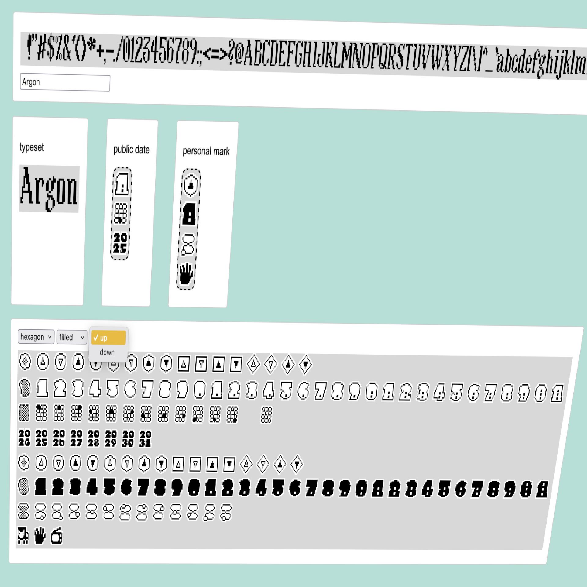
the cartouches both show today’s date. translating data and input into visual systems ❤️
#art #1bit #solodev #pixelart #ドット絵 #oc #픽셀아트 #monochrome #60Grid #javascript #webdev #font #1bitart #digitalart #infodesign
the cartouches both show today’s date. translating data and input into visual systems ❤️
#art #1bit #solodev #pixelart #ドット絵 #oc #픽셀아트 #monochrome #60Grid #javascript #webdev #font #1bitart #digitalart #infodesign
🎬 From spelling bees to sci-fi blockbusters — the movies of Keke Palmer, mapped from 2006 to 2026.
Which one’s your favorite?
#KekePalmer #Movies #FilmTimeline #Bamlytics #DataViz #InfoDesign

🎉 it's the end of the work week
🌈 a good time to follow a few folks for visualization inspiration – in case you do not know them yet:
#followfriday #DataViz #DataVis #InfoDesign #InfoGraphics #DigitalHumanities #TGIF
The Aalto infodesign showcases are pretty neat (Full disclosure: I advised some of the creators) #infodesign
One year ago today, my book Building Science Graphics started shipping around the world. 🥂 https://www.buildingsciencegraphics.com
#scicomm #sciart #scienceillustration #scientificillustration #informationdesign #infodesign #sciencecommunication #sciencebooks https://www.tiktok.com/t/ZT8HxcbRx/
Last week @jona Pomerance presented the interactive and narrated #BetterCatastrophe flowchart at #infoplus2023 in Edinburgh. For this occasion we also released Interactive Flowchart as a free reusable template with detailed explanations of its structure, a visual step-by-step tutorial, and 12 student examples covering a range of well-known personal dilemmas.
Find everything compiled here:
https://uclab.fh-potsdam.de/interactive-flowchart/
#Flowchart #Datavis #Infodesign #Storytelling #FHPotsdam
what i also really liked about #infoplus2023 was that many presenters shared various materials making it easy to reuse these for teaching, research and practice.
here are some freely available tutorials, toolkits and templates:
https://www.marieneurath.org
https://www.lizbravob.com/data-distortion-exercises
https://chartbites.webflow.io
http://easydataviz.co
https://sonification.design
https://mitvis.github.io/olli/
https://uclab.fh-potsdam.de/interactive-flowchart/
Hey! 👋 We're Fathom. We build platforms and products for understanding data.
Some of our projects have included a Ron Carter discography explorer (https://www.roncarteruniverse.com/), Mayo Clinic healthcare information tools, an archive of Krista Tippett's On Being Project (https://discover.fathom.info/), a data platform for the Gates Foundation, and a research-driven educational platform for understanding the Chinese political system (http://china.fathom.info/).
We also love nerding out about typography, fiber and textile arts, paper, language, and the history of computation, to name a few interests shared between ourselves.
In the past three years, we've been hard at work developing dozens of tools for pandemic prevention, in collaboration with the Sabeti Lab at the Broad Institute. Stay tuned for more project details; we can't wait to share everything we're working on with you.
@troos
I’m increasingly convinced that the graphic I photographed is an older set of the same symbols by E. Christopher Klumb Associates. Perhaps they tried selling them separately before developing them for NYC Health?
Here’s some fairly clear cases, in addition to the babies. The surgeon with mask and the one with head lamp were made more uniform, the mother and child is visually better balanced.
#icons #infodesign #history
Self-promotion:
If you happen to know of projects suitable for our information design agency, then we would actually have time to take on something new.
We do stuff from one-off charts and maps to interactive online dataviz. We can also create high-quality print publications, including design, illustration and layout.
Applying Otto Neurath's Isotype methods is still a valid method to acquire #dataLiteracy skills. Proud of the results secondary school students gathered in mapping their multi-cultural background during an experimental #dataviz #workshop I held.#isotype #ottoneurath #infoDesign


Marie Neurath was born yesterday in 1898. Reading her book ”The transformer” was an, ahem, transformative experience for me as an information designer.
#infodesign
https://hyphenpress.co.uk/products/books/978-0-907259-40-4/
In my grandfather's estate I found an envelope with several hotel suitcase stickers from the (ca.) 1930s. Several amazing designs, but this one really takes the cake. Apparently both the "Atlantico" and the ristorante "Massimo D'Azeglio" are still in business today.
:blobcatrainbow: Chronoscope with animated time slider! #ChronoLink
https://mprove.de/chrono?q=16.32978,-32.46293&z=2.15&t=47&m=WMnippur&o=0.8&d=1&c=l,-2,y1500-1520,~y,~y,~y,~y,~y,~y,~y,~y,~y,~y,~y,~y,~y,~y,~y,~y,~y,~y,~y,~y,~y,~y,~y,~y,~y,y1500
Cool exercise in data visualisation that had me (dare I say) excited about thinking about tax for the 5min or so it took me to read it. Which is a lot longer than I'm normally excited about tax.
https://www.abc.net.au/news/2023-04-28/stage-three-tax-cuts-to-scale/102268304
#tax #dataviz #datavisualisation #design #infodesign #auspol
The next iteration of the Information+ conference will be held in Edinburgh this November and the @InfoPlusConf organizers have just refreshed the website featuring a revolving logo accompanied by swarming particles and calls for presentations, workshops, and exhibits:
It was a treat to chat with Jonathan Schwabish for PolicyViz podcast. We talked about everything from what makes science graphics weird, to designing academic posters—and even books—with the mindset that those objects are simply very large graphics.
#scicomm #dataviz #infodesign #informationdesign https://policyviz.com/podcast/episode-235-jen-christiansen/
Earlier this month, I had the pleasure of chatting about science graphics with @Allitorban for her podcast Data Viz Today. Check out episode 85, in which we discuss using welcoming gestures, collaborating with others, the power of arrows, and more. #scicomm #dataviz #infodesign #informationdesign https://dataviztoday.com/shownotes/85
We updated our website with some new projects. Do you have data that needs visualizing or workshops that need workshopping?
Hit us up!
https://koponen-hilden.fi/
#visualization #dataviz #portfolio #designAgency #infodesign