#Letraset dry-transfer lettering was obsoleted by desktop publishing, but as Letraset owned the rights to the fonts they had created, they digitised them and many of their iconic #fonts are still in widespread use.
#Letraset
Just thinking about this has made me feel all nostalgic about #Letraset. I created many DIY documents with Letraset back in the day, but they were all consigned to the dustbin long ago.
Letraset gave me my first introduction to #fonts and #typeography. I remember standing in the stationer's looking at all the different fonts on offer and carefully deciding which ones I would spend my pocket money on.
I'm gradually working my way through the recordings from the #DCC creator summit. I just watched the seminar on #layout for #TTRPGs. It prompted me to think of how my own experience with layout developed.
The first #RPG thing I laid out was an attempt at a zine that I made as a teenager. This was in the days before desktop publishing was a thing. I used my mum's #typewriter to write the text and physically cut and pasted the columns onto a page, with rub-on #Letraset transfers for the headings.
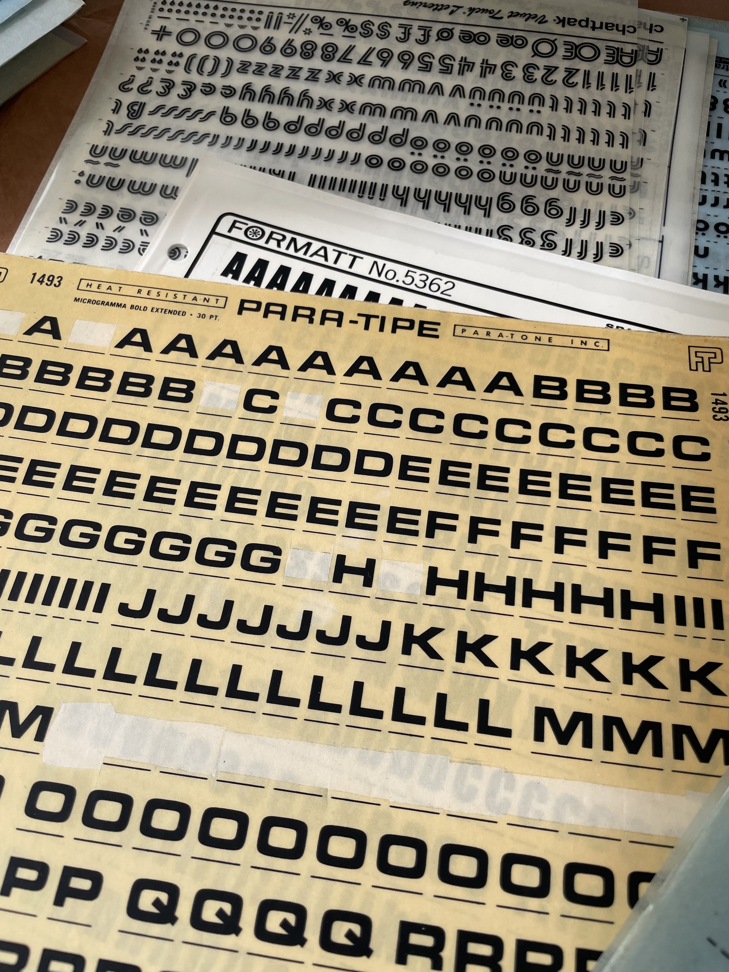
No, not Paratype. Para-tipe. One of the many Letraset competitors. This brand is new to me.
#Letraset #TransferType #Typography #Typefaces #Fonts #Microgramma
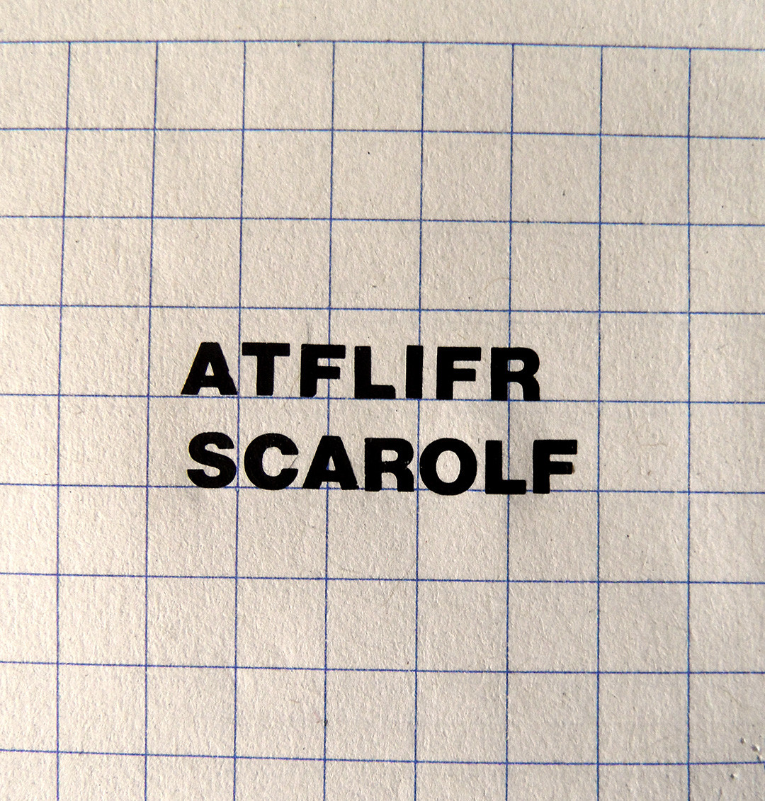
What can I say? I love vernacular type. #letraset #typography
Quelques améliorations sont à prévoir.
#atelierscarole #gwenaelmorice #julienscheidle #fritzbol #lanester #morbihan #lorient #letraset
Vieilles encyclopédies pour jeunes, letraset usé.
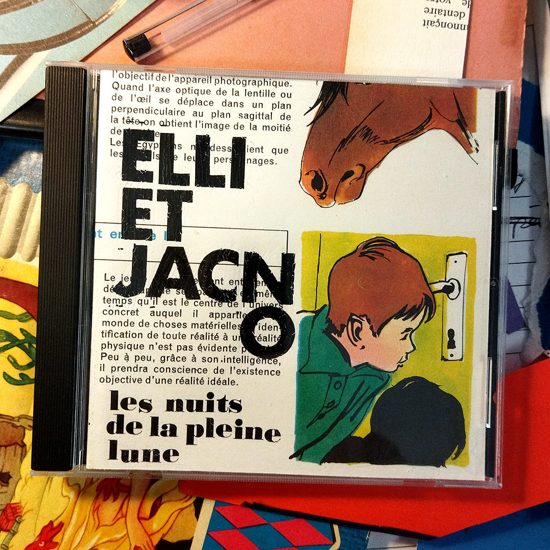
#papierdecoupe #collage #cd #papercut #letraset #ellietjacno #lesnuitsdelapleinelune #elliandjacno #ellimedeiros #jacno
#papierdecoupe #collage #cd #papercut #letraset #ellietjacno #lesnuitsdelapleinelune #elliandjacno #ellimedeiros #jacno
Oh, guess which british female type designer doesn't have a Wikipedia page? Freda Sack. *sigh*
I don't have the energy to create one right now. It's like half a day to make a decent page, and then it'll get deleted immediately as not-notable.
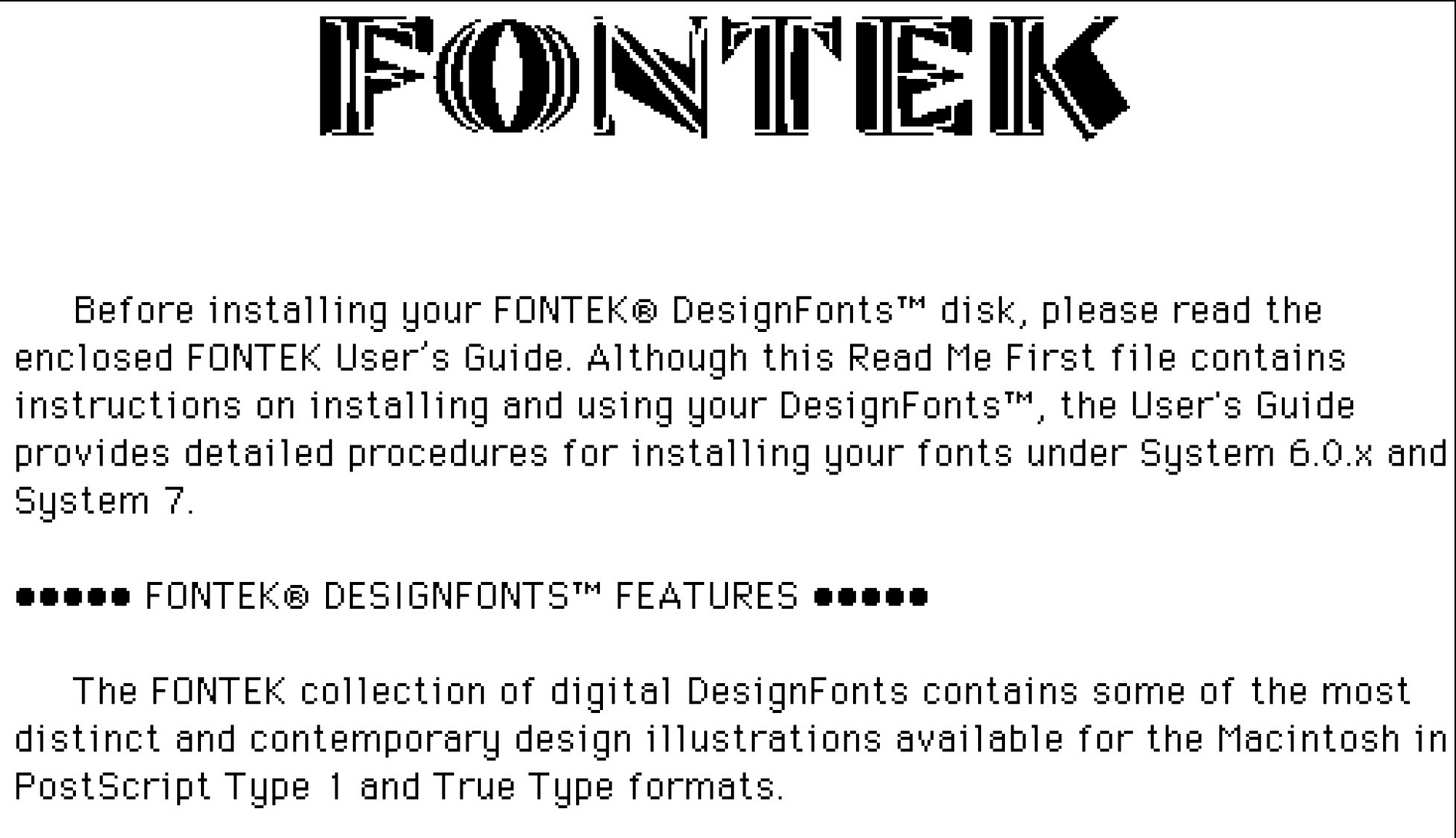
FONTEK DesignFont
https://macintoshgarden.org/apps/fontek-designfont
Letraset FONTEK DesignFont
#macgarden #fonts #1993 #letraset
What happens when you ignore overshoot when setting your Letraset on the baseline? Dancing type! https://fontsinuse.com/typefaces/298/modern-no-20
Only have personal experience with the drawers and desk organizer, but here you go: https://www.presentandcorrect.com/blogs/blog/letraset-1981
With the 80th anniversary approaching it is appropriate that I uncover this in a box of ancient treasures.
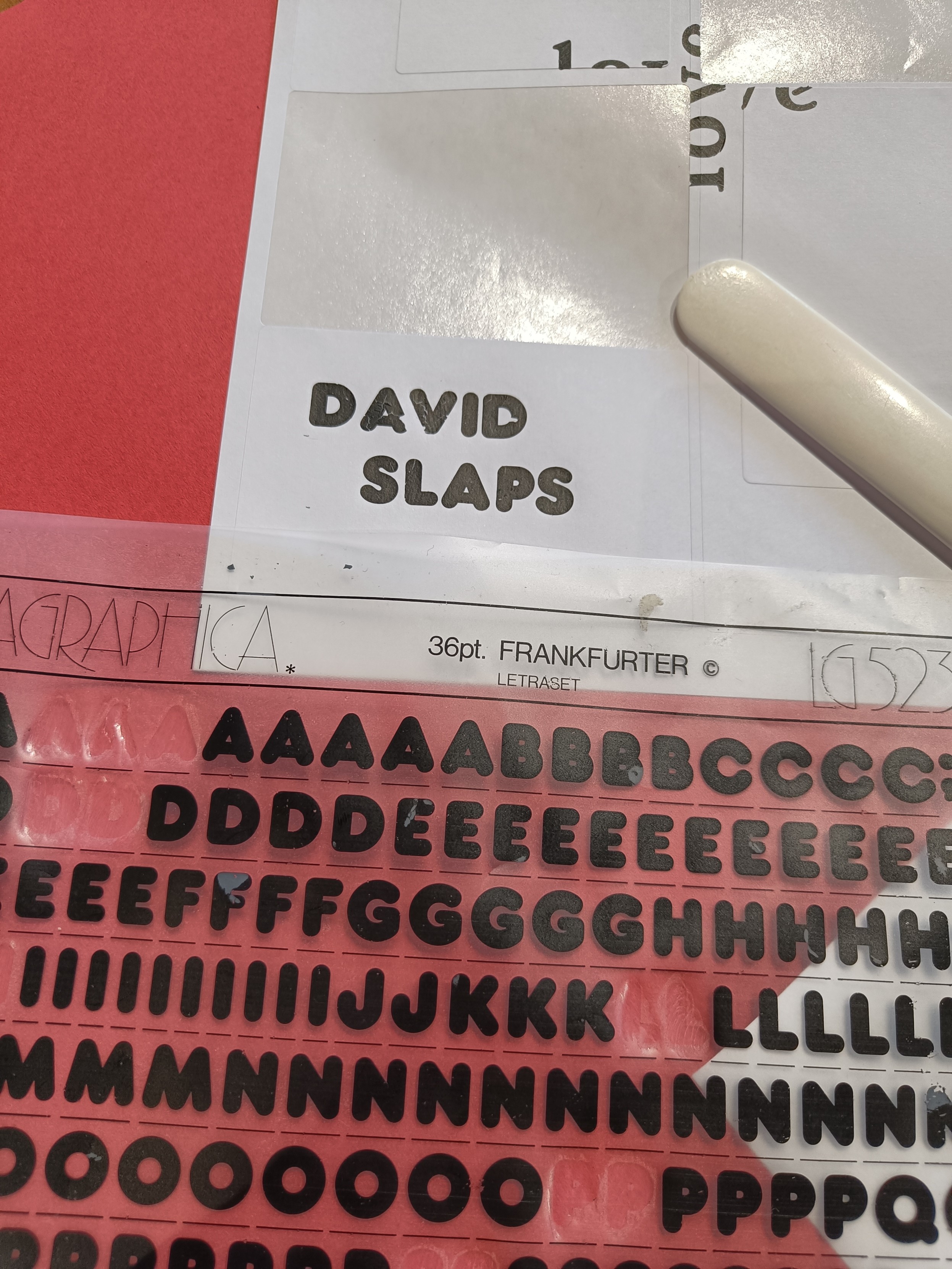
At Kelham Island Museum last night, had fun playing with some real rub down Letraset. Loved the tactile, slow, hands-on experience, hated the spacing and the terror of tearing the letter as you peel the sheet off.
It always seems weird to me how the Futura family can vary in style quite wildly.
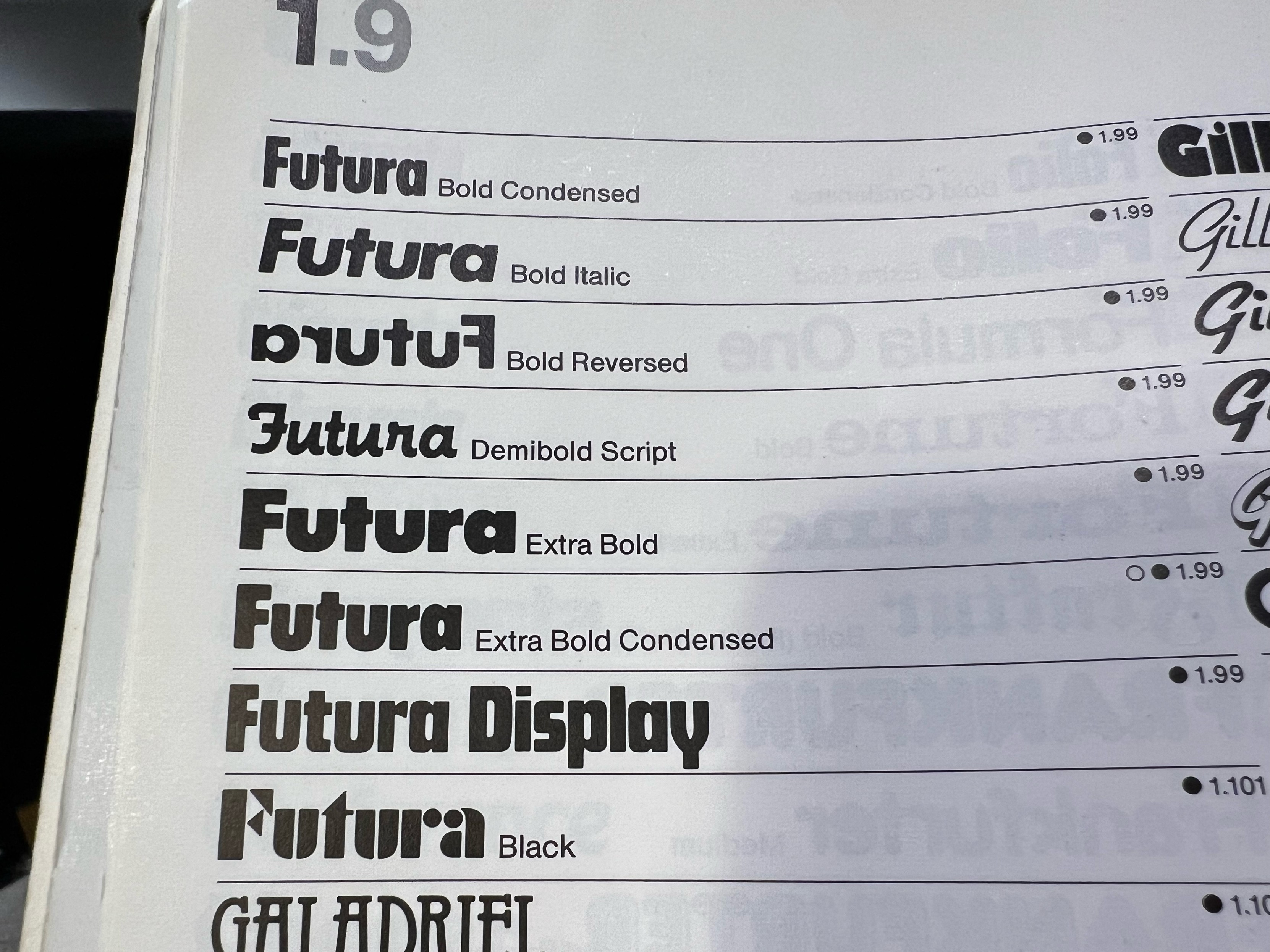
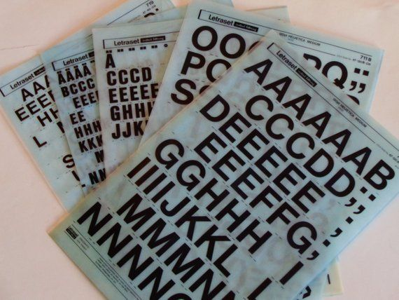
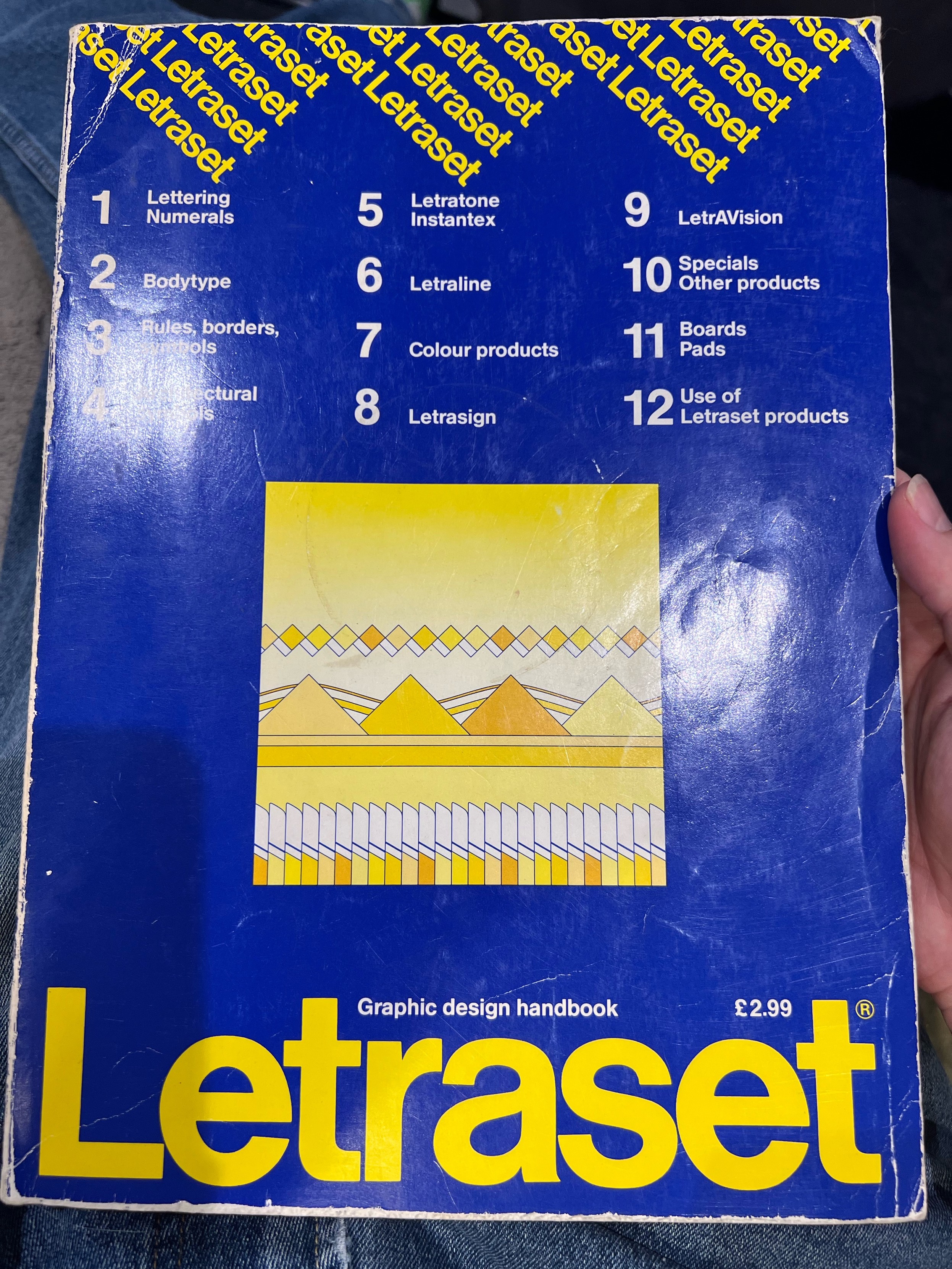
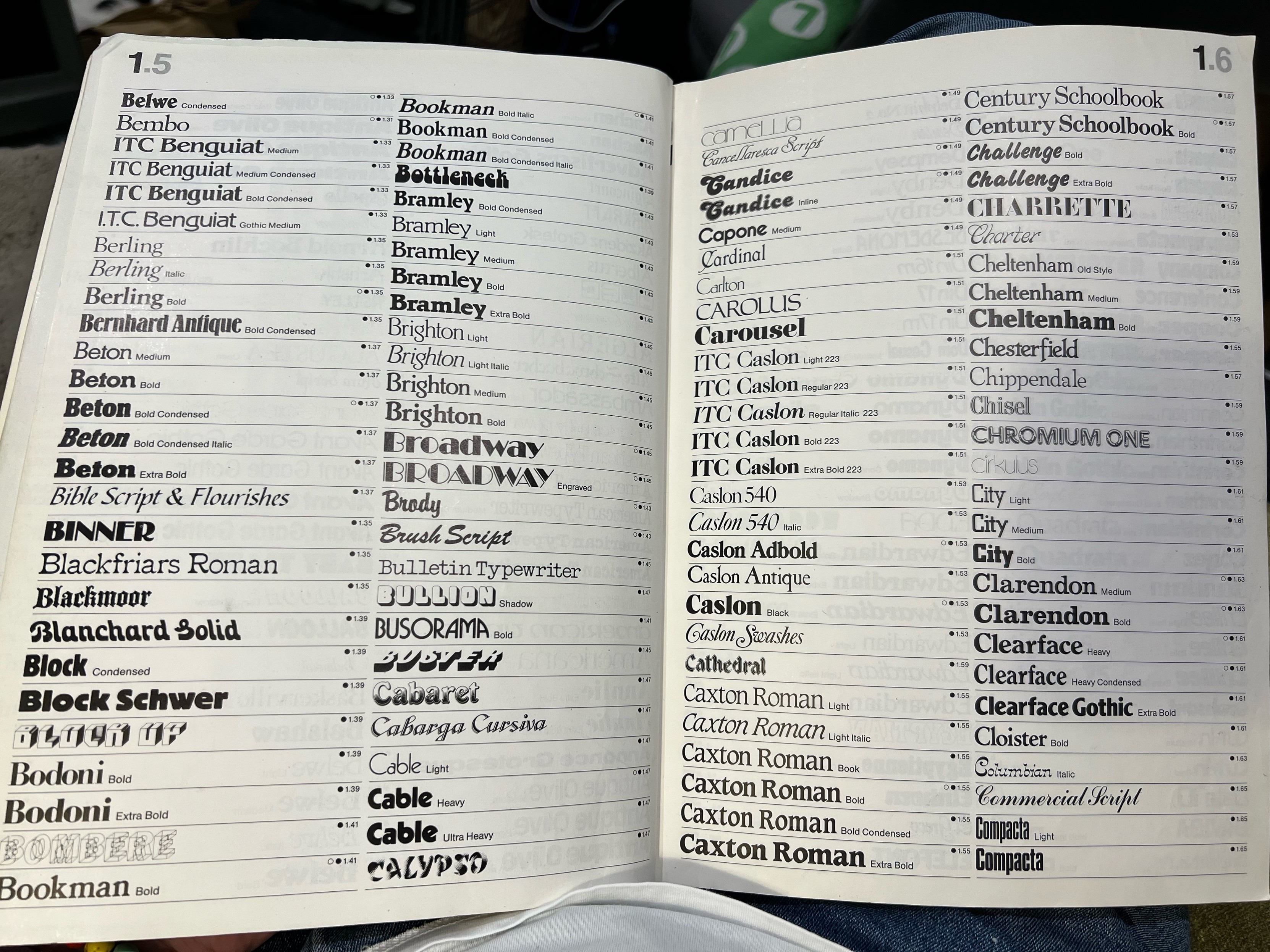
Just spending my evening flicking though an old Letraset catalogue as you do.
A catalog designed for an exhibition that ran in Darmstadt, München, and Zürich in 1978–79, Typographie: Schrift und Graphik mit Letraset (1978) features the work of the catalog’s designer, Christof Gassner, as well as dozens of other artists and designers using Letraset.
For a closer look at select images and typefaces from this book, check out @FontsInUse: https://fontsinuse.com/uses/5433/typographie-schrift-und-graphik-mit-letraset
#LetterformArchive #Letraset #ChristofGassner #1970sDesign #ExhibitionCatalogue #Typography #GraphicDesign
This weekend (among other things): a triple about the 1972 Jamaican cult film “The Harder They Come”, starring Jimmy Cliff. Featuring three Letraset classics, Zipper, Superstar Shadow, and Bottleneck:
https://fontsinuse.com/tags/41459/the-harder-they-come?order=most-liked
#TheHarderTheyCome #JimmyCliff #Jamaica #reggae #Letraset #FontsInUse #fonts
So, in summary, today I learned that either there's a typography aficionado living somewhere in the neighborhood, or that old #Letraset lettering swag is something you can potentially sell online ironically to millennials, but unfortunately I have no way to tell which of those is the truth.
Delightful thread on supposedly obsolete technologies...
#Steenbeck #letraset et al
Client Info
Server: https://mastodon.social
Version: 2025.04
Repository: https://github.com/cyevgeniy/lmst