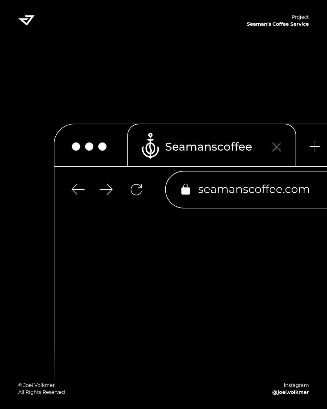
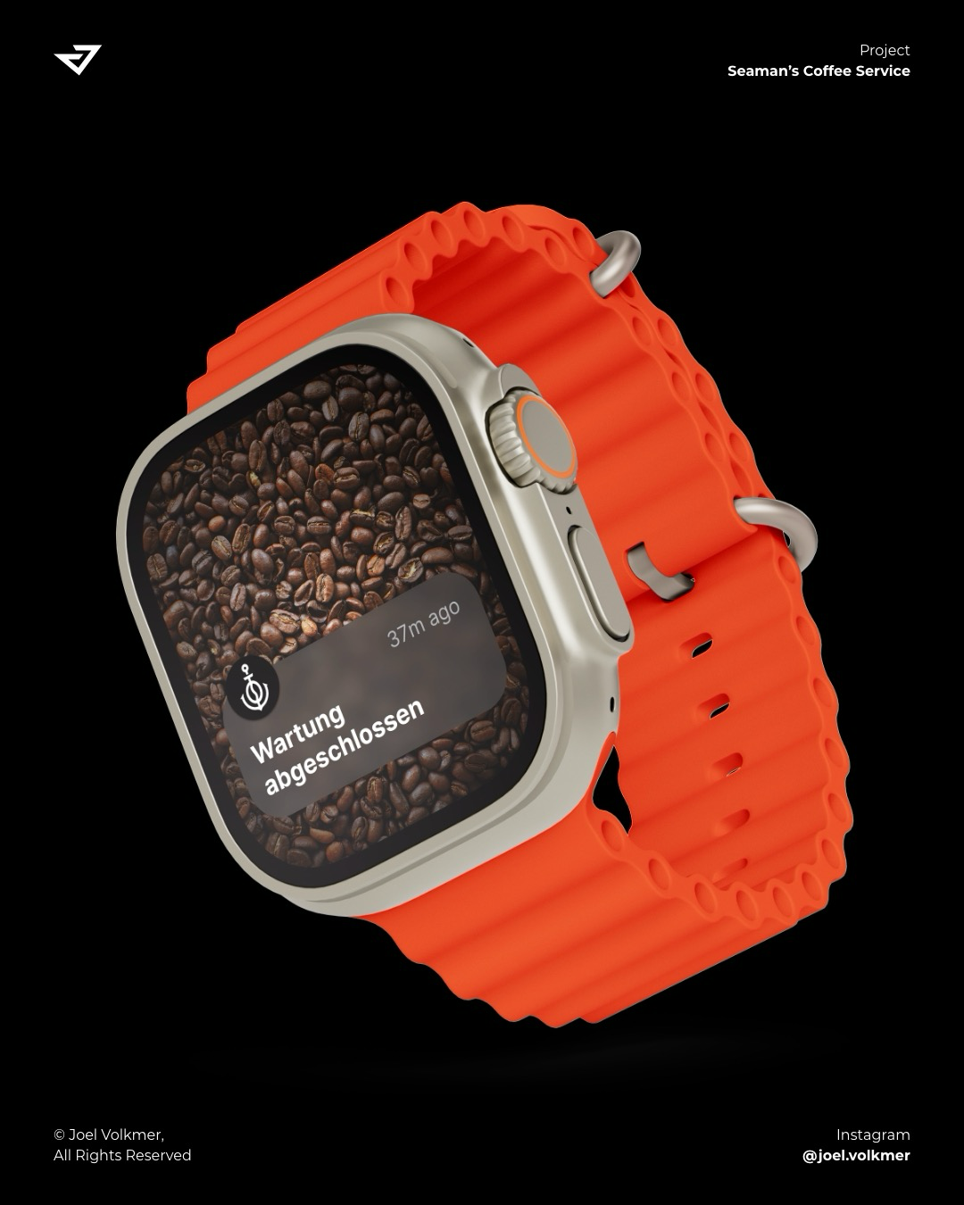
Logo Design für Seaman’s Coffee Service
#logo #logodesign
#Logodesign

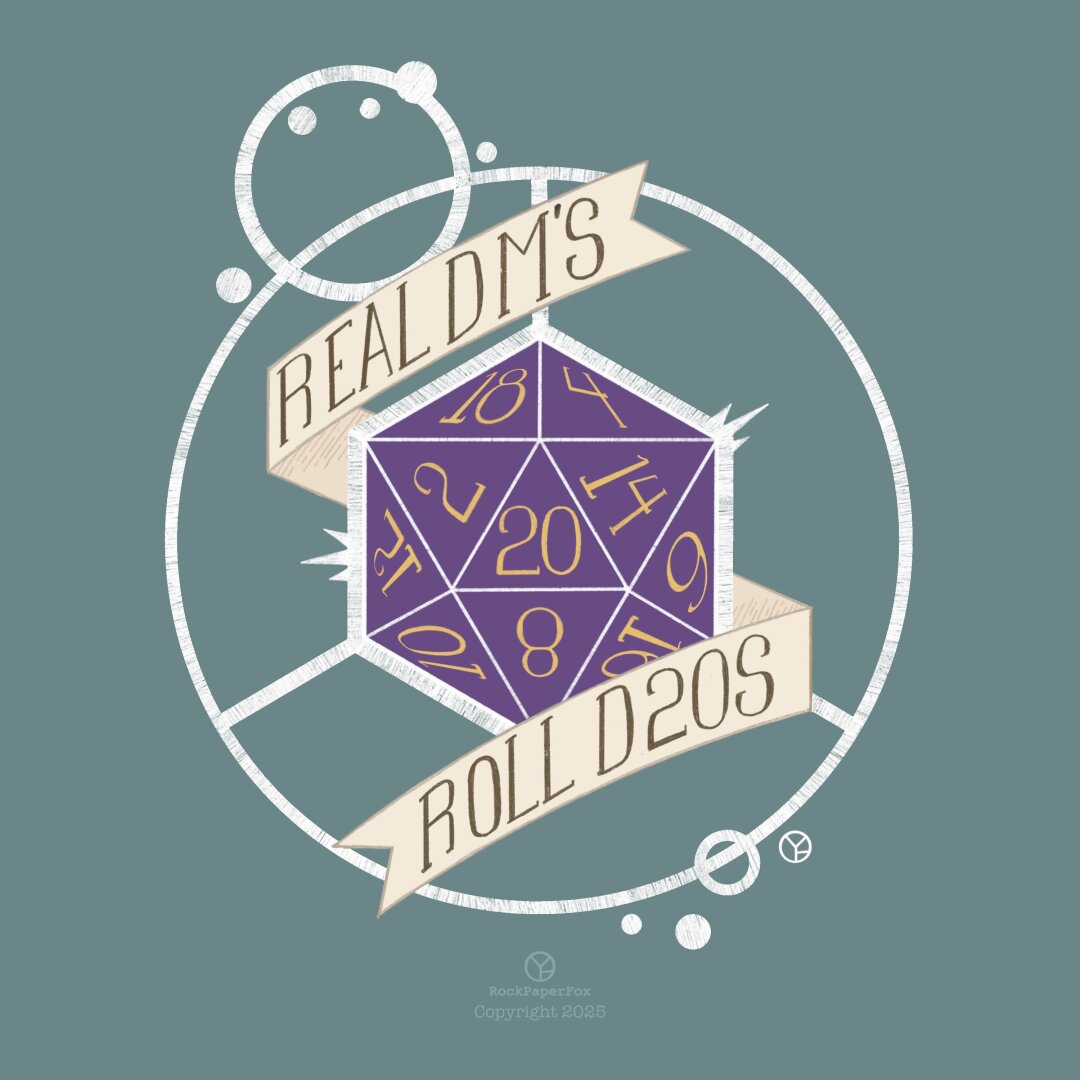
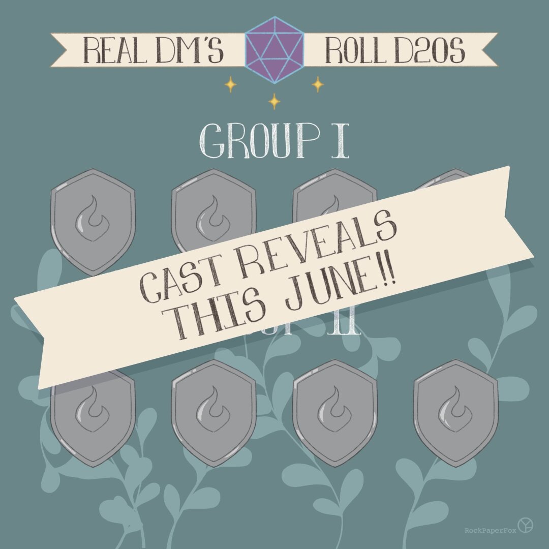
Well adventurer! The time has come for the story to unfold! On January 3rd I will be starting a DnD Livestream known as "Real DMs Roll D20s" as it's head storyteller.
I am very excited as this has been in the works for the last 5-6 years and I cannot wait to begin! And I hope you will continue to follow along on this journey, as I will be revealing my amazing cast this next month, which I am so excited to show you the wonderful people that I will have the honor of DMing for. But till then, stay safe, stay well, don't forget to have an adventure and don't forget to love each other!
#artist #rockpaperfox #dungeons&dragons #RealDmsRollD20s #gamer #ttrpg #homebrew #castreveals #digitalart #logodesign
Your logo isn’t your brand. It’s the hello, not the whole conversation. Build a brand that speaks even when your logo’s off-screen. 🎯 #BrandingTips #LogoDesign
Why Your Logo Needs To Be A Vector Graphic: https://weandthecolor.com/why-your-logo-needs-to-be-a-vector-graphic/202822
#logo #logos #logodesign #vectorgraphics #vectorgraphic #vectorlogos #graphicdesign
Why Your Logo Needs To Be A Vector Graphic
A Logo Vector Graphic is the Unskippable Secret to a Flawless Brand Identity.
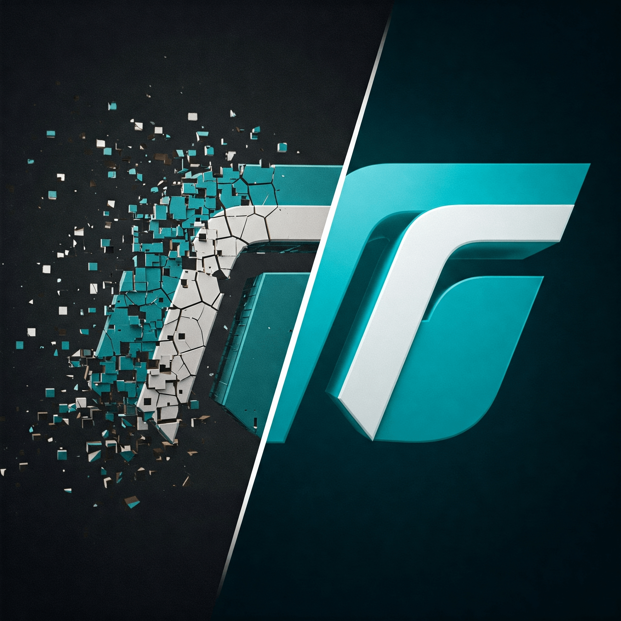
We all have seen these pixelated business emblems somewhere. People in the printing industry are particularly familiar with the scenario where they request a vector file, and the customer has no clue what they are talking about. The issue often isn’t the brilliance of the design itself, but rather the format of that design. This is precisely where understanding the immense power of a logo vector graphic becomes not just helpful, but absolutely essential. It’s far more than a mere technicality; it’s the robust foundation upon which a versatile, adaptable, and thoroughly professional brand presence is built. So, what is it about a logo based on vector graphics that makes it so critical for your brand’s journey and ultimate success?
What Exactly is a Vector Graphic? (And Why Should This Matter for Your Logo?)
Let’s unravel this mystery. Imagine you’re looking at two ways to create an image. One way is to use tiny colored squares, or pixels, to paint a picture on a grid. This is a raster graphic (think JPEGs or PNGs). It looks great at its intended size. But what happens if you try to make that picture much bigger? Those tiny squares just get larger and more obvious, leading to a blurry, blocky mess. Not ideal for your brand’s primary symbol, is it?
Now, picture a different approach. Instead of pixels, imagine drawing with mathematical instructions: “draw a line from point A to point B,” “create a curve with this radius,” “fill this shape with this specific color.” This is the essence of a logo vector graphic. It’s constructed from paths, points, and algorithms, not a fixed grid of pixels. Think of it like an infinitely adaptable blueprint rather than a static photograph. Why does this distinction matter so profoundly for your emblem? Because your logo needs to perform flawlessly everywhere, a logo vector graphic ensures it can. This fundamental difference is key to understanding the advantages of vector graphics for logos.
The Superpower of Scalability: Why Your Logo Vector Graphic is a Master Shape-Shifter
Herein lies the true magic of a logo vector graphic: unparalleled scalability. Because it’s defined by mathematical equations, a vector image can be shrunk down to the size of a tiny website favicon or blown up to adorn a massive billboard, all without losing a shred of clarity, sharpness, or detail. It will remain perfectly crisp.
Consider the diverse applications your logo faces:
- Tiny icons on mobile apps.
- Sharp emblems on business cards.
- Crisp graphics on your website.
- Large banners for trade shows.
- Vehicle wraps.
- Massive building signage.
A single logo vector graphic file can handle all these demands. Try doing that with a pixel-based image, and you’ll quickly encounter that dreaded pixelation when you scale up. This inherent ability to resize perfectly is why a logo vector graphic is non-negotiable for a dynamic brand. How can you make a logo scalable without losing quality? The answer is simple: ensure it’s a logo vector graphic from the outset.
Editing Prowess: The Logo Vector Graphic Advantage for Adaptability
Branding isn’t static. Needs change. Opportunities arise. Perhaps you need a monochrome version of your logo for a specific print job. Maybe you want to subtly adjust a curve or an element within the design. With a vector design, these edits are straightforward.
Designers can easily:
- Change colors with precision.
- Modify individual shapes or components.
- Adjust line thicknesses.
- Create different versions (e.g., black and white, reversed out for dark backgrounds, or simplified versions for small applications).
Attempting such edits on a raster image is far more complex and often destructive, meaning quality degrades with each change. A logo vector graphic provides the flexibility to adapt your branding consistently across all touchpoints. This adaptability ensures your logo vector graphic remains a current and effective asset for years to come, supporting your overall graphic design and branding strategy.
Versatility Unleashed: One Logo Vector Graphic, Countless Applications
The true workhorse nature of a logo vector graphic shines when you consider its versatility. This single master file becomes the source for almost every visual representation of your brand.
- Professional Printing: For business cards, brochures, flyers, posters, and packaging, printers will almost invariably request, or even demand, a logo vector graphic. They need it to produce sharp, high-quality results. An EPS file or AI file is often their preferred logo file type.
- Digital Media: While websites and social media use raster formats like PNGs (especially for transparency) or JPEGs, these should always be exported from your master logo vector graphic at the exact size and resolution needed. This maintains quality control. An SVG logo is also increasingly popular for web use due to its scalability directly in browsers.
- Specialty Manufacturing: Think about embroidered apparel, engraved awards, or custom signage. These processes often rely on the clean lines and paths of a logo vector graphic to guide machinery.
Having a logo vector graphic means you are prepared for virtually any application, now or in the future. It answers the question, “What is the best file format for a logo?” by providing the foundational master.
Key File Formats: Your Vector Graphic’s Trusted Allies
When you receive your logo design, understanding the file types is crucial. For your master brandmark, you should look for these common formats:
- .AI (Adobe Illustrator): This is the native file format for Adobe Illustrator, a leading software for vector design. It preserves all editing capabilities. An AI file is a gold standard for any kind of vector design.
- .EPS (Encapsulated PostScript): An older but still widely supported vector format. EPS files are great for compatibility with various design software and printers. An EPS file is another excellent choice for a scalable logo.
- .SVG (Scalable Vector Graphics): An XML-based open-standard vector format. SVGs are fantastic for web use because they scale in the browser and can be manipulated with code. They are also gaining traction for print. An SVG logo offers modern flexibility.
- .PDF (Portable Document Format): While PDFs can contain raster images, they can also perfectly encapsulate vector information. A PDF saved correctly from vector software can serve as a good, shareable version that retains scalability. However, always ensure your primary master is an AI, EPS, or SVG file.
When working with a designer, always request these logo file types as part of your final deliverables. They are essential components of a professional logo package.
“But My Logo is a PNG/JPG, Isn’t That Good Enough?” (Addressing a Common Misconception)
It’s a frequent question: Can a logo be a JPG or PNG only? While PNGs (especially for transparent backgrounds on websites) and JPEGs have their place in the digital realm, relying on them exclusively for your logo is a significant limitation. As we’ve discussed, these are raster formats. They are fixed in resolution.
If your only logo file is a PNG or JPG, you will inevitably face problems when:
- You need to print it larger than its original size.
- You require edits to colors or shapes.
- You need to provide it for specialty manufacturing like embroidery.
Raster versions are perfectly acceptable for specific uses like websites or social media. However, these should always be derived or exported from your master logo vector graphic. Having only a raster version means you lack the foundational, infinitely scalable master file. This often leads to asking, “Why does my logo need to be a vector?” precisely when a problem arises. The answer is to prevent those problems from ever happening.
The Professional Standard: A Logo Vector Graphic Signals Credibility
In the world of graphic design and branding, providing a logo vector graphic is standard practice for professional designers. It demonstrates an understanding of how logos function across various media and a commitment to providing clients with robust, usable brand assets.
Receiving only a raster file (like a JPG or PNG) as your “final logo” can be a red flag. It might indicate a lack of professional experience or the use of inappropriate tools for logo design. A proper logo vector graphic not only ensures technical quality but also contributes to the overall perception of your brand’s professionalism. What if you currently lack a logo vector graphic for your established brand? It’s highly advisable to either go back to your original designer to request it or invest in having your logo professionally recreated as a true logo vector graphic. This investment will pay dividends in quality and usability.
Create Stunning Logos with These Fully Editable Logo Vector Graphics
Download a set of 30 fully customizable, minimalist logo templates as editable vector graphicsIf you don’t want to create a logo vector graphic from scratch, feel free to try this collection of 30 fully customizable, minimalist logo designs by Amito Vectors. These editable vector graphics, perfect for diverse applications from corporate to personal projects, feature an impeccable line art style with clean, modern aesthetics. They integrate seamlessly with professional software like Adobe Illustrator, enabling the easy creation of polished and sophisticated logos suitable for various industries, though such software is required for editing.
You can download the set for free from Adobe StockLong-Term Value: Future-Proofing Your Brand with a Logo Vector Graphic
Investing in a proper logo vector graphic from the start, or rectifying the situation if you don’t have one, is an investment in your brand’s future. It saves countless headaches, potential redesign costs, and lost opportunities down the line.
Imagine new advertising mediums emerging or needing your logo for an unexpected, large-format application. With a logo vector graphic, you’re prepared. Your brand can adapt, evolve, and seize new opportunities without being hampered by a technically inferior logo file. This forward-thinking approach is crucial for sustainable branding. Your logo vector graphic is a timeless asset, ensuring your visual identity remains consistent and high-quality, no matter where it appears.
Ultimately, the question isn’t whether your logo can exist without a vector version, but whether it should. For any business serious about its brand image, versatility, and professional presentation, the answer is a resounding no. A logo vector graphic isn’t just a “nice-to-have”; it’s a fundamental component of a strong and enduring brand identity. Do you know what format your logo is in? Now might be the perfect time to check and ensure your brand is built on the solid, scalable foundation of a logo vector graphic.
Feel free to browse WE AND THE COLOR’s Graphic Design and Branding categories for more inspiring content.
Subscribe to our newsletter!
[newsletter_form type=”minimal”]#branding #design #graphicDesign #logoDesign #logoVectorGraphic #logoVectorGraphics #vectorDesign
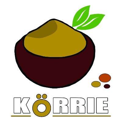
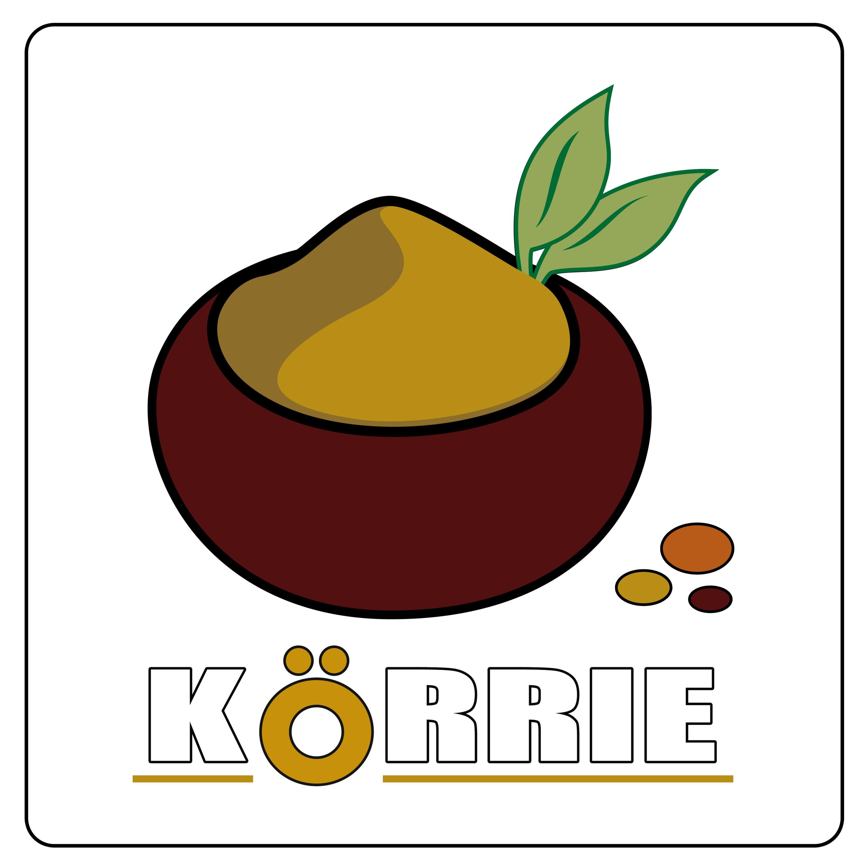
Schönen Morgen liebe Leute, lange haben wir nichts mehr getrötet.
Jetzt gibt es mal ein vorher-nachher Beispiel für eine Logo-Update für @kauftkoerrie sehr empfehlenswerte Gewürzmischungen, nebenbei bemerkt, besonders wenn mensch Wert auf Gewürzmischungen ohne Geschmacksverstärker oder Steckmittel legt.
Wie gefällt es euch?
#logodesign #grafikdesign #gewurzmischung #neuhier
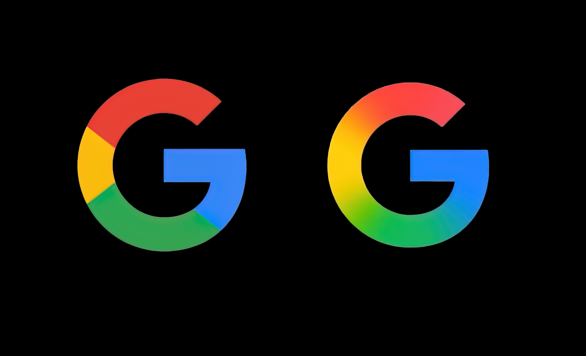
DesignBoom : google has a new ‘G’ logo – can you spot the difference? https://www.designboom.com/design/google-new-g-logo-color-gradient-05-13-2025/ #logodesign #design #google
Google's G logo is sporting a subtle new gradient after nearly a decade. The iconic four colors now blend smoothly, rolling out on mobile first. This refresh aligns with their Gemini AI visuals. Teasing more design shifts?
#Google #LogoDesign #TechUpdate
Any or know a good graphic designer who can help a small UK based club design their logo ? I really don’t want to use AI to generate it and well it’s beyond my skill set. I would also prefer someone who is UK based.
I want to say hi and thanks to everyone who is following the birth of this project from the beginnings 🤗
I was not sure if I should even make it public before having the website ready, but here I am...
Giving you a little peek into the creative process behind my company logo from first draft to the final version. It took me a whole morning just to learn how to draw a leaf 😅
#teadaydreams #makelifeaceremony #logodesign #logo #teashop #tea
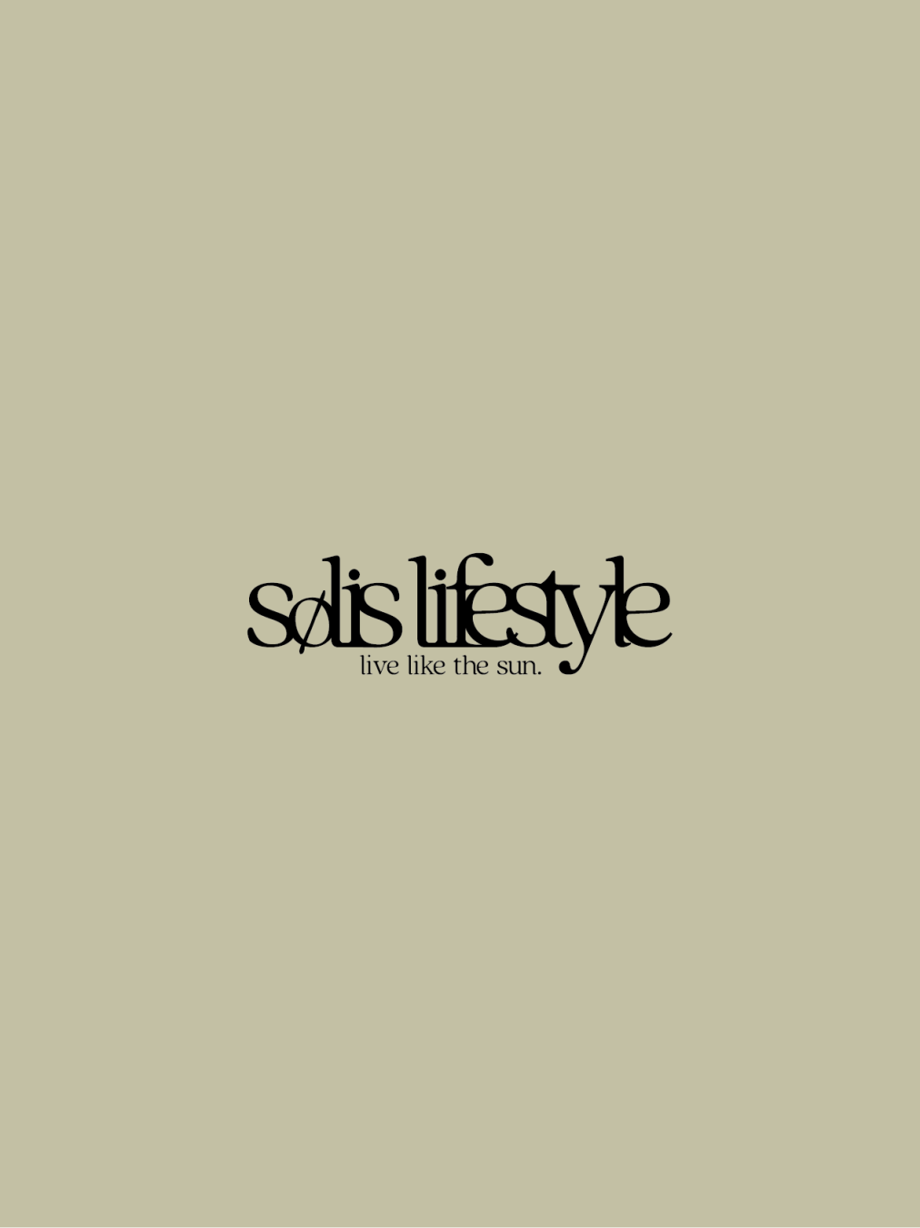
Fictional Brand Logo Design No.3
Solis Lifestyle
Solis Lifestyle - Business Description
1. Development and sales of solar-powered smart home appliances.
2. Organic clothing and eco-friendly lifestyle goods.
3. Ritual-inspired products such as tea tools and aromatherapy items.
4. Digital content that supports mindfulness and sensory reconnection (e.g., journals, podcasts).
5. Hosting the annual Solis Living Festival, an event that promotes sustainable living experiences.
Solis Lifestyle - 사업 설명
1. 태양광을 활용한 스마트 가전의 개발 및 판매
2. 유기농 소재의 의류 및 생활용품 제공
3. 차 문화 및 향기 제품 등 일상의 의식을 위한 아이템 기획
4. 감각을 되살리는 디지털 콘텐츠 제작 (예: 저널, 오디오 가이드 등)
5. 지속 가능한 삶을 체험할 수 있는 연례 이벤트 Solis Living Festival 개최
Solis Lifestyle - 事業の説明
1. 太陽光を活用したスマート家電の開発・販売(ソーラー充電対応など)
2. オーガニック素材を使用した衣類・生活雑貨の展開
3. 「暮らしの儀式」に寄り添うティー用品や香りプロダクトの企画・販売
4. 感覚を整えるためのデジタルコンテンツ(ジャーナル、音声ガイド等)の制作
5. サステナブルな暮らしを体験できる年1回のイベント「Solis Living Festival」の開催
#logodesigner #logodesign #logobrand #logoideas #로고디자인 #디자인 #디자이너 #로고 #デザイナー #ロゴ #ロゴデザイン #デザイン
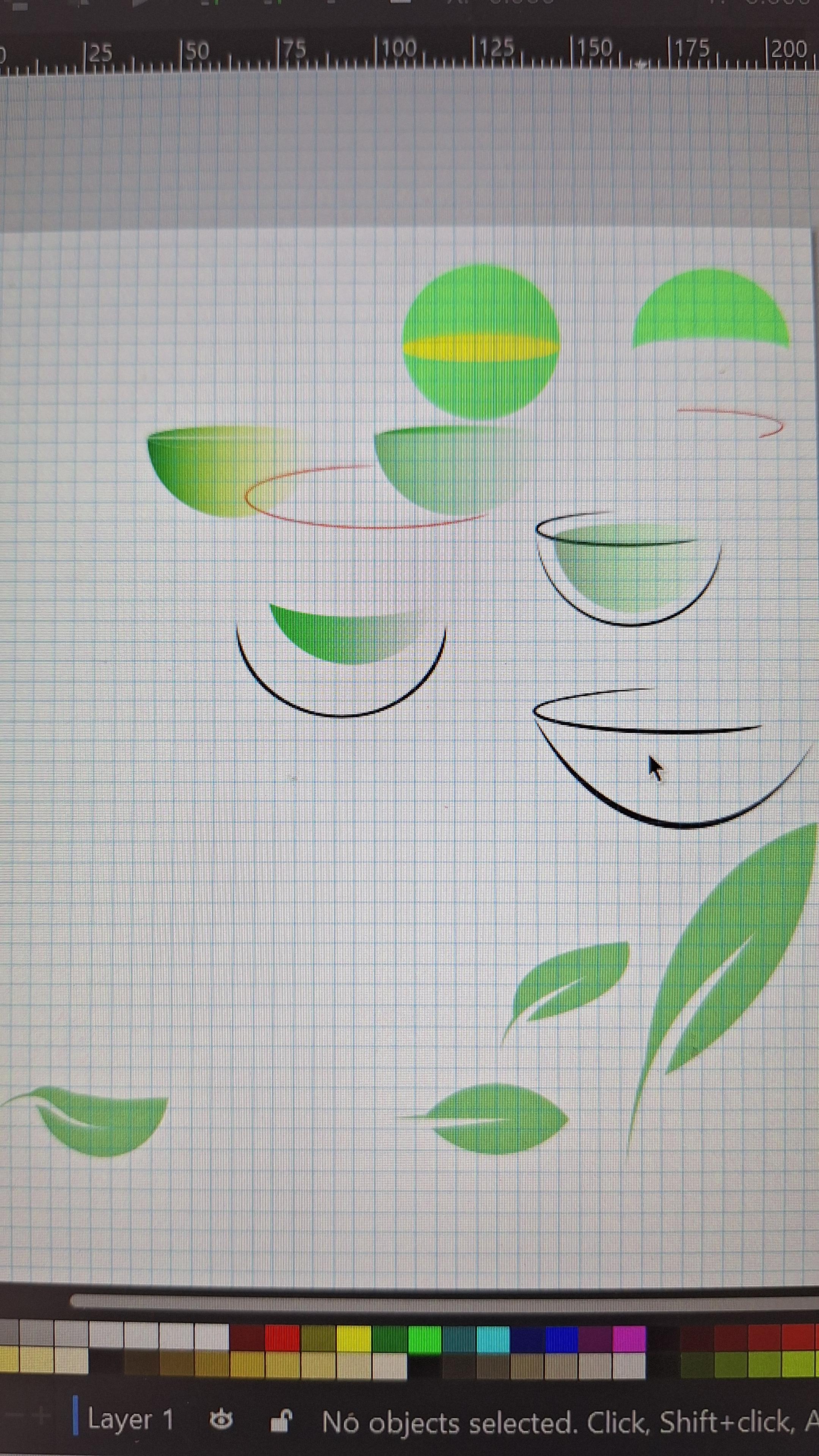
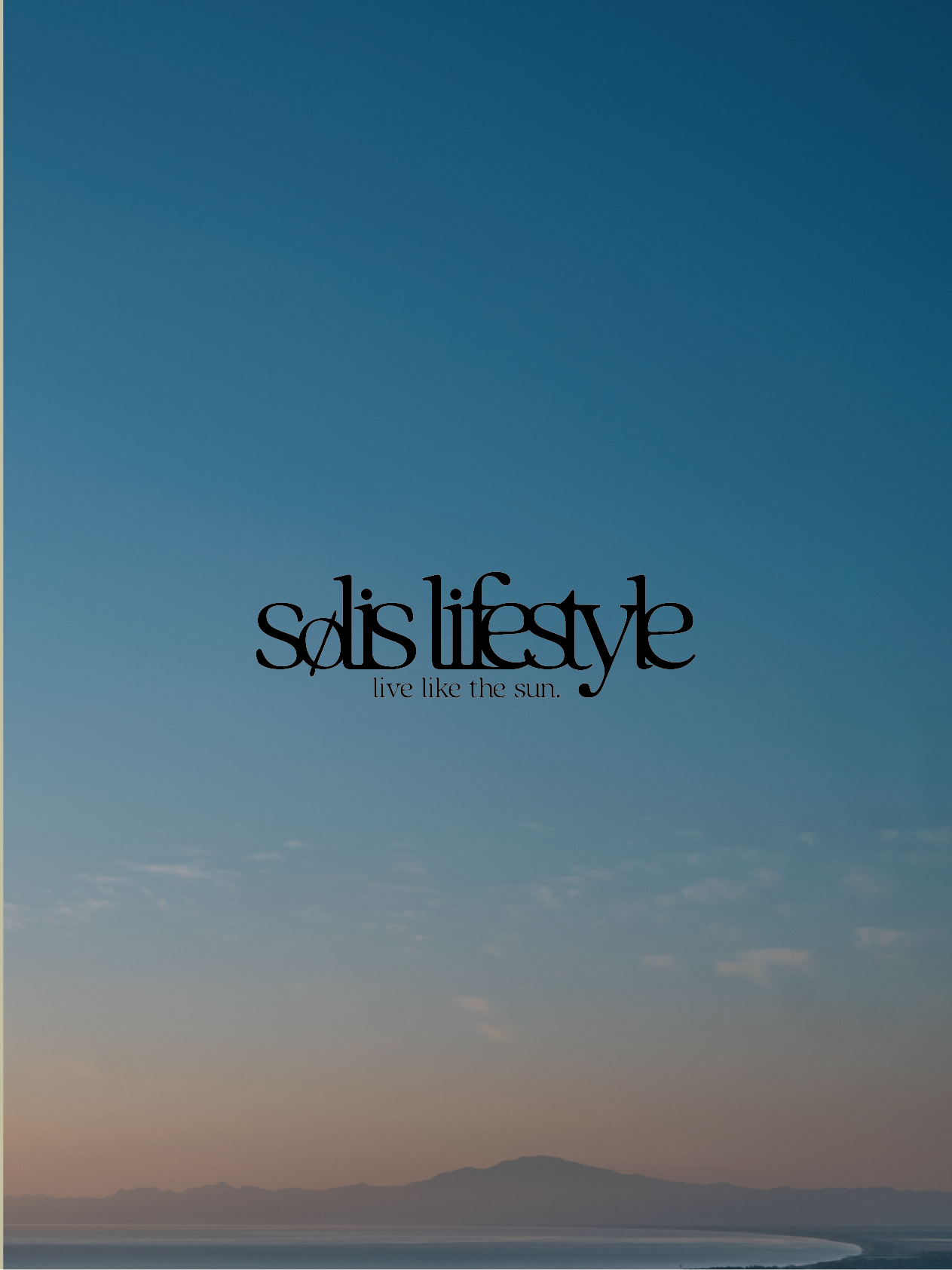
Fictional Brand Logo Design No.3
Solis Lifestyle
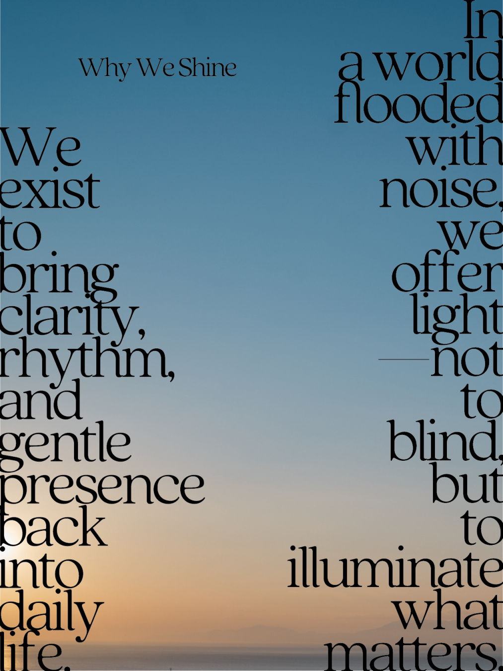
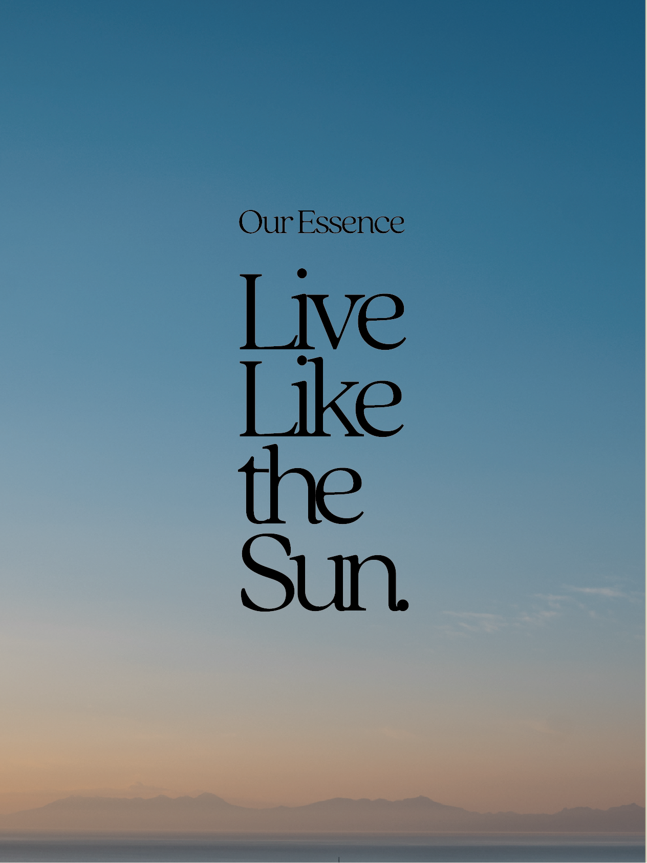
Solis Lifestyle proposes a way of living that reconnects us with the natural rhythm of the sun. It values lifestyles chosen through one’s own inner rhythm, free from trends or pressure. Rather than focusing on “things,” the brand emphasizes a way of being in harmony with nature and self. Like the sun, it quietly yet surely brings warmth and light to daily life. Its mission is to help people rediscover the gentle clarity and comfort of authentic living.
Solis Lifestyle는 태양의 리듬에 따라 살아가는 본래의 감각을 회복하는 삶을 제안합니다. 트렌드나 타인의 시선이 아닌, 자신만의 리듬에 따라 선택하는 삶을 중요하게 여깁니다. ‘물건’ 중심이 아닌 ‘존재 방식’을 중심으로 자연과 사람, 자신과 조화를 이루는 삶을 지향합니다. 태양처럼 조용하지만 분명하게 사람들의 마음을 비추는 존재가 되고자 합니다. 감각을 되찾고 진정한 삶의 편안함을 회복하는 것이 우리의 사명입니다.
Solis Lifestyleは、太陽のリズムとともに生きる“本来の感覚”を取り戻す暮らしを提案します。情報やトレンドに左右されず、自分の内なるリズムで選ぶライフスタイルを重視。「モノ」ではなく「在り方」を中心に、自然・人・社会と調和する生き方をデザインします。太陽のように静かに、でも確かに人の心を照らす存在を目指し、日常に“感覚の光”を取り戻すことを使命としています。
#logodesigner #logodesign #logobrand #logoideas #로고디자인 #디자인 #디자이너 #로고 #デザイナー #ロゴ #ロゴデザイン #デザイン
Solis Lifestyle
Solis Lifestyle proposes a way of living that reconnects us with the natural rhythm of the sun. It values lifestyles chosen through one’s own inner rhythm, free from trends or pressure. Rather than focusing on “things,” the brand emphasizes a way of being in harmony with nature and self. Like the sun, it quietly yet surely brings warmth and light to daily life. Its mission is to help people rediscover the gentle clarity and comfort of authentic living.
Solis Lifestyle는 태양의 리듬에 따라 살아가는 본래의 감각을 회복하는 삶을 제안합니다. 트렌드나 타인의 시선이 아닌, 자신만의 리듬에 따라 선택하는 삶을 중요하게 여깁니다. ‘물건’ 중심이 아닌 ‘존재 방식’을 중심으로 자연과 사람, 자신과 조화를 이루는 삶을 지향합니다. 태양처럼 조용하지만 분명하게 사람들의 마음을 비추는 존재가 되고자 합니다. 감각을 되찾고 진정한 삶의 편안함을 회복하는 것이 우리의 사명입니다.
Solis Lifestyleは、太陽のリズムとともに生きる“本来の感覚”を取り戻す暮らしを提案します。情報やトレンドに左右されず、自分の内なるリズムで選ぶライフスタイルを重視。「モノ」ではなく「在り方」を中心に、自然・人・社会と調和する生き方をデザインします。太陽のように静かに、でも確かに人の心を照らす存在を目指し、日常に“感覚の光”を取り戻すことを使命としています。
#logodesigner #logodesign #logobrand #logoideas #로고디자인 #디자인 #디자이너 #로고 #デザイナー #ロゴ #ロゴデザイン #デザイン
Fictional Brand Logo Design No.3
Solis Lifestyle
Solis Lifestyle is a brand that promotes sustainable living with the concept "Living Naturally with the Sun." Through solar-powered smart appliances and organic lifestyle products, it supports a gentle way of living in rhythm with natural light. The brand helps people reconnect with their senses, nature, and authentic selves in today's fast-paced world.
Solis Lifestyle는 “태양과 함께하는 자연스러운 삶”을 컨셉으로 한 지속 가능한 라이프스타일 브랜드입니다. 태양 에너지를 활용한 스마트 가전과 유기농 제품을 통해, 자연의 리듬에 맞춘 편안한 삶을 제안합니다. 빠르게 변화하는 현대 사회에서 감각, 자연, 진정한 자기 자신과 다시 연결될 수 있도록 돕는 브랜드입니다.
Solis Lifestyleは、「太陽とともに、自然な暮らしを」コンセプトに、サステナブルなライフスタイルを提案するブランドです。太陽エネルギーを活用したスマート家電やオーガニック製品を通じて、“光のリズム”とともにある心地よい生き方をサポートします。現代の喧騒から感覚を取り戻し、自然・感性・自己と調和する暮らしの在り方を提案しています。
Logo Description / 로고 설명 / ロゴの説明
The logo uses a serif typeface with a natural and classic feel, evoking an ethical, native, and avant-garde aesthetic that embodies the concept of harmony between nature and art. A hand-drawn slash tilted at 23.4° is inserted into the “O,” symbolizing the Earth's axial tilt and its relationship with the sun. The tight kerning creates a sense of closeness and unity, suggesting the bond between individuals and nature.
이 로고는 자연스럽고 클래식한 느낌의 세리프체를 사용하여, 에시컬하고 네이티브하며 아방가르드한 감성을 불러일으키며 자연과 예술의 공존이라는 컨셉을 표현합니다. “O” 부분에는 지구의 자전축 기울기인 23.4°의 손글씨 슬래시가 삽입되어 태양 안의 지구를 상징합니다. **좁은 커닝(자간)**은 사람과 자연, 그리고 공동체 간의 유대감과 일체감을 시각적으로 전달합니다.
ロゴは、ナチュラルかつクラシックなテイストのセリフ体のフォントを用い、エシカル、ネイティブ、アバンギャルドのイメージを持たせ、自然とアートと共生するコンセプトを体現。また、「O」の部分に地軸の傾きである23.4°の手書きのスラッシュを加え、太陽の中での地球を表現しています。カーニングは狭く自然と仲間との一体化も感じさせるようなあしらいにしています。
#logodesigner #logodesign #logobrand #logoideas #로고디자인 #디자인 #디자이너 #로고 #デザイナー #ロゴ #ロゴデザイン #デザイン
Best Logo Design Services:
https://www.designpluz.com
Designpluz Branding Services is the best logo design company in Coimbatore. We design unique, professional logos that represent your business identity and make a lasting impression.
#LogoDesign #BrandDesign
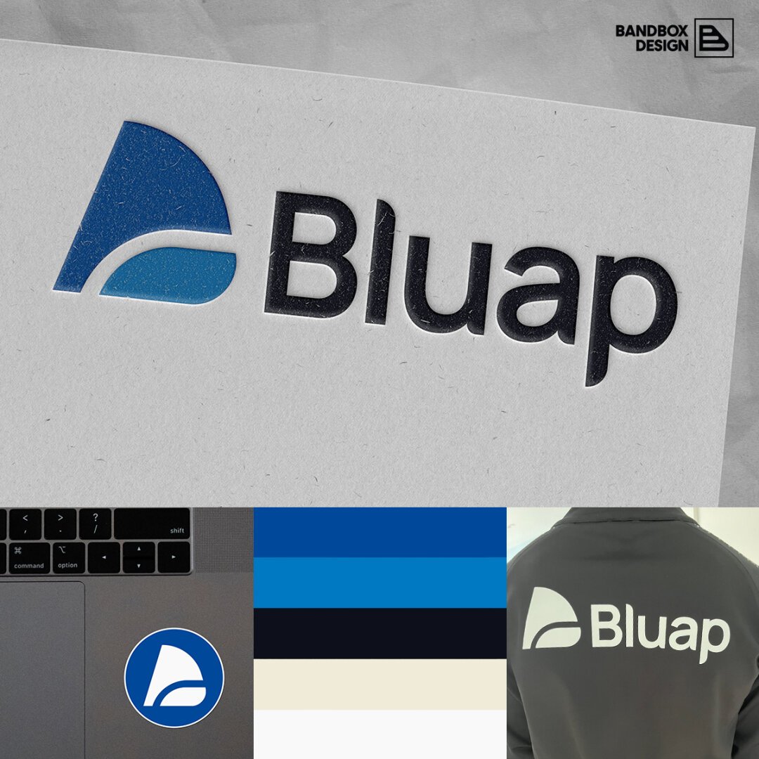
Graphic designers are not pixel pushers. We’re problem solvers.
For example, last year I worked with Paul Brown, founder of Bluap. Their logo and visual identity was an off-the-shelf option chosen when the company was founded.
In the initial discovery call, Paul and I agreed the current logo and visual identity was in real need of a refresh and redesign to reflect Bluap’s professional service with a personal touch.
First, I needed to understand the business offering. Bluap has over 20 years’ experience in developing and integrating new operating and IT systems, delivering projects for companies across multiple industries.
Armed with this business summary and more information from Paul, we agreed these keywords to guide my design process: Blue. Transformation. Change. Bold. Intelligence. Trust.
With the name Bluap, it was clear that the hero colour of the new visual identity should be, well, blue. But I wanted to move away from the light blue colour used previously, as this did not provide a lot of contrast against white.
The two keywords for the logomark that stood out were ‘change’ and ‘transformation’. This made me think of butterflies and their wings, so I turned into David Attenborough for a while and researched those.
For the typeface, I focused on the keywords ‘trust’ and ‘intelligence’ but wanted something that felt modern rather than using a classic sans serif.
I spent time sketching and creating my proposed logo design and making a brand presentation document to explain the creative process behind it.
I recorded a short video where I talked through the presentation and sent it over to Paul.
And the feedback was ‘you’ve nailed it!’ Paul didn’t quite put it like that perhaps, but because of our clear discussions and his involvement in the process from the start, I’d understood the ethos of Bluap and its objectives straight away.
#brandidentity #design #freelancer #graphicdesign #branddesign #logodesign #visualidentity
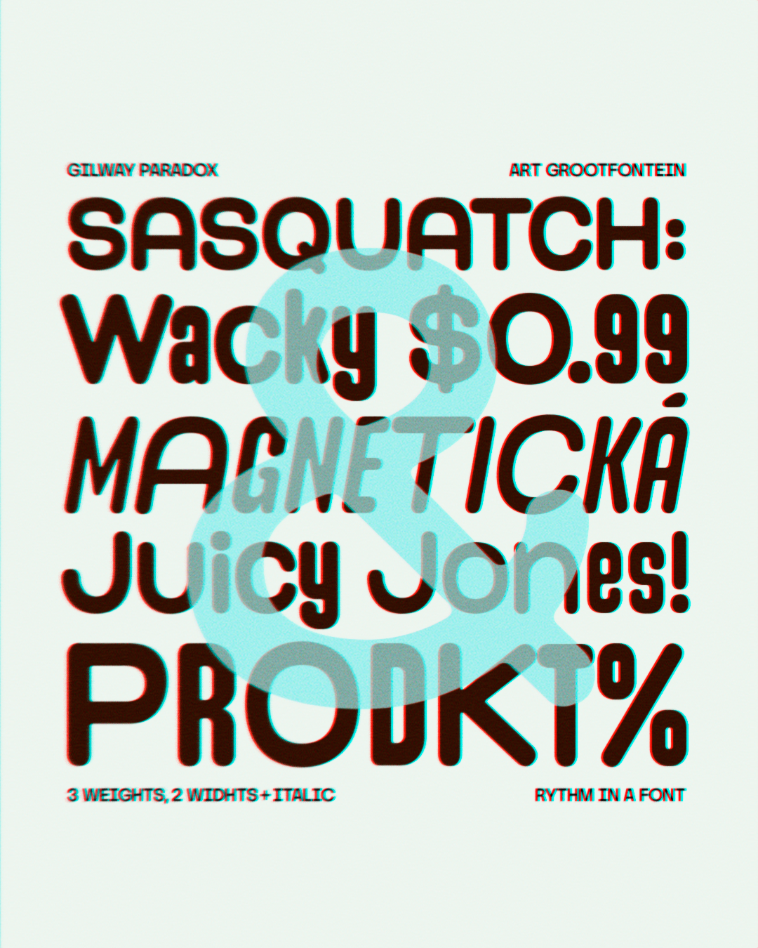
From Editorial to Identity
Whether it’s packaging, magazines, or fashion branding—Gilway Paradox fits right in. Modern, versatile, and full of personality.
🔗 Available now—link in bio.
#brandingfonts #editorialdesign #versatilefonts #logodesign #TDKpeepshow #typegoodness #typographicdesign
A recommended read for anyone in digital graphic design and/or front-end design and development:
https://arielsalminen.com/2017/design-tools-processes/
#webdesign #logodesign #graphicdesign
P.S. Tagging logodesign because have you tried explaining screen DPI vs print-to-paper DPI to a traditional graphic designer?
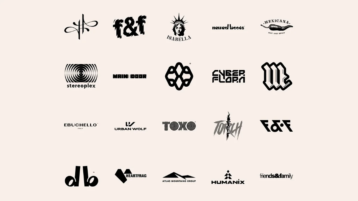
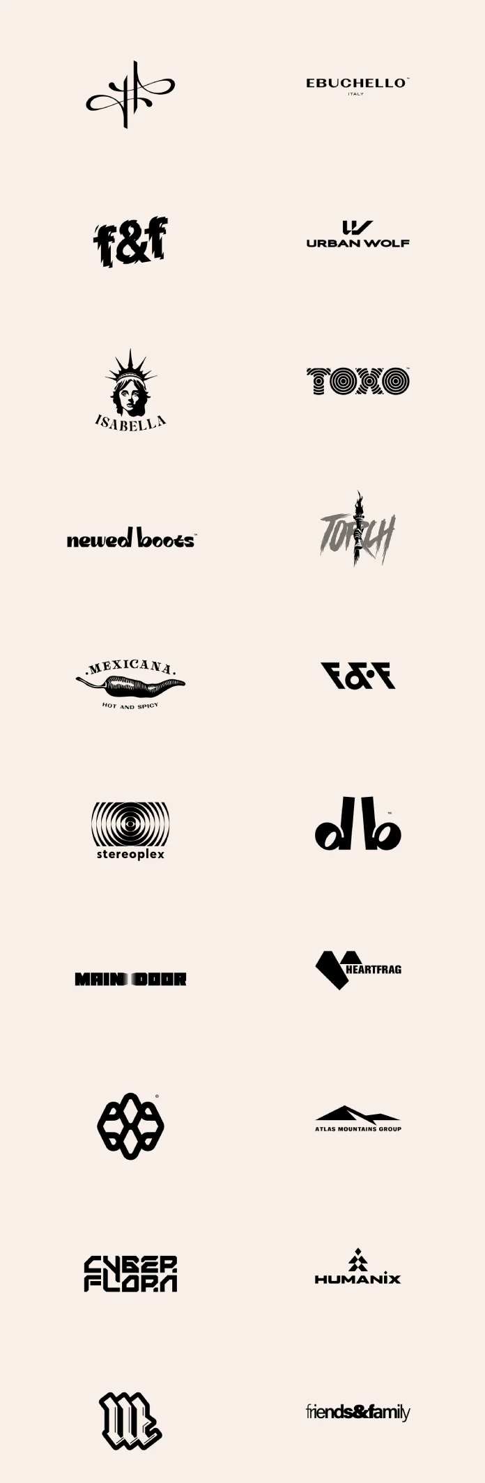
Inspiring Logos: Explore 20 Unique Brand Marks by Prague’s Malina Cosmica
A great logo captures the essence of a brand, communicates its values, and sticks in your mind long after you’ve seen it. It’s a tiny piece of art with a massive job to do. Finding designers who consistently create impactful logos can feel like searching for a hidden gem. Well, today feels like a lucky day because we get to explore a stunning collection of visual identities crafted by a truly talented individual.
We’re looking at a curated selection of 20 distinctive logos, logotypes, and brand marks, all brought to life by the creative vision of Malina Cosmica. Based in the beautiful city of Prague, Malina, also known online as COSMODROME ART, is a graphic designer whose work speaks volumes. Her portfolio showcases a remarkable range, covering everything from intricate illustrations and sharp graphic design to compelling printed materials, intuitive web design, and engaging social media content. This particular collection, created using professional tools like Adobe Illustrator and Adobe Photoshop, offers a fantastic window into her skill in distilling complex ideas into powerful visual symbols. Ready to see some design brilliance? Let’s appreciate these unique creations together.
20 Logos, Logotypes, and Brand Marks by Graphic Designer Malina CosmicaThe Silent Language of Effective Logos
Think about your favorite brands. What comes to mind first? Often, it’s their logo, right? That simple symbol acts as an instant identifier. It’s the handshake, the first impression, the visual shorthand for everything the brand represents. Designing effective logos is a delicate balance between aesthetics, strategy, and psychology. A successful logo needs to be distinct, versatile (working well whether tiny on an app icon or large on a billboard), relevant to its audience, and timeless enough to endure. Malina Cosmica’s work demonstrates a keen understanding of this silent language. Each piece in this collection feels purposeful, designed not just to look good, but to communicate.
A Spectrum of Styles: Exploring Malina’s Logo Designs
What’s immediately striking about this collection is the sheer variety. Malina doesn’t seem confined to a single aesthetic. Instead, she adapts her style to suit the specific needs and personality of each brand. Isn’t that what great design is all about?
You can see bold, geometric logos sitting comfortably alongside more organic, illustrative marks. Look at the contrast:
- Intricate & Symbolic: Notice the abstract, almost calligraphic flourish in the top left, or the complex, interwoven pattern that looks like a futuristic knot. These suggest sophistication and perhaps a touch of mystery.
- Illustrative Flair: The “Isabella” logo, featuring the Statue of Liberty head or the “Mexicana” chili pepper, is rich in detail and personality, telling a story immediately. The “Torch” logo has a raw, energetic, almost grunge-like feel.
- Strong Typography: Several logos rely heavily on unique typography. The distorted, impactful “f&f,” the retro-tech vibe of “Stereoplex” with its concentric circles, the sharp, futuristic cuts in “Cyber Flora,” and the hypnotic pattern within “Toko” all showcase creative letterform manipulation. The bold, blackletter-inspired “M” demands attention.
- Clean & Modern: You also find minimalist approaches. “Ebuchello,” “Urban Wolf,” “Atlas Mountains Group,” and “Humanix” use clean lines and straightforward typography, conveying professionalism and clarity. The simple elegance of “newed boots” or the friendly accessibility of “friends & family” works beautifully.
- Combined Marks: Some logos, like “Heartfrag” (a heart shape formed from fragmented geometric pieces), cleverly combine a symbol with the wordmark.
This diversity highlights Malina’s versatility as a designer. She clearly possesses the ability to tune into different brand voices and translate them visually. The presentation in black and white further emphasizes the strength of form, concept, and execution in these logos, stripping away color to focus purely on the design itself.
Craftsmanship and Professionalism in Logo Creation
Creating logos that look this effortless actually requires significant skill and a meticulous process. It’s evident that Malina utilizes professional tools like Adobe Illustrator, perfect for vector graphics that scale infinitely without losing quality, and potentially Adobe Photoshop for specific effects or mockups.
But the tools are only part of the equation. What shines through is the thought process. Each logo feels considered. It suggests a designer who listens to her clients, understands their market, and works diligently to create a mark that is both unique and strategically sound. Whether it’s achieving perfect balance in a minimalist design or rendering complex details in an illustration, the craftsmanship is apparent. These aren’t just quick sketches; they are well-executed pieces of visual communication, representing brands with confidence. Have you ever tried designing a logo? It’s a challenging task to make something so simple carry so much weight!
Meet the Designer: Malina Cosmica (COSMODROME ART)
So, who is the creative mind behind these impressive logos? Malina Cosmica, working under the banner COSMODROME ART, is a graphic designer currently based in Prague. Her expertise isn’t limited to just logo design. She offers a comprehensive suite of creative services, including:
- Graphic Design (Branding, Identity Systems)
- Illustrations
- Printed Products (Brochures, Posters, Packaging)
- Web Design
- Social Media Graphics and Strategy
Her portfolio demonstrates a strong capability across these areas, making her a versatile partner for businesses and individuals seeking impactful visual solutions. Importantly, Malina is open to cooperation and joint projects. If you’re inspired by the quality and creativity you see in these logos and have a project in mind, reaching out to her could be the start of something great.
This collection serves as more than just a showcase of talent. It’s a source of inspiration for anyone interested in branding and design. It reminds us that logos can be incredibly diverse, powerful, and artistic. Malina Cosmica’s work exemplifies how thoughtful design can elevate a brand’s identity.
Exploring sets like this helps us appreciate the nuances of logo design – the clever use of negative space, the choice of typeface, the balance of elements. It pushes us to think critically about the visual identities we encounter every day.
What do you think of these designs? Does a particular logo stand out to you? Seeing such a strong, varied collection from one designer is truly inspiring. It underscores the vital role graphic design plays in shaping our perception of brands and the world around us. Malina Cosmica’s work is a testament to the power of creative vision and skilled execution in the field of logo and brand identity design.
All images © by Malina Cosmica. Check out WE AND THE COLOR’s Graphic Design and Branding categories for more creative inspiration.
Subscribe to our newsletter!
[newsletter_form type=”minimal”]#bestLogos #brandMarks #branding #design #graphicDesign #logo #logoCollection #logoDesign #logoInspiration #logos #logotypes #MalinaCosmica #marks
Client Info
Server: https://mastodon.social
Version: 2025.04
Repository: https://github.com/cyevgeniy/lmst