Inspiring Logos: Explore 20 Unique Brand Marks by Prague’s Malina Cosmica
A great logo captures the essence of a brand, communicates its values, and sticks in your mind long after you’ve seen it. It’s a tiny piece of art with a massive job to do. Finding designers who consistently create impactful logos can feel like searching for a hidden gem. Well, today feels like a lucky day because we get to explore a stunning collection of visual identities crafted by a truly talented individual.
We’re looking at a curated selection of 20 distinctive logos, logotypes, and brand marks, all brought to life by the creative vision of Malina Cosmica. Based in the beautiful city of Prague, Malina, also known online as COSMODROME ART, is a graphic designer whose work speaks volumes. Her portfolio showcases a remarkable range, covering everything from intricate illustrations and sharp graphic design to compelling printed materials, intuitive web design, and engaging social media content. This particular collection, created using professional tools like Adobe Illustrator and Adobe Photoshop, offers a fantastic window into her skill in distilling complex ideas into powerful visual symbols. Ready to see some design brilliance? Let’s appreciate these unique creations together.
20 Logos, Logotypes, and Brand Marks by Graphic Designer Malina Cosmica
The Silent Language of Effective Logos
Think about your favorite brands. What comes to mind first? Often, it’s their logo, right? That simple symbol acts as an instant identifier. It’s the handshake, the first impression, the visual shorthand for everything the brand represents. Designing effective logos is a delicate balance between aesthetics, strategy, and psychology. A successful logo needs to be distinct, versatile (working well whether tiny on an app icon or large on a billboard), relevant to its audience, and timeless enough to endure. Malina Cosmica’s work demonstrates a keen understanding of this silent language. Each piece in this collection feels purposeful, designed not just to look good, but to communicate.
A Spectrum of Styles: Exploring Malina’s Logo Designs
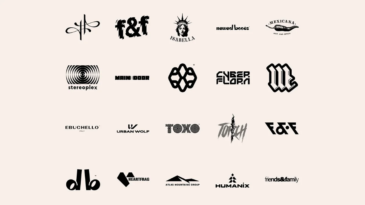
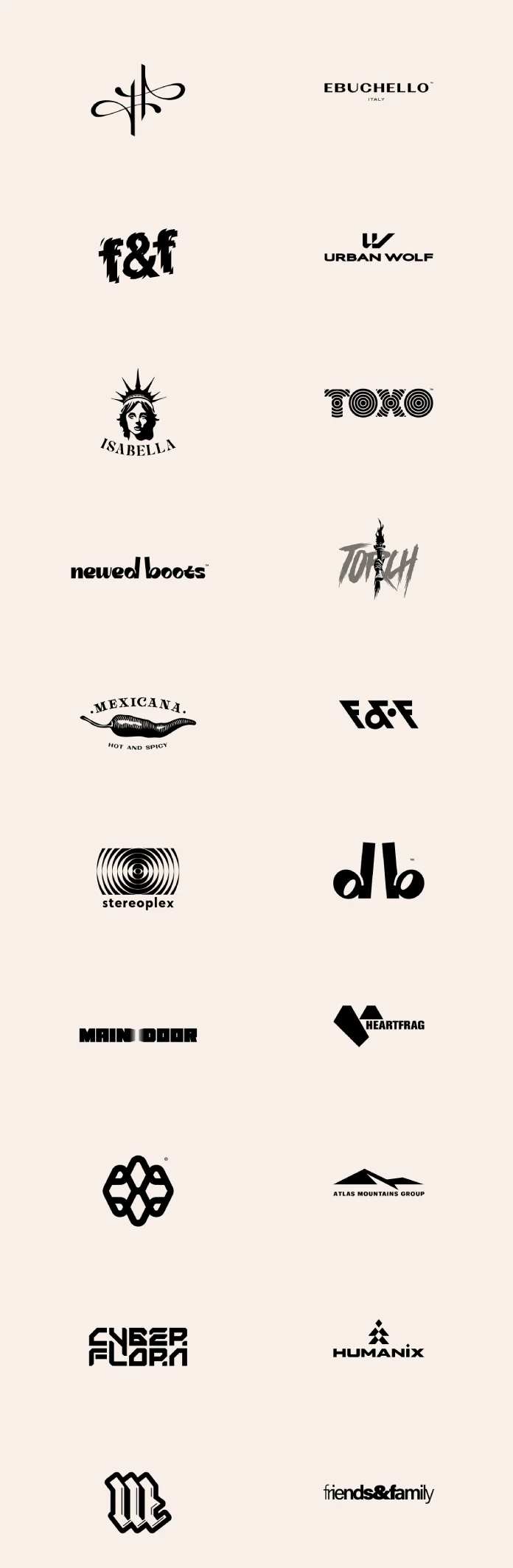
What’s immediately striking about this collection is the sheer variety. Malina doesn’t seem confined to a single aesthetic. Instead, she adapts her style to suit the specific needs and personality of each brand. Isn’t that what great design is all about?
You can see bold, geometric logos sitting comfortably alongside more organic, illustrative marks. Look at the contrast:
- Intricate & Symbolic: Notice the abstract, almost calligraphic flourish in the top left, or the complex, interwoven pattern that looks like a futuristic knot. These suggest sophistication and perhaps a touch of mystery.
- Illustrative Flair: The “Isabella” logo, featuring the Statue of Liberty head or the “Mexicana” chili pepper, is rich in detail and personality, telling a story immediately. The “Torch” logo has a raw, energetic, almost grunge-like feel.
- Strong Typography: Several logos rely heavily on unique typography. The distorted, impactful “f&f,” the retro-tech vibe of “Stereoplex” with its concentric circles, the sharp, futuristic cuts in “Cyber Flora,” and the hypnotic pattern within “Toko” all showcase creative letterform manipulation. The bold, blackletter-inspired “M” demands attention.
- Clean & Modern: You also find minimalist approaches. “Ebuchello,” “Urban Wolf,” “Atlas Mountains Group,” and “Humanix” use clean lines and straightforward typography, conveying professionalism and clarity. The simple elegance of “newed boots” or the friendly accessibility of “friends & family” works beautifully.
- Combined Marks: Some logos, like “Heartfrag” (a heart shape formed from fragmented geometric pieces), cleverly combine a symbol with the wordmark.
This diversity highlights Malina’s versatility as a designer. She clearly possesses the ability to tune into different brand voices and translate them visually. The presentation in black and white further emphasizes the strength of form, concept, and execution in these logos, stripping away color to focus purely on the design itself.
Craftsmanship and Professionalism in Logo Creation
Creating logos that look this effortless actually requires significant skill and a meticulous process. It’s evident that Malina utilizes professional tools like Adobe Illustrator, perfect for vector graphics that scale infinitely without losing quality, and potentially Adobe Photoshop for specific effects or mockups.
But the tools are only part of the equation. What shines through is the thought process. Each logo feels considered. It suggests a designer who listens to her clients, understands their market, and works diligently to create a mark that is both unique and strategically sound. Whether it’s achieving perfect balance in a minimalist design or rendering complex details in an illustration, the craftsmanship is apparent. These aren’t just quick sketches; they are well-executed pieces of visual communication, representing brands with confidence. Have you ever tried designing a logo? It’s a challenging task to make something so simple carry so much weight!
Meet the Designer: Malina Cosmica (COSMODROME ART)
So, who is the creative mind behind these impressive logos? Malina Cosmica, working under the banner COSMODROME ART, is a graphic designer currently based in Prague. Her expertise isn’t limited to just logo design. She offers a comprehensive suite of creative services, including:
- Graphic Design (Branding, Identity Systems)
- Illustrations
- Printed Products (Brochures, Posters, Packaging)
- Web Design
- Social Media Graphics and Strategy
Her portfolio demonstrates a strong capability across these areas, making her a versatile partner for businesses and individuals seeking impactful visual solutions. Importantly, Malina is open to cooperation and joint projects. If you’re inspired by the quality and creativity you see in these logos and have a project in mind, reaching out to her could be the start of something great.
This collection serves as more than just a showcase of talent. It’s a source of inspiration for anyone interested in branding and design. It reminds us that logos can be incredibly diverse, powerful, and artistic. Malina Cosmica’s work exemplifies how thoughtful design can elevate a brand’s identity.
Exploring sets like this helps us appreciate the nuances of logo design – the clever use of negative space, the choice of typeface, the balance of elements. It pushes us to think critically about the visual identities we encounter every day.
What do you think of these designs? Does a particular logo stand out to you? Seeing such a strong, varied collection from one designer is truly inspiring. It underscores the vital role graphic design plays in shaping our perception of brands and the world around us. Malina Cosmica’s work is a testament to the power of creative vision and skilled execution in the field of logo and brand identity design.
All images © by Malina Cosmica. Check out WE AND THE COLOR’s Graphic Design and Branding categories for more creative inspiration.
Subscribe to our newsletter!
[newsletter_form type=”minimal”]
#bestLogos #brandMarks #branding #design #graphicDesign #logo #logoCollection #logoDesign #logoInspiration #logos #logotypes #MalinaCosmica #marks