Geschwindigkeit beim Solarausbau wächst rasant
Speed of solar capacity installation is growing rapidly
#ourworldindata #solarpower #solarenergy #solarenergie #photovoltaik #photovoltaics
Geschwindigkeit beim Solarausbau wächst rasant
Speed of solar capacity installation is growing rapidly
#ourworldindata #solarpower #solarenergy #solarenergie #photovoltaik #photovoltaics
Good news:
Sinkende Kindersterblichkeit
Decrease in child mortality

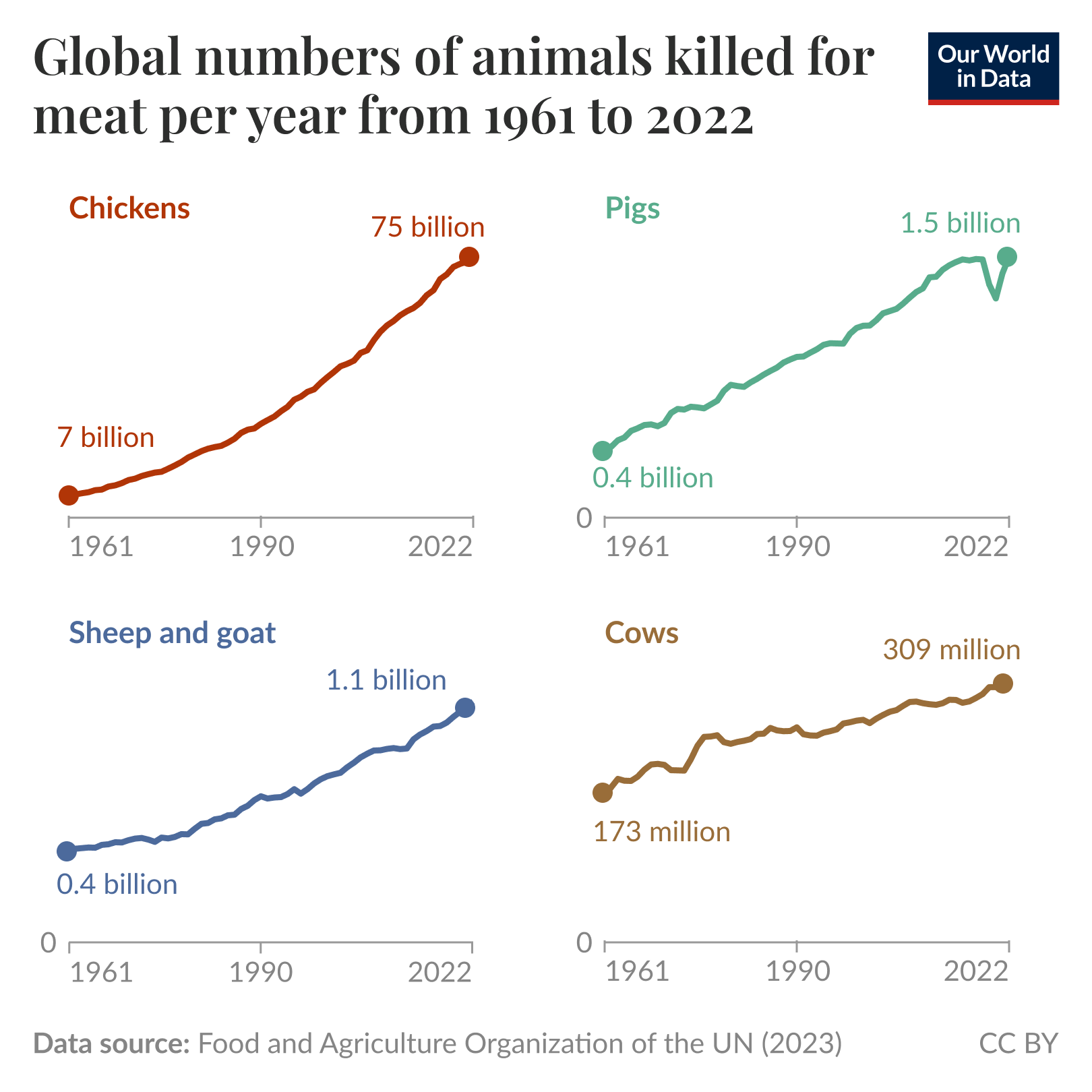
Zahlen, die der Verstand nicht mehr bewältigt:
Fleischtierproduktion weltweit (hier nur die nach Masse größten Gruppen der Landtiere)
https://ourworldindata.org/data-insights/more-land-animals-than-ever-before-are-slaughtered-for-meat
#fleisch #ernaehrung #Tierprodukte #statistik #ourworldindata
#meat #food #animalproduction #statistics
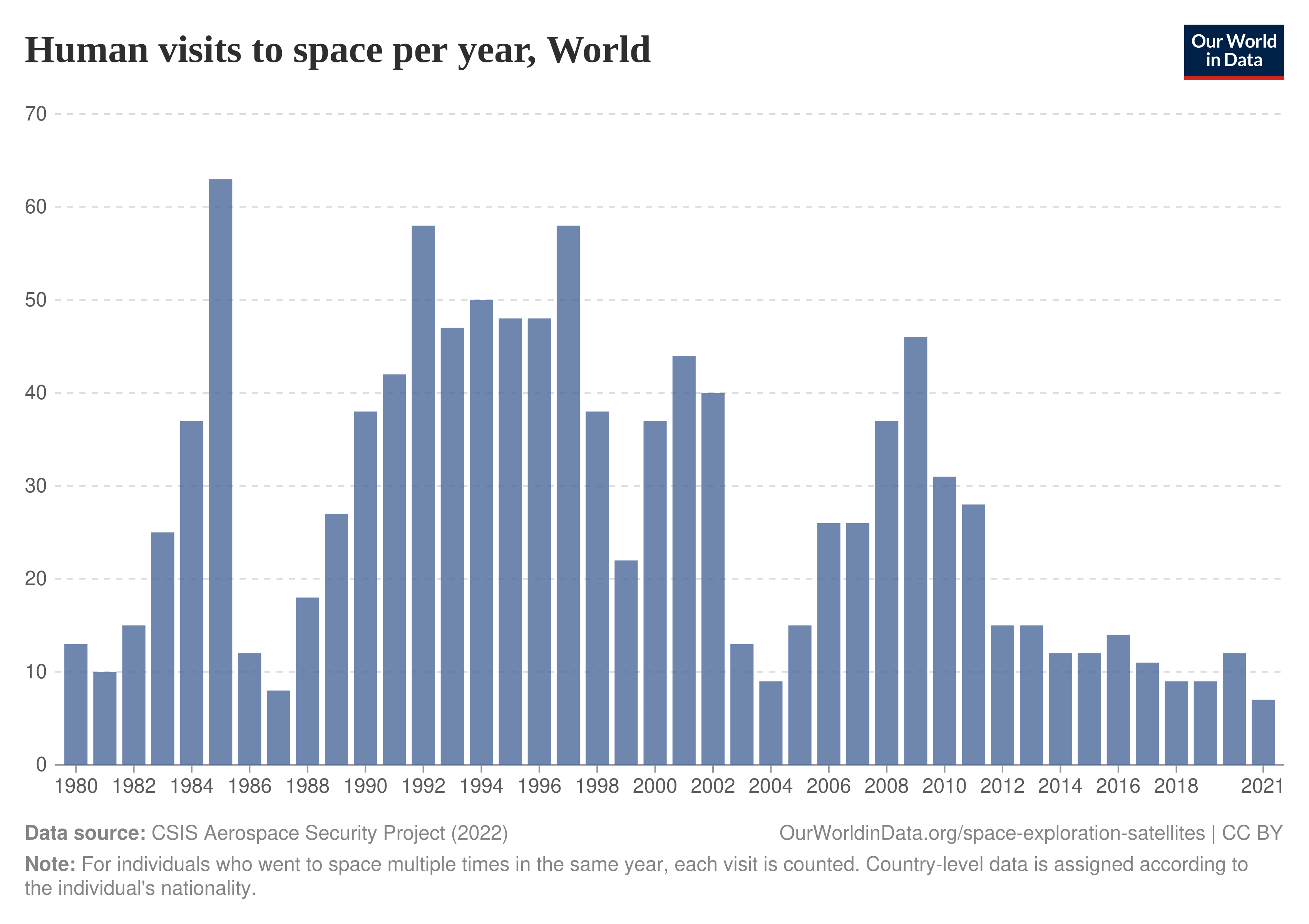
📆 January 28, 1986 : #Challenger https://en.wikipedia.org/wiki/Space_Shuttle_Challenger_disaster
📆 February 1, 2003 : #Columbia https://en.wikipedia.org/wiki/Space_Shuttle_Columbia_disaster
#OurWorldInData : https://ourworldindata.org/grapher/annual-space-visits
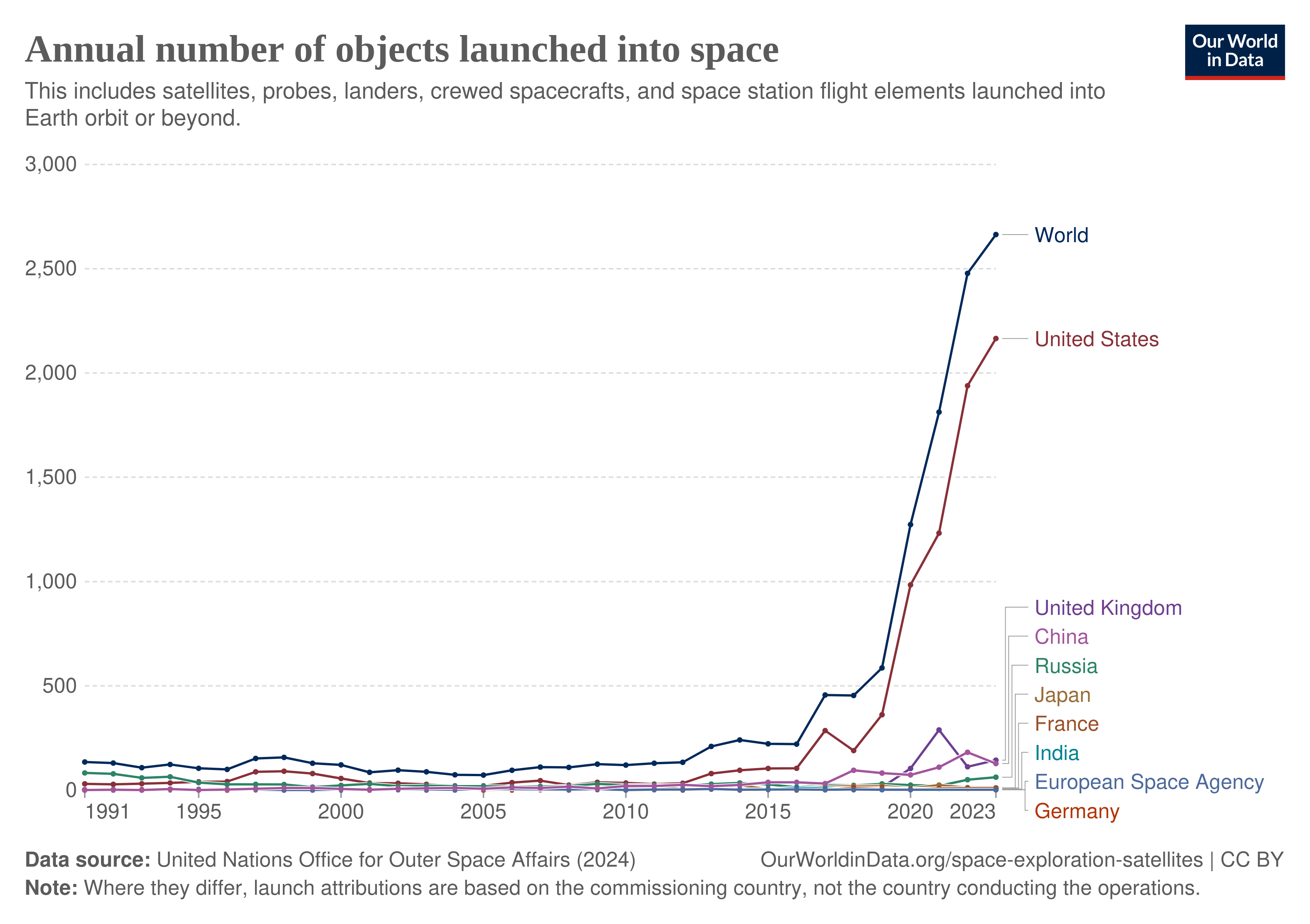
Annual number of objects 🛰️ launched into #space 🌌 https://ourworldindata.org/grapher/yearly-number-of-objects-launched-into-outer-space?time=1991..latest by #OurWorldInData
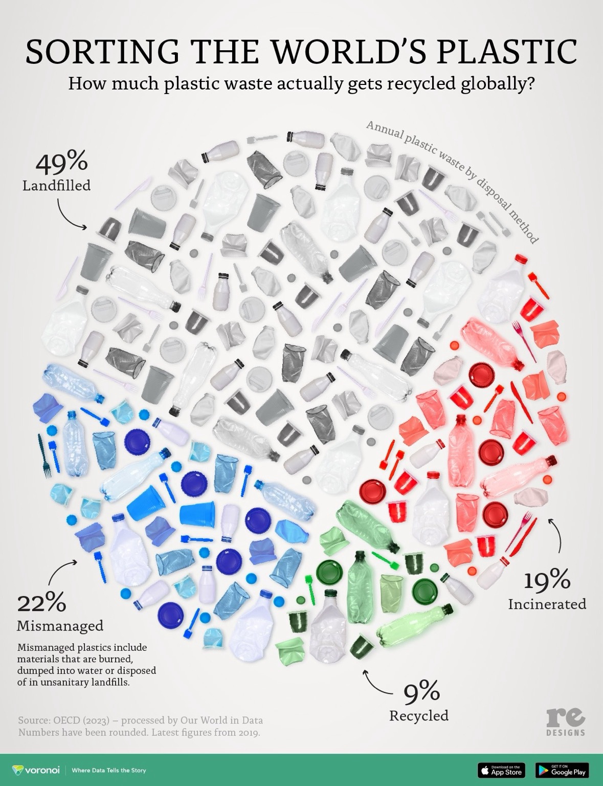
When you think we are recycling most of our plastics… Think again! https://www.voronoiapp.com/sustainability/How-much-plastic-waste-actually-gets-recycled-globally-3599 #voronoi #OurWorldInData #plasticavengers
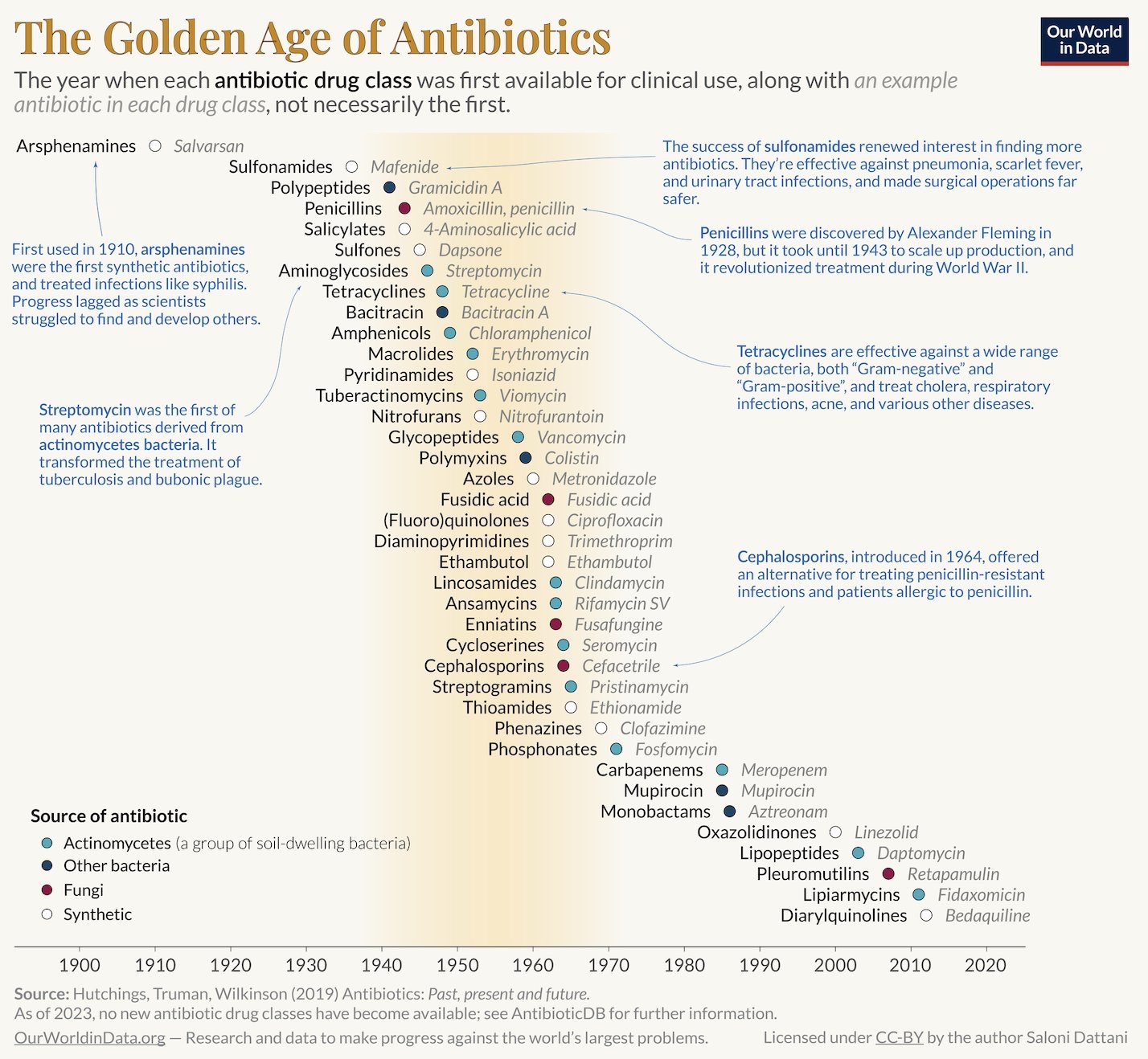
The Golden Age of Antibiotics Credit: #OurWorldInData #salonium
Do you think this connection affects the credibility of the data presented by Our World In Data? #OurWorldInData
Who Is Responsible For Climate Change? – Who Needs To Fix It?
Video from Kurzgesagt – In a Nutshell and Our World in Data (Jan 2024)
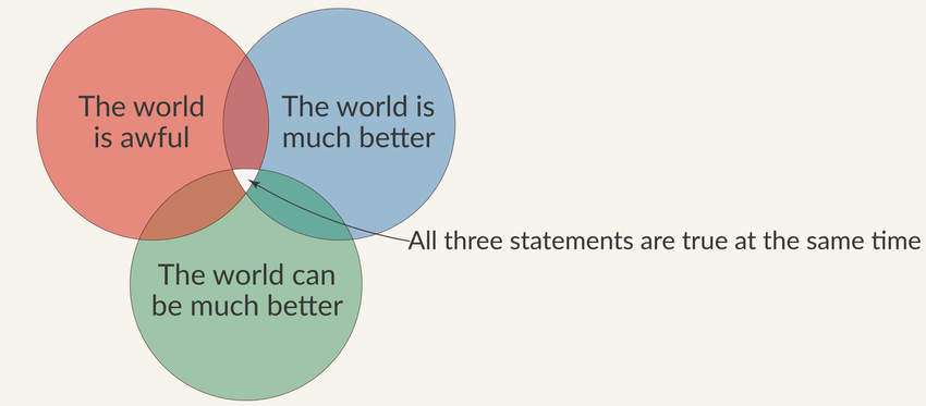
I've seen this multiple times and always thought it's fascinating.
It was out several years ago, and today Our World in Data shared it again on their social media, reminding us just how important this is.
Source: https://ourworldindata.org/much-better-awful-can-be-better (Our World in Data)
#ourworldindata #language #society #government #socialimpact #information #statement
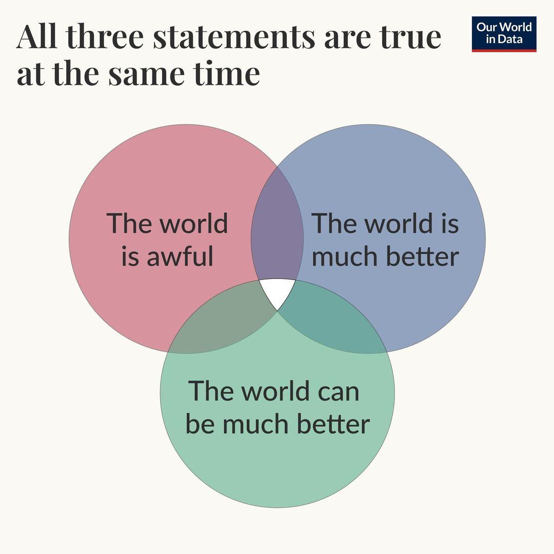
Ça parait contre-intuitif mais pourtant...
https://ourworldindata.org/much-better-awful-can-be-better
#TheWorldIsMuchBetter #TheWorldIsAwful #TheWorldCanBeMuchBetter
#OurWorldInData
Datengestützte Entscheidungen sind der beste Weg, um den größtmöglichen Nutzen von #Spenden zu erzielen.
Der Artikel zeigt, dass einige wohltätige Organisationen bis zu 100-mal effektiver sind als andere. Für rund 5.000 US-Dollar kann ein Leben gerettet werden. Durch die Unterstützung besonders effizienter Organisationen lässt sich der positive Einfluss von Spenden maximieren.
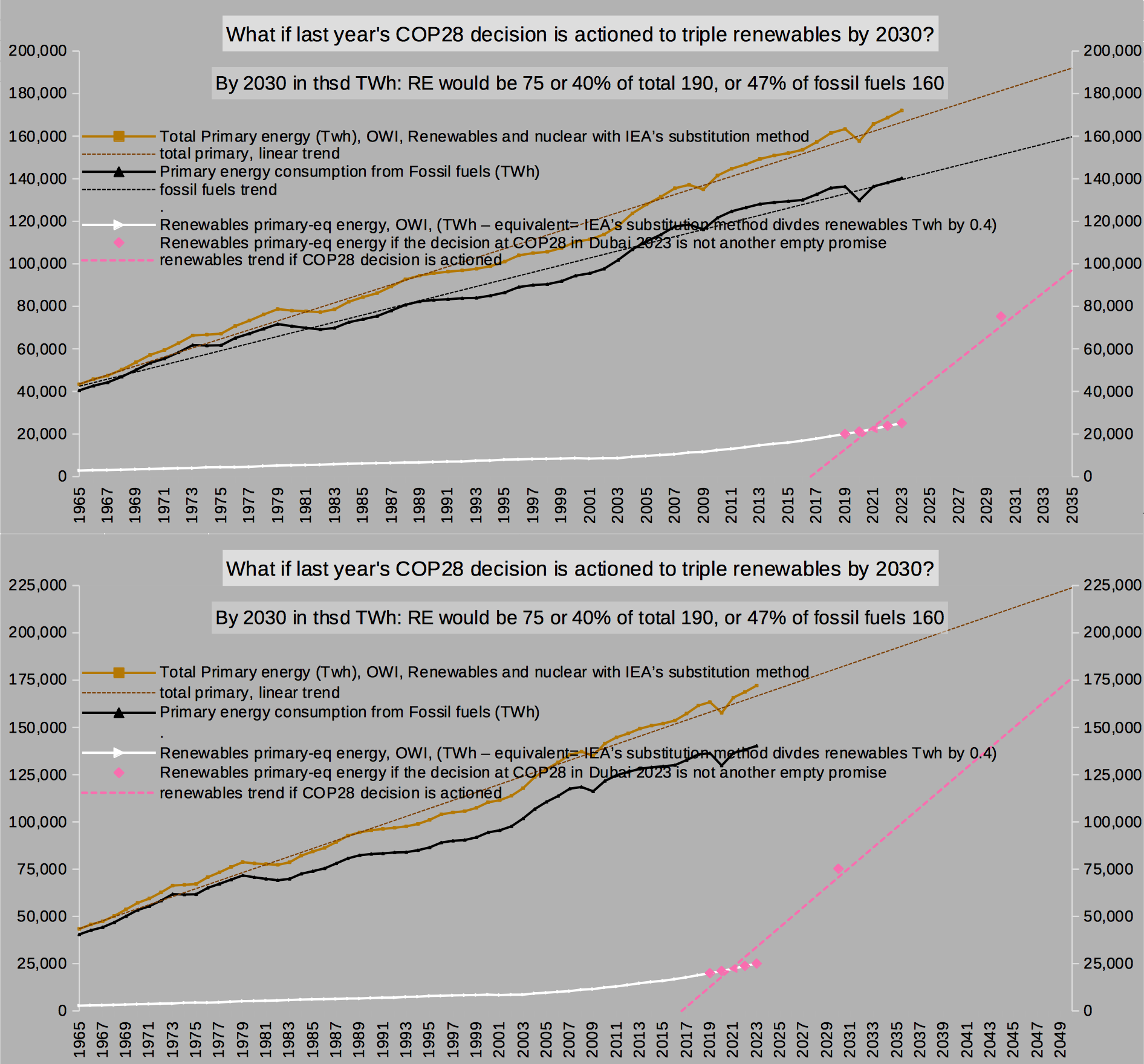
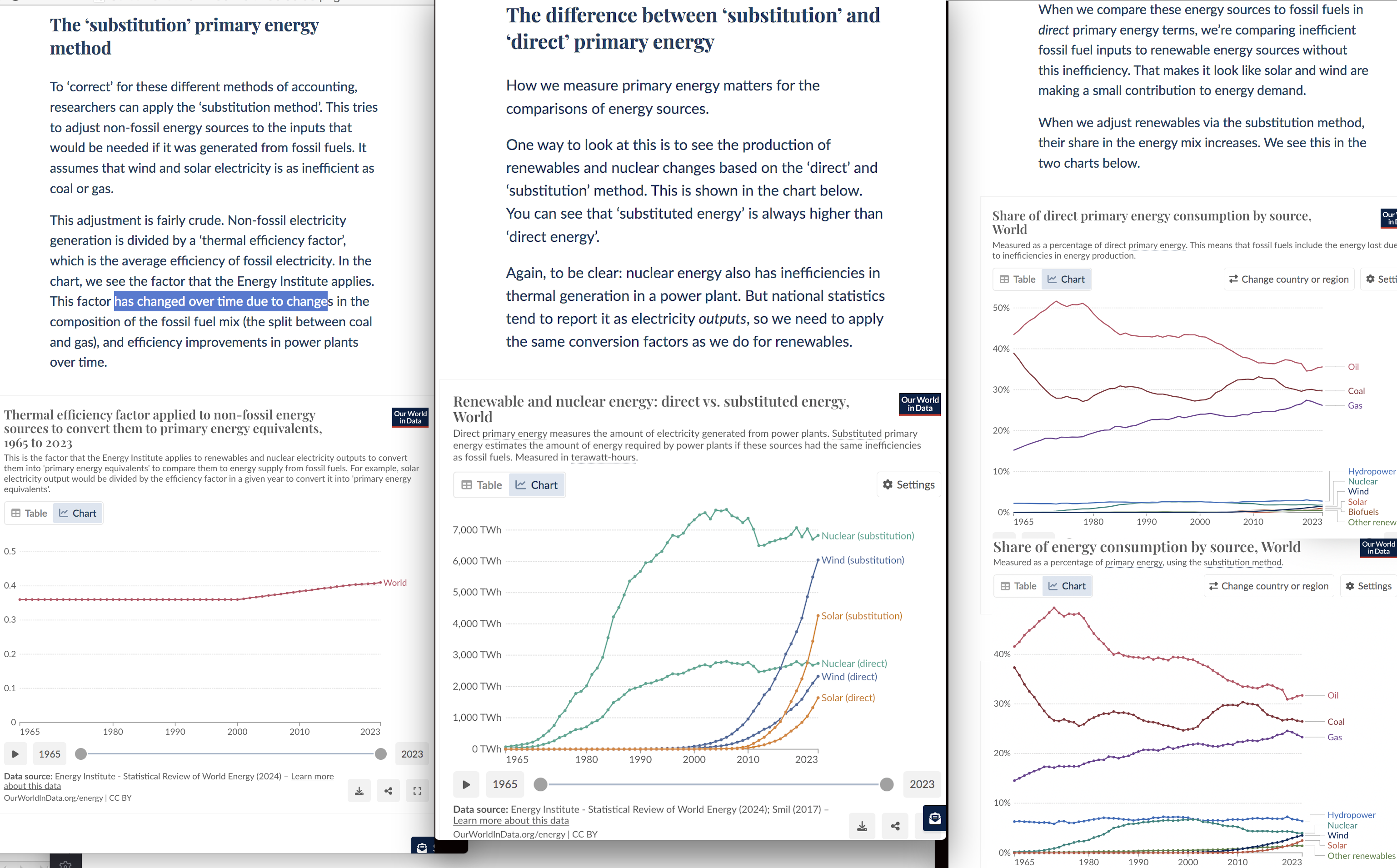
What if the agreement signed at COP28 last year is actioned: to triple renewables by 2030 over 2023?
Here's primary energy from #FossilFuels, #renewables & total. Renewables are adjusted to allow comparison with wasteful fossil energy. My data from #OurWorldInData has the IEA's substitution method applied.
(See image 2 and: https://ourworldindata.org/energy-substitution-method)
At linear growth in energy demand, tripling RE by 2030 actually meets Rockström's carbon law!!
Cause for celebration!! It really IS!
Yet no one reported on it AFAIK? We need to push our governments to achieve AND exceed that!! Exceeding it is important especially for rich nations. To allow for a likely underachievement in poorer nations.
Now, what this carbon law says: to halt warming at a bad but manageable level, the world needs to halve CO2 every decade starting in 2020.
Talking in percent is a prop, an aid for minds who think in %.
Meeting Rockström's carbon law doesn't say anything about the actual amount of CO2 that's emitted per decade. And only this number really counts.
But it is still something that the signed agreement at COP28 does meet this important gauge! Let's talk about it! Make it known! Make it become a demand!! #FridaysForFuture
Air conditioning causes around 3% of greenhouse gas emissions. How will this change in the future?
Ensuring the purchase of more efficient AC units and implementing energy efficiency standards can curb the rise in energy demand...

The 20 year lag is quite something. It tells a story. That's some patience, before seeing the impact on the population at large!
"Smoking was a 20th-century problem. [..] it became steadily more common. By the 1960s, it was extremely widespread: on average, American adults [bought] more than 10 cigarettes every day."
The world is awful. The world is much better. The world can be much better. https://www.youtube.com/watch?v=CGmdvdXoJ-8 #RationalAnimations #OurWorldInData
Som underviser i geografi er jeg rigtig glad for webstedet #OurWorldInData, der sætter både mig selv og eleverne i stand til at finde opdateret information om relevante emner som f.eks. befolkning, økonomi, energi og sundhed - og lave overbevisende figurer.
Det er derfor en god nyhed at de er sikret støtte til at fortsætte det gode arbejde flere år frem.
https://ourworldindata.org/wellcome-supports-our-world-in-data-to-expand-work-on-global-health
How much warming in the middle #Miocene 15million years ago came from methane?
Methane is not constrained at all for the Miocene.
But I did the maths –yet I also warn you: I am maths dyslexic. 😁
tldr: with assumed 10 times more wetlands than today and all of the remaining landmass assumed to be like today's tiny "wild rest",
CH4 emissions were 2124 Mt per year.
Which amounted to 6608 ppb CH4 in the atmosphere which in itself caused +2.1°C .
CO2 in 15Ma is not well constrained either. (see below)
I calculate 560ppm to have contributed 3°C (current science working theory for ECS ±1).
So methane 2.1°C and CO2 3°C on their own, omitting all other climate factors, caused +5.1°C in the Miocene.
The breakdown of the numbers follows. With links.
# CO2:
Hoenisch et al 2023 published meticulously revised CO2 values from global #d13C proxies https://paleo-co2.org , their considered-best proxies are all oceanic in origin.
The chart #1 of 1milion years 15 million years ago, shows #Hoenisch ' s CO2 proxies as the horizontal lines. I chose to fill the gaps with repeated values between the rare data points. So each line segment really is only 1 data point at its right-most end.
560 ppm CO2 seems an okay guess, no?
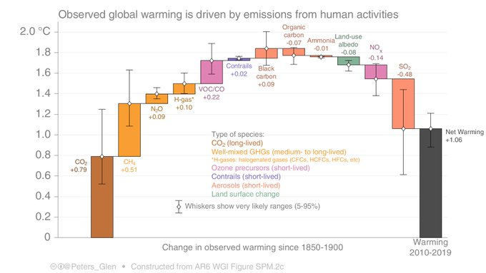
@Peters_Glen did a cool chart, more intuitive than the one in #AR6, I think. See pic 2 or his tweet where he plots the various greenhouse gases with their warming contribution 2010-2019: https://x.com/Peters_Glen/status/1431873249449680901
The average CH4 concentration in the decade 2010-2019 was 1840ppb (NOAA) and caused +0.51°C as per Glen's chart.
From Glen's chart follows my secret methane formula 😁
1 Mt methane <=> 3.111 ppb <=> 0.001 ºC
If emissions in 15Ma were 2124 Mt CH4 (see #landmass below), it resulted in 2.12°C at a concentration of 6608 ppb.
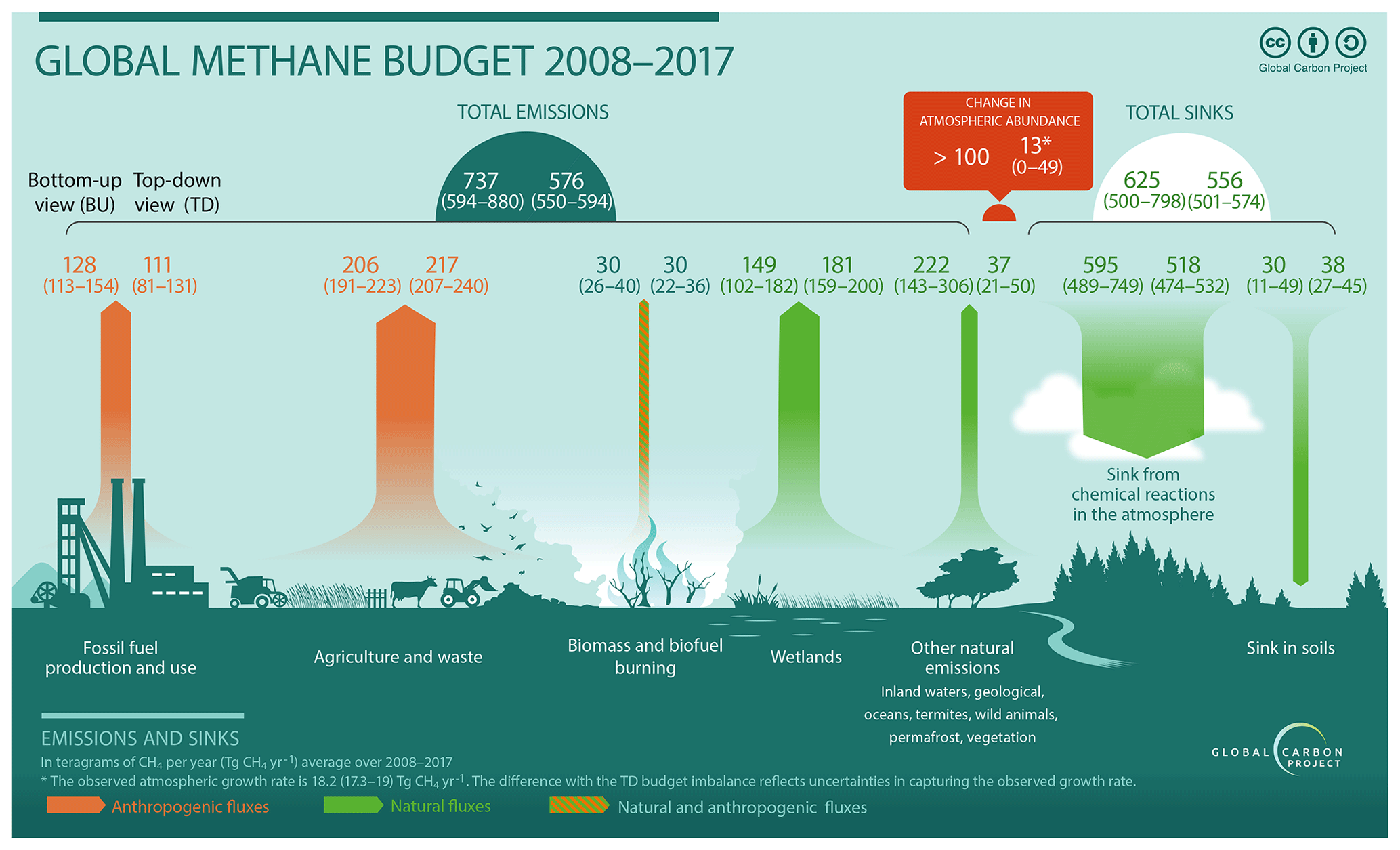
According to the Global Methane Budget by #GlobalCarbonProject : https://essd.copernicus.org/articles/12/1561/2020/
emissions from the "wild rest" 2008-2017 were 222 Mt CH4 annually . See picture 3.
The wild rest today is 54mio km2, according to #OurWorldInData https://ourworldindata.org/global-land-for-agriculture
Wild rest: 222 Mt CH4 from 54mio km2 = 4.1 t CH4 / km2.
Emissions from wetlands 2008-2017 were 180Mt CH4 (Tg=Mt) .
They cover 4.37% of the total land mass: https://ourworldindata.org/grapher/coverage-of-wetlands?tab=chart&country=~OWID_WRL
4.37% of 141mio km2 total is:
Wetlands 6.2mio km2.
Wetlands: 180 Mt from 6.2 km2 = 30 t CH4 / km2.
In 15Ma Miocene, 10 times more wetlands would have been
62 mio km2.
And
wild rest 79 mio km2.
wetlands 62mio km2 times 30t CH4 = 1800 Mt CH4
wild rest 79 mio km2 times 4.1t CH4 = 324 Mt CH4.
Wetlands plus wild rest:
1800 Mt + 324 Mt = 2124 Mt CH4
secret methane formula:
1 Mt methane <=> 3.111 ppb <=> 0.001 ºC
2124 Mt <=> 6608 ppb <=> 2.12°C
Why do I assume that wetlands were 10x more than today, tho? Why not 15, 20 or 5 times more?
Dunno. Well, humans have unwetted lotsa wetlands since the invention of agriculture in the #Holocene. (Btw, the area of today's dried peatland alone emits 2Gt CO2 per year. See table on dried wetland areas and their emissions GHG:
https://www.nature.com/articles/s41467-020-15499-z/tables/2 #Günther et al 2020, based on IPCC guidelines for wetlands https://www.ipcc.ch/publication/2013-supplement-to-the-2006-ipcc-guidelines-for-national-greenhouse-gas-inventories-wetlands/ )
Hard to tell what area was covered by wetlands in the previous interglacial 126thsd years ago.
And in the middle Miocene, 15Ma?
My thinking goes like this:
The #Sahara was still forested 15Ma. As was the Gobi Desert probably. The prairies in the US were still forested, even #Greenland and #Antarctica. Northern #Russia had much more land mass back then, too.
Some of the different vegetation compared to pre-Holocene was due to different topography: the Rockies and Alpes were much, much lower, the high mountain ranges in East Asia didn't exist. #Australia was 15° further South. See also #Steinthordottir et al 2021 in "Miocene The Future Of The Past https://agupubs.onlinelibrary.wiley.com/doi/full/10.1029/2020PA004037
And the whole special Miocene issue:
https://agupubs.onlinelibrary.wiley.com/doi/toc/10.1002/(ISSN)2572-4525.Miocene1
All land area had gap-less biomes growing. Mostly forests. What do forests do? Away from the coast, within the continents, forests control the hydrological cycle, how much evaporates and how much it rains. All biomes do, but forests most.
The more forests there are, the more it rains. Uninterrupted plant cover with its propagating rain cycle hinders deserts from forming in the heart of the continents, too.
Also, air holds 7% more water per 1°C warming, raising the potential rain amount.
Now, if it rains a lot, and depending on the topography, land is inundated temporary, seasonally or permanently, methane-producing microbes in the soil get to work presto, eat carbon and fart CH4.
The warmer it is, the more the microbes work.
But why 10x more wetlands?
Why not 7 or 15x?
Dunno. 10 feels right. And 6608ppb is nicely close to a guesstimate of mine that mid Miocene CH4 concentration cd have been 7000 ppb.
Maybe 400ppb came from huge animals, happily roaming among giant trees.
Brazil's Giant Sloth? The "wild rest" in the Miocene was HUGE! And cute.
#FridaysForFuture
#anloCH4