> if ... the null hypothesis were true (i.e., social media does not cause harm to teen mental health), then the published studies would just reflect random noise2 and Type I errors (believing something that is false). In that case, we’d see experimental studies producing a wide range of findings, including many that showed benefits to mental health from using social media (or that showed harm to those who go off of social media for a few weeks). Yet there are hardly any such experimental findings.
https://www.afterbabel.com/p/phone-based-childhood-cause-epidemic
#StatisticsClass #JonathanHaidt
#StatisticsClass
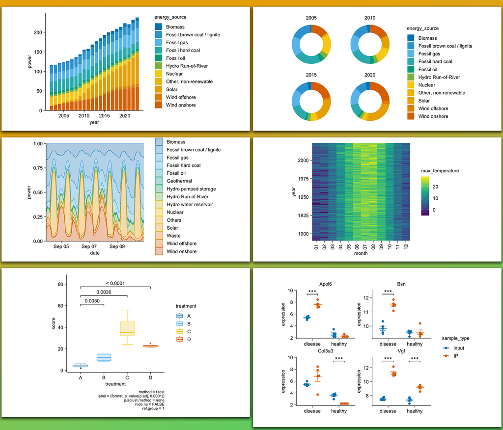
I recently discovered the tidyplots package in R, and it’s impressive how effortlessly it enables you to create beautiful, publication-ready plots.
The example visualizations shown here were created by the package author, Jan Broder Engler, and are featured on the tidyplots website: https://jbengler.github.io/tidyplots/
Click this link for detailed information: https://statisticsglobe.com/online-course-data-visualization-ggplot2-r
#statisticsclass #datavisualization #advancedanalytics #rprogramminglanguage #visualanalytics #package #tidyverse
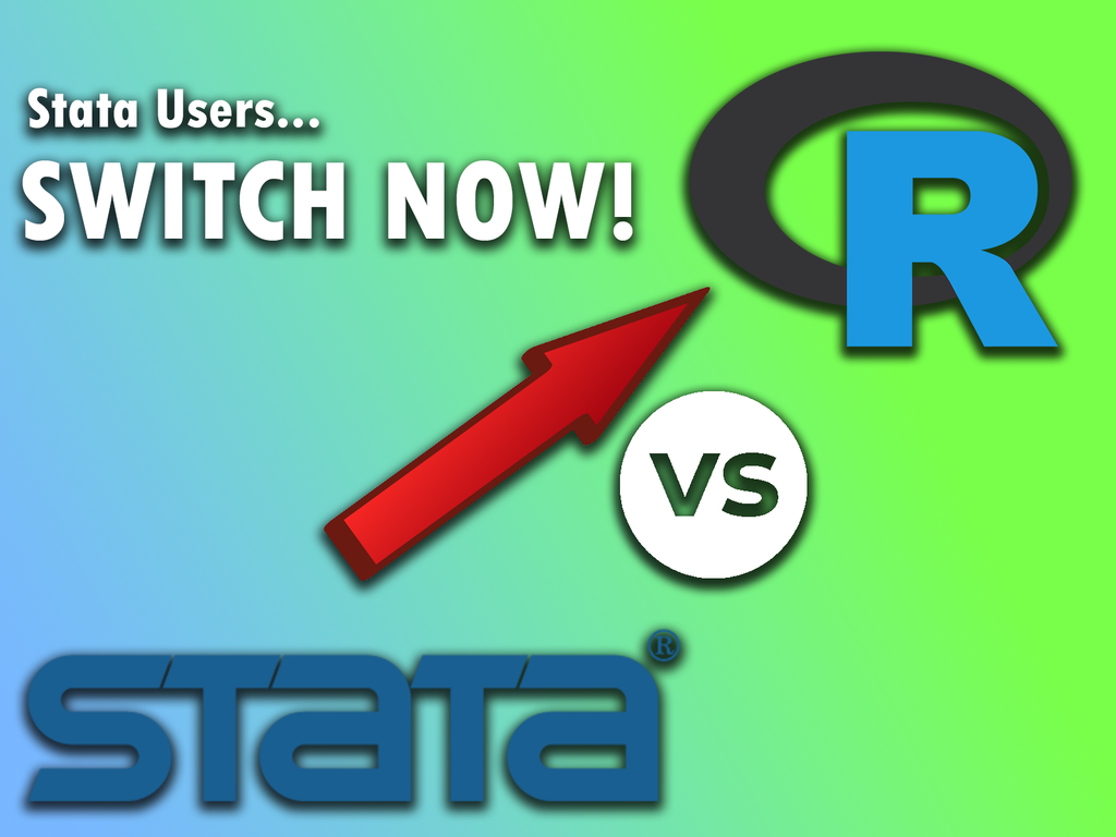
If you're a Stata user, you should switch to R now!
Thinking about switching to R? Check out my online course for absolute beginners in R programming.
Click this link for detailed information: https://statisticsglobe.com/online-course-r-introduction
#advancedanalytics #data #package #datasciencecourse #statisticsclass #rprogramminglanguage
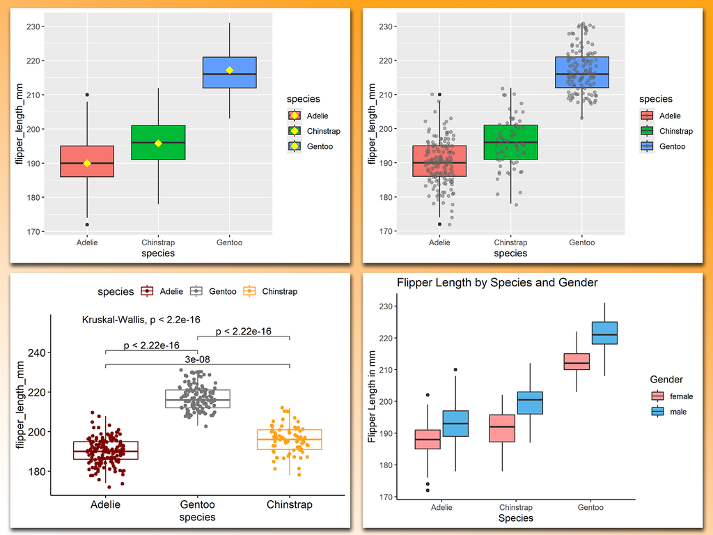
Basic boxplots are often not the best way to visualize your data! They can hide important information, such as the distribution of individual data points or group-specific differences.
The attached visual showcases several ways to enhance boxplots.
All of these examples were created using ggplot2 and extensions in R.
Click this link for detailed information: https://statisticsglobe.com/online-course-data-visualization-ggplot2-r
#statisticsclass #datavisualization #advancedanalytics #rprogramminglanguage #visualanalytics #package

> .. example in the success of NAVY test flights...examination of Israeli test flights had shown that pilots who did well on one test flight usually did not fare as well on their..[next] flight. Overlooking the presence of regression to the mean, the Israeli flight instructors concluded that the praising the pilots was hindering the pilots ability... the decreases were.. part of a larger picture that involved #RegressionToTheMean.
https://economics-files.pomona.edu/garysmith/econ190/Econ190%202015/Jacob%20Wilson.pdf
#StatisticsClass #RegressionToMean
The Graphs and Statistics are fascinating in this UN Report. It might provide good exercises for a data or statistcs class: redesign the pie charts, find the original figures and design tables... Just learn from it.. It's a shame the text was garbled when I tried to copy direct from the .pdf..
https://www.unodc.org/documents/data-and-analysis/gsh/2023/Global_study_on_homicide_2023_web.pdf
#HomicideRates #MurderRate #StatisticsClass #LearningStatistics #UncertaintyGraphs #UncertaintyVisualization
🧵
> ... de Moivre's equation in action. The variation of the mean is inversely proportional to the sample size, so small counties display much greater variation than large counties. A county with, say, 100 inhabitants that has no cancer deaths would be in the lowest category. But if it has 1 cancer death it would be among the highest. Counties like Los Angeles, Cook or Miami-Dade with millions of inhabitants do not bounce around like that.
@bsmall2@writing.exchange
#StatisticsClass #Variance #EstimatingMeans
In my opinion, R should be your go-to programming language!
Ready to explore the world of R? I've created a comprehensive online course that introduces R for beginners.
More information: https://statisticsglobe.com/online-course-r-introduction
#datavisualization #rstudio #dataanalytics #datasciencetraining #statisticsclass
> Probability is expectation founded upon partial knowledge. A perfect acquaintance with all the circumstances affecting the occurrence of an event would change expectation into certainty, and leave neither room nor demand for a theory of probabilities.
https://gutenberg.org/ebooks/15114
#Boole #GeorgeBoole #StatisticsClass #GutenbergEbook
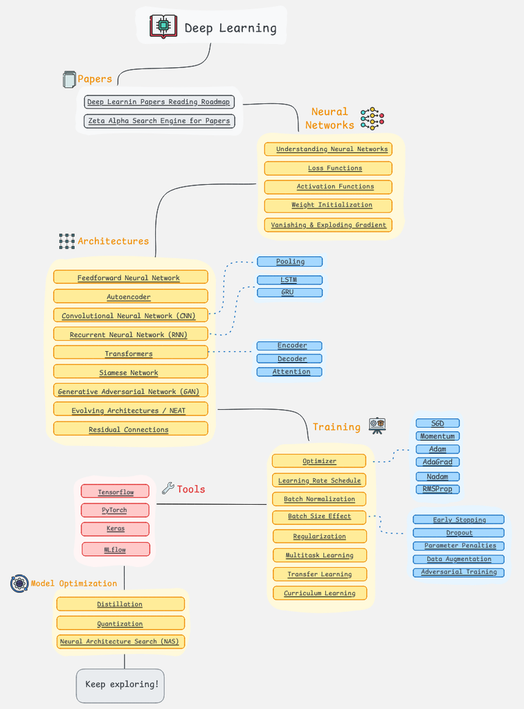
If you're looking to master Deep Learning, following a structured roadmap is key to navigating this advanced and ever-evolving field.
I came across this roadmap on the AIGENTS website, and what really stands out is its interactive format. Each element is clickable, offering AI-powered insights and resources that make it easier to dive deeper into each topic. Check out this link for more details: https://aigents.co/learn/roadmaps/deep-learning-roadmap
> Bertrand Russell has this great quote, “This is one of those views which are so absurd that only very learned men could possibly adopt them.” On the other hand, there’s this from George Orwell: “To see what is in front of one’s nose needs a constant struggle.”
https://statmodeling.stat.columbia.edu/2019/06/25/another-regression-discontinuity-disaster-and/
#StatisticsClass #AndrewGelman #BertrandRussel #GeorgeOrwell
> The term histogram was first used by Karl Pearson in his 1895 lectures on statistical graphics. The stem-and-leaf plot, which is a variant of the histogram, was introduced by the U.S. statistician John Tukey in 1970. In the words of Tukey,
> “Whereas a histogram uses a nonquantitative mark to indicate a data value, clearly the best type of mark is a digit.”
#JohnTukey in #SheldonMRoss #IntroductoryStatistics #StatisticsClass #Histogram #StemAndLeafPlot
This might be helpful in a #StatisticsClass to keep track of where you are in the sequence...
I'll have to try to watch some of the videos, the book pages and blog posts have been fascinating so far...
https://xcelab.net/rmpubs/sr2/statisticalrethinking2_chapters1and2.pdf
https://xcelab.net/rm/
#RichardMcElreath #RethinkingStatistics #StatisticsClass
The command line is the best tool...
... the command line is more powerful... saves you time and fulfills ethical obligations. With a command script, each analysis documents itself... years from now you can come back to your analysis and replicate it exactly. You can re-use your old files and send them to colleagues. Pointing and clicking, however, leaves no trail of breadcrumbs...
https://xcelab.net/rm/
#RichardMcElreath in #RethinkingStatistics book #StatisticsClass #EthicalCLI
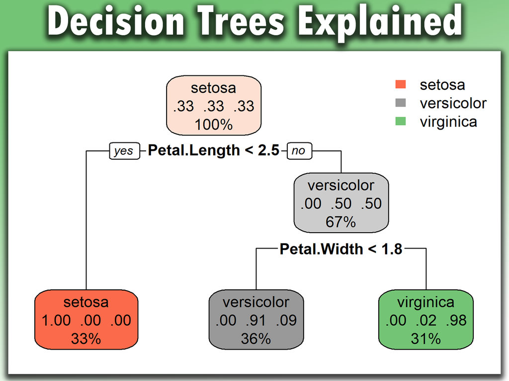
Decision trees are a powerful tool in data science for making decisions and predictions based on data. They work by splitting data into branches based on specific criteria, allowing for clear and interpretable decisions. When used correctly, decision trees can significantly enhance the accuracy and interpretability of models.
Learn more: https://statisticsglobe.com/online-course-statistical-methods-r
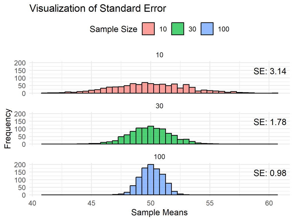
The Standard Error measures how much a sample statistic, like the mean, is expected to vary from the true population parameter. It helps us understand the precision of our estimates and how much confidence we can place in our results.
Learn more: https://statisticsglobe.com/online-course-statistical-methods-r

> I strongly recommend that you make it a habit to avoid all statistical language. Keep it simple and stick to what you know for sure. There is absolutely nothing wrong with speaking of the “range over which points spread,” because this phrase means exactly what it says...
#PhilipKJanert in _Data Analysis with Open Source Tools_ #DataAnalysis #StatisticsClass #StatisticalLanguage
Never thought about dice before, how "snake eyes" should be as probable as 12s and much less than 7s... Vague rainy Saturday so I started putting those musings into Racket with Graphite, Scribble and `random. I guess stay-at-home days are needed/healthy every one in a while...
> the theory of.. probability... unsavoury origin.. from... nobility of France.. competing in a race to ruin at the gaming tables.
https://codeberg.org/bsmall2/statistics-class-notes
#RacketLang #StatisticsClass #GoofingWithCoding #RaceToRuin
I wanted to make a visualization using the survival numbers for Stepehen Jay Gould's cancer in _The Median is Not The Message_. It might be a good way to see, and remember "right-skewed" and be an anecdote for use in the introductory section "Why learn statistics" at the start of a course. But I don't know how to get the numbers so I'll follow the suggestion to use Japanese age data for a left-skewed example.
https://www.e-stat.go.jp/en/stat-search/files?layout=dataset&query=population%20by%20age
#StatisticsClass #SkewnessLearning
Understanding the Law of Large Numbers (LLN) is crucial for anyone working with statistics and probability. The LLN states that as the number of trials in an experiment increases, the average of the results becomes closer to the expected value.
Visualization: https://en.wikipedia.org/wiki/Law_of_large_numbers#/media/File:DiffusionMicroMacro.gif
Click this link for detailed information: https://statisticsglobe.com/law-of-large-numbers
#datastructure #RStudio #RStats #ggplot2 #statisticsclass #DataAnalytics #DataViz
Client Info
Server: https://mastodon.social
Version: 2025.07
Repository: https://github.com/cyevgeniy/lmst