My visualisation of Australian fruit and veg seasonality made the Information is Beautiful awards longlist.
As the food bowl of Australia was flooded thanks to #CycloneAlfred, the information in the guide may be off for a bit until we recover!
My visualisation of Australian fruit and veg seasonality made the Information is Beautiful awards longlist.
As the food bowl of Australia was flooded thanks to #CycloneAlfred, the information in the guide may be off for a bit until we recover!
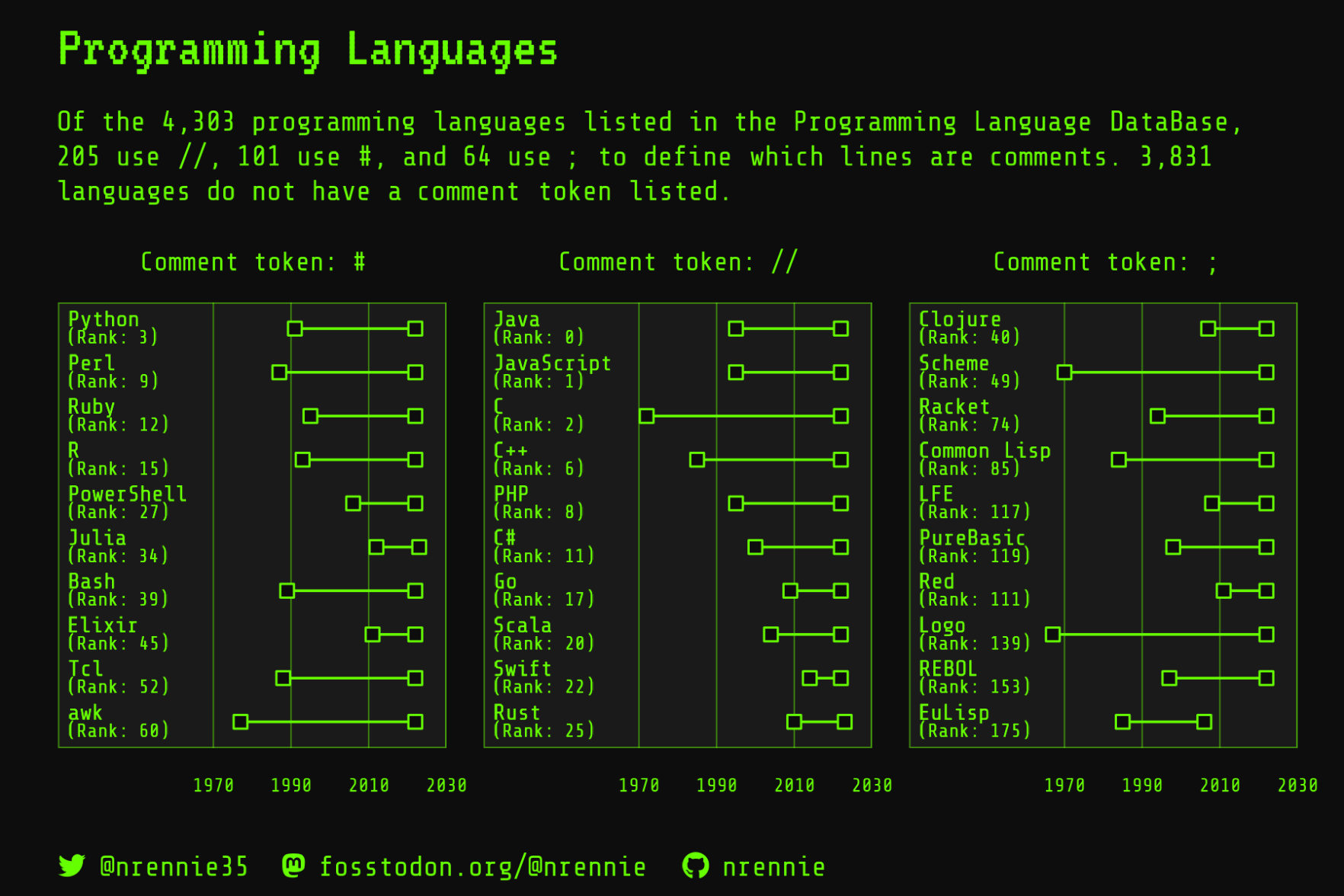
Neat. My "Analyzing fediverse followers of my creative online bots" data visualization was accepted for this year's Information is Beautiful Awards' longlist.
#data #dataviz #fediverse #CreativeBots #InformationIsBeautiful #InformationIsBeautifulAwards #IIBA2024
@NanetteRissler @jberenike @fotis_jannidis @u_henny
Nun, aber das ist vielleicht zu naheliegend, man könnte ja mit Designerinnen und Designern reden.
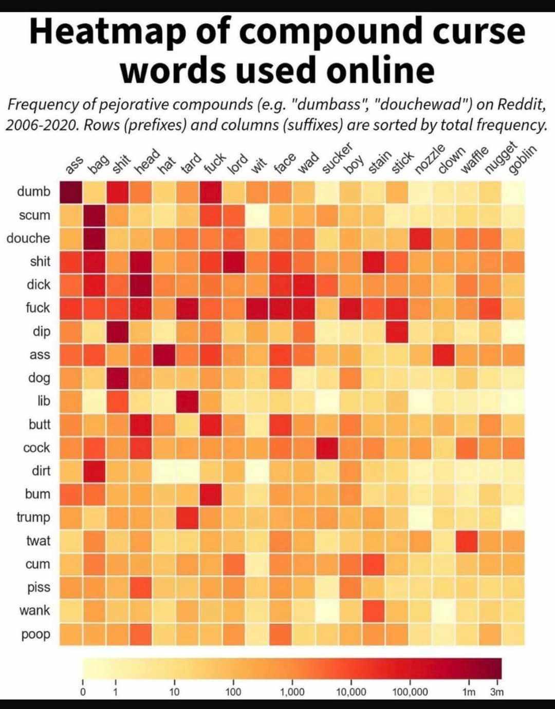
I did it. I have found the worst data visualisation ever.
Heat map of compound swearwords. This is the kind of information I care about.
#heatmap #information #informationisbeautiful #swearwords #reddit
I have very ambivalent feelings about data visualization awards. But having said that... It feels good when your work wins an #InformationIsBeautiful gold, and is is voted the Most Beautiful overall!
See the entry here https://www.informationisbeautifulawards.com/showcase/6530-atlas-of-sustainable-development-goals-2023 or go directly to the Sustainable Development Goals Atlas https://datatopics.worldbank.org/sdgatlas
Congrats to the whole team, and especially to the dataviz team, with @JanWillemTulp @dominikus and @al_ice_t
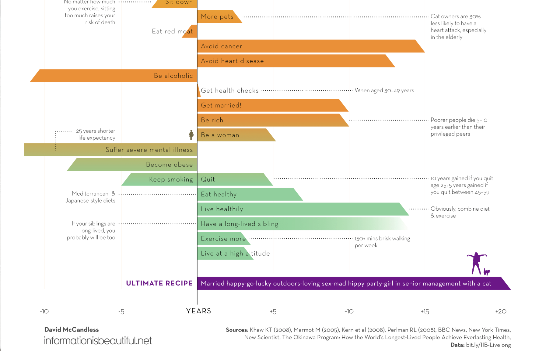
"Married. Happy go lucky. Outdoors loving. Sex mad. Hippy party girl. In sr mgmt. With😺."
Thx 🙏 @DavidMcCandless for the ultimate recipe. #InformationisBeautiful
https://informationisbeautiful.net/visualizations/what-could-really-increase-life-expectancy-lifespan-and-longevity/
My snake sightings data viz made the Information is Beautiful Awards 2023 Longlist alongside some spectacular entries this year 😊

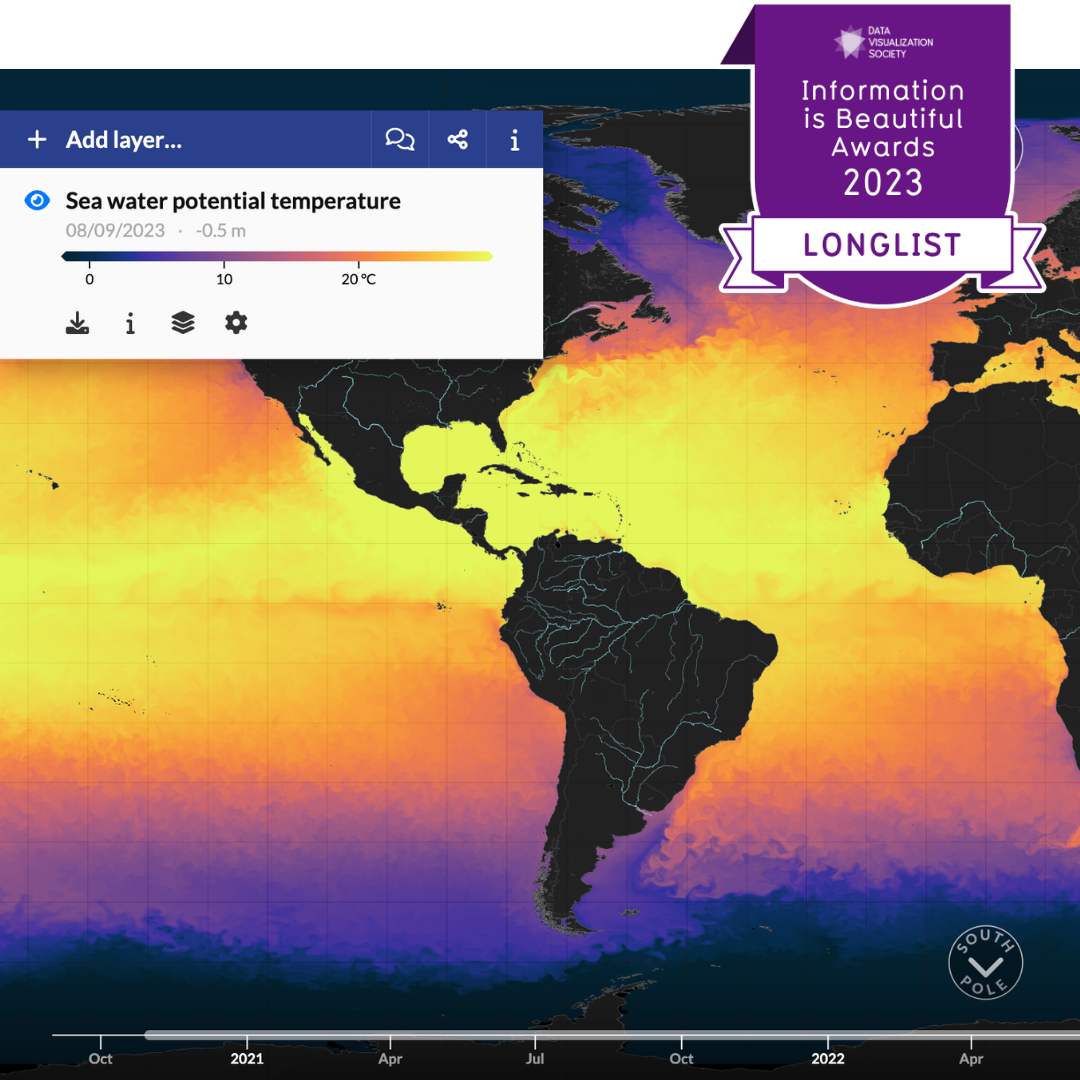
We're thrilled to share that our talented developers have been recognized for their outstanding work on MyOceanViewer 🎉✨
➡️ longlisted for the 2023 Information is Beautiful Awards!
#DataViz #IIBAwards #InformationIsBeautiful #RStats
https://bit.ly/44C5CVx
I'm very happy to see four of my data visualisations long-listed at the 2023 Information is Beautiful Awards! All of mine were made using #RStats, using publicly available data - most of them shared via #TidyTuesday!
You can see mine and other visualisations at: https://www.informationisbeautifulawards.com/showcase?award=2023
Stumbled across this uplifting news link: https://informationisbeautiful.net/beautifulnews/
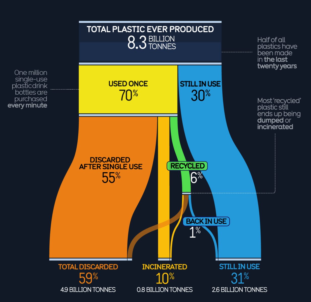
The truth about plastics.
#InformationisBeautiful
#ClimateCrisis #Ecocide #KillingOurselves
The #AGI iceberg...
so much more unseen below the surface...regulate #AI now.
#InformationisBeautiful
#DavidMcCandless
#LLM
https://informationisbeautiful.net/visualizations/the-rise-of-generative-ai-large-language-models-llms-like-chatgpt/?mc_cid=597dd8babd&mc_eid=44f25d98d1
Imagine this chart in 3yrs? 5yrs?Regulate #AI now.
No getting toothpaste back in tube.
#InformationisBeautiful
#DavidMcCandless
#LLM
https://informationisbeautiful.net/visualizations/the-rise-of-generative-ai-large-language-models-llms-like-chatgpt/?mc_cid=597dd8babd&mc_eid=44f25d98d1
Rather frightening, highlights the differences. I wonder if it would be possible to create a version that emphasised the similarities.
https://informationisbeautiful.net/visualizations/left-vs-right-us/
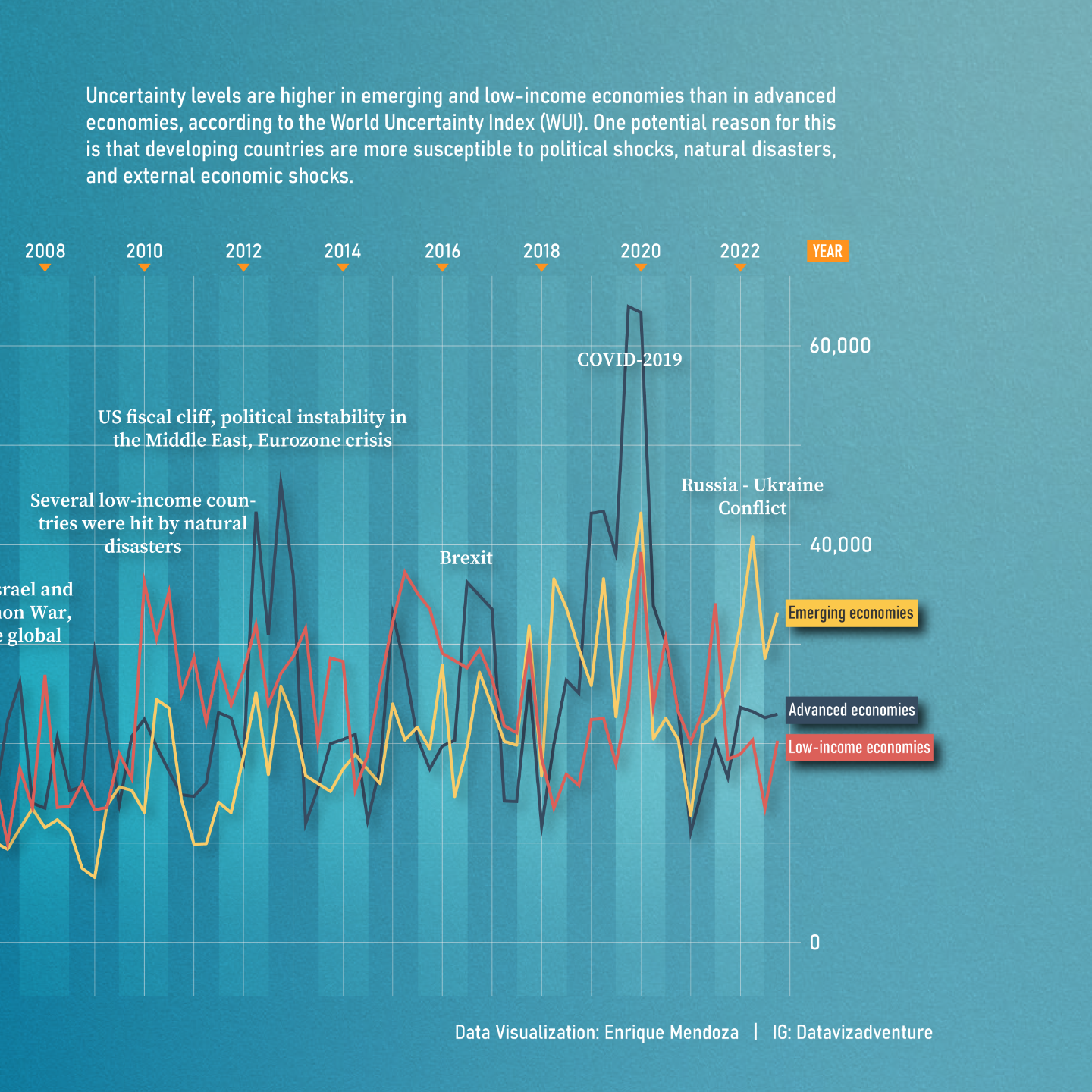
Uncertainty is a common feature in our daily lives, and it can affect us all regardless of where we live. The following dataviz shows that uncertainty is higher in emerging and low-income economies than in advanced economies.
.
.
.
.
.
.
.
#dataviz #datavisualization #informationdesign #data #infovis #datavizsociety #viz #uncertainty #worlduncertainty #design #informationisbeautiful #dataart #datajournalism #designer #datavizadventure #illustration

America’s 20 Biggest Tech Layoffs This Decade
"The events of the last few years could not have been predicted by anyone. From a global pandemic and remote work as the standard, to a subsequent hiring craze, rising inflation, and now, mass layoffs.
This visual puts the current layoffs in the tech industry in context and ranks the 20 biggest tech layoffs of the 2020s using data from the tracker, Layoffs.fyi."
#InfoGraphics
#InformationIsBeautiful
https://www.visualcapitalist.com/americas-20-biggest-tech-layoffs-since-2020/