Steam just added screen reader support in the latest Big Picture Mode beta. On the Deck. On SteamOS. On Linux.
Not hacked in. Not community-patched. Built-in. From Valve.
There's an accessibility tab. There's a screen reader. There's high-contrast mode, UI scaling, color filters, reduced motion, and more.
I can’t believe I’m saying this but: I need a Steam Deck now.
Accessibility isn’t just coming to gaming — it’s here, and it’s official.
Let’s make some noise so they keep going.
🔗 https://www.theverge.com/games/689922/steam-is-adding-screen-reader-support-and-other-accessibility-tools
#Accessibility #Gaming #SteamDeck #ScreenReader #Linux #valve
Chris
Service Designer at Fearless | Created the Monster List of UX Books: https://colvr.co/uxbks | he/him
Chris boosted:
@sebulon @libreoffice Where do you save your docs if not to a floppy disk?
Yeah, there’s probably a “reduce transparency” setting, but users shouldn’t have to dig into accessibility settings just to read text on the screen.
Text in Apple’s new liquid glass UI can be really hard to read depending on the background. If I can’t read it, then it has to be a nightmare for people low vision.
Chris boosted:
“Do Not Publish Your Designs on the Web with Figma Sites…”
https://adrianroselli.com/2025/05/do-not-publish-your-designs-on-the-web-with-figma-sites.html
Figma announced Figma Sites, letting you publish your Figma designs directly to the web like it’s 1997.
Chris boosted:
You are not your job search.
You are not a failed application.
You are not an algorithm's reject pile.
The system isn't broken—it's functioning exactly as designed.
Stop performing.
Stop contorting.
Stop thinking one more résumé tweak will crack the code.
https://brilliantcrank.com/you-are-not-your-job-search-redux/
R E A C T . R E P O S T . S H A R E .
Because you know someone who needs this right now.

Chris boosted:
I know I'm old man yelling at clouds, but I miss not only physical buttons on devices, but multiple physical buttons.
I'm really getting tired of the current trend seen on headphones. Hold for 5 seconds to turn on, hold 5 seconds to turn off. Tap once for volume up. Double tap for next song, triple tap to turn on noise canceling. Hold the button down for 20 seconds while patting your head and doing interpretive dance in order to pair Bluetooth.
Give me an on/off switch. Give me an analog volume wheel. Give me dedicated buttons for functions
It's like a generation of designers grew up with one button Apple mice, and forgot how much more simple doing actual work with dedicated buttons actually is
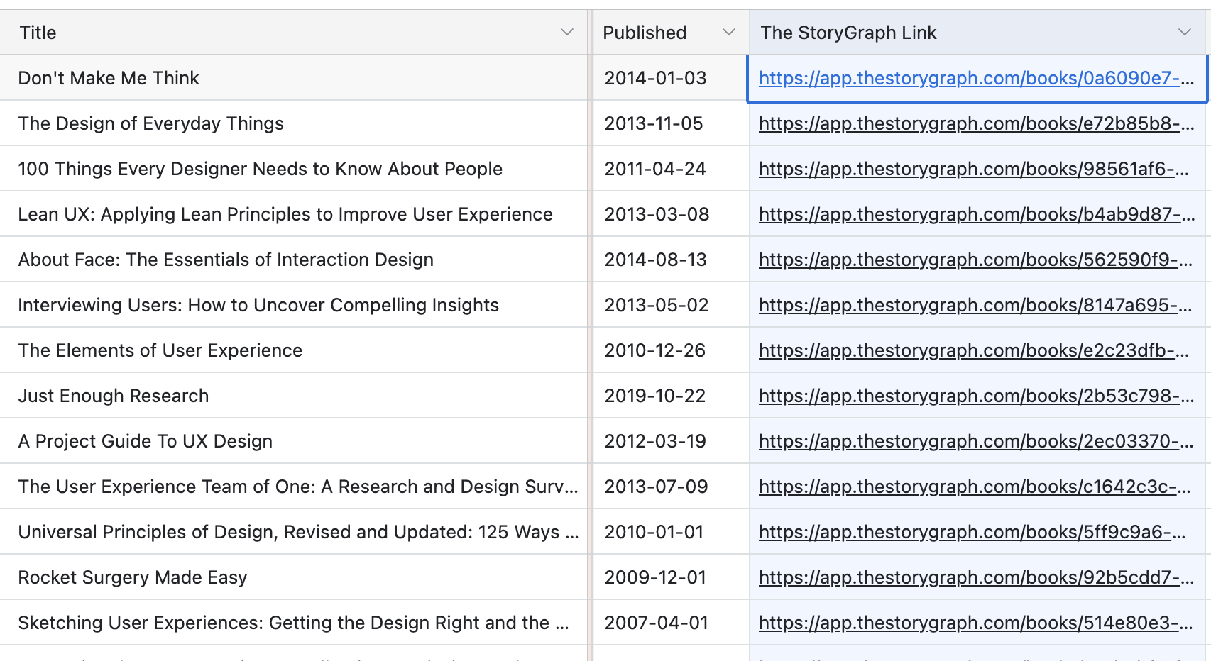
As a reminder, authors in the list have links to Mastodon (as well as Bluesky and their websites and blogs). Find them in the Authors with Links view.
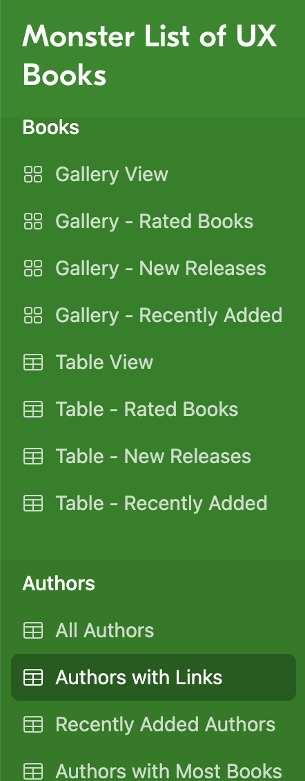
I've added The StoryGraph links for all books in the Monster List of UX Books:
https://www.airtable.com/universe/expqM3OWZoJkjl7wy/the-monster-list-of-ux-books
#ux #design #servicedesign #userresearch #usability #books #thestorygraph
@linc @simplebits I did. I looked at the knot before reading the post and though, “Is that a bowline? Oh, it’s upside down.”
@pixelfed What "newer formats" are supported? Does that include photos with the P3 color profile, or will they still get converted to sRGB?
What “newer formats” are supported? Does that include photos with the P3 color profile, or will they still get converted to sRGB?
@CindyG @chrisoliver I don’t know that it’s necessary uniform across an organization. It may be different depending on the department or project.
There’s another presentation from this conference (that I haven’t finished watching the recording of yet) that uses a different model where co-design isn’t the “best” type of participation but one of several types to choose from based on what’s appropriate and feasible for a given project.
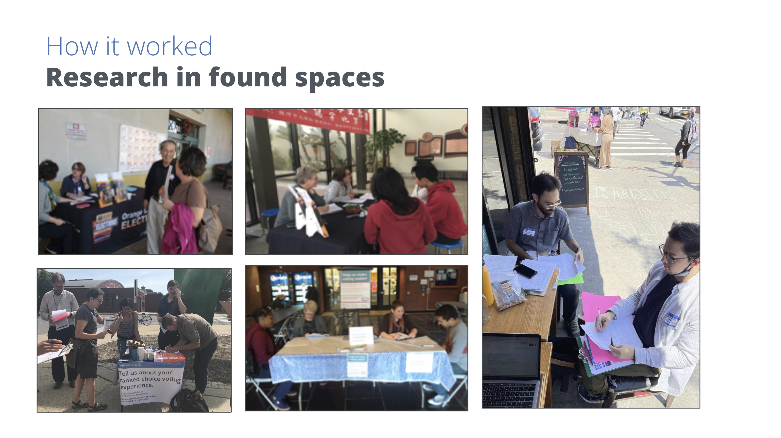
Whitney Quesenbery with the Center for Civic Design showed how they used research intercepts to “go where the people are” and interview them in everyday spaces in her presentation “Government 360” at #SDinGovVirtual.
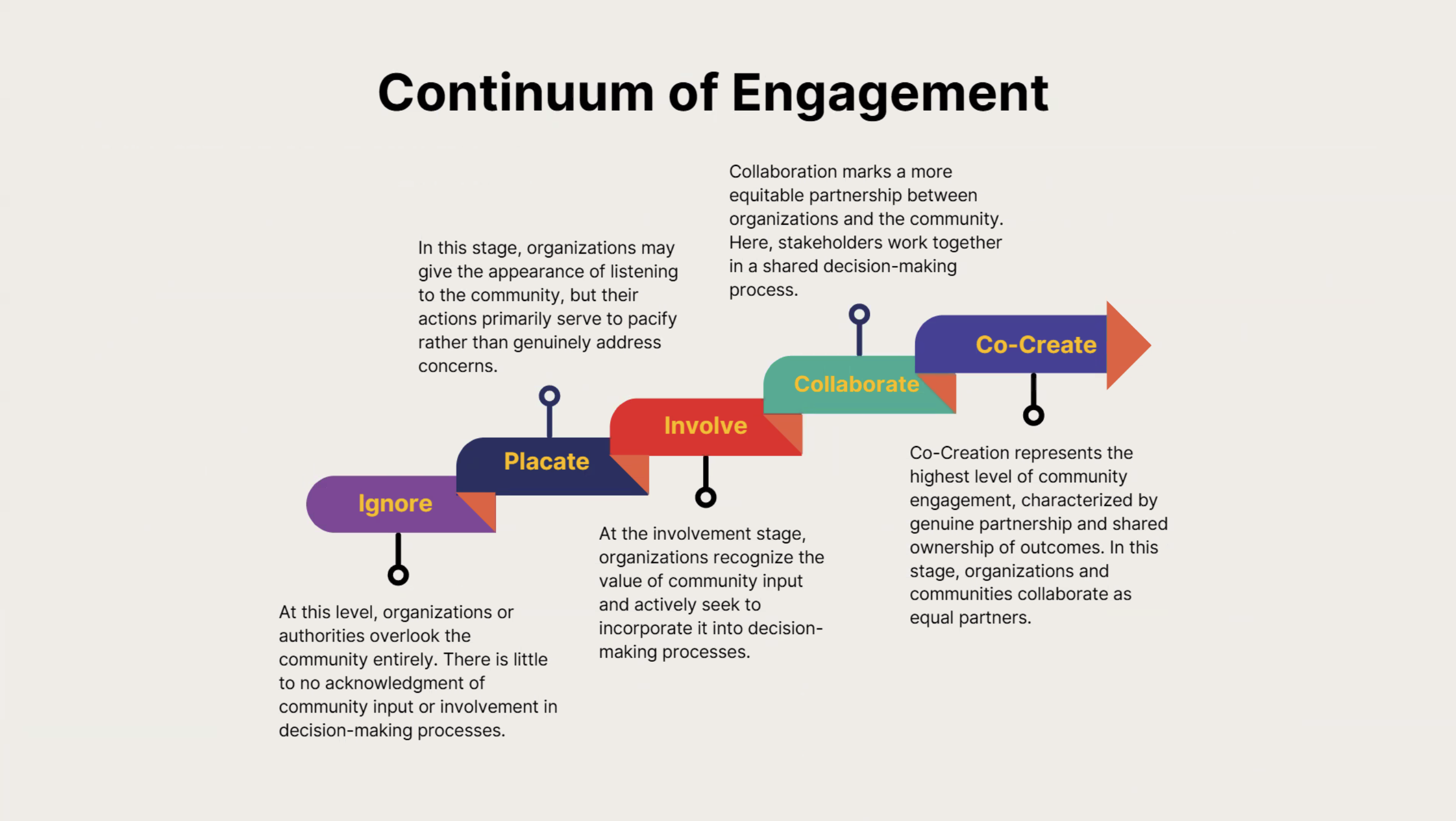
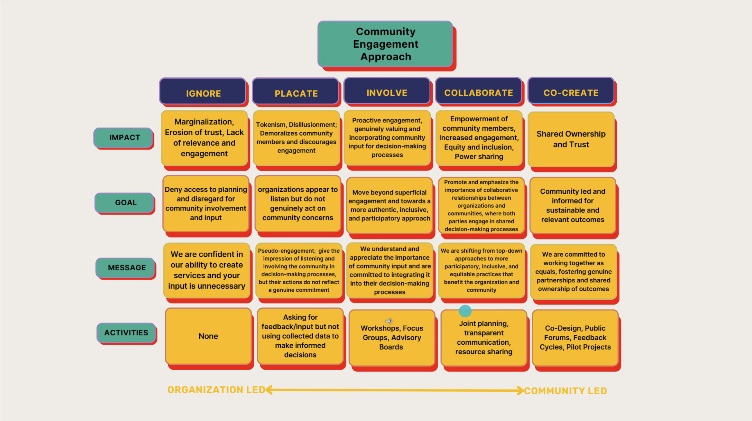
Samuel Martin and Pamela Javier with the Co-Design Institute shared the Continuum of Engagement and the Community Engagement Approach from ignoring to co-creation with the community in their talk "Sharing power: strategies from lived experts on engaging lived experts” at #SDinGovVirtual.
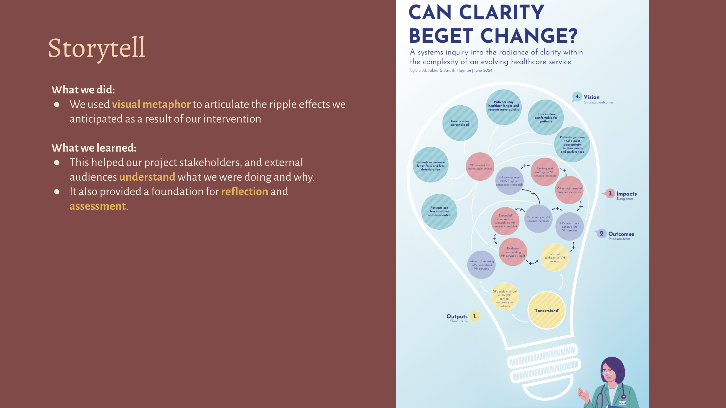
Sylvie Abookire shared this visual her team used to illustrate the ripple effects in a system they anticipated as a result of their intervention in her presentation, “From systems thinking to systems doing” at #SDinGovVirtual.
My head is swimming after a long day of great sessions at the #SDinGovVirtual 2025 conference. I’ll post some of my favorite takeaways later after I’ve had a chance to process everything.
Client Info
Server: https://mastodon.social
Version: 2025.04
Repository: https://github.com/cyevgeniy/lmst