#ClimateStripes

2025-07-28

orf.at/stories/3400929/

"Fatales Signal"

Internationaler Güter-Schiffsverkehr gibt sich alle Mühe die rosa, blauen und weißen Container auf den Frachtern so zu sortieren, dass sie nicht zufällig eine Trans-Flagge oder die Climate Stripes ergeben.
Es wäre ja schlimm fürs eigene Image, wenn sich die Industrie auf die Seite der Menschenrechte Stellen würde - auch unabsichtlich.

#TransPride #ClimateStripes #ShowYourStripes #NewsFreestyle

Frachter in Vogelpespektive. Container, die hauptsächlich in weiß, rot- und blau-Tönen gehalten sind, sind in 9er Reihen auf dem Schiff geordnet und erinnern dabei ein wenig an die Trans Flagge bzw an die Climate Stripes.
Anna-la-la-la, fa-la-la-lavenite@mastodon.nl
2025-07-03

De #climateStripes zijn bedacht door een hoogleraar van Reading. Ik vind het mega stoer dat ze ze laten zien op het meest kakkineuze roeievenement van Groot-Brittannië. Heel mooi signaal naar de jasjes en dasjes op de kant.

2025-06-23

I'm sure @edhawkins.org will like this Climate Bench made from recycled garden furniture, by Jilles Verspoor (PlaSTiEK Breda), as displayed and used at the start of Friday's Climate Classic! I do :)
#ShowYourStripes #ClimateStripes

Three cyclists on a long bench with vertical elements in the colors of the climate stripes, presumably for the Netherlands.
2025-06-23

Climate change in four places I've lived:
1. Malang, Indonesia
2. Copenhagen, Denmark
3. Brooklyn, United States
4. Vancouver, Canada

#ShowYourStripes #ClimateChange #ClimateStripes

A bar chart showing temperature change in Malang relative to the 1961-2010 average from 1866 to 2024. The chart displays a dramatic transition from predominantly blue bars (indicating below-average temperatures) in the late 19th and early-to-mid 20th centuries to increasingly red bars (above-average temperatures) from the 1980s onward. The earliest decades show temperature anomalies ranging from -0.5°C to -1.0°C below the baseline, while the most recent years show anomalies reaching +1.0°C to +1.2°C above average. The visual transition from blue to red creates a stark illustration of accelerating warming, with the steepest temperature increases occurring after 2000, where the red bars become consistently taller and more intense in color.A bar chart showing temperature change in Copenhagen relative to the 1961-2010 average from 1850 to 2024. The data reveals a clear warming trend with significant variability. Early decades (1850s-1880s) show predominantly blue bars indicating below-average temperatures, with some anomalies reaching -2.0°C. The period shows considerable year-to-year variation throughout, with notable cold spikes in the 1880s, 1940s, and as late as the 1980s-1990s. However, the transition to warming becomes pronounced after 1990, with increasingly dominant red bars representing above-average temperatures. The most recent decades show consistent warming, with several years exceeding +1.5°C above the baseline and peak anomalies reaching +2.0°C around 2020-2024. Unlike some tropical locations, Copenhagen's temperature record shows the characteristic high variability of northern latitudes while still demonstrating the clear anthropogenic warming signal in recent decades.A bar chart showing temperature change in Brooklyn relative to the 1961-2010 average from 1850 to 2024. The data shows predominantly blue bars (below-average temperatures) from 1850 through the 1970s, with notable cold periods in the 1870s, 1890s, and 1960s where anomalies reach approximately -3.0°F. The early period exhibits high year-to-year variability typical of mid-latitude urban locations. A pronounced shift occurs around 1980, after which red bars (above-average temperatures) become increasingly dominant. The warming trend accelerates dramatically in recent decades, with the 2000s showing consistent positive anomalies and the final years (2023-2024) displaying the most extreme warming in the entire 174-year record, reaching approximately +3.0°F above the baseline. The visualization demonstrates both the natural climate variability of the pre-industrial era and the clear anthropogenic warming signal that emerges in the latter half of the 20th century.A bar chart showing temperature change in Vancouver relative to the 1961-2010 average from 1850 to 2024. The data displays predominantly blue bars (below-average temperatures) from 1850 through approximately 1980, with notable cold periods in the 1860s, 1880s, 1910s, and 1950s where anomalies reach approximately -1.7°C. The Pacific coastal location shows characteristic high variability throughout the record. A gradual warming trend begins around 1980, with increasing frequency of red bars (above-average temperatures). The transition becomes pronounced after 1990, with the most recent three decades showing sustained warming. The period from 2000-2024 exhibits predominantly positive anomalies, with several years exceeding +1.0°C above baseline and a peak anomaly reaching approximately +1.5°C around 2021. Vancouver's temperature record shows typical Pacific Northwest maritime variability with clear recent anthropogenic warming, though less extreme than continental interior locations.
2025-06-22

I'm late for #ShowYourStripesDay, but I have an excuse. I was busy yesterday.

:VerifiedClimate: #ClimateStripes
:QueerFlag: #queer stripes
:AsexualFlag: #ace stripes
:NonbinaryFlag: #enby stripes
:GynephileFlag: #gynephile stripes

#ShowYourStripes #ClimateStripes #HappyPride

Pictogram of a Zebra, but instead of stripes the front half is black and the back halt is white. Text reads: I defragged my Tebra.
2025-06-21

Show Your Stripes!

This is the closest I could get to my home on the official site, Hamburg is about an hour south of where I live.

Find your climate stripes here:

showyourstripes.info/

#Klimawandel #ClimateChange #ClimateStripes #ShowYourStripes

Climate Stripe for Hamburg, Germany.

The chart shows stripes indicating the diversion from the average temperature of the year 1981-2010 in °C.  The time-scale stretches from 1850 to 2024.

Until about 1980, most stripes are blue, indicating lower temperatures than average. Starting around 1990, most stripes are red, indicating higher temperatures than average. After 2000, there is only one more blue stripe, and the red ones get darker and darker, indicating an ever higher deviation from the old average.

2024 is the hottest year yet, reaching 2°C above the average.

The world's leaders originally agreed to limit global warming to 1.5°C.
Cass M 🇨🇦 :failtusk: :CApride:cass_m@mstdn.ca
2025-06-21

Even though it's cool and windy today, it's been a warm spring. We have water so our garden is going strong and things are early.

#ClimateStripes

Climate stripe Edmonton
2025-05-08

Scientists just found a way to break through #ClimateApathy

In a field of muddy results, it's among the clearest findings that one cognitive scientist has seen in his career.

Kate Yoder
May 05, 2025

Excerpt: "Liu worked with professors at Princeton to test how people responded to two different graphs. One showed winter temperatures of a fictional town gradually rising over time, while the other presented the same warming trend in a black-or-white manner: The lake either froze in any given year, or it didn’t. People who saw the second chart perceived #ClimateChange as causing more abrupt changes.

"Both charts represent the same amount of winter warming, just presented differently. 'We are not hoodwinking people,' said Rachit Dubey, a co-author of the study who’s now a professor of communications at the University of California, Los Angeles. 'We are literally showing them the same trend, just in different formats.' "

Read more / listen:
grist.org/science/break-throug

#DataVisualizations #Climate #ClimateStripes #GlobalWarming #ClimateData

Those are probably not #ClimateStripes but they along with the subject of the story did make me wonder if any decorative PV with Climate Stripes on them are in the works? @edhawkins.org

RE: https://bsky.app/profile/did:plc:yapvitpo2txykwiua24kkcem/post/3lojqgkntas2z

Climate stripes for Lingít Aaní (Tlingit county) across Southeast Alaska into NW Canada, 1900 to 2024. Data from Berkeley Earth and processing made possible with code by @climatologist49.bsky.social. #akwx #ClimateStripes #Climate @spiraledu.bsky.social @seakgal.bsky.social @seachanger.bsky.social

Climate stripes 1900-2024 for the traditional county of Tlingit peoples. Annual temperatures are ranked lowest to highest with the coldest years in blue, middle ranks in off-white and the warmest years in red.
2025-05-03

Climate stripes for Lingít Aaní (Tlingit county) across Southeast Alaska into NW Canada, 1900 to 2024. Data from Berkeley Earth and processing made possible with code by @Climatologist49

@ScoterD @pepper @seachanger @BogCranAK

#Climate #ClimateStripes #Alaska #Canada

Climate stripes 1900-2024 for the traditional county of Tlingit peoples. Annual temperatures are ranked lowest to highest with the coldest years in blue, middle ranks in off-white and the warmest years in red.
2025-04-07

How I was mistaken! In this video, Ed Hawkins explains that the famous #climatestripes were actually inspired on the #knitting of a blanket: youtu.be/qOnEz_KAV9Q?list=PLZW

Jon lower-chance-of-Snowfieldurlyman
2025-01-20

This year, @ed_hawkins has added a new darker red to his palette. I’ve had such stripes in my profile pic for a few years now.

I’ll keep going on about climate – sorry not sorry – but I’ve grown a little weary of that implying it’s the only thing I care about, so for now you’ll be stuck with a picture of me from about 10 years ago. But I’m more withered now – older not wiser

4 social media profile pics: me peeking through a B&Q point-of-sale board circa 2011, a graphic icon of me in 2016, changed to have climate stripes in the background in 2021. And then in 2022, a fairly recent photo of me on climate stripes.
Datagraver.comDatagraver
2025-01-02

Interactive version the Netherlands, since 1706.
public.flourish.studio/visuali

See
https://public.flourish.studio/visualisation/21008348/
2024-11-29

you remember these , someone has done the same thing for biodiversity & the worlds freshwater and that sums up our entire situation pretty comprehensively.


Extinction Rebellion MünchenMucRebellion@climatejustice.global
2024-11-20

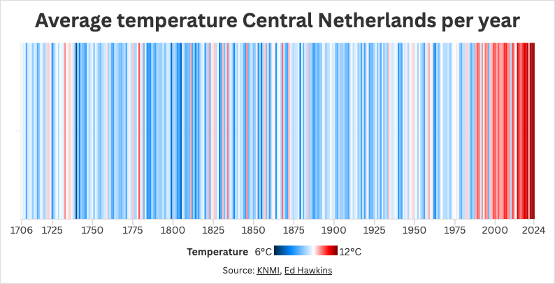
🌡️ Die "Climate Stripes" zeigen die globale Erwärmung seit 1850. Jede Linie steht für ein Jahr – ein kraftvolles Bild für den menschgemachten Klimawandel. 2024 wird erneut die dunkelrote Linie setzen.

bbc.com/future/article/2024111

❄️ Die Nordwestpassage, einst unpassierbar, öffnet sich durch das Schmelzen des arktischen Eises. 115 Tage segelte die Yacht Abel Tasman, um diese Veränderungen sichtbar zu machen.

🌊 Das grönländische Eisschild verliert 6x mehr Eis als in den 1980ern. Die Diskobucht zeigte die Realität: schmelzende Eisberge an einem der heißesten Tage die je gemessen wurden.

📊 "Air Quality Stripes" erzählen eine gemischte Geschichte: In einigen Städten verbessert sich die Luftqualität, während andere unter zunehmender Verschmutzung leiden. Maßnahmen wirken schnell – ein lösbares Problem!

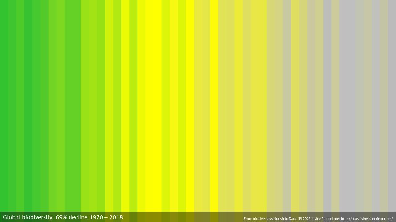
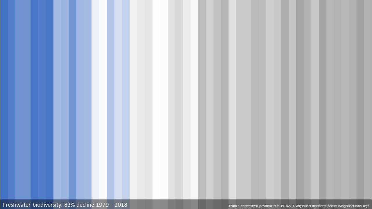
🌳 "Biodiversity Stripes" zeigen den Verlust an Artenvielfalt seit 1970. Grün zu Grau – ein Symbol für die Krise unserer Naturbeziehung. Auch sie fanden globalen Anklang.

🎨 Diese grafischen Darstellungen sind mehr als Daten: Sie berühren, verbinden und inspirieren Menschen weltweit. Der Wandel beginnt mit Bewusstsein und Dialog.

💡 "Climate Stripes" ermutigen zu einer neuen Perspektive: Herausforderungen als Chancen zu begreifen. Jeder hat einen Beitrag zu leisten.

#ClimateStripes #Klimakrise #ClimateCrisis

Kevin LeecasterGreenFire@mstdn.social
2024-10-09

@TexasObserver @oconnell
At first I thought that shirt was patterned after @ed_hawkins #ClimateStripes

Client Info

Server: https://mastodon.social
Version: 2025.07
Repository: https://github.com/cyevgeniy/lmst