The Dank Mono Font by Phil Pluckthun: The Aesthetic Coding Typeface
Why is the Dank Mono font the preferred tool for design-conscious developers?
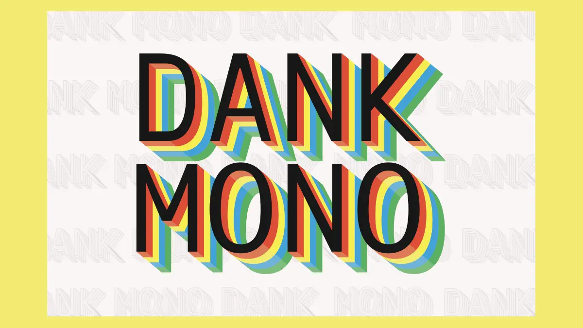
Visual environments significantly impact a developer’s productivity. Coders spend thousands of hours staring at text editors. Therefore, the choice of typography becomes a critical workflow decision. The Dank Mono typeface answers this need for visual clarity and personality. Phil Pluckthun created this unique font to serve coding aesthetes specifically. It breaks the mold of sterile, robotic system fonts. Consequently, it introduces a human touch to the digital workspace. The Dank Mono font balances functionality with a distinct, modern flair.
Download the typeface from GumroadMost monospaced fonts prioritize rigid structure over style. However, Phil Pluckthun took a different approach in April 2018. He designed the Dank Mono typeface as a hobbyist project. The goal involved merging utility with delight. Furthermore, the font includes a comprehensive set of features for serious programming. It supports bold styles, an italic variant, and delightful ligatures. Over 5,000 users currently rely on this tool for their daily work.
The Dank Mono Font by Phil Pluckthun is an Aesthetic Coding TypefaceThe minimalist font quickly gained traction on platforms like ProductHunt. It stood out because it felt personal. Developers often seek tools that reflect their identity. This typeface offers exactly that distinctiveness. Moreover, the project is now considered finished and finalized. It moved beyond its initial sales phase on dank.sh. The creator considers the current iteration complete. Thus, users receive a stable, reliable product.
Download the typeface from GumroadThe aesthetic rebellion of cursive italics
Standard coding fonts often lack nuance. The Dank Mono typeface changes this narrative entirely. Its standout feature remains the cursive italic variant. Usually, code comments look identical to the code itself. Phil Pluckthun changed this dynamic intentionally. The italics in the font resemble handwriting. Consequently, comments and keywords pop off the screen.
This visual separation aids code readability significantly. Your brain instantly distinguishes between logic and annotation. The aesthetic feels similar to the expensive Operator Mono but retains a unique “dank” flavor. Additionally, the semi-rounded corners make the text feel friendly. It lacks the harsh, industrial sharpness of older terminal fonts. Therefore, the Dank Mono typeface reduces visual fatigue during long coding sessions.
Designers particularly appreciate this attention to detail. The lowercase ‘f’ in italics creates a satisfying visual loop. These small details matter immensely to typography enthusiasts. The font transforms a text editor into a design canvas. It proves that utility software need not look boring.
Ligatures and technical prowess
A modern coding font must handle complex symbol combinations. The Dank Mono typeface excels in this technical area. It includes ligatures for 26 different code character combinations. Ligatures combine two characters into a single, seamless glyph. For example, a “not equals” sign (!=) becomes a single crossed-out equals symbol. Arrow functions (=>) transform into actual arrows.
These ligatures clean up the code visually. The font reduces visual clutter in dense logic files. Furthermore, the character set covers an exhaustive list of requirements. It supports Latin uppercase and lowercase letters. It handles all modifiers and diacritics for most European languages. Phil Pluckthun ensured no developer feels left behind.
Additionally, the font supports mathematical symbols extensively. It includes basic Greek glyphs for scientific computing. Terminal users also benefit greatly. The Dank Mono typeface contains specific terminal glyphs. These include Unicode block symbols, shades, circles, and arrows. Moreover, it fully supports Powerline symbols for status bars. This wide support makes the font versatile across different tech stacks.
From hobby project to cult classic
The trajectory of the Dank Mono typeface offers an interesting case study. Phil Pluckthun launched it as a personal passion project. He targeted a niche audience of “coding aesthetes.” Subsequently, the community responded with overwhelming enthusiasm. The font’s success demonstrates a market for high-quality developer tools.
Originally, the font was sold directly through a dedicated website. However, the lifecycle of software eventually evolves. The creator has now marked the Dank Mono font as finalized. This means no new features will disrupt the current stability. Users value this consistency. A finalized font ensures that your editor always looks the way you expect.
The term “dank” suggests something excellent and high-quality in internet slang. The Dank Mono typeface lives up to this moniker. It captured a specific moment in developer culture. It bridges the gap between the chaotic creativity of the web and the strict order of code. Consequently, it remains a reference point for independent type design.
How visual comfort improves code quality
You might wonder if a font truly matters. Experience suggests it absolutely does. The Dank Mono font reduces cognitive load. Clearer text means fewer syntax errors. Distinct italics mean faster scanning of documentation. Therefore, investing in the typeface pays dividends in efficiency.
Developers customize themes, keyboards, and desk setups. Typography serves as the final piece of this puzzle. The typeface provides a unique voice. It speaks to the creator who values craft. Furthermore, using a paid or premium-tier font creates a sense of professionalism. It signals that you take your environment seriously.
Phil Pluckthun understood that code is written for humans first, machines second. The Dank Mono font prioritizes the human reader. The spacing allows the eyes to breathe. The weight of the bold style emphasizes key logic without overpowering the screen. Every design choice in the Dank Mono typeface serves a practical purpose.
Conclusion
The Dank Mono typeface remains a standout achievement in programming typography. Phil Pluckthun successfully merged style with rigorous utility. The inclusion of ligatures, Powerline symbols, and European diacritics makes it robust. Simultaneously, the cursive italics provide unmatched aesthetic pleasure.
Download the typeface from GumroadFor the developer who cares about their craft, the Dank Mono font is essential. It transforms the mundane act of typing into a visually rewarding experience. Although the project is finalized, its impact endures. It challenged the status quo of boring monospaced fonts. Ultimately, the Dank Mono typeface proves that code can be beautiful.
Frequently Asked Questions
Who designed the Dank Mono typeface?
Phil Pluckthun designed the Dank Mono typeface. He started the project in April 2018 as a hobbyist endeavor for coding aesthetes.
Does the Dank Mono font support ligatures?
Yes, the font includes ligatures for 26 different code character combinations. This feature converts standard operator sequences into clean, single glyphs.
Is the Dank Mono typeface still being updated?
No, the project is considered finished and finalized. The font stopped changing as it matured, providing a stable experience for all users.
What languages does the Dank Mono font support?
The character set includes Latin uppercase and lowercase letters, modifiers, and diacritics for most European languages. It also covers Greek glyphs and math symbols.
Does the Dank Mono typeface work in the terminal?
Yes, it includes terminal glyphs such as Unicode block symbols, shades, circles, and Powerline symbols for customized shell prompts.
All images © Phil Pluckthun. Check out other trending typefaces on WE AND THE COLOR or take a look at our selection of the 100 hottest fonts for designers in 2026.
Subscribe to our newsletter!
[newsletter_form type=”minimal”]#codingFont #DankMono #font #minimalFont #PhilPluckthun #typeface