#VisualCapitalist

Ranked: America’s Top Trading Partners in 2025 – Visual Capitalist

Image from article…

Economy

Ranked: America’s Top Trading Partners in 2025

By Dorothy Neufeld, Published1 day ago on January 25, 2026

Graphics/Design: Amy Kuo

See more visualizations like this on the Voronoi app.

Use This Visualization

The Largest U.S. Trading Partners in 2025

See visuals like this from many other data creators on our Voronoi app. Download it for free on iOS or Android and discover incredible data-driven charts from a variety of trusted sources.

Key Takeaways

  • The European Union accounted for 18.8% of all U.S. trade in the first 10 months of 2025, valued at $883.3 billion .
  • China ranks as America’s fourth-largest trading partner, with U.S. imports declining 26.7%, given rising tensions.

U.S. bilateral trade reached $4.7 trillion between January and October 2025, in a volatile year for trade policy.

As the U.S.’s largest trading partner, the EU plays a central role in trade flows. While tariffs linked to Greenland were briefly threatened on eight EU countries before being withdrawn, trade dynamics vary across the bloc. The U.S. runs surpluses with countries such as the Netherlands and Belgium, while having deficits with Ireland and Germany.

This graphic shows America’s biggest trading partners in 2025 through October, based on data from the U.S. Census Bureau.

A Closer Look at the Largest U.S. Trading Partners

Below, we show America’s top trading partners in a year of head-spinning trade policy:

RankCountry/RegionTotal Trade Jan-Oct 2025Share of Total Trade1🇪🇺 EU$883.3B18.8%2🇲🇽 Mexico$731.2B15.6%3🇨🇦 Canada$606.7B12.9%4🇨🇳 China$357.2B7.6%5🇹🇼 Taiwan$201.1B4.3%6🇯🇵 Japan$190.7B4.1%7🇻🇳 Vietnam$170.5B3.6%8🇰🇷 South Korea$162.1B3.5%9🇨🇭 Switzerland$154.3B3.3%10🇬🇧 United Kingdom$133.5B2.8%11🇮🇳 India$126.4B2.7%—🌍 Other countries$977.2B20.8%—Total Trade (Jan-Oct ’25)$4.69 trillion100.0%

Trade with the EU stood at $883.3 billion, with Germany ($196.4 billion), Ireland ($140.8 billion), and the Netherlands ($108.7 billion) driving the most trade activity overall.

In August 2025, the U.S. and EU agreed to a framework that set a 15% tariff ceiling on most goods, while existing 50% U.S. tariffs on steel and aluminum were left in place for all global trading partners.

Mexico follows, with $731.2 billion in cross-border trade in 2025. After the U.S. announced tariffs on Mexican imports in February 2025, subsequent negotiations led to delays and partial exemptions.

Ranking in third is Canada, with $606.7 billion in trade value.

Continue/Read Original Article Here: Ranked: America’s Top Trading Partners in 2025

#2025 #American #Chart #Graphics #Ranked #Top #TradingPartners #VisualCapitalist
Americas-Top-Trading-Partners-in-2025_WEB

Charted: Where Inflation Has Hit the Hardest (2000–2025) – Visual Capitalist

Economy

Charted: Where Inflation Has Hit the Hardest (2000–2025)

Published17 hours ago, on January 13, 2026

By Dorothy Neufeld, Graphics/Design: Miranda Smith

See more visualizations like this on the Voronoi app.

Use This Visualization

Twitter Facebook LinkedIn Reddit Pinterest Email

Where Inflation Has Hit the Hardest (2000–2025)

See visuals like this from many other data creators on our Voronoi app. Download it for free on iOS or Android and discover incredible data-driven charts from a variety of trusted sources.

Key Takeaways

  • Overall U.S. inflation has increased 92% over the past 25 years.
  • The cost of many essentials, like hospital services, childcare, medical care, housing, and even the cost of food, are rising at a faster rate than inflation overall.
  • Meanwhile, the cost of technology (software, TVs, toys) is generally becoming cheaper on a relative basis.

Affordability remains a potent issue in America, with both Trump and Mamdami campaigning on high costs of living.

Even though inflation has fallen to around 2.7%, prices are about 25% higher than in 2020. Meanwhile, certain sectors, like housing and healthcare, have far outpaced this rate, putting growing strain on consumer wallets.

This graphic shows U.S. inflation by category, based on data from the Bureau of Labor Statistics.

The chart was inspired by Mark J. Perry’s famous “Chart of the Century”, which you should also take a look at.

ℹ️ Note: The BLS calculates CPI by tracking price changes for a fixed “basket” of goods, adjusting for quality improvements over time. For tech products, rapid gains in performance mean consumers get far more value per dollar, which shows up as large price declines even if sticker prices don’t fall.

Ranked: Inflation By Category in America

Below, we show the cumulative rate of inflation across key goods and services between 2000 and September 2025.

CategoryConsumer Price Inflation 2000-2025🏥 Hospital Services+275%🎓 College Tuition & Fees+196%🧒 Child Care+185%🩺 Medical Care+129%🏠 Housing+111%🍽️ Food & Beverages+104%🚗 New & Used Vehicles+25%🛋️ Furniture+9%👕 Clothing+2%📱 Cellphone Services-43%🧸 Toys-74%💻 Computer Software-75%📺 TVs-98%🛒 All U.S. Items+92%

Hospital services have consistently outpaced inflation over the past several decades, with costs rising a stunning 275% since 2000.

For perspective, hospital services increased 6.9% annually as of June 2024, faster than nursing homes (6%), prescription drugs (2.4%), and overall inflation (3%). Today, nearly one in five dollars spent in the U.S. economy goes toward health care, up from one in 20 in 1960.

More broadly, prices for essential services have significantly outpaced overall inflation, fueled by consolidation and labor-intensive operations.

College tuition and fees have also skyrocketed, rising 196% since 2000. Driving up costs are the hiring of more faculty and increased spending to attract students. Additionally, state funding has seen a long-term downtrend, meaning that colleges must rely more on tuition.

As we can see, housing inflation has jumped 111% compared to a 92% increase for all U.S. items. When interest rates hovered near 0% in 2020, it turbocharged housing demand, leading prices to spike to multiple record highs, even as interest rates increased.

Goods Under the Average, or Seeing Deflation

Interestingly, we can see that new and used vehicle inflation is far below the overall inflation rate, at 25%, averaging an annual increase of less than a percent. Like the housing market, however, prices increased notably over the pandemic amid supply chain bottlenecks.

On the other hand, software has seen a clear deflationary trend, driven by the rise of cloud computing and subscription models. Furthermore, TV prices are 98% cheaper than they were at the turn of the century, thanks to technological advancements and rising manufacturing efficiency.

Continue/Read Original Article Here: Charted: Where Inflation Has Hit the Hardest (2000–2025)

#20002025 #92PerCentIncreaseInflation #Affordability #AffordabilityCrisis #BureauOfLaborStatistics #ChildCareUp185 #CollegeUp196 #Data #Economy #HospitalCosts #HospitalServicesUp275 #HousingCosts #Inflation #MecicalCareUp129 #UnitedStates #VisualCapitalist #Visualized #VoronoiApp

Charted: U.S. Population by Generation – Visual Capitalist

Demographics

Charted: U.S. Population by Generation

Published 7 hours ago, on January 2, 2026, By Niccolo Conte

Article/Editing: Bruno Venditti

Graphics/Design: Christina Kostandi

See more visuals like this on the Voronoi app.

Use This Visualization

Twitter Facebook LinkedIn Reddit Pinterest

U.S. Population by Generation

See visuals like this from many other data creators on our Voronoi app. Download it for free on iOS or Android and discover incredible data-driven charts from a variety of trusted sources.

Key Takeaways

  • Millennials are the largest generation in the U.S., accounting for more than one in five Americans.
  • Boomers and Gen X together still make up nearly 40% of the population, reflecting the country’s aging demographic profile.

The age structure of the U.S. population is undergoing a major transition, as younger generations are becoming more prominent.

This visualization breaks down the U.S. population by generation in 2025, using data from the U.S. Census Bureau, as of 2025.

Millennials and Gen Z Are the Two Largest

Millennials, born between 1981 and 1996, are the largest generation in the U.S., with roughly 74 million people. They account for 22% of the total population and are now firmly in their prime working and family-forming years. Close behind is Generation Z, with over 71 million people, representing 21% of Americans.

GenerationBirth YearsAge Range (2025)PopulationShare of populationSilent Generation1928–194580–9713,741,6304%Baby Boomers1946–196461–7964,448,24819%Generation X1965–198045–6065,432,12119%Millennials1981–199629–4474,104,18622%Generation Z1997–201213–2871,146,11621%Generation Alpha2013–20250–1251,238,68715%Total Population––340,110,988100%

Boomers and Gen X are a Major Demographical Force

Baby Boomers remain a major demographic force, totaling about 64 million people, or 19% of the population. Now aged 61 to 79, this group continues to impact healthcare demand, retirement systems, and wealth distribution. Generation X is nearly the same size, with 65 million people and an equal 19% share.

Meanwhile, generation Alpha, born from 2013 onward, already numbers more than 51 million people. Although they represent 15% of the population, their impact is still emerging. This cohort will shape future education systems, technology adoption, and long-term workforce trends.

At the opposite end of the spectrum, the Silent Generation now makes up just 4% of Americans.

Continue/Read Original Article Here: Charted: U.S. Population by Generation

Tags: America, App, By Generation, Chart, Data, Generations, Graphic, Population, Total Population, VC, Visual Capitalist, Voronoi
#America #App #ByGeneration #Chart #Data #Generations #Graphic #Population #TotalPopulation #VC #VisualCapitalist #Voronoi
two generations women embracing, looking at sea
Lahminewski ⚒️lahminewski@tooting.ch
2025-11-24

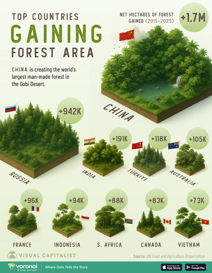
#infographie : les pays qui ont gagné le plus de forêts entre 2015 et 2025. 🌳 🌲

🇨🇳 #Chine 1'686 kha
🇷🇺 #Russie 942 kha
🇮🇳 #Inde 191 kha
🇹🇷 #Turquie 118 kha
🇦🇺 #Australie 105 kha

À noter quand même que les champs d'arbre ne sont pas équivalents en termes de stockage de #carbone, de #biodiversité et de #résilience en comparaison des "vrais" forets.

Les données proviennent de la #FAO :cc: :ccby:
elements.visualcapitalist.com/

#foret #visualCapitalist #co2 #foretprimaire

1	🇨🇳 China	1,686,000	0.8
2	🇷🇺 Russia	942,000	0.1
3	🇮🇳 India	191,000	0.3
4	🇹🇷 Türkiye	118,000	0.5
5	🇦🇺 Australia	105,000	0.1
6	🇫🇷 France	95,900	0.6
7	🇮🇩 Indonesia	94,100	0.1
8	🇿🇦 South Africa	87,600	0.4
9	🇨🇦 Canada	82,500	0.0
10	🇻🇳 Vietnam	72,800	0.5
2025-10-21

World’s merchant fleet visualization

Indonesia tops the global ranking with over 11,000 merchant ships — a reflection of its massive archipelago, large domestic economy, and laws requiring ships in its waters to fly the Indonesian flag.
Panama is the world’s 3rd largest ship registry — thanks to its open ‘flag of convenience’ system, which allows global shipowners to register their vessels under Panama’s flag.

Ranked: The World’s Largest Merchant Ship Fleets by Country

I love visual capitalist. Surprising data: Japan as #4 and Liberia (what?). Most of the rest of the composition makes sense to me.

#4 #merchantFleet #nations #visualCapitalist #visualization

Lahminewski ⚒️lahminewski@tooting.ch
2025-08-27

Liste des endroits les plus chers où vivre dans le monde en 2025.

Parmi les dix premières villes, la #Suisse en a cinq. 🇨🇭 🤑

Pour offrir une vue d'ensemble du coût de la vie en milieu urbain, les villes ont été analysées en fonction des dépenses quotidiennes telles que l'alimentation, les transports, les services publics et les coûts du logement.

#infographie #visualCapitalist #Zurich #Geneve #Lausanne #Bale #Lugano

Ranking	City	Country	Cost of Living Plus Rent Index
1	New York, NY	🇺🇸 U.S.	100
2	Zurich	🇨🇭 Switzerland	93.2
3	Geneva	🇨🇭 Switzerland	90.6
4	San Francisco, CA	🇺🇸 U.S.	85.3
5	Basel	🇨🇭 Switzerland	83.9
6	Lausanne	🇨🇭 Switzerland	83.4
7	Boston, MA	🇺🇸 U.S.	81.2
8	Singapore	🇸🇬 Singapore	80.9
9	San Jose, CA	🇺🇸 U.S.	80.4
10	Lugano	🇨🇭 Switzerland	79.1
11	Honolulu, HI	🇺🇸 U.S.	78.5
12	Washington, DC	🇺🇸 U.S.	78.1
13	London	🇬🇧 United Kingdom	77.9
14	Bern	🇨🇭 Switzerland	77.2
15	Reykjavik	🇮🇸 Iceland	76.3
Lahminewski ⚒️lahminewski@tooting.ch
2025-06-10

Perte de forêts tropicales en 2024 🌴

Les #incendies de #forêt (49,5 %) sont le principal facteur de perte des forêts tropicales en 2024, suivis par l'#agriculture (29,1 %). 🔥 🐂

Les forêts tropicales sont essentielles. Elles stockent le #co2, fournissent de l'#eau douce, empêchent l'#érosion des sols, assurent la #subsistance de plus d'un milliard de personnes et abritent plus de la moitié de la #biodiversité terrestre.

visualcapitalist.com/charted-t

#Arbre #Décroissance #VisualCapitalist #DataVis

Country	2023 (Mha)	2024 (Mha)
🇧🇷 Brazil	1.14	2.82
🇧🇴 Bolivia	0.49	1.48
🇨🇩 Congo (DRC)	0.53	0.59
🇮🇩 Indonesia	0.29	0.26
🇵🇪 Peru	0.15	0.19
🇱🇦 Laos	0.14	0.12
🇨🇴 Colombia	0.07	0.10
🇨🇲 Cameroon	0.10	0.10
🇳🇮 Nicaragua	0.06	0.09
🇲🇽 Mexico	0.05	0.09
🌐 Other countries	0.73	0.89
Total	3.74	6.73
:rss: Информационное агентствоunian@rss-mstdn.studiofreesia.com
2025-05-13

Страны с самыми большими танковыми парками показали на одной инфографике: на каком месте Украина
unian.net/weapons/u-kakih-stra
#unian #Visualcapitalist #Китай #США

Lahminewski ⚒️lahminewski@tooting.ch
2025-03-21

Lait de vache ou lait végétal : lequel est le plus écologique ?

Au-delà des restrictions alimentaires telles que l'intolérance au #lactose ou le #végétalisme, de nombreux consommateurs choisissent le lait #végétal pour des raisons de durabilité. Cependant, la consommation d'eau et les émissions de gaz à effet de serre varient considérablement en fonction des ingrédients.

visualcapitalist.com/dairy-vs-

#Ecologie #lait #vegan #VisualCapitalist

Milk Type	Avg. CO2e emissions (g)	Avg. water use (L)	Avg. protein content (g)
Cow	330	21	8.2
Soy	122	5	6.1
Oat	102	9	2.7
Almond	98	19	1.0
Coconut	69	1	0.5
JavAlpsjavalps
2025-03-18

I am glad that have their own feed and I don't have to use their app .

The RSS feed if anyone need ➡️ feeds.feedburner.com/visualcap

Ehay2kEhay2k
2025-02-23

Fascinating. A lot of people don't understand why the French in particular aren't amazingly obese because they seem to eat so much fat, especially butter and cream.

And then you see interesting information like this from the

Now correlation isn't always causation, but damn.

visualcapitalist.com/ultra-pro

We Can Fix Climate Changewecanfixclimatechange
2024-10-22

Mapped: Carbon Emissions Per Capita, by Country

This map uses consumption-base emissions, attributing emissions to where goods were consumed, rather than where the were made.

wecanfixclimatechange.com/2024

We Can Fix Climate Changewecanfixclimatechange
2024-10-02

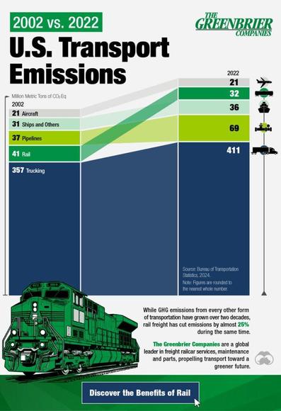
20 Years of U.S. Freight Transport Emissions

While emissions from every other transport mode have grown, rail freight has cut emissions by almost 25%.

wecanfixclimatechange.com/2024

We Can Fix Climate Changewecanfixclimatechange
2024-09-19

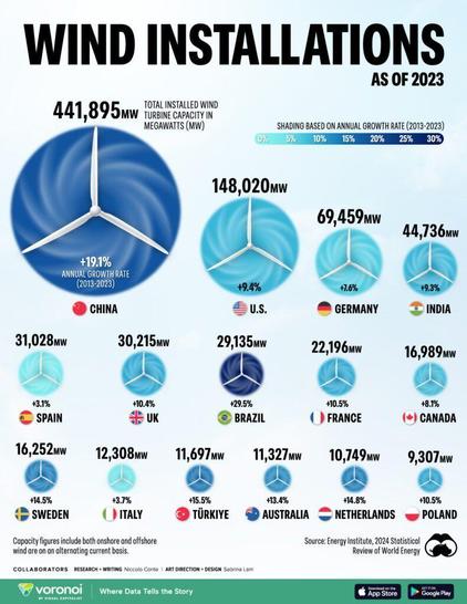
Ranked: The Largest Producers of Wind Power, by Country

China has the most capacity, and Brazil is growing the fastest.

wecanfixclimatechange.com/2024

We Can Fix Climate Changewecanfixclimatechange
2024-09-10

Carbon Emissions of the World’s Biggest Fashion Brands

The companies accounted for 73 million tons of CO₂e emissions in 2022, which is comparable to Morocco’s 2023 emissions.

wecanfixclimatechange.com/2024

Ehay2kEhay2k
2024-09-06

Fascinating. I appreciate the great articles, with equally great graphics, from the Visual Capitalist.

visualcapitalist.com/sp/which-

We Can Fix Climate Changewecanfixclimatechange
2024-08-27

Ranked: The 15 Countries With the Most Solar Power Installed

The Asia-Pacific region is leading the solar energy transition as of 2023.

wecanfixclimatechange.com/2024

Client Info

Server: https://mastodon.social
Version: 2025.07
Repository: https://github.com/cyevgeniy/lmst