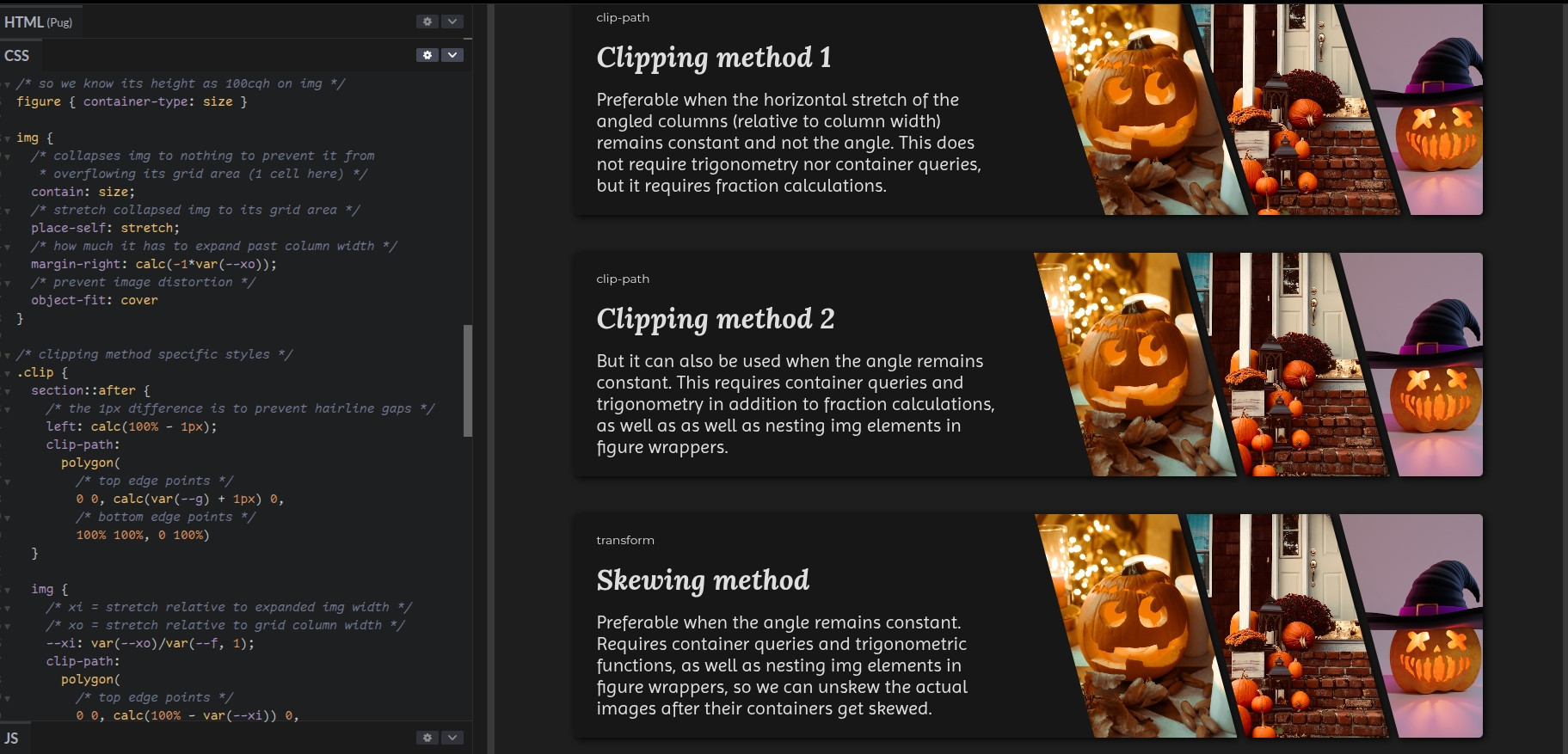
#clipPath

Ana Tudor 🐯anatudor
2025-05-24

A little thing I made on @codepen.io: breathing with `shape()`
codepen.io/thebabydino/pen/vEE

`shape()` is supported in Chrome 135+ and Safari 18.4+.

Firefox 126+ supports it for simple shapes (but not for this demo) when setting thelayout.css.basic-shape-shape.enabled to true in about:config.

Ana Tudor 🐯anatudor
2025-05-02

Someone asked how to create such cross-browser wave dividers that keep the same height as the width changes, so here's my take on it reddit.com/r/css/comments/1kcm

Live on @codepen codepen.io/thebabydino/pen/Pww

`mask` is another option, but needs an extra container and container query units, so not as well supported, plus it wouldn't be exactly the same shape.

Ana Tudor 🐯anatudor
2025-04-10

`clip-path` or `mask` are applied after `filter`.

This means we cannot clip/ mask, then add a `drop-shadow()` on the same element for the clipped/ masked shape.

We need to apply the `filter` on a parent of the clipped/ masked (pseudo-)element.

codepen.io/thebabydino/pen/BRR

Diagram of how browsers apply filter and clip-path when they’re set on the same element. First the drop-shadow() filter is applied on the initial rectangular box, then the element with drop-shadow() is clipped, cutting out the drop-shadow() too.Screenshot of the linked demo showing how applying the filter on the parent of the clipped (pseudo-)element can solve the problem if this parent has no other visible parts (borders, backgrounds, shadows).
Ana Tudor 🐯anatudor
2025-04-09

Here's a quick breathing box demo with `clip-path: shape()` on @codepen.io: codepen.io/thebabydino/pen/ZYE

Working in Chrome 135 and Safari 18.4! πŸ₯³πŸŽ‰

Ana Tudor 🐯anatudor
2025-04-09

I haven't had the time to do anything for this week's yet, but here are some older card demos:

From 5+ years ago: pure 1 element bevel cards! No SVG or images save for the cat, real (semi)transparency inside borders and all.

See it on @codepen codepen.io/thebabydino/pen/ZEG

Screenshot of linked demo. Shows 7 beveled cards, some with borders (solid, gradient or patterned ones), some with (semi)transparent backgrounds, some with gradient backgrounds, one with an image background. They are all on top of an image backdrop.
Ana Tudor 🐯anatudor
2025-03-17

Because I saw a @codepen demo creating a hex grid using my well over a decade old nested and reverted transforms technique to get the shape + MQs...

Here's a super simple modern grid + clip-path + mathematical functions responsive version with no breakpoints codepen.io/thebabydino/pen/QwW

Screenshot of linked demo with DevTools open, highlighting the main grid and showing there are no media queries at play.
Ana Tudor 🐯anatudor
2025-03-17

Know how border-image & border-radius don't play nice together?

(interactive codepen.io/thebabydino/pen/jxZ)

there's a workaround IF corner radius ≀ border-width: use inset() clip-path + a round value!

clip-path: inset(0 round $r)

@codepen demo: codepen.io/thebabydino/pen/qBE

(and yes, this is a tip I first shared on twitter over half a decade ago x.com/anatudor/status/12199161 )

Screenshot showing the interactive demo showing that setting a `border-image` on an element with `border-radius` makes the `border-radius` be ignored.Screenshot of the solution when the desired corner rounding is not bigger than the border-width:
```
border: solid $r;
border-image: linear-gradient(90deg, purple, orange) 1;
clip-path: inset(0 round $r)
```
Ana Tudor 🐯anatudor
2024-10-25

Another super old @codepen demo I redid with modern is this yummy menu codepen.io/thebabydino/pen/Aox

CSS grid instead of absolute positioning, clip-path instead of nested skew and un-skew, CSS variables to avoid setting a separate transform chain on each item... and more!

Ana Tudor 🐯anatudor
2024-10-16
Angled sections, each containing info about and a photo of a parrot species. The image itself is clipped, but that doesn't include the parrot itself.
Ana Tudor 🐯anatudor
2024-10-16

Here's another little something from forever ago that I've recently updated on @codepen: a circular menu!

codepen.io/thebabydino/pen/nKz

The code was really outdated, so I redid it to use CSS variables, trigonometry, grid, clip-path, SVG filters for the inner shadow & grain.

Hope you like it!

Ana Tudor 🐯anatudor
2024-10-16

Also on the topic of circle sectors/ pie slices πŸ₯§ - I've updated an old SO answer of mine stackoverflow.com/a/14185845/1

This goes through the simplest code possible in 2024 for a few cases (equal slices or not, interactive/ with content or not).

Screenshot of the code + visual result in the simplest possible case: all the slices are equal and they don't need to be elements (interactive, holding text content).
```
.pie {
  width: 16em; /* set width to desired pie diameter */
  aspect-ratio: 1; /* make pie element square */
  border-radius: 50%; /* turn square into disc */
  /* equally sized slices */
  background: 
    conic-gradient(from 17deg, #f94144 14%, #f3722c 0% 29%, #f8961e 0% 43%, 
        #f9c74f 0% 57%, #90be6d 0% 71%, #43aa8b 0% 86%, #577590 0%)
}
```
Ana Tudor 🐯anatudor
2024-09-12

Ever want a pure CSS regular ?

Back in 2016, I first wrote this to generate one. I've had others before, but this is the one I've kept updating it ever since and it's heavily commented.

You just need to pass it a number of vertices and an initial rotation.

@codepen demo: codepen.io/thebabydino/pen/mEg

Screenshot. Shows calling the mixin with:

```
@include polygon(6)
```

This creates a regular polygon with 6 vertices and 6 edges (regular hexagon) and with the offset angle (the angle of the circumcircle radius to the first vertex) not set, which means it falls back on the default value, which is -90Β° for polygons with an odd number of vertices and -90Β° + .5Β·ba, where ba is the base angle corresponding to a polygon edge.Screenshot. Shows calling the mixin with:

```
@include polygon(5, 0deg)
```

This creates a regular polygon with 5 vertices and 5 edges (regular pentagon) and with the offset angle (the angle of the circumcircle radius to the first vertex) set to 0Β°.Screenshot. Shows calling the mixin with:

```
@include polygon(10, 9deg)
```

This creates a regular polygon with 10 vertices and 10 edges (regular decagon) and with the offset angle (the angle of the circumcircle radius to the first vertex) set to 9Β°.
Ana Tudor 🐯anatudor
2024-07-30

How do you get a zoom effect on an `img`? So that you still have the right click `img` menu and also don't need any extra element?

Here's how on @codepen: codepen.io/thebabydino/pen/BaG

Prompted by coming across a demo that gets the effect with a `div` wrapped in an `overflow: hidden` parent.

/* single img zoom effect in just a few declarations */
img {
	/* amount padding-box edges move out by
	 * = the maximum possible padding */
	--d: 1.5em;
	/* so border-box doesn't increase with padding */
	box-sizing: border-box;
	/* maximum passible padding (1 - 0)*d = d initially
	 * zero padding (1 - 1)*d = 0 in hovered case */
	padding: calc((1 - var(--f, 0))*var(--d));
	/* no image distortion regardless of set dimensions */
	object-fit: cover;
	/* clip everything within a distance d inwards 
	 * from border limit */
	clip-path: inset(var(--d));
	/* smooth zoom effect */
	transition: padding .4s;
  
	/* is hovered flag f switches to 1 */
	&:hover { --f: 1 }
}
Ana Tudor 🐯anatudor
2024-07-26

As someone just hearted this again: a pure flexible multi-panel demo with continuous background I made some half a decade ago codepen.io/thebabydino/pen/Baa

Screenshot of linked demo.
pablolarahpablolarah
2024-07-14

πŸ”΄πŸŸ’The Magic of Clip Path
by Emil Kowalski
@emilkowalski_

emilkowal.ski/ui/the-magic-of-

Green text on pink background:
The Magic of Clip Path
Ana Tudor 🐯anatudor
2024-06-10

Re x.com/meodai/status/1800098657

If you ever want to create a regular/ star-shaped , I made a that generates them years ago
codepen.io/thebabydino/pen/PRM

A heavily commented & more modern version of the regular poly mixin codepen.io/thebabydino/pen/mEg

Bonus: chubby stars mixin codepen.io/thebabydino/pen/KLy

Example of a @codepen demo using such a regular polygon mixin to create three rolling hexagons: codepen.io/thebabydino/pen/LYz

Regular polygon & equilateral star-shaped polygon.Regular hexagon.Chubby stars.
Ana Tudor 🐯anatudor
2024-03-28

`filter: drop-shadow()` is great for non-rectangular shapes.

But there are a couple of frustrating issues:

😿 `filter` is applied before `clip-path`
➑ set `filter` on parent πŸ₯³πŸŽ‰

😿 blur inconsistent with that of box/ text shadow
➑ set it to half the value πŸ₯³πŸŽ‰

Resources:

✨ codepen.io/thebabydino/pen/BRR
✨ dbaron.org/log/20110225-blur-r
✨ codepen.io/thebabydino/pen/WNP

Diagram. A box representing an element (left) has a CSS filter applied to become a box with a box-shadow (center) then has a clip-path applied to become a star with no shadow (right).Screenshot of a demo illustrating two cases.

One, a drop-shadow filter is applied on parent of clipped element, but this parent has either some text content, a border, a box-shadow or a background. This results in the drop-shadow also being applied to the parent's text, border, etc., not just to the clipped pseudo.

Two, a drop-shadow filter is applied on parent of clipped element and this parent has no other visible parts. This results in the clipped pseudo getting a nice drop-shadow that follows its shape.Screenshot with the following text:

Comparing text/ box shadows with drop shadows
(blur needs to be half for drop shadows)
.text-css { text-shadow: 0 0 8px hsl(335, 100%, 50%) }
.text-svg { filter: drop-shadow(0 0 4px hsl(335, 100%, 50%)) }
.rect-css { box-shadow: 0 0 8px hsl(335, 100%, 50%) }
.rect-svg { filter: drop-shadow(0 0 4px hsl(335, 100%, 50%)) }So, getting back to CSS and HTML: what does this blur radius mean? A Gaussian distribution is described by two parameters: the mean (ΞΌ) and the standard deviation (Οƒ). We obviously want the mean (the center) of the kernel function applied to the source image to be the same as the pixel in the result image that we're computing. The blur effect is now defined by css3-background and by HTML to be a Gaussian blur with the standard deviation (Οƒ) equal to half the given blur radius, with allowance for reasonable approximation error.

This means that a blur with a 10px radius has an effect that extends a little past 10 pixels, but the bulk of the visible effect is within the 10px blur radius.

I mentioned SVG at the beginning, and I'll mention it again here. The SVG feGaussianBlur filter primitive has a stdDeviation attribute, which takes the standard deviation (Οƒ) of the Gaussian blur. So in SVG, the number given is half the number that you would give to get the same blur with CSS or canvas.
pablolarahpablolarah
2024-03-26

πŸ₯­ Animating clip paths on scroll with @property in CSS
by Brecht De Ruyte @utilitybend

utilitybend.com/blog/animating

Green text on pink background:
Animating clip paths on scroll with @property in CSS
pablolarahpablolarah
2023-12-06

πŸŸ£πŸ”΄ How to Create Stunning Slanted Containers with CSS
by @zoranjambor
at @CSSWeekly

A detailed, in-depth guide to creating slanted card components using CSS clip-path & shape-outside properties.

youtube.com/watch?v=emP8tWHtpwk

White text on violet background with green lemon arrows pointing to it:
"Perfect Slanted Edges Using Only CSS
Learn how to create a slanted-edge effect using clip-path and shape-outside CSS properties.
Find out how"
On the right, image of Zoran Jambor smiling.
pablolarahpablolarah
2023-09-04

πŸ”΅βšͺ️ How to add complex image masking to website images with CSS clip-path and Figma
by Rik Lomas @riklomas
at @superhi_
+ demo + code
@figma

youtu.be/StsPKN3M-Bg?si=LEcqZ4

Four pictures with different shapes: semicircles on rectangle shape with picture of sat man, semicircles cutting rectangular shape with picture of man and women, S shape with circle in the middle shape with picture of couple and K shape with picture of man sat. 
Light blue background.

Client Info

Server: https://mastodon.social
Version: 2025.04
Repository: https://github.com/cyevgeniy/lmst