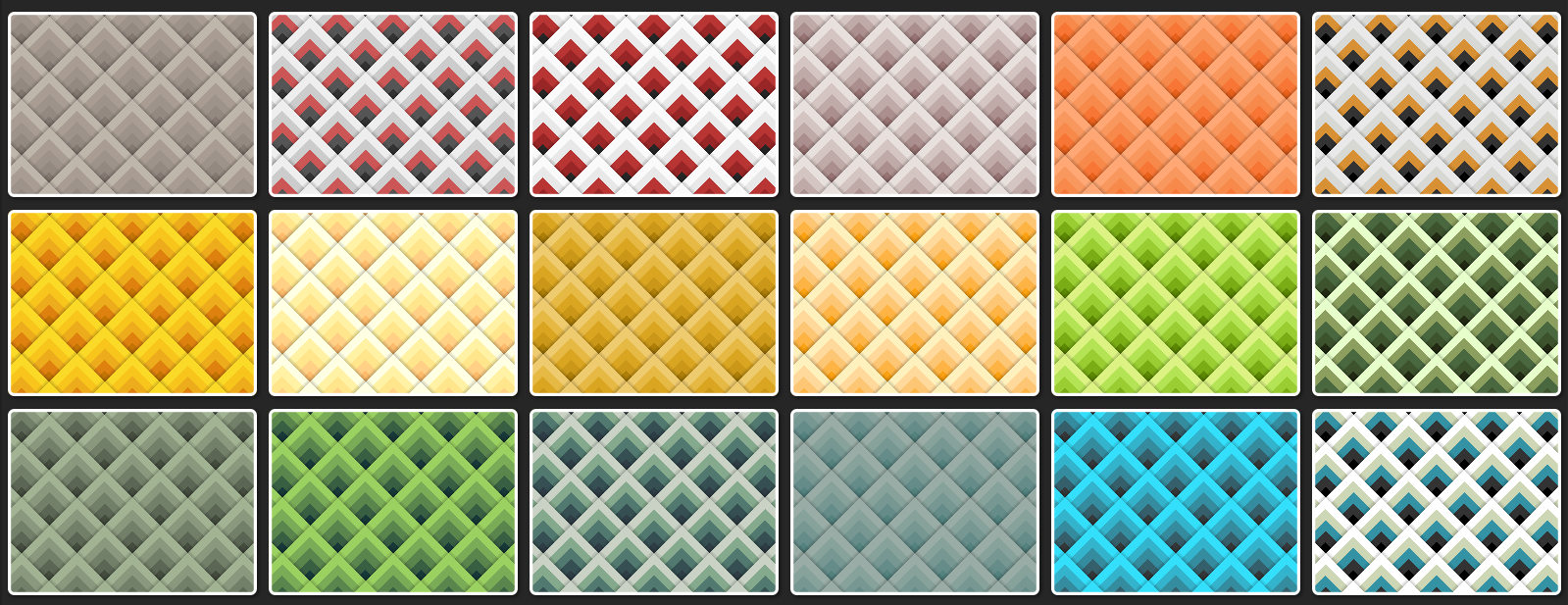
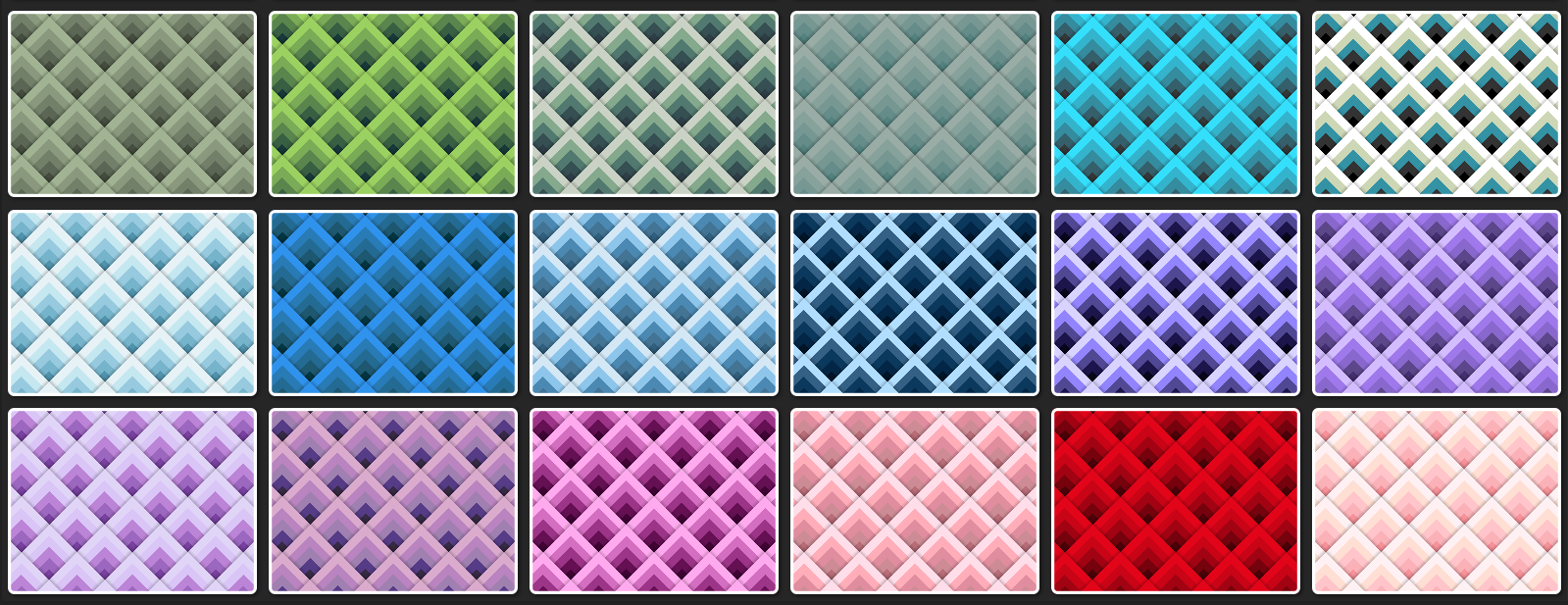
Noticed this got featured on @codepen: an animated XOR background - enjoy!
https://codepen.io/thebabydino/pen/JoKYVeB
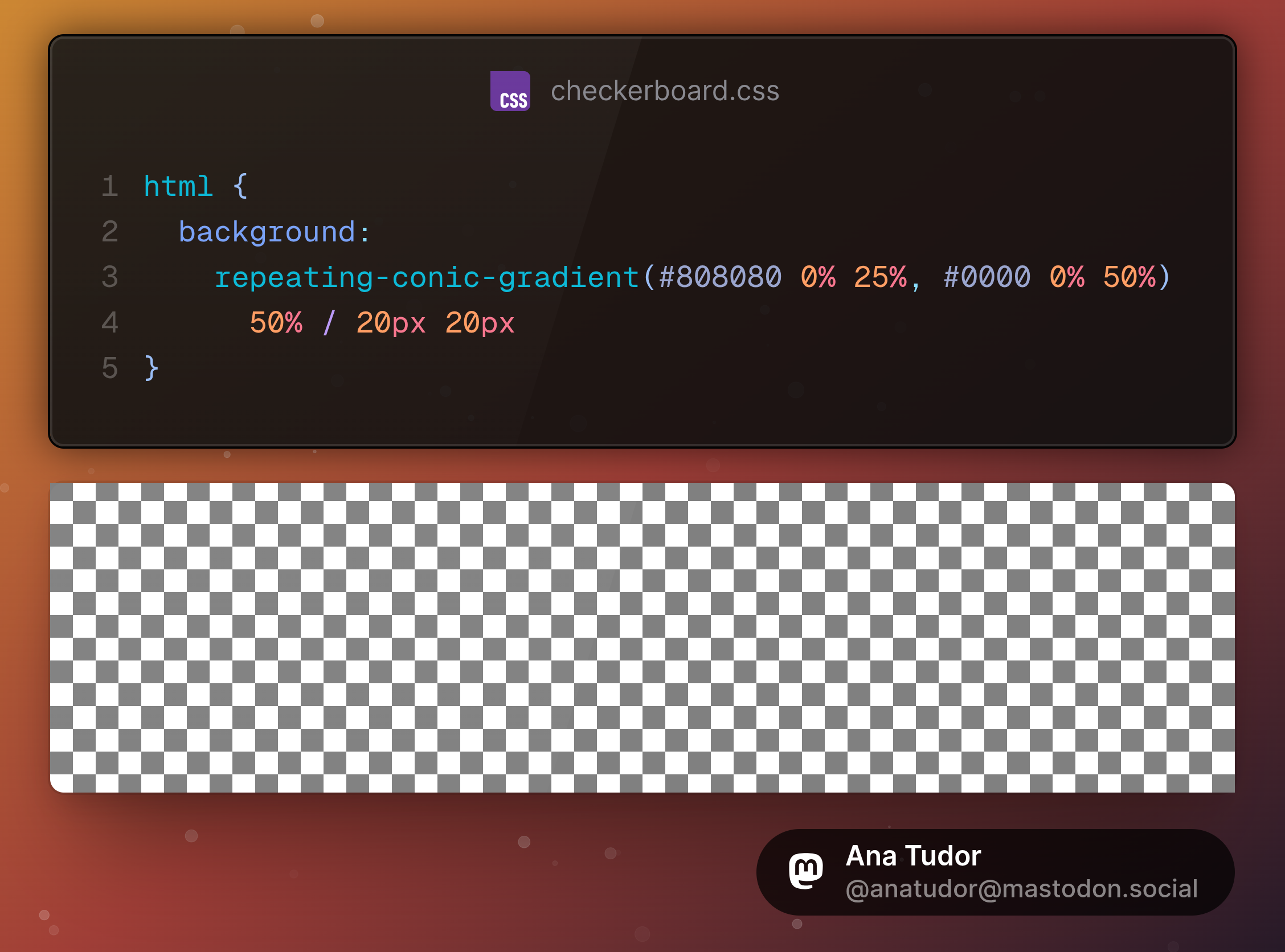
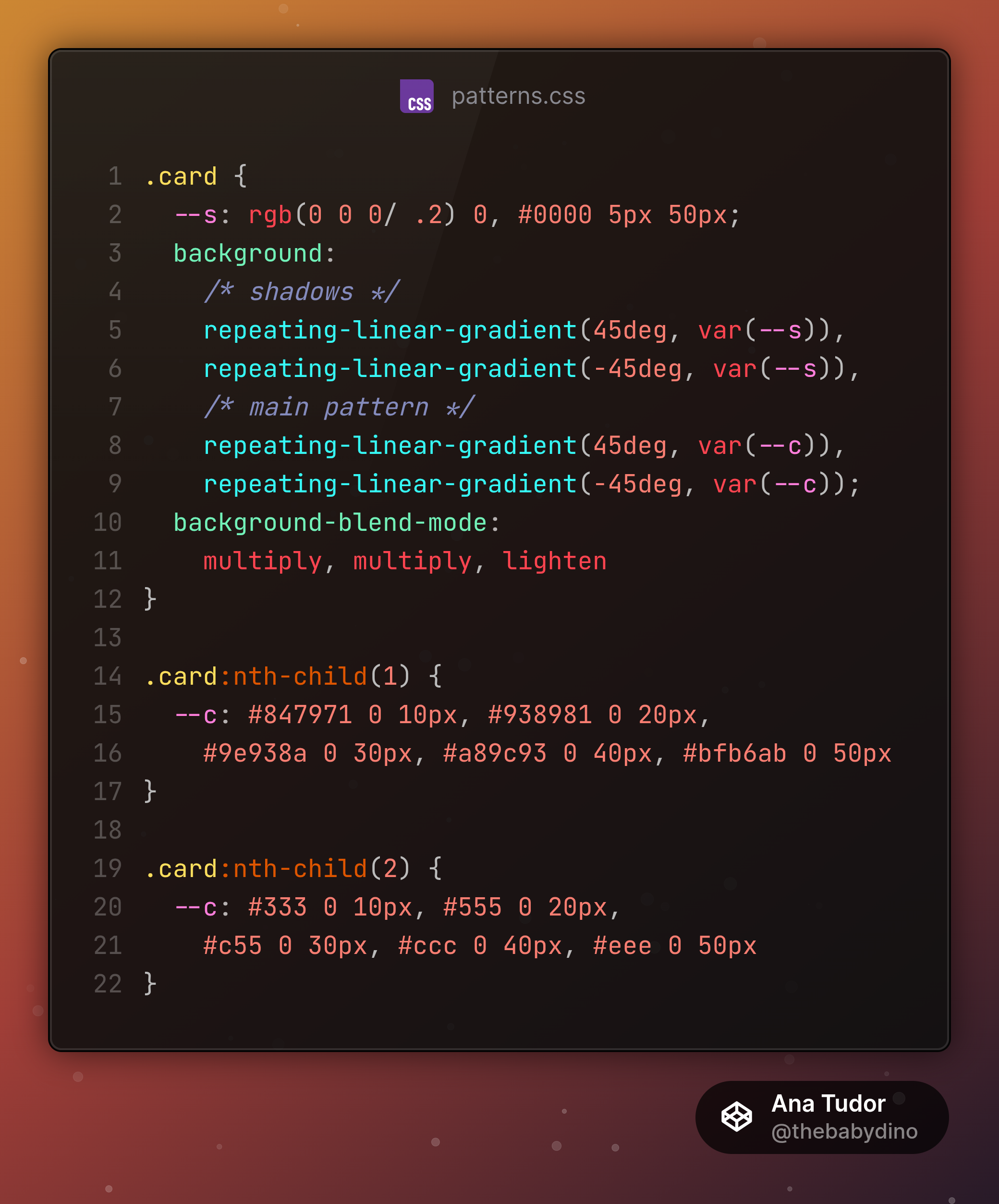
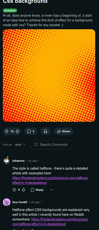
Made this to answer a question from reddit https://www.reddit.com/r/css/comments/1q242on/comment/nxag5vj/?context=3
#CSS #gradient #blending #cssGradient #blendMode #xor #difference #coding #cssPattern #cssAnimation #frontend #web #dev #webDev #webDevelopment #code