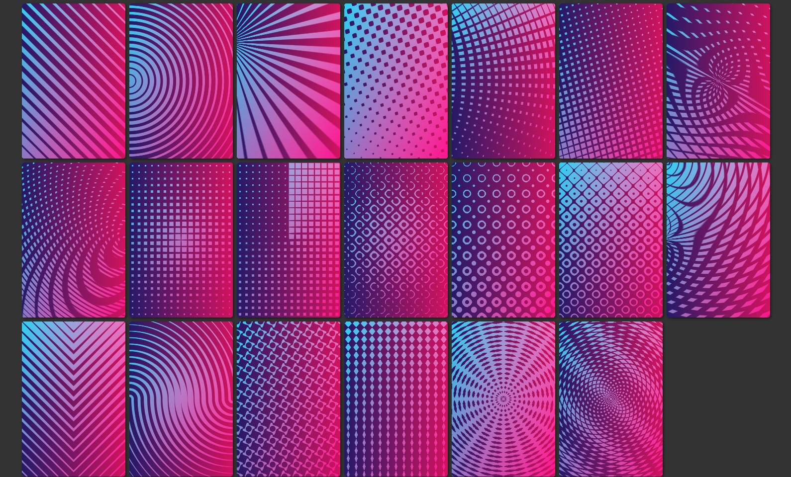
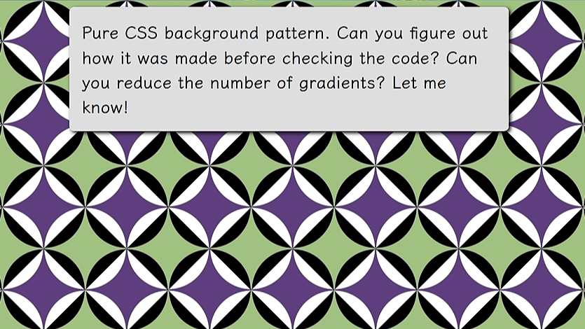
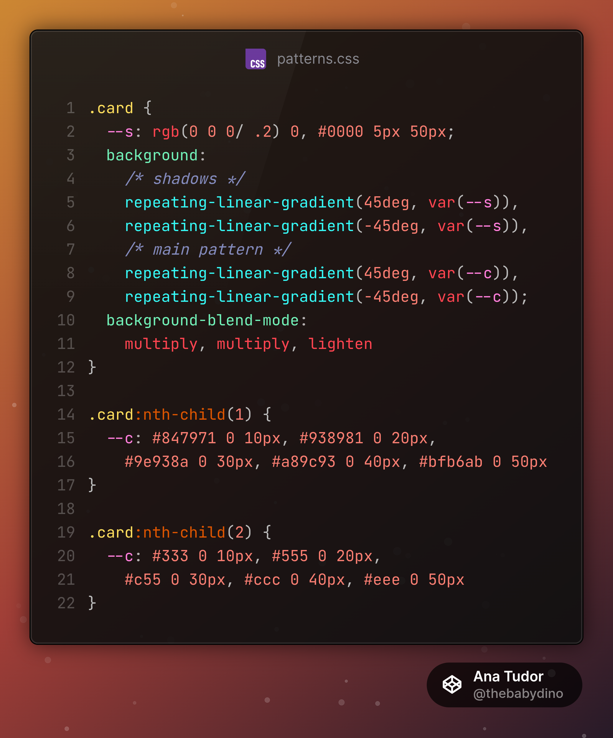
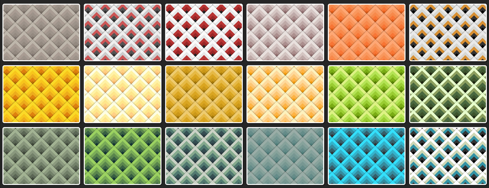
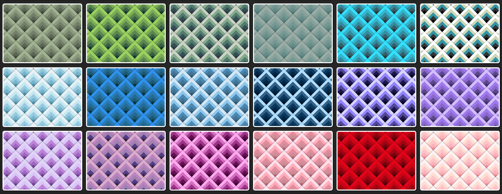
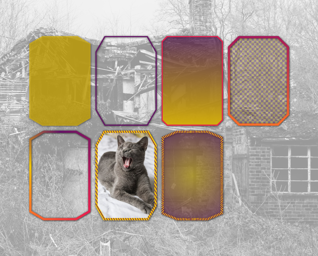
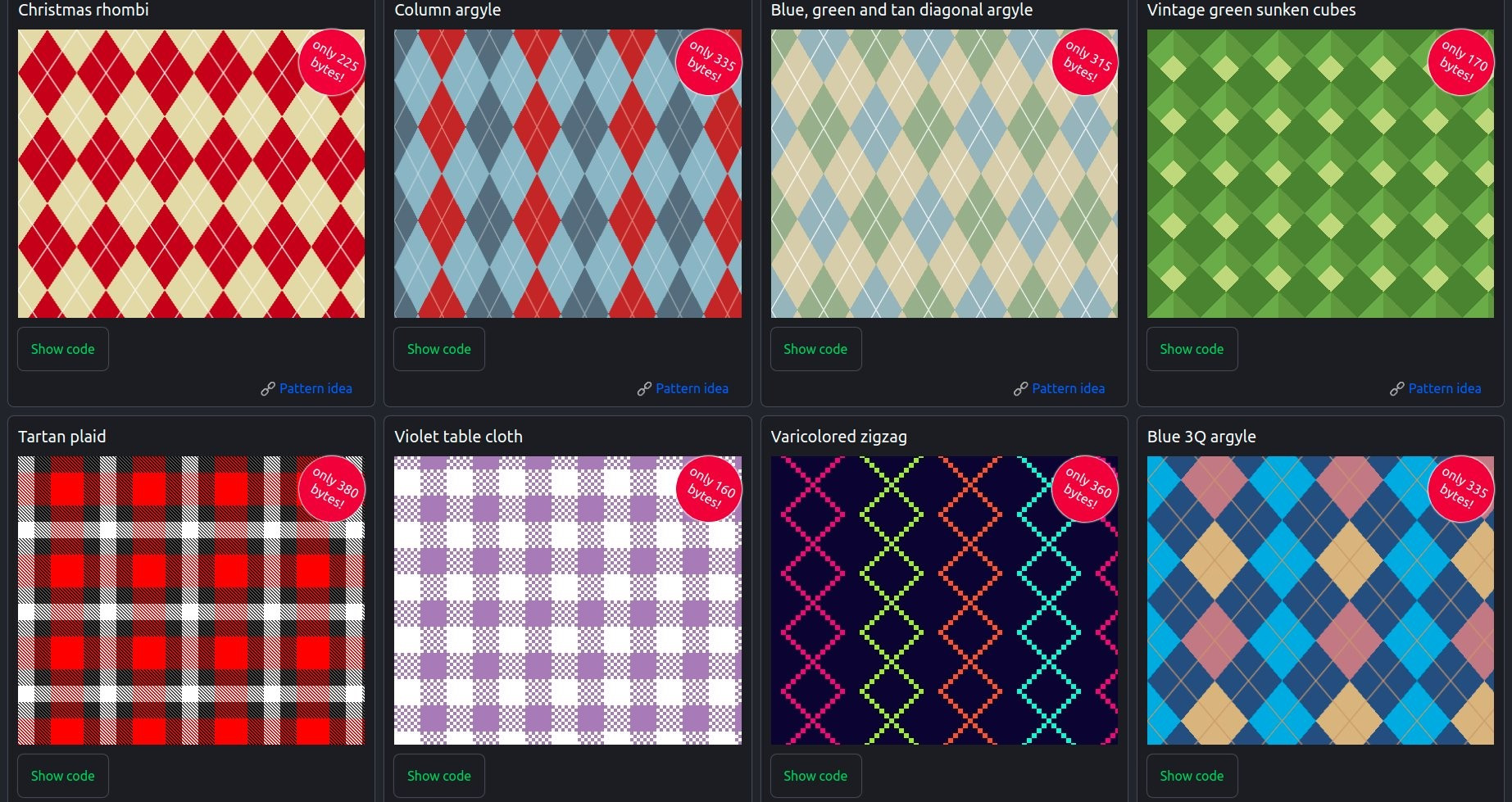
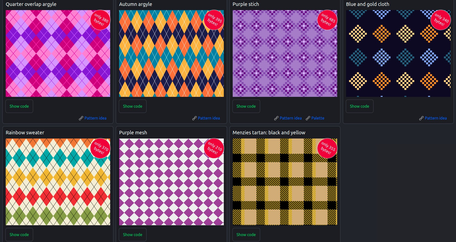
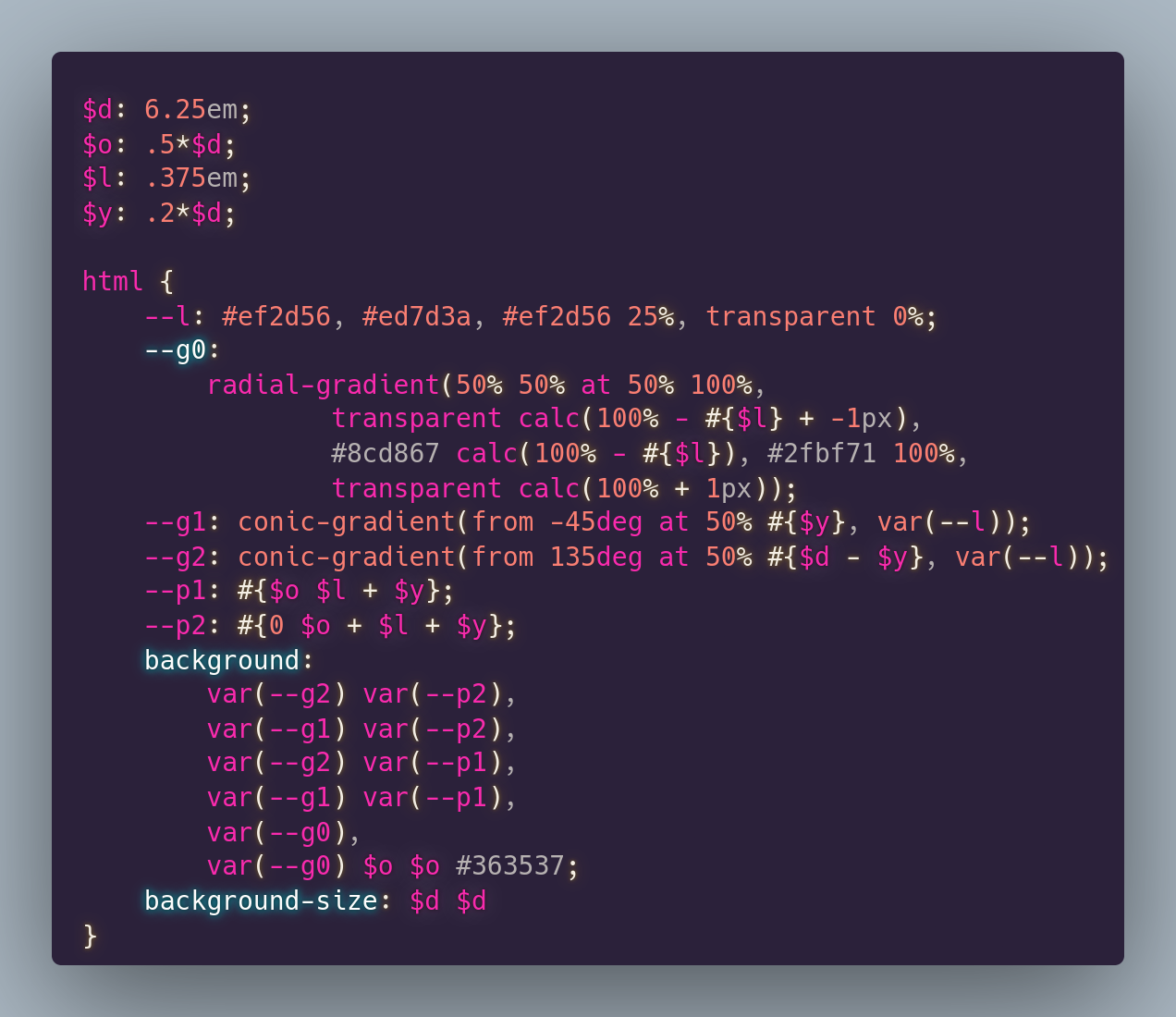
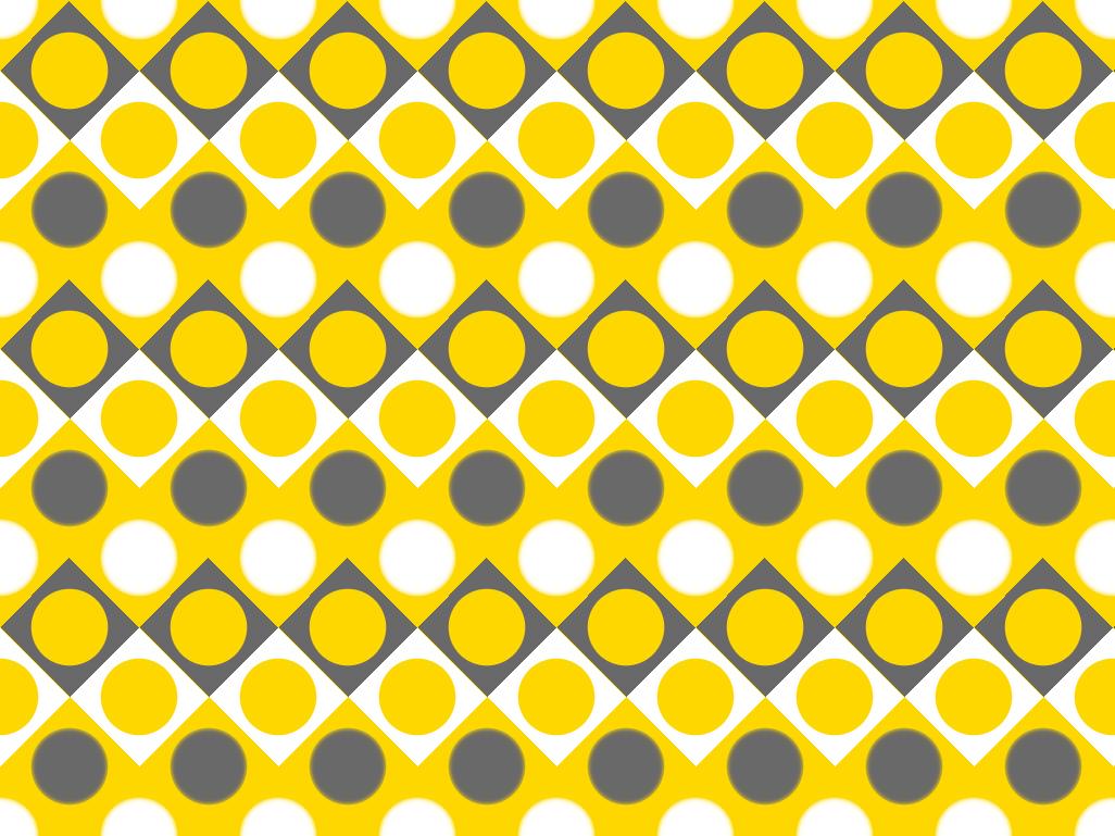
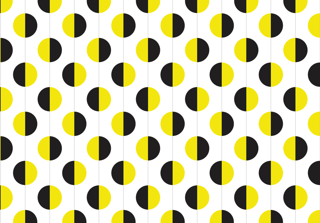
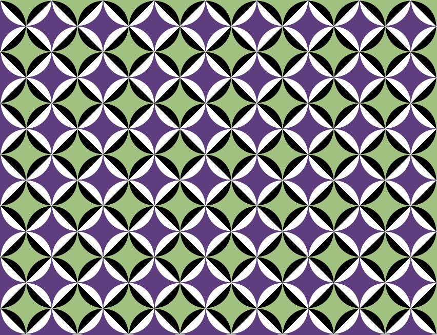
#cssPatterns

Ana Tudor ๐Ÿฏanatudor
2025-05-25

8๏ธโƒฃ 736 โ™ฅ๏ธ Pure 1 div card patterns (no SVG, no images other than CSS gradients) - see it on @codepen codepen.io/thebabydino/pen/NWx

A bunch of variations on the pure CSS technique detailed in this article frontendmasters.com/blog/pure-

19 cards, each with a different kind of halftone pattern.
Ana Tudor ๐Ÿฏanatudor
2025-05-10

A cool little pure background on @codepen codepen.io/thebabydino/pen/Yzv

Can you figure out how it was made before checking the code? ๐Ÿ˜ผ

Geometric pattern, where we have a xor effect at the intersection of two grids of plane packing circles, offset by a radius in both directions. This then gets xored with a diagonal checkerboard with the grid nodes where the circles are tangent to other circles on the same grid.
Ana Tudor ๐Ÿฏanatudor
2025-04-11

Here's another set of cards with varying patterns, all created with the exact same 4 blended CSS gradients, it's just the stops list `--c` that changes for each card.

So basically, it's again just one `background` + one `background-blend-mode` property.

Live demo on @codepen
codepen.io/thebabydino/pen/vYy

.card {
	--s: rgb(0 0 0/ .2) 0, #0000 5px 50px;
	background: 
		/* shadows */
		repeating-linear-gradient(45deg, var(--s)), 
		repeating-linear-gradient(-45deg, var(--s)), 
		/* main pattern */
		repeating-linear-gradient(45deg, var(--c)), 
		repeating-linear-gradient(-45deg, var(--c));
	background-blend-mode: 
		multiply, multiply, lighten
}

.card:nth-child(1) {
	--c: #847971 0 10px, #938981 0 20px, 
		#9e938a 0 30px, #a89c93 0 40px, #bfb6ab 0 50px
}

.card:nth-child(2) {
	--c: #333 0 10px, #555 0 20px, 
		#c55 0 30px, #ccc 0 40px, #eee 0 50px
}Up arrow card patterns.More up arrow card patterns.
Ana Tudor ๐Ÿฏanatudor
2025-04-09

I haven't had the time to do anything for this week's yet, but here are some older card demos:

From 5+ years ago: pure 1 element bevel cards! No SVG or images save for the cat, real (semi)transparency inside borders and all.

See it on @codepen codepen.io/thebabydino/pen/ZEG

Screenshot of linked demo. Shows 7 beveled cards, some with borders (solid, gradient or patterned ones), some with (semi)transparent backgrounds, some with gradient backgrounds, one with an image background. They are all on top of an image backdrop.
Ana Tudor ๐Ÿฏanatudor
2025-03-19

Minimal pure textile patterns on @codepen codepen.io/thebabydino/full/OJ

Absolutely no images other than CSS gradients and they are all tiny! All of them are under 500 bytes minified, some of them well under!

Some of the patterns in the gallery.Some more of the patterns in the gallery.
Ana Tudor ๐Ÿฏanatudor
2022-12-11

Here's a blue textile pattern. It's pure , using only background gradients on a single element (the root element in this case). No other images or tricks.

Oh, and it's under 500 bytes minified!

Can you guess how I did it before checking the code? Let me know!

codepen.io/thebabydino/pen/bGK

Oh, and if you want more textile patterns, check this out! codepen.io/thebabydino/full/OJ

Blue plaid pattern.@use 'sass:math';

$u: 1px;
$l: 24*$u;
$g: 1.5*$l;
$d: 2*$g;
$s: $l + 2*$g + 3*$d;
$c: #224 #66b #ace;
$b: math.sqrt(2)*$u;

html {
	--g: conic-gradient(at #{$s - $g $g}, #{nth($c, 3)} var(--p));
	--p: 25%, #0000 0%;
	--l: 
		#{nth($c, 3)} 0 #{$g}, 
		#0000 0 #{$d + $g}, 
		#{nth($c, 3)} 0 #{$d + 2*$g}, 
		#0000 0;
	background: 
		var(--g) $d + 2*$g $d + $g, 
		var(--g) $g $d + $g, 
		var(--g) $d + 2*$g 0, 
		var(--g) $g 0, 
		conic-gradient(at $s - $l $l, nth($c, 1) var(--p)) -$d #{-($d + $l)}, 
		conic-gradient(at $l $s - $l, nth($c, 2) var(--p)) -($d + $l) #{-$d}, 
		repeating-linear-gradient(-45deg, nth($c, 1) 0 $b, #0000 0 2*$b), 
		linear-gradient(var(--l)), 
		linear-gradient(90deg, var(--l))
		nth($c, 2);
	background-size: $s $s;
	background-blend-mode: normal, lighten
}
Ana Tudor ๐Ÿฏanatudor
2022-12-05

So here's a little : how would you this pattern?

โš ๏ธ 1 HTML element
โŒ no pseudos
โš ๏ธ pure CSS
โŒ no JS
โŒ no SVG
โš ๏ธ no images in general save for CSS gradients
โœจ acute (top) rhombus angle is 76ยฐ
โœจ rhombus width is 5em
โœจ light gold is

PS - If you're a $5+ patron on Patreon, know I've already posted the solution there ๐Ÿ‘€ ๐Ÿคซ

Rhombic tiling of the plain. Each rhombus has a light gold to blue gradient, but whether it's from top to bottom or from bottom to top varies depending on the row. All rows  with the same vertical alignment have the same gradient direction, while those offset by half a rhombus width have the gradient in the other direction. There are also thin lines of the same light gold used to delimit the rhombic edges.
Ana Tudor ๐Ÿฏanatudor
2022-12-05

Another little pure pattern: rhombic ๐Ÿ”ฅ codepen.io/thebabydino/pen/mdK

Minified compiled CSS is under 380 bytes. Can you figure out how before checking the code? ๐Ÿ˜Š

Palette:
ed7b32 f19b36 966459 824739
b65333 fadc9c f4bb3a d6552b
Rhombi have a 60ยฐ acute angle and are 4em wide.

Rhombic plane tiling in eight colours. Every row is in one colour and this repeats every eight rows.@use 'sass:math';

$w: 4em;
$a: 60deg;
$h: $w*math.tan(90deg - .5*$a);

html {
	--s: from #{.5*$a},;
	--l: 0% #{180deg - $a}, #0000 0% 50%;
	background:
		repeating-conic-gradient(var(--s) #b65333 var(--l)), 
		repeating-conic-gradient(var(--s) #f4bb3a var(--l)) 0 $h, 
		repeating-conic-gradient(var(--s) #ed7b32 var(--l)) 0 2*$h, 
		repeating-conic-gradient(var(--s) #966459 var(--l)) 0 3*$h, 
		linear-gradient(#f19b36 25%, #824739 0 50%, #fadc9c 0 75%, #d6552b 0);
	background-size: $w 4*$h
}
Ana Tudor ๐Ÿฏanatudor
2022-12-03

Pure pattern on : connectors codepen.io/thebabydino/pen/MWX

Made with two grids of targets, one with black in the middle, the other one with white, offset by half a background-size.

These targets touch diagonally, so their size within background box is computed as in the hand drawing.

Beside these two layers, we also stack a conic-gradient one of twice the background-size of the other two and which creates a sort of chessboard. We blend all 3 of them using lighten.

The geometry of three targets, two (black middle, centered at B & C) on the same row, one (white middle, centered at A) offset by half a background-size in both directions, thus touching both of them diagonally.

ABC is a right isosceles triangle whose catheti are twice a target's outer radius, that is AB = AC = 2ยทr. This makes the hypotenuse BC 2ยทrโˆš2 (this is also the background-size) and the gap between the two targets on the same row:
g = 2ยทrโˆš2 - 2ยทr = 2ยทrยท(โˆš2 - 1)The two grids of targets (one with targets that are black in the middle, the other with targets that are white in the middle), offset by half a background-size and touching diagonally.Blending the two target grids from before with a conic-gradient-created chessboard whose squares are either blue or transparent using the lighten blend mode.

Blending with transparent is like not blending at all, so nothing happens there.

White is lighter than everything, so wherever one of the layer has white, the  result is also white.

Everything is lighter than black, so wherever one of the layers has black, the result is the other layer, blue in this case, just to see better the effect.The final result that makes it look like the targets are connected in a stair-like way.
Ana Tudor ๐Ÿฏanatudor
2022-11-28

Pure pattern: ๐Ÿฅ€

codepen.io/thebabydino/pen/zYa

Felt like making this one a bit more gradienty than the original shutterstock.com/image-vector/
(otherwise, the number of gradients could be reduced)

Screenshot of rows of diagonal bloat gradient rotated squares hanging from green arches, in positions offset by half an arch for every row.$d: 6.25em;
$o: .5*$d;
$l: .375em;
$y: .2*$d;

html {
	--l: #ef2d56, #ed7d3a, #ef2d56 25%, transparent 0%;
	--g0: 
		radial-gradient(50% 50% at 50% 100%, 
				transparent calc(100% - #{$l} + -1px), 
				#8cd867 calc(100% - #{$l}), #2fbf71 100%, 
				transparent calc(100% + 1px));
	--g1: conic-gradient(from -45deg at 50% #{$y}, var(--l));
	--g2: conic-gradient(from 135deg at 50% #{$d - $y}, var(--l));
	--p1: #{$o $l + $y};
	--p2: #{0 $o + $l + $y};
	background: 
		var(--g2) var(--p2), 
		var(--g1) var(--p2), 
		var(--g2) var(--p1), 
		var(--g1) var(--p1), 
		var(--g0), 
		var(--g0) $o $o #363537;
	background-size: $d $d
}
Ana Tudor ๐Ÿฏanatudor
2022-11-24

And here's another little pure CSS pattern: codepen.io/thebabydino/pen/gOK

This is a more straightforward one and I really wish I could figure out a way of doing it with fewer gradients...

Inspiration: shutterstock.com/image-vector/

For reference: background patterns, simplified by conic gradients css-tricks.com/background-patt

Pattern with grey braid of squares rotated at 45ยฐ, intertwined with another such braid of such white squares, both with gold dots on top. In between such groups, there's a gold zigzag with grey dots in between the edges of adjacent rotated white squares above and white dots in between the edges of adjacent rotated grey squares below.
Ana Tudor ๐Ÿฏanatudor
2022-11-23

(if you're a $5 patron on Patreon, you may have already seen this one + the thought process behind)

๐Ÿ
Little pure CSS pattern:
codepen.io/thebabydino/pen/KKe

Inspiration: shutterstock.com/image-vector/

Can you guess how it was made before checking the code? Can you reduce the number of gradients? Let me know! ๐Ÿ‘‡

Screenshot of pattern. Consists of vertical lines splitting into two halves, one black and one golden (hence the bee pattern name) discs distributed on a diagonal grid. The discs along the same vertical line alternate in their order of the two halves - if for one black is on the left and gold is on the right, it's the opposite for that below and for that above.$d: 5em;

html {
	background: 
		linear-gradient(90deg, #ddd 2px, transparent 0) calc(.5*#{$d} + -1px), 
		repeating-conic-gradient(#fff 0% 25%, transparent 0% 50%), 
		radial-gradient(closest-side, 
				transparent calc(100% - 1px), #fff), 
		repeating-conic-gradient(#201e1f 0% 25%, #f3e60e 0% 50%) .5*$d 0;
	background-size: $d, 2*$d 2*$d, $d $d, 2*$d 4*$d;
	background-blend-mode: darken, normal, normal
}
Ana Tudor ๐Ÿฏanatudor
2022-11-21

Here's another quick & fun pure CSS pattern: tablets (not in the sense you might first think of, but ๐Ÿ’Š)
codepen.io/thebabydino/pen/yLE

Inspiration shutterstock.com/image-vector/

Can you guess how it was made before checking the code? Can you reduce the number of gradients? Let me know! ๐Ÿ‘‡

Diagonal grid of discs, with an alternating horizontal/ vertical split between yellowish and a dirty white.The Sass code generating the pattern: 

$d: 8em;
$c: #160c28;

html {
	background: 
		repeating-conic-gradient(transparent 0% 25%, $c 0% 50%) 
			.25*$d .25*$d, 
		radial-gradient(closest-side, 
				transparent calc(100% - 1px), $c) .25*$d .25*$d, 
		linear-gradient(135deg, #d1dfd6 50%, #efab48 0);
	background-size: $d $d, .5*$d .5*$d
}
Ana Tudor ๐Ÿฏanatudor
2022-11-21

First coded this pattern when I started playing with masking - at the time, it involved using a masked pseudo.

Now figured out how to do it with no pseudos! ๐Ÿฅณ codepen.io/thebabydino/pen/rNK

Can you guess how it was made before checking the code? Can you reduce the number of gradients? Let me know! ๐Ÿ‘‡

Screenshot. We have a left to right monochromatic gradient - darker and more vibrant purple on the left, light and more desaturated purple on the right. This gradient is restricted to each rhombus forming a rhombic tiling of the plane.The Sass code creating the pattern:

@use 'sass:math';

$l: 5em;
$h: $l*math.sqrt(3);
$c: #652f90, #a874d2, #ece0f5;

html {
	background: 
		linear-gradient(90deg, transparent 50%, nth($c, 1) 0, nth($c, 2)), 
		linear-gradient(90deg, nth($c, 2), nth($c, 3) 50%, transparent 0),  
		conic-gradient(from -30deg, 
				transparent 0% 60deg, #000 0% 50%, transparent 0% 240deg, #fff 0%), 
		linear-gradient(90deg, $c);
	background-size: $l $h;
	background-blend-mode: lighten, darken, normal
}
Ana Tudor ๐Ÿฏanatudor
2022-11-21

๐Ÿ
Another little pure CSS pattern:
codepen.io/thebabydino/pen/ZER

Inspiration: shutterstock.com/image-vector/

Can you guess how it was made before checking the code? Can you reduce the number of gradients? Let me know! ๐Ÿ‘‡

Diagonal grid of round balls with a black middle, golden layer and a black outer shell. In the "corner" spaces between them, there are round white balls intersecting the previous ones and blacking out the intersections.$d: 8em;
$p0: 27%;
$p1: 53%;
$p2: 35%;
$l: .0625*$d;

html {
	--l: 
		#{$p1}, transparent calc(#{$p1} + 1px);
	--g0: 
		radial-gradient(#000 #{$p0}, #fff calc(#{$p0} + 1px) var(--l));
	--g1: 
		radial-gradient(#fff #{$p2}, transparent calc(#{$p2} + 1px));
	--g2: 
		radial-gradient(#ffe313 calc(#{$p1} + -1*#{$l}), 
				#000 calc(#{$p1} + -1*#{$l} + 1px) var(--l));
	background: 
		var(--g2), var(--g2) .5*$d .5*$d, 
		var(--g1) .5*$d 0, var(--g1) 0 .5*$d, 
		var(--g0), var(--g0) .5*$d .5*$d;
	background-size: $d $d;
	background-blend-mode: darken, darken, difference, difference
}

Client Info

Server: https://mastodon.social
Version: 2025.07
Repository: https://github.com/cyevgeniy/lmst