An update to those #Euro2025 network diagrams. One player dropping out, and being replaced by an AC Milan player has changed a fair few things - https://fulltimesportsfan.wordpress.com/2025/07/04/euro-2025-network-diagrams-an-update/ #football #DataVisualisation #Gephi
#dataVisualisation
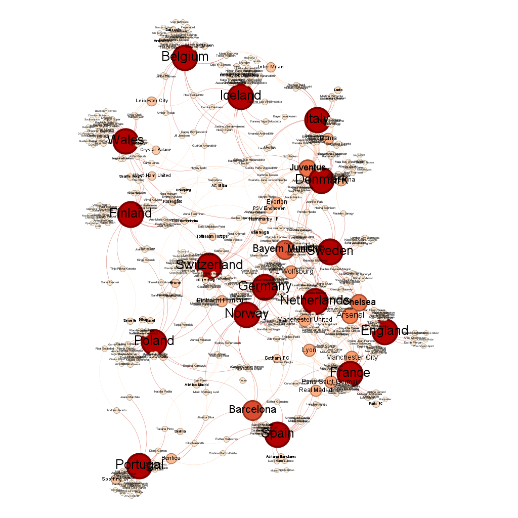
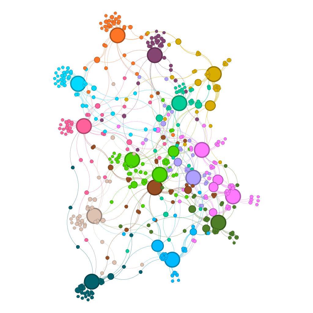
Some #Gephi network diagrams for the women's #Euro2025. The versions coloured in by community view are particularly pretty this year. #football #DataVisualisation - https://fulltimesportsfan.wordpress.com/2025/06/29/euro-2025-group-stage-network-diagrams/
Maps for #DataVisualisation: Our #Dataviz map style highlights the data you put on top. It’s simple, elegant, and ideal for dashboards. Available in color, light, and dark variants! Find out more: maptiler.link/3T0fB3A
Visualisez les zones concernées par des arrêtés préfectoraux liés au manque d’eau sur notre carte interactive, mise à jour quotidiennement.#Planète #Climat #Sécheresse #Catastrophesnaturelles #LesDécodeurs #Datavisualisation
Sécheresse : la carte des restrictions d’eau en France
Sécheresse : la carte des restrictions d’eau en France
Game 27 of Saints's 2024 season, which I'm following for my #rstats #RugbyLeague #DataVisualisation project was a loss to Warrington - https://fulltimesportsfan.wordpress.com/2025/06/24/saints-ahoy-game-27-and-the-2024-season-to-date/.
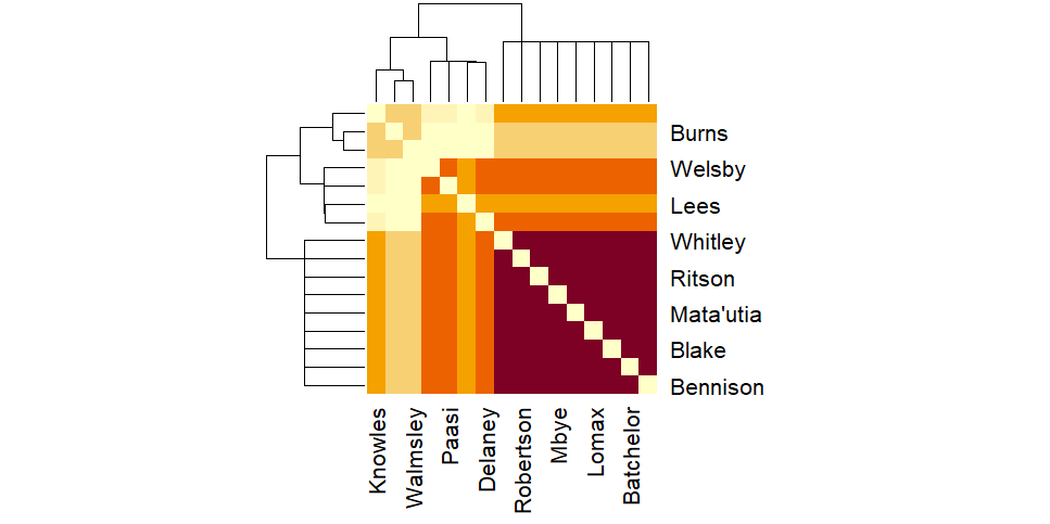
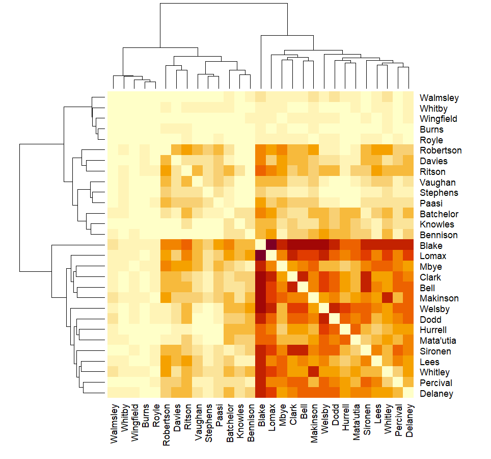
The most interesting figure was from the game itself, a matrix of which players were present together when Warrington scored. It's really easy to see that Matty Lees was the Saints player who received a yellow card.
My #rstats #DataVisualisation project of Saints's 2024 season has reached game 26 (away vs Huddersfield). The matrix charts are doing interesting things again - https://fulltimesportsfan.wordpress.com/2025/06/18/saints-ahoy-game-26-and-the-2024-season-to-date/

https://meta.masto.host/@GamingNews/114697486520779984
Hello
#socialscience #socialsciences #economics #geography #psychology #Economicmodels #clinicalpsychology #cognitivepsychology #developmentalpsychology #economist #sociology #statistics #anthropology #datascience #SocialPsychology #politicalscience #austerity #recession #ECB #FED #IMF #WTO #psychotherapy #cognitivebehaviouraltherapy #CBT #pyschoanalysis #behaviorism #pyschology #neuroscience #DataVisualisation #geopolitics
Quelles sont vos chances de gagner ? Les jeux à gratter se valent-ils tous ? « Le Monde » a compilé les gains des principaux tickets de la Française des jeux disponibles dans le commerce.#LesDécodeurs #Datavisualisation #Société
Vendredi 13 : pourquoi nous sommes toujours perdants aux jeux d’argent et de hasard
Vendredi 13 : pourquoi nous sommes toujours perdants aux jeux d’argent et de hasard
Le gouvernement actuel figure parmi les plus fortunés depuis 2017, avec 22 ministres millionnaires, selon les déclarations de transparence rendues publiques.#Datavisualisation #LesDécodeurs #Engraphiques #GouvernementBayrou #FrançoisBayroupremierministre #Politique
Gouvernement Bayrou : plus de la moitié des ministres sont millionnaires, selon leur déclaration de patrimoine
Gouvernement Bayrou : plus de la moitié des ministres sont millionnaires, selon leur déclaration de patrimoine
Following the 25th game of the 2024 season, the "who is present together when Saints concede" matrix chart now looks very pretty indeed (I have to take some positives from game 25 being a loss to Hull KR) - https://fulltimesportsfan.wordpress.com/2025/06/11/saints-ahoy-game-25-and-the-2024-season-to-date/ #RugbyLeague #DataVisualisation #rstats
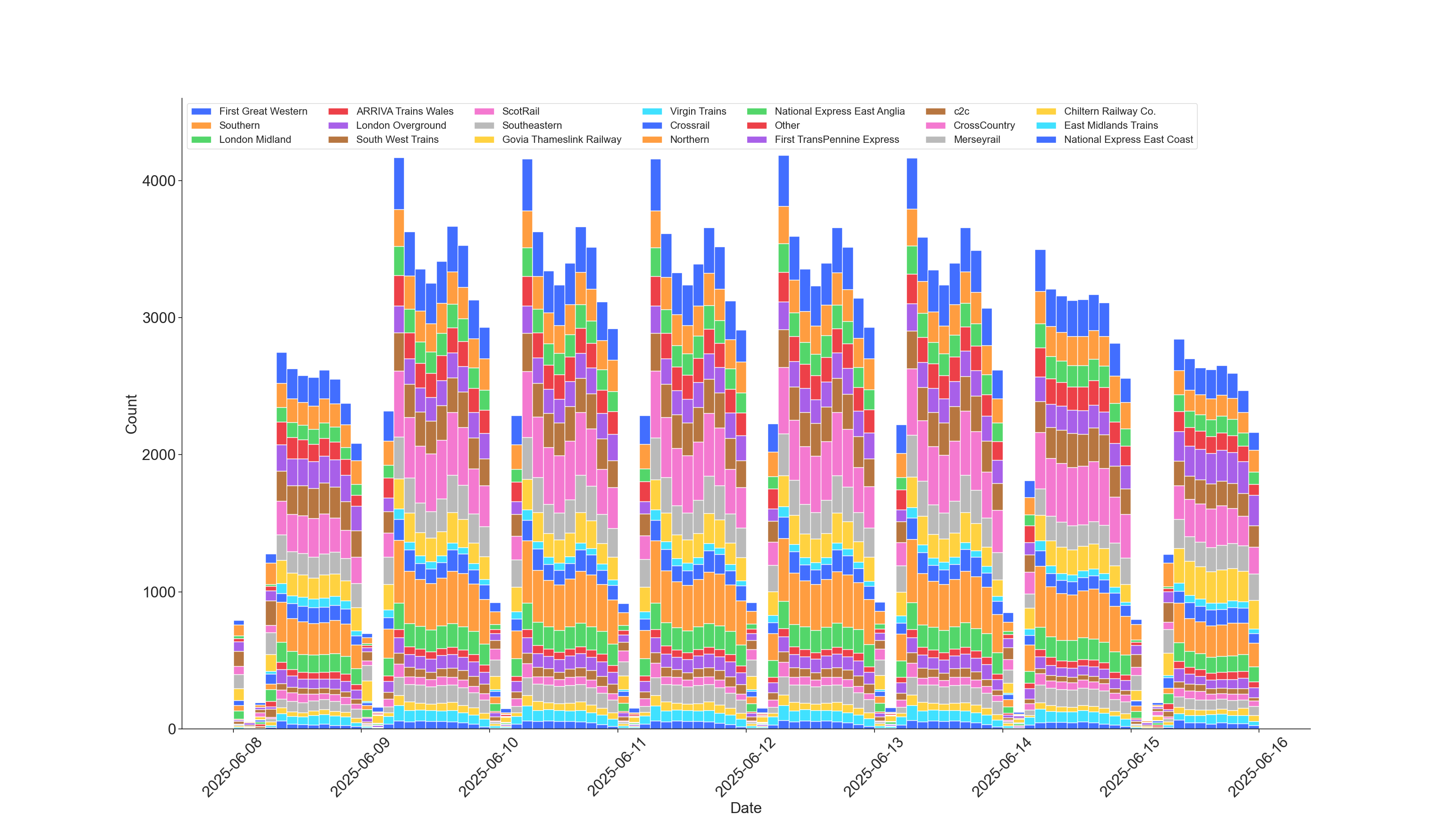
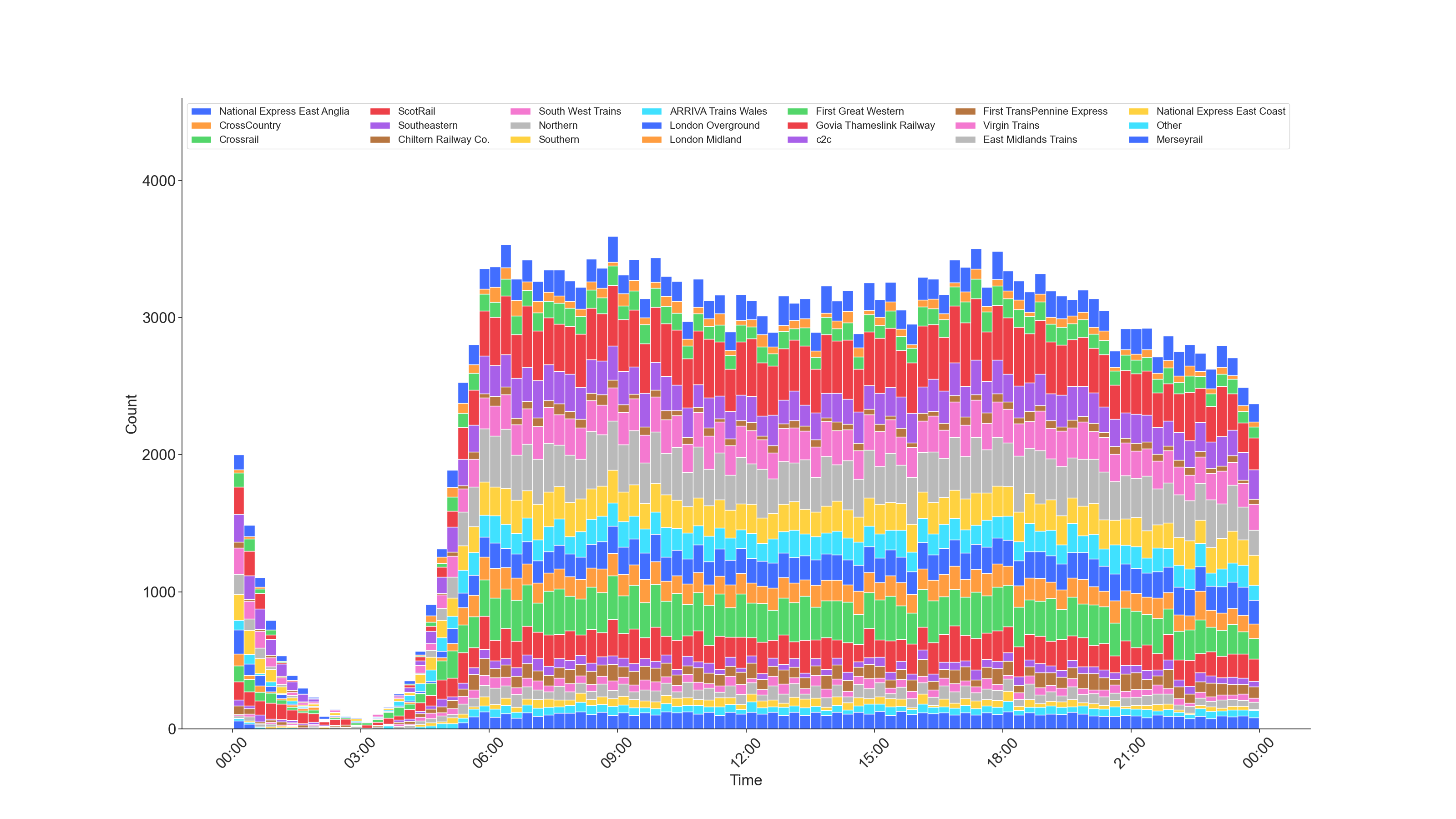
For those interested in such things, here are aggregated bar chart visualization showing timetabled departure-from-origin British train passenger service count by train operating company for week 8-15 June 2025 in 15-minute bin.
#rail #passenger #DataScience #Datavisualisation #PublicTransport
I wrote a blog post about a habit I try to teach my students, to help them figure out which experiments to run and how to communicate their findings.
https://latower.github.io/posts/2025/06/ASK-which-experiments-should-I-run/
What is your favourite figure?
#AcademicMastodon #AcademicChatter #DataVisualisation #SciComm
Deux nouvelles chaînes et un grand jeu de chaises musicales... Le 6 juin au soir, les téléspectateurs découvriront une TNT remodelée. Cette petite révolution laisse derrière elle C8 et NRJ12, qui ont rejoint le grand cimetière du PAF où sont enterrées plus de 200 chaînes.#Datavisualisation #LesDécodeurs #Télévisions&Radio #Culture
La grande histoire des chaînes de télévision, de Télé-Paris à T18
La grande histoire des chaînes de télévision, de Télé-Paris à T18
hi
#socialscience #clinicalpsychology #cognitivepsychology #developmentalpsychology #economist #sociology #statistics #anthropology #datascience #SocialPsychology #politicalscience #austerity #recession #ECB #FED #IMF #WTO #psychotherapy #cognitivebehaviouraltherapy #CBT #pyschoanalysis #behaviorism #pyschology #neuroscience #DataVisualisation #geopolitics
Pour injecter de la proportionnelle dans les élections législatives, comme le souhaite le premier ministre François Bayrou, plusieurs options se présentent. Mais laquelle est la plus juste ?#LesDécodeurs #Politique #Élections #GouvernementBayrou #FrançoisBayroupremierministre #Pourcomprendre #Datavisualisation #Électionslégislatives2024
Proportionnelle : les enjeux du changement de mode de scrutin
Proportionnelle : les enjeux du changement de mode de scrutin
https://newsmast.social/@newsmast/114613185578761343
long post? #socialscience #socialsciences #economics #geography #psychology #Economicmodels #clinicalpsychology #cognitivepsychology #developmentalpsychology #economist #sociology #statistics #anthropology #datascience #SocialPsychology #politicalscience #austerity #recession #ECB #FED #IMF #WTO #psychotherapy #cognitivebehaviouraltherapy #CBT #pyschoanalysis #behaviorism #pyschology #neuroscience #DataVisualisation #geopolitics #particlephysics #QuantumMechanics #physics #quantumphysics #molecularphysics #nuclearphysics #modernphysics
hello community 👋 #testedbysev
#socialscience #socialsciences #economics #geography #psychology #Economicmodels #clinicalpsychology #cognitivepsychology #developmentalpsychology #economist #sociology #statistics #anthropology #datascience #SocialPsychology #politicalscience #austerity #recession #ECB #FED #IMF #WTO #psychotherapy #cognitivebehaviouraltherapy #CBT #pyschoanalysis #behaviorism #pyschology #neuroscience #DataVisualisation #geopolitics
helllo
#socialscience #socialsciences #economics #geography #Economicmodels #economist #sociology #anthropology #datascience #SocialPsychology #politicalscience #austerity #recession #ECB #FED #IMF #WTO #psychotherapy #cognitivebehaviouraltherapy #CBT #pyschoanalysis #behaviorism #pyschology #neuroscience #DataVisualisation #geopolitics
Client Info
Server: https://mastodon.social
Version: 2025.04
Repository: https://github.com/cyevgeniy/lmst